Pop-up Christmas card progression, con’t . . .
December 16, 2021
….with the final design carbon traced onto a cream-coloured, blank notecard, the image is completed in watercolour —
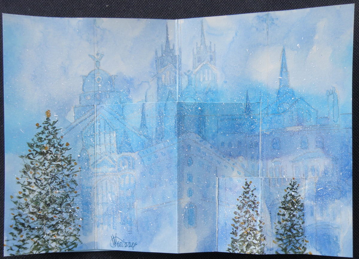
…..and Christmas trees added, cuts carefully made with an x-acto knife, and scored folds added to then oh-so-carefully make the folds and the cuts pop out. And once a successful Christmas pop-up snowy cityscape with Christmas trees was successfully done, it was time to then make fifteen more of them . . .
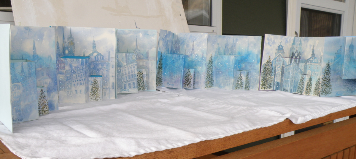
The biggest surprise when doing this was discovering how well a dollar store package of six blank notecards with envelopes received watercolour. Painting on them was almost as forgiving and receptive as my go-to Arches Hot Press #140 watercolour paper — and, a package of 6 is $1. Even the envelopes could be festively painted over and made to look handmade.
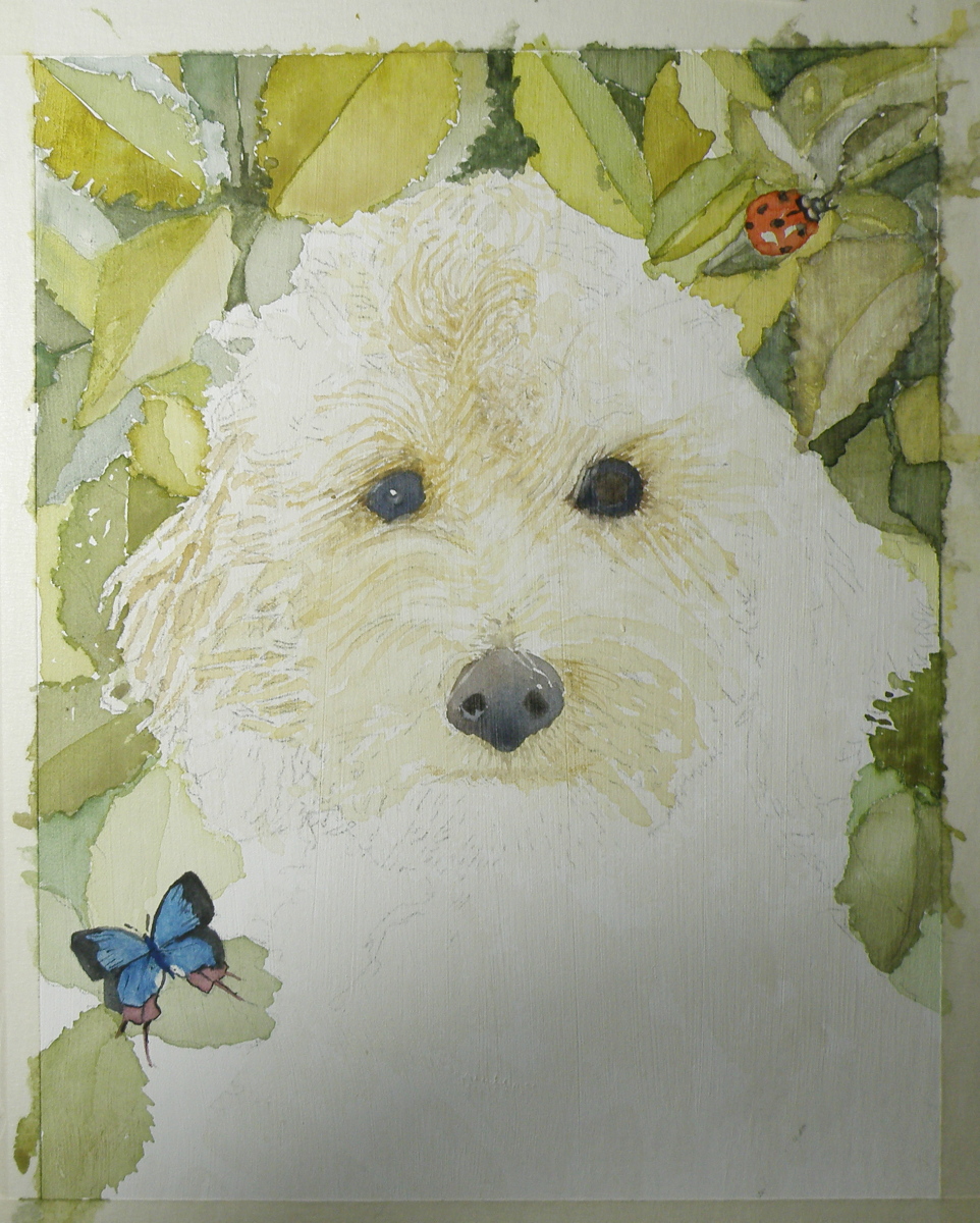
Painting Progression 4: Juno, finished
March 9, 2021
While painting this portrait of Juno in honour of Kathie’s birthday, our little Bichon, ‘Elmo’, was in the final days of his thirteen-year-old life. Stoically dealing with a heart twice its normal size, an enlarged liver and kidney malfunction, our beloved ‘Elmo’ passed away in his bed just after I’d checked on him on January 24th. For his two daddies, this was a sorrowful occasion and one very difficult to get over.
As the weeks passed, however, we realised we needed to at least try to fill the emotional hole of losing our lovely pet and began searching far and wide for a new puppy. At the same time, I was close to finishing the portrait of Juno and finally did, a couple of weeks before Kathie’s big day:

Kathie and Ken were very pleased and the Juno portrait now hangs in their dining room.
And we–Raul and I–have a new addition to our family, a tiny toy Maltipoo puppy named ‘Ashton’, who can never replace ‘Elmo’ and yet has won us completely over by his beautiful perky cuteness and charming personality:

Painting Progression 3 ‘Juno’
March 7, 2021
“Juno was the sister and wife (hmmm) of Jupiter, and the mother of Mars and Vulcan. The patron goddess of Rome and protector of women and marriage, Juno’s name is heard in Virgil’s Aeneid, Shakespeare’s The Tempest, and Sean O’Casey’s 1924 play Juno and the Paycock.” [source: https://nameberry.com/babyname/Juno%5D
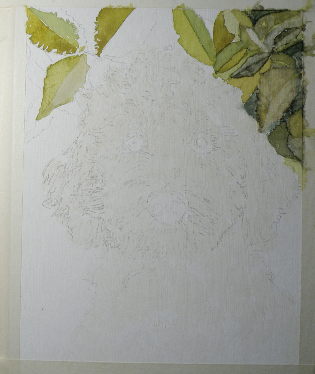
Although I’m posting these progressive treatments over a few days, this painting actually took me several weeks. That’s because I just wasn’t sure how to go about it. Painting complicated hair/fur isn’t my forte. And watercolour isn’t a terribly forgiving medium. So I ultimately chose to use Daniel Smith’s Watercolour Ground applied over white art board. The lovely quality of this product is how easily one can lift mistakes off it–it lifts previously applied, and dried paint, like a dream. What it therefore doesn’t allow is a number of washes or glazes on top of each other, because once a fresh wash is placed over a dried wash, that old one will lift and mix with the new wet one. So my experience has been to use one put-down of wash and let that be the one, and if it doesn’t look good, just put water all over it and lift it right off and wait till the surface has dried and start again.
Painting Progression 2: Juno
March 6, 2021
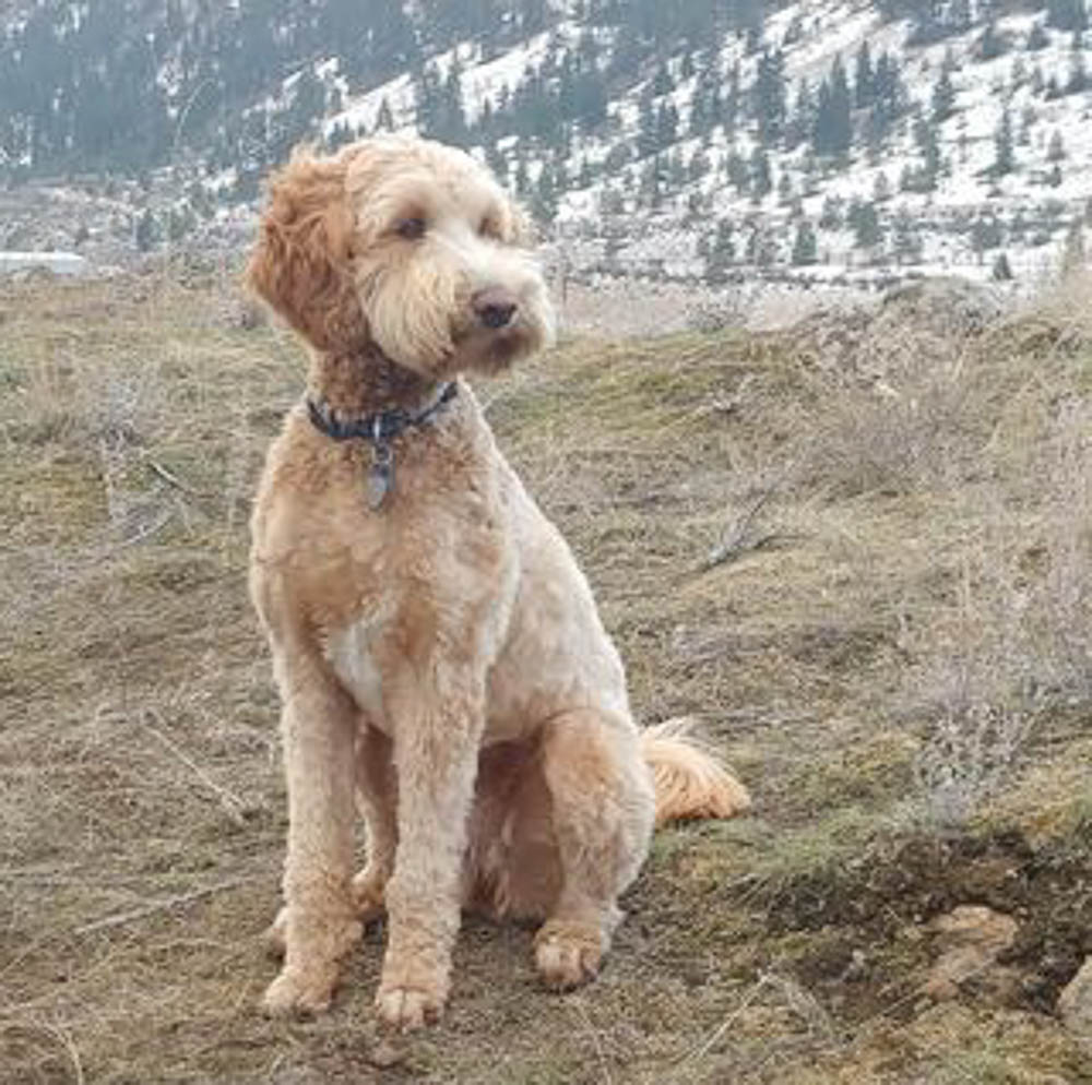
Because Labradoodles are created by mating a Labrador with a Poodle, any number of colour combinations are possible, including black, dark brown, reddish brown, blonde-brown and who knows how many others. Each puppy can be more like the father, or take after the mother, with different fur/hair qualities as a result. Juno’s hair is a delicious golden colour and not as tightly curled as a Poodle, but not as straight as a Labrador, and so very curly and yet wavy.
Here is the way the painting progressed from the initial sketch and wash:
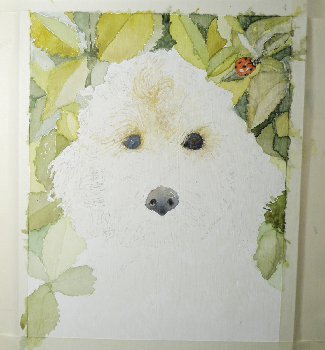
Personally, I have a need to establish the eyes and nose before progressing further. If they don’t happen correctly, forget about it. I was satisfied that my attempts looked true enough to the image I was given to work from to keep on working.
Painting Progression: Juno
March 5, 2021
To help celebrate the birthday of a recently retired Occupational Therapist and good friend–Kathie–her spouse, Ken, the Dean of our local Anglican Cathedral, provided me with photographs of their very charming one year old Labradoodle dog, Juno. My hope was to present Kathie with a watercolour portrait of Juno to mark her upcoming, significant ‘0’ birthday,
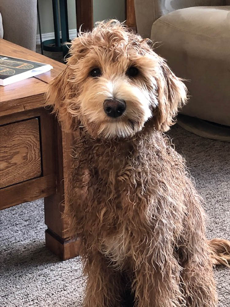

Dog portraiture is not something I have experience with/in. And Juno being from a breed known for its gorgeous curls and wavy hair/fur, presented challenges I wasn’t convinced my experience with watercolour could overcome. Fortunately, this painting was one I offered to do, and so if it was beyond my abilities I simply had to say so and produce a watercolour of another subject I knew Kathie would enjoy receiving.
I started with a detailed drawing:
Because Juno’s place to be is anywhere outdoors, I decided to provide a rosebush background.
When it’s all about sky….
August 1, 2020
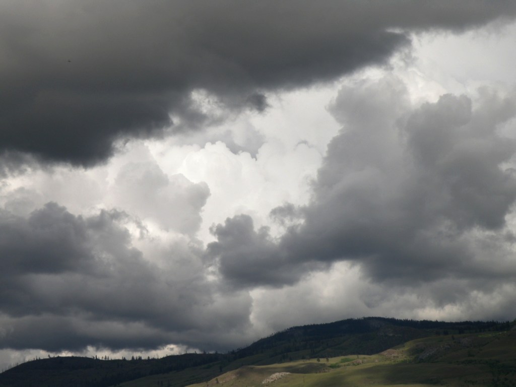
Lately here in Kamloops, British Columbia, we’ve been treated to cloud Cirque du Soleil. Each time I step out on our deck, there’s another stunning performance in progress:


As a student of watercolour, the challenge of painting skies on location doesn’t come from the medium itself because all it amounts to is sloshing water-tinted pigment over paper.
It doesn’t get more immediate than that.
Clouds are suspended water vapours being moved about by the atmosphere and wind. So a marriage made in heaven–immediate subject matter matched with an immediate medium, yes?
Um, well, maybe for some…. It takes a lot of confidence, deftness and elan to nail a quickly changing sky, and those aren’t exactly my gifts.
What helps move my senior’s ass is panic-induced adrenaline, like the time I brought all my equipment down to Kitsilano Beach in Vancouver. Perched in my umbrella-shaded lawn chair, sipping iced tea, leisurely sketching the Vancouver skyline, I noticed the sky dramatically changing from a fluffy blue to an angry charcoal.
After lugging everything from the parking lot to the shore, I wasn’t about to give up my precious spot for a little weather. Prudence did step in, however, and whisper in my aging ear that I had only minutes to accomplish what I’d been taking hours dallying over.
And then the rains came down, bruising the top of my umbrella, the beach crowd scattering, wind whipping the waves. As the saying goes, ‘in for a penny, in for a pound’, I finally found my spine and went for it, drops pelting my paper, gusts throwing up sand.
Cloud Studies
July 21, 2020
Sometimes there’s a need to trample on whole bunches of internal dos and don’ts, accumulated over years of anal retentive watercolour practices.
‘Don’t premix washes–glaze one pigment over another right on the paper’; ‘Don’t soak the paper in the bathtub and then stretch it on a stretcher–it removes the lovely sizing’; ‘Don’t get obsessed with detail–be expressive’; ‘Don’t use opaque white’; ‘Don’t use so much masking fluid’; ‘Don’t be so timid’; ‘Don’t paint today–you aren’t centred’.
Lordy. I went to the sink, grabbed a kitchen sponge and some dollar store poster board.

For all who might be equally plagued by a mental build-up of watercolour dos and don’ts, have a look at this example of watercolour exploration and artistic daring:
Sky Positioning and Treatment II
July 1, 2020
Just as choosing to place one’s subject matter in front of bright sky produces remarkable effects as in the work of Joseph Zbukvic, so also can equally-remarkable effects be achieved when making the sky itself the subject.
An almost unparalleled master is a lesser known watercolourist than the celebrated J. Zbukvic, but a truly exquisite painter of both sea and sky, the Russian Sergey Temerev:
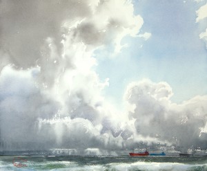


Here is a video of him at work:
Now, those are clouds.
Sky Positioning and Treatment
June 29, 2020
If one were to try and name the No. 1 watercolourist on the planet–or at least the most popular and followed–it would be safe to claim it is the Australian, Joseph Zbukvic:
The word ‘master’ understates the enormous talent and skill Joseph Zbukvic exudes from his artistic fingertips as he transforms a sheet of white paper into whatever his mind fancies.
Taking a moment to view these examples of his prodigious output, one thing might stand out to us when it comes to focusing in on, and studying Mr. Zbukvic’s skies:
Joseph Zbukvic’s signature artistic decision is at odds with a great many of his colleagues, because he takes the daring approach of nearly always rendering his subject matter facing directly into the sun.
This has the effect of placing everything of interest–whether it be buildings, people, horses, boats, vehicles–more or less in silhouette, backlit and often somewhat mysterious. Making this choice provides any artist with a great deal of painterly latitude simply because, whatever we might be trying to view while looking directly into the sun, is going to be greatly lacking in detail. Looking into the sun, we see general shapes, outlines of things, and blurred, obscured objects and people.
Placing everything in front of direct sunlight means one doesn’t have to attend to minute detail. It means there will automatically be contrast, exaggerated shadow, enormous differences between light and dark, and all the drama a watercolourist needs to make a painting ‘pop’.
If one does a search of YouTube watercolour instruction these days, you will find a great many Zbukvic devotees, with their subject matter silhouetted against a bright sky. It has now become almost the de rigueur approach for aspiring watercolourists.
What is sacrificed by placing all subject matter in front of direct sunlight?
Skies.
All the luscious drama of cloud formations and subtlety of light which plays in, around and between the loveliness of clouds is the price one pays. Viewing Zbukvic’s work makes that seem worth it, at least for him.
However, as influential as some artists are, and deserve to be–for those bettering their skills, it is always important to remember that variety still remains the spice of life. All painters have their own unique painterly story to tell, in their own unique manner–and not all paintings need to be looking directly into the sun. I suspect Mr. Zbukvic would be the first to agree.
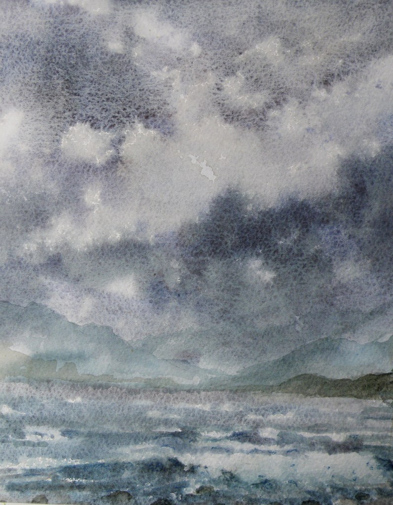
Cloud study
June 21, 2020
The problem is, clouds can look terribly dark, yet the prevailing wisdom by learned painters is the caution that regardless of how dark the sky might appear, it is the lightest component of any landscape painting–except in rare cases like snowscapes, or some seascapes.

The temptation, at least for me, is to go about trying to recreate that memorable sky full of drama by mixing up a bucket of what might best be described as ‘peat bog grey’ or ‘burned frying pan umber’ and sloshing it onto the top of the picture.
The end result is a landscape where anyone deigning to walk would be greatly at risk–paintings where interspersed throughout should be little yellow triangular signs reading: WATCH FOR FALLING CLOUDS :

The other prevailing wisdom by a great many worthy painters, is that if one’s painting is featuring clouds, then whatever else is depicted ought to be kept rather simple and relatively free of detail. Conversely, if the focus is on whatever is happening below the sky, then the sky itself should be left unassuming and merely supportive. The above painting is a good case proving that point.
Where Green Reigns Supreme
February 10, 2020
In watercolour-land much discussion takes place over how one goes about dealing with an abundance of greens in a given landscape. Summer landscapes abound with green, all of them different in hue and tone and degree. The old school adherents council the need to create greens from the various blues and yellows available on one’s pallet–that using those pre-mixed greens directly from tubes will only clash.
So if one is using Cobalt Blue for one’s sky, for example, using it with a Raw Sienna or New Gambodge for a foliage green will integrate it, anchor it and serve to unify the painting, as long as one then also uses the Raw Sienna and New Gambodge in other parts of the painting as well.
There are, however, such a huge variety of pre-mixed Greens being offered, it is almost too tempting not to use them, or at least borrow from them when mixing a blue and yellow, as was done in this little sketch of a Bulacan yard, Philippines. My spouse, Raul, is from there, and I stayed for a month each time over three years, a place so fresh and lush, it is a virtual and visual smorgasbord of every green there is.
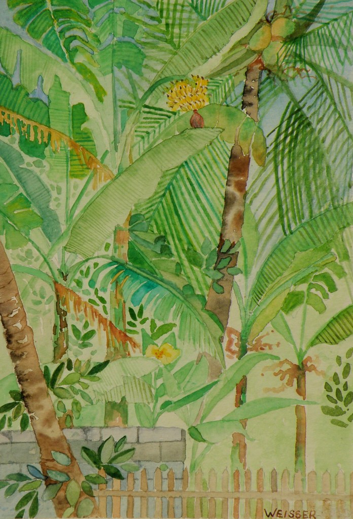
watercolour sketch, 5″ x 7″ on ordinary card
by Lance Weisser
‘School’s Out’
April 9, 2018
Not far from our Kamloops, B. C., home is the village of Pritchard which used to have an original one room school occupying a corner of a farmer’s pasture–a school he himself reputedly attended as a boy–that no amount of seeking to have it lovingly restored bore any fruit with historical groups or municipalities.
Fearing its derelict floors and frame would be responsible for causing trespassing children accidental injury, he reluctantly tore it all down some five years or so ago. But fortunately I managed to capture its classic image with my camera while it was still part of this farmer’s horse paddock, and I’ve painted a series of watercolours using it as a focal point.
Since it no longer exists, I choose to place this old school in settings that depart rather dramatically from where it actually had been (on a rather non-descript flat field right beside Duck Range Rd).

‘School’s Out’, watercolour by Lance Weisser, 14″ x 16″
Arches Hot Press 140 lb. Paper, Sold
The ‘how’ of ACEOs
April 6, 2018
To gain more know-how about the way ACEOs are collected and acquired, just go to eBay and view the huge number of them being sold/auctioned: https://www.ebay.com/sch/i.html?_nkw=aceo+original+painting&_sacat=0&_from=R40
You’ll see the quality contrasts, the styles, the subject matter variety, the variety of mediums, too–as well as price, with some going for $40/ea to $1/ea.
Below are examples of how I personally approach doing ACEOs:
‘A Westsyde Winter’, ACEO by Lance Weisser, Arches Hot Press 140 lb Paper, sold.
Once one of mine is matted and framed, it is generally priced at $25 to $30US. Unframed, $20US. But I’m not beyond letting interested people barter for them because what is most pleasing to me is having a person get an original watercolour that is within his/her means. As painters, we really just want people to enjoy what we do, and know our work is being appreciated and displayed.
If interested, please just email me at weisserlance@gmail.com.
I can work from an emailed attached photo, or your personal subject matter ideas. It can be mailed to you wherever you may be — postal costs will be built into the final price 🙂
ACEOs (miniature art cards)
April 3, 2018
[source: https://creationsbygena.zibbet.com]
An ACEO is 2.5″ x 3″ — artwork the size of sports trading cards — otherwise known as a miniature. I personally love the challenge of painting something that small.

Old Barn, watercolour ACEO, 2.5″ x 3″, Arches Hot Press 140 lb paper. Sold.
Have you ever done them or bought one? I’d be interested to know!
Happy Easter
March 29, 2018
As children, we loved writing on eggs with crayon and then colouring them, the smell of vinegar used in setting the dyes filling the kitchen, and our fingers almost permanently stained purple and orange and green–yet we weren’t very keen on then having to eat cold hard-boiled eggs, pretty though they were. Our mother held a big church breakfast at our parsonage home, card tables decorated up, little ‘favour’ cups filled with mints and peanuts, lots of hot chocolate for people returning from sunrise service. And of course, lots of coloured, hard-boiled eggs.
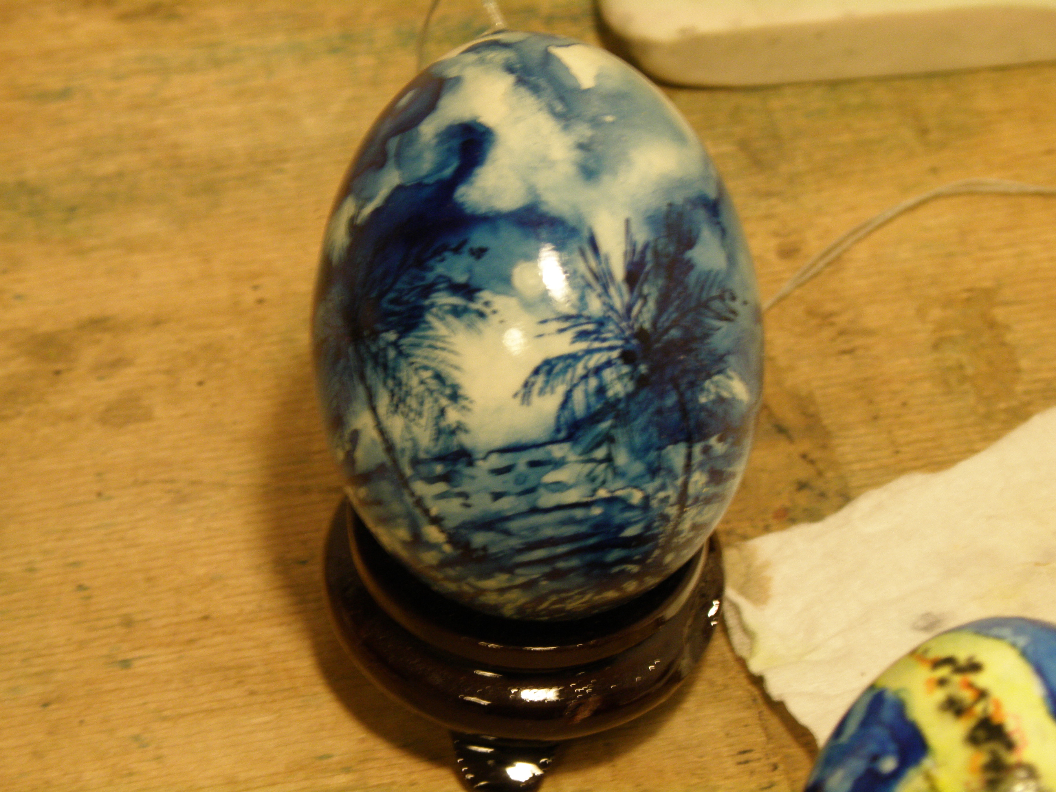
I enjoy painting watercolour on eggs, which receive it quite well, the best eggs being duck eggs whose satin-smooth surface is perfect for watercolour. The eggs then have to be blown out and finally spray-lacquered to protect them.


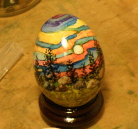

Christmas tree ornament egg done using the traditional Ukrainian beeswax and dye method.
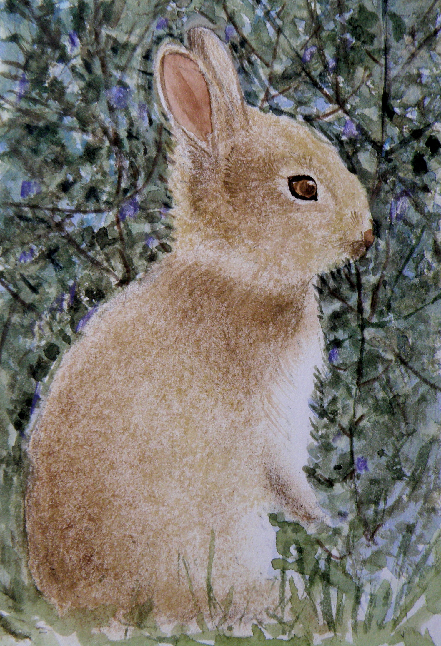
‘Little Bunny’, watercolour on Saunders Waterford Hot Press Paper, 4″x6″, sold.
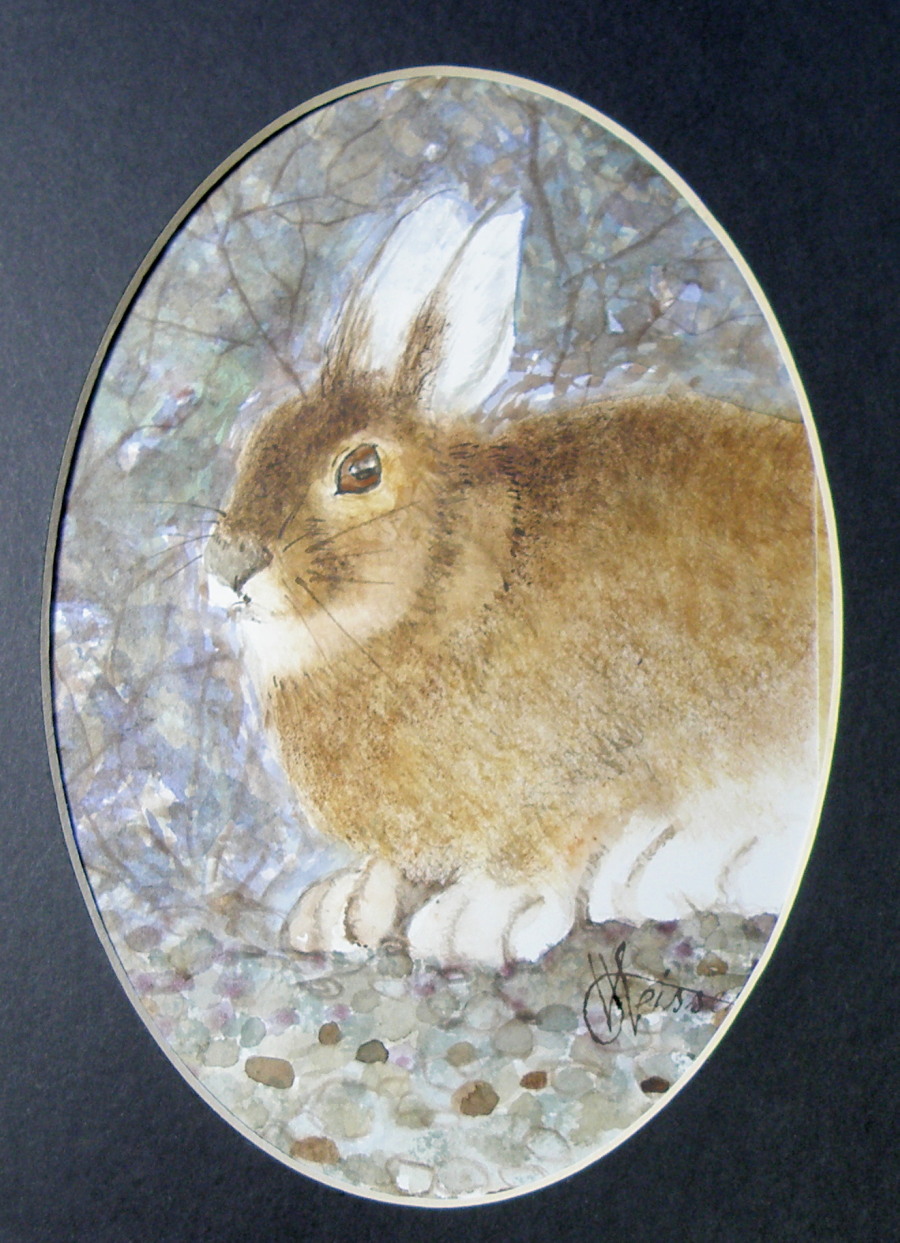
‘Arctic Hare’, watercolour, Arches Aquarelle Hot Press Paper, 4″x6″, sold.
A blessed and Happy Easter everyone!
Stage Two: ‘Raven Winter’
February 14, 2018
The painting for my friend Patricia Kellogg is taking shape. The treated surface of the mat board I’m using to paint on was/is achieved by applying a product by Daniel Smith called ‘watercolor ground’. It comes in a jar and is painted onto any surface one desires, instantly turning it–once allowed to thoroughly dry–into one which can be painted on using transparent watercolour. So, glass, metal, wood, masonite, anything of the kind can basically become a surface with the characteristics of watercolour paper.

Work in progress: ‘An ear-full of Waxwings’
February 2, 2018
As a child there was probably no bird I wished more to see than a Waxwing. In on-location photographs they just looked so exotic and intriguing–their colouration and little tufted crowns–the whole package was and is so appealing.
In those days we lived in Eastern N. America where Waxwings aren’t found and so it took many decades–after I’d moved to British Columbia–for my chance to encounter these birds. And it happened as I stood at our front picture window looking out at the Red Maple just beyond the glass–a tree which had nestled within it a deserted Robin’s nest.
Suddenly there appeared a large group of birds I’d never before seen, Cedar Waxwings, darting about the nest, examining it animatedly and calling to one another. I watched in fascination as they systematically began dismantling this Robin’s nest, their little bandit’s masks seeming very appropriate to their deciding to make someone else’s home theirs for the taking.

‘An Ear-full of Waxwings’ — work in progress — Saunders Waterford Hot Press Paper, 140 lb.
A grouping of these birds is known as ‘an ear-full’ almost certainly because they go about in bunches and are constantly chattering in a distinctive, rather conversational voice that is more insistent than melodic or song-like, yet charming even so.
‘The Way Home’
January 24, 2018
In the spirit of watercolour experimentation, it was interesting to take ordinary white mat board and coat it with a thin layer of clear acrylic medium. The board then had to dry for a good 24 hours. The experience when painting is one of finding it acts as a kind of resist while providing a rather intriguing texturing quality.

It is a bit tricky because there’s no wet-in-wet opportunity, or much reworking/touching up or the acrylic medium will moisten and lift from the surface and become gummy. So getting one crack at it is pretty much all one gets, making every brushstroke really count.
…. composition exercise conclusion
February 27, 2016
Results of ‘composition exercise 1’: dividing a landscape into thirds, placing visual interest at each intersectional point….
Results of ‘composition exercise 2’:
and 3:
bringing us to 4:
It has taken a long spell of waffling over what to do about being less than pleased with the finished piece. The snowy fields seemed to extend themselves too far down, without enough visual interest to hold a viewer’s attention. And then I gave into the temptation/artistic trap I almost always seem to fall into, which is going one step too far by defining open field with regimented rows of corn which wind up being so monotonous, the fence posts going the opposite direction only add yet more visual predictability and kill whatever freshness the piece had going for it.
….so the only satisfactory outcome was to crop the painting and salvage what could be salvaged.
It is a very small painting, about 6″ x 12″, and has at least enough mood still going on to make it only just worth framing.
As an exercise, however, it was more than useful, and confirmed satisfactorily that placing interest at intersectional points within a composition divided into thirds works (sans rows of corn, that is), does hold one’s attention, and lends a feeling of balance.
…. Tranquille Creek Gorge
January 21, 2016
The watercolour video demonstrations of David Dunlop are challenging and yet simple. https://www.youtube.com/watch?v=Lgtg-Adql1Y&index=6&list=PLtEJwQmsB7SvVg8C4J2c4LDijerH7SSKF (I tried to embed the video itself in this post, but WordPress thought otherwise). But here is the blurb describing it….”Emmy Award winning David Dunlop takes you to his Connecticut studio to demonstrate a two minute watercolor, used as preparation for an oil sketch or to explore ideas“.
Mr. Dunlop is an artist/teacher from Connecticut, whose manner when teaching is inspiring and animated. He is a great follower of descriptive, energetic Masters like J.M.W. Turner and Winslow Homer, and seeks to employ their methods, while demonstrating their techniques.
The video cited above challenges painters to do two to three minute painting sketches, which convey the movement and mood and spirit of the subject, without stopping to think and rework. In an effort to ‘do’ and not think, the subject chosen here is a favourite–a place about 20 minutes from our house–called Tranquille Creek Gorge.
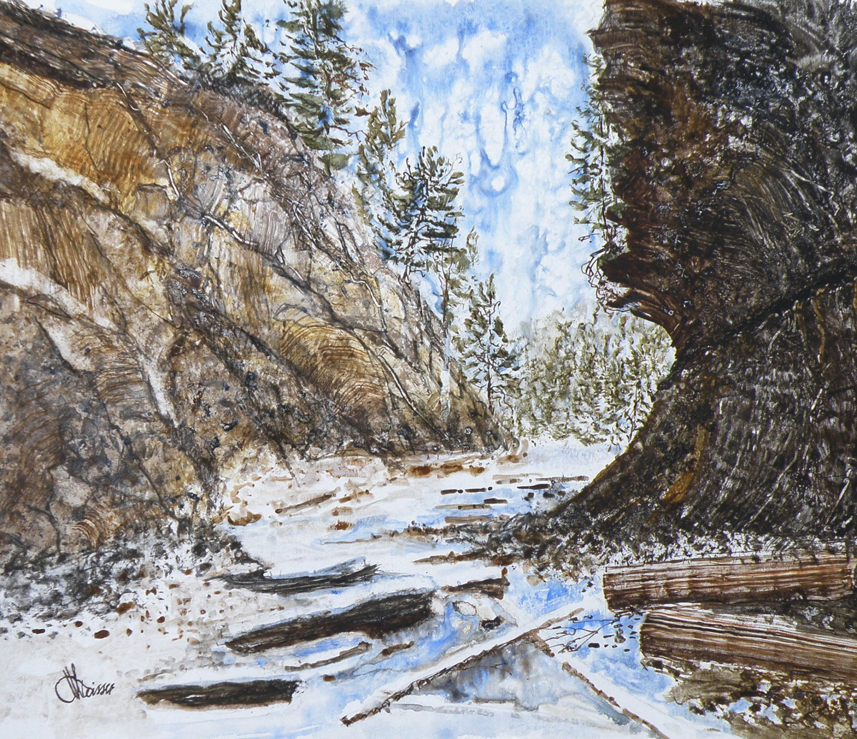
Mr. Dunlop’s videos are quite dynamic and aimed more at oil painters a bit more than watercolourists, but full of very encouraging lessons because of the force of his optimistic personality and sense of fun. They are well worth watching, for those who enjoy painting as a means of expression.
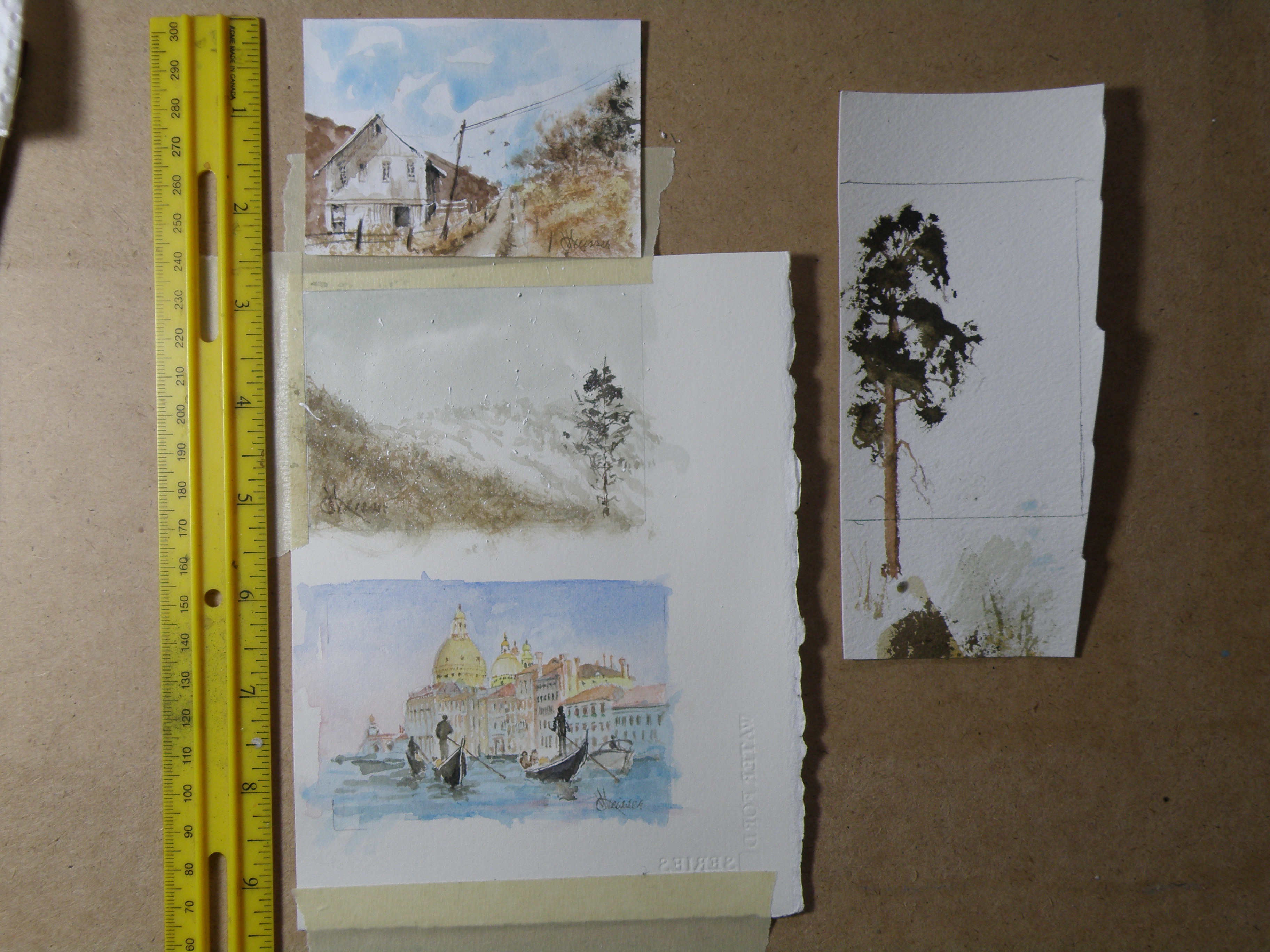
….composition exercise 2
January 17, 2016
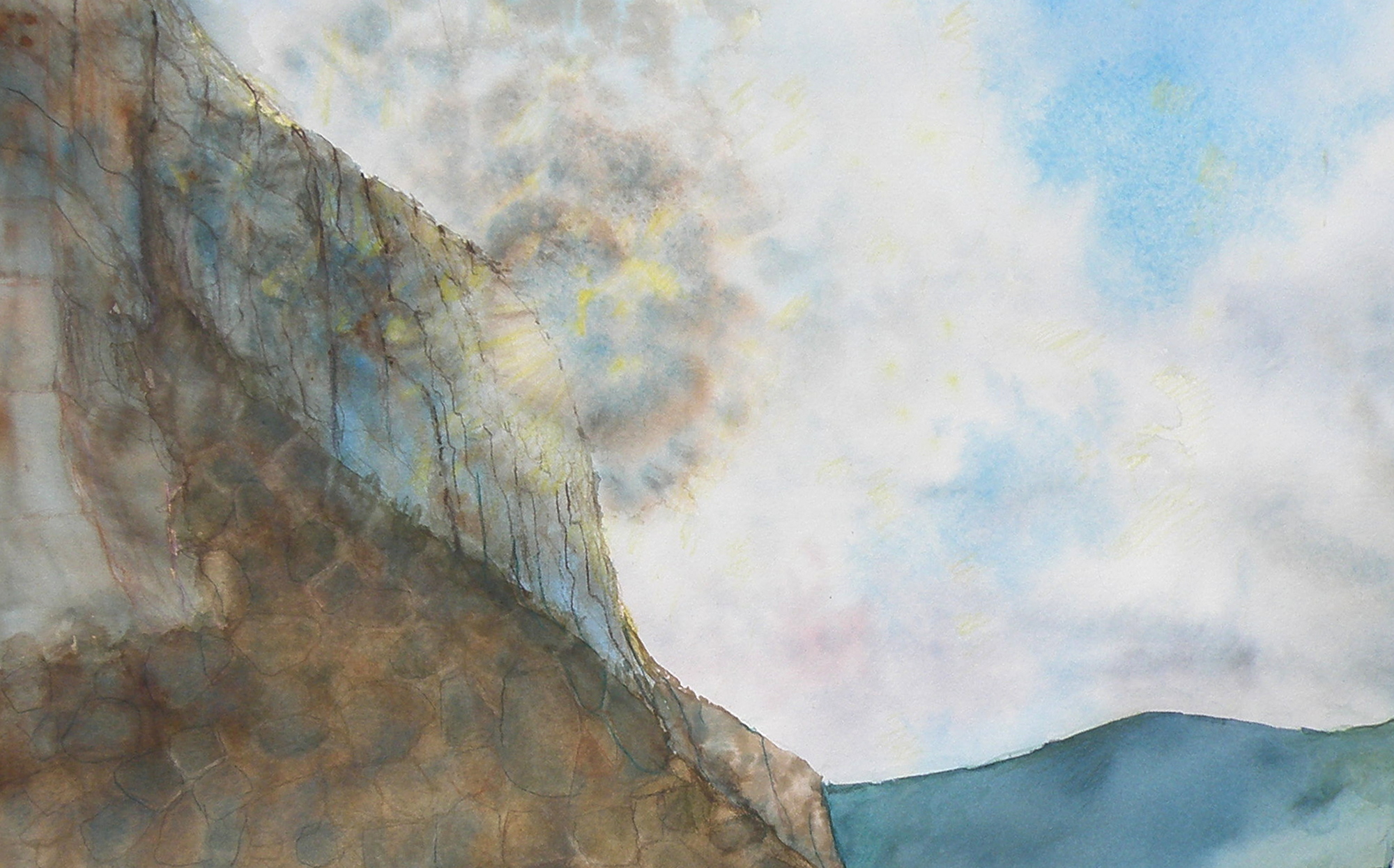
Continuing on with an attempt to test out the compositional dictum known as ‘the rule of thirds’, which was conceived and named by John Thomas Smith in 1797 :
“. . . Analogous to this “Rule of thirds”, (if I may be allowed so to call it) I have presumed to think that, in connecting or in breaking the various lines of a picture, it would likewise be a good rule to do it, in general, by a similar scheme of proportion; for example, in a design of landscape, to determine the sky at about two-thirds ; or else at about one-third, so that the material objects might occupy the other two : Again, two thirds of one element, (as of water) to one third of another element (as of land); and then both together to make but one third of the picture, of which the two other thirds should go for the sky and aerial perspectives. . . “
To illustrate its basics…..

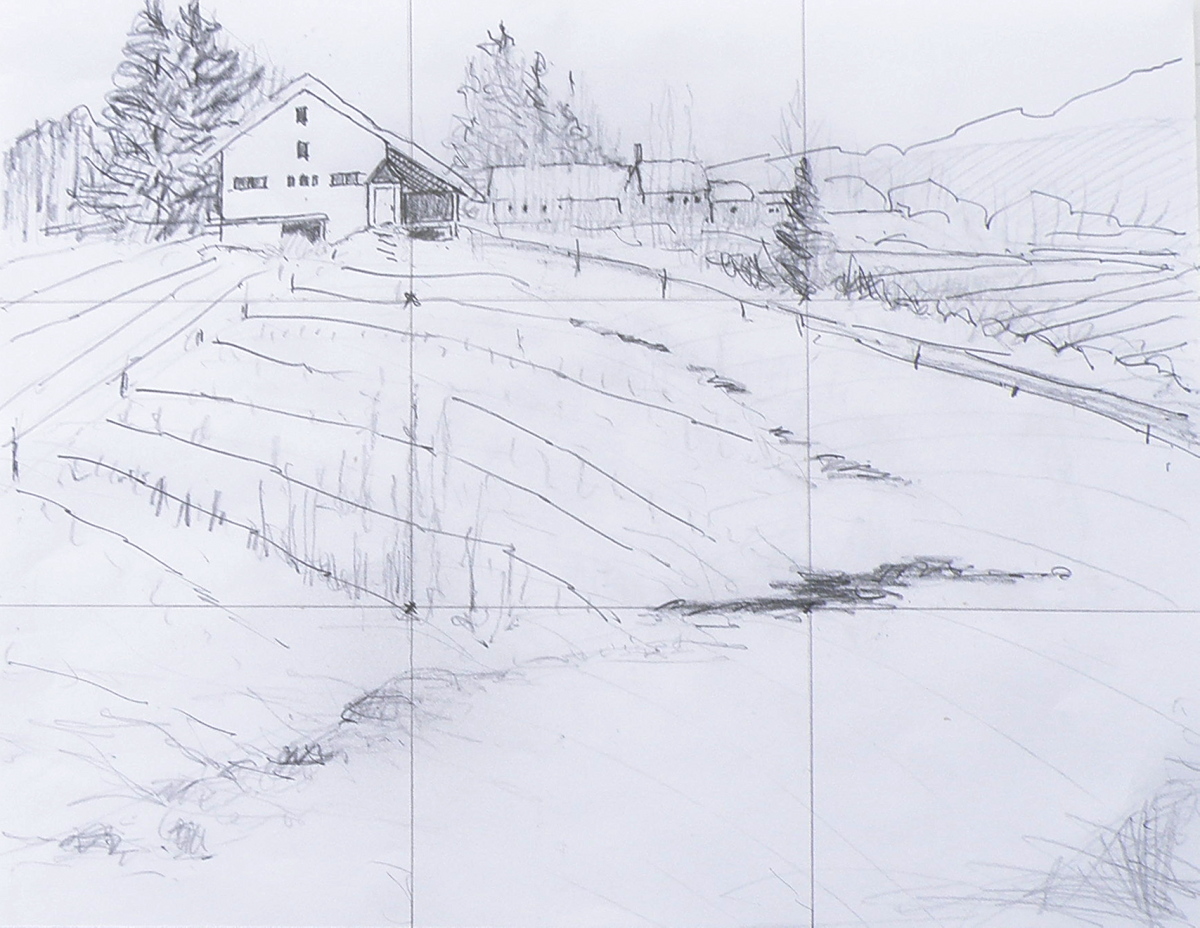
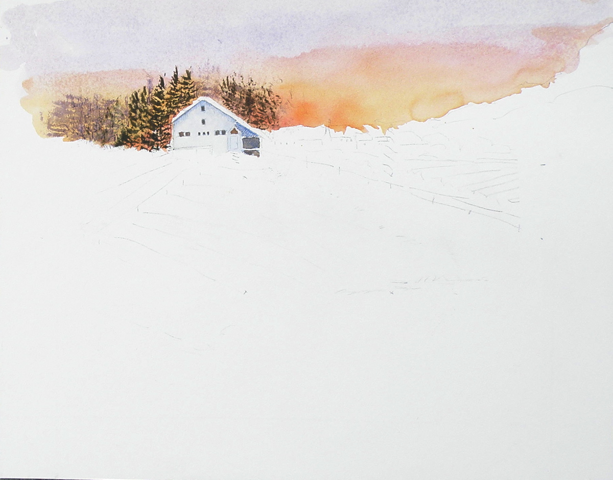
Once again, this is the drawing I did initially, to put this into practice….
And this is the first go at painting the scene….
And now today, here is the progress so far, attempting to locate some visual interest at each of the four intersections within the piece, the barn being the first and the pine being the second and the creekbed being the third…..
The darkest darks and greatest contrast will remain with the barn, for that is the intended focus for the picture, when completed.
The ‘rule of thirds’, as stated above, holds that generally two-thirds of a landscape be devoted to the sky, with one-third given to the land below (the sky being such a vast and dominant feature). In this case two-thirds is dedicated to the land and a very high horizon means that the one third is devoted to the sky area.
….the silt bluffs
November 22, 2015
An area east of Kamloops, B. C., follows the South Thompson River which flows between dramatic limestone cliffs originally formed (it is estimated) 270 million years ago.
Among those cliffs is a gully–a waterworn ravine known as ‘the silt bluffs’, featuring very distinctive rock formations which have the look and feel of something out of a Western movie.
Massive geological formations such as these require some form of treatment by a painter in order to adequately convey their uniqueness and grandeur. This watercolour attempts to do that by purposely choosing to paint directly into the sun.
This part of our landscape gets quite literally baked by heat at midday, so when painting outdoors it is important to get it done quickly.
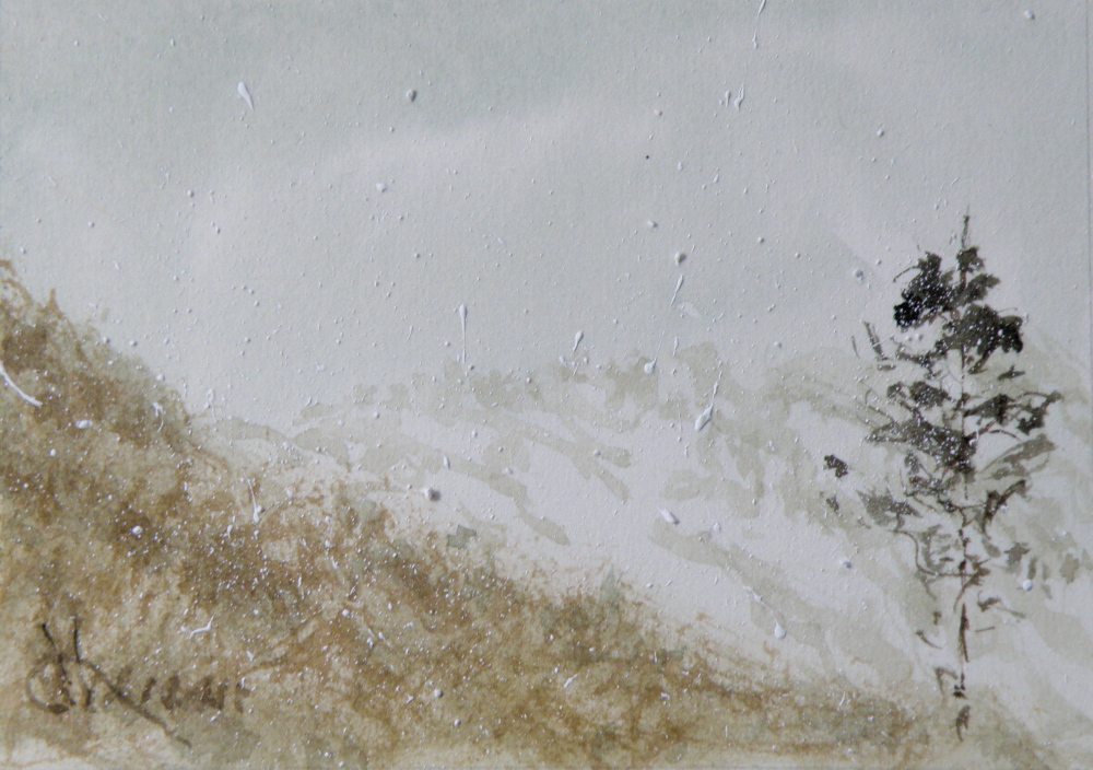
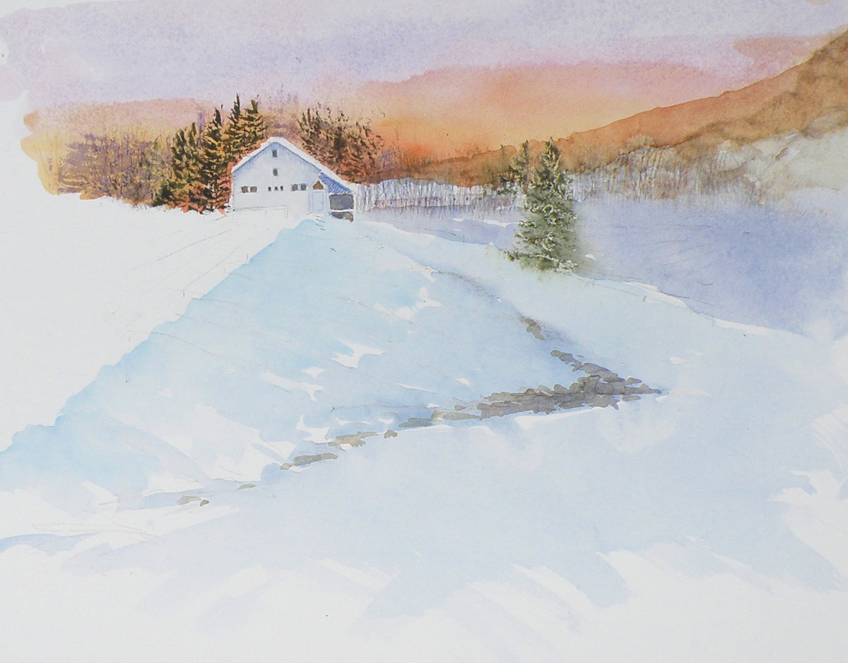
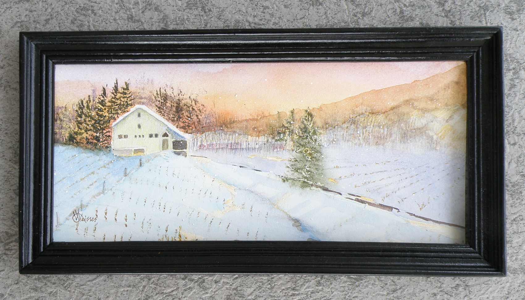
….depicting snowy pines
October 22, 2015
Snow-laden firs and pines aren’t the easiest of subjects for depicting in watercolour–(at least not for this painter). The challenge comes in first understanding the effect snow has on branches, for, obviously, there is snow and then there is snow–each snowfall having its own unique effect. That crystalline, hardened seizing of tender branches by icy snow pulls them heavily towards the ground, while sub-zero powdered flurries creates a mere dusting of needles–each presenting technical challenges.
Of course, the problem is one of always having to paint around the white of the paper allowing it to ‘be’ the snow in watercolour. Given that opaque white can’t be used, a light dusting on pine needles becomes really quite a bit more difficult than painting the after-effects of a full-blown blizzard. Leaving minute dots of paper surrounding green needles is a recipe for madness in my book. Give me a snow-stormed pine any day of the week in its place.
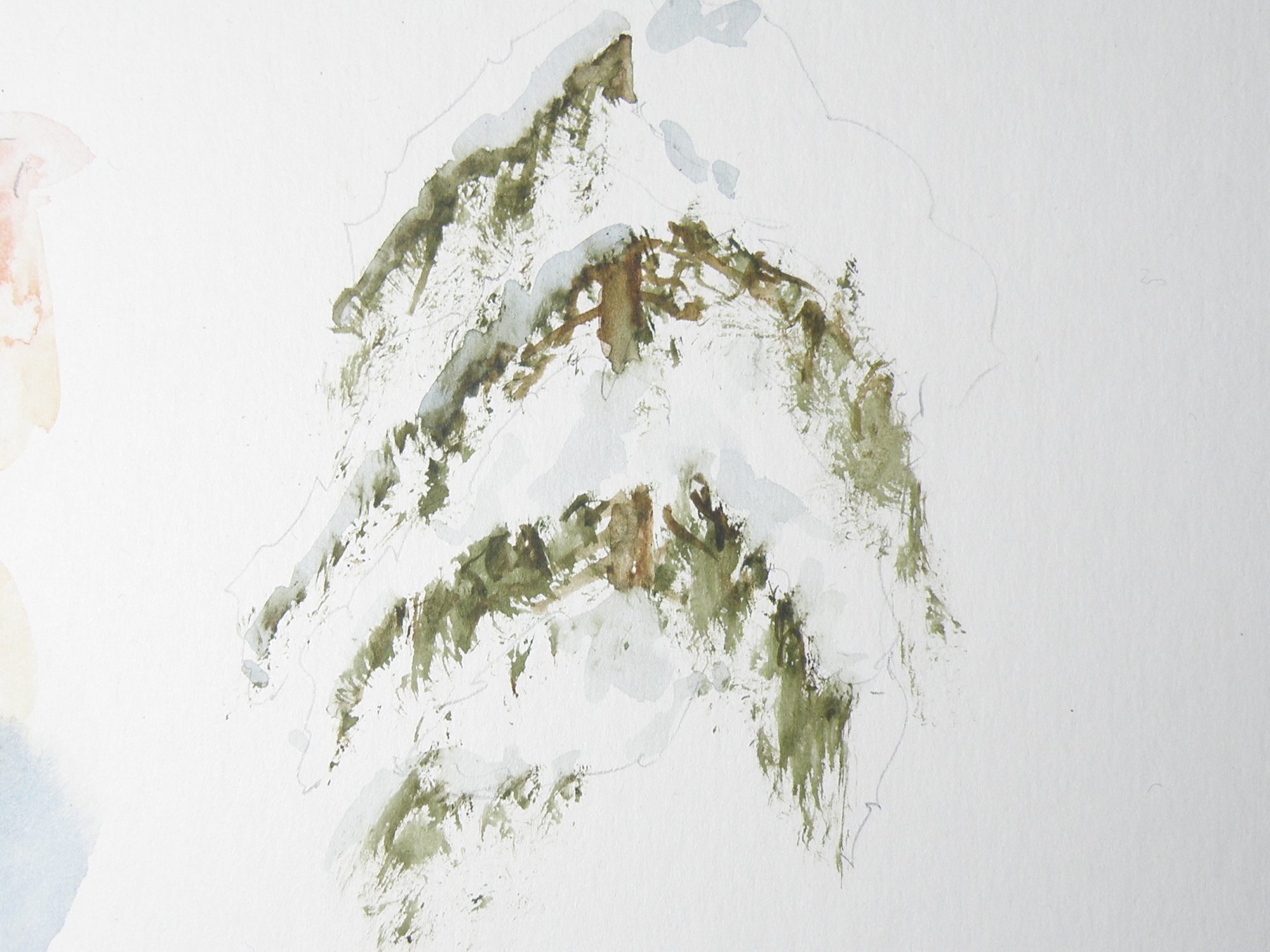
Figuring out just where branches are on a given variety of pine, fir, balsam, cedar or spruce is key to understanding where snow will sit when on them. So it seems crucial that any study be limited to particular species, (in the above case, cedar) — otherwise, a painter of representational art will be in danger of ending up with a kind of ‘marshmellowed’, generic evergreen most often seen on Hallmark Christmas cards.
Truly, each variety of coniferous tree accepts snow in its own unique way. A blue spruce, for example, with its stiff, jutting branches, is much more able to bear the weight of snow than the red cedar in the above study, whose branches are prone to drooping and bending.
This study was done on leftover piece of plain white matt board, using a chopped-up small fan brush to go after the greens, then a more pointed, conventional brush to soften the hard edges and provide shadowed depth to the snow. The branches aren’t quite correct. Once snow is included, it changes perception to such a degree, I have trouble understanding where it goes and branches fall.
The beauty of our being blessed with so many evergreens to choose from comes in knowing that each one offers the student of watercolour great and intriguing challenges, especially when brimming with that wonderful adornment–snow.
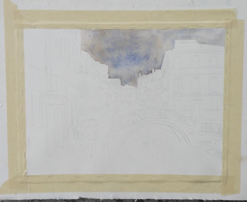
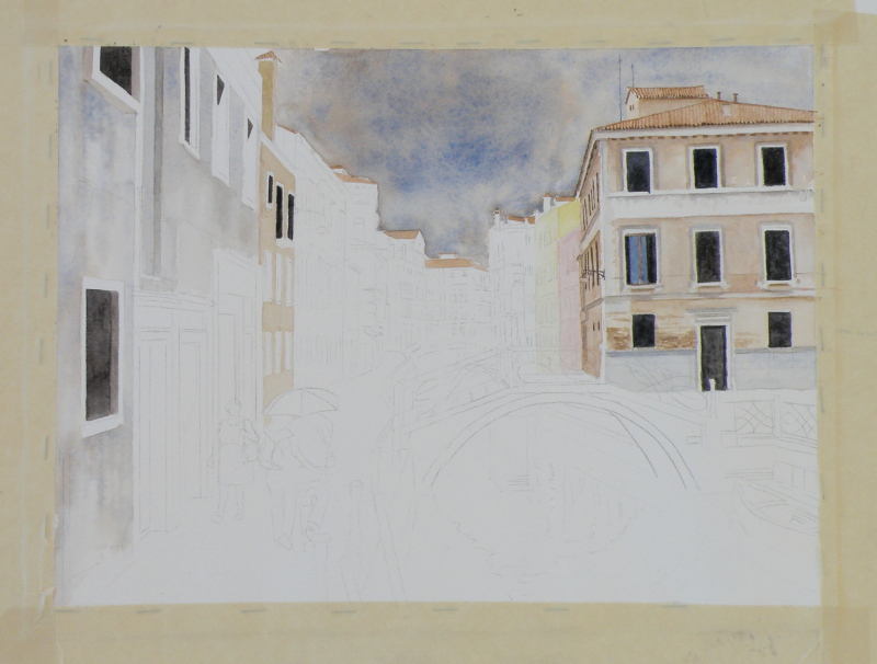
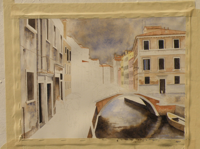
venice challenge
September 6, 2015
We’ve reached the finish line, limping all the way. This was somewhat beyond my abilities as a painter. Whether a success or not, every endeavour provides a great learning experience. All the watercolourists looked up to for advice offer the same counsel: when it comes to watercolour as a medium, suggesting detail far surpasses actually getting bogged-down in it. The pitfalls begin when the painter keeps trying to improve on what’s there.
Despite the overworked areas, enough aspects work to allow this to maybe escape the scrap heap — but probably not. It would, however, be useful to begin it again and learn from the errors.

it’s not easy being….
August 18, 2015
The beauty of people is that though 99.9% the same, we all know it only takes going to, say, The Iowa State Fair, to discover we’re probably not. All you have to do is stand aside (wondering what on earth you bought that hot dog and sauerkraut for) and watch everyone passing by.
This is just a convoluted way of confessing that not everyone is a great fan of Summer. Painters (some painters who write certain blogs about watercolour) in particular who like landscapes can (on occasion) find Summer just too, um, well, green.
There are ways of uncomplicating all the greens. When I lived in The Adirondacks of New York, not far from our town, in another small town, the famous Grandma Moses, who began painting at the age of 78 had only recently died at the age of 101 .


She was once found in her studio with masonite panels at her feet and a roller with blue paint. Looking up from coating a panel and filling the roller with more blue from the tray, she informed her visitor, “On Thursdays I do skies.”
In 2006 one of her pieces sold for $1.6 million.
Greens can be as simply applied to a landscape as opening up a tube of something and rolling it on. In representational forms of art, trying to authenticate the many greens of a summer scene can be a complex challenge, if for no other reason than that there are just so many variations. Leaves on the very same tree play on different greens, without even mentioning the grasses, shrubs, bushes, ferns below it.
Because it is a colour derived from mixing blues and yellows, greens straight from the tube nearly always have a garishness when, for example, painted against a very blue sky. That’s because the blue of the sky likely isn’t the same blue used to create that particular green. If the sky is cerulean, mixing a green from cerulean and a yellow used in another part of the painting will harmonize. So finding ways to harmonize greens through using their primary parents elsewhere in the painting is a way forward–a way of conquering ‘the greens’.
A worthwhile exercise from a contributor named ‘CharM’ on the site http://www.wetcanvas.com, posted in 2011, is provided by this chart:

‘CharM’ takes a similar exercise to completion here:
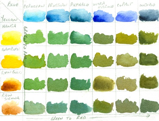
http://www.wetcanvas.com/forums/showthread.php?t=925152
While one is actually in the process of painting a landscape with a variety of greens, it is entirely possible to include in the painting all of the above blues, through washes, cloud shadows, sky and/or water, and generally just finding ways to get them all in there. Likewise, the full range of yellows can also find their way into the painting. Doing this then puts all the blues in the scene, as well as all the yellows, and sets the stage for being able to harmoniously use every single green (and more) shown on ‘CharM’s very helpful chart(s).
I still prefer doing fog, mist, moonlight, winter and early dawns (before green has a glimmer of a chance of making an appearance). And that’s fine, because we all know I am .001% different — or lived a past life on a Scotland isle, where being able to see beyond the front step meant it was a lovely day.
