Winter Watercolours
January 5, 2022
One of Kamloops’ older homes, the Fort House at the corner of Fortune Drive and Fort Avenue, is so named because it is on land formerly part of The Hudson Bay Company’s fur-trading post.
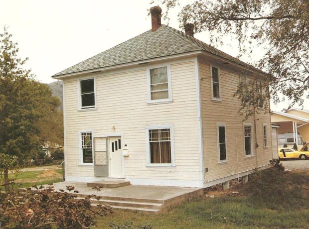
“. . . According to a listing of heritage buildings published by the Kamloops Museum and Archives years ago, the fur-trading post was located there from 1843 to 1862, at which point the Hudson’s Bay Company moved its post to Mission Flats.

However, the company continued to use the land for agriculture until B.C. Fruitlands bought it in 1906 and subdivided it into lots of five or so acres.
The Fort House was built about 1907 for Archie Davis, a railway employee. ‘The house, a foursquare design with a cottage roof common for that period, was originally located on extensive acreage’. . . ” [source: https://armchairmayor.ca/2014/05/24/answer-man-reader-wants-to-know-the-story-behind-the-old-fort-house-on-fortune-drive/#prettyPhoto%5D
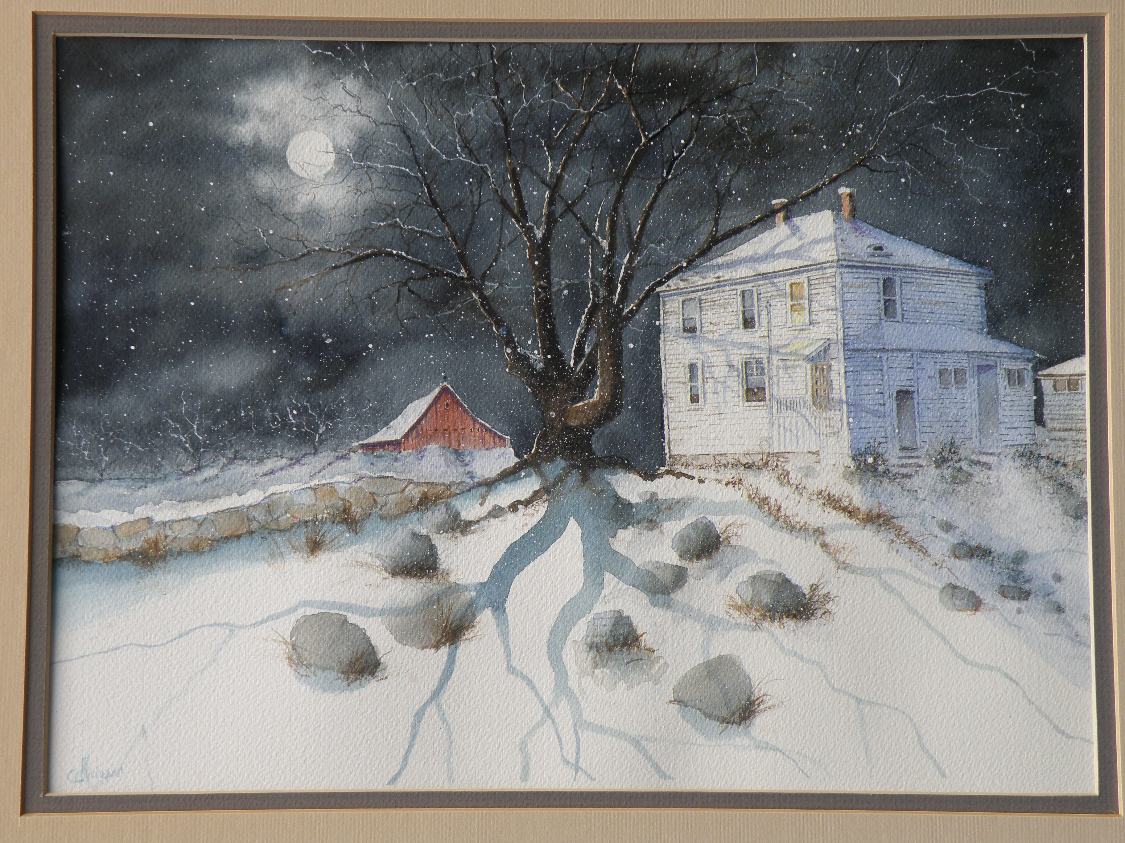
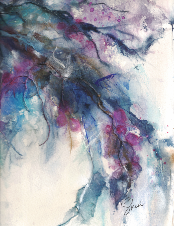
All Hallow’s Eve
October 31, 2020
A reposting of a watercolour with an All Hallow’s Eve feel and flavour . . .

[available for purchase]
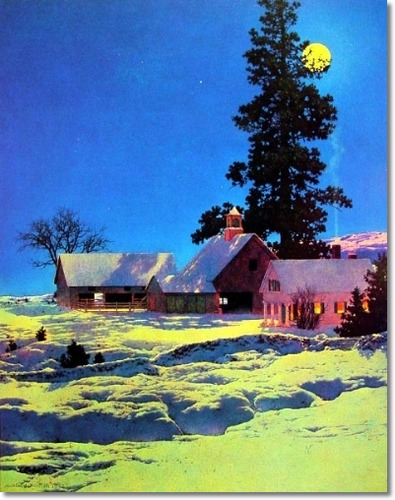
As evening grows deeper, they gather together to stand watch through the autumn night.
by Lance Weisser
[sold]
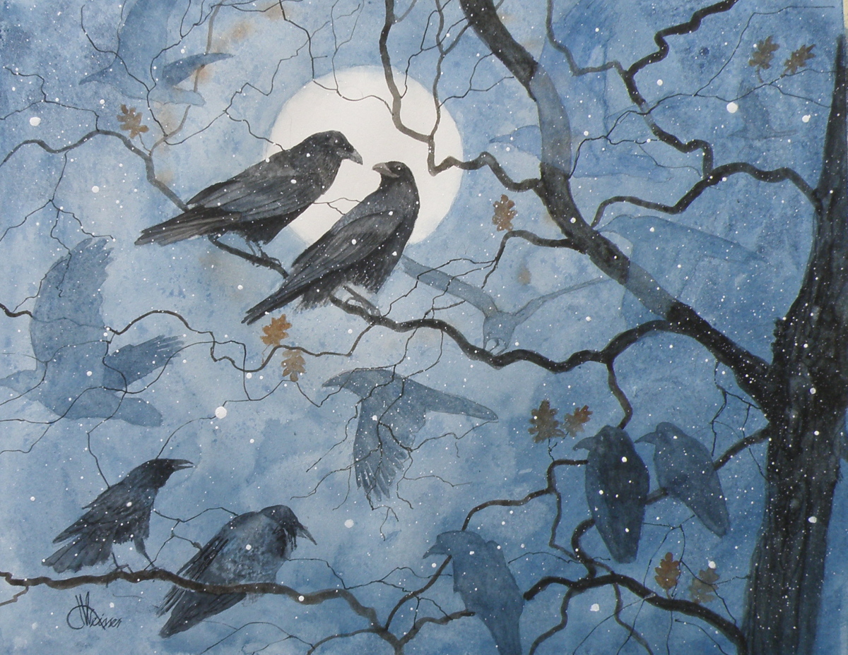
Raven Trio
March 10, 2018
Portraying moonlight is something of an intriguing interpretation for painters. Some, like the famous American painter Frederic Remington, chose a greenish hue for its earthly glow….
Others, like the American painter Maxfield Parrish, often used yellow as the predominant colour of moon glow….
I’ve noticed other painters depicting the colour of moonlight in hues of blue. And in this little painting of Ravens, my choice is sepia and white….
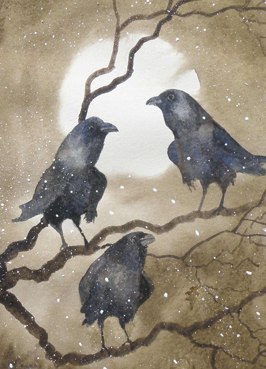
‘Three Ravens‘, 8″ x 10″, Arches Hot Press 140 lb Paper, Sold
By including my own, I’m certainly not attempting to put myself in the league of a Parrish or Remington–but merely drawing attention to how our eye finds mystery in the way the moon reflects and illuminates the landscape. When I go outside on a full moonlit night, I feel it is a blueish reflection on snow, and more earth-toned on our backyard mountain and rocks. And even though I never quite manage to see moonglow as green, I simply adore Remington’s moonlit scenes and illustrations. He convinces me it really is green!
What is it for you?
book cover
August 11, 2015
Leon Idriz Azevedo is a Brazilian author who requested the use of the painting “Raven Moon” for the cover of his recent Novel “The Desert of My Eyes” (“O Deserto Dos Meus Olhos”).
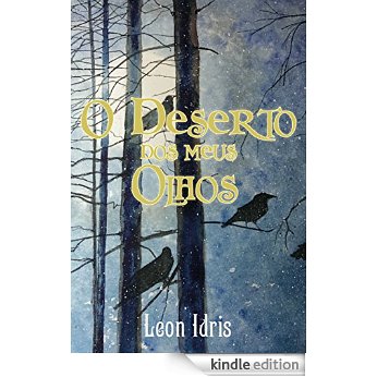
The Novel (currently available in Portuguese) finds the main character, Rupert Lang, thrown into a historic quest to seek the remains of what he stumbles upon as a ‘lost identity’ — taking him through ‘the Spanish court of the reign of Isabel II, the streets of Prague Johannes Kepler and the halls of a Buddhist temple built on a cliff in China’.
“. . . What could have been lived and what is suspected from the imagination receive equal value, challenging the reader to trust the chaos and find answers and truths in the improbable . . . “
A miniature of the new book’s cover has just been painted and is wending its (slow, ship-bound way) to Brazil, with best wishes and hopes Mr. Azevedo receives great reviews and even greater public readership of this new adventurous Novel.
My hope is that I’ll soon be able to read it in English.
blue moon
July 4, 2015
Because watercolour basically amounts to taking white paper and staining it with various colours by way of a brush and water-activated pigments, the possibility of texture using a buildup of paint, gesso, gel medium and other ‘helps’ available to painters in acrylic and oil just isn’t there. IOW, in classic watercolour technique the word ‘impasto’ doesn’t exist.
Some painters get around this disadvantage by way of collage, and apply watercolour to glued on tissue and similar textural material…..
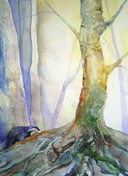 “Forest Forager”, watercolour and collage by Shari Hills, source: httpwww.drawntothevalley.co.ukartistsdetailshari-hills
Here, the painter, Sheri (Colours by Sheri), used ‘delicate papers’ as a glued foundation to provide textures which then received watercolour paint to complete the effect. On her site she describes how she also has used organic leaf material at times.
“Winter’s Chill”, watercolour collage, Colours by Sheri, source: httpwww.coloursbysheri.comcurrent-series.html#sthash.aUBXtd8f.dpuf
If this method is used, painters are required to identify their medium as ‘collage’, or ‘watercolour collage’ if entering the piece in an exhibition or juried show. Such work falls outside the accepted boundaries of what constitutes a ‘watercolour’.
In order to remain within the rather strict boundaries painters cannot have more than one third be of another medium or it then becomes a ‘mixed media’ work or ‘collage’ or ‘gauche’. Gauche is watercolour which uses white tempera paint, and thus is opaque, not transparent. Of course, that is perfectly well and good. Every painter does as (s)he is led to do.

‘Moonrise’, watercolour on art board, 19cm x 24cm, (7.5″ x 9.5″)
Personally, like writers who enjoy the challenge of staying within the bounds of iambic pentameter and composing 14 line sonnets, being ‘confined’ to the rather strict parameters of traditional watercolour is rewarding. These protocols include reserving paper to serve as white in a painting (such as the moon in the above example) — and the white of the paper is what brings life to the pigments laid over it. And it means having to discover ways of creating texture which, in the end, remains just an illusion.
more night
June 5, 2015
I KNOW, I KNOW, it’s June. I’m incurably attracted to Autumn and Winter, most likely because they are for me what I’d describe as cozy seasons, where a sweater serves perfectly.
ADMITTING to age preferences is slightly embarrassing, but only slightly. Heat is no longer an attraction to me, weather-wise, and here it is June 5 and in two days it will be going to 92F (33C). Now please, do NOT misinterpret this as whining. I’m not (right now), but rather simply stating a preference in order to justify posting this painting….
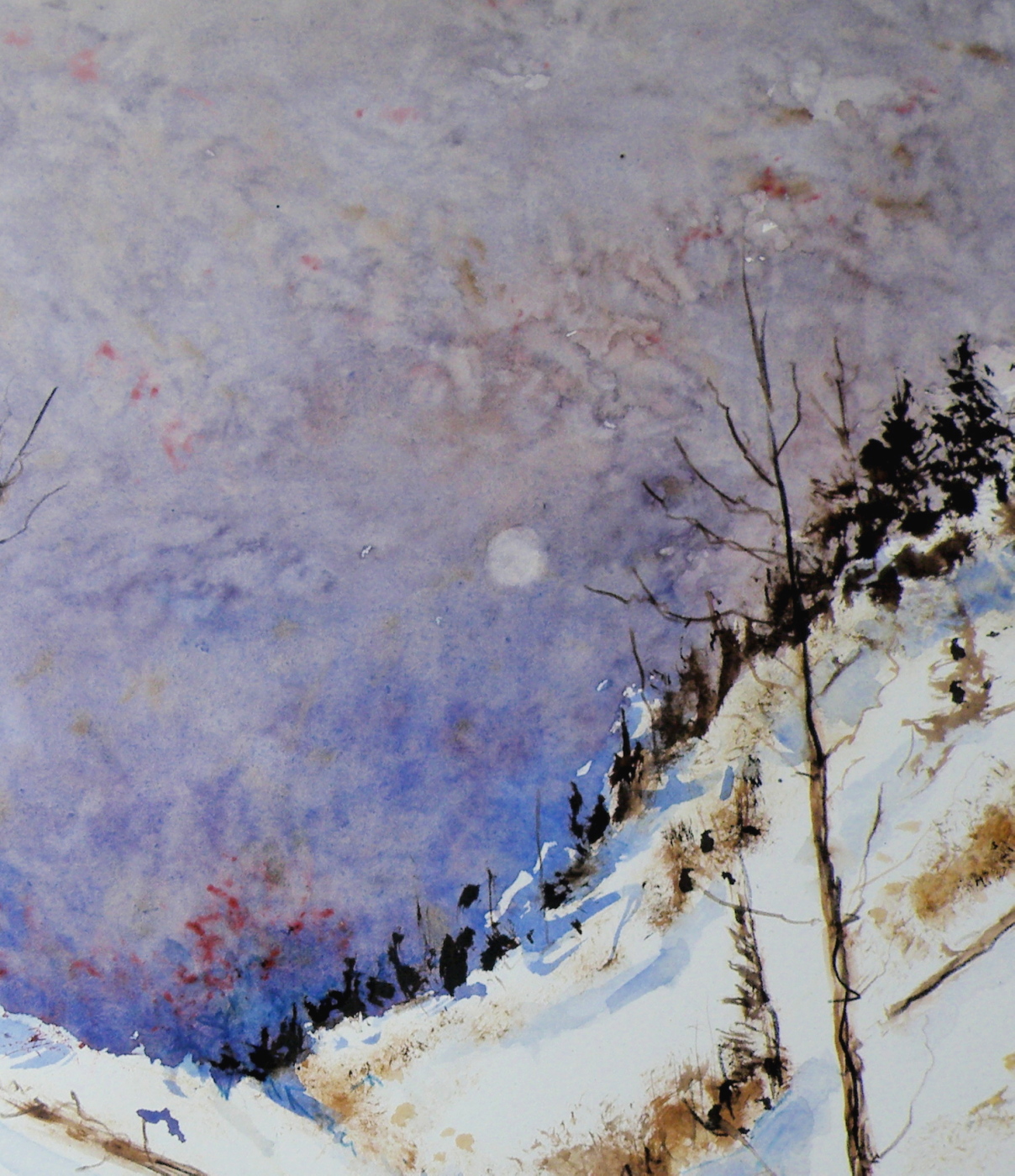
‘Pale Moon’, Watercolour on Arches Hot Press 140 lb Paper, 13cm x 18cm (5″ x 7″)
WHEN PAINTING, I admit to finding it more satisfying to express feeling through stark scenes with diminished-light. For one thing, the above place is not one many people would find themselves visiting at that hour in that weather. It therefore brings us in as though inviting a search for Snowy Owls on the prowl, or a pack of Grey Wolves threading a path back to the lair.
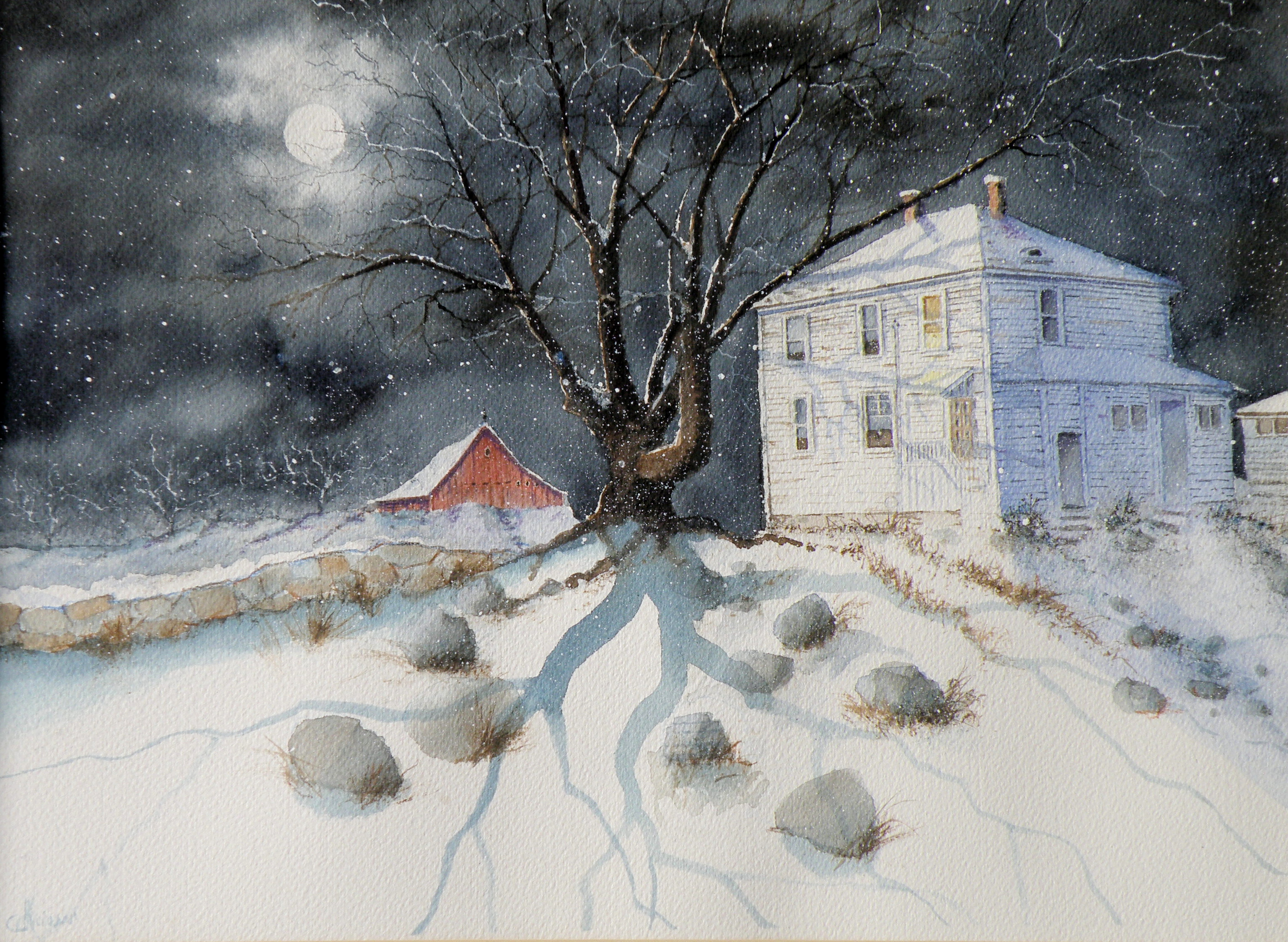
raven moon
May 20, 2015
PAINTING NIGHT has become something of a preoccupation. On a very bald and pedestrian level, one could simply say that ‘night sells’. However, it is the ‘why’ which is intriguing–why do scenes of watercolour-rendered night have an appeal.

‘Raven Moon’, watercolour, 35cm x 25cm (14″x10″), Art Board, (sold)
THERE IS A FASCINATION over what goes on in nature while we are sleeping. When walking the dog at 4 a.m., there are owls hooting, deer eating in people’s yards, the occasional cries of coyotes, and the enduring scent of lilac.
HEARING, TOUCHING, SMELLING all come alive, while seeing is at the pleasure of the muted moon–at once reassuring and mysterious.
painting night
May 18, 2015
THERE IS A FASCINATION surrounding night, when all is cloaked in darkness and the earth dons a mysterious manteau.
WE SEE, and yet we don’t. Depicting night is a painting fascination because I personally do not have a firm visual anamnesis of what exactly night ‘looks like’.
FOR EXAMPLE, is the moon really white–or silvery? Or is it, rather, lemony–or perhaps, blue?
A NUMBER OF RENOWNED NORTH AMERICAN PAINTERS made the depiction of night their signature subject. Some, like the famous Western painter, Remington, chose to depict moonlight as a bit of each, including even at times, degrees of green….


IT IS SOMEWHAT OF A MYSTERY as to what our eyes truly see, in terms of chromaticity, when looking at night, and particularly, moonlight. Painting night offers an enjoyable challenge: convincing viewers that what has been painted corresponds to their personal, nightly experience.
‘Up Late’, watercolour, Arches Hot Press Paper, “14×18”, (sold)
THIS IS ANOTHER heritage home in Kamloops, known locally as Fort House, because it was built on land originally used as a Fort by The Hudson Bay Company when Kamloops was established in 1812. At present, this early 20th century farmhouse is a rather rundown rooming house.
Start to Finish . . .
February 7, 2012
Though I’ve certainly seen this done many times on websites and in books, I’ve never taken photos of a painting of mine as it progresses from a drawing to a finished piece. Whether it proves interesting or useful is anyone’s guess, but here goes . . .
I sought out written permission from the Irish Photographer Joseph Hogan to use his images to create watercolours. This is necessary whenever an artist chooses to make use of another artist’s image(s). I have paintings which I’ve done from photos I’ve found on the internet but won’t post them here (nor sell them) because I’ve yet to go about getting explicit permission to use the original image.
In any case, here is the image I am using for a painting entitled “Winter Barn“. . . .

Original Photograph by Joseph Hogan (used with Joe's exclusive permission)
The first step is for me to choose the right kind of paper. It took me about ten years to discover ‘my’ paper–the one that receives my style of painting the best. (And there are honking bunches of types of paper out there beckoning watercolourists.) For this particular subject I chose Arches 140 lb. Cold Press Paper, because it has a creamy hue and just a bit of tooth to it. My other preferred paper is Arches 140 lb. Hot Press Paper which is smooth as glass (which is what I used for ‘Winter Horses’, for example). Both papers receive the paint in a different way.
I first decided to change this photo into a night scene. For me it is important to establish a definite and personal mood, to embody the photograph–use it to draw out from me what I feel when I see it–let my mind take me back to similar scenes in time’s past.
When we lived in Granville, New York, we lived in the Baptist Parsonage (my father was a Pastor) and it was a 19th Century house with the original horse barn for our garage. Sitting at its open back door, I remember looking at the host of stars while sneaking a Marlboro, and wondering what my life was going to involve. (And, lo and behold, it involved a prolonged effort to finally give up those deliciously-sinful Marlboros). But I sat there rain or shine or snow–usually at night–and thought my thoughts and enjoyed just being me instead of a Pastor’s son.
Back to the task at hand—I made a detailed drawing of the barn, used a prescription medicine container to draw a moon, then used masking fluid to mask out the moon, the window, and several fruit trees I decided belonged on a hill not in the photo.

Once that was done, I gave a preliminary wash to the night sky using Payne’s grey.

First wash over sky using Payne's Grey and a touch of Sepia
The next stage was to define the sky with a second, and darker wash. This is occasionally referred to as ‘glazing’ by my partners in crime but I just call it a second wash. I also decided to remove the masked moon and trees by rubbing off the rubbery masking, and then began defining the fruit trees by using Sepia mixed with Payne’s Grey and some Burnt Umber using a fan brush to give the feeling of many branches against a moonlit night.

blocking-in of fruit trees
I also used a small rigger brush to create more defined trees within the grove . . .

more tree detail . . .
As you can see, I also added shadows using Payne’s Grey and Thalo Blue. I want to convey the impression that they are growing on a hillside. And now it is time to begin the initial washes over the wood of the barn. The red in the photograph is not the red of my memory. I want the red of the barn in Granville, and not the red of Joseph Hogan’s barn photo.

initial barn washes and grasses on the hill
The next several illustrations show the development of the barn–the attention paid to the stonework, the window, the planks, the grasses and shadows. This takes me hours, and is somewhat distressing (in a I-just-want-a-Marlboro kind of way) because again, this is taking a photo of an anonymous barn in the daylight and changing it into a personal painting of a memory-laden place where my teenage self got lost in imagining futures (a different one every time I went out there–but all of them grand). In other words, there’s no blueprint to follow and it needs to look authentic, yet I have no scene before me to guide my brush–I must let the painting tell me where to go next . . .


more definition added to barn's stonework and planks . . .

yet more detail . . .
Finally, it took several days to stew over how to find the guts to put in the barn’s frosty shadows. I say ‘guts’ because with watercolour, there’s no turning back–once darks are laid in, they’re there to stay. (At any point along the way, an ill-advised decision has many a time consigned my work to the ‘not good enough’ heap.) And I chose to use a sponge and Payne’s Grey mixed with Thalo Blue to provide a texture-like effect to the snow covered grasses in front of the barn.
I then spattered Payne’s Grey over the wooden parts of the barn and over the fruit trees. I also spattered Yellow Ochre onto the stonework, and used it to sponge-in more grasses. Selective spattering adds the feeling of age to the barn, and more depth to the trees.
To finally convey the effect of a moonlit Wintery night, I spattered Opaque White over the whole to give the feel of a fine powder of snow falling gently onto the scene.
This may yet prove to be the final rendering of this subject–but then again, I may still stand back and feel it’s missing the mark (which I do feel it is, but can’t quite figure out how) and get in there and muck around some more. I actually do think I may spatter a bit more snow into the air . . . .

Final (maybe) version of "Winter Barn" by Lance Weisser relying on an image by Joseph Hogan (with permission)
I’ve enjoyed sharing this process with you. More than that, I have come to appreciate with increasing affection and encouragement your own artistic endeavours. You all spur me on, and make me happy that I’ve chosen watercolour as my medium to share as I take heart in your photos, pottery, paintings, drawings, computer art, and poetry.
Thank you for being my friends.
