… a little Junco
May 3, 2016
My observations are that birds which winter over are more agreeable in disposition than birds which come here to breed. Case in point, Juncos, which winter over here and then head further North to breed. They are such a delightfully polite and agreeable little bird, not taken to fighting over the feeders, but rather preferring to peacefully forage below them.

‘Dark-eyed Junco’
3″ x 5″, watercolour on Saunders Hot Press 140# Paper
On the other hand, birds which migrate here to breed, like the Common Grackle, dive-bomb me when I’m giving our dog Elmo his early morning walk, as though I am suddenly in my dotage going to start climbing trees to pull down their nests.
But blest be the birds which come here to winter over, like the so-lovely Common Redpoll and the Dark-eyed Junco. Although extremely territorial when nesting, we get to see Juncos when sex is the furthest thing from their bird-brained minds and finding seeds on the snow is all they care about.
Some birdie facts:
- Juncos are the “snowbirds” of the middle latitudes. Over most of the eastern United States, they appear as winter sets in and then retreat northward each spring. Some juncos in the Appalachian Mountains remain there all year round, breeding at the higher elevations. These residents have shorter wings than the migrants that join them each winter. Longer wings are better suited to flying long distances, a pattern commonly noted among other studies of migratory vs. resident species.
https://www.allaboutbirds.org/guide/dark-eyed_junco/lifehistory
….cedar waxwing
April 23, 2016
As a kid, having to enter the annual Science Fairs in Jr. High–the ones where invited experts walked around with clipboards trying to find possible prize winners–I had exhibits which were often concerned with birds–songbirds, usually–their migration patterns and predators, and fun facts.
I never won a prize. That usually went to kids who electrocuted themselves voluntarily in order to prove water and wires don’t mix–or the kids who cross fertilized seeds and created vegetative freaks.
The shortlist I had then in the 50s (living in upper New York State) was to see any kind of Bunting (they looked outrageously colourful), our State Bird the American Bluebird (which I never did see, and still haven’t), any kind of Tanager, and of course, any kind of Waxwing.

“Berry Picking”
Cedar Waxwing, 4″ x 6″, watercolour, Saunders Waterford Hot Press 140# Paper
Having lived now in seven different Canadian locations, from coast to coast, I’ve been able to photograph a Western Tanager in our front garden, a pair of Mountain Bluebirds (astonishingly blue), and a group of Cedar Waxwings which descended on our Red Maple branches and began dismantling a Robin’s nest, rather than having to bother scavenging their own material.
The Waxwings were much smaller than expected, and every bit as fascinating as I’d hoped. Their ‘bandit’s mask’ gives them an allure other birds lack, and their interesting ‘song’ and penchant for travelling about in flocks makes them worth having to wait 60 years to see them.
….Chickadee Miniature
April 21, 2016
This Winter along with the usual Mountain Chickadees at our feeders, we were pleased to have Black-Capped Chickadees as well. Coming from Eastern parts, they are the ones associated with childhood and so have a special place for me.
Right now we are experiencing amazingly warm temperatures–85F (30C)–and gardening is ramped up as a result. Dividing time between perennials and painting is a pleasure. As an Autumn and Winter person, I continue painting with that pallet of tones and colourations, and so ask you to cut some slack if/when I post snow scenes in April.

‘Pause That Refreshes’
5"x 7", Watercolour, Saunders Hot Press #140 paper
Cool Facts
- The Black-Capped Chickadee hides seeds and other food items to eat later. Each item is placed in a different spot and the chickadee can remember thousands of hiding places.
- Every autumn Black-capped Chickadees allow brain neurons containing old information to die, replacing them with new neurons so they can adapt to changes in their social flocks and environment even with their tiny brains.
- Chickadee calls are complex and language-like, communicating information on identity and recognition of other flocks as well as predator alarms and contact calls. The more dee notes in a chickadee-dee-deecall, the higher the threat level.
- Winter flocks with chickadees serving as the nucleus contain mated chickadee pairs and nonbreeders, but generally not the offspring of the adult pairs within that flock. Other species that associate with chickadee flocks include nuthatches, woodpeckers, kinglets, creepers, warblers and vireos.
- Most birds that associate with chickadee flocks respond to chickadee alarm calls, even when their own species doesn’t have a similar alarm call.
- There is a dominance hierarchy within flocks. Some birds are “winter floaters” that don’t belong to a single flock—these individuals may have a different rank within each flock they spend time in.
- Even when temperatures are far below zero, chickadees virtually always sleep in their own individual cavities. In rotten wood, they can excavate nesting and roosting holes entirely on their own.
- Because small songbirds migrating through an unfamiliar area often associate with chickadee flocks, watching and listening for chickadee flocks during spring and fall can often alert birders to the presence of interesting migrants.
- The oldest known wild Black-capped Chickadee was at least 11 years, 6 months old when it was recaptured and re-released during banding operations in Minnesota.
source: https://www.allaboutbirds.org/guide/Black-capped_Chickadee/lifehistory
….House Finch miniature
April 16, 2016
It is so heartening to have requests from bloggers and site visitors who have arranged to have original bird miniature paintings sent to them. The last posting of the Raven miniature, “Keeping Watch”, is currently winging its way to Hawaii, and the March 5th miniature entitled “Raven Moon” is sitting on Byron’s desk in Wisconsin. Another of a wintering Chickadee is with its new owner, Cynthia the poet, https://littleoldladywho.net/ in Maine.
Some bird species are seemingly germain to just about anywhere, the House Finch being one. When we moved from Eastern Canada to extreme Western Canada, there they were. And on fellow blogging sites like H. J. Ruiz’ Avian 101 (https://avian101.wordpress.com/), there they are in the Peach State of Georgia.

‘House Finch’ — watercolour on Saunders Waterford 140# Hot Press Paper, 2.5″ x 4″
They are, along with wintering Goldfinches, the most frequent visitor to our feeders, and have such a delightfully melodious song. Unlike the slightly larger Purple Finch which probably isn’t found in the West, they do not so much look like they’ve been dipped in raspberry concentrate, as they’ve stuck their heads in wild cherry cream soda. Their disposition is mild, insofar as they aren’t pushy or argumentative when at the feeders. If another species is bossy, they simply flit down to the snow and eat the remains below, along with the Juncos.
If you are ever interested in owning one of these posted bird miniatures, simply email me at: weisserlance@gmail.com and we’ll work out the arrangements. Thank you to all who are so very supportive in comments and visits!
…..Keeping Watch
April 7, 2016
Our little Gallery in the small city of Kamloops, B. C.’s historic Courthouse (1911) has a Featured Artist offering every month and May will be my month to put on a display of recent miniatures. So now it is a matter of working towards having a good showing.

“Keeping Watch”
watercolour on Saunders Hot Press #140 lb paper, 4″ x 6″
I can’t quite explain why it is that depictions of Ravens sell so well, but they do. So it is a pleasure to be able to comply and feed the need, so to speak. They are indeed a very symbolic and ancient bird whose fame is heralded in many countries and cultural legends concerning them abound.
Out taking photographs of them this week, I came across a pair whose size was truly astonishing and whose throaty calls echoed off the nearby boulders and across the wide Thompson River. Once that is accomplished, it is a matter of trying to place them in a scene which has definite mood and emotional impact.
….Raven rave
March 9, 2016
Having found a frame the perfect colour and size for a larger version of the Raven painting done a few days ago, this is turning out to be a Raven rave of sorts, this time a little more wintry.

7″ x 7″ on Arches Hot Press #140 paper
…. Robin miniature 2
February 12, 2016
It has been an unsettlingly warm Winter here in interior British Columbia, with Spring bulbs actually starting to poke up through the ground. Unsettling, because being only mid-Winter, we might well suddenly get one of those Arctic inflows and see temps plunge to -20C, which would effectively ruin what shouldn’t have already begun sprouting, including fruit trees.
It wouldn’t be surprising at all to actually see Robins returning in February, when their normal return isn’t until mid-March. Being such avid worm-hunters, I have wondered at their early returns here, particularly as to what they find to eat. The answer is the Mountain Ash berry and other lingering berries. The danger, apparently, is eating ones which have fermented, thereby becoming naturally alcoholic and responsible for killing birds who eat too many.
This miniature is of the British/European Robin, which doesn’t reside in Canada. But English Robin miniatures are snapped up in our Gallery simply because they have established such a rich literary following, and also appeal to Canadian emigres.


The difficulty painting a bird the painter has never seen–and therefore isn’t familiar with–means it may not be true to how the bird actually looks. However, this particular bird has so frequently been depicted in book illustrations and greeting cards, that its persona lives beyond its ‘real life’ comings and goings. So here in Canada, getting the English Robin ‘right’ isn’t as stringent a matter as getting the Canadian Robin right–a bird everyone is familiar with, and therefore has to be flawlessly rendered.
They seem so very sweet.
…. belated draw a bird day
February 9, 2016
It has become ‘belated everything’ for me lately…so why not this as well.

2.5″ x 3.75″ watercolour on Arches Hot Press 140#
We’ve come to know this as the English Robin (at least here in Canada), though I see it referred to elsewhere as the European Robin (which of course no Brit would ever go for).
Here are some (possibly) little-known tidbits about it: “. . . The distinctive orange breast of both sexes contributed to the European robin’s original name of redbreast (orange as the name of a colour was unknown in English until the sixteenth century, by which time the fruit of that name had been introduced). In the fifteenth century, when it became popular to give human names to familiar species, the bird came to be known as robin redbreast, which was eventually shortened to robin. As a given name, Robin was originally a diminutive of Robert . . . ” [ Lack, D. (1950). Robin Redbreast. Oxford: Oxford, Clarendon Press. p. 44]
Personally, I have never seen this bird except depicted and written about in stories like “The Secret Garden”. But whenever I paint a miniature of them, it is purchased very quickly, and usually by a homesick, transplanted member of a country ‘across the pond’. It would be a treat to see them in their natural setting.
….composition exercise 2
January 17, 2016
Continuing on with an attempt to test out the compositional dictum known as ‘the rule of thirds’, which was conceived and named by John Thomas Smith in 1797 :
“. . . Analogous to this “Rule of thirds”, (if I may be allowed so to call it) I have presumed to think that, in connecting or in breaking the various lines of a picture, it would likewise be a good rule to do it, in general, by a similar scheme of proportion; for example, in a design of landscape, to determine the sky at about two-thirds ; or else at about one-third, so that the material objects might occupy the other two : Again, two thirds of one element, (as of water) to one third of another element (as of land); and then both together to make but one third of the picture, of which the two other thirds should go for the sky and aerial perspectives. . . “
To illustrate its basics…..

Once again, this is the drawing I did initially, to put this into practice….

And this is the first go at painting the scene….

And now today, here is the progress so far, attempting to locate some visual interest at each of the four intersections within the piece, the barn being the first and the pine being the second and the creekbed being the third…..

The darkest darks and greatest contrast will remain with the barn, for that is the intended focus for the picture, when completed.
The ‘rule of thirds’, as stated above, holds that generally two-thirds of a landscape be devoted to the sky, with one-third given to the land below (the sky being such a vast and dominant feature). In this case two-thirds is dedicated to the land and a very high horizon means that the one third is devoted to the sky area.
….snow
November 25, 2015
We received about 12cm overnight and now everything’s white, with temperatures starting to drop to around -10C (16F) under strong winds.
The birds are in the branches of the large Red Maple just beyond our big front window–at the four hanging feeders and suet cakes. We get mostly goldfinches and house finches, chickadees, juncos, nuthatches, flickers, clark’s nutcrackers, pine siskins, ring-necked doves, occasional pileated and downy woodpeckers, grosbeaks, stellar’s jays, magpies, ravens, white-crowned sparrows, and when it gets really cold the sweetly-blushing redpolls come down from the Arctic (but not likely until January or so).
Occasionally we see a Northern Pygmy Owl which swoops in on the dining lot, lighting on a branch like a handful of fluff with alarming eyes and causes the rest to take off like an explosion. They are one of a few daylight-hunting owls, and for two or three days following, the feeders remain untouched, the memory of that fist-sized, feathered-danger keeping everyone away.
In honour of the occasion — the advent of real Winter — a wintry watercolour, not unlike what the countryside looks like presently. The subject no doubt wishes the wind were less than it is….

….but imagine the pleasures of fireplace and toddies once he gets back.
It’s an old painting–6 years–and approximately 8″ x 10″ on my favoured Arches Aquarelle Hot Press 140# paper. It took approximately 30 years to finally discover the right paper, having gone through all the choices of surface, weight, paper-maker (brand), and so on. Were it to be done again, the figure would be altered some, as there’s something anatomically odd about it.
….depicting snowy pines
October 22, 2015
Snow-laden firs and pines aren’t the easiest of subjects for depicting in watercolour–(at least not for this painter). The challenge comes in first understanding the effect snow has on branches, for, obviously, there is snow and then there is snow–each snowfall having its own unique effect. That crystalline, hardened seizing of tender branches by icy snow pulls them heavily towards the ground, while sub-zero powdered flurries creates a mere dusting of needles–each presenting technical challenges.
Of course, the problem is one of always having to paint around the white of the paper allowing it to ‘be’ the snow in watercolour. Given that opaque white can’t be used, a light dusting on pine needles becomes really quite a bit more difficult than painting the after-effects of a full-blown blizzard. Leaving minute dots of paper surrounding green needles is a recipe for madness in my book. Give me a snow-stormed pine any day of the week in its place.
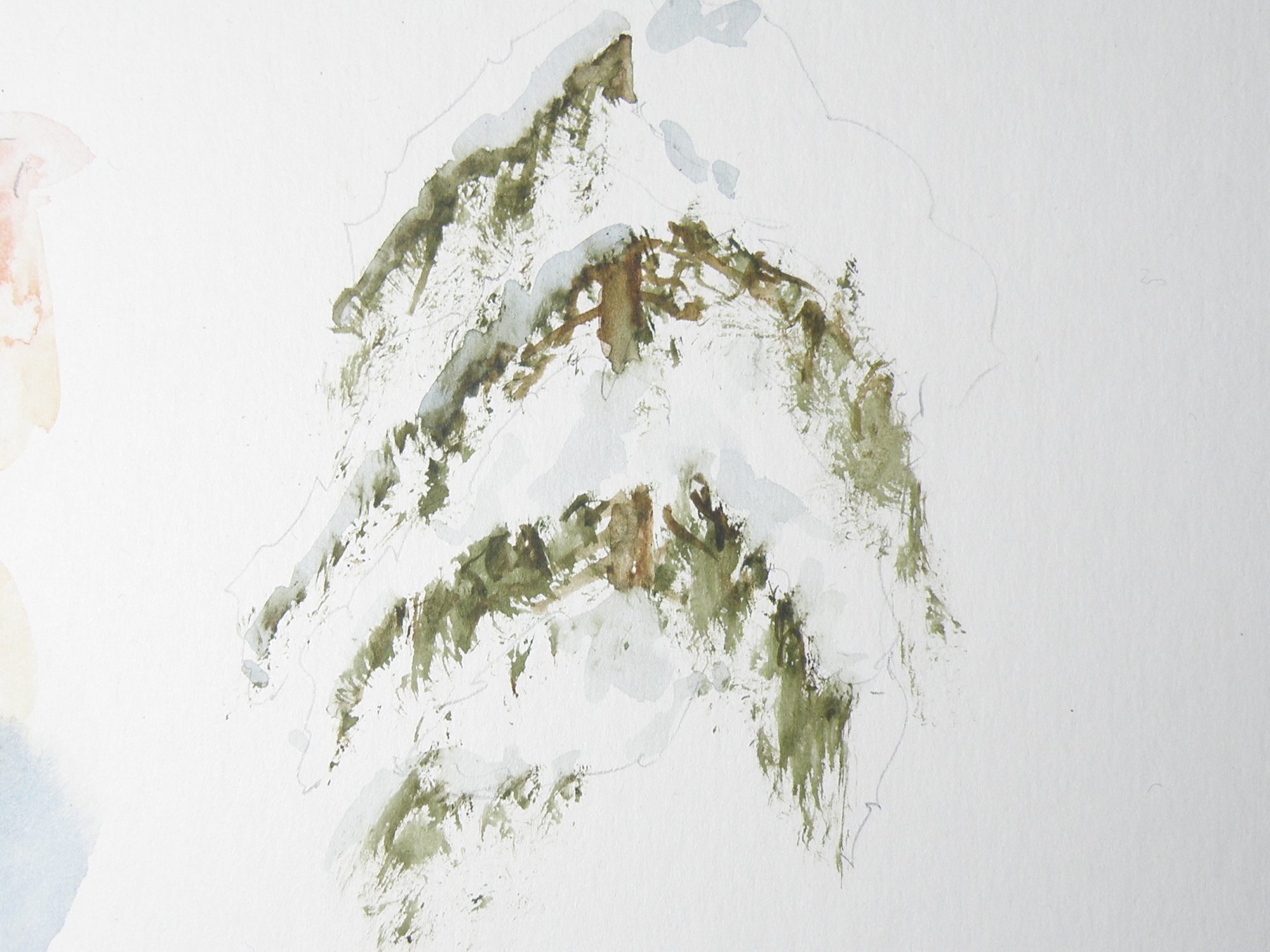
Figuring out just where branches are on a given variety of pine, fir, balsam, cedar or spruce is key to understanding where snow will sit when on them. So it seems crucial that any study be limited to particular species, (in the above case, cedar) — otherwise, a painter of representational art will be in danger of ending up with a kind of ‘marshmellowed’, generic evergreen most often seen on Hallmark Christmas cards.
Truly, each variety of coniferous tree accepts snow in its own unique way. A blue spruce, for example, with its stiff, jutting branches, is much more able to bear the weight of snow than the red cedar in the above study, whose branches are prone to drooping and bending.
This study was done on leftover piece of plain white matt board, using a chopped-up small fan brush to go after the greens, then a more pointed, conventional brush to soften the hard edges and provide shadowed depth to the snow. The branches aren’t quite correct. Once snow is included, it changes perception to such a degree, I have trouble understanding where it goes and branches fall.
The beauty of our being blessed with so many evergreens to choose from comes in knowing that each one offers the student of watercolour great and intriguing challenges, especially when brimming with that wonderful adornment–snow.
blue moon
July 4, 2015
Because watercolour basically amounts to taking white paper and staining it with various colours by way of a brush and water-activated pigments, the possibility of texture using a buildup of paint, gesso, gel medium and other ‘helps’ available to painters in acrylic and oil just isn’t there. IOW, in classic watercolour technique the word ‘impasto’ doesn’t exist.
Some painters get around this disadvantage by way of collage, and apply watercolour to glued on tissue and similar textural material…..
 “Forest Forager”, watercolour and collage by Shari Hills, source: httpwww.drawntothevalley.co.ukartistsdetailshari-hills
Here, the painter, Sheri (Colours by Sheri), used ‘delicate papers’ as a glued foundation to provide textures which then received watercolour paint to complete the effect. On her site she describes how she also has used organic leaf material at times.
“Winter’s Chill”, watercolour collage, Colours by Sheri, source: httpwww.coloursbysheri.comcurrent-series.html#sthash.aUBXtd8f.dpuf
If this method is used, painters are required to identify their medium as ‘collage’, or ‘watercolour collage’ if entering the piece in an exhibition or juried show. Such work falls outside the accepted boundaries of what constitutes a ‘watercolour’.
In order to remain within the rather strict boundaries painters cannot have more than one third be of another medium or it then becomes a ‘mixed media’ work or ‘collage’ or ‘gauche’. Gauche is watercolour which uses white tempera paint, and thus is opaque, not transparent. Of course, that is perfectly well and good. Every painter does as (s)he is led to do.

‘Moonrise’, watercolour on art board, 19cm x 24cm, (7.5″ x 9.5″)
Personally, like writers who enjoy the challenge of staying within the bounds of iambic pentameter and composing 14 line sonnets, being ‘confined’ to the rather strict parameters of traditional watercolour is rewarding. These protocols include reserving paper to serve as white in a painting (such as the moon in the above example) — and the white of the paper is what brings life to the pigments laid over it. And it means having to discover ways of creating texture which, in the end, remains just an illusion.
composition woes….
May 3, 2015
MY GREATEST CHALLENGE when painting anything is composition. For years I felt I was being a ‘purist’, insisting that I always paint on location, never in a studio setting. And once at the location, I convinced myself that if a tree was in that spot, then that was how it needed to be depicted.
IT WAS ALL DUE TO my tendency to early-on stop referring to the subject in front of me and become more and more involved in what was happening on paper, to the point where I may as well have not been on location at all. So in an effort at self-discipline, I decided that not only should I paint what things actually look like, I shouldn’t muck around with how and where ‘mother nature’ placed them.
THE SILLY THING WAS, I ended up choosing a composition by default because of course, I couldn’t paint everything my eyes saw in front of me. And more often than not, it was not a good composition. So now, not only do I go to some lengths to study the skill of creating an interesting arrangement, I realise it is the painter’s task to take what ‘mother nature’ provides and make art out of that. Fences do need to be repositioned, as do trees and hills and clouds.
SO NOW I MAKE thumbnail studies first on matt board before beginning anything . . .
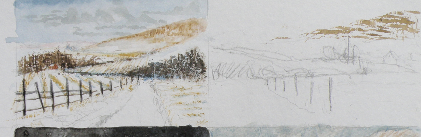
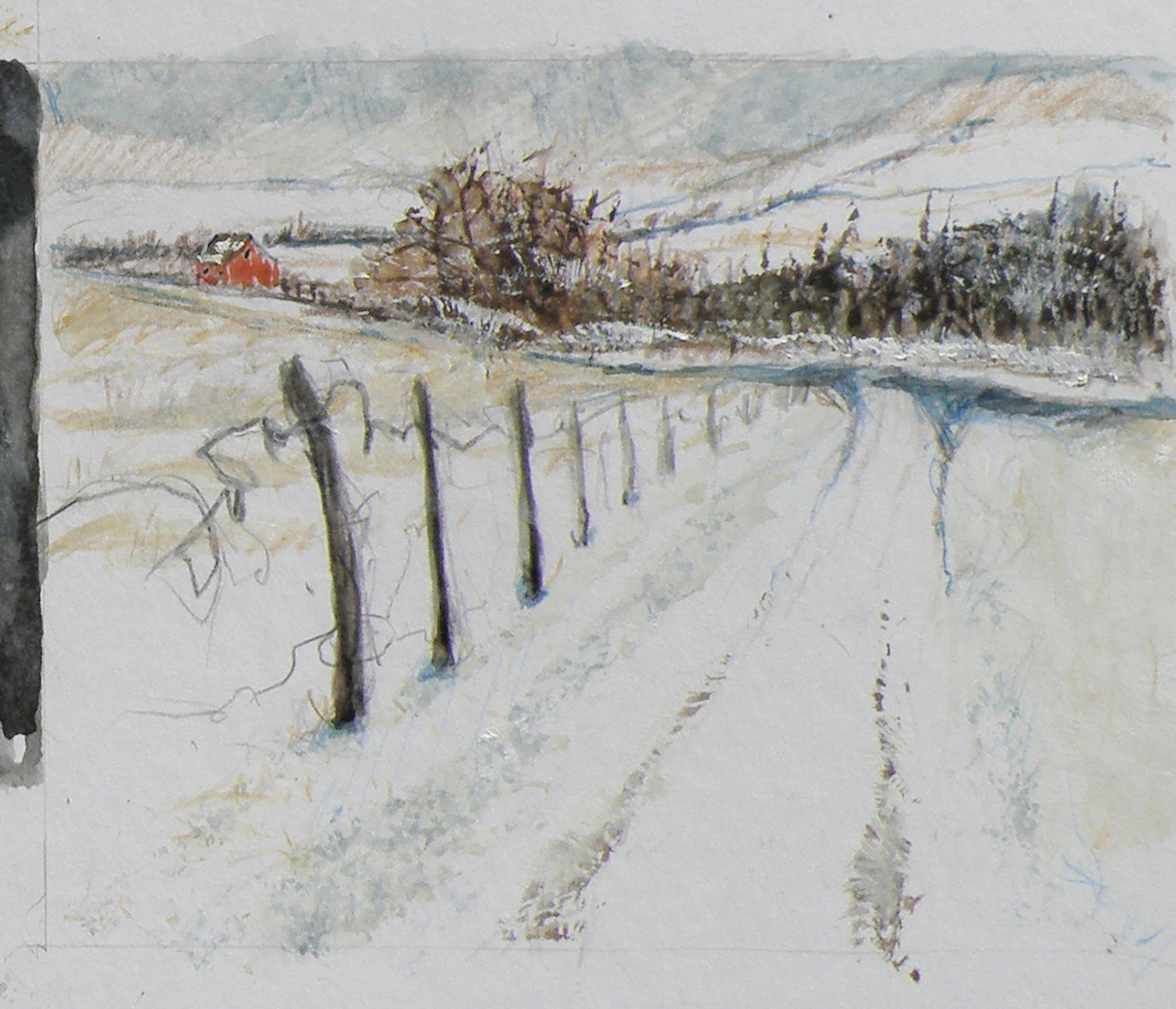
THE OBJECTIVE is to provide a focal point, a visual way in towards it, then additional visual interest so the eye has more to discover by wandering beyond the subject itself. These thumbnails are exploring the use of a compositional figure ‘Z’ shape to lead the eye of the viewer.
The Common Raven (corvus corax)
April 21, 2015
THE COMMON RAVEN is amply represented in British Columbia and enjoys the distinction of co-existing with people for thousands of years, to the point where–in Haida Nation tradition–the Raven has god-like qualities. It was the Raven which released the Sun from its little box–made the stars and moon–and even brought people out of the earth in order to populate a party being thrown. But in traditional stories Raven doesn’t actually create (make things out of nothing), so much as steal, exchange, rearrange and redistribute and generally push things around into new combinations. If that isn’t humanlike, I don’t know what is, lol.

“Spring Thaw”
watercolour on art board, 20 cm x 28 cm (8″ x 11″), sold
In Kamloops it is against the law to feed them, as well as crows. A buyer of my work named Joan pours bags of cat kibble into her elaborate and large cement bird baths in the Winter and revels in their continuous, noisy presence. The neighbours? not so much. When they report her, she just pays the fine and keeps at it.
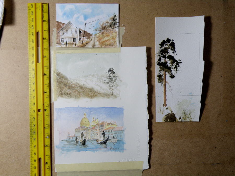
ACEOs (Art Card Editions and Originals)
April 20, 2015
ARTIST TRADING CARDS aka ART CARD EDITIONS AND ORIGINALS are popularly known as ACEOs. ACEOs are the size of baseball cards–65mm x 89mm (2.5″ x 3.5″) and are purchased and then traded and sold the way sports cards are. The ACEO movement originated in Switzerland in the 90s but grew in popularity through eBay, where art cards are now sold and bought on a 24hr basis.
They require precision and are very enjoyable to do. But then, who wouldn’t be fascinated by the challenge of painting tiny things (smile). The subject matter can be chosen by the purchaser, and the painting done accordingly.
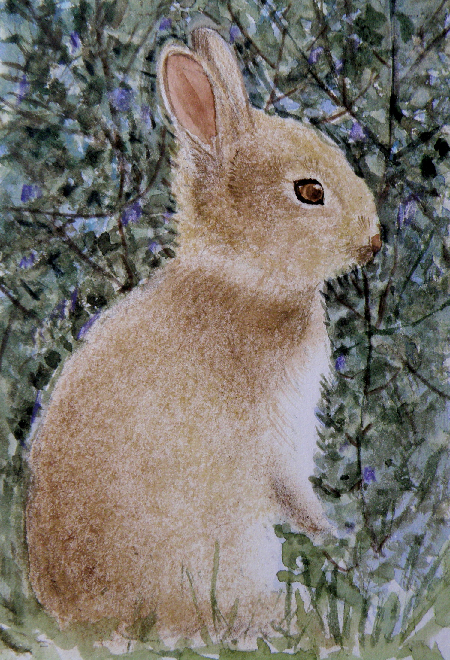
Spring means….bunnies
April 17, 2015
Local Mountains
April 8, 2015
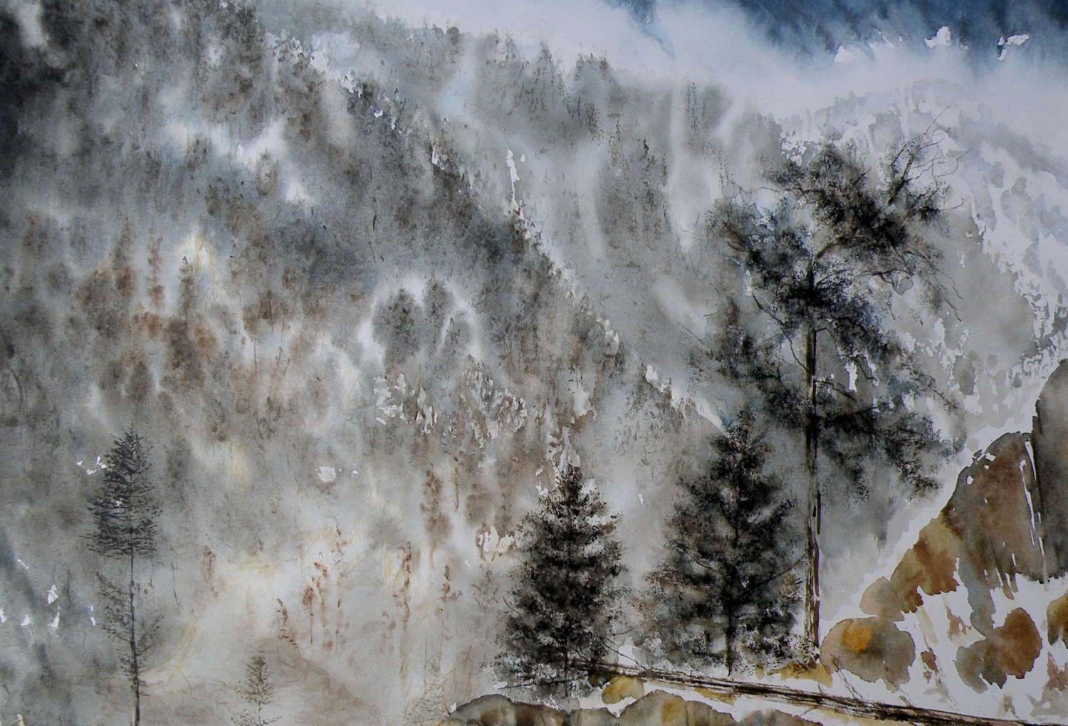
A decision has to be made as to whether this painting ‘holds up’, composition-wise. It succeeds in conveying the misty atmospheric conditions of winter in the mountains. But the composition is troubling me.
A FEW LAST COMMENTS about this painting…..there is a decided difference between nature and the art of depicting nature. Mother Nature is not only a hoarder, but not interested in housekeeping nor pruning, encapsulating, or boiling-down. She wants it all, all the time, and enjoys lavishing on us the plentitude of what happens when everything we look at, at any given moment, reproduces at will and overwhelms us with dozens–and even thousands–of itself.
FOR THE LANDSCAPE PAINTER the challenge, always, is to take Nature and make it into Art. It is the very human discipline of paring down, re-arranging, configuring and composing. What separates raw Nature from the art of painting is having a limited space, with only two dimensions, which is ultimately going to end up on a wall inside a human-made space. That restrictiveness requires moving trees and clouds and birds about in order to have a sense of balance or sense of wonder or sense of drama. It means the painter must dare to alter time itself, put limits on colour, and restrict amounts of what is naturally before the painter’s eyes.
MAKING ART is similar to the difference between looking at a field of wheat and sitting down to a loaf of freshly-baked bread. What happens between those two events is the act of altering something to create something else.
THIS PAINTING is not what the photograph of this scene looks like. For many years I struggled with whether I was ‘allowed’ as a painter to do anything other than depict Nature as it presented itself to me. Sitting out on some stoney ground, I would suddenly find myself slavishly working at painting the weeds between cracks of rock, then painting the seed heads on the weeds to look exactly like what my eyes saw, when really I knew the larger purpose of sitting there in the hot sun was not to pay attention to weeds, but to paint the distant mountains above and beyond them. By the time I’d gotten away from doing weeds justice, I was so hot I had to fold up my equipment and go back to the car. And I went home with a painting of weeds between rocks and a big expanse of white paper above them.
THAT DOESN’T HAPPEN ANYMORE. I have learned that I must take what is presented to me and do with it as I wish to do. That is the work of a painter.
A PHOTOGRAPHER has a whole different set of challenges because a lens is very different from a human eye (it can’t do half of what a living, ‘breathing’ eye can do) and from human imagination (once it has seen what is before the eye) . But I have noticed some irony happening between the worlds of photography and painting. In the past, painters often worked very diligently to make a painting ‘look like’ a photograph. These days, with technological photo-shopping manipulation, a photographer seems more or less obsessed with trying to make a photograph look like a painting. I am not convinced either enterprise is worth spending all that amount of time on.
IF A PAINTER WISHES TO BE A PHOTOGRAPHER, then don’t go trying to make a painting into a photograph. Do go and take courses and buy equipment and learn how to take photographs and do the work a photographer must work at in order to eventually become a photographer. And IF A PHOTOGRAPHER WISHES TO BE A PAINTER, then leave the photo-shopping manipulation apps alone and do take courses and buy equipment and learn how to paint paintings and do the work a painter must work at in order to eventually become a painter. They are two distinctly separate and inherently different artforms and–in my flawed way of viewing things–should stay that way.
AND YOU…what’s your view? Tell me how I’m missing things you’ve discovered!
Painting progression 3…. ‘Jamieson Creek Thaw’
April 4, 2015
BECAUSE WATERCOLOUR is such a watery, transparent, delicate medium–one which must always allow the paper it’s laid on top of to breathe through it–one which traditionally doesn’t use white pigment, but relies on the paper to be the white of the painting–BECAUSE of this (and more) the challenge of the watercolour student is to convey an illusion of texture, without the ability to actually build up a surface texture.
WERE WATERCOLOUR PIGMENT applied so thickly as to create an impasto-like texture on the paper beneath, it would lose its luminosity and look pasty, muddy, dull–worse, it would crack. Watercolour pigment only works when the paper beneath dazzles through it and brings life to the pigmentation. In other words, watercolour as a medium is more the business of staining paper than it is a business of building up layers and coats of daubs, stipples, slatherings.
THAT’S WHY CARE is required to not apply so many washes that the luminosity of the paper receeds and eventually provides no life at all. And that’s why the whites of the paper must be thoughtfully reserved and left untouched in key areas–the crests of waves; the moon; snow; clouds; a picket fence–and skill taken to paint AROUND these places to let the paper be the white.
SO….a student of watercolour (me) learns early-on that (s)he will be a student of the medium for life–that mastery is illusive–and failures, many. A good piece is approached very thoughtfully, noting where the paper will be left to serve the function of white (pigment) and painted around. Then the student will also have to gather enough courage to apply exceedingly dark washes in one ‘go’, while maintaining a sense of secure, carefree animation in order to present an immediacy and liveliness in the final piece.
THE DEATHKNELL of a failing, dying work of watercolour is finicky overworking of areas, and a refusal to accept what happened when water joined pigment joined brush joined paper. It is NOT a medium for those who love to micro-manage or be in control.
THE STUDENT OF WATERCOLOUR has to be more a Peter Pan than a child wanting to grow up–loving the thrill of what happens when ‘danger’ is courted, yet having the assurance that daring will win the day. However, that daring and search for adventure–on the surface of a good piece of paper–will only be pulled off if it is backed by enough experience to have a good hunch about what will happen when such-and-such is tried.
ATTEMPTING what remains beyond one’s ability isn’t courting danger–it is ignoring it. Trying to fly without thinking happy thoughts will give a person a broken bone. Within the bounds of representational art–(i.e. wishing to have a tree ‘look like’ a tree)–a painter cannot ‘pull off’ a landscape with lots of shadows if (s)he has yet to study them in some depth. Trying to do a scene which includes far far more than what one yet learned how to interpret is an invitation to frustration and wanting to give up watercolour for say, acrylics (oh, my).
AND SO FOR MYSELF, I know by this time that I must confine my attentions to learning about how corn grows, what it feels like, looks like, behaves like, before I can throw my abandonment into rendering a watercolour of winter corn in January. Not only that, but I must also have studied the qualities of snow–the qualities of what a winter sun does to shadows of corn stalk–the blues, the purples. And only then can a learned abandonment bring about a possible reward.
IT TAKES A LONG TIME to find the right paper, the right brushes, the right working pallet of colours, the right approach and the right subject matter. Knowing what can be done when paper is sopping wet–and what can’t–depends on who made the paper, how thick it is, how textured it is, how stretched it is, how quickly it will dry. Knowing when to wait until the paper is exactly wet or damp or dry enough to throw one’s energies at it, comes (usually) through ruining (many pieces of) good paper.
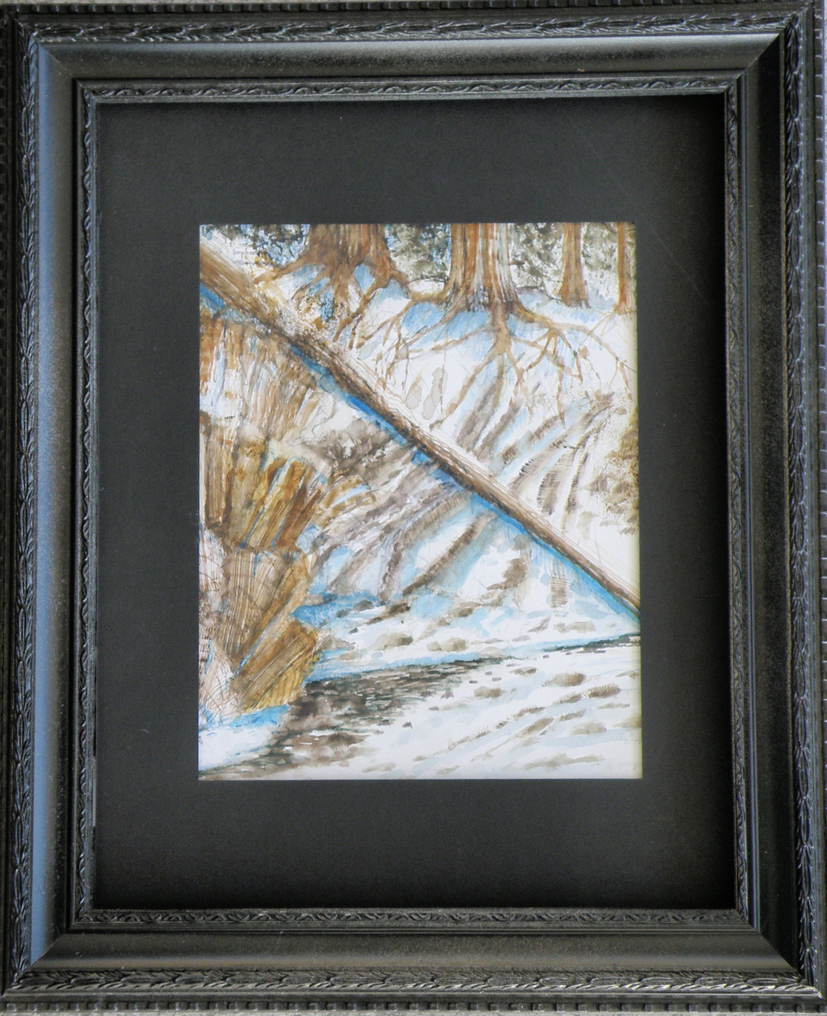
HERE IS THE LATEST DEVELOPMENT of the subject of Jamieson Creek in a February thaw…..
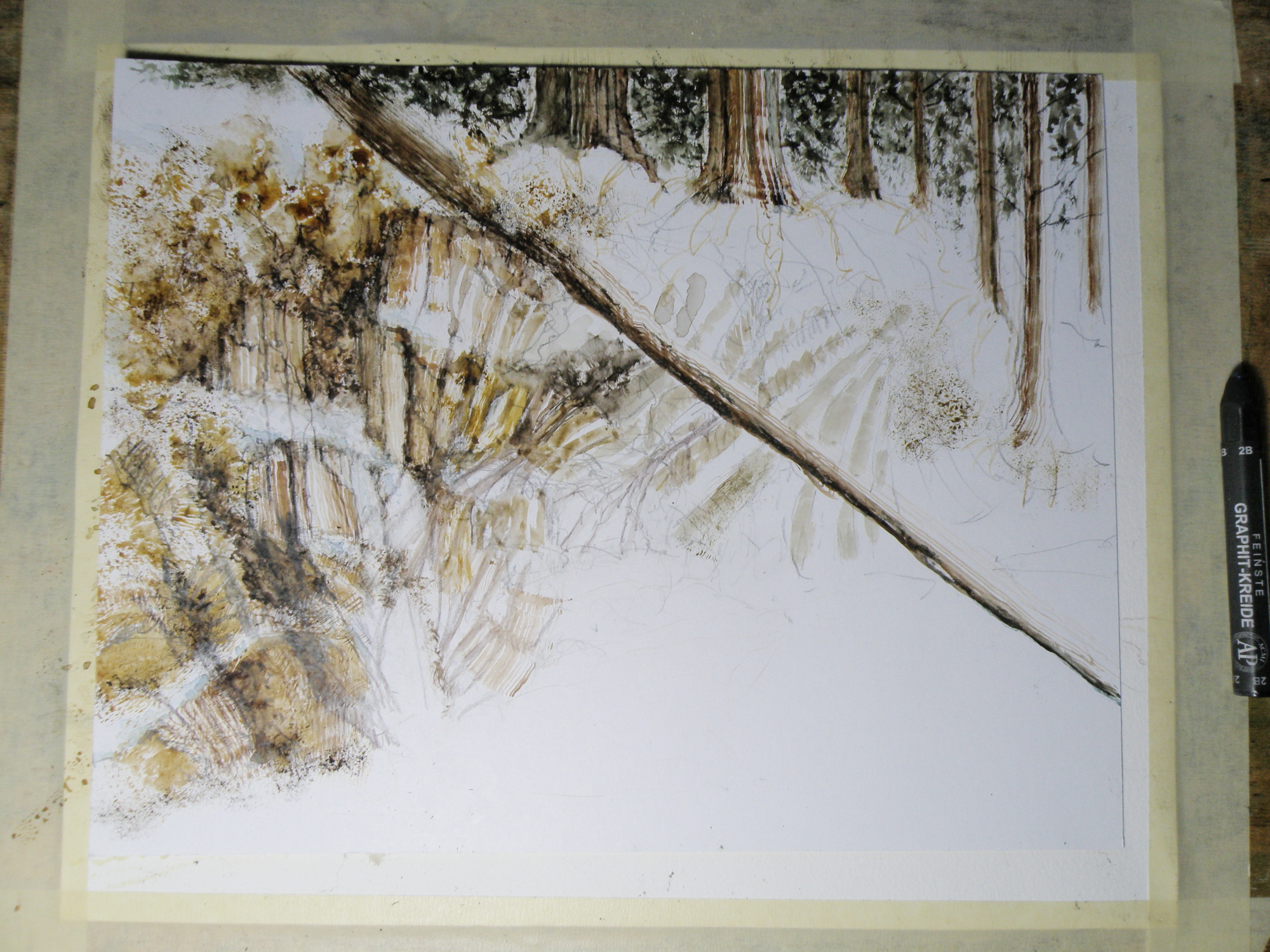
TOMORROW will (hopefully) provide a photo of the finished piece!
Painting progression 2…. ‘Jamieson Creek Thaw’
April 3, 2015

Painting progression 1…. ‘Jamieson Creek Thaw’
April 2, 2015
JAMIESON CREEK is about a 15 minute drive from our home, along a dirt logging road. The Kamloops, British Columbia, region is a geologist’s dream come true, featuring some of the oldest mountains in Canada. As a student of watercolour, I am fascinated by stone and rock, particularly because it is so challenging as a subject.
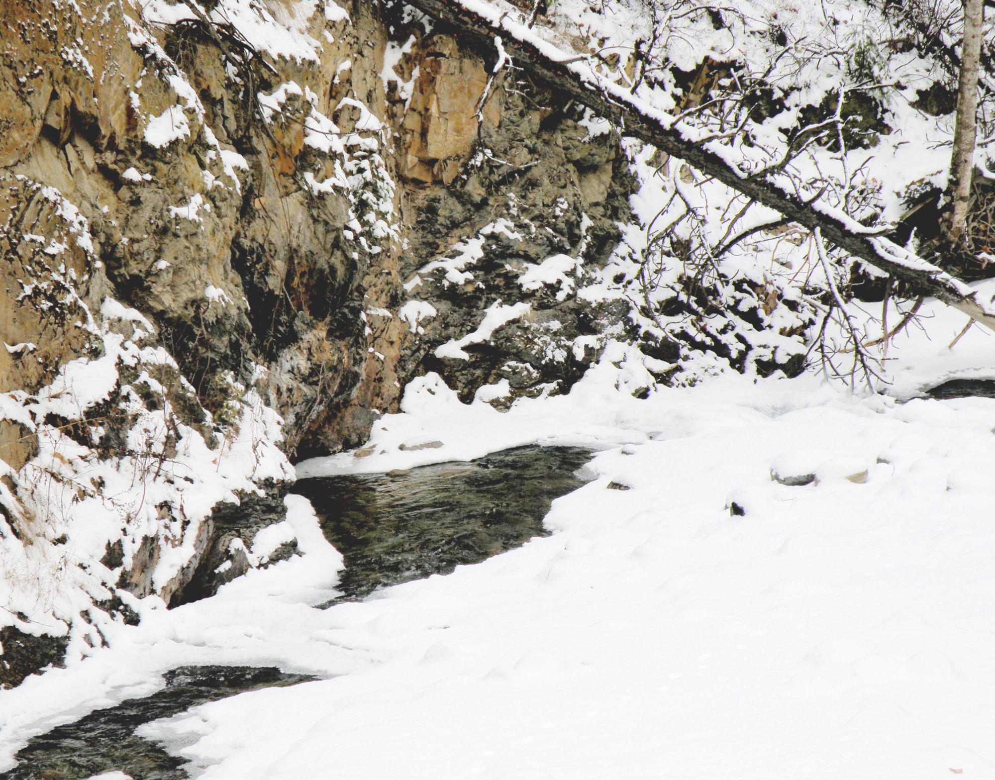
This is Jamieson Creek, taken four years ago around February, early March….
And here is my initial drawing of the subject…..

As you can already see, photography is not my gift (which is why I paint, lol)–so forgive the darkness. It was taken, pre-dawn in the spare room which serves as a studio.
Same subject, different take…
March 17, 2015
THE OLD SCHOOLHOUSE is once again the subject……

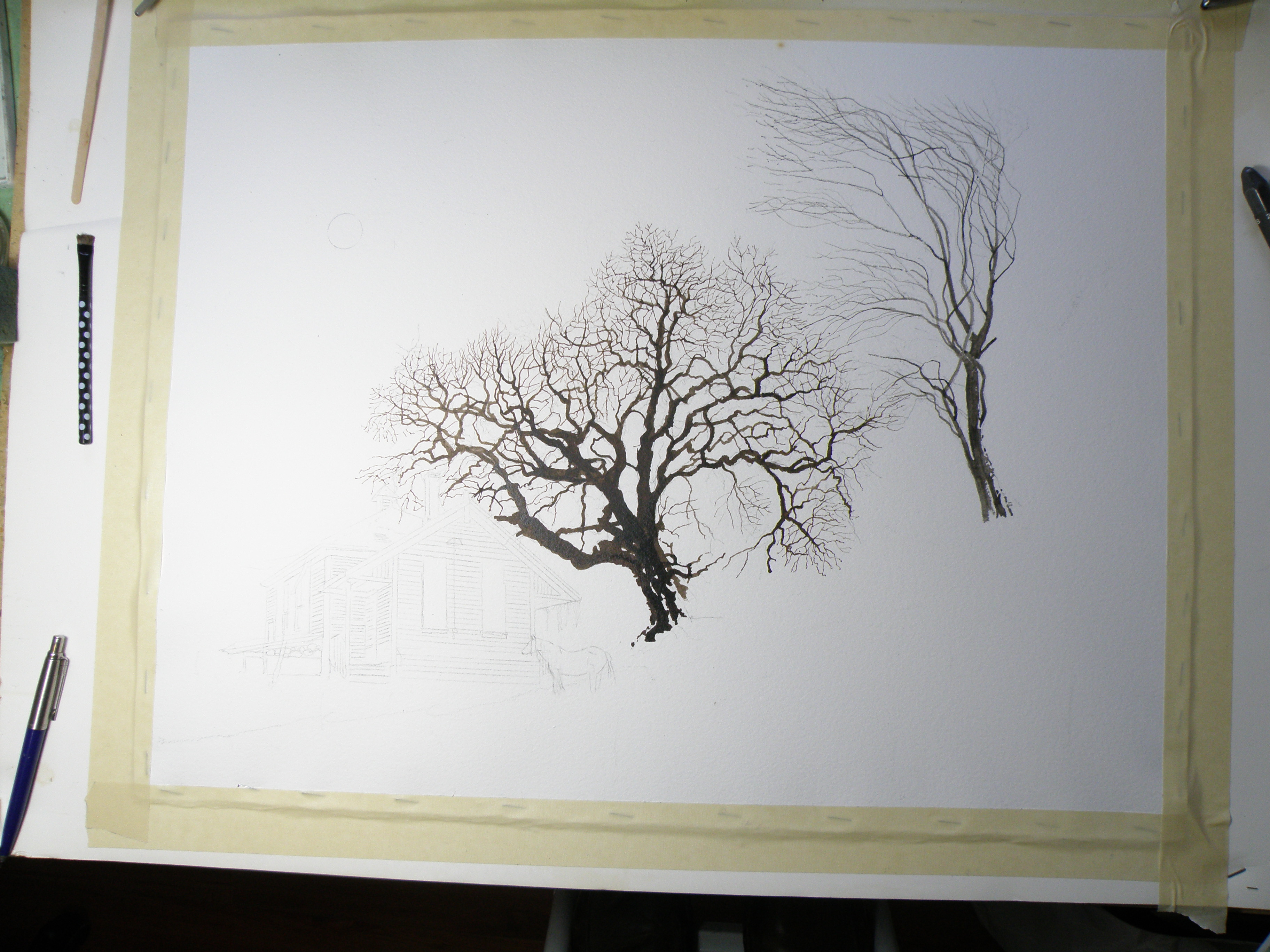
THIS TIME around, a horse was to be included, which meant it could not be a nocturnal scene, as that would be an odd addition to a night painting. The choice was made to have only a single horse, even though horses are most often seen in pairs or groups, being a social animal…..
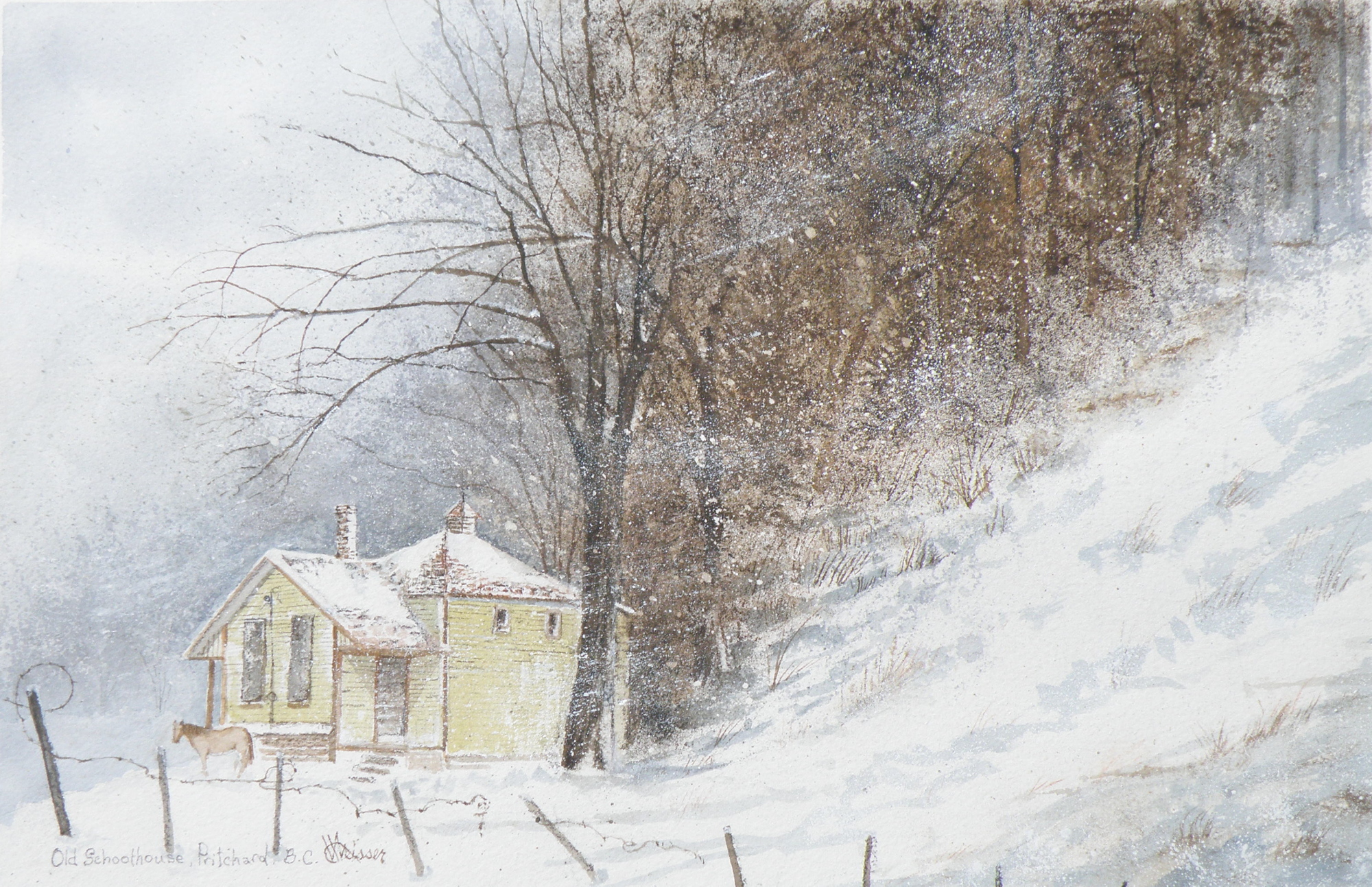
THE DECISION over depicting a single horse was selected as adding to the feeling of isolation: a lone horse beside an abandoned school in a lonely, forgotten field in the dead of winter……
“FROZEN IN TIME”
watercolour, 12″ x 15″, 140 lb. Arches Cold Press Paper, Kamloops Courthouse Gallery, Kamloops, British Columbia http://www.kamloopscourthousegallery.ca
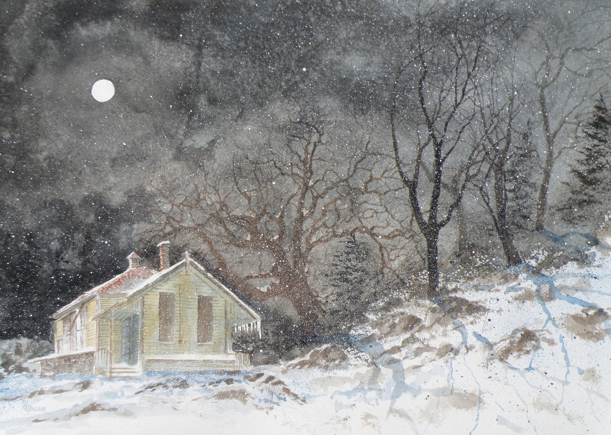
Painting progression 5
March 16, 2015
THE FINISHED piece–“Abandoned Schoolhouse, Pritchard”. The rocks needed darkening and definition. Pines were added. Spattering of snow was used to unify the whole and add a feeling of movement.
Painting progression 3
March 14, 2015
THE MOON and schoolhouse roof were masked, then a wash applied in the sky areas.
Once done, a decision was made to next eliminate the horse, it becoming an unintended focal point if left in. (A lone horse standing at night in front of an abandoned school in bitter cold would be incongruous).
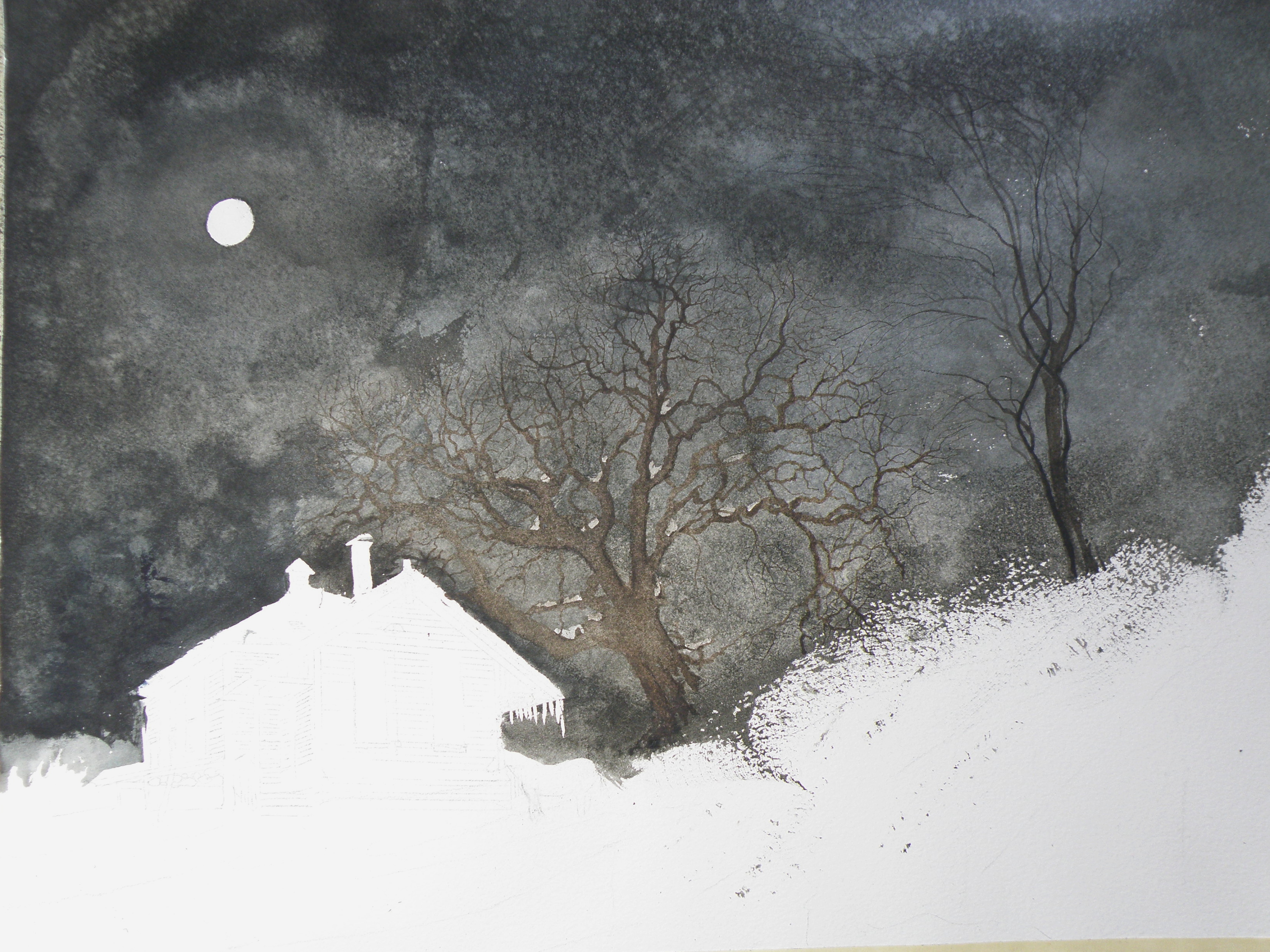
Painting Progression 2
March 13, 2015
TREES are painted in very dark and the watercolour pigment tempered a bit in order to have it resist being completely taken away by an overlay of secondary wash.