venice challenge
September 6, 2015
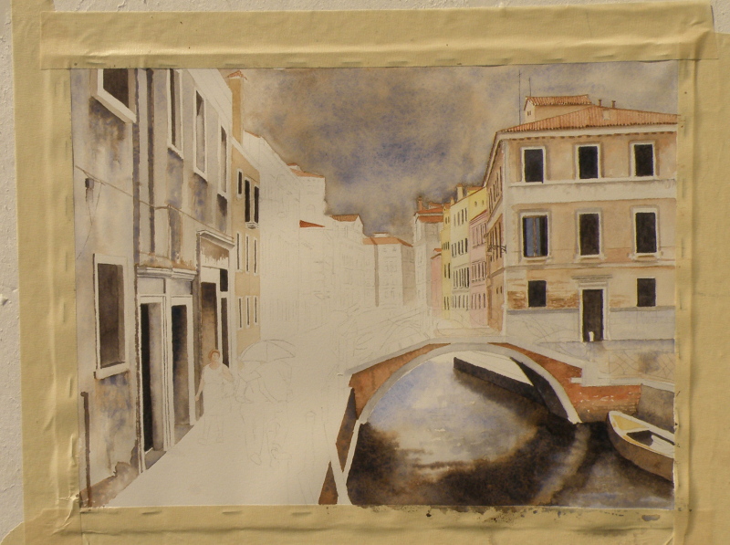
We’ve reached the finish line, limping all the way. This was somewhat beyond my abilities as a painter. Whether a success or not, every endeavour provides a great learning experience. All the watercolourists looked up to for advice offer the same counsel: when it comes to watercolour as a medium, suggesting detail far surpasses actually getting bogged-down in it. The pitfalls begin when the painter keeps trying to improve on what’s there.
Despite the overworked areas, enough aspects work to allow this to maybe escape the scrap heap — but probably not. It would, however, be useful to begin it again and learn from the errors.

venice challenge 3
August 14, 2015
It is so affirming when blogging friends don’t find details about paint pigments and their sedimentation arcane. One can easily picture guests around a table nodding-off face-first into their creme-brulee.
In the Renaissance, clay earth from Siena, Tuscany, (Terra di Siena, “Siena ground”) rich in iron oxide and manganese oxide was used for pigments. In its natural state, is a yellowish clay, and becomes raw sienna as a pigment. When heated up, it turns reddish brown and becomes burnt sienna.
However, due to its being heated up, there is a variety of watercolour burnt sienna shades and hues among the various manufacturers because some heat it a little more, some a little less, making it somewhat more or less ‘burnt’.
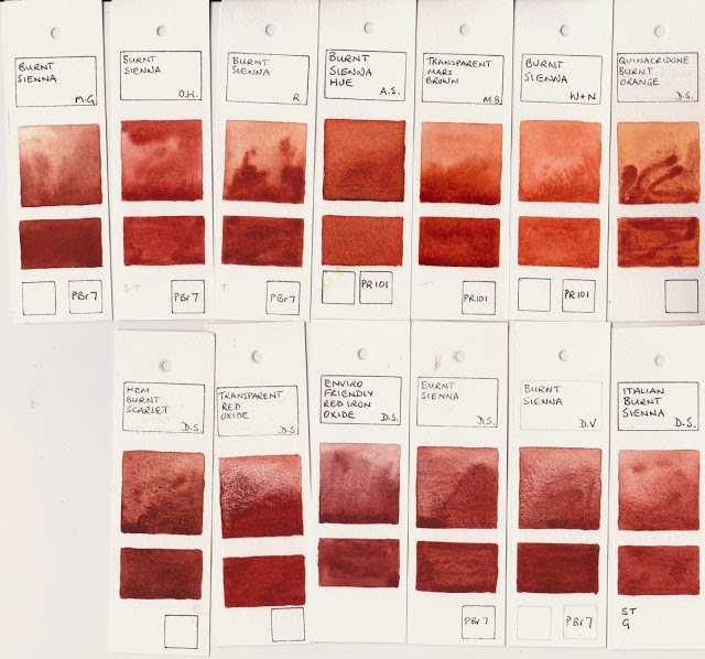
http://janeblundellart.blogspot.com.au/2013/11/watercolour-comparisons-4-burnt-sienna.html
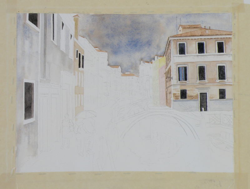
Ultramarine and burnt sienna will be the two colours for the whole piece with the exception of a bit of Rose Madder and Quin Gold for the more distant buildings. Doing so (almost) guarantees integration. That is because a viewer’s eye will find a colour harmony whenever the pallet is limited, as no one colour or tone will be glaringly different from the rest.
stage two
Focal points are achieved in limited-pallet paintings through value contrast (the dark windows against the lighter walls), rather than by there being a glaringly-different colour thrown in. That said, some of the early masters used a glaringly-different colour to great visual effect, as in Corot, whose ‘signature’ accent was the use of a dash of scarlet in an otherwise integrated landscape….

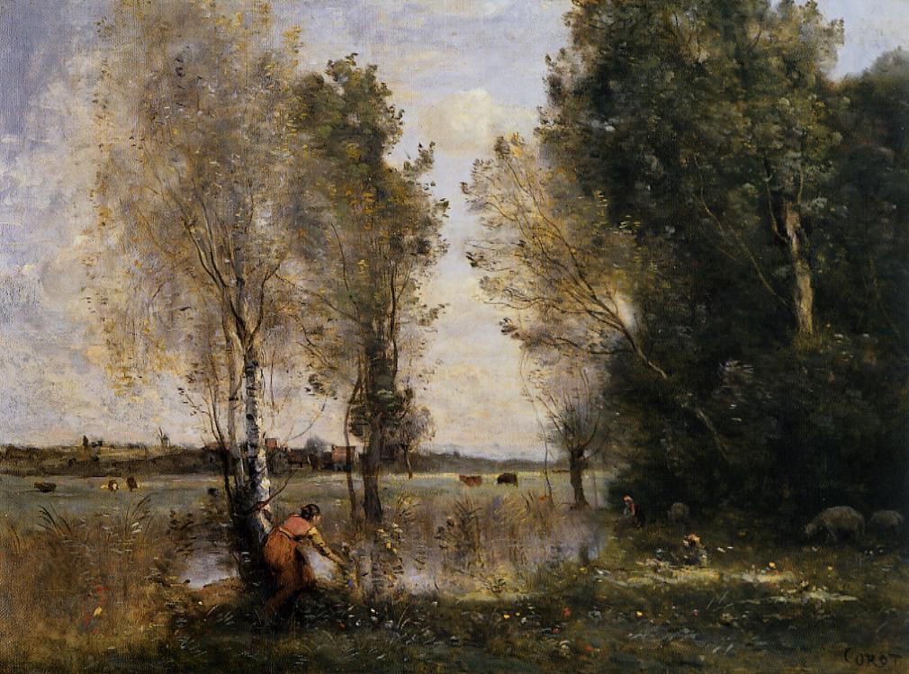

JEAN-BAPTISTE-CAMILLE COROT (1796 – 1875)
(sources for ‘burnt sienna’ from Jane Blundell and Wikipedia)
venice challenge 2
August 12, 2015
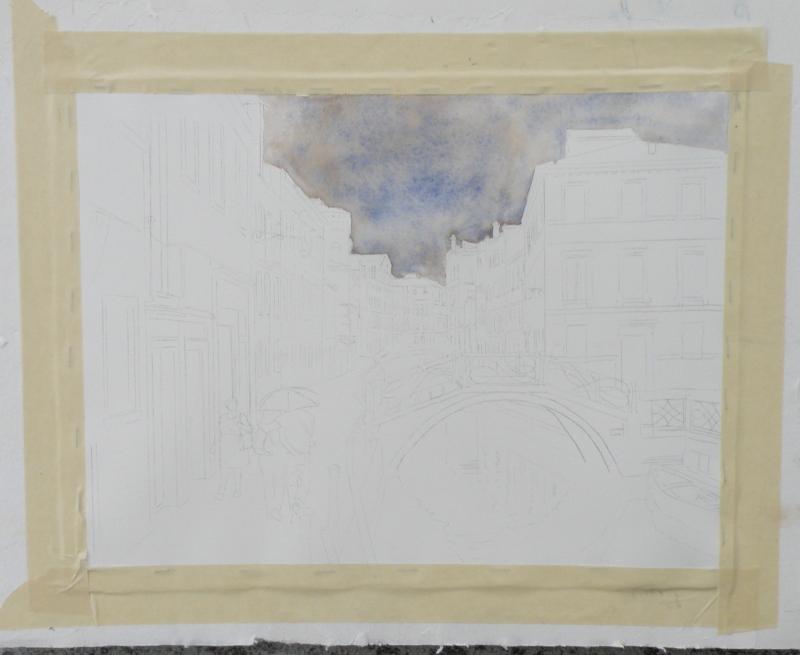
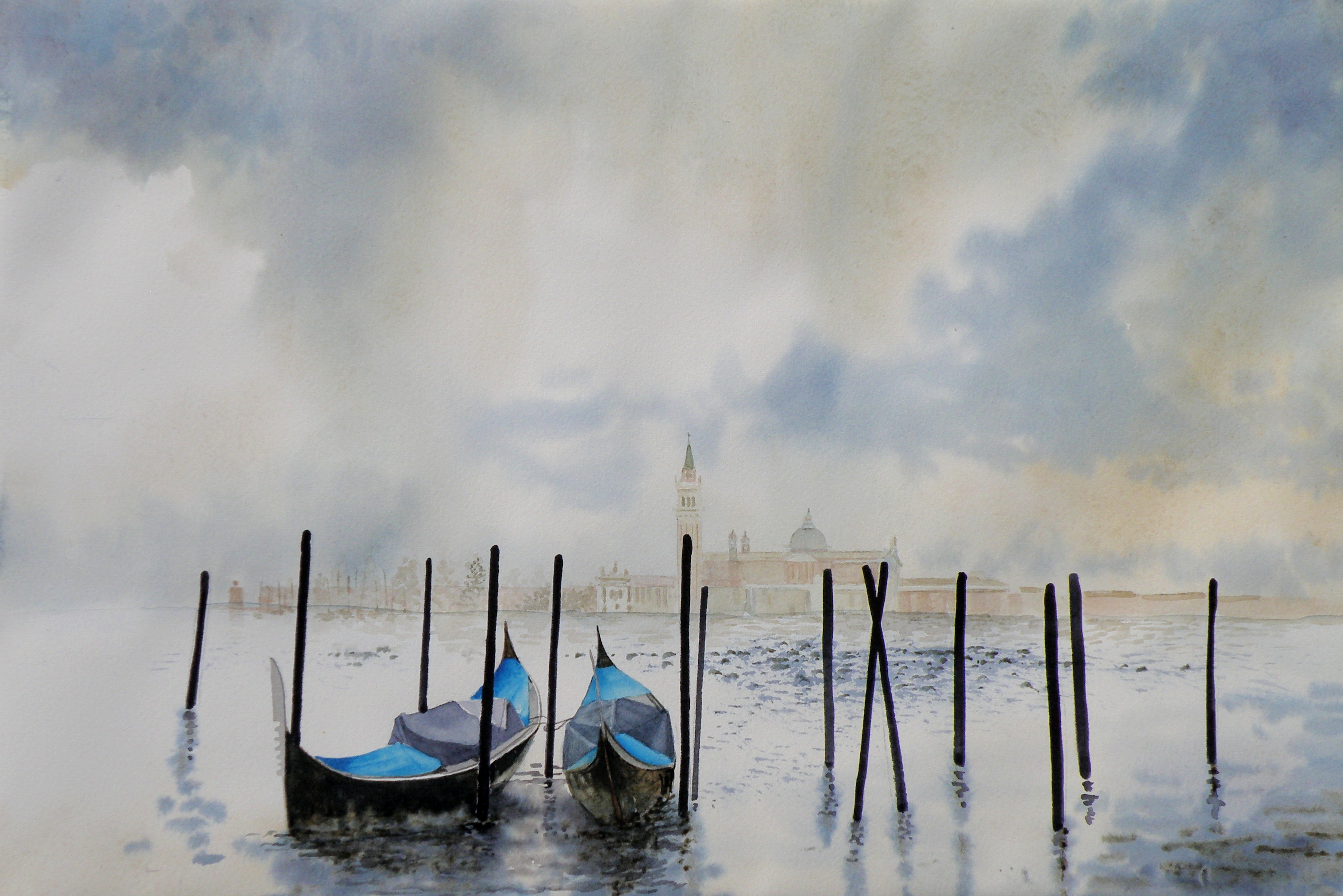
The ongoing quest to interpret in watercolour a photo of Venice by Frank Dwyer of our local Kamloops Photo Arts Club has begun to take shape with a decision to take this 11.5cm x 16.5cm image and paint it as bigger–28cm x 25.5cm (11″ x 14″) –simply because a miniature of such a complex scene might prove less successful.

So here goes….
Arches Hot Press #140 lb. Paper, stretched and stapled onto gatorboard, then taped.
As much as the photo (entitled ‘The Blue Umbrella’) reveals damp pavement and the umbrella-holding couple, the sky isn’t quite as rainy-looking as perhaps it can be made to be for artistic interpretation purposes. So ultramarine blue and burnt sienna were applied to the whole of the sky as a wash.
Ultramarine Blue has a nice quality of being one of the ‘granulating’ pigments of watercolour. Its origins stem from the grinding of lapis lazuli, and received its name from the Latin ‘ultramarinus’ (meaning ‘beyond the sea’) .
So treasured and prized by the early painters, ground lapis (from Afghanistan, principally) was used by the painters of early icons as the garments for The Blessed Virgin. (When The Holy Mother is depicted, her robes are red.)
In 1826 a synthetic version was created which itself derives from a mineral compound, lazurite, and is today the most complex of all pigments. Being a ground mineral, ultramarine produces sediment that dries in a granular way when mixed with water.
To get this effect, however, the painter must apply ultramarine as a wash so the sediment can, in fact, separate and settle to create granulization. That is why, then, the sky dropped into the first stage of the painting appears granulated and gives a kind of antique look. If ultramarine is applied with only a bit of water, or straight from the tube (yikes), it will not granulate as such.
Some watercolourists are so avid about granulization, they buy a granulating medium from Daniel Smith, which, when mixed with most any watercolour paint, granulates. However, the natural granulating pigments are raw umber, burnt umber, raw sienna, and some brands of burnt sienna. That is because they come from the earth, and earth leaves sediment.
All of this material comes from a variety of sources, including http://janeblundellart.blogspot.com.au/ — (a very thorough and devoted watercolourist from Australia).
venice challenge 1
August 9, 2015
Our local Kamloops Photo Arts Club is doing a joint arts project with our Kamloops Courthouse Gallery, involving the pairing of chosen art photographs with various art media interpretations based on the photo.
At one of our meetings we sat around large tables with a great many photographs strewn about, and at a given moment were invited to select ones which struck us as exciting to base our own work on. Jan, who is a weaver, selected photos which spoke to her about textures and colours. Others went with shapes, values, composition.
As a student of representational painting technique, almost all of the photographs were appealing due to their rich tones and lively views. One in particular was very striking because it involved architecture and rain and water, and an exemplary scene from that painter’s perennial eye-trap, Venice–a place so overly painted, yet so eternally attractive.
“Blue Umbrella”, 11.5cm x 16.5cm (4.5″ x 6.5″), Frank Dwyer KPAC, 2014
Choices had to be made immediately about size, complexity (whether to simplify while not messing with the integrity of the scene), wetness/dryness (very rainy? or as is), attention to detail (loose interpretation, or ala the photo itself), type of paper, and selection of pallet (minimal number of colours, or full compliment), overall tonal value (to keep it dark or go for something less so).
There is a website where its blogger goes to great and tremendously helpful lengths to demonstrate the qualities of particular watercolour colours when mixed together. Her name is Jane Blundell http://janeblundellart.blogspot.com.au/. When wanting to know what might work well as a pallet, she never fails but to provide great choices. So it was through her that the combination of Ultramarine Blue and Burnt Sienna was selected as the backbone for this challenging photo/watercolour project.
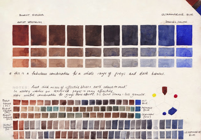
combination of visual effects possible when combining burnt sienna and ultramarine blue, Jane Blundell: Watercolour Comparisons 4 – burnt sienna
This visual and written saga will continue as progress is (slowly) made on this. If all is well, the painting and the photograph will be displayed side-by-side in The Main Gallery of The Old Courthouse, Kamloops, B. C. for the month of November. (www.kamloopscourthousegallery.ca)
commissioned work . . .
April 28, 2015
I HAVE NEVER TRAVELED to Europe, except through the amazing blogs of those I follow. The countries I have had the privilege of visiting have been confined to Canada (10 of the 11 Provinces); The United States (45 of the 50 states); Israel (1989); Taiwan (2002); and The Philippines (2003,04,05).
OUR FINANCIAL ADVISOR’S FAMILY comes from Italy and she went to visit the cities and places which mean the most to her, and asked me to paint a watercolour based on the photos she provided me with upon her return . . .
Campanile de San Marco
33cm x 50cm (13″ x 20″) watercolour on 140 lb. Arches Hot Press Paper
‘Award of Excellence’, Federation of Canadian Artists, 2013
IT WAS A PRIVILEGE being able to work on this scene for it allowed me to be there, even though I wasn’t (smile).
