Pop-up Christmas card progression, con’t . . .
December 16, 2021
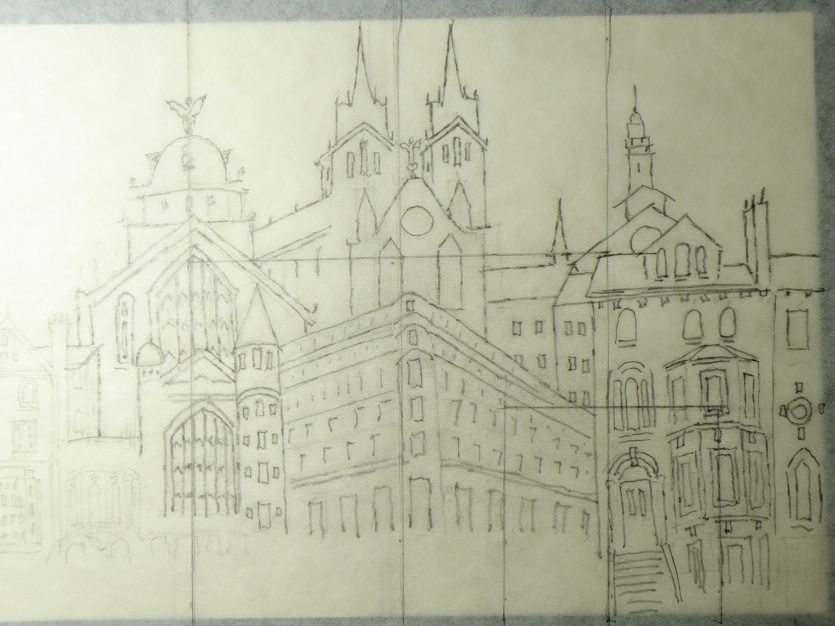
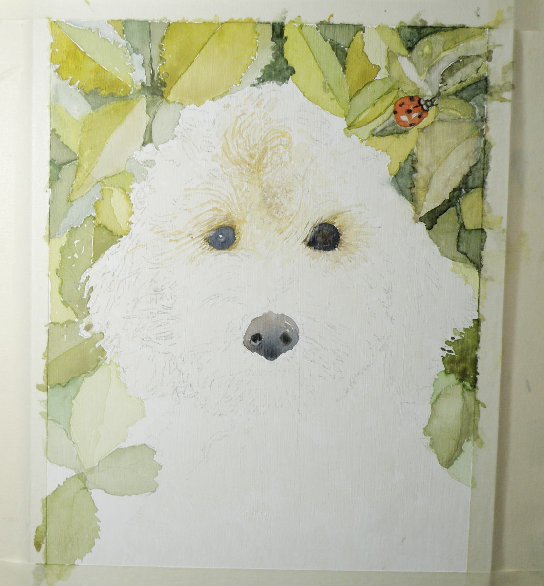
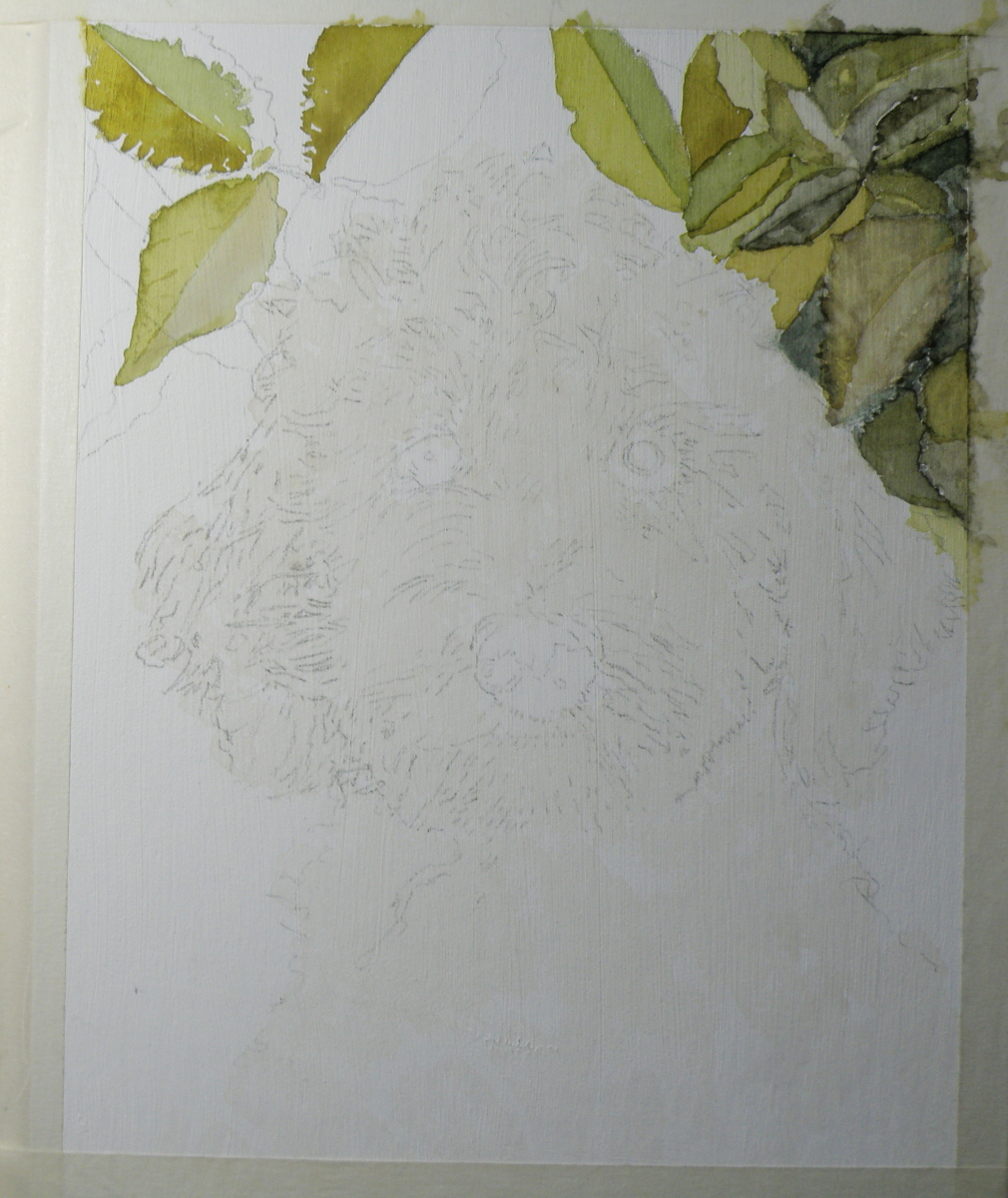
….with the final design carbon traced onto a cream-coloured, blank notecard, the image is completed in watercolour —
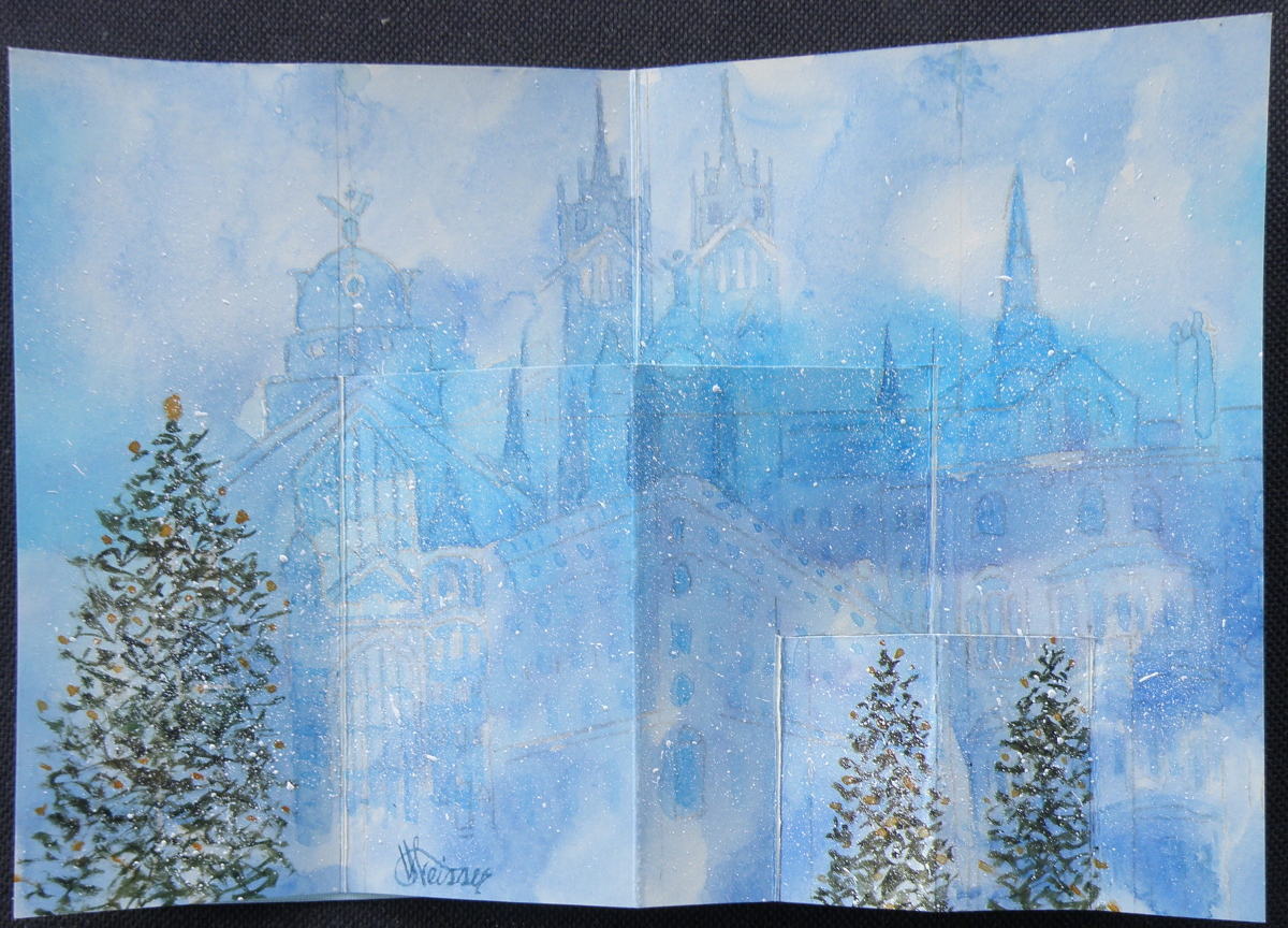
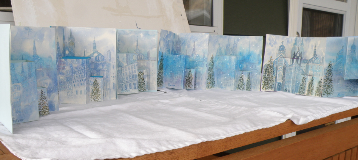
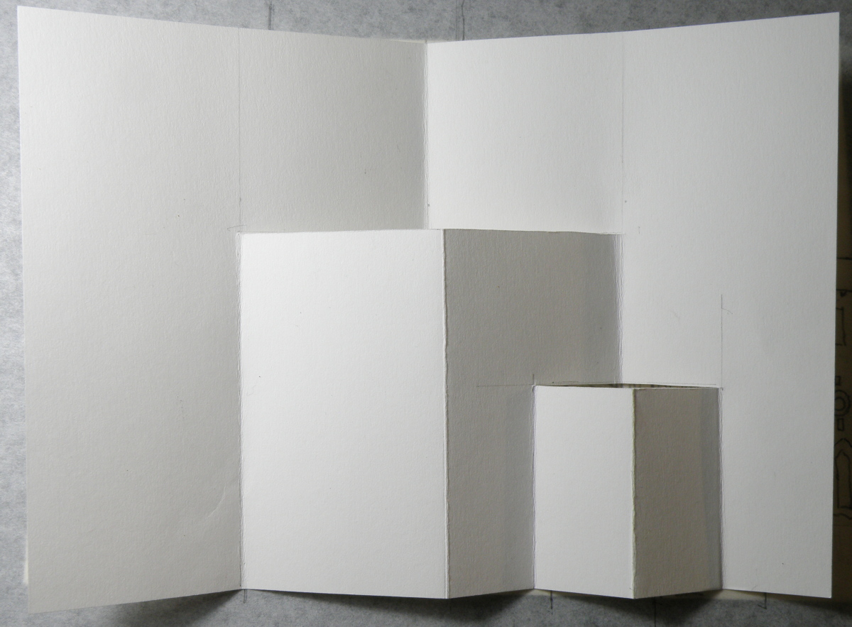
…..and Christmas trees added, cuts carefully made with an x-acto knife, and scored folds added to then oh-so-carefully make the folds and the cuts pop out. And once a successful Christmas pop-up snowy cityscape with Christmas trees was successfully done, it was time to then make fifteen more of them . . .
The biggest surprise when doing this was discovering how well a dollar store package of six blank notecards with envelopes received watercolour. Painting on them was almost as forgiving and receptive as my go-to Arches Hot Press #140 watercolour paper — and, a package of 6 is $1. Even the envelopes could be festively painted over and made to look handmade.
Pop-Up Christmas Card Progression
December 13, 2021
Designing a hand-painted watercolour pop-up card for Christmas began in August because there were going to have to be seventeen of them in time for mailing.
Here is a look at the process and progress:

Completed Rosh Hashanah pop-up card
September 7, 2021
There are all kinds of ideas online for how to do a simple DIY pop-up greeting card. Here’s one site I found helpful: http://mashustic.com/category/pop-up-and-other-cards/. Pop-ups can be as simple and as complex as one wishes, one for the person whose personality is ‘I just can’t be bothered’ to the person who likes getting lost in endless detail.
Here is the cover of the completed card….
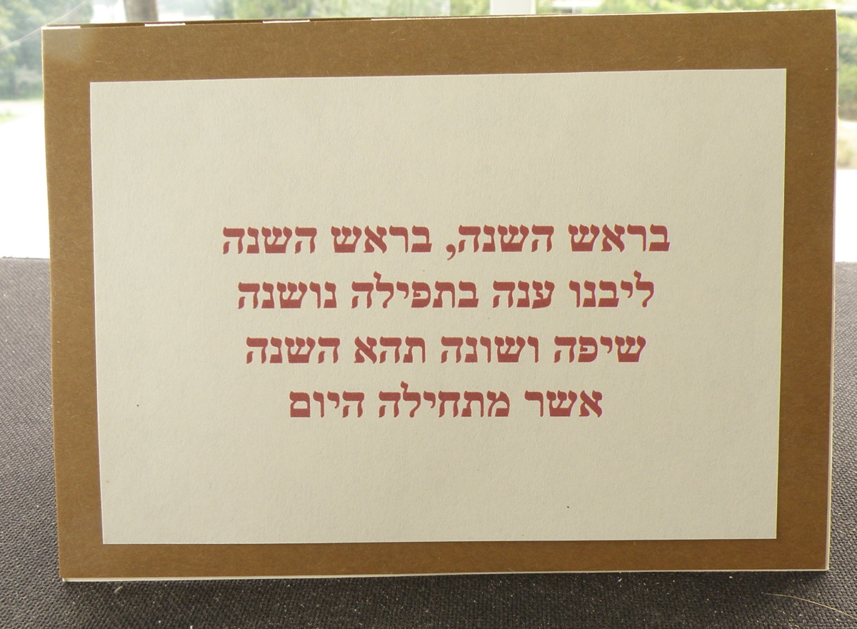
This is the Hebrew wording for a Rosh Hashanah hymn/song which begins (reading right to left), ‘On Rosh Hashanah, On Rosh Hashanah…’
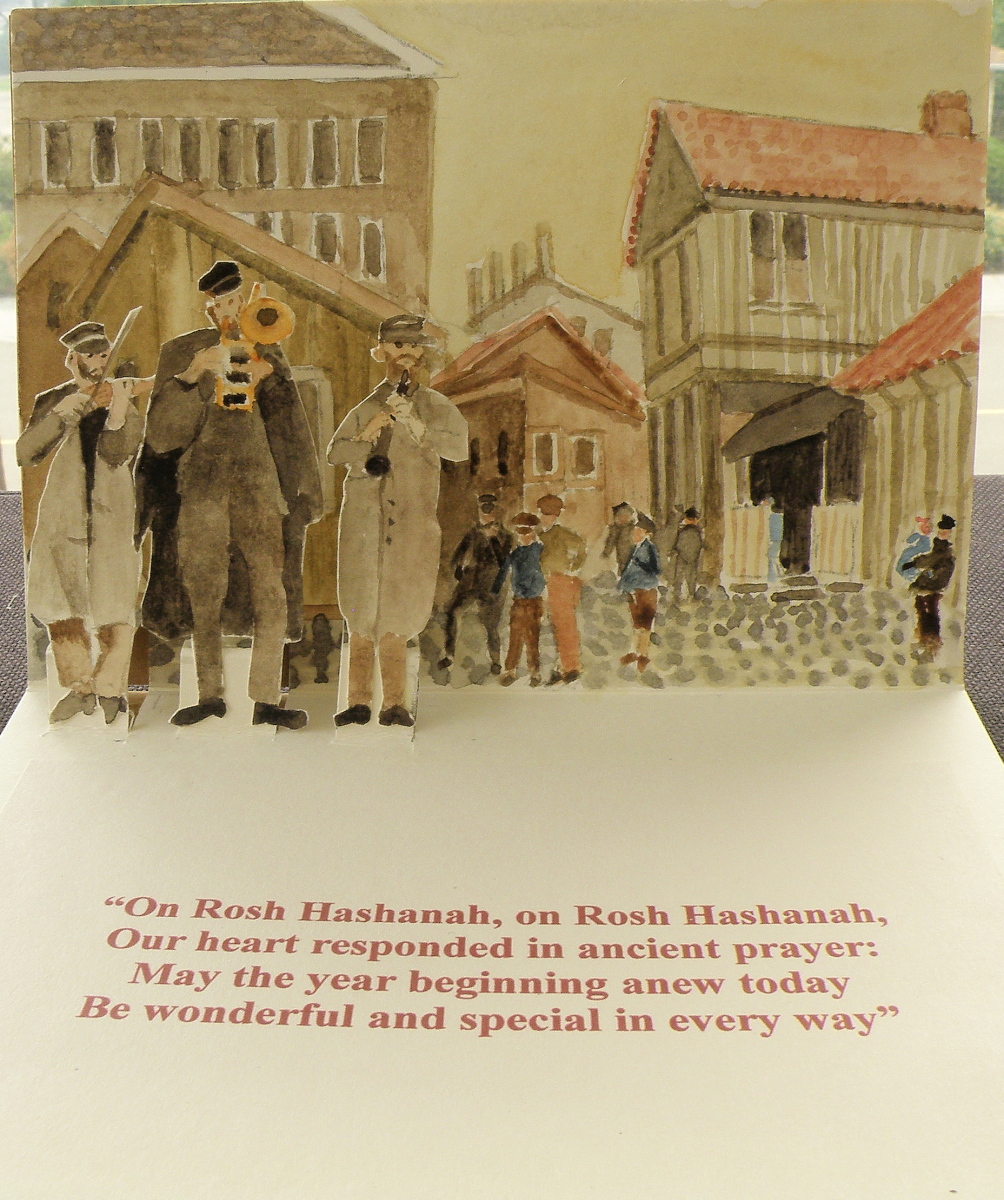
And when the card is opened, here is the English translation…..

And here is the watercolour painted scene with three pop-up klezmer musicians:
This was such a fun and entertaining project, especially during these pandemic-restricted days when we really don’t quite know what to do with ourselves, ha ha.
A Happy and Blessed New Year to our Jewish brothers and sisters everywhere!
Rosh Hashanah 2021 con’t…
September 6, 2021
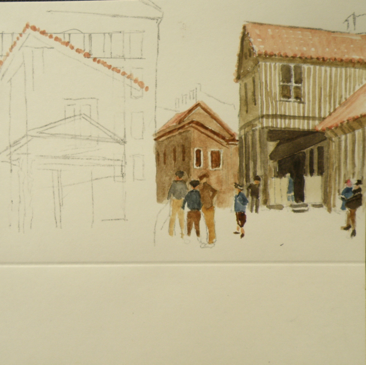
As described in yesterday’s posting, my interest in making a Jewish New Year card has centred around recreating the atmosphere of a 19th century Eastern European shtetl (yiddish for ‘village’) where the Jewish community developed a rich heritage of customs, including a unique style of musical tradition called klezmer.
Here is a taste–more likely a reminder–of what klezmer sounds like, being rich in the minor keys and featuring clarinet, violin, accordion and trumpet:
And here is the initial painting of my Rosh Hashanah 2021 greeting card….
Painting Progression 4: Juno, finished
March 9, 2021
While painting this portrait of Juno in honour of Kathie’s birthday, our little Bichon, ‘Elmo’, was in the final days of his thirteen-year-old life. Stoically dealing with a heart twice its normal size, an enlarged liver and kidney malfunction, our beloved ‘Elmo’ passed away in his bed just after I’d checked on him on January 24th. For his two daddies, this was a sorrowful occasion and one very difficult to get over.
As the weeks passed, however, we realised we needed to at least try to fill the emotional hole of losing our lovely pet and began searching far and wide for a new puppy. At the same time, I was close to finishing the portrait of Juno and finally did, a couple of weeks before Kathie’s big day:

Kathie and Ken were very pleased and the Juno portrait now hangs in their dining room.
And we–Raul and I–have a new addition to our family, a tiny toy Maltipoo puppy named ‘Ashton’, who can never replace ‘Elmo’ and yet has won us completely over by his beautiful perky cuteness and charming personality:

Painting Progression 3 ‘Juno’
March 7, 2021
“Juno was the sister and wife (hmmm) of Jupiter, and the mother of Mars and Vulcan. The patron goddess of Rome and protector of women and marriage, Juno’s name is heard in Virgil’s Aeneid, Shakespeare’s The Tempest, and Sean O’Casey’s 1924 play Juno and the Paycock.” [source: https://nameberry.com/babyname/Juno%5D
Although I’m posting these progressive treatments over a few days, this painting actually took me several weeks. That’s because I just wasn’t sure how to go about it. Painting complicated hair/fur isn’t my forte. And watercolour isn’t a terribly forgiving medium. So I ultimately chose to use Daniel Smith’s Watercolour Ground applied over white art board. The lovely quality of this product is how easily one can lift mistakes off it–it lifts previously applied, and dried paint, like a dream. What it therefore doesn’t allow is a number of washes or glazes on top of each other, because once a fresh wash is placed over a dried wash, that old one will lift and mix with the new wet one. So my experience has been to use one put-down of wash and let that be the one, and if it doesn’t look good, just put water all over it and lift it right off and wait till the surface has dried and start again.
Painting Progression 2: Juno
March 6, 2021
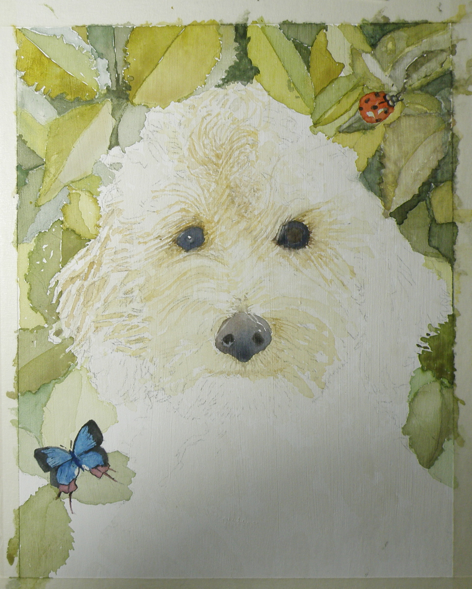
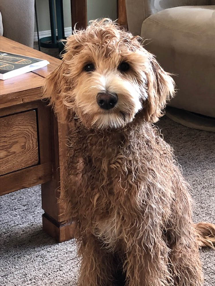
Because Labradoodles are created by mating a Labrador with a Poodle, any number of colour combinations are possible, including black, dark brown, reddish brown, blonde-brown and who knows how many others. Each puppy can be more like the father, or take after the mother, with different fur/hair qualities as a result. Juno’s hair is a delicious golden colour and not as tightly curled as a Poodle, but not as straight as a Labrador, and so very curly and yet wavy.
Here is the way the painting progressed from the initial sketch and wash:
Personally, I have a need to establish the eyes and nose before progressing further. If they don’t happen correctly, forget about it. I was satisfied that my attempts looked true enough to the image I was given to work from to keep on working.
Painting Progression: Juno
March 5, 2021
To help celebrate the birthday of a recently retired Occupational Therapist and good friend–Kathie–her spouse, Ken, the Dean of our local Anglican Cathedral, provided me with photographs of their very charming one year old Labradoodle dog, Juno. My hope was to present Kathie with a watercolour portrait of Juno to mark her upcoming, significant ‘0’ birthday,

Dog portraiture is not something I have experience with/in. And Juno being from a breed known for its gorgeous curls and wavy hair/fur, presented challenges I wasn’t convinced my experience with watercolour could overcome. Fortunately, this painting was one I offered to do, and so if it was beyond my abilities I simply had to say so and produce a watercolour of another subject I knew Kathie would enjoy receiving.
I started with a detailed drawing:
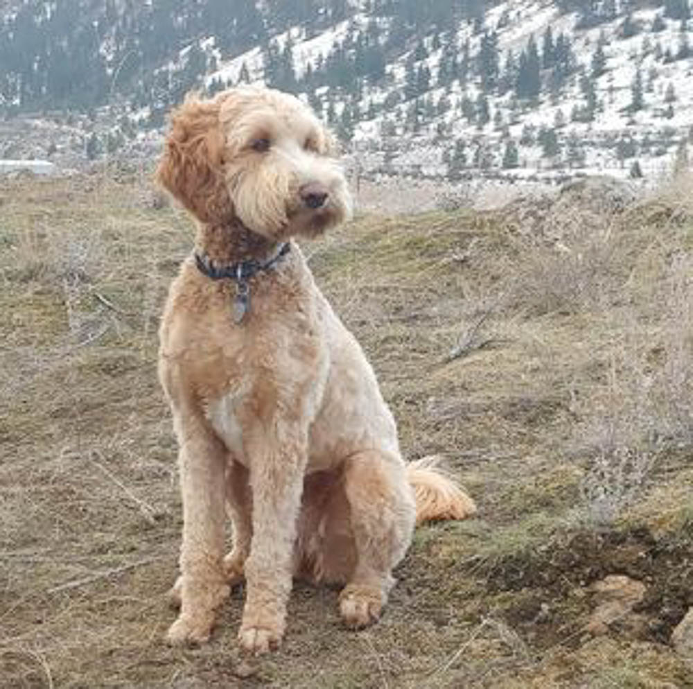
Because Juno’s place to be is anywhere outdoors, I decided to provide a rosebush background.
Sky Positioning and Treatment II
July 1, 2020
Just as choosing to place one’s subject matter in front of bright sky produces remarkable effects as in the work of Joseph Zbukvic, so also can equally-remarkable effects be achieved when making the sky itself the subject.
An almost unparalleled master is a lesser known watercolourist than the celebrated J. Zbukvic, but a truly exquisite painter of both sea and sky, the Russian Sergey Temerev:
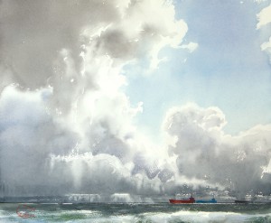


Here is a video of him at work:
Now, those are clouds.
Sibelius Park detail…..
June 11, 2020
Trying to fit a very rectangularly-wide picture inside the borders of a wordpress blogpost forces one to shrink it to fit. So here is the completed painting, divided in half in order to provide more up-close detail:
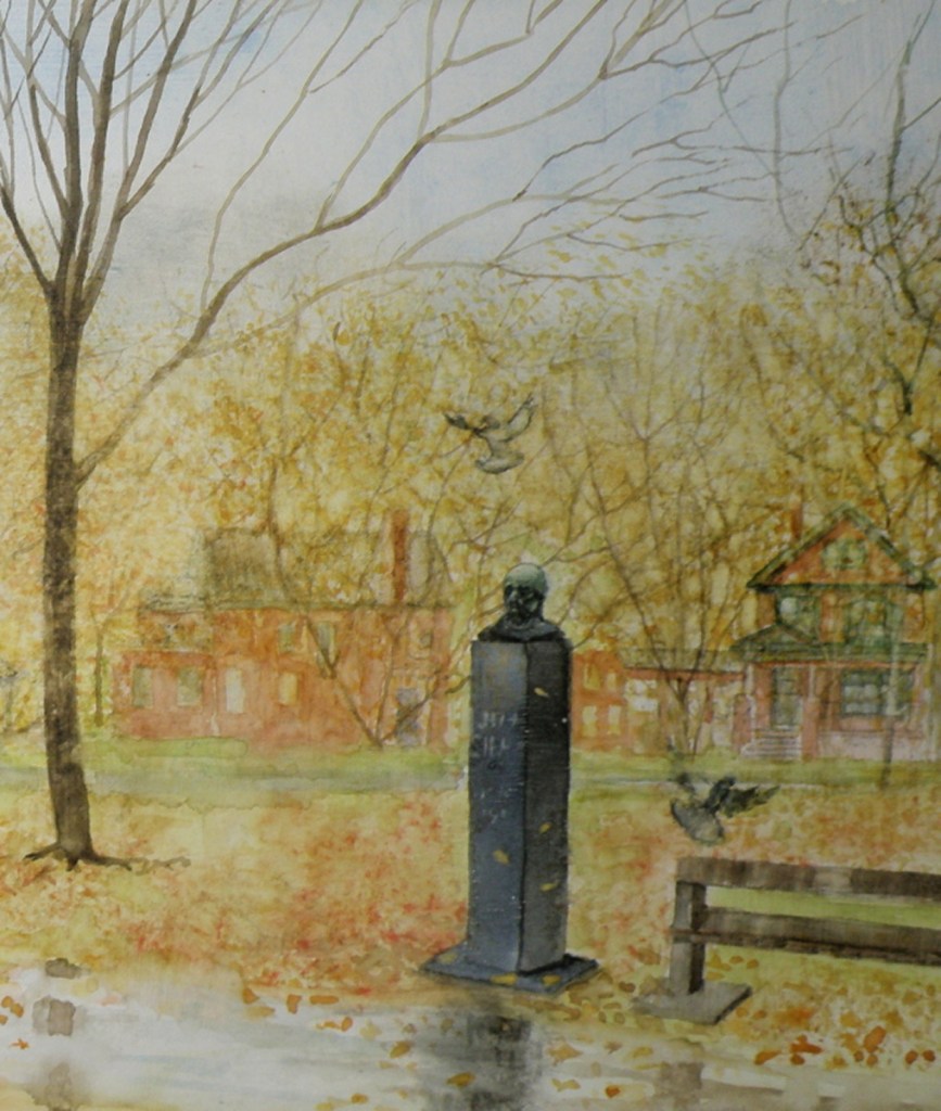

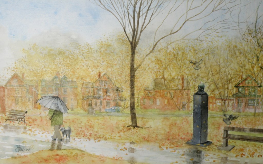
Your many comments through this painting progression series are such a tonic and encouragement. Your blogs are a daily boost to my spirits, and certainly to all who read them.
Painting Completed: Jean Sibelius Square Park, Toronto
June 10, 2020
The Finnish composer, Jean Sibelius ” . . . is widely recognized as his country’s greatest composer and, through his music, is often credited with having helped Finland to develop a national identity during its struggle for independence from Russia. . . “

Quite probably, his most recognizable contribution and gift to us was ‘Finlandia’, the tune from which many of us have come to know as the melody for the well known hymn, ‘Be Still My Soul’:
Music is, for me, like a beautiful mosaic which God has put together. He takes all the pieces in his hand, throws them into the world, and we have to recreate the picture from the pieces.
~ Jean Sibelius
The visual objective in this commissioned project, was to infuse the painting with the mood and the tenor of those 1970s years when I and my dear friend, Doug Todd, were living near The Jean Sibelius Square Park in The Annex of Toronto.
Those were challenging years, when we were actors in the ensemble known as Creation II, living communally in a large Victorian red brick Annex house. The experience permanently altered our lives, as what began as an altruistic experiment in communal living and performing, gradually descended into becoming a cult.
Therefore, this painting is meant to embrace the feelings of those times, and bring back the memory of a one acre oasis in the midst of spiritual confusion and personal ambivalence.
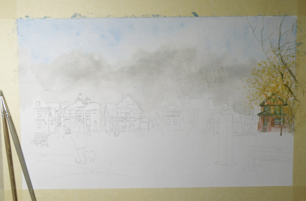
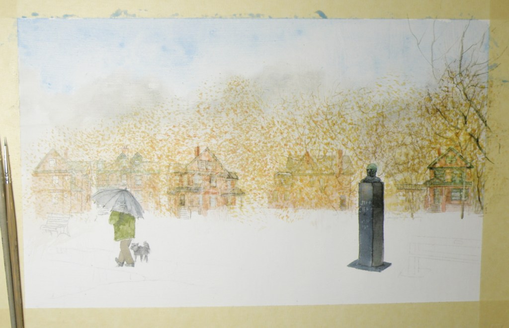
The completed work depicting a drizzly November morning, includes the emblematic red brick Victorian homes which surround the square, and a pair of Toronto’s ever-present pigeons to help bring animation to the solid silence of the memorable and remembered Jean Sibelius:
watercolour on treated art board
commissioned by Douglas Todd
by Lance Weisser June, 2020
[note: the rectangular size of this painting, 7″ x 13″, is preventing it being inserted here without undergoing distortion.]
When one reads about the long life of Jean Sibelius and how he had such a strong affinity for nature, for Autumn and Winter in particular, and was, after all, a Finn, whose country embraces the colder months, it seemed fitting to depict Sibelius Square in November. His biographer wrote this:
“. . . Even by Nordic standards, Sibelius responded with exceptional intensity to the moods of nature and the changes in the seasons: he scanned the skies with his binoculars for the geese flying over the lake ice, listened to the screech of the cranes, and heard the cries of the curlew echo over the marshy grounds just below Ainola [his home, named after his wife]. He savoured the spring blossoms every bit as much as he did autumnal scents and colours. . . “

The distinctive, late 19th c. Toronto architecture of the area known as The Annex is unabashedly Victorian, boasting ‘some of the largest collection of Victorian houses in North America.’
‘During this period Toronto also developed some unique styles of housing. The bay-and-gable house was a simple and cost effective design that also aped the elegance of Victorian mansions. Built of the abundant red brick, the design was also well suited to the narrow lots of Toronto.’ [wikipedia: The Architecture of Toronto]
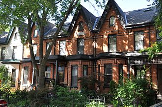
In The Annex, however, there was an elegance reserved only for those who could afford it. ‘Built by the city’s wealthy and mostly found in the neighbourhood they are named after, these houses contain diverse and eclectic elements borrowed from dozens of different styles. These houses are built of a mix of brick and sandstone, turrets, domes, and other ornamentation abound.’ [ibid.]

In this painting, some decisions had to be made as to whether it was going to be about the houses surrounding The Jean Sibelius Square Park, or about the monument dedicated to the composer, or about the overall mood of late Autumn and how it informs the architecture, the park and what Sibelius himself loved about November.
This neighbourhood-emersed, one square acre oasis in the middle of Toronto [pop. 6,129,000], was originally known as Kendal Square due to being beside Kendal Avenue…
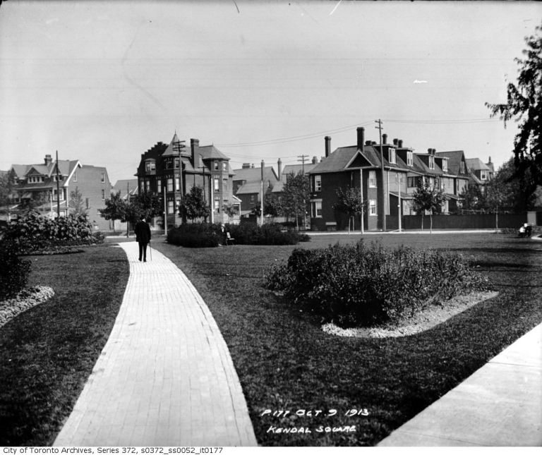
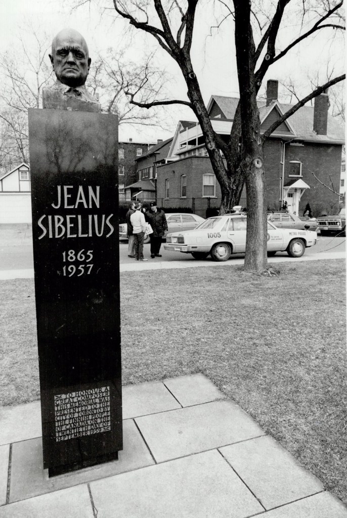
In 1959, in recognition of the diligence and passion of Toronto’s Finnish community, the little square was officially renamed Jean Sibelius Square and featured a striking monument with the Finish composer’s likeness crowning it.
My encounter with this petite and charming park was during the socially-disruptive 70s, when The Annex was transformed from a neighbourhood of red-brick mansion propriety, to one of red-brick mansion rooming houses populated by hippies and university students.
I lived in the former red brick Victorian home of a Toronto physician with fifteen other actors–including Doug Todd, who has commissioned this painting of Jean Sibelius Square. We were members of the theatre ensemble called Creation 2 (I for seven years, he for two), which was both commune and theatre ensemble:
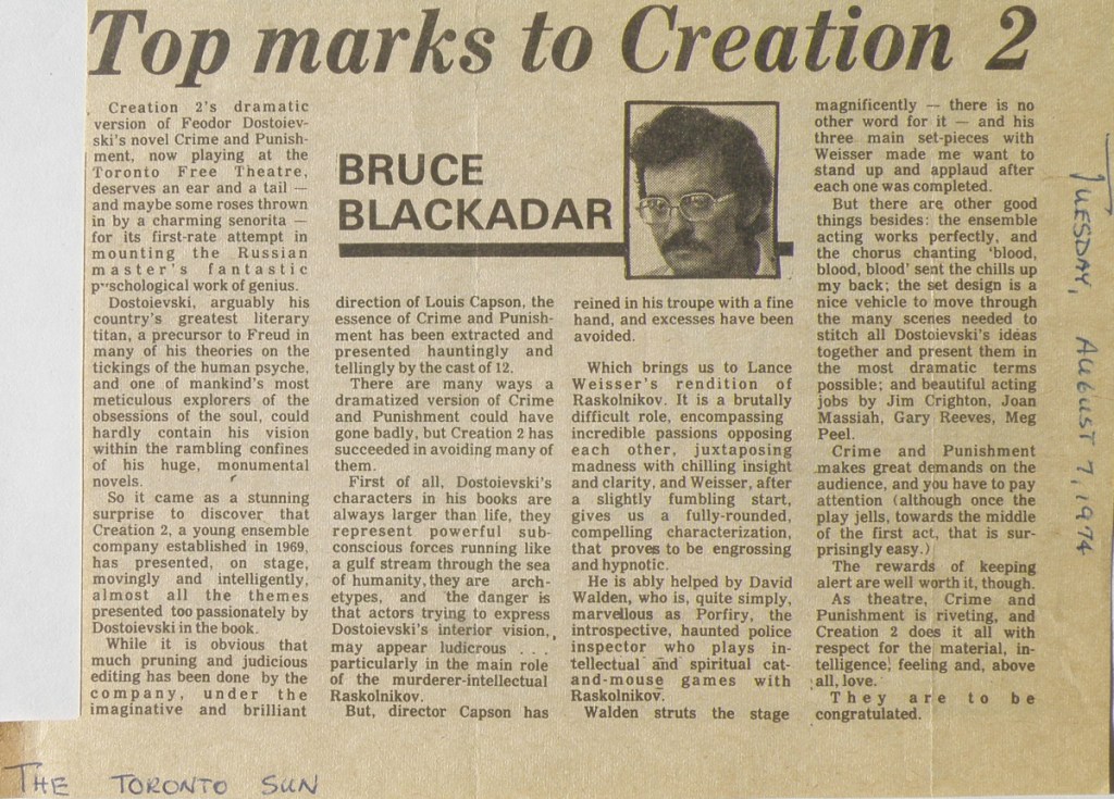
Life for Doug Todd and I, and others within the group, was a mixture of great bonding, high demands, internal turmoil and personal confusion. What had started out as a dynamic experiment combining the best of ensemble acting with the ideals of a close-knit communal living, began taking on the telling characteristics of a cult.
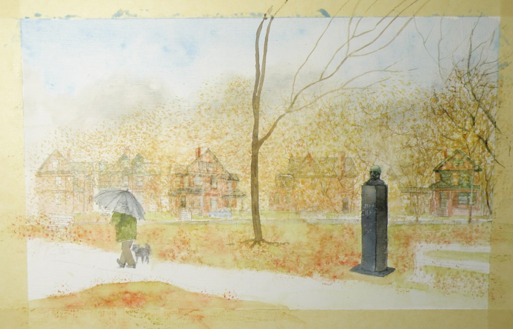
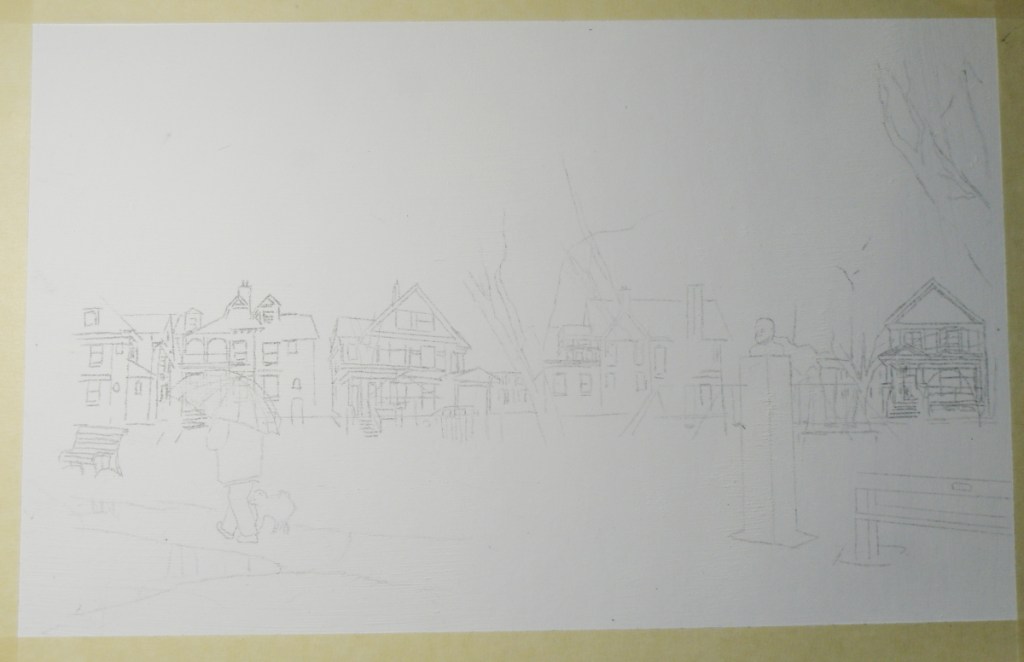
The Jean Sibelius Square Park, being a block away from our living situation, provided us with a treed, quiet, people-free place of calm and restoration. The watercolour depicting that 1970s’ oasis-like feeling is now finding its expression as it goes from outlined sketch to the initial wash stage:
The Finnish composer (seven symphonies, including ‘Finlandia’) is memorialized in a tidy little one acre park in The Annex area of Toronto, Canada, nestled on four sides by its red brick house neighbourhood.
The Vancouver Sun’s long-serving investigative reporter and author, Douglas Todd, [https://vancouversun.com/author/douglastodd2/page/2], commissioned a watercolour of this familiar setting he and I knew well when living nearby while in a theatre company commune in the mid-1970s.
A striking memorial was donated by Toronto’s Finnish community in 1959 and the park–originally known as Kendal Square–was renamed Jean Sibelius Square Park. In 2010, the park was officially reopened after a major redesign equipped it with an extensive playground and enhanced outdoor skating rink.
Approaching this watercolour commission, it seemed most appropriate to laden it with a 1970s feel–visually allowing Doug and my memories of Sibelius Park to surface and suffuse the painting with an autumnal feel.
A decision has been made to sacrifice accuracy to the bringing up from deep memories a vision of what we both recall and felt about this little space–this oasis from the complicated goings-on within our nearby commune. And we both remembered it being nearly always empty of people, strewn with fallen leaves, lit by street lamps, smelling slightly of wood smoke from the chimneys of the surrounding substantial, Victorian brick homes of the established Annex community.
Therefore, the end result will disappoint anyone currently familiar with Jean Sibelius Square, and its revitalized, playground-dominated landscape, as well as those who may live around it. None of the actual homes will be depicted, rather homes springing from our memory of those homes are being brought to the surface.
The ‘how’ of ACEOs
April 6, 2018
To gain more know-how about the way ACEOs are collected and acquired, just go to eBay and view the huge number of them being sold/auctioned: https://www.ebay.com/sch/i.html?_nkw=aceo+original+painting&_sacat=0&_from=R40
You’ll see the quality contrasts, the styles, the subject matter variety, the variety of mediums, too–as well as price, with some going for $40/ea to $1/ea.
Below are examples of how I personally approach doing ACEOs:
‘A Westsyde Winter’, ACEO by Lance Weisser, Arches Hot Press 140 lb Paper, sold.
Once one of mine is matted and framed, it is generally priced at $25 to $30US. Unframed, $20US. But I’m not beyond letting interested people barter for them because what is most pleasing to me is having a person get an original watercolour that is within his/her means. As painters, we really just want people to enjoy what we do, and know our work is being appreciated and displayed.
If interested, please just email me at weisserlance@gmail.com.
I can work from an emailed attached photo, or your personal subject matter ideas. It can be mailed to you wherever you may be — postal costs will be built into the final price 🙂
Happy Easter
March 29, 2018
As children, we loved writing on eggs with crayon and then colouring them, the smell of vinegar used in setting the dyes filling the kitchen, and our fingers almost permanently stained purple and orange and green–yet we weren’t very keen on then having to eat cold hard-boiled eggs, pretty though they were. Our mother held a big church breakfast at our parsonage home, card tables decorated up, little ‘favour’ cups filled with mints and peanuts, lots of hot chocolate for people returning from sunrise service. And of course, lots of coloured, hard-boiled eggs.
I enjoy painting watercolour on eggs, which receive it quite well, the best eggs being duck eggs whose satin-smooth surface is perfect for watercolour. The eggs then have to be blown out and finally spray-lacquered to protect them.


Christmas tree ornament egg done using the traditional Ukrainian beeswax and dye method.
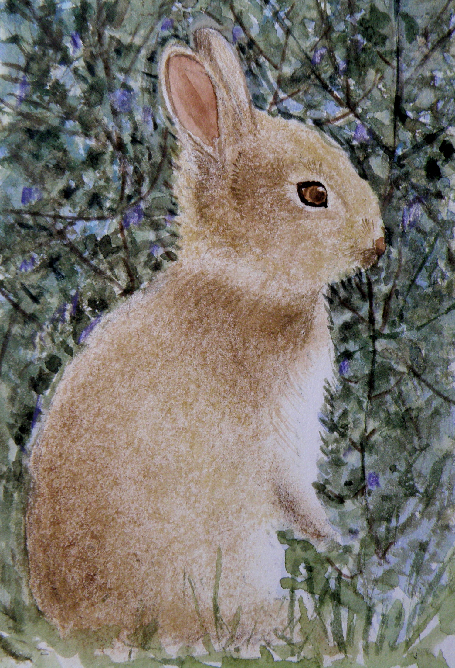
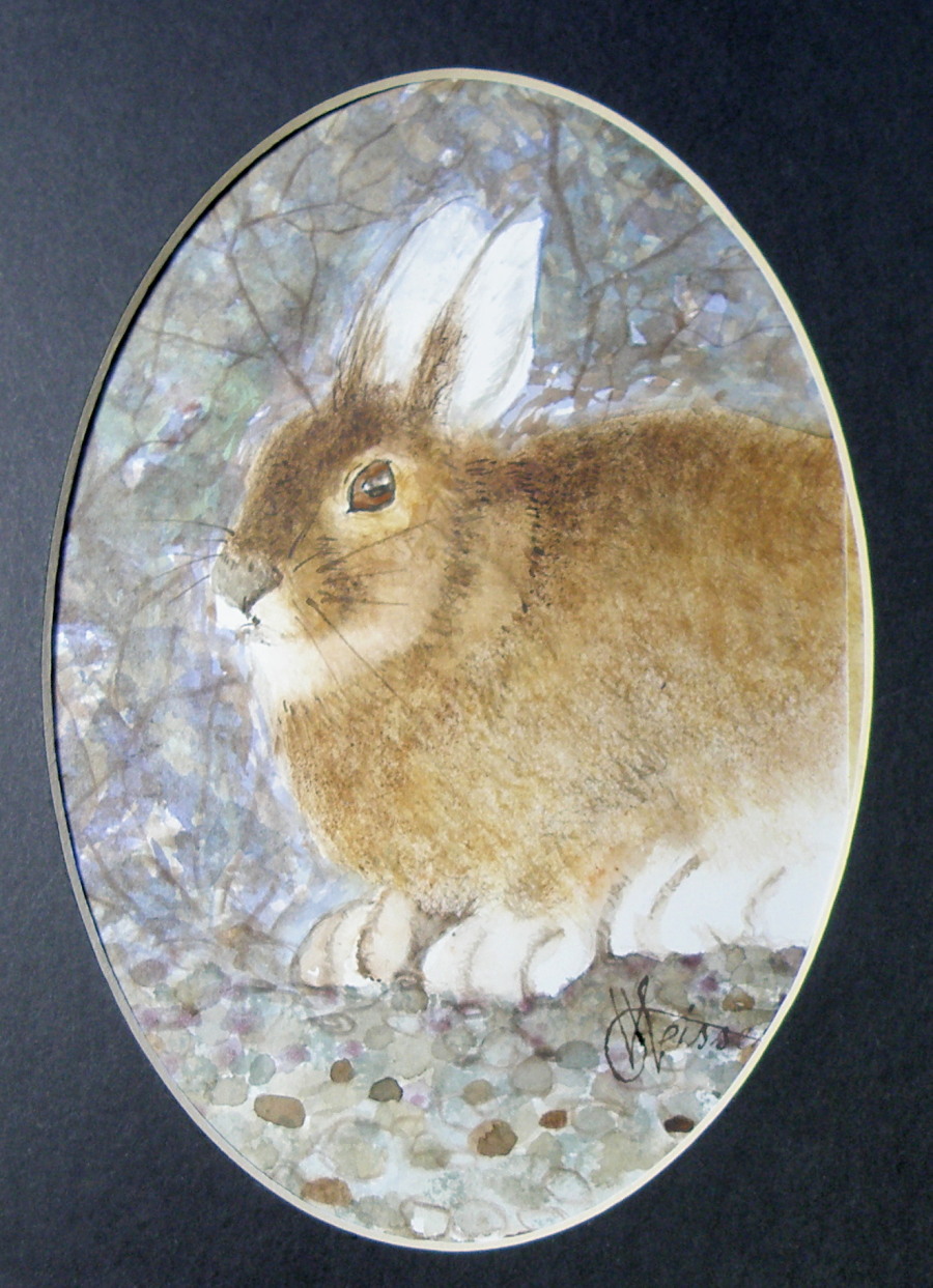
‘Little Bunny’, watercolour on Saunders Waterford Hot Press Paper, 4″x6″, sold.
‘Arctic Hare’, watercolour, Arches Aquarelle Hot Press Paper, 4″x6″, sold.
A blessed and Happy Easter everyone!
Finished Painting: ‘Raven Winter’
February 16, 2018
It is snowing again, and is likely to continue through today and tonight and into tomorrow. As my friend Shiela says, snow today is water tomorrow, meaning we live in a characteristically arid part of British Columbia (our backyard mountain ridge has many cacti plants) and so every source of water is cherished. The snowmelt from the mountains is crucial to ensuring our lifeline, the Thompson River, is of normal size.
Around here, many people kind of roll their eyes and sigh when learning we’re getting another ‘dumping’, but I’ve always delighted in snow and can now sadly envision a day when there won’t be any. Our living situation is such that I can handle clearing the driveway without much effort, otherwise I might be joining one of the eye-rolling crowd.
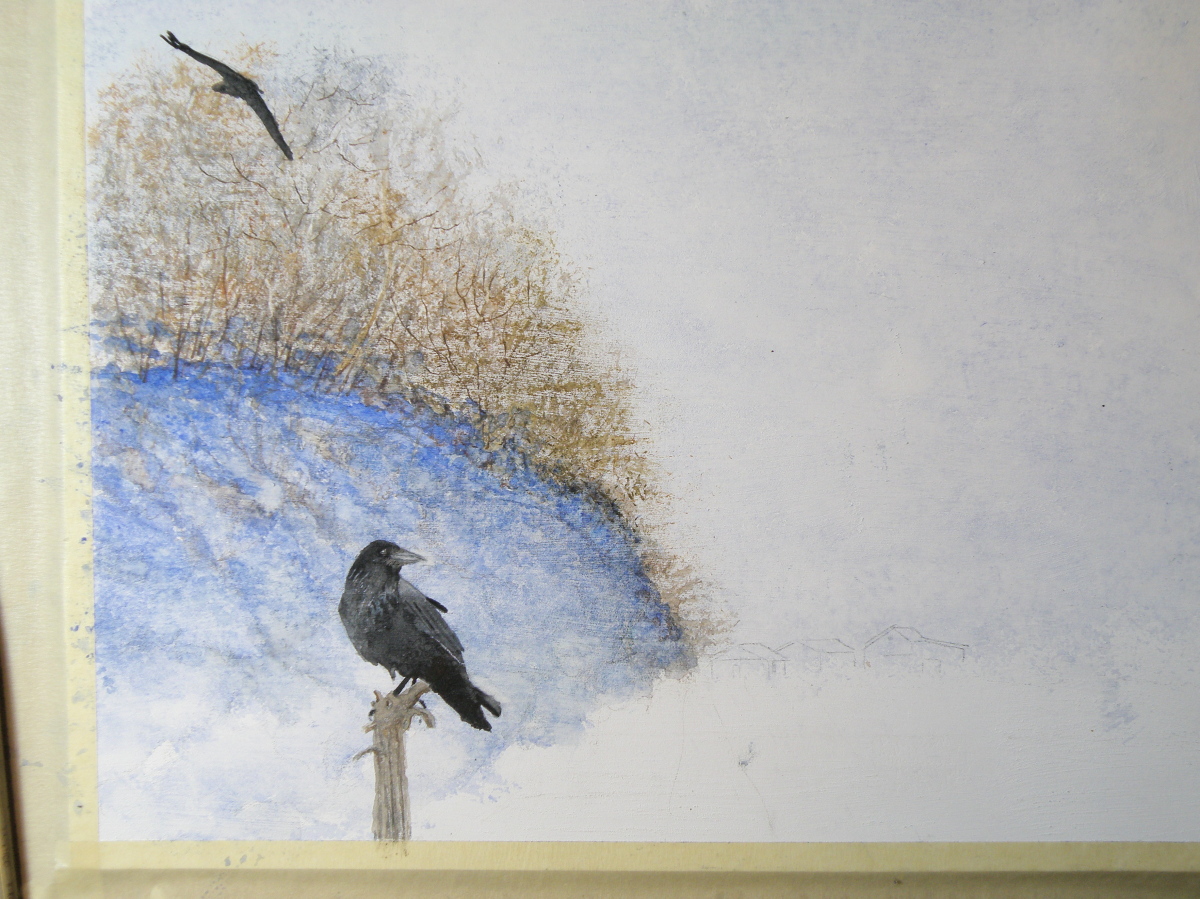
Here is the painting ‘Raven Winter’ that is now framed and ready to be presented to my friend Patricia Kellogg as a possible choice in our painting exchange deal:

‘Raven Winter’, watercolour on treated art board, 9″ x 12″
Stage Two: ‘Raven Winter’
February 14, 2018
The painting for my friend Patricia Kellogg is taking shape. The treated surface of the mat board I’m using to paint on was/is achieved by applying a product by Daniel Smith called ‘watercolor ground’. It comes in a jar and is painted onto any surface one desires, instantly turning it–once allowed to thoroughly dry–into one which can be painted on using transparent watercolour. So, glass, metal, wood, masonite, anything of the kind can basically become a surface with the characteristics of watercolour paper.

Stage One: ‘Raven Winter’
February 13, 2018
My watercolourist friend Patricia Kellogg [https://www.facebook.com/Patricia-A-Kellogg-357357001050096/] and I are doing a painting exchange. I acquired one of hers of an artichoke plant in late autumn–that expressive form plants take when frost renders them lifeless, yet beautiful even so. And because she has a couple of mine with ravens in them, she wanted one more and so here’s the first stage of it.
The surface for this painting is treated mat board and the medium is transparent watercolour. It is a 9″ x 12″ piece. Once it is finished I will enjoy taking it over to The Red Beard Cafe where we have our monthly coffee and seeing if she likes it. I’ll also bring a couple of others with me to provide a choice.
Stage Two: Waxwing Watercolour
February 5, 2018
1) They are named Waxing because they sport red wax-like accents on the tips of their secondary feathers;
2) Although they eat insects during Summer months, they thrive on berries the rest of the year and, in our part of British Columbia, go about in groups to feast on Mountain Ash berries;
3) If there is a cluster of berries hanging from the tip of a long branch that only a single bird can reach, sometimes the rest of the group will line up and pass berries beak-to-beak down the line allowing each bird the opportunity to feed.
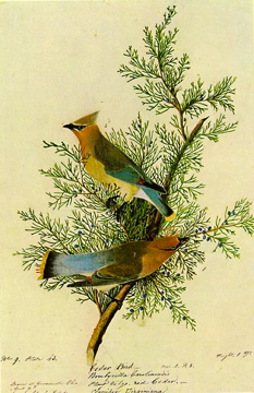
Audubon Print
Its fondness for the small cones of the eastern red cedar is why this particular Waxwing is called ‘Cedar’ Waxwing. (My first post is mistaken in assuming they are not found in Eastern N. America. They are–but I just wasn’t privileged to spot any when growing up in upper New York State.)
Cedar Waxwing watercolour-in-progress, Saunders Waterford Hot Press Paper 140 lb.
[above facts gathered from Cornel Ornithological and Wikipedia websites]
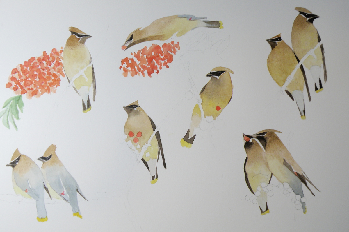
Work in progress: ‘An ear-full of Waxwings’
February 2, 2018
As a child there was probably no bird I wished more to see than a Waxwing. In on-location photographs they just looked so exotic and intriguing–their colouration and little tufted crowns–the whole package was and is so appealing.
In those days we lived in Eastern N. America where Waxwings aren’t found and so it took many decades–after I’d moved to British Columbia–for my chance to encounter these birds. And it happened as I stood at our front picture window looking out at the Red Maple just beyond the glass–a tree which had nestled within it a deserted Robin’s nest.
Suddenly there appeared a large group of birds I’d never before seen, Cedar Waxwings, darting about the nest, examining it animatedly and calling to one another. I watched in fascination as they systematically began dismantling this Robin’s nest, their little bandit’s masks seeming very appropriate to their deciding to make someone else’s home theirs for the taking.

‘An Ear-full of Waxwings’ — work in progress — Saunders Waterford Hot Press Paper, 140 lb.
A grouping of these birds is known as ‘an ear-full’ almost certainly because they go about in bunches and are constantly chattering in a distinctive, rather conversational voice that is more insistent than melodic or song-like, yet charming even so.
…. composition exercise conclusion
February 27, 2016
Results of ‘composition exercise 1’: dividing a landscape into thirds, placing visual interest at each intersectional point….
Results of ‘composition exercise 2’:
and 3:
bringing us to 4:
It has taken a long spell of waffling over what to do about being less than pleased with the finished piece. The snowy fields seemed to extend themselves too far down, without enough visual interest to hold a viewer’s attention. And then I gave into the temptation/artistic trap I almost always seem to fall into, which is going one step too far by defining open field with regimented rows of corn which wind up being so monotonous, the fence posts going the opposite direction only add yet more visual predictability and kill whatever freshness the piece had going for it.
….so the only satisfactory outcome was to crop the painting and salvage what could be salvaged.
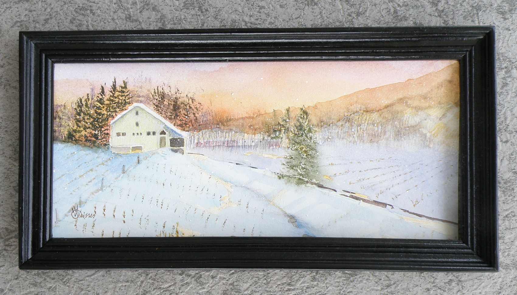
It is a very small painting, about 6″ x 12″, and has at least enough mood still going on to make it only just worth framing.
As an exercise, however, it was more than useful, and confirmed satisfactorily that placing interest at intersectional points within a composition divided into thirds works (sans rows of corn, that is), does hold one’s attention, and lends a feeling of balance.
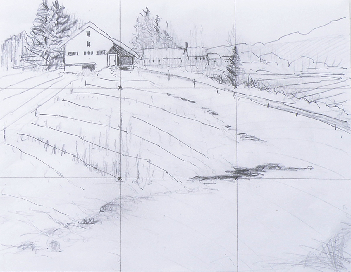
….composition exercise 2
January 17, 2016
Continuing on with an attempt to test out the compositional dictum known as ‘the rule of thirds’, which was conceived and named by John Thomas Smith in 1797 :
“. . . Analogous to this “Rule of thirds”, (if I may be allowed so to call it) I have presumed to think that, in connecting or in breaking the various lines of a picture, it would likewise be a good rule to do it, in general, by a similar scheme of proportion; for example, in a design of landscape, to determine the sky at about two-thirds ; or else at about one-third, so that the material objects might occupy the other two : Again, two thirds of one element, (as of water) to one third of another element (as of land); and then both together to make but one third of the picture, of which the two other thirds should go for the sky and aerial perspectives. . . “
To illustrate its basics…..

Once again, this is the drawing I did initially, to put this into practice….
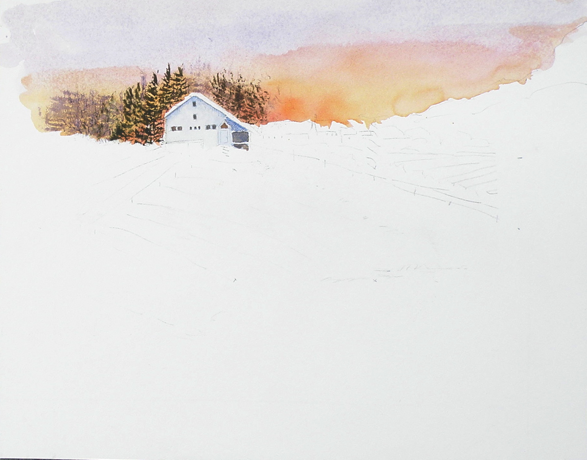
And this is the first go at painting the scene….
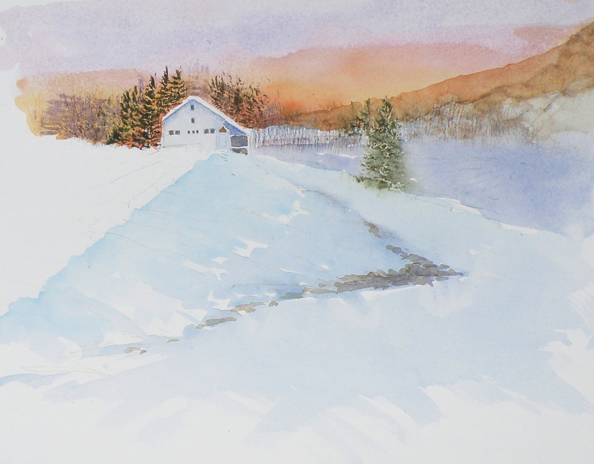
And now today, here is the progress so far, attempting to locate some visual interest at each of the four intersections within the piece, the barn being the first and the pine being the second and the creekbed being the third…..
The darkest darks and greatest contrast will remain with the barn, for that is the intended focus for the picture, when completed.
The ‘rule of thirds’, as stated above, holds that generally two-thirds of a landscape be devoted to the sky, with one-third given to the land below (the sky being such a vast and dominant feature). In this case two-thirds is dedicated to the land and a very high horizon means that the one third is devoted to the sky area.
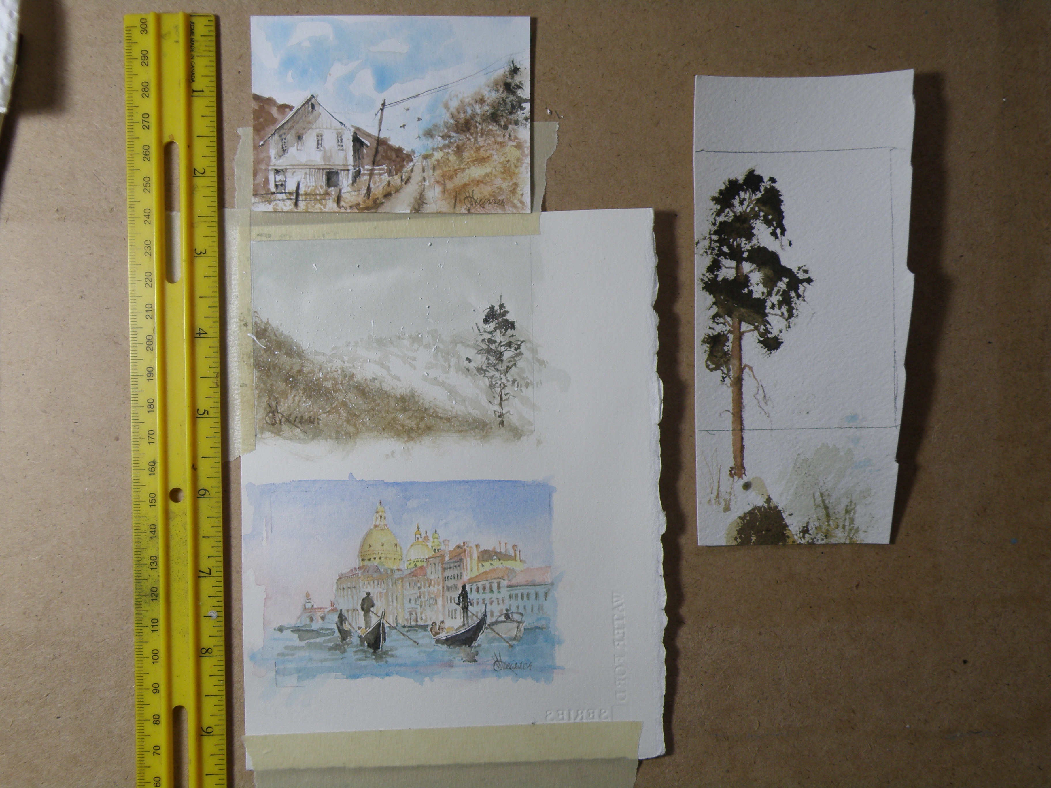
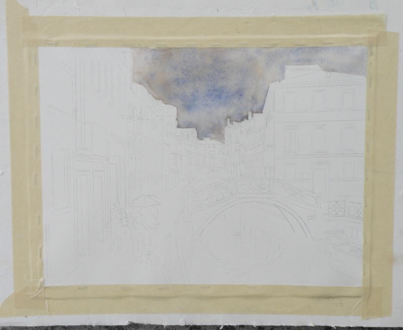
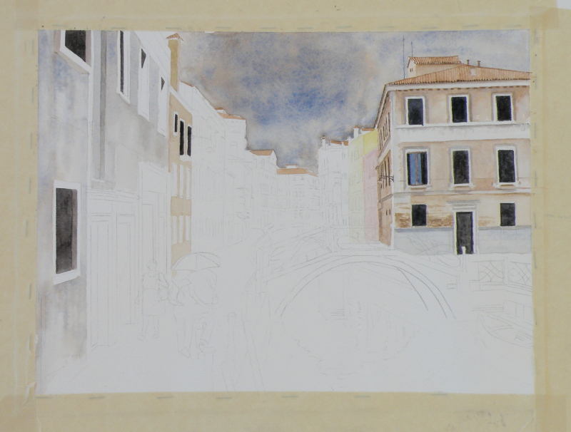
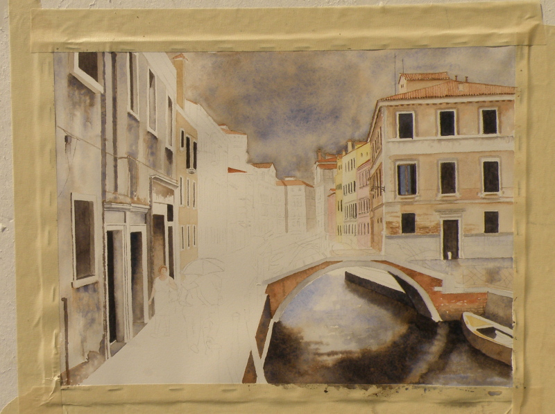
venice challenge
September 6, 2015
We’ve reached the finish line, limping all the way. This was somewhat beyond my abilities as a painter. Whether a success or not, every endeavour provides a great learning experience. All the watercolourists looked up to for advice offer the same counsel: when it comes to watercolour as a medium, suggesting detail far surpasses actually getting bogged-down in it. The pitfalls begin when the painter keeps trying to improve on what’s there.
Despite the overworked areas, enough aspects work to allow this to maybe escape the scrap heap — but probably not. It would, however, be useful to begin it again and learn from the errors.

tortured brushes
May 12, 2015
THE BEST BRUSHES–in my wacked estimation–is a dollar store packet in the crafts section, next to those garish tubes of glitter and such. The second those poor things get home, they undergo an Edward Scissorhands attack that is not pretty.
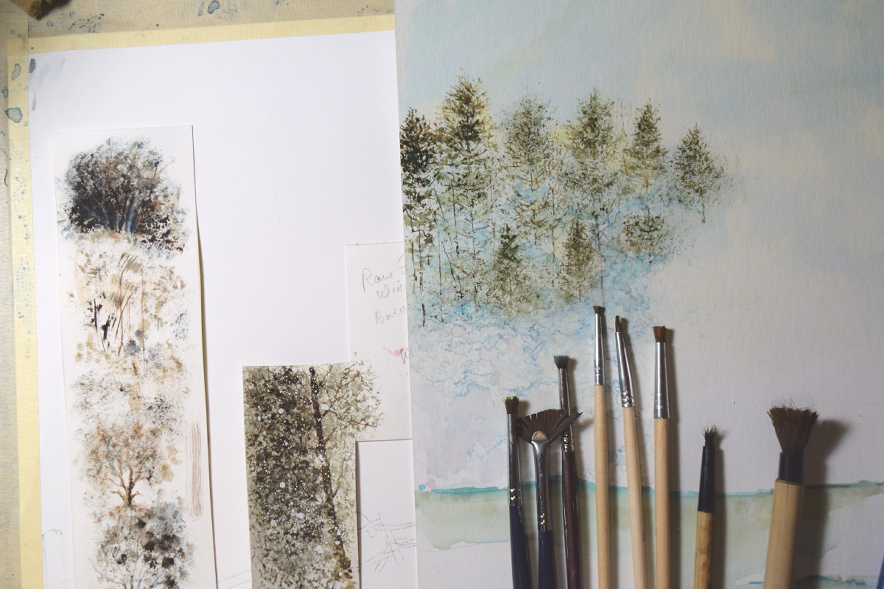
SECOND-HAND STORES also usually have some wonderful, pathetic-looking excuses for brushes, pretty much being handed out for free.
VERY FEW BRUSHES I own get to keep their original shape except ones sized 0, 00, 000, and 0000. For some additional fine work, a nib pen loaded with watercolour does well also. But for large areas, chopped-up, hippie-freak brushes are like, tubular, man.

FORGET SABLE–even squirrel is too refined–woodchuck, maybe–and those synthetic sponges on handles used to paint walls with are good, too.
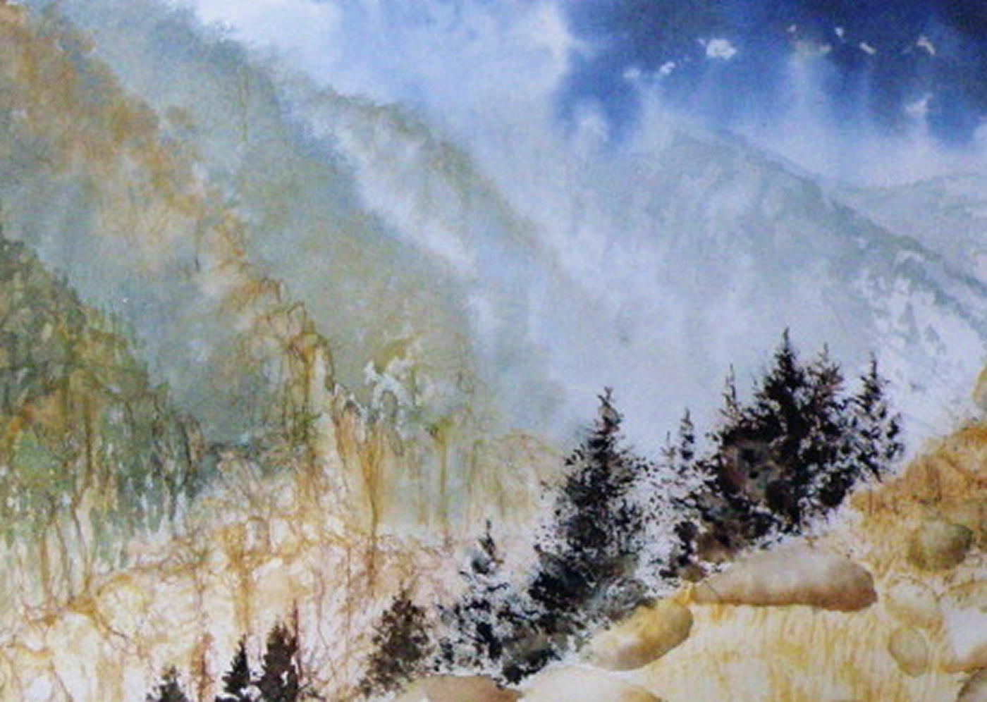
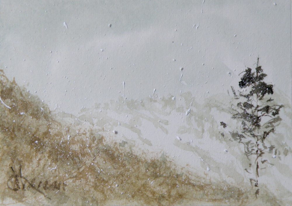
‘Mountain Mists’, 20cm x 28cm, Arches hot press 140 lb paper
THE TRUE ENJOYMENT OF PAINTING comes when viewing how another painter’s personal and unique need for self-expression realises itself in ways personal and unique. Interaction with the subject demands an approach which only the painter her/himself knows is right.
