Winter Watercolours
January 5, 2022
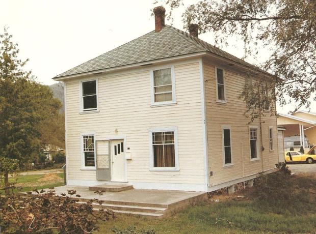
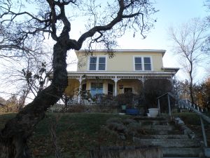
One of Kamloops’ older homes, the Fort House at the corner of Fortune Drive and Fort Avenue, is so named because it is on land formerly part of The Hudson Bay Company’s fur-trading post.
“. . . According to a listing of heritage buildings published by the Kamloops Museum and Archives years ago, the fur-trading post was located there from 1843 to 1862, at which point the Hudson’s Bay Company moved its post to Mission Flats.

However, the company continued to use the land for agriculture until B.C. Fruitlands bought it in 1906 and subdivided it into lots of five or so acres.
The Fort House was built about 1907 for Archie Davis, a railway employee. ‘The house, a foursquare design with a cottage roof common for that period, was originally located on extensive acreage’. . . ” [source: https://armchairmayor.ca/2014/05/24/answer-man-reader-wants-to-know-the-story-behind-the-old-fort-house-on-fortune-drive/#prettyPhoto%5D
Pop-up Christmas card progression, con’t . . .
December 16, 2021
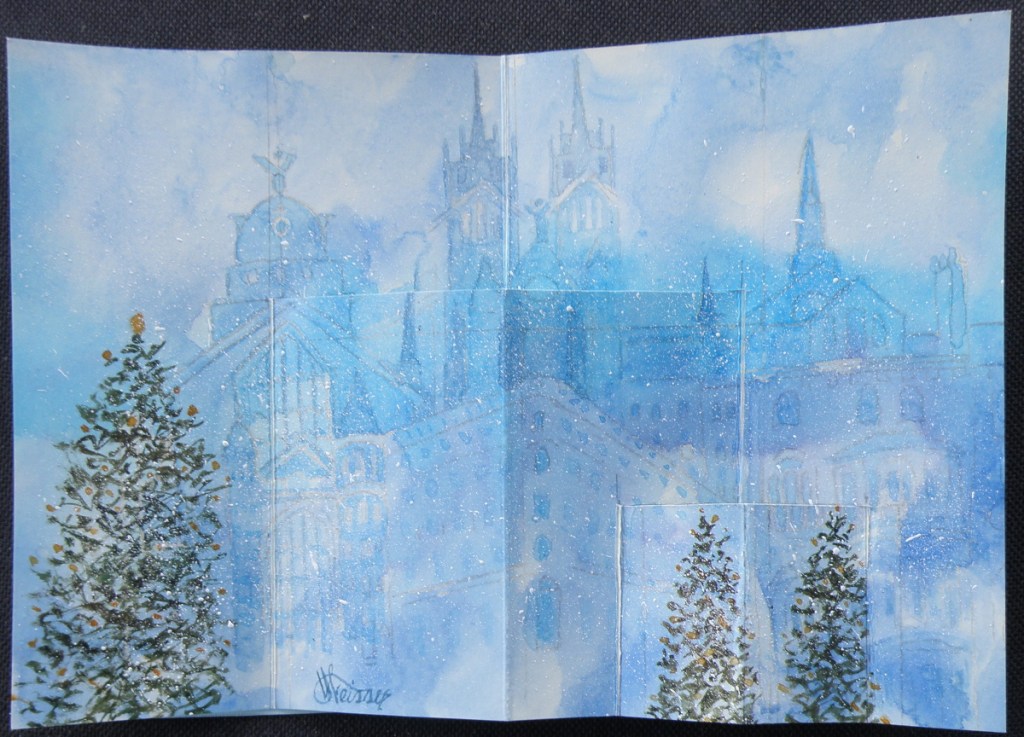
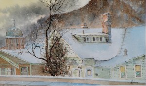
….with the final design carbon traced onto a cream-coloured, blank notecard, the image is completed in watercolour —
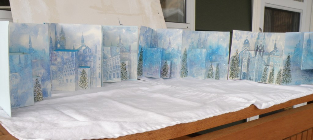
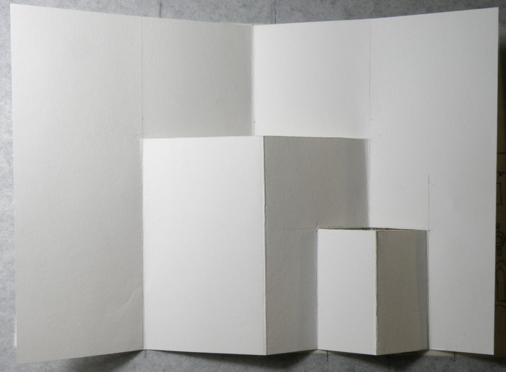
…..and Christmas trees added, cuts carefully made with an x-acto knife, and scored folds added to then oh-so-carefully make the folds and the cuts pop out. And once a successful Christmas pop-up snowy cityscape with Christmas trees was successfully done, it was time to then make fifteen more of them . . .
The biggest surprise when doing this was discovering how well a dollar store package of six blank notecards with envelopes received watercolour. Painting on them was almost as forgiving and receptive as my go-to Arches Hot Press #140 watercolour paper — and, a package of 6 is $1. Even the envelopes could be festively painted over and made to look handmade.
Pop-Up Christmas Card Progression
December 13, 2021
Designing a hand-painted watercolour pop-up card for Christmas began in August because there were going to have to be seventeen of them in time for mailing.
Here is a look at the process and progress:
Summer’s Zenith
August 5, 2020
We’ve been sizzling here in British Columbia’s Southern Interior. For the past two weeks, it has been very hot and very dry. This is when all the dirt bikes get loaded on the back of country music-blaring pickups, heading for the hills, bypassing all the slower, fishing boat-toting pickups. And even those pickups bypass the even slower camper trailer-toting pickups, with everyone and their dog all heading out of Dodge.
What’s left behind are solitary scenes of empty pasture, sun-weathered farms, the occasional horse. And not a lick of shade.

We’re at the apex of Summer–the zenith–with a high today of 35C (95F). And tomorrow? Well, tomorrow marks the slow slide into September, with showers and a high of only 23C (73F).
So today we pretend we’re Texans, and tomorrow that old familiar tinge of an early Fall brings us all back to where we really are and love to be.
Sibelius Park detail…..
June 11, 2020
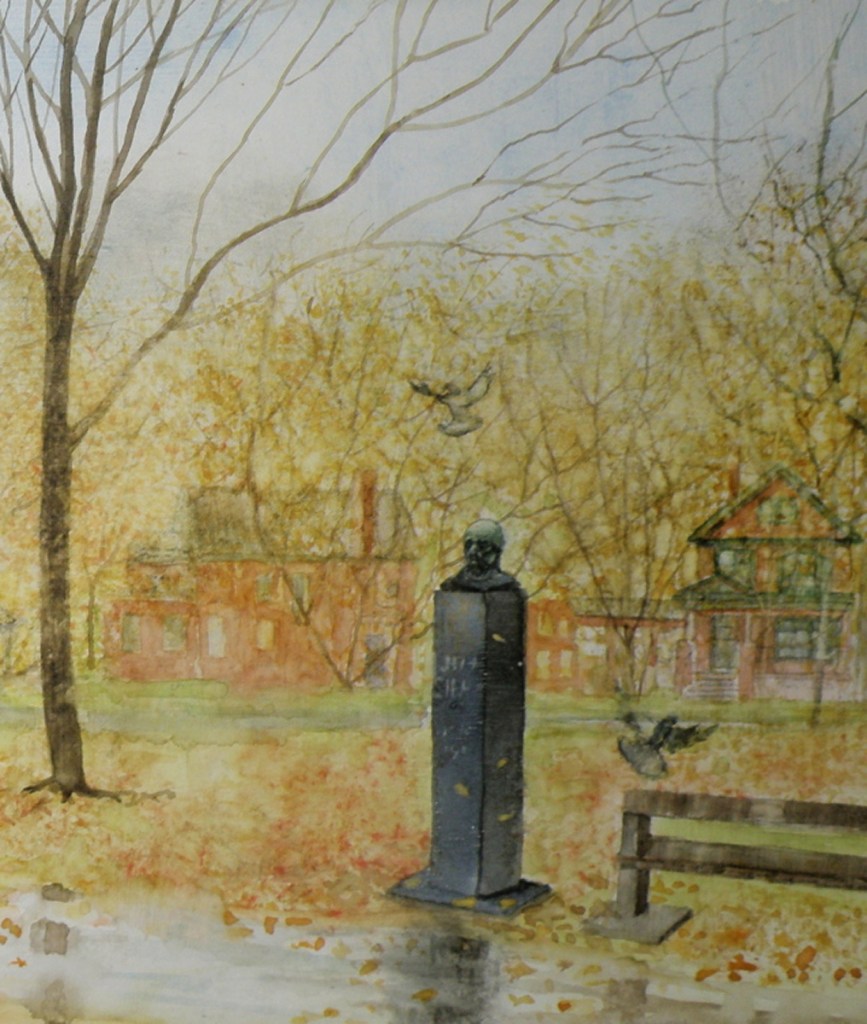
Trying to fit a very rectangularly-wide picture inside the borders of a wordpress blogpost forces one to shrink it to fit. So here is the completed painting, divided in half in order to provide more up-close detail:

Your many comments through this painting progression series are such a tonic and encouragement. Your blogs are a daily boost to my spirits, and certainly to all who read them.
Painting Completed: Jean Sibelius Square Park, Toronto
June 10, 2020
The Finnish composer, Jean Sibelius ” . . . is widely recognized as his country’s greatest composer and, through his music, is often credited with having helped Finland to develop a national identity during its struggle for independence from Russia. . . “

Quite probably, his most recognizable contribution and gift to us was ‘Finlandia’, the tune from which many of us have come to know as the melody for the well known hymn, ‘Be Still My Soul’:
Music is, for me, like a beautiful mosaic which God has put together. He takes all the pieces in his hand, throws them into the world, and we have to recreate the picture from the pieces.
~ Jean Sibelius
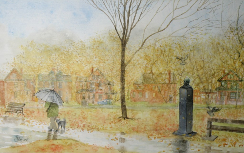
The visual objective in this commissioned project, was to infuse the painting with the mood and the tenor of those 1970s years when I and my dear friend, Doug Todd, were living near The Jean Sibelius Square Park in The Annex of Toronto.
Those were challenging years, when we were actors in the ensemble known as Creation II, living communally in a large Victorian red brick Annex house. The experience permanently altered our lives, as what began as an altruistic experiment in communal living and performing, gradually descended into becoming a cult.
Therefore, this painting is meant to embrace the feelings of those times, and bring back the memory of a one acre oasis in the midst of spiritual confusion and personal ambivalence.
The completed work depicting a drizzly November morning, includes the emblematic red brick Victorian homes which surround the square, and a pair of Toronto’s ever-present pigeons to help bring animation to the solid silence of the memorable and remembered Jean Sibelius:

watercolour on treated art board
commissioned by Douglas Todd
by Lance Weisser June, 2020
[note: the rectangular size of this painting, 7″ x 13″, is preventing it being inserted here without undergoing distortion.]
When one reads about the long life of Jean Sibelius and how he had such a strong affinity for nature, for Autumn and Winter in particular, and was, after all, a Finn, whose country embraces the colder months, it seemed fitting to depict Sibelius Square in November. His biographer wrote this:
“. . . Even by Nordic standards, Sibelius responded with exceptional intensity to the moods of nature and the changes in the seasons: he scanned the skies with his binoculars for the geese flying over the lake ice, listened to the screech of the cranes, and heard the cries of the curlew echo over the marshy grounds just below Ainola [his home, named after his wife]. He savoured the spring blossoms every bit as much as he did autumnal scents and colours. . . “
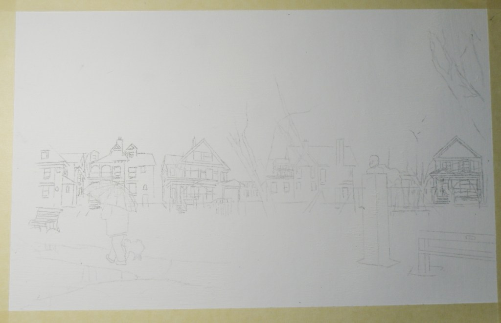
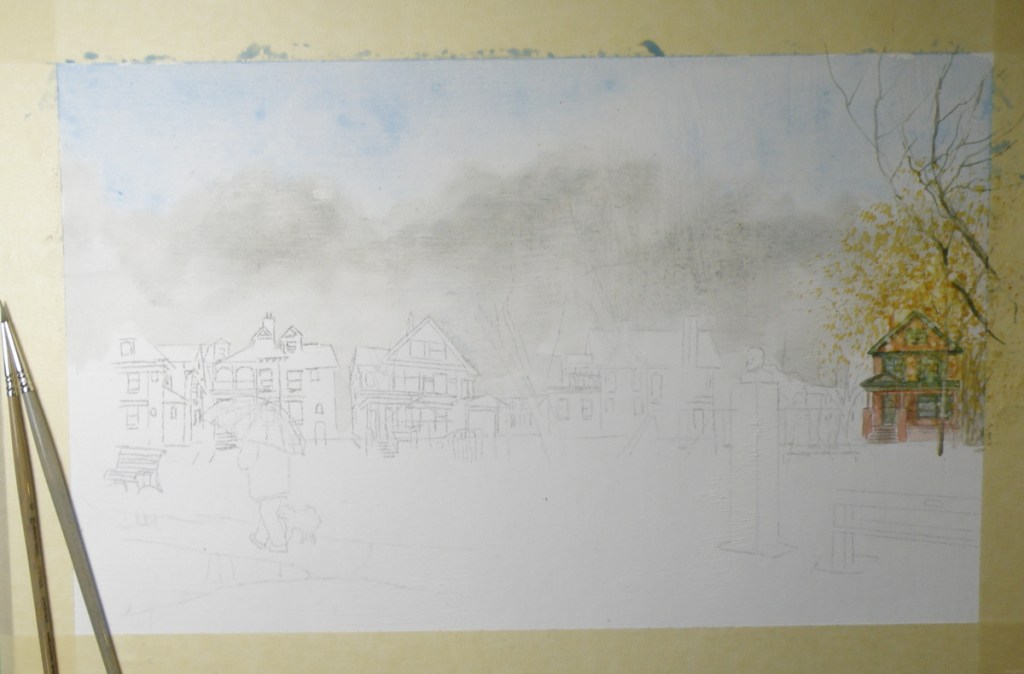

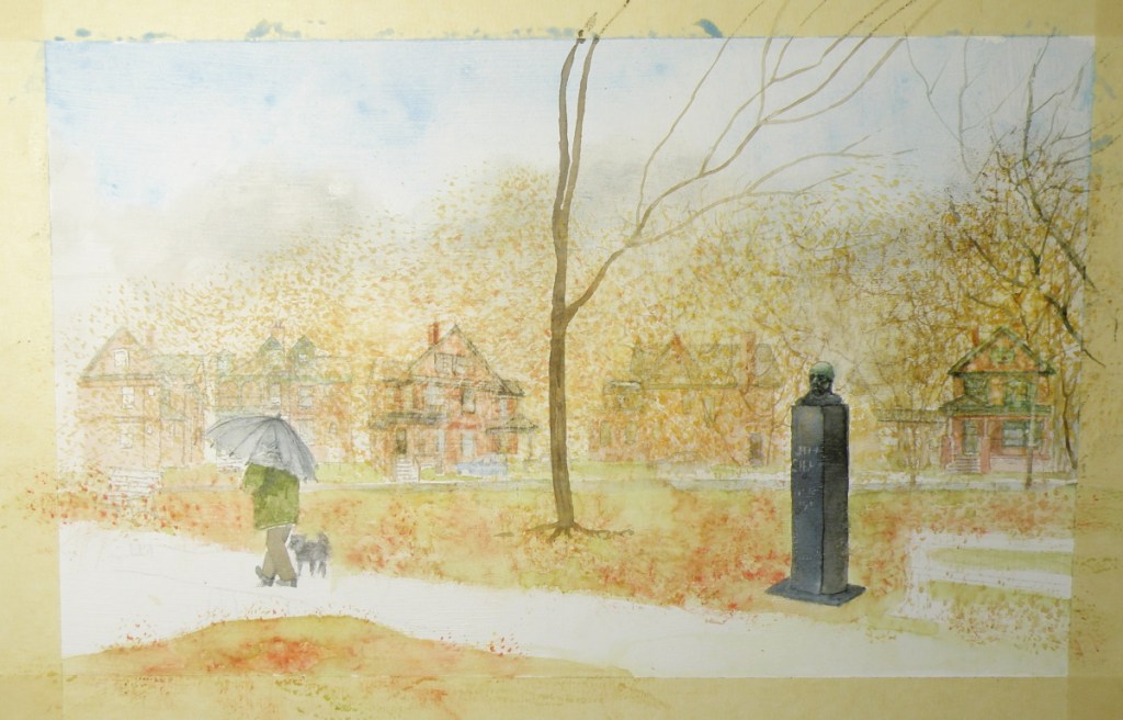
The distinctive, late 19th c. Toronto architecture of the area known as The Annex is unabashedly Victorian, boasting ‘some of the largest collection of Victorian houses in North America.’
‘During this period Toronto also developed some unique styles of housing. The bay-and-gable house was a simple and cost effective design that also aped the elegance of Victorian mansions. Built of the abundant red brick, the design was also well suited to the narrow lots of Toronto.’ [wikipedia: The Architecture of Toronto]

In The Annex, however, there was an elegance reserved only for those who could afford it. ‘Built by the city’s wealthy and mostly found in the neighbourhood they are named after, these houses contain diverse and eclectic elements borrowed from dozens of different styles. These houses are built of a mix of brick and sandstone, turrets, domes, and other ornamentation abound.’ [ibid.]

In this painting, some decisions had to be made as to whether it was going to be about the houses surrounding The Jean Sibelius Square Park, or about the monument dedicated to the composer, or about the overall mood of late Autumn and how it informs the architecture, the park and what Sibelius himself loved about November.
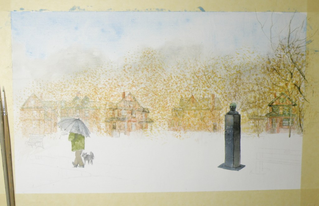
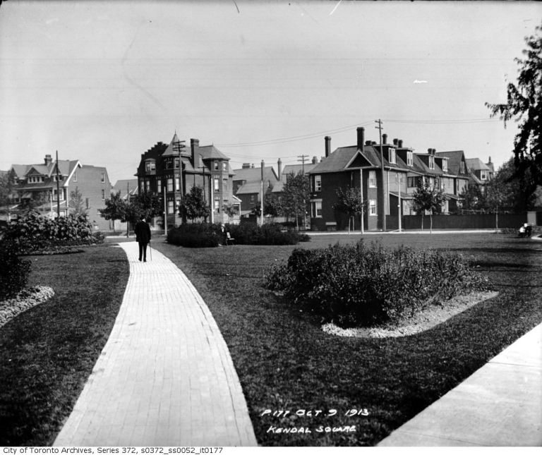
This neighbourhood-emersed, one square acre oasis in the middle of Toronto [pop. 6,129,000], was originally known as Kendal Square due to being beside Kendal Avenue…
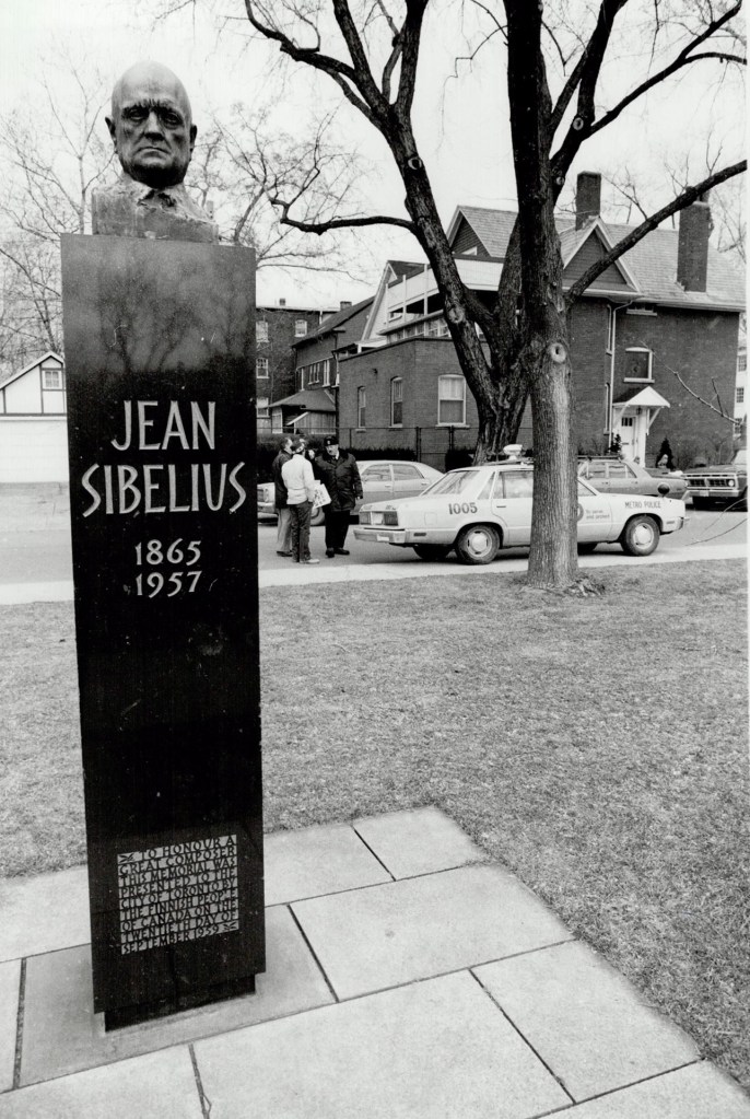
In 1959, in recognition of the diligence and passion of Toronto’s Finnish community, the little square was officially renamed Jean Sibelius Square and featured a striking monument with the Finish composer’s likeness crowning it.
My encounter with this petite and charming park was during the socially-disruptive 70s, when The Annex was transformed from a neighbourhood of red-brick mansion propriety, to one of red-brick mansion rooming houses populated by hippies and university students.
I lived in the former red brick Victorian home of a Toronto physician with fifteen other actors–including Doug Todd, who has commissioned this painting of Jean Sibelius Square. We were members of the theatre ensemble called Creation 2 (I for seven years, he for two), which was both commune and theatre ensemble:
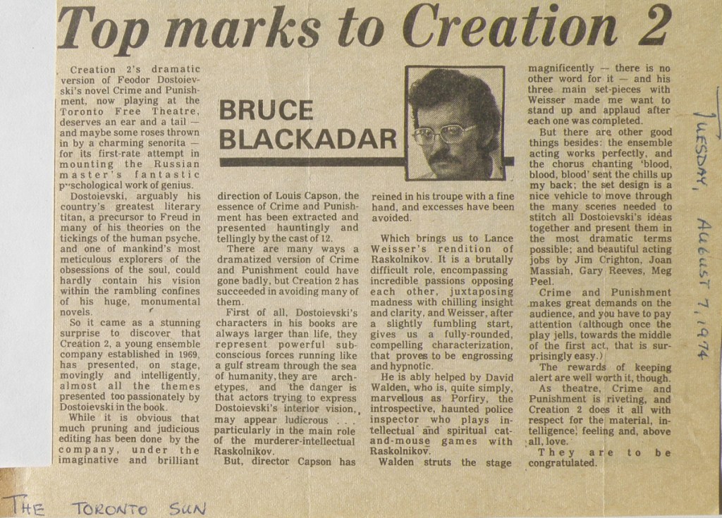
Life for Doug Todd and I, and others within the group, was a mixture of great bonding, high demands, internal turmoil and personal confusion. What had started out as a dynamic experiment combining the best of ensemble acting with the ideals of a close-knit communal living, began taking on the telling characteristics of a cult.
The Jean Sibelius Square Park, being a block away from our living situation, provided us with a treed, quiet, people-free place of calm and restoration. The watercolour depicting that 1970s’ oasis-like feeling is now finding its expression as it goes from outlined sketch to the initial wash stage:


Rock and Sky
May 1, 2018
We live in a very rocky place. Our house is situated just below a mountain ridge that is home to native varieties of cactus, sagebrush, tumbleweed, and the domain of Chukar Partridges, mule deer, black bear, a variety of hawks and owls, and the occasional Cougar.
Painting rocky scenes is something particularly satisfying due to the artistically-geometric shapes which become something of a foil for the full-blown and free-flowing movement of cloud and sky.
This was simply an experiment–discovering where shapes and natural design and configuration would lead–a painting begun without knowing where it might end.

‘The Home Place’, watercolour by Lance Weisser, 14″ x 16″, Arches Hot Press Paper
Taste of Spring
April 17, 2018
A painting drawing on a style in keeping with children’s books illustration, this painting was done for my niece and great-niece and nephews. It was done more than ten years ago now, and is of a fictional place that now seems more like Middle Earth than anywhere else.
Taken by a low grade camera through glassed-in frame, I hesitated before posting this….
![Sept2009045[1]ab](https://weisserwatercolours.com/wp-content/uploads/2018/04/sept202009200451ab.jpg)
‘Fields of Home’, watercolour by Lance Weisser
Arches Hot Press 140 lb paper,
10″ x 16″
collection of R. Jones & Family
‘School’s Out’
April 9, 2018
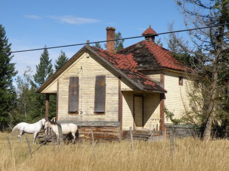
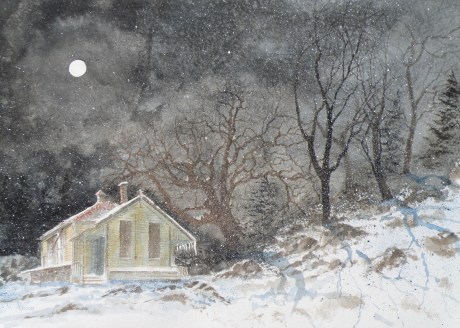
Not far from our Kamloops, B. C., home is the village of Pritchard which used to have an original one room school occupying a corner of a farmer’s pasture–a school he himself reputedly attended as a boy–that no amount of seeking to have it lovingly restored bore any fruit with historical groups or municipalities.
Fearing its derelict floors and frame would be responsible for causing trespassing children accidental injury, he reluctantly tore it all down some five years or so ago. But fortunately I managed to capture its classic image with my camera while it was still part of this farmer’s horse paddock, and I’ve painted a series of watercolours using it as a focal point.
Since it no longer exists, I choose to place this old school in settings that depart rather dramatically from where it actually had been (on a rather non-descript flat field right beside Duck Range Rd).

‘School’s Out’, watercolour by Lance Weisser, 14″ x 16″
Arches Hot Press 140 lb. Paper, Sold
…..downtown, phase 2
November 9, 2015
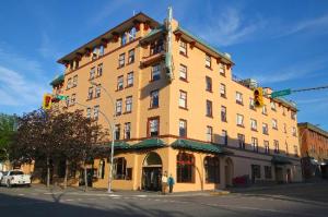
The Plaza Hotel (completed in 1928) is a five story Spanish Colonial Revival building in downtown Kamloops BC, Canada. It is listed as a cultural heritage site in the Canadian Register of Historic Places.
As is so often the case when seeking out subjects for painting, the postcard view isn’t usually very interesting.
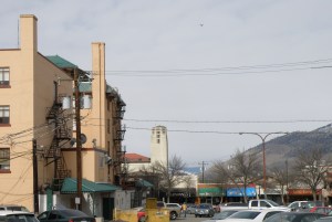
The photo used for reference for this watercolour was taken from the rear alley of The Plaza.
In view is the old Fire Hall tower, with belfry, 73 ft, built in 1935 at a cost of $24,500, when Kamloops had a population of approximately 6,000 (population today is about 100,000). It remains a distinctive landmark.
The decision to cast the subject in Winter has to do with wanting to bring some drama to the scene due to there being an overly abundant amount of sky. Pigeons have also been added to give more visual interest.
Because the hotel is a very light orange, (which gives off a bit of a pink cast in late afternoon), the sky is a wash of quin red, quin yellow and ultramarine blue in order to help incorporate the tones of the building into the rest of the painting. So quin red and quin yellow will be used as the shade of the hotel as the painting progresses.
…..downtown
October 31, 2015
Growing up in the 50s, we lived in a treed suburb of Rochester, New York (home of Eastman Kodak, Bausch and Lomb), but my father was a Pastor of a poor, post-WWII German refugee, inner city Church next to the Greyhound bus depot. My fascination with the grittier side of Rochester’s downtown must have come from how much more interesting it was compared with the staid predictability of houses and lawns and more houses and more lawns where we lived.
Sneaking away during the sermon, I’d scout out the alleyways of crumbling late 19th century brick tenements with their fascinating tangle of iron fire escapes doubling as fasteners for clotheslines, festooned with gingham tablecloths and sheets and jeans. Labyrinths of back-doored kitchens, cooks smoking, observing me in my too-small Sunday navy suit, an out-of-place kid trying to look nonchalant and part of the scene.
Luckily for me, Kamloops has that kind of feel. It is a railroad hub, cow ranchers beyond that–a labourer’s city–begun in 1812 as an outpost of the Hudson’s Bay Company, and has enough Western wear and roughness that some citizens feel our downtown still lacks class. By ‘class’ they mean there aren’t enough designer boutiques and specialty shops.
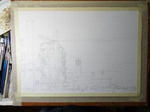
This is the start of a painting of downtown from behind one of the old hotels. . . .
The intention here is to make this a Christmasy, snowy subject, and its progress will be followed as the days go by.
venice challenge
September 6, 2015
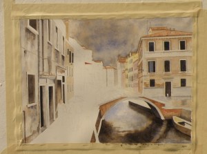
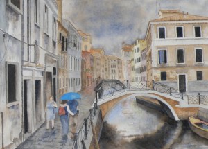
We’ve reached the finish line, limping all the way. This was somewhat beyond my abilities as a painter. Whether a success or not, every endeavour provides a great learning experience. All the watercolourists looked up to for advice offer the same counsel: when it comes to watercolour as a medium, suggesting detail far surpasses actually getting bogged-down in it. The pitfalls begin when the painter keeps trying to improve on what’s there.
Despite the overworked areas, enough aspects work to allow this to maybe escape the scrap heap — but probably not. It would, however, be useful to begin it again and learn from the errors.
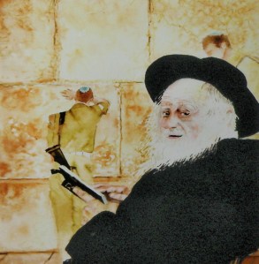
שַחֲרִית Shacharit — Morning Prayer
August 27, 2015
In January of 1990 I had the privilege of going on a tour of Israel conducted by an outstanding Orthodox guide named Joe, who was so completely well-versed in history and biblical understanding that archaeological sites acquired lively, humanized detail under his well-studied knowledge of what we believe took place there.
Though he was conducting about a dozen clergy, he was able to draw comparison between traditions which were tied to ha aretz (הארץ), to the land, helping us see the visceral, physical connections we’d only tried to understand through having read the ancient texts and stories.
‘Western Wall Shacharit’
watercolour on Arches Hot Press 140# Paper, 10″ x 15″, sold
The Western Wall is almost certainly the most revered of all sites in Israel, as it physically connects worshipers to those before them who also had to struggle to build a homeland–who also had to appeal to that higher power to protect and defend them.
I felt privileged to have been able to see Israel at a time when the intifada was at a standstill and veritably every location in the country was accessible and security was more relaxed. We could travel the Golan Heights as well as the West Bank, stand at the Lebanese border and visit the historic cities and towns throughout the land.
…this is a repost from an entry several years ago
venice challenge 3
August 14, 2015
It is so affirming when blogging friends don’t find details about paint pigments and their sedimentation arcane. One can easily picture guests around a table nodding-off face-first into their creme-brulee.
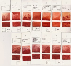
In the Renaissance, clay earth from Siena, Tuscany, (Terra di Siena, “Siena ground”) rich in iron oxide and manganese oxide was used for pigments. In its natural state, is a yellowish clay, and becomes raw sienna as a pigment. When heated up, it turns reddish brown and becomes burnt sienna.
However, due to its being heated up, there is a variety of watercolour burnt sienna shades and hues among the various manufacturers because some heat it a little more, some a little less, making it somewhat more or less ‘burnt’.
http://janeblundellart.blogspot.com.au/2013/11/watercolour-comparisons-4-burnt-sienna.html
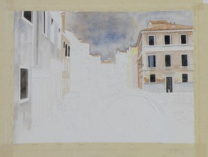
Ultramarine and burnt sienna will be the two colours for the whole piece with the exception of a bit of Rose Madder and Quin Gold for the more distant buildings. Doing so (almost) guarantees integration. That is because a viewer’s eye will find a colour harmony whenever the pallet is limited, as no one colour or tone will be glaringly different from the rest.
stage two
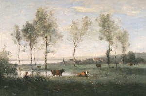
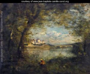
Focal points are achieved in limited-pallet paintings through value contrast (the dark windows against the lighter walls), rather than by there being a glaringly-different colour thrown in. That said, some of the early masters used a glaringly-different colour to great visual effect, as in Corot, whose ‘signature’ accent was the use of a dash of scarlet in an otherwise integrated landscape….
JEAN-BAPTISTE-CAMILLE COROT (1796 – 1875)
(sources for ‘burnt sienna’ from Jane Blundell and Wikipedia)
venice challenge 2
August 12, 2015
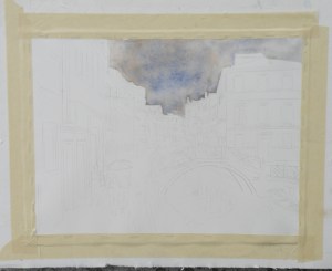
The ongoing quest to interpret in watercolour a photo of Venice by Frank Dwyer of our local Kamloops Photo Arts Club has begun to take shape with a decision to take this 11.5cm x 16.5cm image and paint it as bigger–28cm x 25.5cm (11″ x 14″) –simply because a miniature of such a complex scene might prove less successful.
So here goes….
As much as the photo (entitled ‘The Blue Umbrella’) reveals damp pavement and the umbrella-holding couple, the sky isn’t quite as rainy-looking as perhaps it can be made to be for artistic interpretation purposes. So ultramarine blue and burnt sienna were applied to the whole of the sky as a wash.
Ultramarine Blue has a nice quality of being one of the ‘granulating’ pigments of watercolour. Its origins stem from the grinding of lapis lazuli, and received its name from the Latin ‘ultramarinus’ (meaning ‘beyond the sea’) .
So treasured and prized by the early painters, ground lapis (from Afghanistan, principally) was used by the painters of early icons as the garments for The Blessed Virgin. (When The Holy Mother is depicted, her robes are red.)
In 1826 a synthetic version was created which itself derives from a mineral compound, lazurite, and is today the most complex of all pigments. Being a ground mineral, ultramarine produces sediment that dries in a granular way when mixed with water.
To get this effect, however, the painter must apply ultramarine as a wash so the sediment can, in fact, separate and settle to create granulization. That is why, then, the sky dropped into the first stage of the painting appears granulated and gives a kind of antique look. If ultramarine is applied with only a bit of water, or straight from the tube (yikes), it will not granulate as such.
Some watercolourists are so avid about granulization, they buy a granulating medium from Daniel Smith, which, when mixed with most any watercolour paint, granulates. However, the natural granulating pigments are raw umber, burnt umber, raw sienna, and some brands of burnt sienna. That is because they come from the earth, and earth leaves sediment.
All of this material comes from a variety of sources, including http://janeblundellart.blogspot.com.au/ — (a very thorough and devoted watercolourist from Australia).
venice challenge 1
August 9, 2015
Our local Kamloops Photo Arts Club is doing a joint arts project with our Kamloops Courthouse Gallery, involving the pairing of chosen art photographs with various art media interpretations based on the photo.
At one of our meetings we sat around large tables with a great many photographs strewn about, and at a given moment were invited to select ones which struck us as exciting to base our own work on. Jan, who is a weaver, selected photos which spoke to her about textures and colours. Others went with shapes, values, composition.
As a student of representational painting technique, almost all of the photographs were appealing due to their rich tones and lively views. One in particular was very striking because it involved architecture and rain and water, and an exemplary scene from that painter’s perennial eye-trap, Venice–a place so overly painted, yet so eternally attractive.
“Blue Umbrella”, 11.5cm x 16.5cm (4.5″ x 6.5″), Frank Dwyer KPAC, 2014
Choices had to be made immediately about size, complexity (whether to simplify while not messing with the integrity of the scene), wetness/dryness (very rainy? or as is), attention to detail (loose interpretation, or ala the photo itself), type of paper, and selection of pallet (minimal number of colours, or full compliment), overall tonal value (to keep it dark or go for something less so).
There is a website where its blogger goes to great and tremendously helpful lengths to demonstrate the qualities of particular watercolour colours when mixed together. Her name is Jane Blundell http://janeblundellart.blogspot.com.au/. When wanting to know what might work well as a pallet, she never fails but to provide great choices. So it was through her that the combination of Ultramarine Blue and Burnt Sienna was selected as the backbone for this challenging photo/watercolour project.
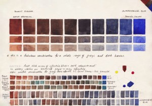
combination of visual effects possible when combining burnt sienna and ultramarine blue, Jane Blundell: Watercolour Comparisons 4 – burnt sienna
This visual and written saga will continue as progress is (slowly) made on this. If all is well, the painting and the photograph will be displayed side-by-side in The Main Gallery of The Old Courthouse, Kamloops, B. C. for the month of November. (www.kamloopscourthousegallery.ca)
mountain pine
June 20, 2015
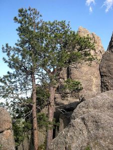
In January 2011, a Pacific ponderosa pine in the Rogue River–Siskiyou National Forest in Oregon was measured with a laser to be 268.35 ft (81.79 m) high. This is now the tallest known pine. The previous tallest known pine was a sugar pine.
Ponderosa Pine photo by Jason Sturner
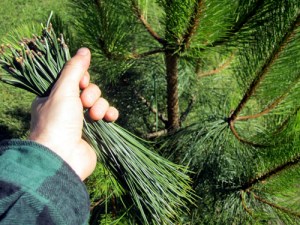
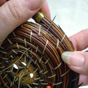
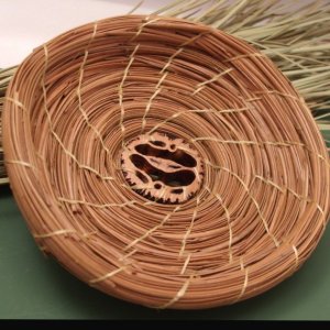
The needles are harvested by First Nations and other local artisans, then washed and woven into Ponderosa Pine needle baskets . . .
(photos: PineGardenBaskets, Etsy)
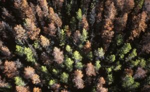
The mountain pine beetle is just over six millimetres long (about the size of a grain of rice). But the tiny forest insect has infested huge areas of mature pine around the interior of British Columbia, causing colossal amounts of damage on B.C. forests.
The beetle likes mature pine and mild weather. Because B.C. has more old pine than ever before, and has had several consecutive mild winters, mountain pine beetle populations have exploded to epidemic levels. (source + photo: Government of British Columbia)
Here in Kamloops, B. C., even pines growing in people’s yards get ravaged–as much as in our great forests. It is a helpless feeling, yet more and more innovative products are being developed from pine beetle timber.
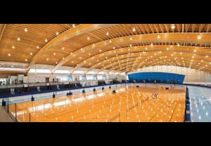
Below is the Richmond, B. C., Olympic Skating Oval, totally made from pine beetle-killed timber. The wood has retained all the pine beetle bores and markings, and has been acclaimed as a ‘truly majestic work of art and design’.
photo: Architectural Review
joan’s place
June 7, 2015
THIS FORMAL AND RATHER LOVELY Heritage Home in our small city (90,000) of Kamloops, B.C., (canada) is known as the Dr. M.S.Wade House. Dr. Mark Wade was an eye, ear, and throat specialist who arrived in Kamloops in 1895. A decade later, in 1905 he built his home. It has become a great favourite painting subject of mine . . .
THE BASIC SHAPE OF THE HOUSE is undecorated and angular, but Wade added rich Victorian millwork and slender, turned verandah columns. Bay windows, stained glass and a wraparound verandah are lovely features to this home.
IT IS SUCH AN APPEALING SUBJECT. The reasons for this are my enjoyment of Victorian architecture, how the many nuances of this design capture the imagination, (especially when situating the house in the midst of ‘moody’ seasonal weather), and how its present owner adds her own personal touches. The watercolour below has been posted here, but some years ago now. . . .
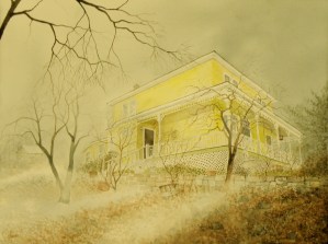
‘Foggy Dew’, November, Dr. Wade Home’, watercolour, Arches 140# Cold Press Paper, 36cm 50cm (14″ x 20″), J. Potter Collection
BUT A MORE SUMMERY ONE is of a portion of the house at the very back which can be faintly seen at the far left in the painting above . . .
“Joan’s Place”, watercolour on matt board, 23cm x 31cm (9″ x 13″)
THIS WAS AN EXPERIMENTATION in depicting grasses on the almost glassy smoothness of plain old white matt board. As a finished painting, it is so-so. The composition suffers from there being just a bit too much grass, and how the lawn ornaments unintentionally became the subject. Without an interesting focal point, in the end it was a helpful study in summer grasses and pines–and an instruction in what to avoid in seeking good composition (i.e. not everything in a photograph needs to be included).
conveying mood
May 14, 2015
THE HERITAGE HOMES in our city of Kamloops were built at the turn of the 20th Century and are really rather distinctive, reflecting a very decided Victorian panache. Here are a couple which have been perfectly maintained….
PAINTING-WISE, the more interesting homes are, for me, the ones which have been given up for rooming houses, and therefore rather neglected….
THE OBJECTIVE is to successfully convey a particular mood to the viewer–in this case, a certain melancholy–a fragile attempt at dressing-up a once-proud home in the midst of frigid temperatures and icy snow.
The buyer of this painting saw it in the Gallery and exclaimed that her parents had had this house built, and immediately claimed it for her own. It suddenly made me wish I hadn’t been quite so accurate about painting in the worn and shabby details.
a constable of ravens
April 24, 2015
YOU’VE HEARD OF ‘a murder of crows’, a ‘volery of birds’, a ‘brood of chickens’. The term for the groupings of Ravens is less fixed. Ravens were/are often seen gathering about The Tower of London, and in meaner times, The Tower was a Royal place of execution (Anne Boleyn, et al) .
AN UNKINDNESS OF RAVENS is what a grouping of them was called when a Royal was awaiting death–as though their presence was a foreboding, a cruel anticipating, a sign of ill will.
A CONSTABLE OF RAVENS is what their grouping was called when The Tower was no longer sinister, but rather a symbol of The Monarchy itself. Their presence in such times meant they were keeping guard over the Royal Family. Ravens were a constance, a watchful presence–a constable.
A CONSPIRACY OF RAVENS is another label for their gatherings, stemming from their ganging together whenever there’s carrion or bodily remains to be picked apart and eaten. Ravens don’t allow other than their own to share in the find.
A WOMAN IN OUR TOWN THUMBS HER NOSE AT by-laws and ritualistically feeds Ravens all through the Winter months by pouring out cat kibble in several of her collection of decorative cement-cast bird baths around the yard of her time-worn and historic home.
‘Where The Heart Is’
watercolour, 41cm x 50cm (16″ x 20″), 140 lb. Arches Hot Press Paper, J. R. Weisser Collection
THE INTENTION of this rather busy piece of work is simply to allow the viewer entry into Joan’s world. Sometimes our hearts want to be filled–if not by another’s affections, then by the things we’ve grown fond of–and sometimes, not just filled, but rather overflowing with so much that we’ve come to take heart in, that its accumulated presence brings with it a comfort.
A CONSTABLE OF RAVENS watches over and protects and guards the fading beauty of Seasons gone by, loves had and interred, and a lasting, loving sanctuary of the heart–as yet another Autumn invites one inside to sit by the fire and grow warm, and remember.
ACEOs (Art Card Editions and Originals)
April 20, 2015
ARTIST TRADING CARDS aka ART CARD EDITIONS AND ORIGINALS are popularly known as ACEOs. ACEOs are the size of baseball cards–65mm x 89mm (2.5″ x 3.5″) and are purchased and then traded and sold the way sports cards are. The ACEO movement originated in Switzerland in the 90s but grew in popularity through eBay, where art cards are now sold and bought on a 24hr basis.
They require precision and are very enjoyable to do. But then, who wouldn’t be fascinated by the challenge of painting tiny things (smile). The subject matter can be chosen by the purchaser, and the painting done accordingly.
Same subject, different take…
March 17, 2015
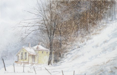
THE OLD SCHOOLHOUSE is once again the subject……
THIS TIME around, a horse was to be included, which meant it could not be a nocturnal scene, as that would be an odd addition to a night painting. The choice was made to have only a single horse, even though horses are most often seen in pairs or groups, being a social animal…..
THE DECISION over depicting a single horse was selected as adding to the feeling of isolation: a lone horse beside an abandoned school in a lonely, forgotten field in the dead of winter……
“FROZEN IN TIME”
watercolour, 12″ x 15″, 140 lb. Arches Cold Press Paper, Kamloops Courthouse Gallery, Kamloops, British Columbia http://www.kamloopscourthousegallery.ca
