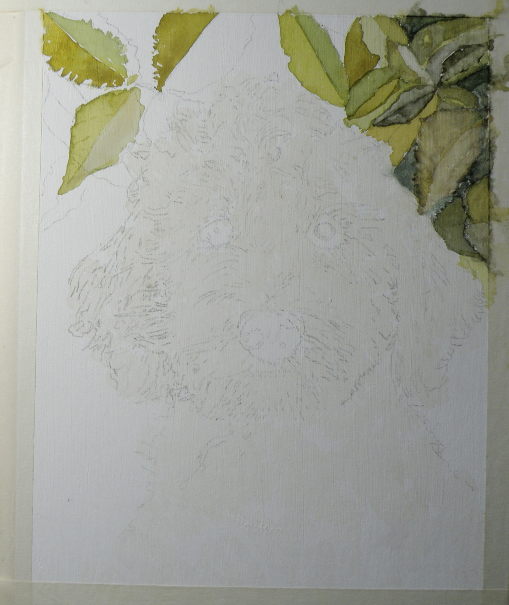
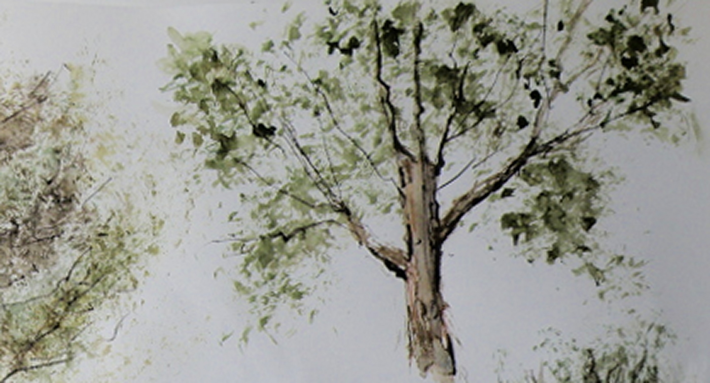
Painting Progression 2: Juno
March 6, 2021
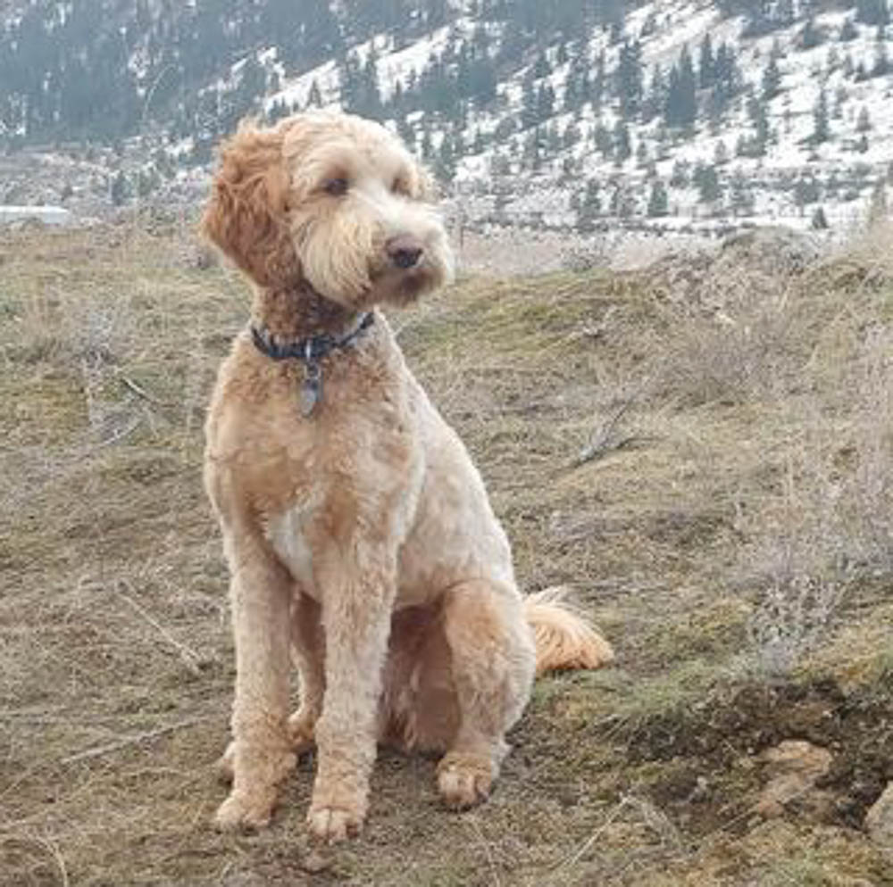
Because Labradoodles are created by mating a Labrador with a Poodle, any number of colour combinations are possible, including black, dark brown, reddish brown, blonde-brown and who knows how many others. Each puppy can be more like the father, or take after the mother, with different fur/hair qualities as a result. Juno’s hair is a delicious golden colour and not as tightly curled as a Poodle, but not as straight as a Labrador, and so very curly and yet wavy.
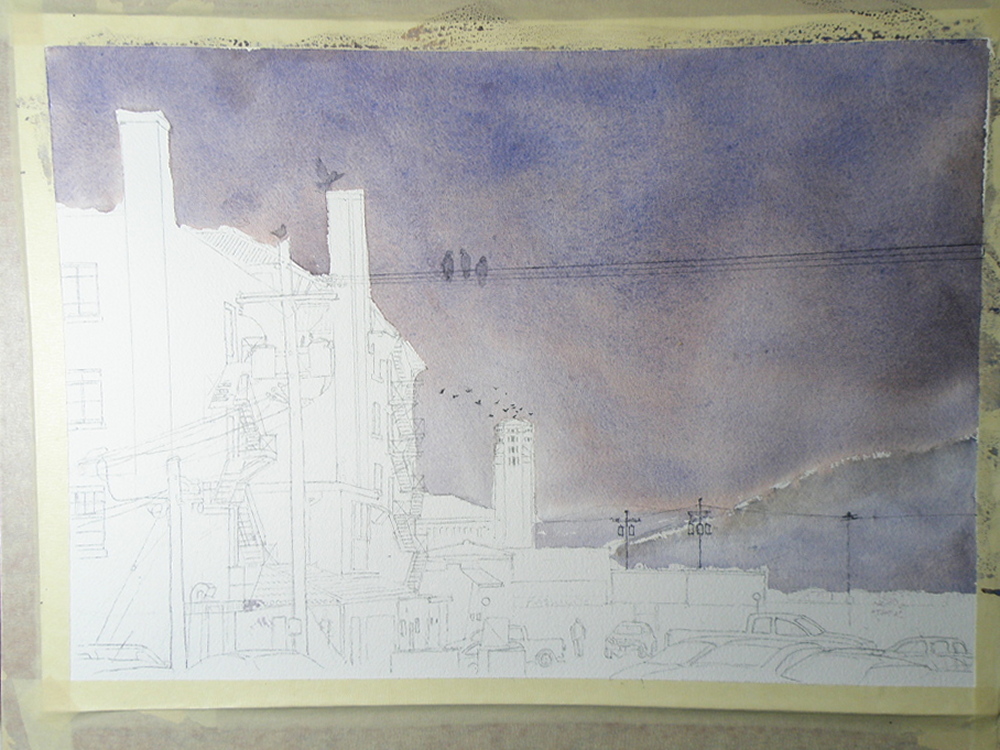
Here is the way the painting progressed from the initial sketch and wash:
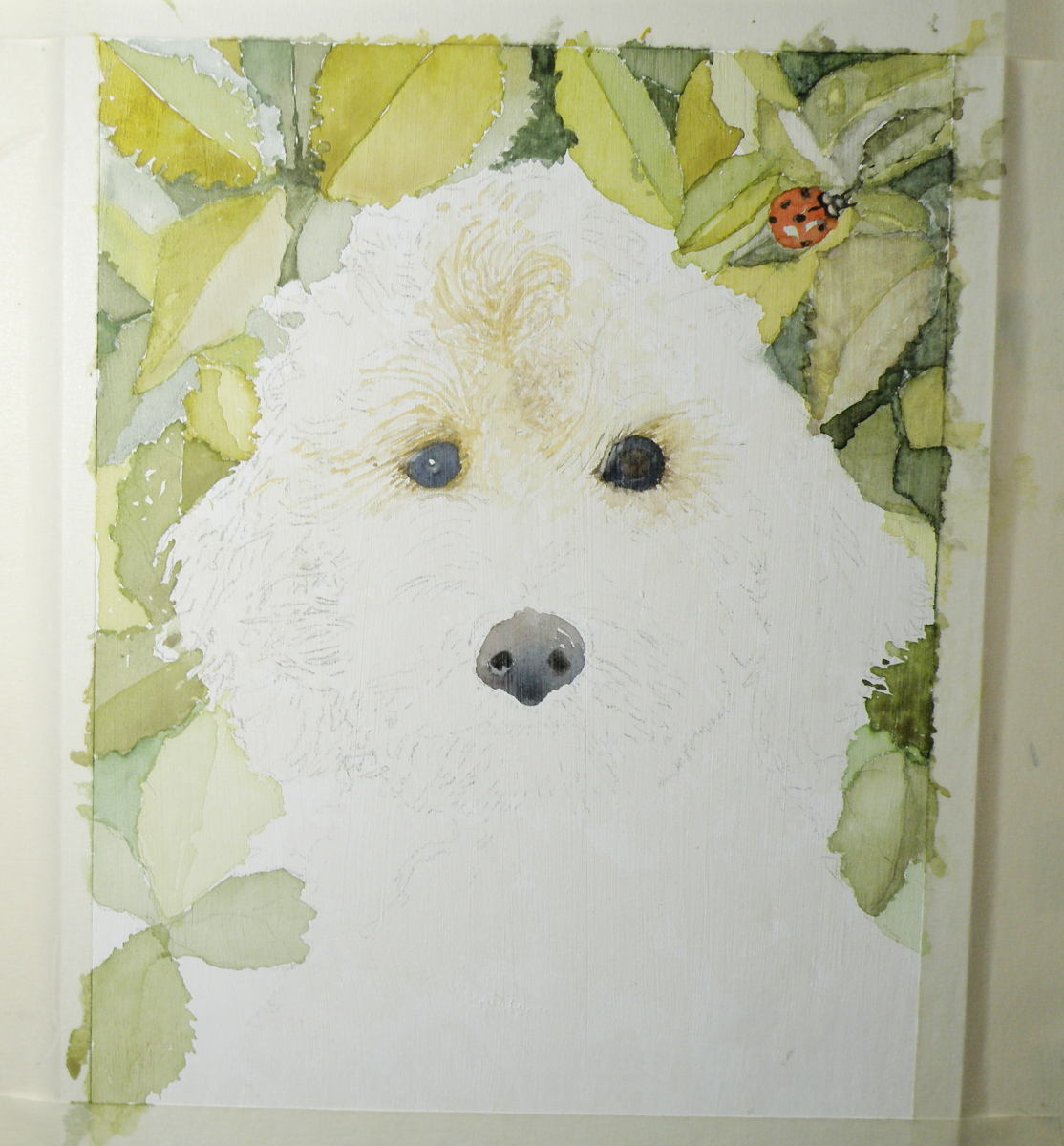
Personally, I have a need to establish the eyes and nose before progressing further. If they don’t happen correctly, forget about it. I was satisfied that my attempts looked true enough to the image I was given to work from to keep on working.
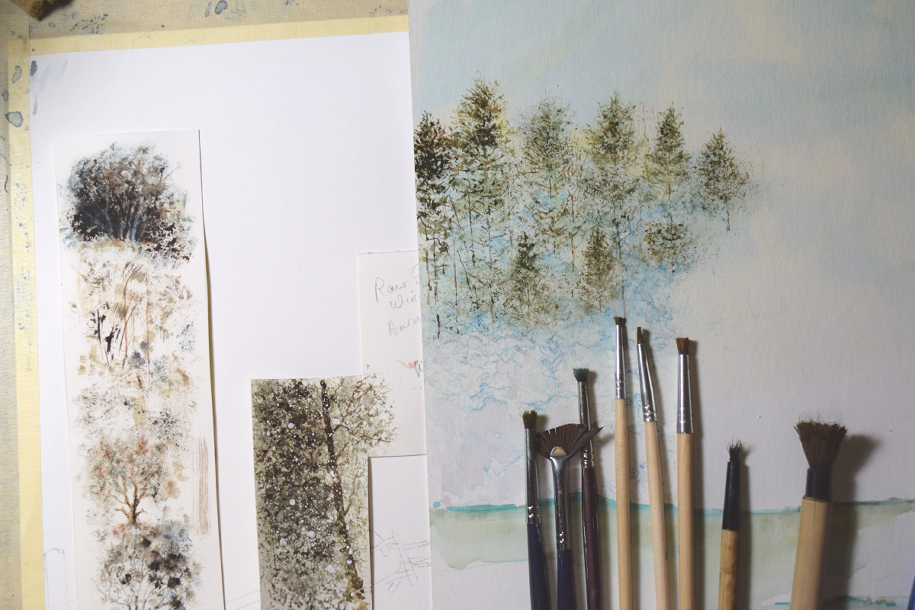
Painting Progression: Juno
March 5, 2021
To help celebrate the birthday of a recently retired Occupational Therapist and good friend–Kathie–her spouse, Ken, the Dean of our local Anglican Cathedral, provided me with photographs of their very charming one year old Labradoodle dog, Juno. My hope was to present Kathie with a watercolour portrait of Juno to mark her upcoming, significant ‘0’ birthday,


Dog portraiture is not something I have experience with/in. And Juno being from a breed known for its gorgeous curls and wavy hair/fur, presented challenges I wasn’t convinced my experience with watercolour could overcome. Fortunately, this painting was one I offered to do, and so if it was beyond my abilities I simply had to say so and produce a watercolour of another subject I knew Kathie would enjoy receiving.
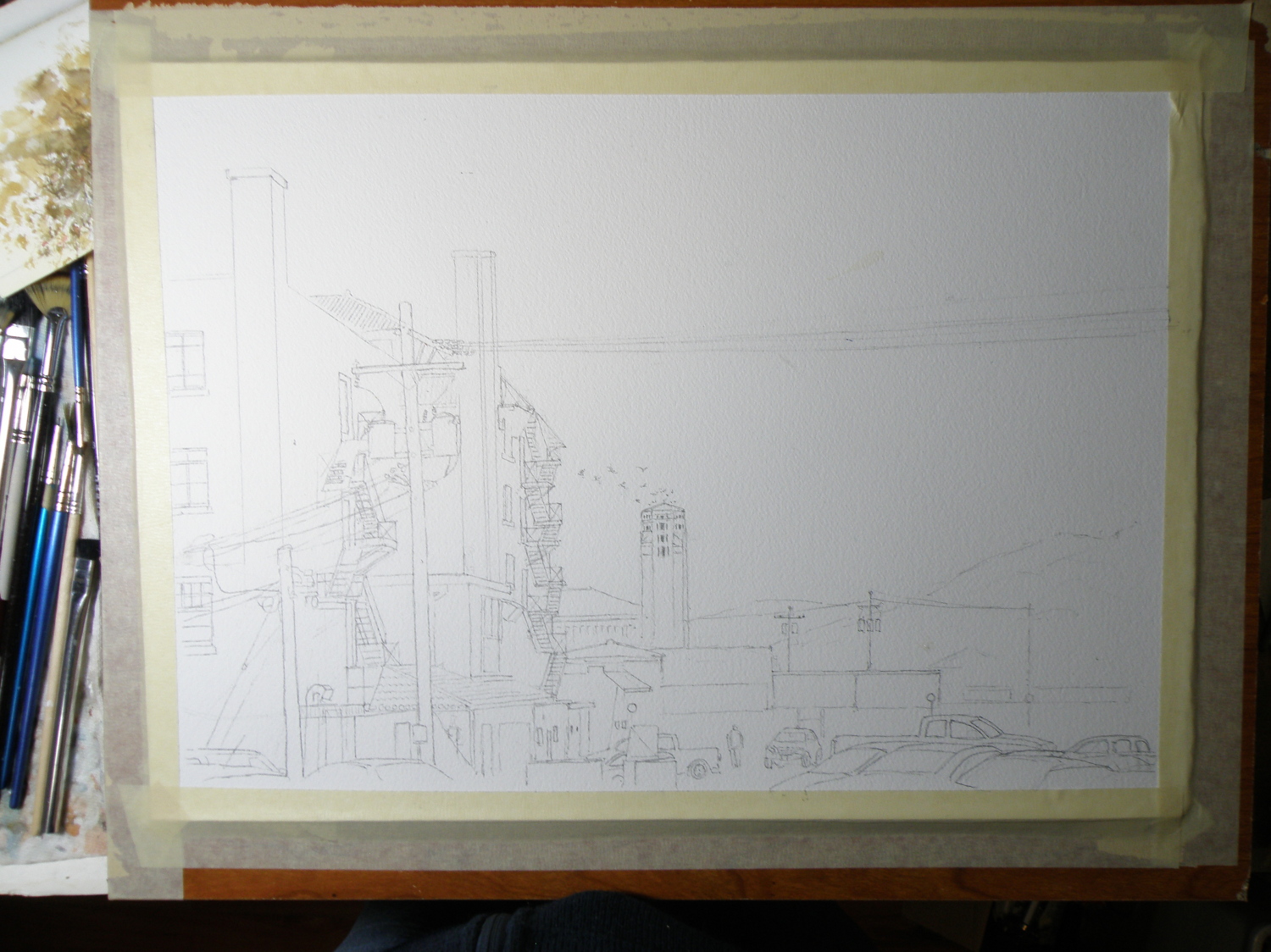
I started with a detailed drawing:
Because Juno’s place to be is anywhere outdoors, I decided to provide a rosebush background.
When it’s all about sky….
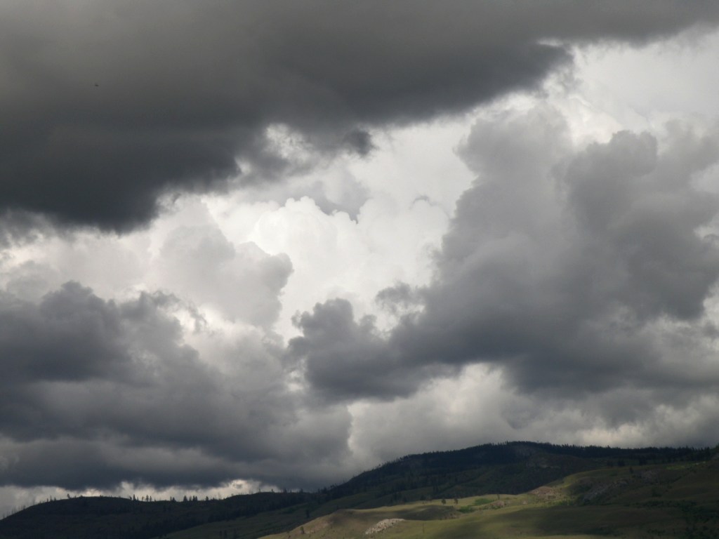
August 1, 2020
Lately here in Kamloops, British Columbia, we’ve been treated to cloud Cirque du Soleil. Each time I step out on our deck, there’s another stunning performance in progress:


As a student of watercolour, the challenge of painting skies on location doesn’t come from the medium itself because all it amounts to is sloshing water-tinted pigment over paper.
It doesn’t get more immediate than that.
Clouds are suspended water vapours being moved about by the atmosphere and wind. So a marriage made in heaven–immediate subject matter matched with an immediate medium, yes?
Um, well, maybe for some…. It takes a lot of confidence, deftness and elan to nail a quickly changing sky, and those aren’t exactly my gifts.
What helps move my senior’s ass is panic-induced adrenaline, like the time I brought all my equipment down to Kitsilano Beach in Vancouver. Perched in my umbrella-shaded lawn chair, sipping iced tea, leisurely sketching the Vancouver skyline, I noticed the sky dramatically changing from a fluffy blue to an angry charcoal.
After lugging everything from the parking lot to the shore, I wasn’t about to give up my precious spot for a little weather. Prudence did step in, however, and whisper in my aging ear that I had only minutes to accomplish what I’d been taking hours dallying over.
And then the rains came down, bruising the top of my umbrella, the beach crowd scattering, wind whipping the waves. As the saying goes, ‘in for a penny, in for a pound’, I finally found my spine and went for it, drops pelting my paper, gusts throwing up sand.
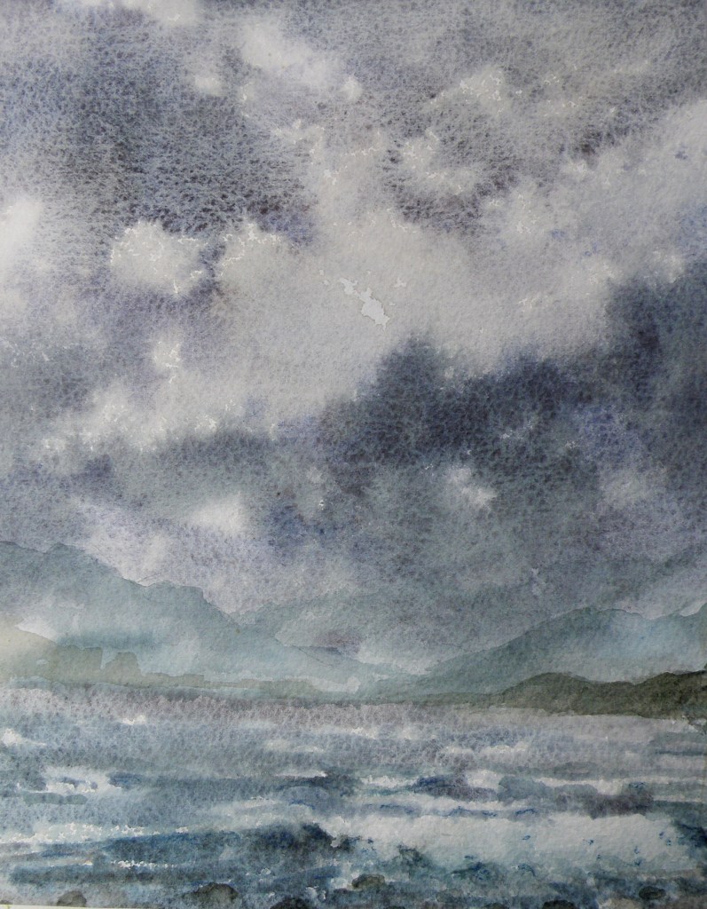
Cloud Studies
July 21, 2020
Sometimes there’s a need to trample on whole bunches of internal dos and don’ts, accumulated over years of anal retentive watercolour practices.
‘Don’t premix washes–glaze one pigment over another right on the paper’; ‘Don’t soak the paper in the bathtub and then stretch it on a stretcher–it removes the lovely sizing’; ‘Don’t get obsessed with detail–be expressive’; ‘Don’t use opaque white’; ‘Don’t use so much masking fluid’; ‘Don’t be so timid’; ‘Don’t paint today–you aren’t centred’.
Lordy. I went to the sink, grabbed a kitchen sponge and some dollar store poster board.

For all who might be equally plagued by a mental build-up of watercolour dos and don’ts, have a look at this example of watercolour exploration and artistic daring:
Sky Positioning and Treatment II
July 1, 2020
Just as choosing to place one’s subject matter in front of bright sky produces remarkable effects as in the work of Joseph Zbukvic, so also can equally-remarkable effects be achieved when making the sky itself the subject.
An almost unparalleled master is a lesser known watercolourist than the celebrated J. Zbukvic, but a truly exquisite painter of both sea and sky, the Russian Sergey Temerev:
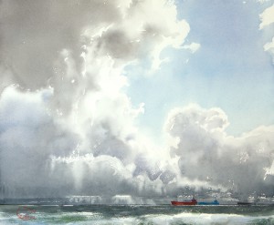


Here is a video of him at work:
Now, those are clouds.
Sky Positioning and Treatment
June 29, 2020
If one were to try and name the No. 1 watercolourist on the planet–or at least the most popular and followed–it would be safe to claim it is the Australian, Joseph Zbukvic:
The word ‘master’ understates the enormous talent and skill Joseph Zbukvic exudes from his artistic fingertips as he transforms a sheet of white paper into whatever his mind fancies.
Taking a moment to view these examples of his prodigious output, one thing might stand out to us when it comes to focusing in on, and studying Mr. Zbukvic’s skies:
Joseph Zbukvic’s signature artistic decision is at odds with a great many of his colleagues, because he takes the daring approach of nearly always rendering his subject matter facing directly into the sun.
This has the effect of placing everything of interest–whether it be buildings, people, horses, boats, vehicles–more or less in silhouette, backlit and often somewhat mysterious. Making this choice provides any artist with a great deal of painterly latitude simply because, whatever we might be trying to view while looking directly into the sun, is going to be greatly lacking in detail. Looking into the sun, we see general shapes, outlines of things, and blurred, obscured objects and people.
Placing everything in front of direct sunlight means one doesn’t have to attend to minute detail. It means there will automatically be contrast, exaggerated shadow, enormous differences between light and dark, and all the drama a watercolourist needs to make a painting ‘pop’.
If one does a search of YouTube watercolour instruction these days, you will find a great many Zbukvic devotees, with their subject matter silhouetted against a bright sky. It has now become almost the de rigueur approach for aspiring watercolourists.
What is sacrificed by placing all subject matter in front of direct sunlight?
Skies.
All the luscious drama of cloud formations and subtlety of light which plays in, around and between the loveliness of clouds is the price one pays. Viewing Zbukvic’s work makes that seem worth it, at least for him.
However, as influential as some artists are, and deserve to be–for those bettering their skills, it is always important to remember that variety still remains the spice of life. All painters have their own unique painterly story to tell, in their own unique manner–and not all paintings need to be looking directly into the sun. I suspect Mr. Zbukvic would be the first to agree.
Cloud study
June 21, 2020
The problem is, clouds can look terribly dark, yet the prevailing wisdom by learned painters is the caution that regardless of how dark the sky might appear, it is the lightest component of any landscape painting–except in rare cases like snowscapes, or some seascapes.

The temptation, at least for me, is to go about trying to recreate that memorable sky full of drama by mixing up a bucket of what might best be described as ‘peat bog grey’ or ‘burned frying pan umber’ and sloshing it onto the top of the picture.
The end result is a landscape where anyone deigning to walk would be greatly at risk–paintings where interspersed throughout should be little yellow triangular signs reading: WATCH FOR FALLING CLOUDS :

The other prevailing wisdom by a great many worthy painters, is that if one’s painting is featuring clouds, then whatever else is depicted ought to be kept rather simple and relatively free of detail. Conversely, if the focus is on whatever is happening below the sky, then the sky itself should be left unassuming and merely supportive. The above painting is a good case proving that point.
Where Green Reigns Supreme
February 10, 2020
In watercolour-land much discussion takes place over how one goes about dealing with an abundance of greens in a given landscape. Summer landscapes abound with green, all of them different in hue and tone and degree. The old school adherents council the need to create greens from the various blues and yellows available on one’s pallet–that using those pre-mixed greens directly from tubes will only clash.
So if one is using Cobalt Blue for one’s sky, for example, using it with a Raw Sienna or New Gambodge for a foliage green will integrate it, anchor it and serve to unify the painting, as long as one then also uses the Raw Sienna and New Gambodge in other parts of the painting as well.
There are, however, such a huge variety of pre-mixed Greens being offered, it is almost too tempting not to use them, or at least borrow from them when mixing a blue and yellow, as was done in this little sketch of a Bulacan yard, Philippines. My spouse, Raul, is from there, and I stayed for a month each time over three years, a place so fresh and lush, it is a virtual and visual smorgasbord of every green there is.
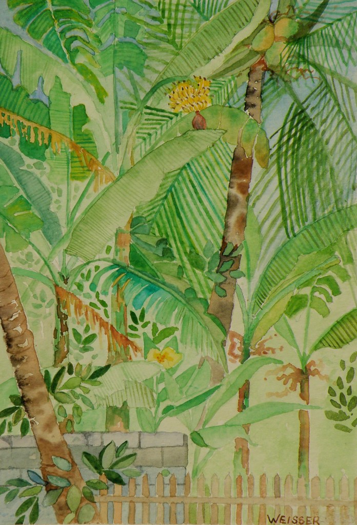
watercolour sketch, 5″ x 7″ on ordinary card
by Lance Weisser
Stage Two: ‘Raven Winter’
February 14, 2018
The painting for my friend Patricia Kellogg is taking shape. The treated surface of the mat board I’m using to paint on was/is achieved by applying a product by Daniel Smith called ‘watercolor ground’. It comes in a jar and is painted onto any surface one desires, instantly turning it–once allowed to thoroughly dry–into one which can be painted on using transparent watercolour. So, glass, metal, wood, masonite, anything of the kind can basically become a surface with the characteristics of watercolour paper.

…..downtown, phase 2
November 9, 2015
The Plaza Hotel (completed in 1928) is a five story Spanish Colonial Revival building in downtown Kamloops BC, Canada. It is listed as a cultural heritage site in the Canadian Register of Historic Places.
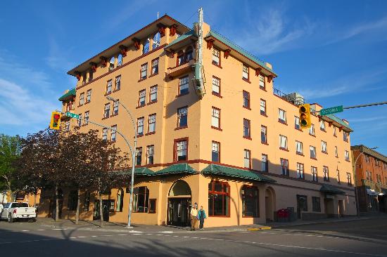
As is so often the case when seeking out subjects for painting, the postcard view isn’t usually very interesting.
The photo used for reference for this watercolour was taken from the rear alley of The Plaza.
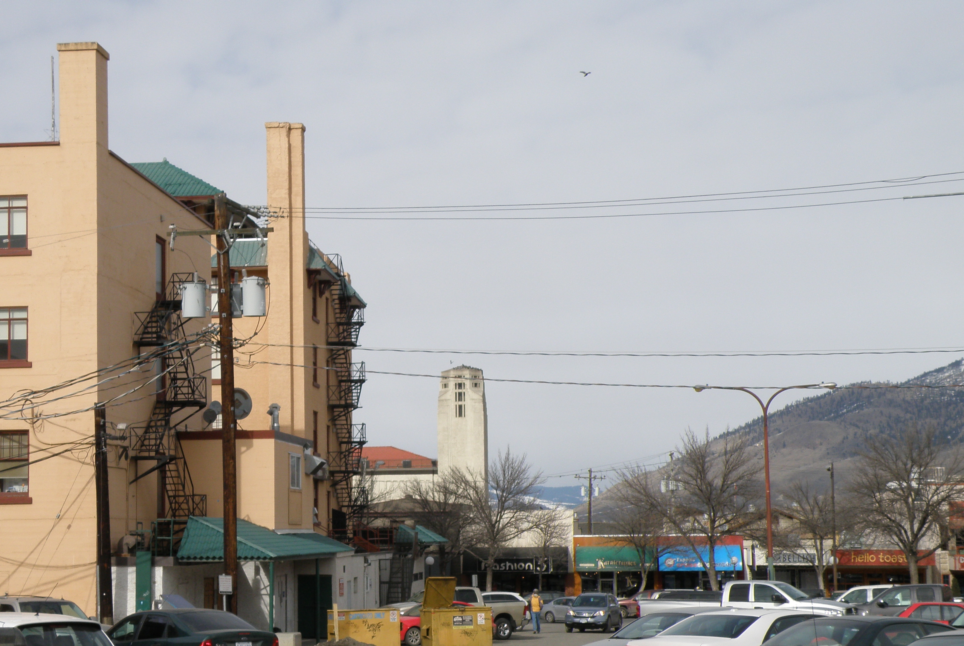
In view is the old Fire Hall tower, with belfry, 73 ft, built in 1935 at a cost of $24,500, when Kamloops had a population of approximately 6,000 (population today is about 100,000). It remains a distinctive landmark.
The decision to cast the subject in Winter has to do with wanting to bring some drama to the scene due to there being an overly abundant amount of sky. Pigeons have also been added to give more visual interest.
Because the hotel is a very light orange, (which gives off a bit of a pink cast in late afternoon), the sky is a wash of quin red, quin yellow and ultramarine blue in order to help incorporate the tones of the building into the rest of the painting. So quin red and quin yellow will be used as the shade of the hotel as the painting progresses.
….depicting snowy pines
October 22, 2015
Snow-laden firs and pines aren’t the easiest of subjects for depicting in watercolour–(at least not for this painter). The challenge comes in first understanding the effect snow has on branches, for, obviously, there is snow and then there is snow–each snowfall having its own unique effect. That crystalline, hardened seizing of tender branches by icy snow pulls them heavily towards the ground, while sub-zero powdered flurries creates a mere dusting of needles–each presenting technical challenges.
Of course, the problem is one of always having to paint around the white of the paper allowing it to ‘be’ the snow in watercolour. Given that opaque white can’t be used, a light dusting on pine needles becomes really quite a bit more difficult than painting the after-effects of a full-blown blizzard. Leaving minute dots of paper surrounding green needles is a recipe for madness in my book. Give me a snow-stormed pine any day of the week in its place.
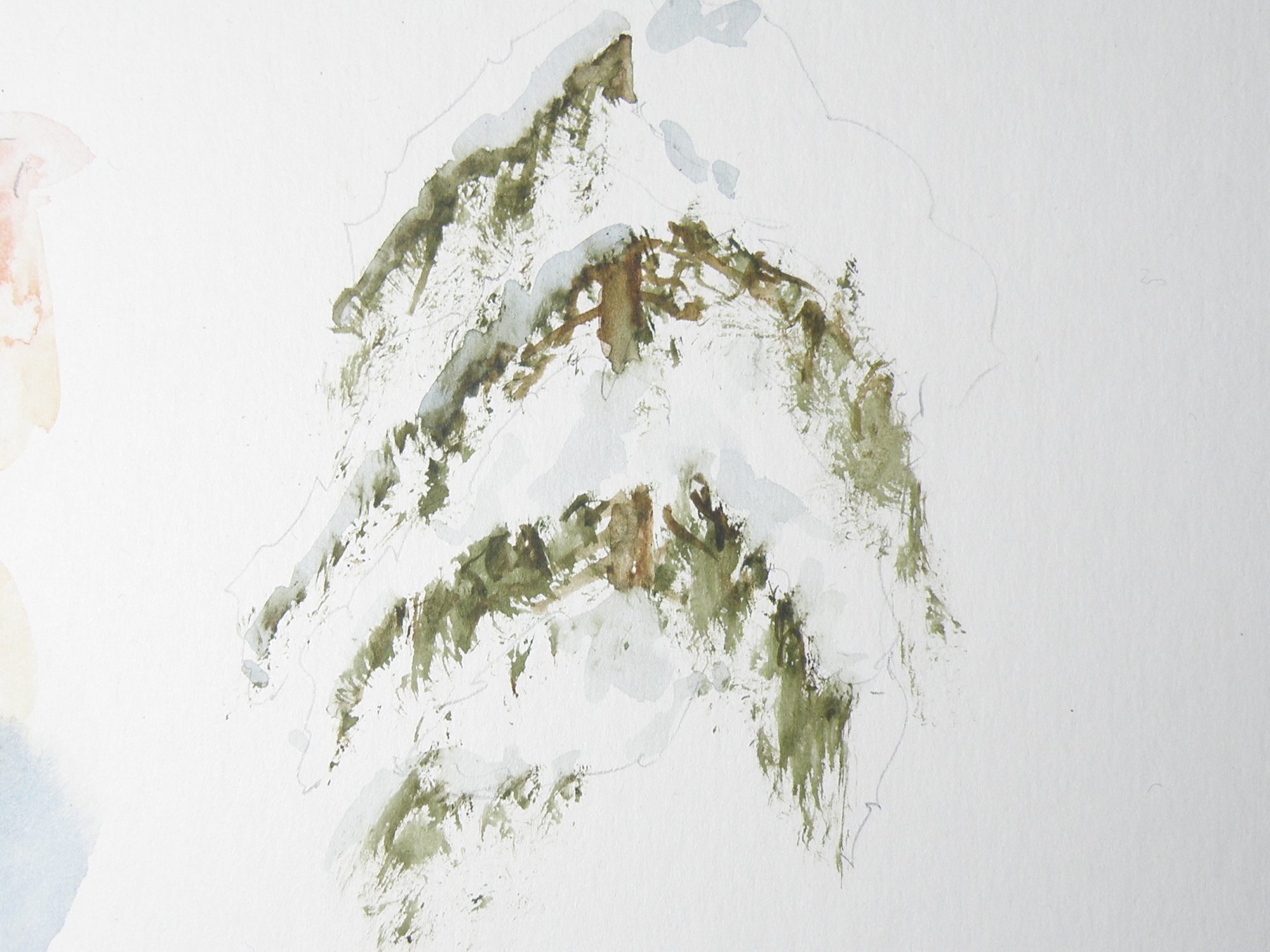
Figuring out just where branches are on a given variety of pine, fir, balsam, cedar or spruce is key to understanding where snow will sit when on them. So it seems crucial that any study be limited to particular species, (in the above case, cedar) — otherwise, a painter of representational art will be in danger of ending up with a kind of ‘marshmellowed’, generic evergreen most often seen on Hallmark Christmas cards.
Truly, each variety of coniferous tree accepts snow in its own unique way. A blue spruce, for example, with its stiff, jutting branches, is much more able to bear the weight of snow than the red cedar in the above study, whose branches are prone to drooping and bending.
This study was done on leftover piece of plain white matt board, using a chopped-up small fan brush to go after the greens, then a more pointed, conventional brush to soften the hard edges and provide shadowed depth to the snow. The branches aren’t quite correct. Once snow is included, it changes perception to such a degree, I have trouble understanding where it goes and branches fall.
The beauty of our being blessed with so many evergreens to choose from comes in knowing that each one offers the student of watercolour great and intriguing challenges, especially when brimming with that wonderful adornment–snow.
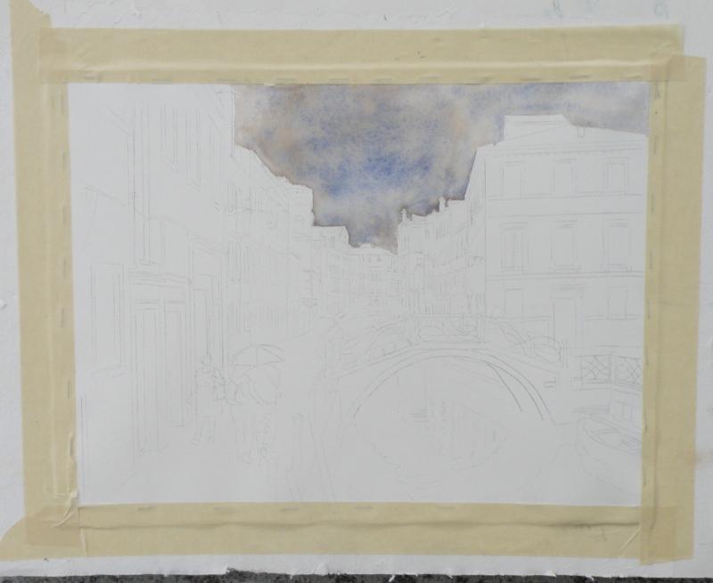
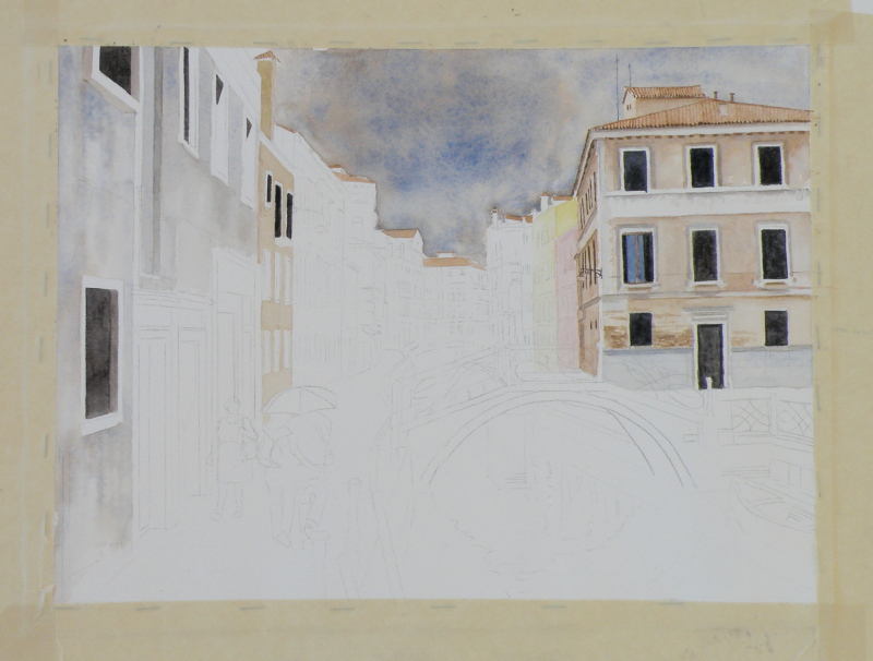
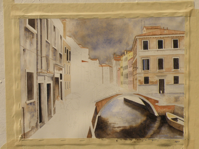
venice challenge
September 6, 2015
We’ve reached the finish line, limping all the way. This was somewhat beyond my abilities as a painter. Whether a success or not, every endeavour provides a great learning experience. All the watercolourists looked up to for advice offer the same counsel: when it comes to watercolour as a medium, suggesting detail far surpasses actually getting bogged-down in it. The pitfalls begin when the painter keeps trying to improve on what’s there.
Despite the overworked areas, enough aspects work to allow this to maybe escape the scrap heap — but probably not. It would, however, be useful to begin it again and learn from the errors.

it’s not easy being….
August 18, 2015
The beauty of people is that though 99.9% the same, we all know it only takes going to, say, The Iowa State Fair, to discover we’re probably not. All you have to do is stand aside (wondering what on earth you bought that hot dog and sauerkraut for) and watch everyone passing by.
This is just a convoluted way of confessing that not everyone is a great fan of Summer. Painters (some painters who write certain blogs about watercolour) in particular who like landscapes can (on occasion) find Summer just too, um, well, green.
There are ways of uncomplicating all the greens. When I lived in The Adirondacks of New York, not far from our town, in another small town, the famous Grandma Moses, who began painting at the age of 78 had only recently died at the age of 101 .


She was once found in her studio with masonite panels at her feet and a roller with blue paint. Looking up from coating a panel and filling the roller with more blue from the tray, she informed her visitor, “On Thursdays I do skies.”
In 2006 one of her pieces sold for $1.6 million.
Greens can be as simply applied to a landscape as opening up a tube of something and rolling it on. In representational forms of art, trying to authenticate the many greens of a summer scene can be a complex challenge, if for no other reason than that there are just so many variations. Leaves on the very same tree play on different greens, without even mentioning the grasses, shrubs, bushes, ferns below it.
Because it is a colour derived from mixing blues and yellows, greens straight from the tube nearly always have a garishness when, for example, painted against a very blue sky. That’s because the blue of the sky likely isn’t the same blue used to create that particular green. If the sky is cerulean, mixing a green from cerulean and a yellow used in another part of the painting will harmonize. So finding ways to harmonize greens through using their primary parents elsewhere in the painting is a way forward–a way of conquering ‘the greens’.
A worthwhile exercise from a contributor named ‘CharM’ on the site http://www.wetcanvas.com, posted in 2011, is provided by this chart:

‘CharM’ takes a similar exercise to completion here:
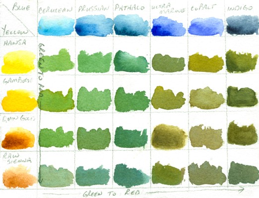
http://www.wetcanvas.com/forums/showthread.php?t=925152
While one is actually in the process of painting a landscape with a variety of greens, it is entirely possible to include in the painting all of the above blues, through washes, cloud shadows, sky and/or water, and generally just finding ways to get them all in there. Likewise, the full range of yellows can also find their way into the painting. Doing this then puts all the blues in the scene, as well as all the yellows, and sets the stage for being able to harmoniously use every single green (and more) shown on ‘CharM’s very helpful chart(s).
I still prefer doing fog, mist, moonlight, winter and early dawns (before green has a glimmer of a chance of making an appearance). And that’s fine, because we all know I am .001% different — or lived a past life on a Scotland isle, where being able to see beyond the front step meant it was a lovely day.
tortured brushes
May 12, 2015
THE BEST BRUSHES–in my wacked estimation–is a dollar store packet in the crafts section, next to those garish tubes of glitter and such. The second those poor things get home, they undergo an Edward Scissorhands attack that is not pretty.
SECOND-HAND STORES also usually have some wonderful, pathetic-looking excuses for brushes, pretty much being handed out for free.
VERY FEW BRUSHES I own get to keep their original shape except ones sized 0, 00, 000, and 0000. For some additional fine work, a nib pen loaded with watercolour does well also. But for large areas, chopped-up, hippie-freak brushes are like, tubular, man.

FORGET SABLE–even squirrel is too refined–woodchuck, maybe–and those synthetic sponges on handles used to paint walls with are good, too.
‘Mountain Mists’, 20cm x 28cm, Arches hot press 140 lb paper
THE TRUE ENJOYMENT OF PAINTING comes when viewing how another painter’s personal and unique need for self-expression realises itself in ways personal and unique. Interaction with the subject demands an approach which only the painter her/himself knows is right.
