שַחֲרִית Shacharit — Morning Prayer
August 27, 2015
In January of 1990 I had the privilege of going on a tour of Israel conducted by an outstanding Orthodox guide named Joe, who was so completely well-versed in history and biblical understanding that archaeological sites acquired lively, humanized detail under his well-studied knowledge of what we believe took place there.
Though he was conducting about a dozen clergy, he was able to draw comparison between traditions which were tied to ha aretz (הארץ), to the land, helping us see the visceral, physical connections we’d only tried to understand through having read the ancient texts and stories.
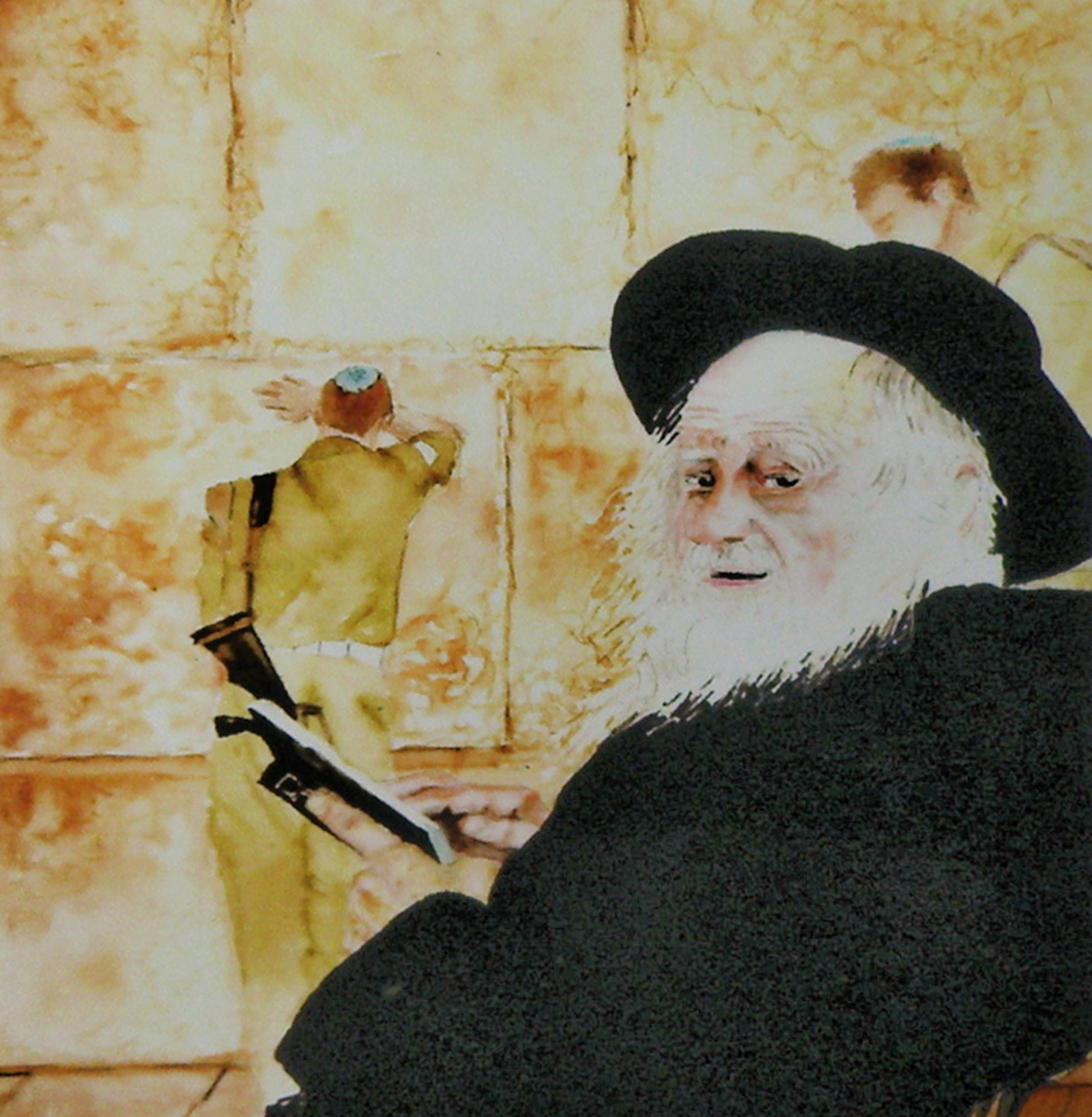
‘Western Wall Shacharit’
watercolour on Arches Hot Press 140# Paper, 10″ x 15″, sold
The Western Wall is almost certainly the most revered of all sites in Israel, as it physically connects worshipers to those before them who also had to struggle to build a homeland–who also had to appeal to that higher power to protect and defend them.
I felt privileged to have been able to see Israel at a time when the intifada was at a standstill and veritably every location in the country was accessible and security was more relaxed. We could travel the Golan Heights as well as the West Bank, stand at the Lebanese border and visit the historic cities and towns throughout the land.
…this is a repost from an entry several years ago
hot
August 24, 2015
This has been one. hot. summer. Right now smoke from fires burning on the Washington State/Canada border is blowing up our way due to Southwest winds. It’s an acrid, doused campfire smell and hazy even when just looking across the street.
‘The Silt Bluffs, Kamloops’, watercolour on Hot Press #140 Arches, 19cm x 24cm, (7.5″ x 9.5″) sold
Oh yeah. I’m done. Bring me a nice serving of September.
ocean study
August 22, 2015
For many years I lived in Vancouver, B. C., which is considered one of the top 3 ‘most livable’ cities in the world. One of its best features is being surrounded by water on three sides. On one occasion I was painting a view from Locarno, one of the many beaches, and was suddenly overcome by a summer storm. It seemed to descend out of nowhere.
As I was not going to escape getting soaked, I soldiered-on and managed to get as much as I could onto paper without the deluge completely washing away everything while working.
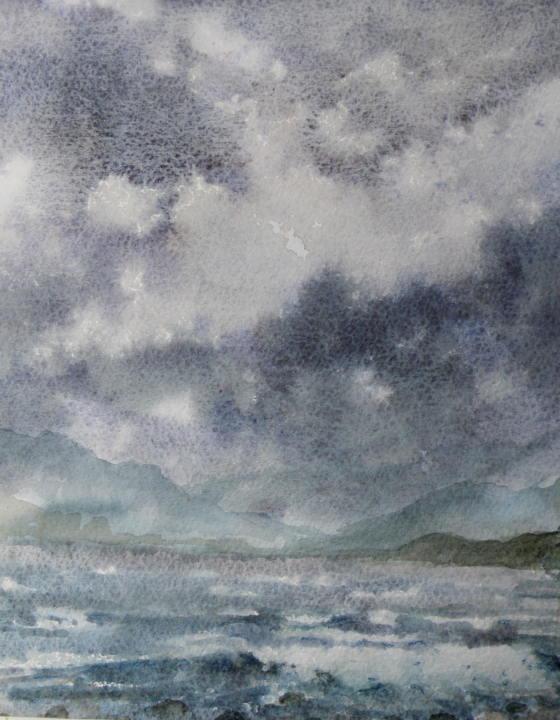
‘ocean study Locarno Beach‘, Vancouver, 13cm x 18cm (5″ x 7″)
Fortunately I had some sort of makeshift shelter–even so, rain splattered onto the painting as I worked.
Painting on location has its rewards as well as its hazards. In those years, I wouldn’t paint at all unless it was outdoors. I was something of a purist, and felt watercolour was meant to be done on location–its immediacy and qualities almost demand it being put to use that way. But bad knees are what they are, and now I almost can’t imagine having to go do that again–which is really a shame. Working from photographs is not my idea of what watercolour should be about.
it’s not easy being….
August 18, 2015
The beauty of people is that though 99.9% the same, we all know it only takes going to, say, The Iowa State Fair, to discover we’re probably not. All you have to do is stand aside (wondering what on earth you bought that hot dog and sauerkraut for) and watch everyone passing by.
This is just a convoluted way of confessing that not everyone is a great fan of Summer. Painters (some painters who write certain blogs about watercolour) in particular who like landscapes can (on occasion) find Summer just too, um, well, green.
There are ways of uncomplicating all the greens. When I lived in The Adirondacks of New York, not far from our town, in another small town, the famous Grandma Moses, who began painting at the age of 78 had only recently died at the age of 101 .


She was once found in her studio with masonite panels at her feet and a roller with blue paint. Looking up from coating a panel and filling the roller with more blue from the tray, she informed her visitor, “On Thursdays I do skies.”
In 2006 one of her pieces sold for $1.6 million.
Greens can be as simply applied to a landscape as opening up a tube of something and rolling it on. In representational forms of art, trying to authenticate the many greens of a summer scene can be a complex challenge, if for no other reason than that there are just so many variations. Leaves on the very same tree play on different greens, without even mentioning the grasses, shrubs, bushes, ferns below it.
Because it is a colour derived from mixing blues and yellows, greens straight from the tube nearly always have a garishness when, for example, painted against a very blue sky. That’s because the blue of the sky likely isn’t the same blue used to create that particular green. If the sky is cerulean, mixing a green from cerulean and a yellow used in another part of the painting will harmonize. So finding ways to harmonize greens through using their primary parents elsewhere in the painting is a way forward–a way of conquering ‘the greens’.
A worthwhile exercise from a contributor named ‘CharM’ on the site http://www.wetcanvas.com, posted in 2011, is provided by this chart:

‘CharM’ takes a similar exercise to completion here:
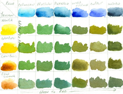
http://www.wetcanvas.com/forums/showthread.php?t=925152
While one is actually in the process of painting a landscape with a variety of greens, it is entirely possible to include in the painting all of the above blues, through washes, cloud shadows, sky and/or water, and generally just finding ways to get them all in there. Likewise, the full range of yellows can also find their way into the painting. Doing this then puts all the blues in the scene, as well as all the yellows, and sets the stage for being able to harmoniously use every single green (and more) shown on ‘CharM’s very helpful chart(s).
I still prefer doing fog, mist, moonlight, winter and early dawns (before green has a glimmer of a chance of making an appearance). And that’s fine, because we all know I am .001% different — or lived a past life on a Scotland isle, where being able to see beyond the front step meant it was a lovely day.
standard-bearer of watercolour
August 15, 2015
Touted often as being the most difficult of mediums, and sometimes even as ‘the medium of mediums’, not everyone holds watercolour in such honour. Indeed, oils are deemed the zenith of painting mediums.
‘Blowing the horn’ about watercolour as the ‘medium of mediums’ is a bit rich, perhaps. That is, until one tries to master its elusive qualities and discovers how the more it is controlled, the less it is allowed to be what it is: a medium set free by water.
Perhaps no greater example of the power of watercolour allowed to find its own way through minimum control is by the hand of its greatest advocate, J. M. W. Turner.
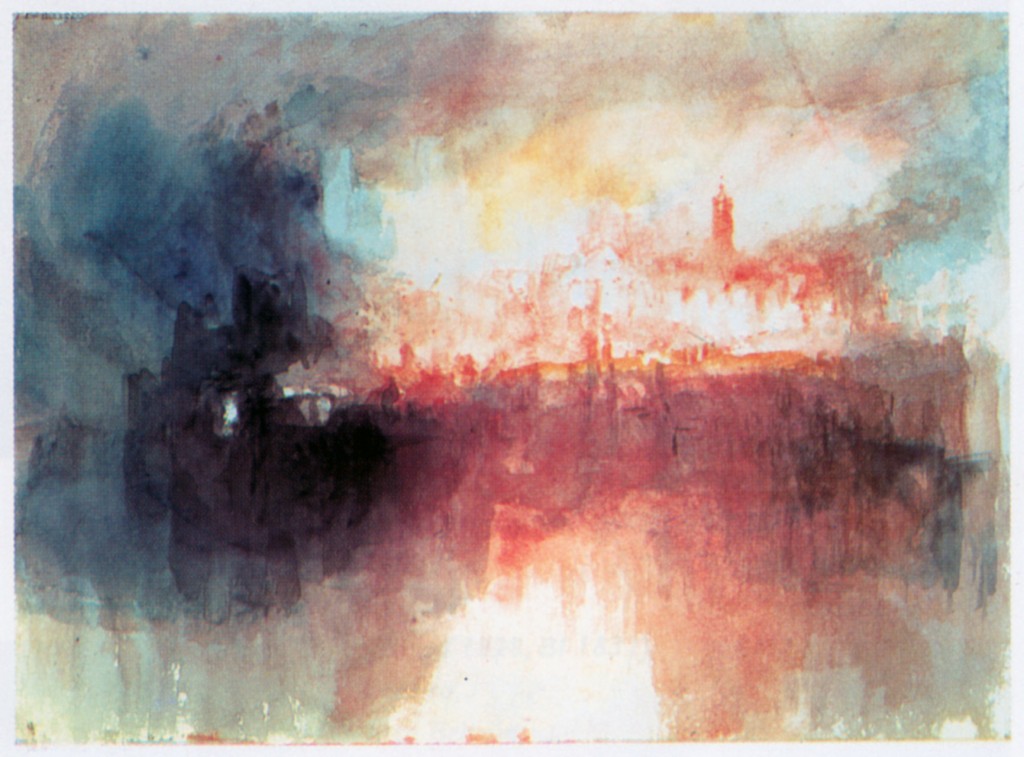
‘Incident At The London Parliament’ 1834
“If I could find anything blacker than black, I’d use it” is a quote which highlights Turner’s love for the power of contrast, which is what watercolour achieves spectacularly when the snow white of the paper is allowed to breathe while then bordered by the darkest dark.
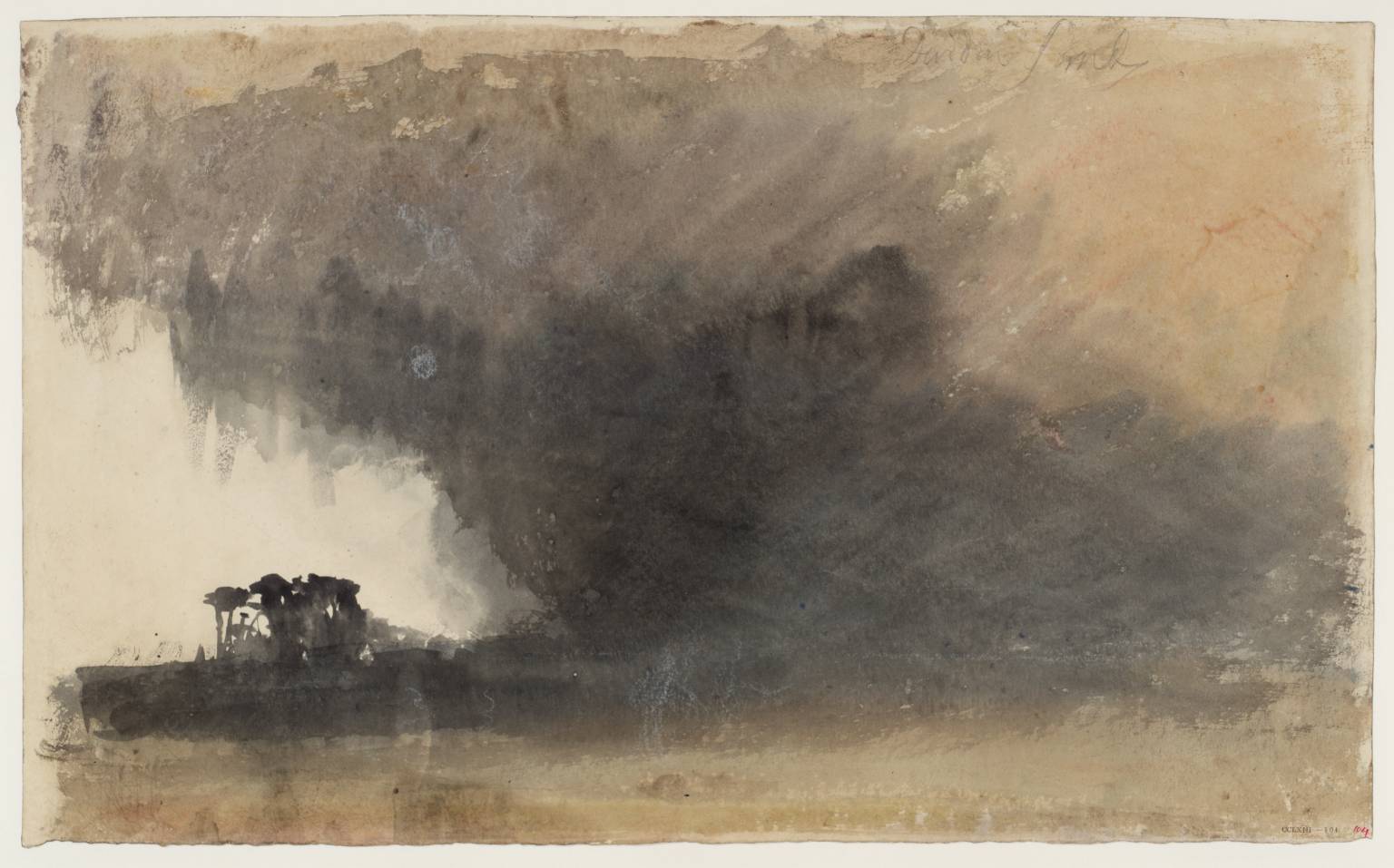
‘Duddon Sands’ circa 1825-32 Joseph Mallord William Turner 1775-1851 Accepted by the nation as part of the Turner Bequest 1856
Joseph Mallord William Turner is sometimes referred to as ‘the father of the abstract’. It is possibly due to the apparent pleasure he took in allowing the medium to run wild, catching it back at just the right moment to indicate location.
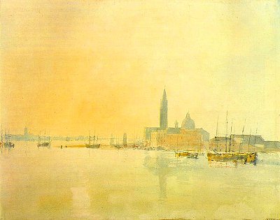
a Venetian watercolour, ‘Untitled’, JMW Turner
Somewhere there is a story about how Turner was very guarded over letting anyone watch him work. But at some sort of gathering Turner asked a young boy if he wanted a picture of something he liked. The boy asked for a Spanish Galleon, and the artist took him into his studio, and not too long afterwards the boy immerged with a small and perfect depiction of a great ship in tossing waves.
Grilled by others about how the master had gone about producing it, the boy dazzled them in claiming Turner was very fast–almost phrenetic–using one unusually long fingernail to rather frantically scrape and tear at the paper for crests and foam of storm-thrown waves.
venice challenge 3
August 14, 2015
It is so affirming when blogging friends don’t find details about paint pigments and their sedimentation arcane. One can easily picture guests around a table nodding-off face-first into their creme-brulee.
In the Renaissance, clay earth from Siena, Tuscany, (Terra di Siena, “Siena ground”) rich in iron oxide and manganese oxide was used for pigments. In its natural state, is a yellowish clay, and becomes raw sienna as a pigment. When heated up, it turns reddish brown and becomes burnt sienna.
However, due to its being heated up, there is a variety of watercolour burnt sienna shades and hues among the various manufacturers because some heat it a little more, some a little less, making it somewhat more or less ‘burnt’.
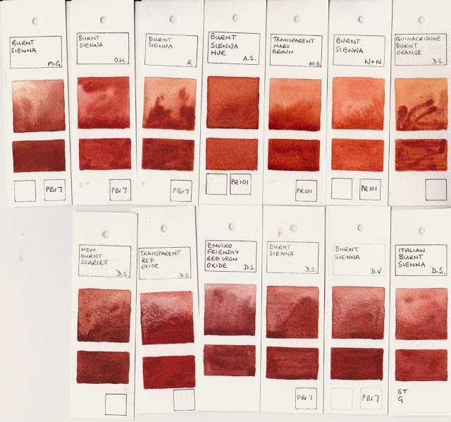
http://janeblundellart.blogspot.com.au/2013/11/watercolour-comparisons-4-burnt-sienna.html
Ultramarine and burnt sienna will be the two colours for the whole piece with the exception of a bit of Rose Madder and Quin Gold for the more distant buildings. Doing so (almost) guarantees integration. That is because a viewer’s eye will find a colour harmony whenever the pallet is limited, as no one colour or tone will be glaringly different from the rest.
stage two
Focal points are achieved in limited-pallet paintings through value contrast (the dark windows against the lighter walls), rather than by there being a glaringly-different colour thrown in. That said, some of the early masters used a glaringly-different colour to great visual effect, as in Corot, whose ‘signature’ accent was the use of a dash of scarlet in an otherwise integrated landscape….

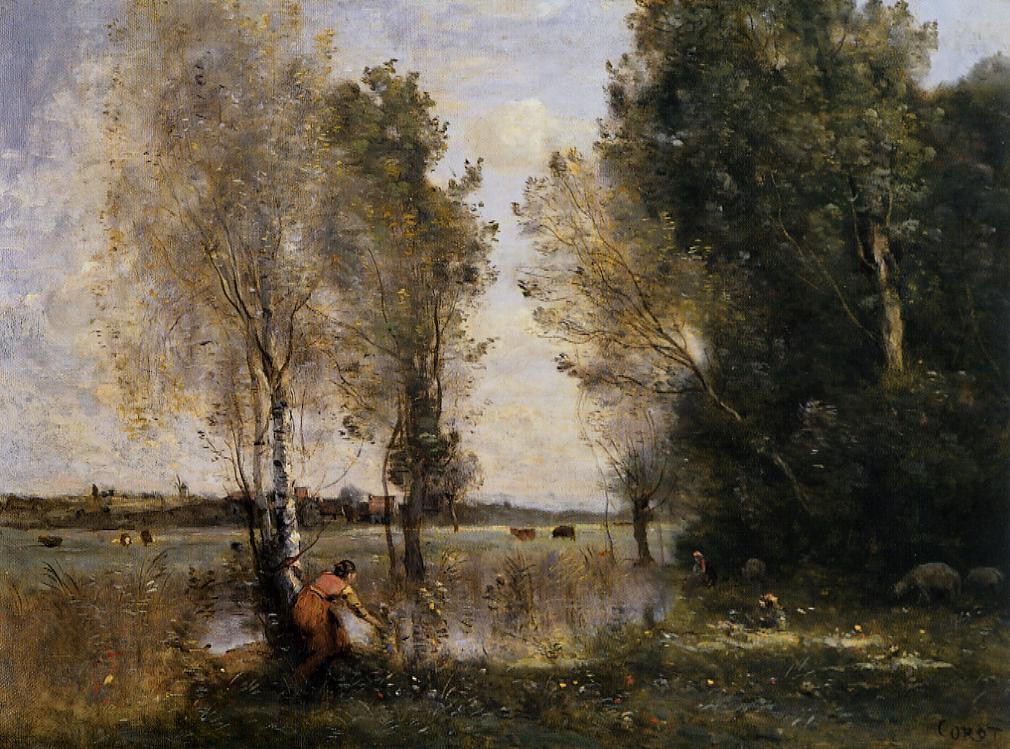

JEAN-BAPTISTE-CAMILLE COROT (1796 – 1875)
(sources for ‘burnt sienna’ from Jane Blundell and Wikipedia)
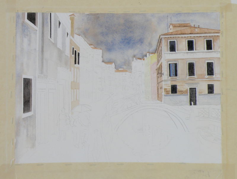
venice challenge 2
August 12, 2015
The ongoing quest to interpret in watercolour a photo of Venice by Frank Dwyer of our local Kamloops Photo Arts Club has begun to take shape with a decision to take this 11.5cm x 16.5cm image and paint it as bigger–28cm x 25.5cm (11″ x 14″) –simply because a miniature of such a complex scene might prove less successful.

So here goes….
Arches Hot Press #140 lb. Paper, stretched and stapled onto gatorboard, then taped.
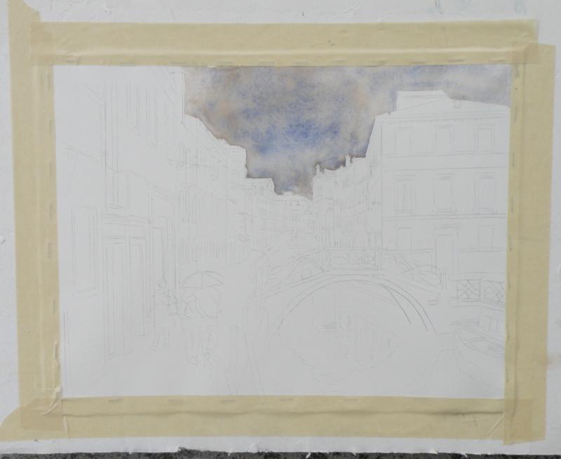
As much as the photo (entitled ‘The Blue Umbrella’) reveals damp pavement and the umbrella-holding couple, the sky isn’t quite as rainy-looking as perhaps it can be made to be for artistic interpretation purposes. So ultramarine blue and burnt sienna were applied to the whole of the sky as a wash.
Ultramarine Blue has a nice quality of being one of the ‘granulating’ pigments of watercolour. Its origins stem from the grinding of lapis lazuli, and received its name from the Latin ‘ultramarinus’ (meaning ‘beyond the sea’) .
So treasured and prized by the early painters, ground lapis (from Afghanistan, principally) was used by the painters of early icons as the garments for The Blessed Virgin. (When The Holy Mother is depicted, her robes are red.)
In 1826 a synthetic version was created which itself derives from a mineral compound, lazurite, and is today the most complex of all pigments. Being a ground mineral, ultramarine produces sediment that dries in a granular way when mixed with water.
To get this effect, however, the painter must apply ultramarine as a wash so the sediment can, in fact, separate and settle to create granulization. That is why, then, the sky dropped into the first stage of the painting appears granulated and gives a kind of antique look. If ultramarine is applied with only a bit of water, or straight from the tube (yikes), it will not granulate as such.
Some watercolourists are so avid about granulization, they buy a granulating medium from Daniel Smith, which, when mixed with most any watercolour paint, granulates. However, the natural granulating pigments are raw umber, burnt umber, raw sienna, and some brands of burnt sienna. That is because they come from the earth, and earth leaves sediment.
All of this material comes from a variety of sources, including http://janeblundellart.blogspot.com.au/ — (a very thorough and devoted watercolourist from Australia).
book cover
August 11, 2015
Leon Idriz Azevedo is a Brazilian author who requested the use of the painting “Raven Moon” for the cover of his recent Novel “The Desert of My Eyes” (“O Deserto Dos Meus Olhos”).
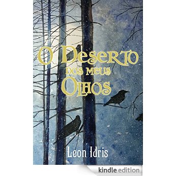
The Novel (currently available in Portuguese) finds the main character, Rupert Lang, thrown into a historic quest to seek the remains of what he stumbles upon as a ‘lost identity’ — taking him through ‘the Spanish court of the reign of Isabel II, the streets of Prague Johannes Kepler and the halls of a Buddhist temple built on a cliff in China’.
“. . . What could have been lived and what is suspected from the imagination receive equal value, challenging the reader to trust the chaos and find answers and truths in the improbable . . . “
A miniature of the new book’s cover has just been painted and is wending its (slow, ship-bound way) to Brazil, with best wishes and hopes Mr. Azevedo receives great reviews and even greater public readership of this new adventurous Novel.
My hope is that I’ll soon be able to read it in English.
venice challenge 1
August 9, 2015
Our local Kamloops Photo Arts Club is doing a joint arts project with our Kamloops Courthouse Gallery, involving the pairing of chosen art photographs with various art media interpretations based on the photo.
At one of our meetings we sat around large tables with a great many photographs strewn about, and at a given moment were invited to select ones which struck us as exciting to base our own work on. Jan, who is a weaver, selected photos which spoke to her about textures and colours. Others went with shapes, values, composition.
As a student of representational painting technique, almost all of the photographs were appealing due to their rich tones and lively views. One in particular was very striking because it involved architecture and rain and water, and an exemplary scene from that painter’s perennial eye-trap, Venice–a place so overly painted, yet so eternally attractive.
“Blue Umbrella”, 11.5cm x 16.5cm (4.5″ x 6.5″), Frank Dwyer KPAC, 2014
Choices had to be made immediately about size, complexity (whether to simplify while not messing with the integrity of the scene), wetness/dryness (very rainy? or as is), attention to detail (loose interpretation, or ala the photo itself), type of paper, and selection of pallet (minimal number of colours, or full compliment), overall tonal value (to keep it dark or go for something less so).
There is a website where its blogger goes to great and tremendously helpful lengths to demonstrate the qualities of particular watercolour colours when mixed together. Her name is Jane Blundell http://janeblundellart.blogspot.com.au/. When wanting to know what might work well as a pallet, she never fails but to provide great choices. So it was through her that the combination of Ultramarine Blue and Burnt Sienna was selected as the backbone for this challenging photo/watercolour project.
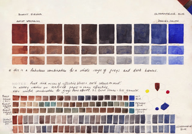
combination of visual effects possible when combining burnt sienna and ultramarine blue, Jane Blundell: Watercolour Comparisons 4 – burnt sienna
This visual and written saga will continue as progress is (slowly) made on this. If all is well, the painting and the photograph will be displayed side-by-side in The Main Gallery of The Old Courthouse, Kamloops, B. C. for the month of November. (www.kamloopscourthousegallery.ca)
