Pop-up Christmas card progression, con’t . . .
December 16, 2021
….with the final design carbon traced onto a cream-coloured, blank notecard, the image is completed in watercolour —
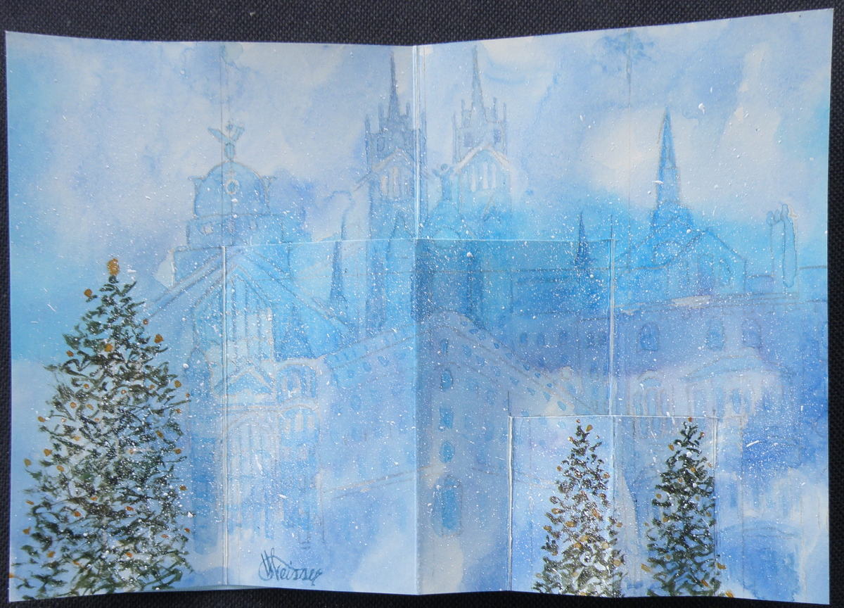
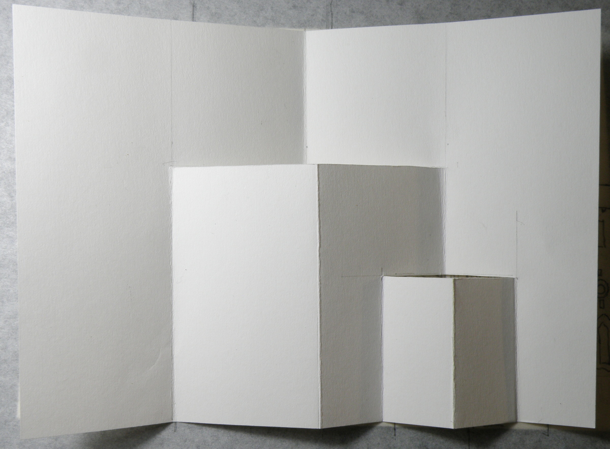
…..and Christmas trees added, cuts carefully made with an x-acto knife, and scored folds added to then oh-so-carefully make the folds and the cuts pop out. And once a successful Christmas pop-up snowy cityscape with Christmas trees was successfully done, it was time to then make fifteen more of them . . .
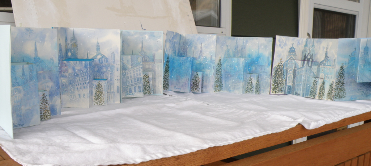
The biggest surprise when doing this was discovering how well a dollar store package of six blank notecards with envelopes received watercolour. Painting on them was almost as forgiving and receptive as my go-to Arches Hot Press #140 watercolour paper — and, a package of 6 is $1. Even the envelopes could be festively painted over and made to look handmade.
Pop-Up Christmas Card Progression
December 13, 2021
Designing a hand-painted watercolour pop-up card for Christmas began in August because there were going to have to be seventeen of them in time for mailing.
Here is a look at the process and progress:

Painting Progression: Juno
March 5, 2021
To help celebrate the birthday of a recently retired Occupational Therapist and good friend–Kathie–her spouse, Ken, the Dean of our local Anglican Cathedral, provided me with photographs of their very charming one year old Labradoodle dog, Juno. My hope was to present Kathie with a watercolour portrait of Juno to mark her upcoming, significant ‘0’ birthday,
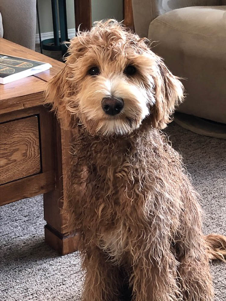
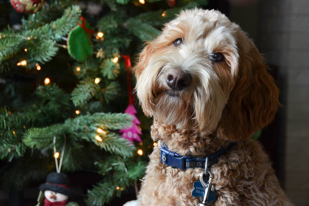
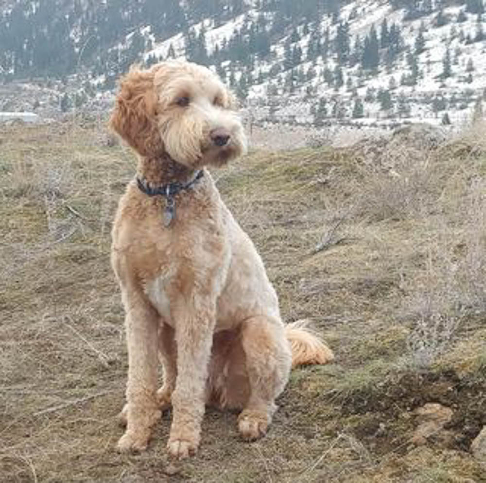
Dog portraiture is not something I have experience with/in. And Juno being from a breed known for its gorgeous curls and wavy hair/fur, presented challenges I wasn’t convinced my experience with watercolour could overcome. Fortunately, this painting was one I offered to do, and so if it was beyond my abilities I simply had to say so and produce a watercolour of another subject I knew Kathie would enjoy receiving.
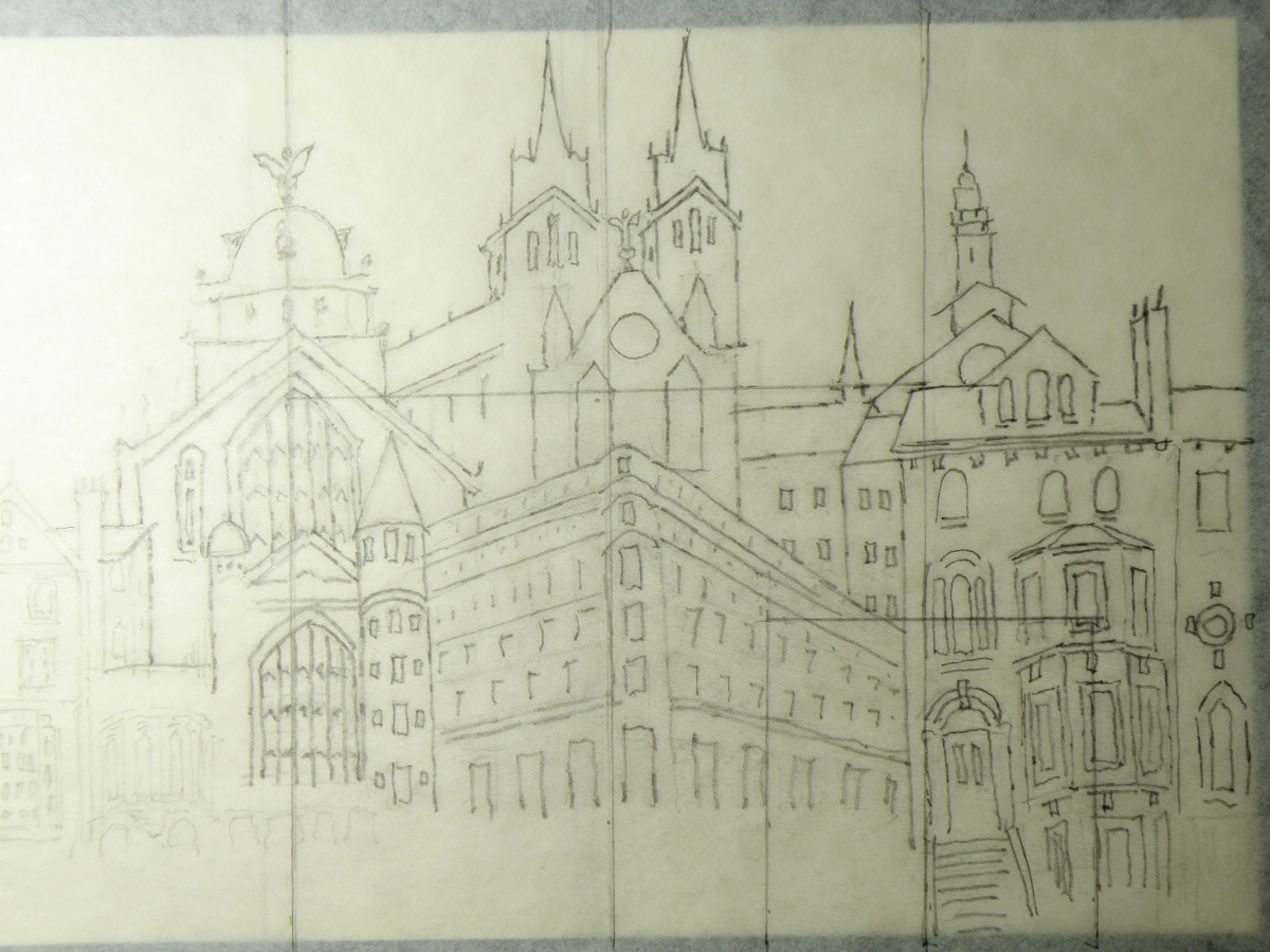
I started with a detailed drawing:
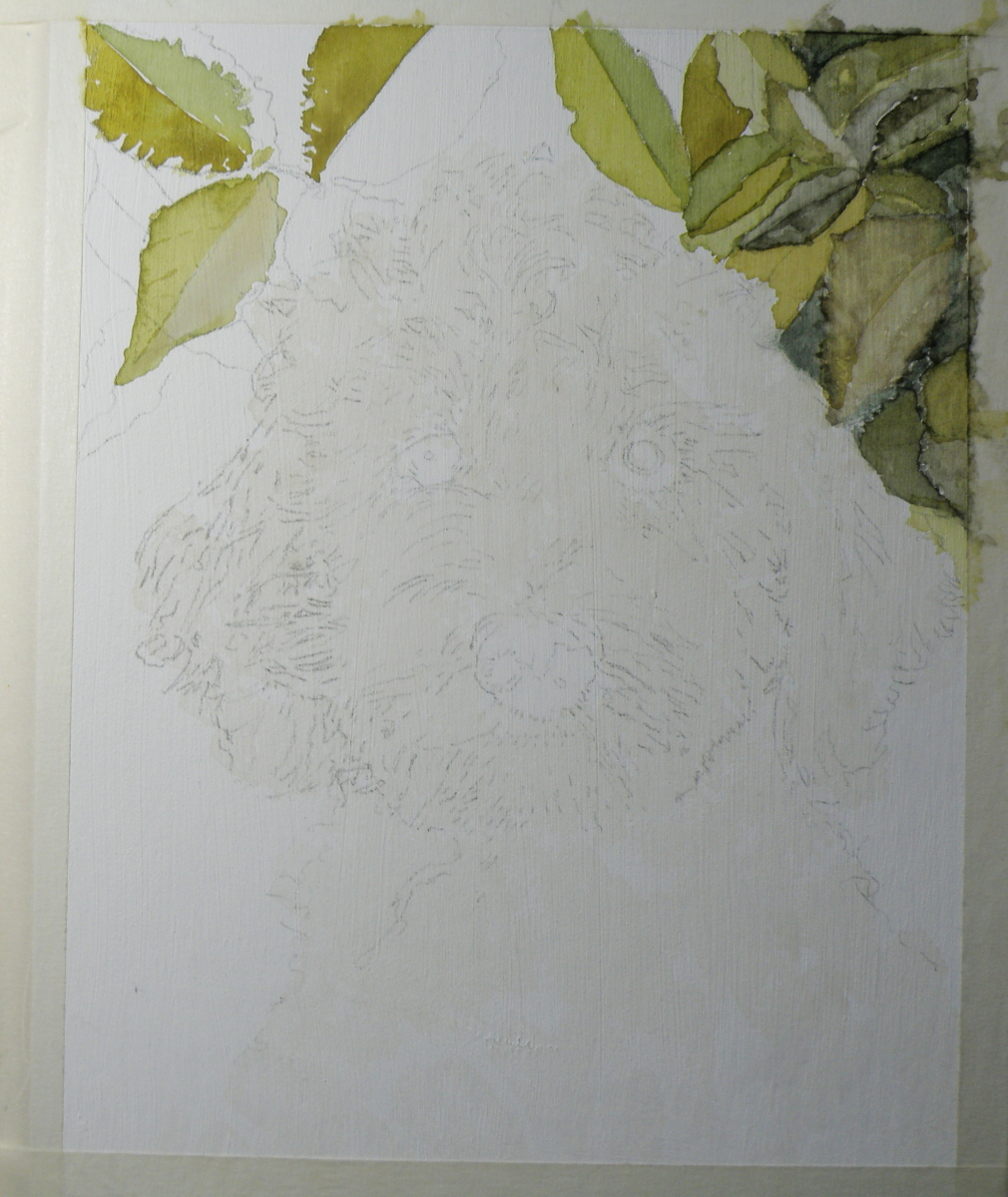
Because Juno’s place to be is anywhere outdoors, I decided to provide a rosebush background.
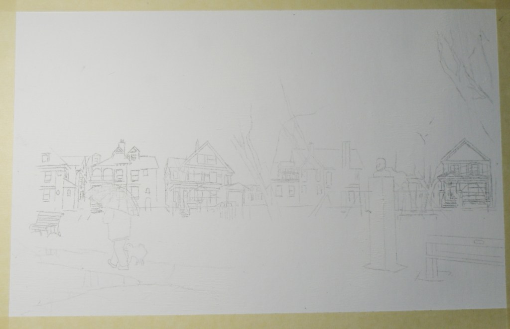
When one reads about the long life of Jean Sibelius and how he had such a strong affinity for nature, for Autumn and Winter in particular, and was, after all, a Finn, whose country embraces the colder months, it seemed fitting to depict Sibelius Square in November. His biographer wrote this:
“. . . Even by Nordic standards, Sibelius responded with exceptional intensity to the moods of nature and the changes in the seasons: he scanned the skies with his binoculars for the geese flying over the lake ice, listened to the screech of the cranes, and heard the cries of the curlew echo over the marshy grounds just below Ainola [his home, named after his wife]. He savoured the spring blossoms every bit as much as he did autumnal scents and colours. . . “

The distinctive, late 19th c. Toronto architecture of the area known as The Annex is unabashedly Victorian, boasting ‘some of the largest collection of Victorian houses in North America.’
‘During this period Toronto also developed some unique styles of housing. The bay-and-gable house was a simple and cost effective design that also aped the elegance of Victorian mansions. Built of the abundant red brick, the design was also well suited to the narrow lots of Toronto.’ [wikipedia: The Architecture of Toronto]
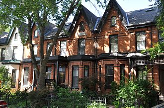
In The Annex, however, there was an elegance reserved only for those who could afford it. ‘Built by the city’s wealthy and mostly found in the neighbourhood they are named after, these houses contain diverse and eclectic elements borrowed from dozens of different styles. These houses are built of a mix of brick and sandstone, turrets, domes, and other ornamentation abound.’ [ibid.]

In this painting, some decisions had to be made as to whether it was going to be about the houses surrounding The Jean Sibelius Square Park, or about the monument dedicated to the composer, or about the overall mood of late Autumn and how it informs the architecture, the park and what Sibelius himself loved about November.
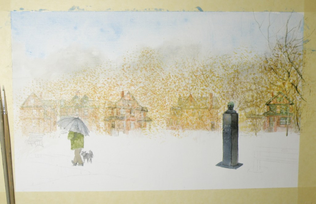
This neighbourhood-emersed, one square acre oasis in the middle of Toronto [pop. 6,129,000], was originally known as Kendal Square due to being beside Kendal Avenue…
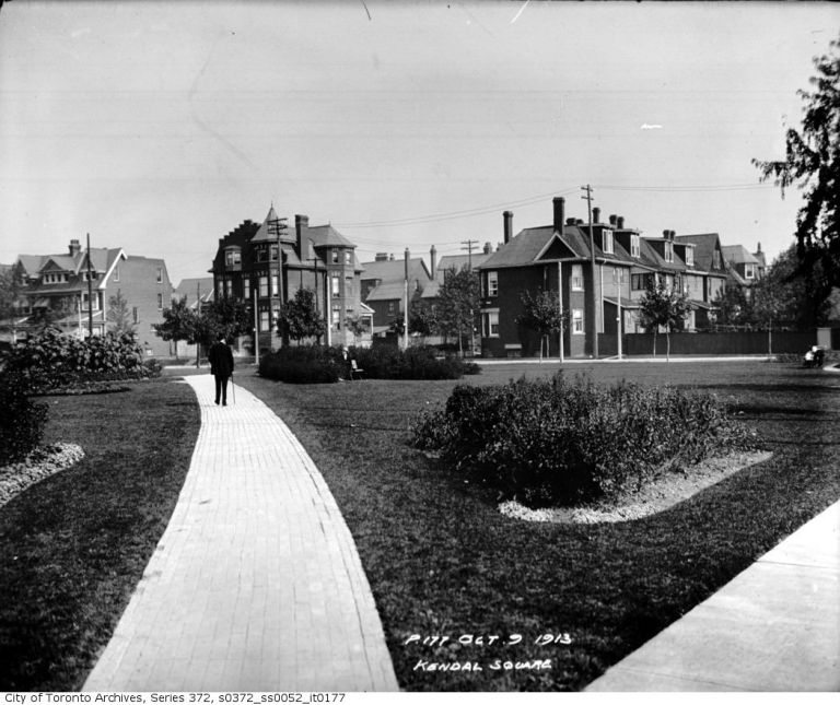
In 1959, in recognition of the diligence and passion of Toronto’s Finnish community, the little square was officially renamed Jean Sibelius Square and featured a striking monument with the Finish composer’s likeness crowning it.
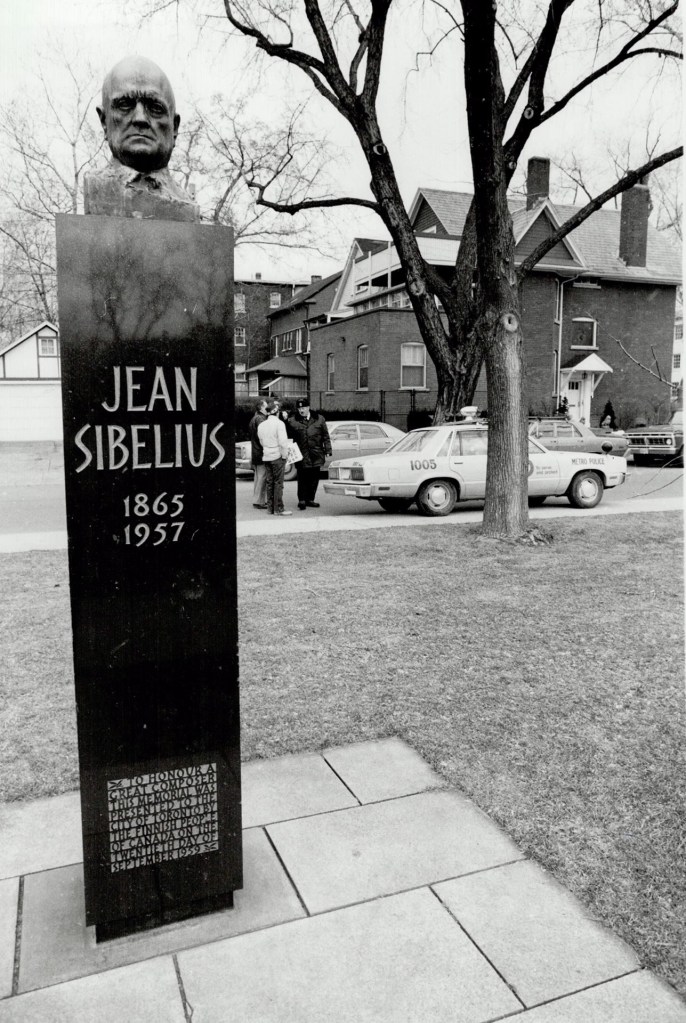
My encounter with this petite and charming park was during the socially-disruptive 70s, when The Annex was transformed from a neighbourhood of red-brick mansion propriety, to one of red-brick mansion rooming houses populated by hippies and university students.
I lived in the former red brick Victorian home of a Toronto physician with fifteen other actors–including Doug Todd, who has commissioned this painting of Jean Sibelius Square. We were members of the theatre ensemble called Creation 2 (I for seven years, he for two), which was both commune and theatre ensemble:
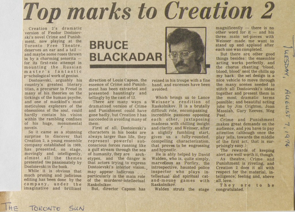
Life for Doug Todd and I, and others within the group, was a mixture of great bonding, high demands, internal turmoil and personal confusion. What had started out as a dynamic experiment combining the best of ensemble acting with the ideals of a close-knit communal living, began taking on the telling characteristics of a cult.
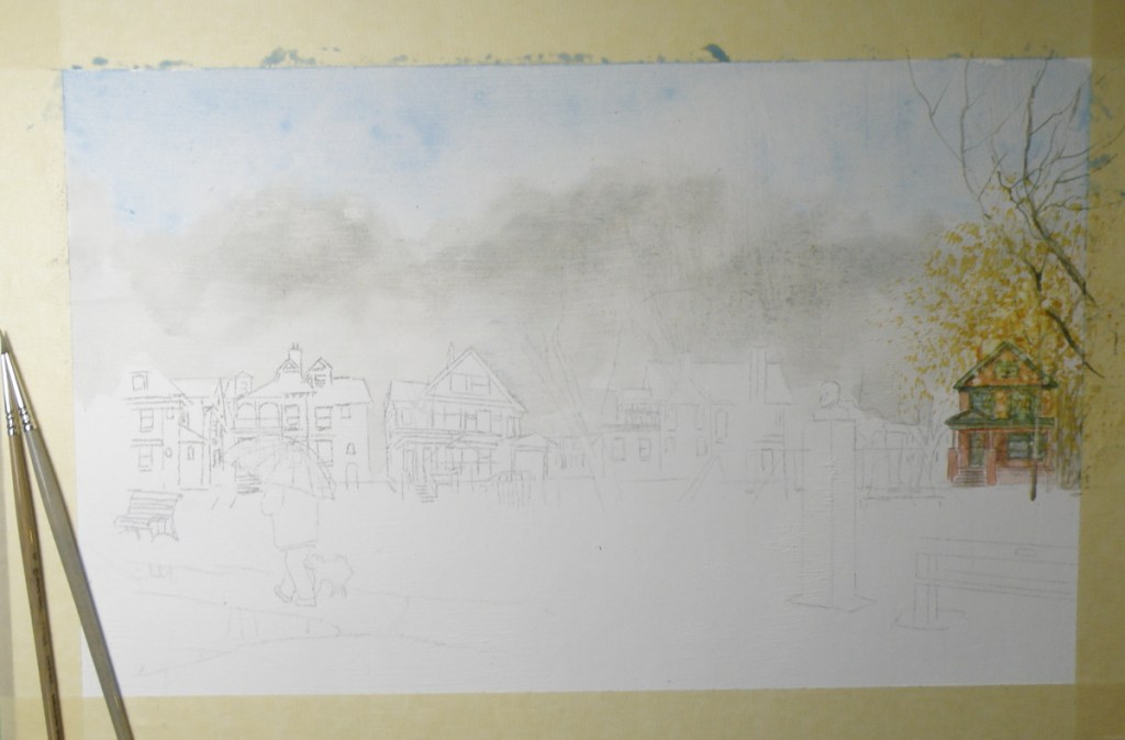
The Jean Sibelius Square Park, being a block away from our living situation, provided us with a treed, quiet, people-free place of calm and restoration. The watercolour depicting that 1970s’ oasis-like feeling is now finding its expression as it goes from outlined sketch to the initial wash stage:
Stage One: ‘Raven Winter’
February 13, 2018
My watercolourist friend Patricia Kellogg [https://www.facebook.com/Patricia-A-Kellogg-357357001050096/] and I are doing a painting exchange. I acquired one of hers of an artichoke plant in late autumn–that expressive form plants take when frost renders them lifeless, yet beautiful even so. And because she has a couple of mine with ravens in them, she wanted one more and so here’s the first stage of it.
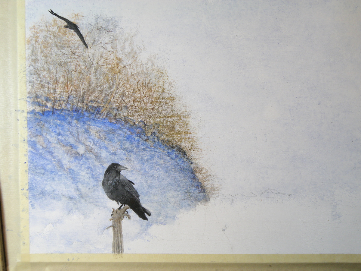
The surface for this painting is treated mat board and the medium is transparent watercolour. It is a 9″ x 12″ piece. Once it is finished I will enjoy taking it over to The Red Beard Cafe where we have our monthly coffee and seeing if she likes it. I’ll also bring a couple of others with me to provide a choice.
Work in progress: ‘An ear-full of Waxwings’
February 2, 2018
As a child there was probably no bird I wished more to see than a Waxwing. In on-location photographs they just looked so exotic and intriguing–their colouration and little tufted crowns–the whole package was and is so appealing.
In those days we lived in Eastern N. America where Waxwings aren’t found and so it took many decades–after I’d moved to British Columbia–for my chance to encounter these birds. And it happened as I stood at our front picture window looking out at the Red Maple just beyond the glass–a tree which had nestled within it a deserted Robin’s nest.
Suddenly there appeared a large group of birds I’d never before seen, Cedar Waxwings, darting about the nest, examining it animatedly and calling to one another. I watched in fascination as they systematically began dismantling this Robin’s nest, their little bandit’s masks seeming very appropriate to their deciding to make someone else’s home theirs for the taking.

‘An Ear-full of Waxwings’ — work in progress — Saunders Waterford Hot Press Paper, 140 lb.
A grouping of these birds is known as ‘an ear-full’ almost certainly because they go about in bunches and are constantly chattering in a distinctive, rather conversational voice that is more insistent than melodic or song-like, yet charming even so.
…..downtown
October 31, 2015
Growing up in the 50s, we lived in a treed suburb of Rochester, New York (home of Eastman Kodak, Bausch and Lomb), but my father was a Pastor of a poor, post-WWII German refugee, inner city Church next to the Greyhound bus depot. My fascination with the grittier side of Rochester’s downtown must have come from how much more interesting it was compared with the staid predictability of houses and lawns and more houses and more lawns where we lived.
Sneaking away during the sermon, I’d scout out the alleyways of crumbling late 19th century brick tenements with their fascinating tangle of iron fire escapes doubling as fasteners for clotheslines, festooned with gingham tablecloths and sheets and jeans. Labyrinths of back-doored kitchens, cooks smoking, observing me in my too-small Sunday navy suit, an out-of-place kid trying to look nonchalant and part of the scene.
Luckily for me, Kamloops has that kind of feel. It is a railroad hub, cow ranchers beyond that–a labourer’s city–begun in 1812 as an outpost of the Hudson’s Bay Company, and has enough Western wear and roughness that some citizens feel our downtown still lacks class. By ‘class’ they mean there aren’t enough designer boutiques and specialty shops.
This is the start of a painting of downtown from behind one of the old hotels. . . .
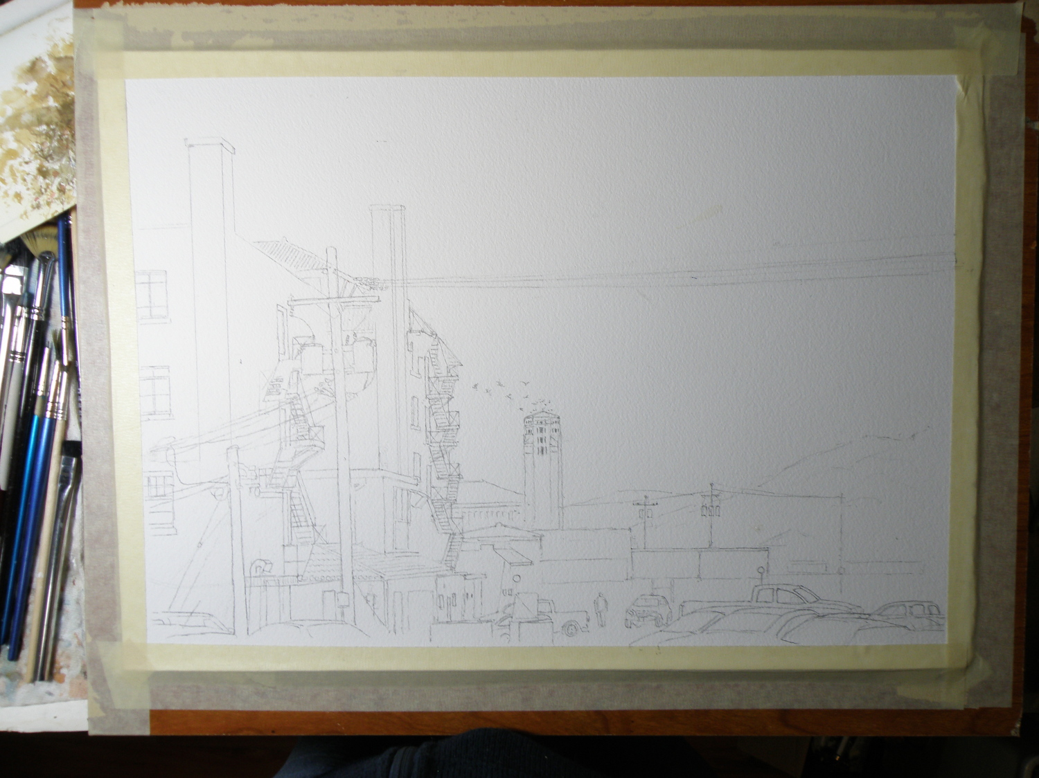
Downtown Kamloops, B. C. Canada
The intention here is to make this a Christmasy, snowy subject, and its progress will be followed as the days go by.
venice challenge 2
August 12, 2015
The ongoing quest to interpret in watercolour a photo of Venice by Frank Dwyer of our local Kamloops Photo Arts Club has begun to take shape with a decision to take this 11.5cm x 16.5cm image and paint it as bigger–28cm x 25.5cm (11″ x 14″) –simply because a miniature of such a complex scene might prove less successful.

So here goes….
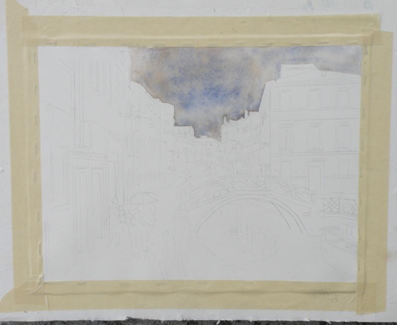
Arches Hot Press #140 lb. Paper, stretched and stapled onto gatorboard, then taped.
As much as the photo (entitled ‘The Blue Umbrella’) reveals damp pavement and the umbrella-holding couple, the sky isn’t quite as rainy-looking as perhaps it can be made to be for artistic interpretation purposes. So ultramarine blue and burnt sienna were applied to the whole of the sky as a wash.
Ultramarine Blue has a nice quality of being one of the ‘granulating’ pigments of watercolour. Its origins stem from the grinding of lapis lazuli, and received its name from the Latin ‘ultramarinus’ (meaning ‘beyond the sea’) .
So treasured and prized by the early painters, ground lapis (from Afghanistan, principally) was used by the painters of early icons as the garments for The Blessed Virgin. (When The Holy Mother is depicted, her robes are red.)
In 1826 a synthetic version was created which itself derives from a mineral compound, lazurite, and is today the most complex of all pigments. Being a ground mineral, ultramarine produces sediment that dries in a granular way when mixed with water.
To get this effect, however, the painter must apply ultramarine as a wash so the sediment can, in fact, separate and settle to create granulization. That is why, then, the sky dropped into the first stage of the painting appears granulated and gives a kind of antique look. If ultramarine is applied with only a bit of water, or straight from the tube (yikes), it will not granulate as such.
Some watercolourists are so avid about granulization, they buy a granulating medium from Daniel Smith, which, when mixed with most any watercolour paint, granulates. However, the natural granulating pigments are raw umber, burnt umber, raw sienna, and some brands of burnt sienna. That is because they come from the earth, and earth leaves sediment.
All of this material comes from a variety of sources, including http://janeblundellart.blogspot.com.au/ — (a very thorough and devoted watercolourist from Australia).
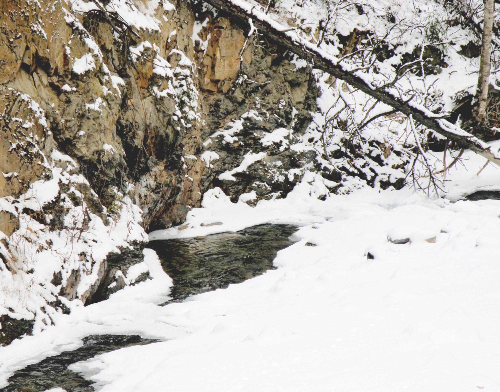
the tranquille creek gorge
May 16, 2015
THE SOUTHERN INTERIOR of British Columbia is a desert-like landscape, plunging steeply into geologically-unique valleys that include rattlesnakes, a ground-creeping variety of prickly pear cactus, sagebrush, and tumbleweed.
I ACCIDENTALLY DISCOVERED the local cacti by casually placing my hand on top of one in our backyard shortly after we’d moved to our current home.
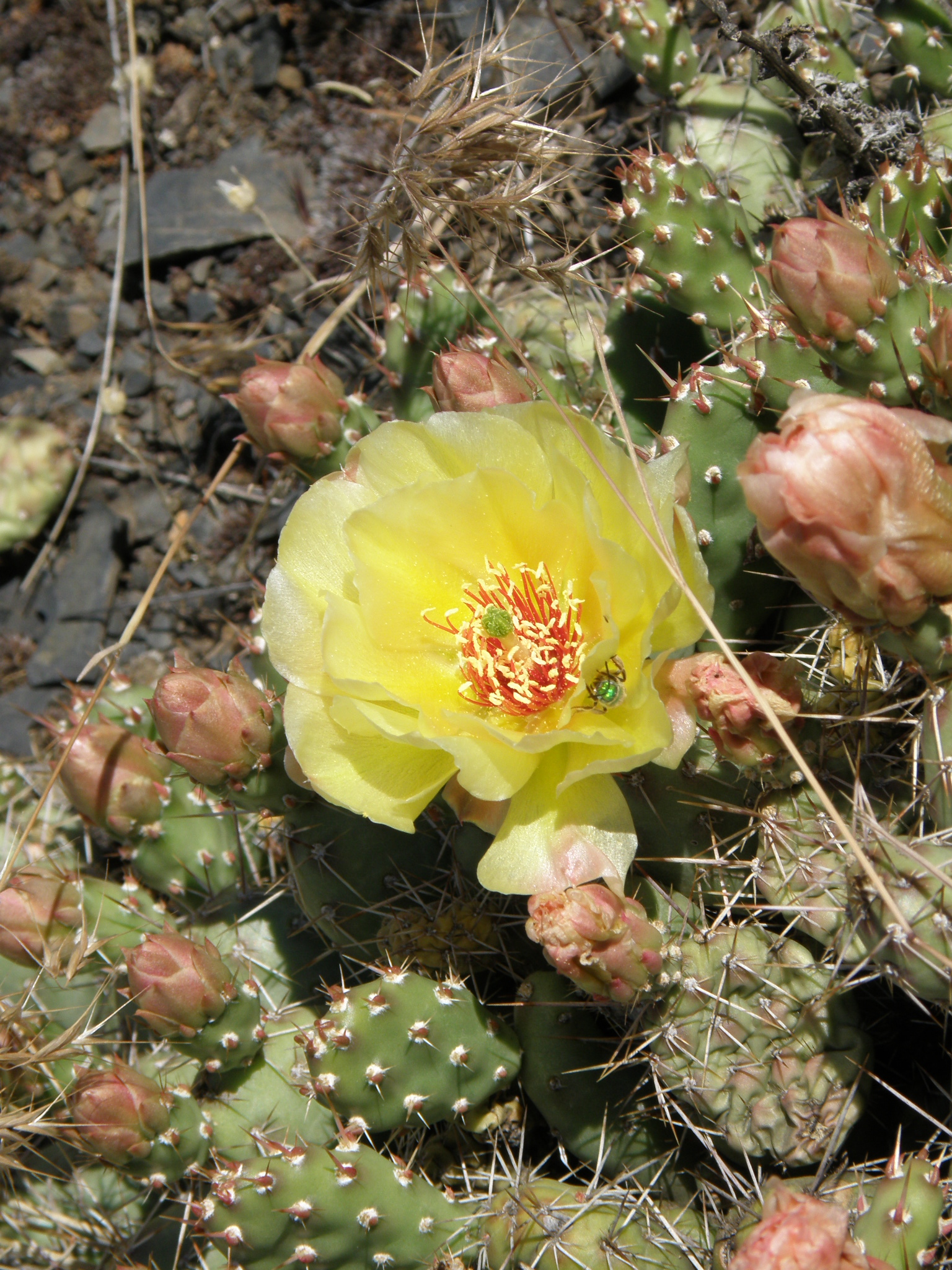
local prickly-pear cactus
OUR BACKYARD as such, is mostly mountain ridge, covered in these low-lying cacti, sagebrush, and outcropping of rock.
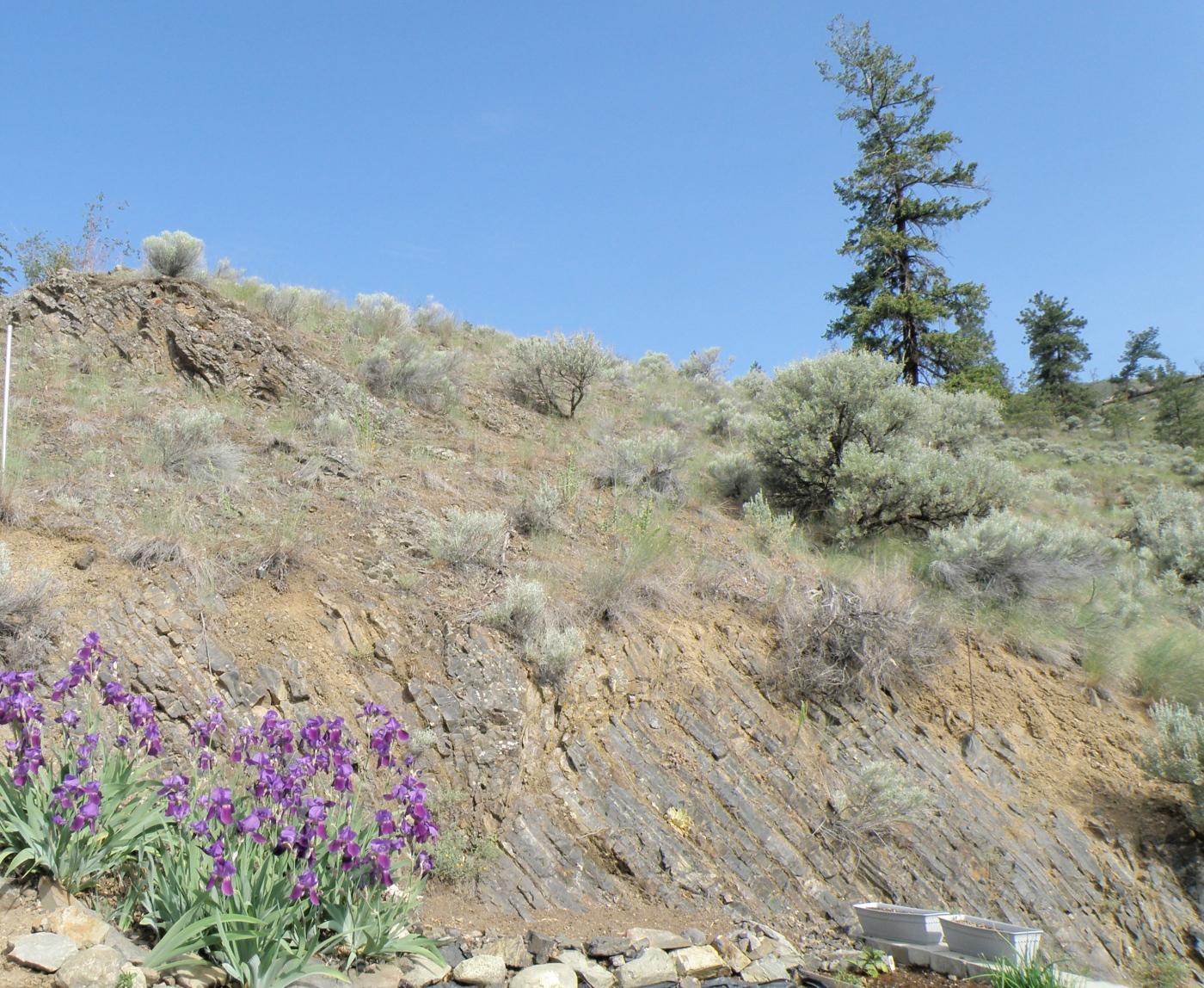
Local terrain
RUNNING UP AND DOWN OUR RIDGE are flocks of Chukar Partridges–a bird which belongs in ‘Roadrunner’ cartoons. Their name is derived from their ‘chuk-chuk-chuk-CHUK-CHUK-CHUKCHUKCHUKCHUK!!!’ call (who needs an alarm clock?). Below is a not-very-good photo of one (they are always on the run, making my camera skills not up to the task)….
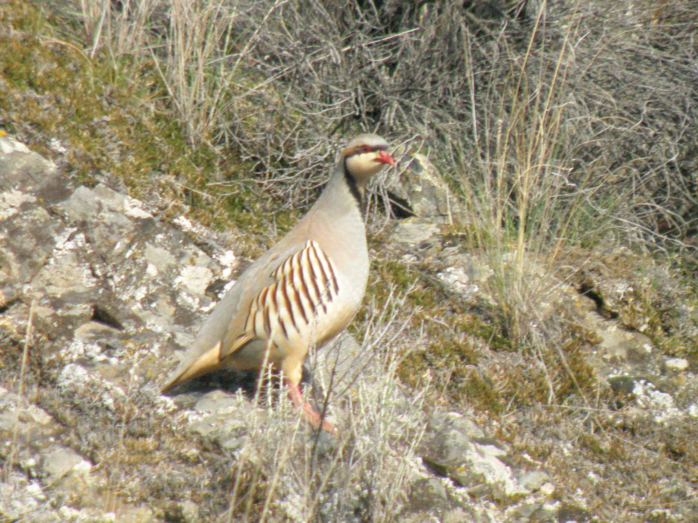
local Chukar Partridge
NEARBY US is a very geologically-dramatic area called The Tranquille Creek Gorge.
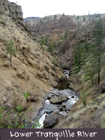
PAINTING THIS TERRAIN ON LOCATION has to be done rather quickly (depending on the time of day), as temperatures can go up to 40C and the sun is relentless due to the lack of trees, and thus, shade….
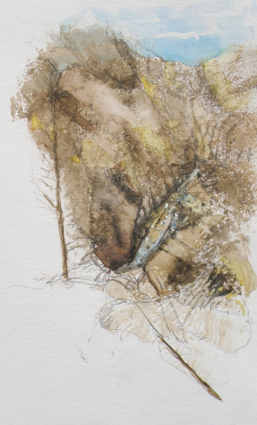
watercolour sketch, tranquille creek
COMING HERE FROM THE WET AND RAINY B. C. COAST, it has taken me years to come to fully appreciate the beauty of an arid area such as ours. But now that my eyes are open to the subtlety, I wouldn’t return to all that green for anything in the world. I’m happy in the depth of our browns (smile).
Bacon & Eggs
May 10, 2015
What a way to bring joy to a very nurturing Mom…


painting pickles
May 7, 2015
CAMPING ALONE along the Oregon Coast–that fantastically alive strip of ocean wonders–provided many outdoor painting pickles. . . .
PICKLE #1–mosquitoes and bugs. Surely some art restoration expert somewhere has discovered kamikaze mosquitoes embedded in the impasto of Impressionist art. French curses likely filled the air, Claude spending as much time squashing bugs as trying to capture the light. Imagine the fog of mosquitoes waiting for him up beside those water lilies;
PICKLE #2–the wind. Big, dramatic, vividly-alive ocean waves are that size because of the wind. The wind along the Oregon Coast is permanent and robust. It carries away notebooks, sketch pads, laptop easels, flimsy plastic pallets, kolinsky brushes, art pencils, and tissues. And, as one panics, dashing after them, fresh water rinse containers are spilled (of course, the nearest fresh water source is at the damn parking lot bathroom), and then (naturally) there goes the lawn chair, too–end over end, heading towards the box kite-flying couple smirking at the Mr. Bean imitation. Everything rescued, finally sitting, easel anchored with one determined hand, brush swishing about in the water jar, a sudden gust throws sand over everything, and the stupid tilley hat Christmas present (guaranteed to age a person 20 yrs, whether 25 or 55) is seen sailing out towards the surf, the wind carrying away the muttered sounds of ‘good riddance’ along with it.
PICKLE #3…..time and tides. Outdoor painting (forget this en plein air crap–it’s called painting outdoors) isn’t done in studio time. It’s done in real live time. The tides never stay put. So the grand, thundering waves are either constantly retreating as the scene is being depicted, or–this is nabob of stubbornness–they are approaching at an erratic, yet ever-constant rate, until the-I’m-staying-put painter sees his supplies (pallet, paint box, little stool, brushes, tubes, you name it) suddenly sucked out into the collapsing surf of an unannounced, really big wave–a REALLY BIG WAVE–which is about to be followed by another.
PICKLE #4…..no supplies left…..
cliffs near Newport Beach, Oregon
….. and sketching is suddenly the preferred medium….*sigh*… and geriatric Charlie Brown decides to go find some fish and chips–and a local art supply store.
…..and maybe a therapist. or a bar.
composition woes….
May 3, 2015
MY GREATEST CHALLENGE when painting anything is composition. For years I felt I was being a ‘purist’, insisting that I always paint on location, never in a studio setting. And once at the location, I convinced myself that if a tree was in that spot, then that was how it needed to be depicted.
IT WAS ALL DUE TO my tendency to early-on stop referring to the subject in front of me and become more and more involved in what was happening on paper, to the point where I may as well have not been on location at all. So in an effort at self-discipline, I decided that not only should I paint what things actually look like, I shouldn’t muck around with how and where ‘mother nature’ placed them.
THE SILLY THING WAS, I ended up choosing a composition by default because of course, I couldn’t paint everything my eyes saw in front of me. And more often than not, it was not a good composition. So now, not only do I go to some lengths to study the skill of creating an interesting arrangement, I realise it is the painter’s task to take what ‘mother nature’ provides and make art out of that. Fences do need to be repositioned, as do trees and hills and clouds.
SO NOW I MAKE thumbnail studies first on matt board before beginning anything . . .
THE OBJECTIVE is to provide a focal point, a visual way in towards it, then additional visual interest so the eye has more to discover by wandering beyond the subject itself. These thumbnails are exploring the use of a compositional figure ‘Z’ shape to lead the eye of the viewer.
Painting progression 3…. ‘Jamieson Creek Thaw’
April 4, 2015
BECAUSE WATERCOLOUR is such a watery, transparent, delicate medium–one which must always allow the paper it’s laid on top of to breathe through it–one which traditionally doesn’t use white pigment, but relies on the paper to be the white of the painting–BECAUSE of this (and more) the challenge of the watercolour student is to convey an illusion of texture, without the ability to actually build up a surface texture.
WERE WATERCOLOUR PIGMENT applied so thickly as to create an impasto-like texture on the paper beneath, it would lose its luminosity and look pasty, muddy, dull–worse, it would crack. Watercolour pigment only works when the paper beneath dazzles through it and brings life to the pigmentation. In other words, watercolour as a medium is more the business of staining paper than it is a business of building up layers and coats of daubs, stipples, slatherings.
THAT’S WHY CARE is required to not apply so many washes that the luminosity of the paper receeds and eventually provides no life at all. And that’s why the whites of the paper must be thoughtfully reserved and left untouched in key areas–the crests of waves; the moon; snow; clouds; a picket fence–and skill taken to paint AROUND these places to let the paper be the white.
SO….a student of watercolour (me) learns early-on that (s)he will be a student of the medium for life–that mastery is illusive–and failures, many. A good piece is approached very thoughtfully, noting where the paper will be left to serve the function of white (pigment) and painted around. Then the student will also have to gather enough courage to apply exceedingly dark washes in one ‘go’, while maintaining a sense of secure, carefree animation in order to present an immediacy and liveliness in the final piece.
THE DEATHKNELL of a failing, dying work of watercolour is finicky overworking of areas, and a refusal to accept what happened when water joined pigment joined brush joined paper. It is NOT a medium for those who love to micro-manage or be in control.
THE STUDENT OF WATERCOLOUR has to be more a Peter Pan than a child wanting to grow up–loving the thrill of what happens when ‘danger’ is courted, yet having the assurance that daring will win the day. However, that daring and search for adventure–on the surface of a good piece of paper–will only be pulled off if it is backed by enough experience to have a good hunch about what will happen when such-and-such is tried.
ATTEMPTING what remains beyond one’s ability isn’t courting danger–it is ignoring it. Trying to fly without thinking happy thoughts will give a person a broken bone. Within the bounds of representational art–(i.e. wishing to have a tree ‘look like’ a tree)–a painter cannot ‘pull off’ a landscape with lots of shadows if (s)he has yet to study them in some depth. Trying to do a scene which includes far far more than what one yet learned how to interpret is an invitation to frustration and wanting to give up watercolour for say, acrylics (oh, my).
AND SO FOR MYSELF, I know by this time that I must confine my attentions to learning about how corn grows, what it feels like, looks like, behaves like, before I can throw my abandonment into rendering a watercolour of winter corn in January. Not only that, but I must also have studied the qualities of snow–the qualities of what a winter sun does to shadows of corn stalk–the blues, the purples. And only then can a learned abandonment bring about a possible reward.
IT TAKES A LONG TIME to find the right paper, the right brushes, the right working pallet of colours, the right approach and the right subject matter. Knowing what can be done when paper is sopping wet–and what can’t–depends on who made the paper, how thick it is, how textured it is, how stretched it is, how quickly it will dry. Knowing when to wait until the paper is exactly wet or damp or dry enough to throw one’s energies at it, comes (usually) through ruining (many pieces of) good paper.
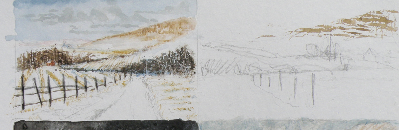
HERE IS THE LATEST DEVELOPMENT of the subject of Jamieson Creek in a February thaw…..
TOMORROW will (hopefully) provide a photo of the finished piece!
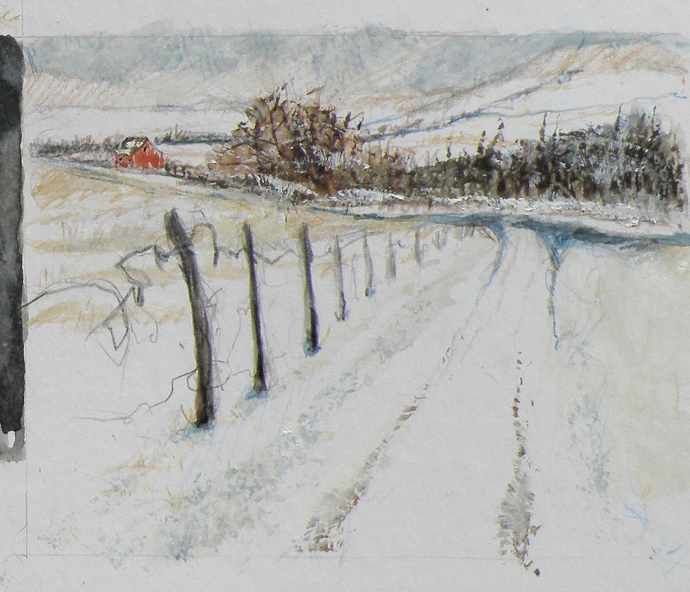
Painting progression 2…. ‘Jamieson Creek Thaw’
April 3, 2015

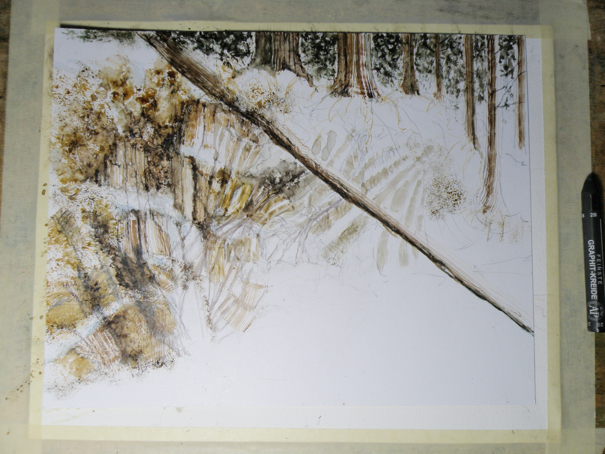
Painting progression 1…. ‘Jamieson Creek Thaw’
April 2, 2015
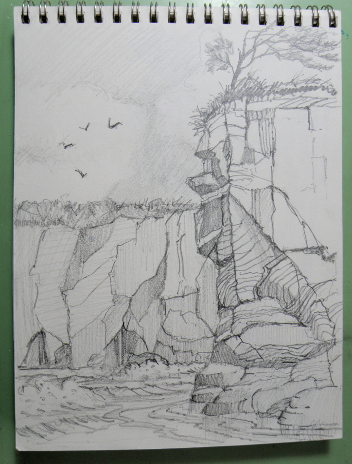
JAMIESON CREEK is about a 15 minute drive from our home, along a dirt logging road. The Kamloops, British Columbia, region is a geologist’s dream come true, featuring some of the oldest mountains in Canada. As a student of watercolour, I am fascinated by stone and rock, particularly because it is so challenging as a subject.
This is Jamieson Creek, taken four years ago around February, early March….
And here is my initial drawing of the subject…..

As you can already see, photography is not my gift (which is why I paint, lol)–so forgive the darkness. It was taken, pre-dawn in the spare room which serves as a studio.
Moral: don’t mess with Mother Nature (or the Ocean Man).
~~~~~
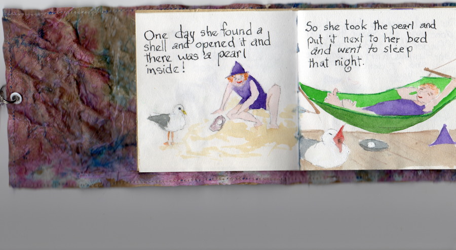
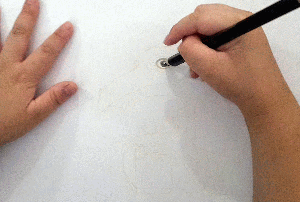
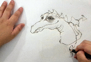
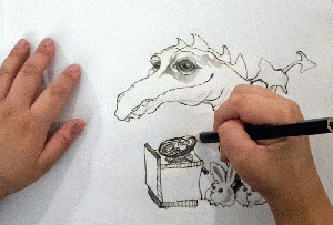
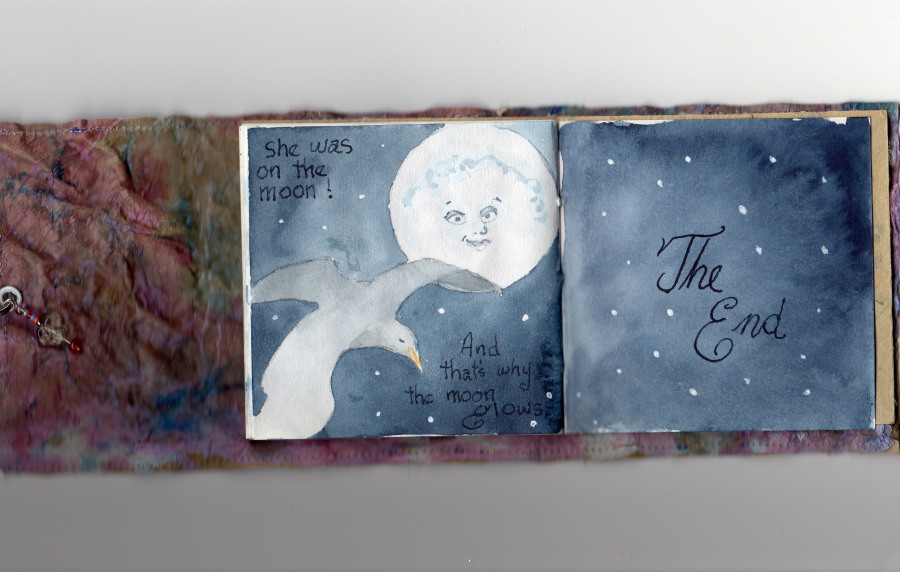
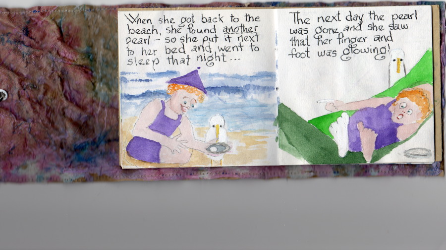
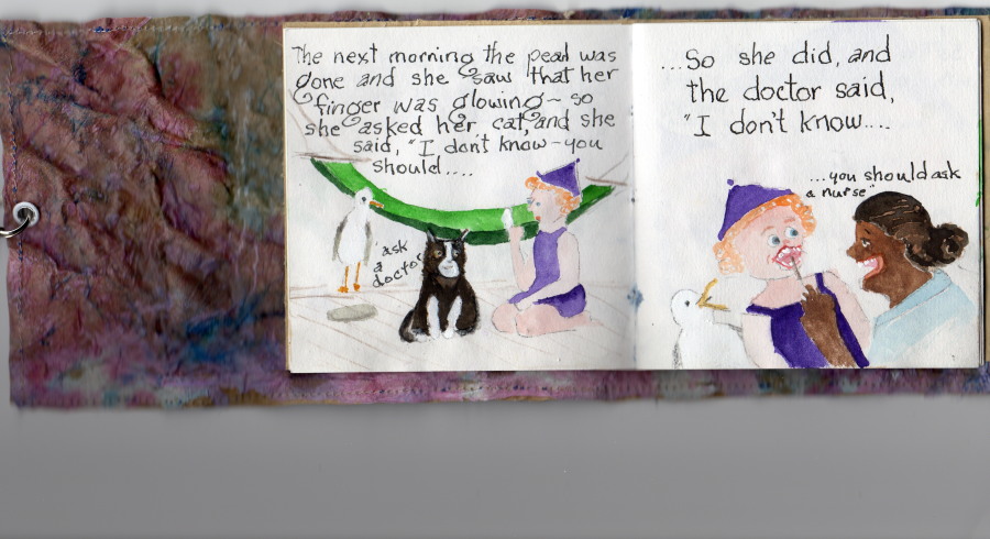
Aneleise (Ane) at her Grandparents’, age 8. . .

. . .’why the moon glows’ by Ane Jones (age 8)
March 31, 2015
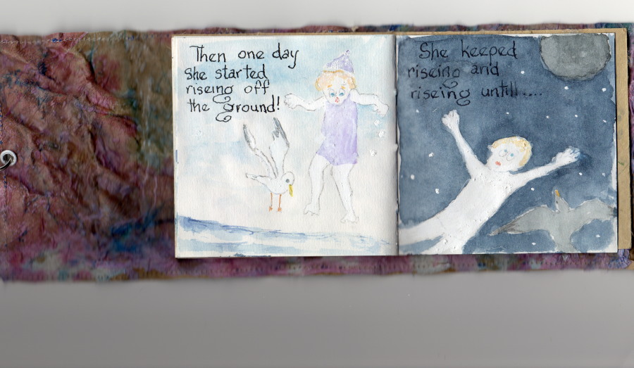
……’why the moon glows’, by Ane Jones (age 8)
March 30, 2015
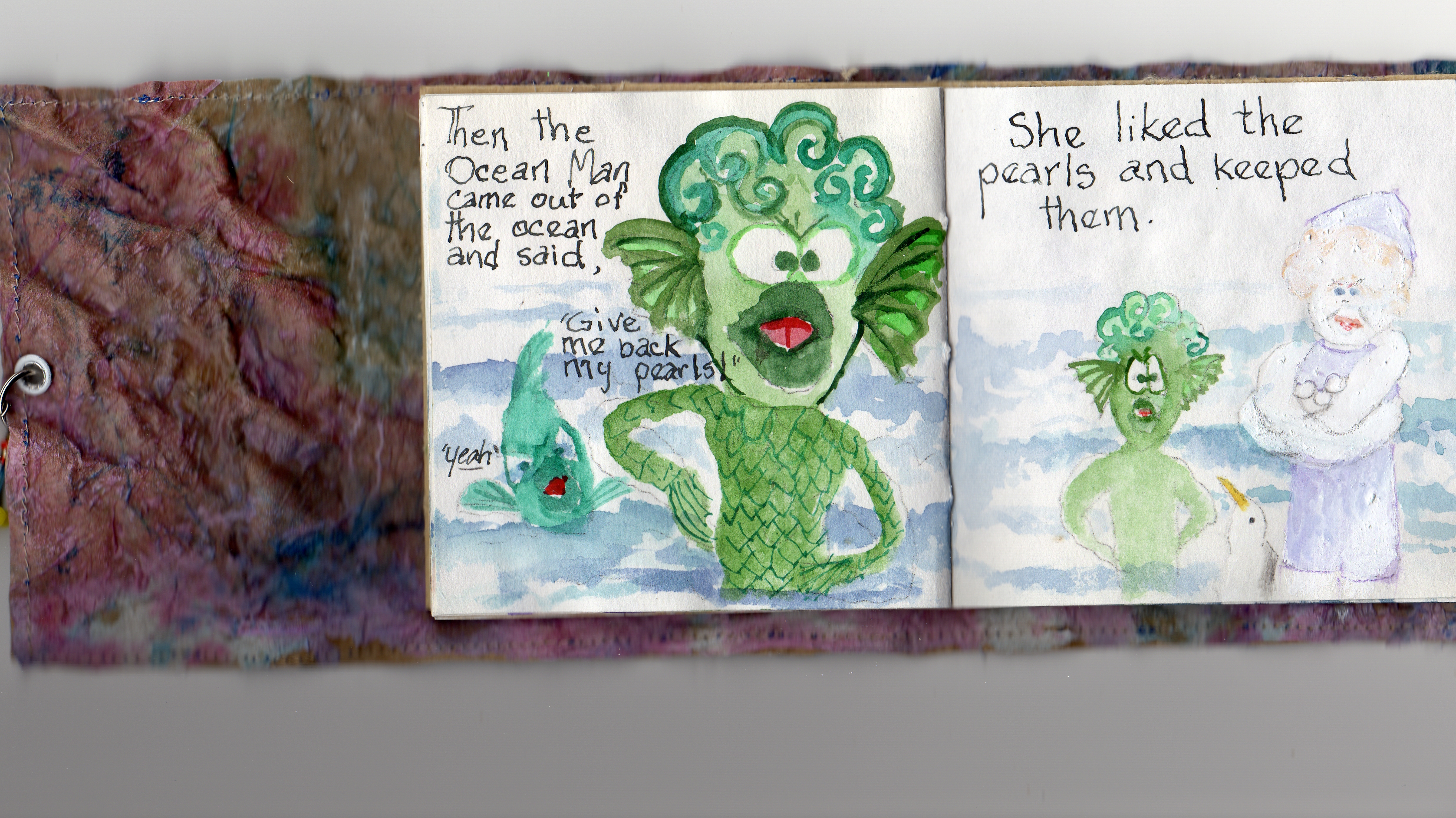
……’why the moon glows’, by Ane Jones (age 8)
March 29, 2015

……’why the moon glows’, by Ane Jones (age 8)
March 28, 2015

……’why the moon glows’, by Ane Jones (age 8)
March 27, 2015
……’why the moon glows’, by Ane Jones (age 8)
March 26, 2015

……’why the moon glows’, by Ane Jones (age 8)
March 25, 2015
……’why the moon glows’, by Ane Jones (age 8)
March 24, 2015