When it’s all about sky….
August 1, 2020
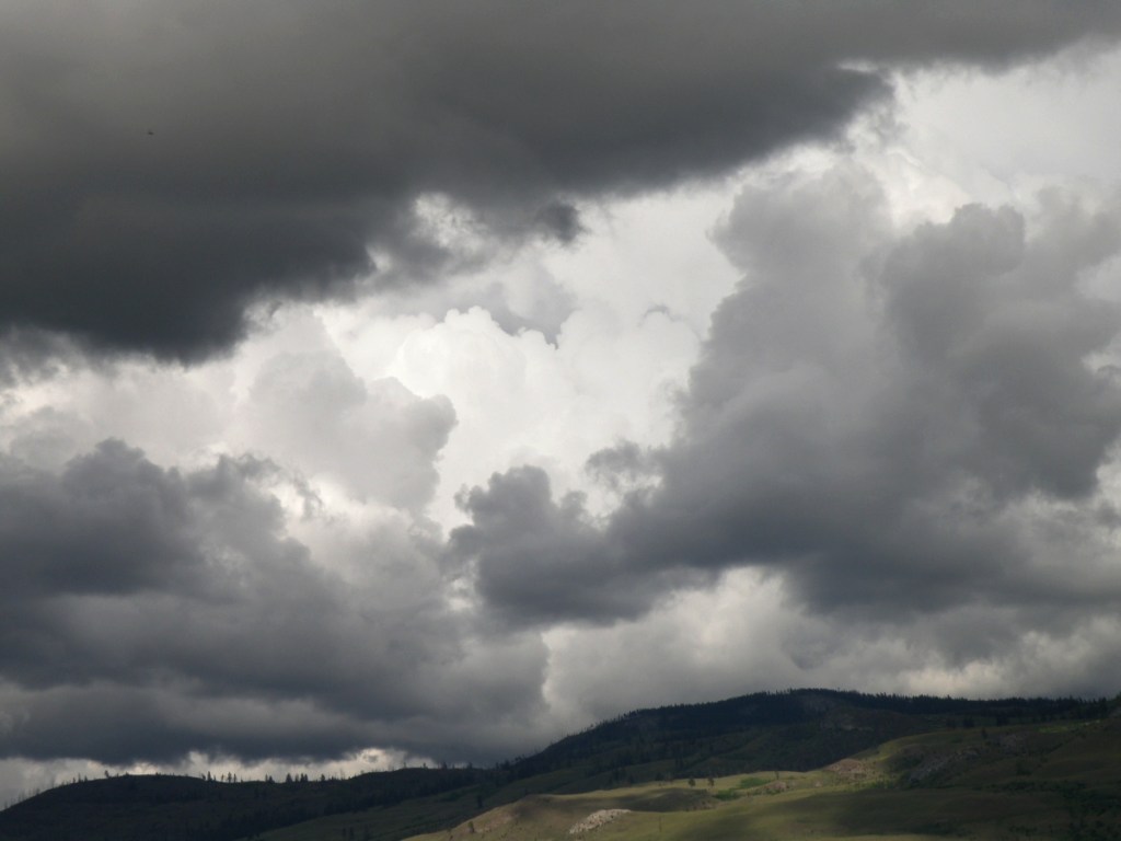
Lately here in Kamloops, British Columbia, we’ve been treated to cloud Cirque du Soleil. Each time I step out on our deck, there’s another stunning performance in progress:


As a student of watercolour, the challenge of painting skies on location doesn’t come from the medium itself because all it amounts to is sloshing water-tinted pigment over paper.
It doesn’t get more immediate than that.
Clouds are suspended water vapours being moved about by the atmosphere and wind. So a marriage made in heaven–immediate subject matter matched with an immediate medium, yes?
Um, well, maybe for some…. It takes a lot of confidence, deftness and elan to nail a quickly changing sky, and those aren’t exactly my gifts.
What helps move my senior’s ass is panic-induced adrenaline, like the time I brought all my equipment down to Kitsilano Beach in Vancouver. Perched in my umbrella-shaded lawn chair, sipping iced tea, leisurely sketching the Vancouver skyline, I noticed the sky dramatically changing from a fluffy blue to an angry charcoal.
After lugging everything from the parking lot to the shore, I wasn’t about to give up my precious spot for a little weather. Prudence did step in, however, and whisper in my aging ear that I had only minutes to accomplish what I’d been taking hours dallying over.
And then the rains came down, bruising the top of my umbrella, the beach crowd scattering, wind whipping the waves. As the saying goes, ‘in for a penny, in for a pound’, I finally found my spine and went for it, drops pelting my paper, gusts throwing up sand.
Cloud Studies
July 21, 2020
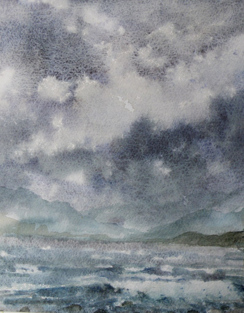
Sometimes there’s a need to trample on whole bunches of internal dos and don’ts, accumulated over years of anal retentive watercolour practices.
‘Don’t premix washes–glaze one pigment over another right on the paper’; ‘Don’t soak the paper in the bathtub and then stretch it on a stretcher–it removes the lovely sizing’; ‘Don’t get obsessed with detail–be expressive’; ‘Don’t use opaque white’; ‘Don’t use so much masking fluid’; ‘Don’t be so timid’; ‘Don’t paint today–you aren’t centred’.
Lordy. I went to the sink, grabbed a kitchen sponge and some dollar store poster board.

For all who might be equally plagued by a mental build-up of watercolour dos and don’ts, have a look at this example of watercolour exploration and artistic daring:
Murtle Lake November
December 30, 2019
Murtle Lake–housed within the gorgeous Wells Grey Provincial Park–about an hour’s drive from our home in Kamloops, B. C.–“is world-famous as the largest canoe-only lake in North America. Set in a pristine mountain valley, the north and west arms are approximately 20 km long, and the lake averages three kilometres wide. . . ” [http://www.env.gov.bc.ca/bcparks/explore/parkpgs/wg_murt/]
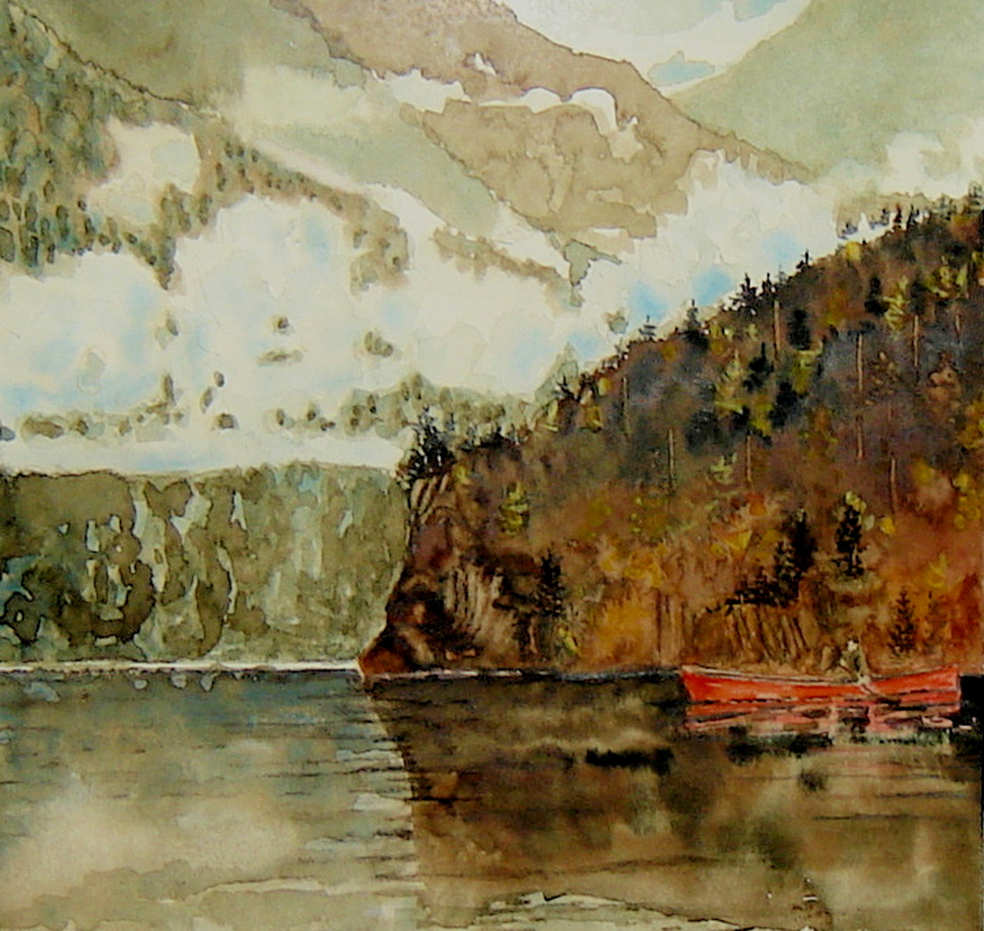
watercolour by Lance Weisser
140# Arches Cold Press Paper [sold]
On the Wells Grey Provincial Park website comes this advice to those who wish to access Murtle Lake for overnight canoe/kayaking trips:
“The outlet of Murtle Lake is the swift-flowing and dangerous Murtle River, noted for its many waterfalls. Visitors wishing to hike to McDougall Falls must use caution in Diamond Lagoon.”
“Murtle Lake is a large lake and subject to gusts of strong wind. The lake often becomes choppy in the afternoon. If moving camp it is best to do so in the forenoon. Never try to out-run a storm; beach at the first available opportunity and wait out bad weather. The Park Operator has emergency communication and a satellite phone link located in the Ranger Cabin on the south shore of Murtle Lake.”
The Gathering
December 7, 2019
Ravens differ from Crows socially. Whereas Crows are given to form large groupings and congregate together socially–whether roosting for the night or for protection–Ravens are more solitary. Adult Ravens, once successfully mated, remain paired-up and together for life.
It is known that teenage Ravens, prior to mating, do in fact form in groups in order to be more effective in their newly-developed hunting skills. So when one teen Raven buddy discovers food, they all pile on, everyone benefiting from the find.
[source: ‘Ravens In Winter’ by Dr. Bernd Heinrich]
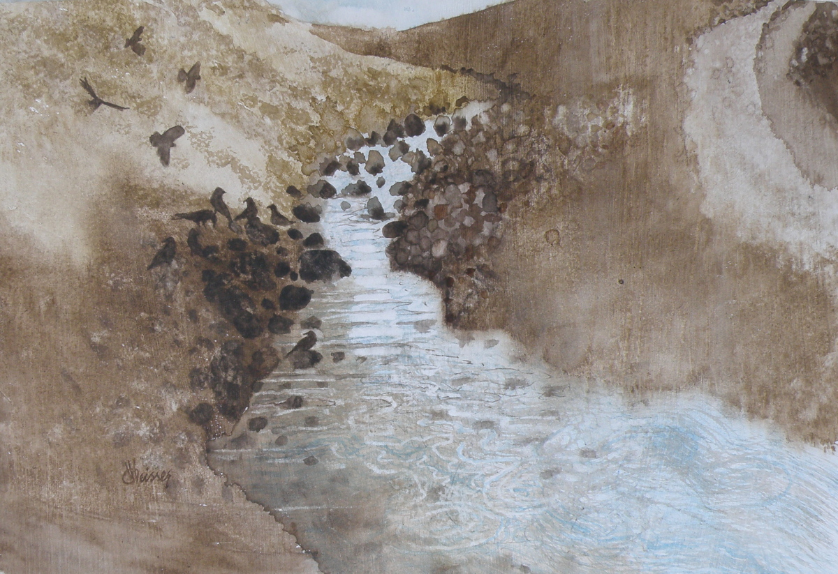
‘The Gathering’
watercolour by Lance Weisser, 8″ x 11″ on art board
for The Small Works Show, Kamloops Arts Council, November 24 to December 24
Old Courthouse, Kamloops, British Columbia
venice challenge
September 6, 2015
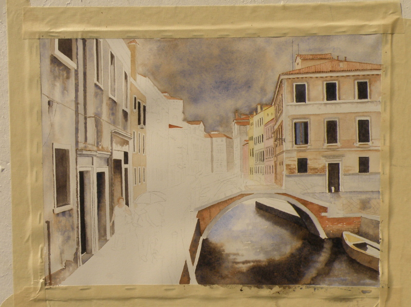
We’ve reached the finish line, limping all the way. This was somewhat beyond my abilities as a painter. Whether a success or not, every endeavour provides a great learning experience. All the watercolourists looked up to for advice offer the same counsel: when it comes to watercolour as a medium, suggesting detail far surpasses actually getting bogged-down in it. The pitfalls begin when the painter keeps trying to improve on what’s there.
Despite the overworked areas, enough aspects work to allow this to maybe escape the scrap heap — but probably not. It would, however, be useful to begin it again and learn from the errors.

venice challenge 3
August 14, 2015
It is so affirming when blogging friends don’t find details about paint pigments and their sedimentation arcane. One can easily picture guests around a table nodding-off face-first into their creme-brulee.
In the Renaissance, clay earth from Siena, Tuscany, (Terra di Siena, “Siena ground”) rich in iron oxide and manganese oxide was used for pigments. In its natural state, is a yellowish clay, and becomes raw sienna as a pigment. When heated up, it turns reddish brown and becomes burnt sienna.
However, due to its being heated up, there is a variety of watercolour burnt sienna shades and hues among the various manufacturers because some heat it a little more, some a little less, making it somewhat more or less ‘burnt’.
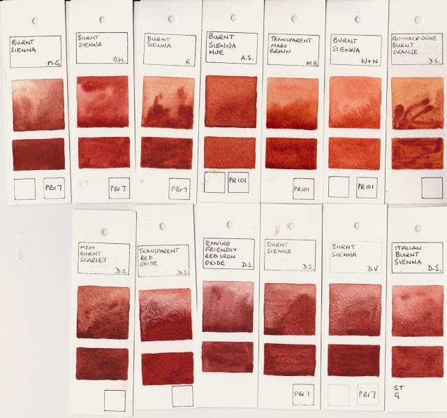
http://janeblundellart.blogspot.com.au/2013/11/watercolour-comparisons-4-burnt-sienna.html
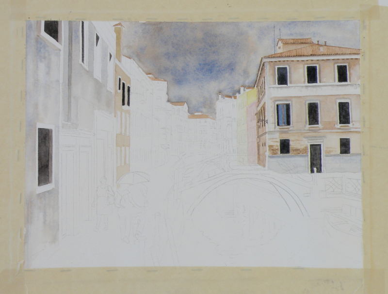
Ultramarine and burnt sienna will be the two colours for the whole piece with the exception of a bit of Rose Madder and Quin Gold for the more distant buildings. Doing so (almost) guarantees integration. That is because a viewer’s eye will find a colour harmony whenever the pallet is limited, as no one colour or tone will be glaringly different from the rest.
stage two
Focal points are achieved in limited-pallet paintings through value contrast (the dark windows against the lighter walls), rather than by there being a glaringly-different colour thrown in. That said, some of the early masters used a glaringly-different colour to great visual effect, as in Corot, whose ‘signature’ accent was the use of a dash of scarlet in an otherwise integrated landscape….

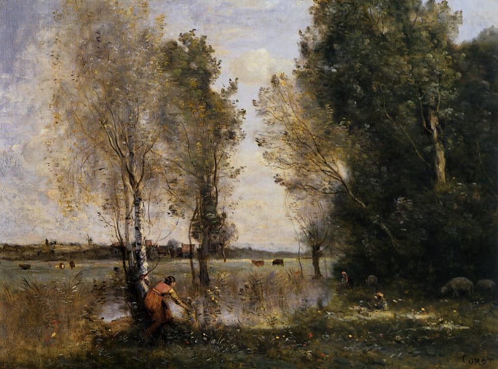

JEAN-BAPTISTE-CAMILLE COROT (1796 – 1875)
(sources for ‘burnt sienna’ from Jane Blundell and Wikipedia)
venice challenge 2
August 12, 2015
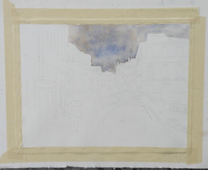
The ongoing quest to interpret in watercolour a photo of Venice by Frank Dwyer of our local Kamloops Photo Arts Club has begun to take shape with a decision to take this 11.5cm x 16.5cm image and paint it as bigger–28cm x 25.5cm (11″ x 14″) –simply because a miniature of such a complex scene might prove less successful.

So here goes….
Arches Hot Press #140 lb. Paper, stretched and stapled onto gatorboard, then taped.
As much as the photo (entitled ‘The Blue Umbrella’) reveals damp pavement and the umbrella-holding couple, the sky isn’t quite as rainy-looking as perhaps it can be made to be for artistic interpretation purposes. So ultramarine blue and burnt sienna were applied to the whole of the sky as a wash.
Ultramarine Blue has a nice quality of being one of the ‘granulating’ pigments of watercolour. Its origins stem from the grinding of lapis lazuli, and received its name from the Latin ‘ultramarinus’ (meaning ‘beyond the sea’) .
So treasured and prized by the early painters, ground lapis (from Afghanistan, principally) was used by the painters of early icons as the garments for The Blessed Virgin. (When The Holy Mother is depicted, her robes are red.)
In 1826 a synthetic version was created which itself derives from a mineral compound, lazurite, and is today the most complex of all pigments. Being a ground mineral, ultramarine produces sediment that dries in a granular way when mixed with water.
To get this effect, however, the painter must apply ultramarine as a wash so the sediment can, in fact, separate and settle to create granulization. That is why, then, the sky dropped into the first stage of the painting appears granulated and gives a kind of antique look. If ultramarine is applied with only a bit of water, or straight from the tube (yikes), it will not granulate as such.
Some watercolourists are so avid about granulization, they buy a granulating medium from Daniel Smith, which, when mixed with most any watercolour paint, granulates. However, the natural granulating pigments are raw umber, burnt umber, raw sienna, and some brands of burnt sienna. That is because they come from the earth, and earth leaves sediment.
All of this material comes from a variety of sources, including http://janeblundellart.blogspot.com.au/ — (a very thorough and devoted watercolourist from Australia).
venice challenge 1
August 9, 2015
Our local Kamloops Photo Arts Club is doing a joint arts project with our Kamloops Courthouse Gallery, involving the pairing of chosen art photographs with various art media interpretations based on the photo.
At one of our meetings we sat around large tables with a great many photographs strewn about, and at a given moment were invited to select ones which struck us as exciting to base our own work on. Jan, who is a weaver, selected photos which spoke to her about textures and colours. Others went with shapes, values, composition.
As a student of representational painting technique, almost all of the photographs were appealing due to their rich tones and lively views. One in particular was very striking because it involved architecture and rain and water, and an exemplary scene from that painter’s perennial eye-trap, Venice–a place so overly painted, yet so eternally attractive.
“Blue Umbrella”, 11.5cm x 16.5cm (4.5″ x 6.5″), Frank Dwyer KPAC, 2014
Choices had to be made immediately about size, complexity (whether to simplify while not messing with the integrity of the scene), wetness/dryness (very rainy? or as is), attention to detail (loose interpretation, or ala the photo itself), type of paper, and selection of pallet (minimal number of colours, or full compliment), overall tonal value (to keep it dark or go for something less so).
There is a website where its blogger goes to great and tremendously helpful lengths to demonstrate the qualities of particular watercolour colours when mixed together. Her name is Jane Blundell http://janeblundellart.blogspot.com.au/. When wanting to know what might work well as a pallet, she never fails but to provide great choices. So it was through her that the combination of Ultramarine Blue and Burnt Sienna was selected as the backbone for this challenging photo/watercolour project.
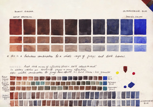
combination of visual effects possible when combining burnt sienna and ultramarine blue, Jane Blundell: Watercolour Comparisons 4 – burnt sienna
This visual and written saga will continue as progress is (slowly) made on this. If all is well, the painting and the photograph will be displayed side-by-side in The Main Gallery of The Old Courthouse, Kamloops, B. C. for the month of November. (www.kamloopscourthousegallery.ca)
