When it’s all about sky….
August 1, 2020
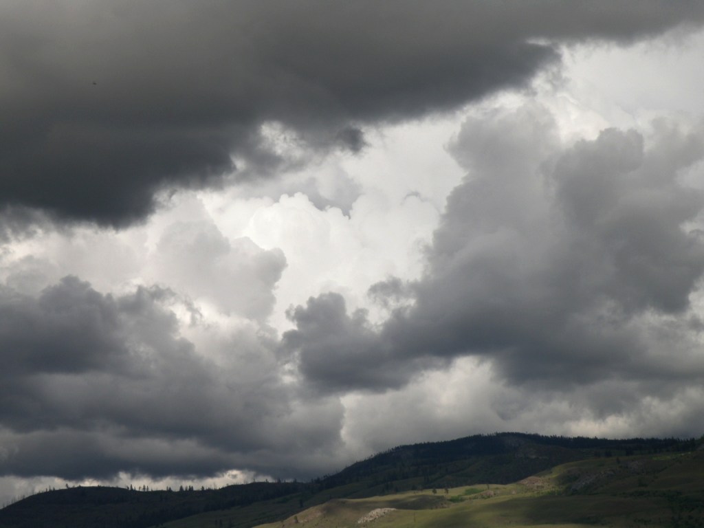
Lately here in Kamloops, British Columbia, we’ve been treated to cloud Cirque du Soleil. Each time I step out on our deck, there’s another stunning performance in progress:


As a student of watercolour, the challenge of painting skies on location doesn’t come from the medium itself because all it amounts to is sloshing water-tinted pigment over paper.
It doesn’t get more immediate than that.
Clouds are suspended water vapours being moved about by the atmosphere and wind. So a marriage made in heaven–immediate subject matter matched with an immediate medium, yes?
Um, well, maybe for some…. It takes a lot of confidence, deftness and elan to nail a quickly changing sky, and those aren’t exactly my gifts.
What helps move my senior’s ass is panic-induced adrenaline, like the time I brought all my equipment down to Kitsilano Beach in Vancouver. Perched in my umbrella-shaded lawn chair, sipping iced tea, leisurely sketching the Vancouver skyline, I noticed the sky dramatically changing from a fluffy blue to an angry charcoal.
After lugging everything from the parking lot to the shore, I wasn’t about to give up my precious spot for a little weather. Prudence did step in, however, and whisper in my aging ear that I had only minutes to accomplish what I’d been taking hours dallying over.
And then the rains came down, bruising the top of my umbrella, the beach crowd scattering, wind whipping the waves. As the saying goes, ‘in for a penny, in for a pound’, I finally found my spine and went for it, drops pelting my paper, gusts throwing up sand.
Cloud Studies
July 21, 2020
Sometimes there’s a need to trample on whole bunches of internal dos and don’ts, accumulated over years of anal retentive watercolour practices.
‘Don’t premix washes–glaze one pigment over another right on the paper’; ‘Don’t soak the paper in the bathtub and then stretch it on a stretcher–it removes the lovely sizing’; ‘Don’t get obsessed with detail–be expressive’; ‘Don’t use opaque white’; ‘Don’t use so much masking fluid’; ‘Don’t be so timid’; ‘Don’t paint today–you aren’t centred’.
Lordy. I went to the sink, grabbed a kitchen sponge and some dollar store poster board.

For all who might be equally plagued by a mental build-up of watercolour dos and don’ts, have a look at this example of watercolour exploration and artistic daring:
Cloud study
June 21, 2020
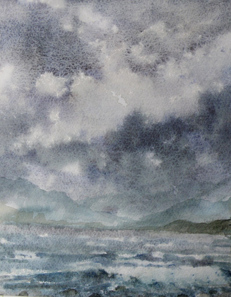
The problem is, clouds can look terribly dark, yet the prevailing wisdom by learned painters is the caution that regardless of how dark the sky might appear, it is the lightest component of any landscape painting–except in rare cases like snowscapes, or some seascapes.

The temptation, at least for me, is to go about trying to recreate that memorable sky full of drama by mixing up a bucket of what might best be described as ‘peat bog grey’ or ‘burned frying pan umber’ and sloshing it onto the top of the picture.
The end result is a landscape where anyone deigning to walk would be greatly at risk–paintings where interspersed throughout should be little yellow triangular signs reading: WATCH FOR FALLING CLOUDS :

The other prevailing wisdom by a great many worthy painters, is that if one’s painting is featuring clouds, then whatever else is depicted ought to be kept rather simple and relatively free of detail. Conversely, if the focus is on whatever is happening below the sky, then the sky itself should be left unassuming and merely supportive. The above painting is a good case proving that point.
Stage Two: Waxwing Watercolour
February 5, 2018
1) They are named Waxing because they sport red wax-like accents on the tips of their secondary feathers;
2) Although they eat insects during Summer months, they thrive on berries the rest of the year and, in our part of British Columbia, go about in groups to feast on Mountain Ash berries;
3) If there is a cluster of berries hanging from the tip of a long branch that only a single bird can reach, sometimes the rest of the group will line up and pass berries beak-to-beak down the line allowing each bird the opportunity to feed.
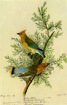
Audubon Print
Its fondness for the small cones of the eastern red cedar is why this particular Waxwing is called ‘Cedar’ Waxwing. (My first post is mistaken in assuming they are not found in Eastern N. America. They are–but I just wasn’t privileged to spot any when growing up in upper New York State.)
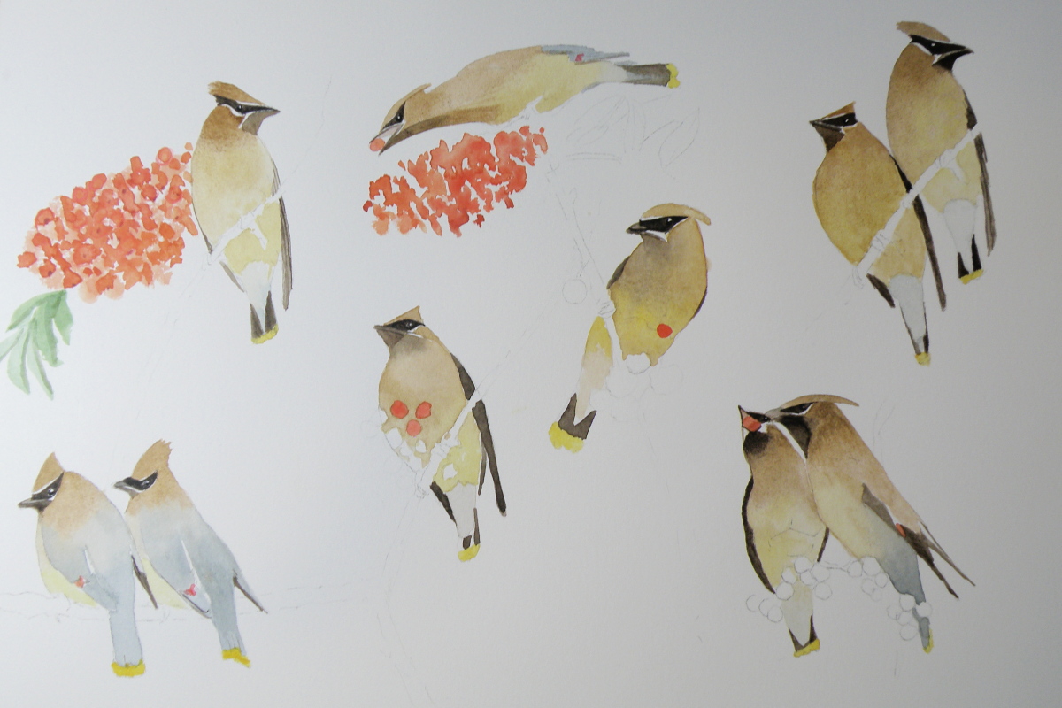
Cedar Waxwing watercolour-in-progress, Saunders Waterford Hot Press Paper 140 lb.
[above facts gathered from Cornel Ornithological and Wikipedia websites]
….depicting snowy pines
October 22, 2015
Snow-laden firs and pines aren’t the easiest of subjects for depicting in watercolour–(at least not for this painter). The challenge comes in first understanding the effect snow has on branches, for, obviously, there is snow and then there is snow–each snowfall having its own unique effect. That crystalline, hardened seizing of tender branches by icy snow pulls them heavily towards the ground, while sub-zero powdered flurries creates a mere dusting of needles–each presenting technical challenges.
Of course, the problem is one of always having to paint around the white of the paper allowing it to ‘be’ the snow in watercolour. Given that opaque white can’t be used, a light dusting on pine needles becomes really quite a bit more difficult than painting the after-effects of a full-blown blizzard. Leaving minute dots of paper surrounding green needles is a recipe for madness in my book. Give me a snow-stormed pine any day of the week in its place.
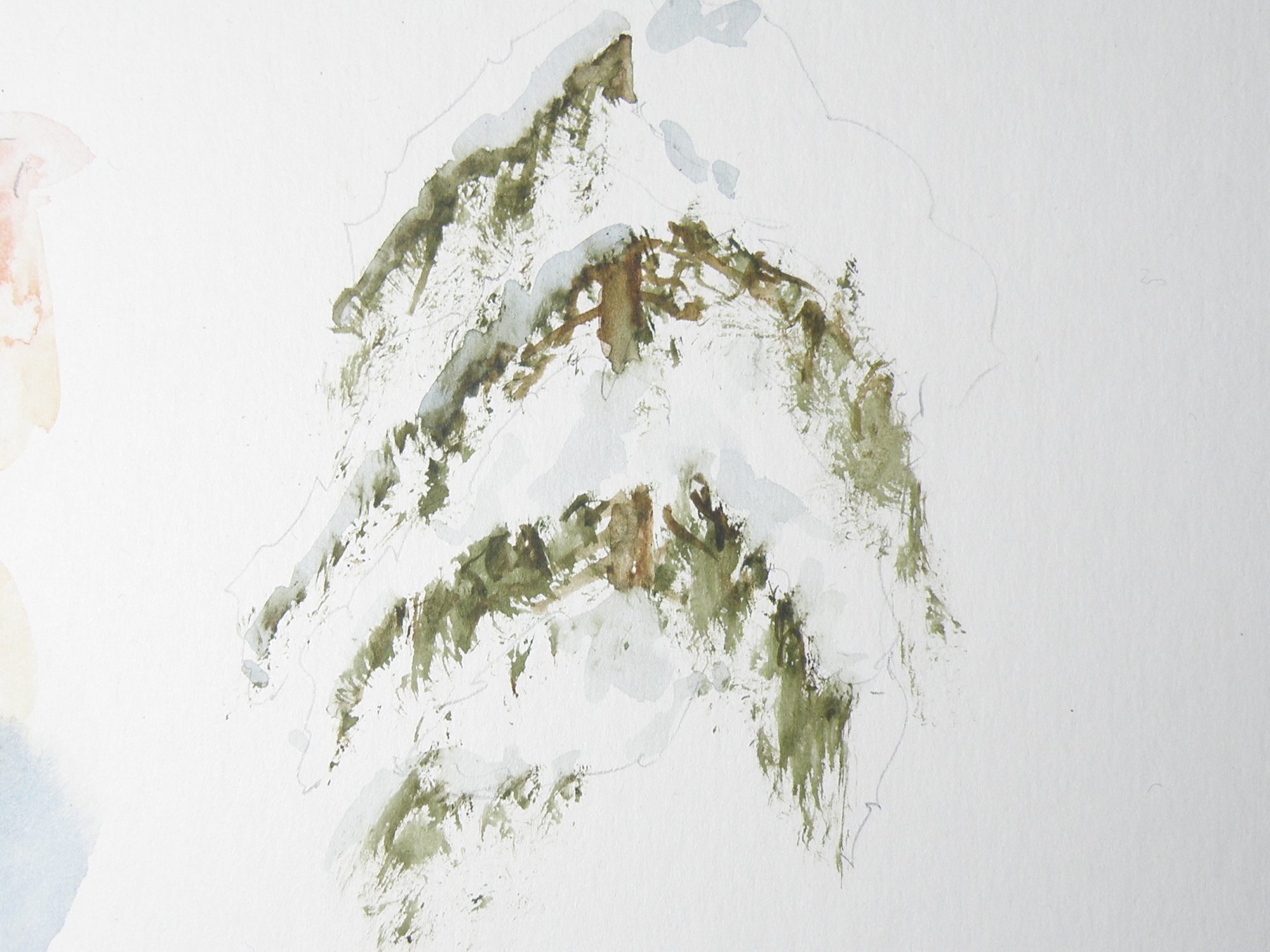
Figuring out just where branches are on a given variety of pine, fir, balsam, cedar or spruce is key to understanding where snow will sit when on them. So it seems crucial that any study be limited to particular species, (in the above case, cedar) — otherwise, a painter of representational art will be in danger of ending up with a kind of ‘marshmellowed’, generic evergreen most often seen on Hallmark Christmas cards.
Truly, each variety of coniferous tree accepts snow in its own unique way. A blue spruce, for example, with its stiff, jutting branches, is much more able to bear the weight of snow than the red cedar in the above study, whose branches are prone to drooping and bending.
This study was done on leftover piece of plain white matt board, using a chopped-up small fan brush to go after the greens, then a more pointed, conventional brush to soften the hard edges and provide shadowed depth to the snow. The branches aren’t quite correct. Once snow is included, it changes perception to such a degree, I have trouble understanding where it goes and branches fall.
The beauty of our being blessed with so many evergreens to choose from comes in knowing that each one offers the student of watercolour great and intriguing challenges, especially when brimming with that wonderful adornment–snow.
