twilight time
June 26, 2015
DUSK HAS ALWAYS BEEN a magical time for photographers and painters alike. Exemplifying this is John Singer Sargents’ famous work, ‘Carnation, Lily, Lily Rose’ . . .

He would work on the piece by running outside every evening at that magical time to take in the effects the setting sun created in his garden, and add more detail to this wonderful painting–and did this over an entire year, between 1885 and 1886.
It borders on fatuous to have a Singer Sargent and something of mine on the same page, so please refrain from making a comparison. Rather, note along with me that regardless of who is photographing, painting in oils, watercolour, or pastel, trying to gain an understanding of the effects of the setting sun continues to be a worthy and challenging pursuit, no matter which century we happen to find ourselves living in.
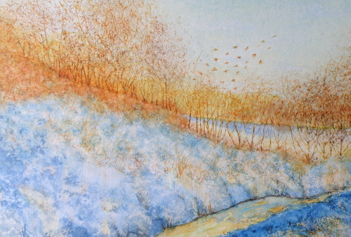
“Winter Sun”, watercolour, 20cm x 30.5cm (8″ x 10″), art board, unsold
more night
June 5, 2015
I KNOW, I KNOW, it’s June. I’m incurably attracted to Autumn and Winter, most likely because they are for me what I’d describe as cozy seasons, where a sweater serves perfectly.
ADMITTING to age preferences is slightly embarrassing, but only slightly. Heat is no longer an attraction to me, weather-wise, and here it is June 5 and in two days it will be going to 92F (33C). Now please, do NOT misinterpret this as whining. I’m not (right now), but rather simply stating a preference in order to justify posting this painting….
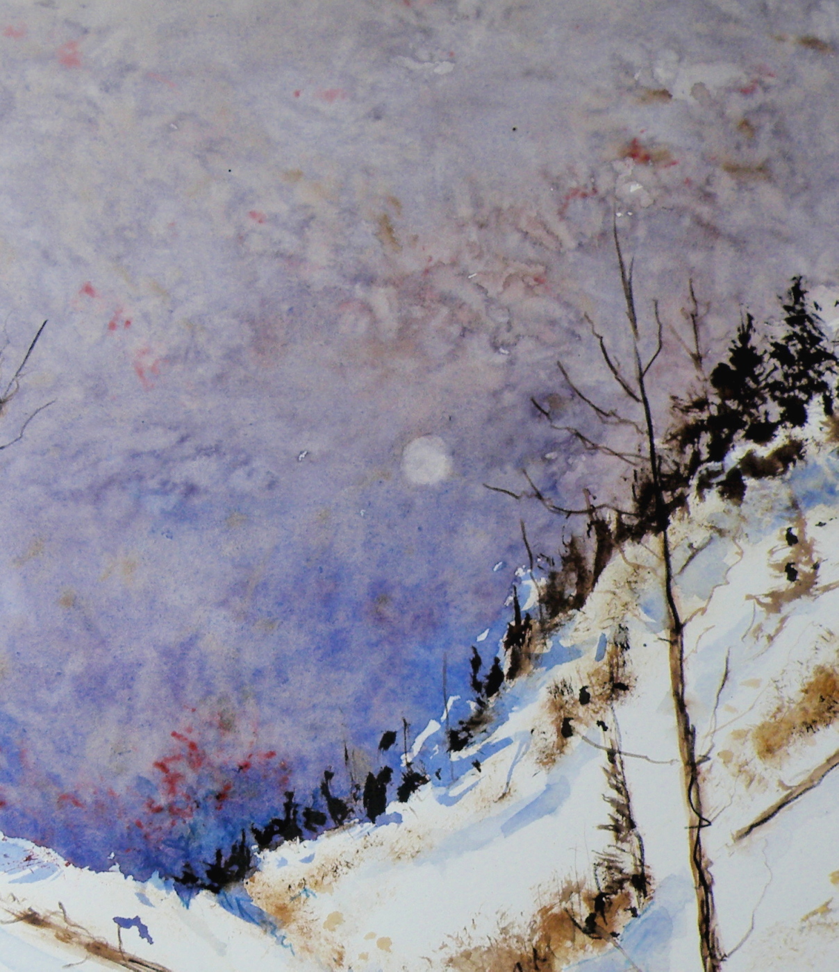
‘Pale Moon’, Watercolour on Arches Hot Press 140 lb Paper, 13cm x 18cm (5″ x 7″)
WHEN PAINTING, I admit to finding it more satisfying to express feeling through stark scenes with diminished-light. For one thing, the above place is not one many people would find themselves visiting at that hour in that weather. It therefore brings us in as though inviting a search for Snowy Owls on the prowl, or a pack of Grey Wolves threading a path back to the lair.
painting night
May 18, 2015
THERE IS A FASCINATION surrounding night, when all is cloaked in darkness and the earth dons a mysterious manteau.
WE SEE, and yet we don’t. Depicting night is a painting fascination because I personally do not have a firm visual anamnesis of what exactly night ‘looks like’.
FOR EXAMPLE, is the moon really white–or silvery? Or is it, rather, lemony–or perhaps, blue?
A NUMBER OF RENOWNED NORTH AMERICAN PAINTERS made the depiction of night their signature subject. Some, like the famous Western painter, Remington, chose to depict moonlight as a bit of each, including even at times, degrees of green….


IT IS SOMEWHAT OF A MYSTERY as to what our eyes truly see, in terms of chromaticity, when looking at night, and particularly, moonlight. Painting night offers an enjoyable challenge: convincing viewers that what has been painted corresponds to their personal, nightly experience.
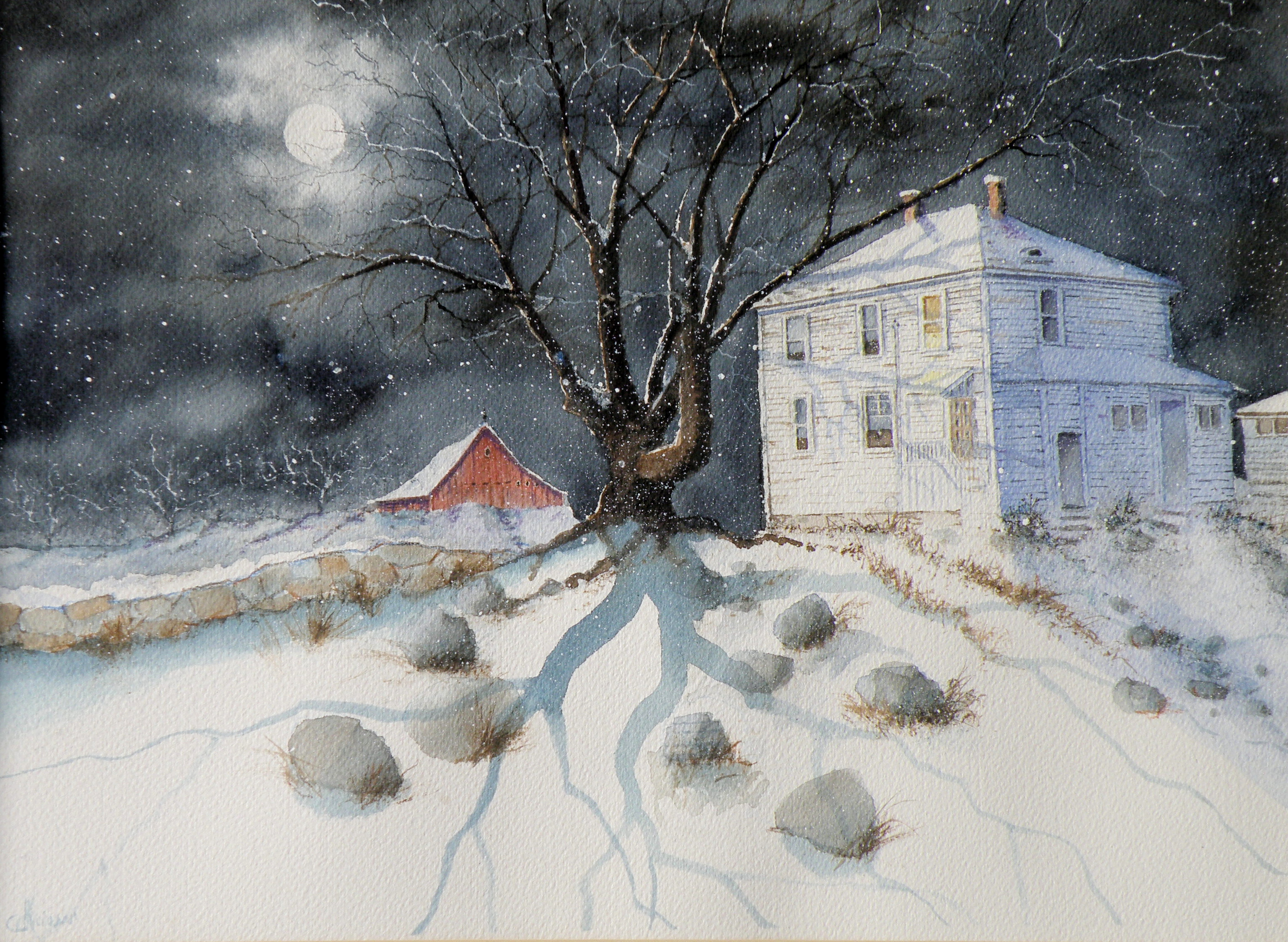
‘Up Late’, watercolour, Arches Hot Press Paper, “14×18”, (sold)
THIS IS ANOTHER heritage home in Kamloops, known locally as Fort House, because it was built on land originally used as a Fort by The Hudson Bay Company when Kamloops was established in 1812. At present, this early 20th century farmhouse is a rather rundown rooming house.
A FEW LAST COMMENTS about this painting…..there is a decided difference between nature and the art of depicting nature. Mother Nature is not only a hoarder, but not interested in housekeeping nor pruning, encapsulating, or boiling-down. She wants it all, all the time, and enjoys lavishing on us the plentitude of what happens when everything we look at, at any given moment, reproduces at will and overwhelms us with dozens–and even thousands–of itself.
FOR THE LANDSCAPE PAINTER the challenge, always, is to take Nature and make it into Art. It is the very human discipline of paring down, re-arranging, configuring and composing. What separates raw Nature from the art of painting is having a limited space, with only two dimensions, which is ultimately going to end up on a wall inside a human-made space. That restrictiveness requires moving trees and clouds and birds about in order to have a sense of balance or sense of wonder or sense of drama. It means the painter must dare to alter time itself, put limits on colour, and restrict amounts of what is naturally before the painter’s eyes.
MAKING ART is similar to the difference between looking at a field of wheat and sitting down to a loaf of freshly-baked bread. What happens between those two events is the act of altering something to create something else.
THIS PAINTING is not what the photograph of this scene looks like. For many years I struggled with whether I was ‘allowed’ as a painter to do anything other than depict Nature as it presented itself to me. Sitting out on some stoney ground, I would suddenly find myself slavishly working at painting the weeds between cracks of rock, then painting the seed heads on the weeds to look exactly like what my eyes saw, when really I knew the larger purpose of sitting there in the hot sun was not to pay attention to weeds, but to paint the distant mountains above and beyond them. By the time I’d gotten away from doing weeds justice, I was so hot I had to fold up my equipment and go back to the car. And I went home with a painting of weeds between rocks and a big expanse of white paper above them.
THAT DOESN’T HAPPEN ANYMORE. I have learned that I must take what is presented to me and do with it as I wish to do. That is the work of a painter.
A PHOTOGRAPHER has a whole different set of challenges because a lens is very different from a human eye (it can’t do half of what a living, ‘breathing’ eye can do) and from human imagination (once it has seen what is before the eye) . But I have noticed some irony happening between the worlds of photography and painting. In the past, painters often worked very diligently to make a painting ‘look like’ a photograph. These days, with technological photo-shopping manipulation, a photographer seems more or less obsessed with trying to make a photograph look like a painting. I am not convinced either enterprise is worth spending all that amount of time on.
IF A PAINTER WISHES TO BE A PHOTOGRAPHER, then don’t go trying to make a painting into a photograph. Do go and take courses and buy equipment and learn how to take photographs and do the work a photographer must work at in order to eventually become a photographer. And IF A PHOTOGRAPHER WISHES TO BE A PAINTER, then leave the photo-shopping manipulation apps alone and do take courses and buy equipment and learn how to paint paintings and do the work a painter must work at in order to eventually become a painter. They are two distinctly separate and inherently different artforms and–in my flawed way of viewing things–should stay that way.
AND YOU…what’s your view? Tell me how I’m missing things you’ve discovered!
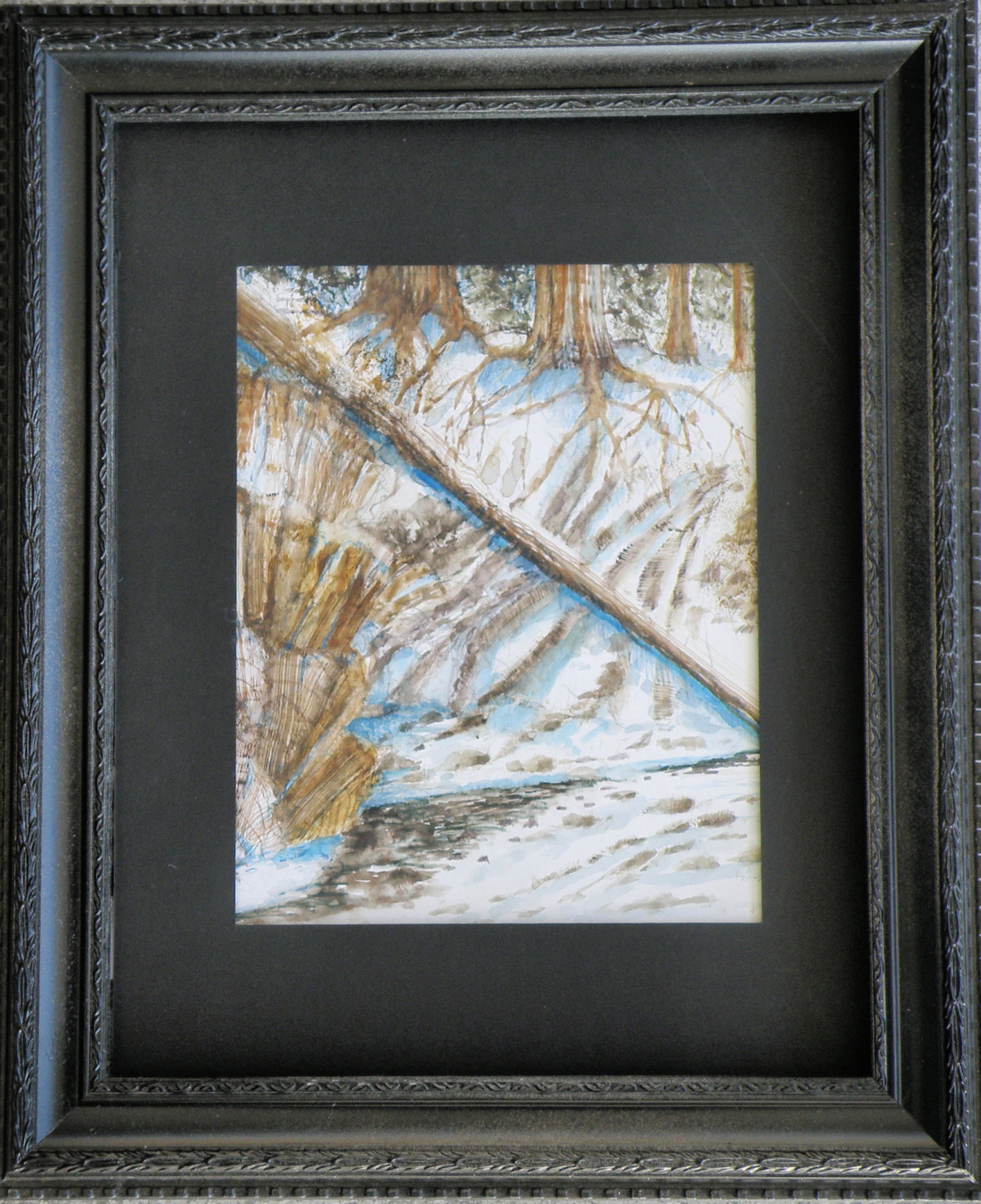
Painting progression 3…. ‘Jamieson Creek Thaw’
April 4, 2015
BECAUSE WATERCOLOUR is such a watery, transparent, delicate medium–one which must always allow the paper it’s laid on top of to breathe through it–one which traditionally doesn’t use white pigment, but relies on the paper to be the white of the painting–BECAUSE of this (and more) the challenge of the watercolour student is to convey an illusion of texture, without the ability to actually build up a surface texture.
WERE WATERCOLOUR PIGMENT applied so thickly as to create an impasto-like texture on the paper beneath, it would lose its luminosity and look pasty, muddy, dull–worse, it would crack. Watercolour pigment only works when the paper beneath dazzles through it and brings life to the pigmentation. In other words, watercolour as a medium is more the business of staining paper than it is a business of building up layers and coats of daubs, stipples, slatherings.
THAT’S WHY CARE is required to not apply so many washes that the luminosity of the paper receeds and eventually provides no life at all. And that’s why the whites of the paper must be thoughtfully reserved and left untouched in key areas–the crests of waves; the moon; snow; clouds; a picket fence–and skill taken to paint AROUND these places to let the paper be the white.
SO….a student of watercolour (me) learns early-on that (s)he will be a student of the medium for life–that mastery is illusive–and failures, many. A good piece is approached very thoughtfully, noting where the paper will be left to serve the function of white (pigment) and painted around. Then the student will also have to gather enough courage to apply exceedingly dark washes in one ‘go’, while maintaining a sense of secure, carefree animation in order to present an immediacy and liveliness in the final piece.
THE DEATHKNELL of a failing, dying work of watercolour is finicky overworking of areas, and a refusal to accept what happened when water joined pigment joined brush joined paper. It is NOT a medium for those who love to micro-manage or be in control.
THE STUDENT OF WATERCOLOUR has to be more a Peter Pan than a child wanting to grow up–loving the thrill of what happens when ‘danger’ is courted, yet having the assurance that daring will win the day. However, that daring and search for adventure–on the surface of a good piece of paper–will only be pulled off if it is backed by enough experience to have a good hunch about what will happen when such-and-such is tried.
ATTEMPTING what remains beyond one’s ability isn’t courting danger–it is ignoring it. Trying to fly without thinking happy thoughts will give a person a broken bone. Within the bounds of representational art–(i.e. wishing to have a tree ‘look like’ a tree)–a painter cannot ‘pull off’ a landscape with lots of shadows if (s)he has yet to study them in some depth. Trying to do a scene which includes far far more than what one yet learned how to interpret is an invitation to frustration and wanting to give up watercolour for say, acrylics (oh, my).
AND SO FOR MYSELF, I know by this time that I must confine my attentions to learning about how corn grows, what it feels like, looks like, behaves like, before I can throw my abandonment into rendering a watercolour of winter corn in January. Not only that, but I must also have studied the qualities of snow–the qualities of what a winter sun does to shadows of corn stalk–the blues, the purples. And only then can a learned abandonment bring about a possible reward.
IT TAKES A LONG TIME to find the right paper, the right brushes, the right working pallet of colours, the right approach and the right subject matter. Knowing what can be done when paper is sopping wet–and what can’t–depends on who made the paper, how thick it is, how textured it is, how stretched it is, how quickly it will dry. Knowing when to wait until the paper is exactly wet or damp or dry enough to throw one’s energies at it, comes (usually) through ruining (many pieces of) good paper.
HERE IS THE LATEST DEVELOPMENT of the subject of Jamieson Creek in a February thaw…..
TOMORROW will (hopefully) provide a photo of the finished piece!
Painting progression 5
March 16, 2015
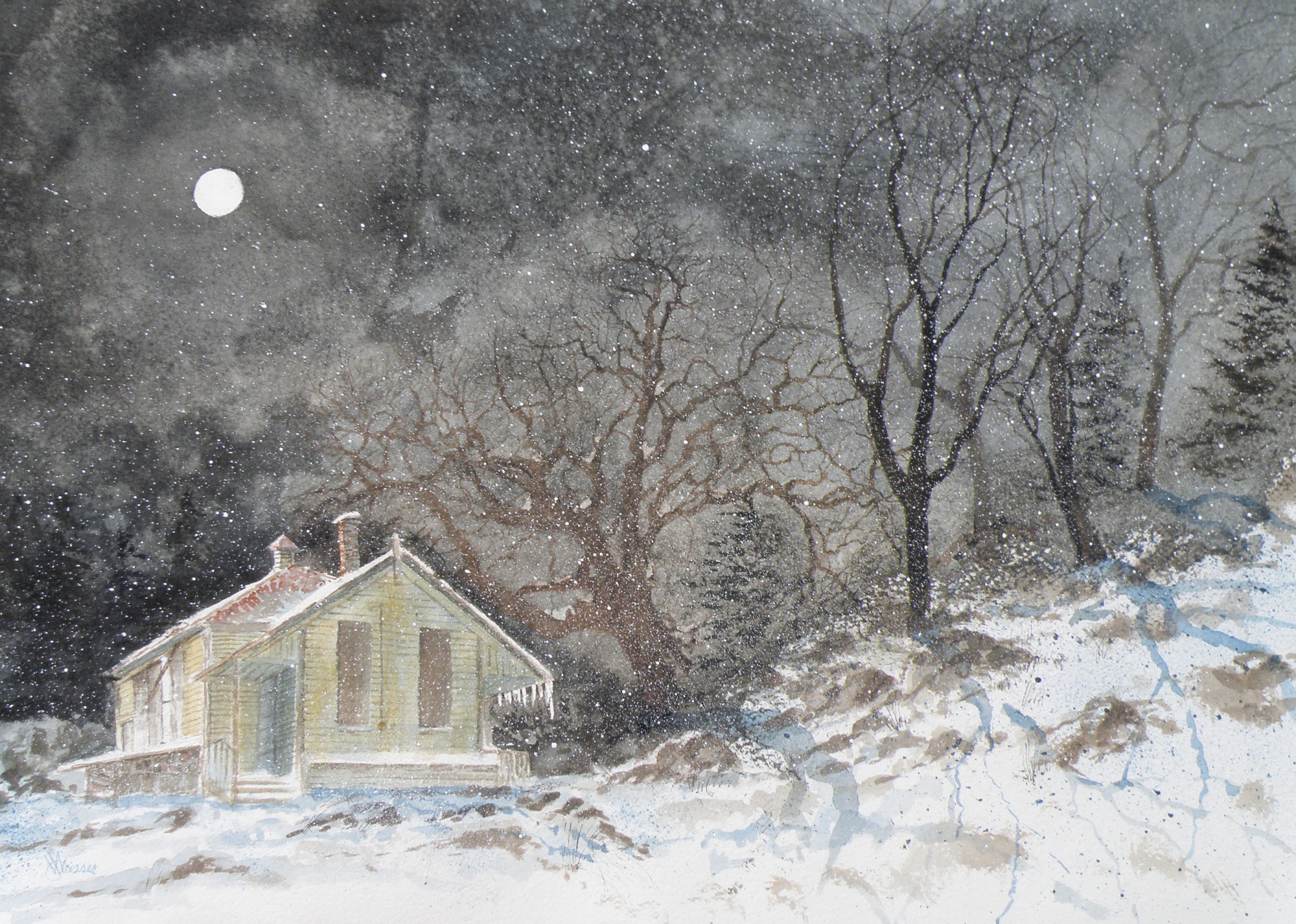
THE FINISHED piece–“Abandoned Schoolhouse, Pritchard”. The rocks needed darkening and definition. Pines were added. Spattering of snow was used to unify the whole and add a feeling of movement.
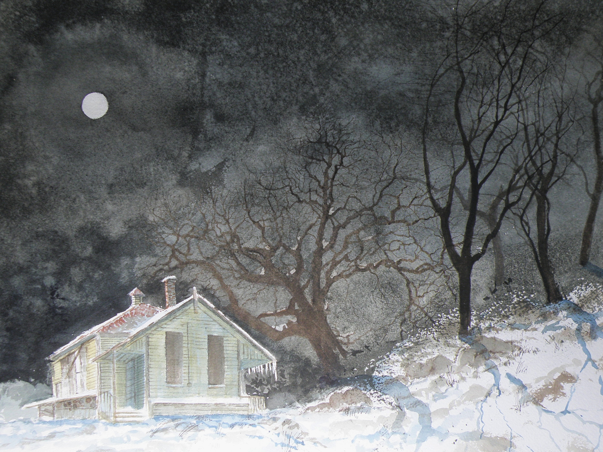
Painting progression 4
March 15, 2015
MORE TREES needed adding. The suggestion of rocky outcrop is introduced. The aging building is blocked in. Shadowing completes this phase…..
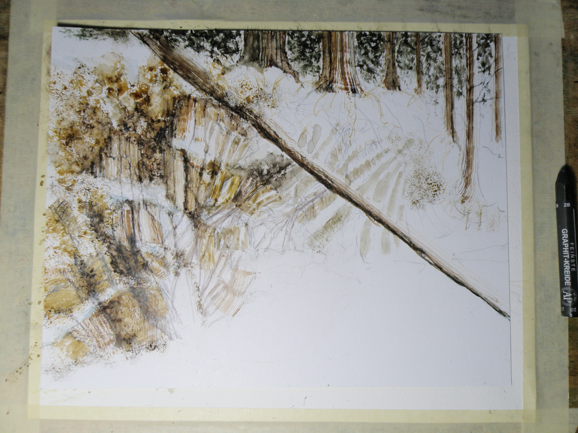
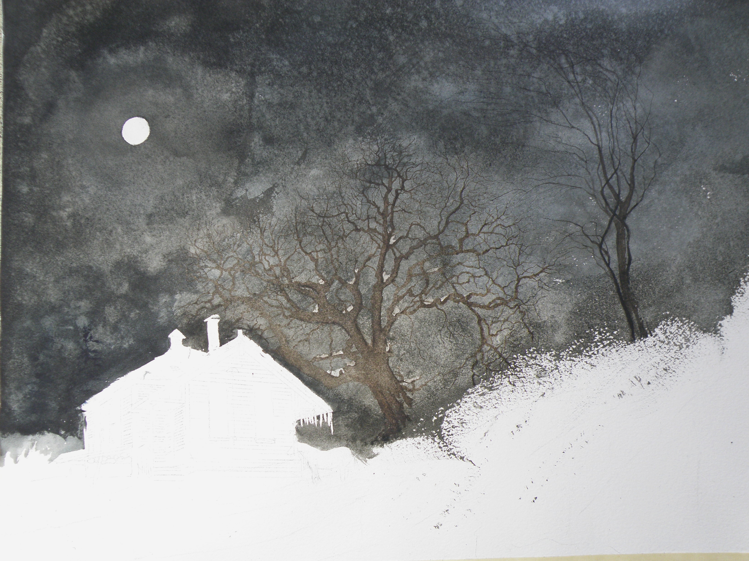
Painting progression 3
March 14, 2015
THE MOON and schoolhouse roof were masked, then a wash applied in the sky areas.
Once done, a decision was made to next eliminate the horse, it becoming an unintended focal point if left in. (A lone horse standing at night in front of an abandoned school in bitter cold would be incongruous).
New Painting
May 23, 2012
One more post before another Tylenol 3!
This painting is based on another photograph from the Irish Photographer Joseph Hogan (used for reference with permission). I have previously used his photography for the painting ‘Winter Barn’ (posted below). It is the second painting of it, as the first crashed and burned at the last minute when applying the wash of burnt umber for the shadow.
Like most watercolours, it had to be thoroughly thought out before beginning. It was deceptively difficult even though it looks rather a simple and straightforward subject.
Here is a preliminary look at it while in progress . . .

Initial wash of diluted Burnt Umber . . .

more detail added . . .

nearing completion . . .
The finished painting . . .

“Poppa’s Chair”
7.5″ x 10.5″ watercolour on 140 lb. Arches Cold Press Paper
It is a painting with a Father’s Day theme, now hanging in The Old Courthouse Gallery here in Kamloops, British Columbia.
Tylenol 3 here I come. . . .
Fort House
January 3, 2012
Kamloops (a native word meaning ‘the joining of two rivers’) has evolved from an c1812 outpost of The Hudson’s Bay Company and an early Railroad and Gold Rush centre into the largest city in the Thompson-Nicola Region of British Columbia’s Interior.
One of our most distinctive houses situated near the North Thompson River, was built in 1907 for a farmer, Archie Davis, who had purchased land originally belonging to Fort Kamloops. It sits at the corner of Fortune Drive and Fort Avenue, and is simply referred to as ‘Fort House’. No longer in the Davis family, its acreage has been reduced to a lot-sized yard, and its classic box design has been altered so that now it is a rooming house with various entries and stairs added.
Wanting to depict it as it once was, this painting imagines a moonlit night with one lone window indicating activity, perhaps Archie Davis preparing to get up–pre-dawn–to attend to his animals and daily chores. It was purchased almost as soon as it was displayed, by a young couple who have a fondness for this familiar Kamloops landmark.

"Up Late"
