Cloud Studies
July 21, 2020
Sometimes there’s a need to trample on whole bunches of internal dos and don’ts, accumulated over years of anal retentive watercolour practices.
‘Don’t premix washes–glaze one pigment over another right on the paper’; ‘Don’t soak the paper in the bathtub and then stretch it on a stretcher–it removes the lovely sizing’; ‘Don’t get obsessed with detail–be expressive’; ‘Don’t use opaque white’; ‘Don’t use so much masking fluid’; ‘Don’t be so timid’; ‘Don’t paint today–you aren’t centred’.
Lordy. I went to the sink, grabbed a kitchen sponge and some dollar store poster board.

For all who might be equally plagued by a mental build-up of watercolour dos and don’ts, have a look at this example of watercolour exploration and artistic daring:
Sky Positioning and Treatment II
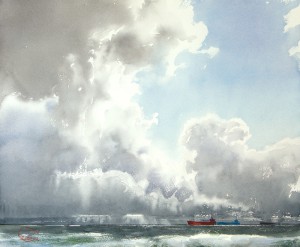
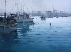
July 1, 2020
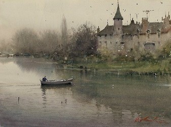
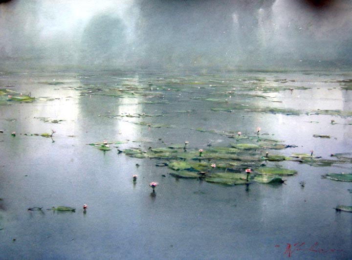
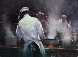
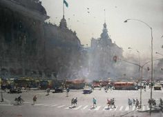
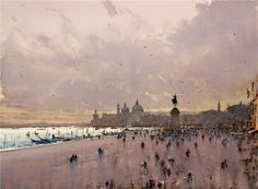
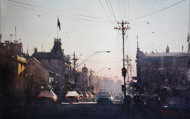
Just as choosing to place one’s subject matter in front of bright sky produces remarkable effects as in the work of Joseph Zbukvic, so also can equally-remarkable effects be achieved when making the sky itself the subject.
An almost unparalleled master is a lesser known watercolourist than the celebrated J. Zbukvic, but a truly exquisite painter of both sea and sky, the Russian Sergey Temerev:


Here is a video of him at work:
Now, those are clouds.
standard-bearer of watercolour
August 15, 2015
Touted often as being the most difficult of mediums, and sometimes even as ‘the medium of mediums’, not everyone holds watercolour in such honour. Indeed, oils are deemed the zenith of painting mediums.
‘Blowing the horn’ about watercolour as the ‘medium of mediums’ is a bit rich, perhaps. That is, until one tries to master its elusive qualities and discovers how the more it is controlled, the less it is allowed to be what it is: a medium set free by water.
Perhaps no greater example of the power of watercolour allowed to find its own way through minimum control is by the hand of its greatest advocate, J. M. W. Turner.
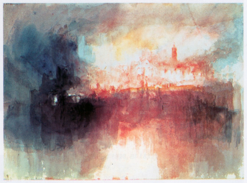
‘Incident At The London Parliament’ 1834
“If I could find anything blacker than black, I’d use it” is a quote which highlights Turner’s love for the power of contrast, which is what watercolour achieves spectacularly when the snow white of the paper is allowed to breathe while then bordered by the darkest dark.
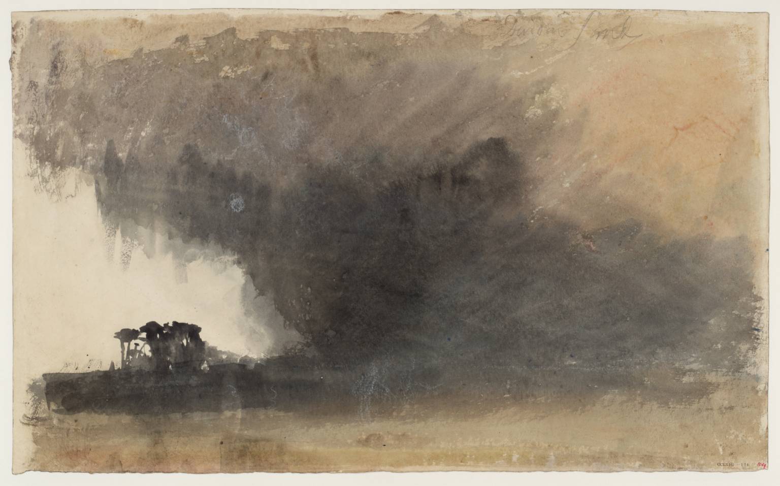
‘Duddon Sands’ circa 1825-32 Joseph Mallord William Turner 1775-1851 Accepted by the nation as part of the Turner Bequest 1856
Joseph Mallord William Turner is sometimes referred to as ‘the father of the abstract’. It is possibly due to the apparent pleasure he took in allowing the medium to run wild, catching it back at just the right moment to indicate location.
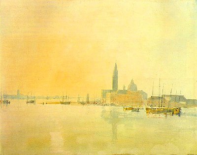
a Venetian watercolour, ‘Untitled’, JMW Turner
Somewhere there is a story about how Turner was very guarded over letting anyone watch him work. But at some sort of gathering Turner asked a young boy if he wanted a picture of something he liked. The boy asked for a Spanish Galleon, and the artist took him into his studio, and not too long afterwards the boy immerged with a small and perfect depiction of a great ship in tossing waves.
Grilled by others about how the master had gone about producing it, the boy dazzled them in claiming Turner was very fast–almost phrenetic–using one unusually long fingernail to rather frantically scrape and tear at the paper for crests and foam of storm-thrown waves.
inspiration galore!
July 6, 2015
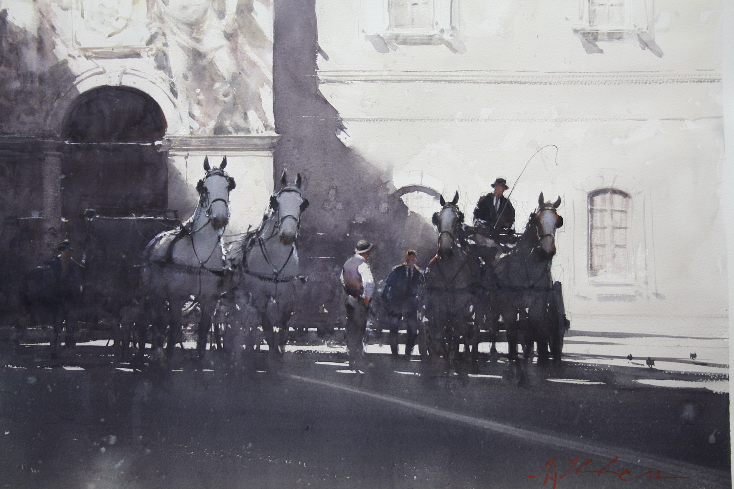
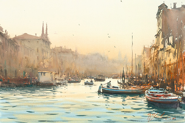
THERE ARE TODAY few watercolourists with the mastery, control, spontaneity and lyrical grace of Joseph Zbukvic, an Australian painter who emigrated from Zagreb in 1970, and took up watercolour in his adopted country.
He is among a handful of true masters of classical watercolour technique, due to an ability to transform veritably any subject into visual poetic language.
Adroit and seemingly effortless whether out on location or in the studio, Joseph Zbukvic’s handling and style builds on a foundation of an accurate, yet freely-rendered underdrawing, the suggestion of detail, a flawless sense of both composition and values, sparing yet daring choices, brought off with efficiency and dashed-off finishing touches of highlighting contrast.


This calibre of painting keeps any student of the medium of watercolour inspired and wanting to stretch and keep striving. It is a wonderful thing to see how high the watercolour bar can be set!
