Where Green Reigns Supreme
February 10, 2020
In watercolour-land much discussion takes place over how one goes about dealing with an abundance of greens in a given landscape. Summer landscapes abound with green, all of them different in hue and tone and degree. The old school adherents council the need to create greens from the various blues and yellows available on one’s pallet–that using those pre-mixed greens directly from tubes will only clash.
So if one is using Cobalt Blue for one’s sky, for example, using it with a Raw Sienna or New Gambodge for a foliage green will integrate it, anchor it and serve to unify the painting, as long as one then also uses the Raw Sienna and New Gambodge in other parts of the painting as well.
There are, however, such a huge variety of pre-mixed Greens being offered, it is almost too tempting not to use them, or at least borrow from them when mixing a blue and yellow, as was done in this little sketch of a Bulacan yard, Philippines. My spouse, Raul, is from there, and I stayed for a month each time over three years, a place so fresh and lush, it is a virtual and visual smorgasbord of every green there is.
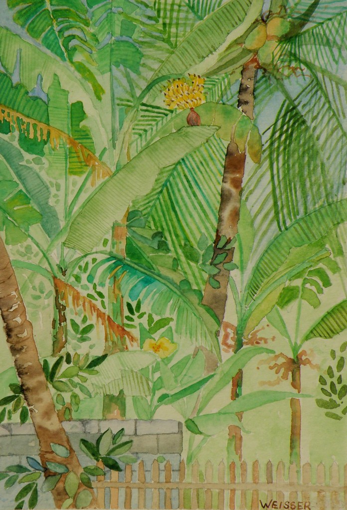
watercolour sketch, 5″ x 7″ on ordinary card
by Lance Weisser
it’s not easy being….
August 18, 2015
The beauty of people is that though 99.9% the same, we all know it only takes going to, say, The Iowa State Fair, to discover we’re probably not. All you have to do is stand aside (wondering what on earth you bought that hot dog and sauerkraut for) and watch everyone passing by.
This is just a convoluted way of confessing that not everyone is a great fan of Summer. Painters (some painters who write certain blogs about watercolour) in particular who like landscapes can (on occasion) find Summer just too, um, well, green.
There are ways of uncomplicating all the greens. When I lived in The Adirondacks of New York, not far from our town, in another small town, the famous Grandma Moses, who began painting at the age of 78 had only recently died at the age of 101 .


She was once found in her studio with masonite panels at her feet and a roller with blue paint. Looking up from coating a panel and filling the roller with more blue from the tray, she informed her visitor, “On Thursdays I do skies.”
In 2006 one of her pieces sold for $1.6 million.
Greens can be as simply applied to a landscape as opening up a tube of something and rolling it on. In representational forms of art, trying to authenticate the many greens of a summer scene can be a complex challenge, if for no other reason than that there are just so many variations. Leaves on the very same tree play on different greens, without even mentioning the grasses, shrubs, bushes, ferns below it.
Because it is a colour derived from mixing blues and yellows, greens straight from the tube nearly always have a garishness when, for example, painted against a very blue sky. That’s because the blue of the sky likely isn’t the same blue used to create that particular green. If the sky is cerulean, mixing a green from cerulean and a yellow used in another part of the painting will harmonize. So finding ways to harmonize greens through using their primary parents elsewhere in the painting is a way forward–a way of conquering ‘the greens’.
A worthwhile exercise from a contributor named ‘CharM’ on the site http://www.wetcanvas.com, posted in 2011, is provided by this chart:

‘CharM’ takes a similar exercise to completion here:
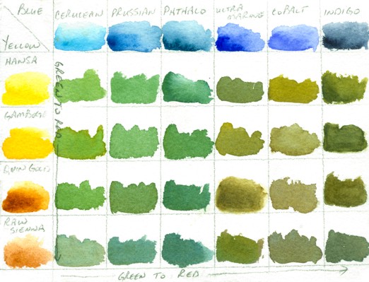
http://www.wetcanvas.com/forums/showthread.php?t=925152
While one is actually in the process of painting a landscape with a variety of greens, it is entirely possible to include in the painting all of the above blues, through washes, cloud shadows, sky and/or water, and generally just finding ways to get them all in there. Likewise, the full range of yellows can also find their way into the painting. Doing this then puts all the blues in the scene, as well as all the yellows, and sets the stage for being able to harmoniously use every single green (and more) shown on ‘CharM’s very helpful chart(s).
I still prefer doing fog, mist, moonlight, winter and early dawns (before green has a glimmer of a chance of making an appearance). And that’s fine, because we all know I am .001% different — or lived a past life on a Scotland isle, where being able to see beyond the front step meant it was a lovely day.
