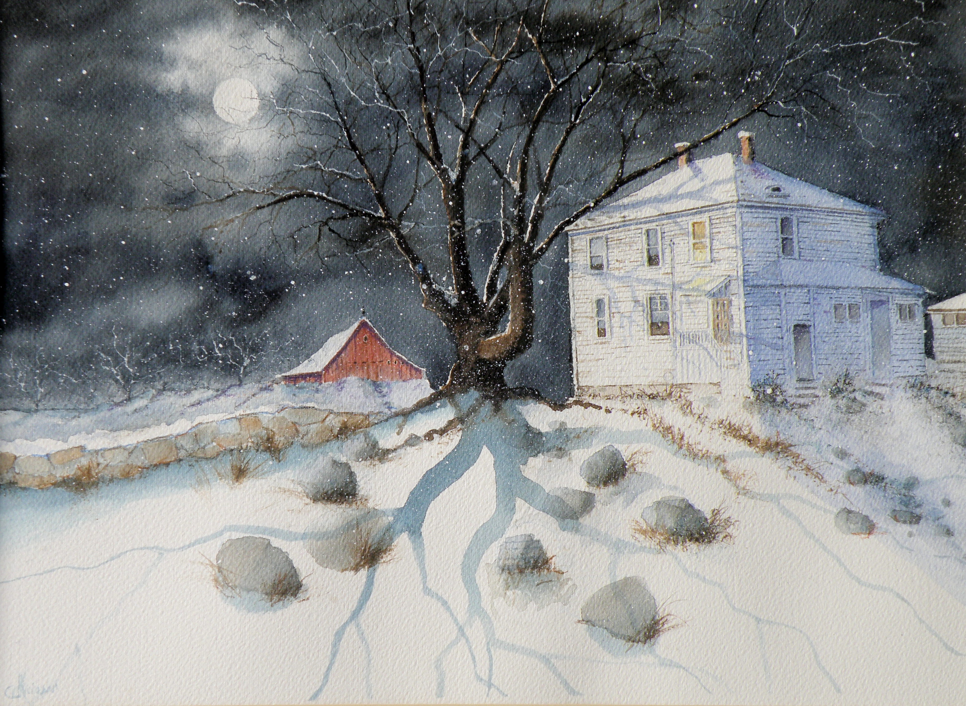
raven moon
May 20, 2015
PAINTING NIGHT has become something of a preoccupation. On a very bald and pedestrian level, one could simply say that ‘night sells’. However, it is the ‘why’ which is intriguing–why do scenes of watercolour-rendered night have an appeal.

‘Raven Moon’, watercolour, 35cm x 25cm (14″x10″), Art Board, (sold)
THERE IS A FASCINATION over what goes on in nature while we are sleeping. When walking the dog at 4 a.m., there are owls hooting, deer eating in people’s yards, the occasional cries of coyotes, and the enduring scent of lilac.
HEARING, TOUCHING, SMELLING all come alive, while seeing is at the pleasure of the muted moon–at once reassuring and mysterious.
painting night
May 18, 2015
THERE IS A FASCINATION surrounding night, when all is cloaked in darkness and the earth dons a mysterious manteau.
WE SEE, and yet we don’t. Depicting night is a painting fascination because I personally do not have a firm visual anamnesis of what exactly night ‘looks like’.
FOR EXAMPLE, is the moon really white–or silvery? Or is it, rather, lemony–or perhaps, blue?
A NUMBER OF RENOWNED NORTH AMERICAN PAINTERS made the depiction of night their signature subject. Some, like the famous Western painter, Remington, chose to depict moonlight as a bit of each, including even at times, degrees of green….


IT IS SOMEWHAT OF A MYSTERY as to what our eyes truly see, in terms of chromaticity, when looking at night, and particularly, moonlight. Painting night offers an enjoyable challenge: convincing viewers that what has been painted corresponds to their personal, nightly experience.
‘Up Late’, watercolour, Arches Hot Press Paper, “14×18”, (sold)
THIS IS ANOTHER heritage home in Kamloops, known locally as Fort House, because it was built on land originally used as a Fort by The Hudson Bay Company when Kamloops was established in 1812. At present, this early 20th century farmhouse is a rather rundown rooming house.
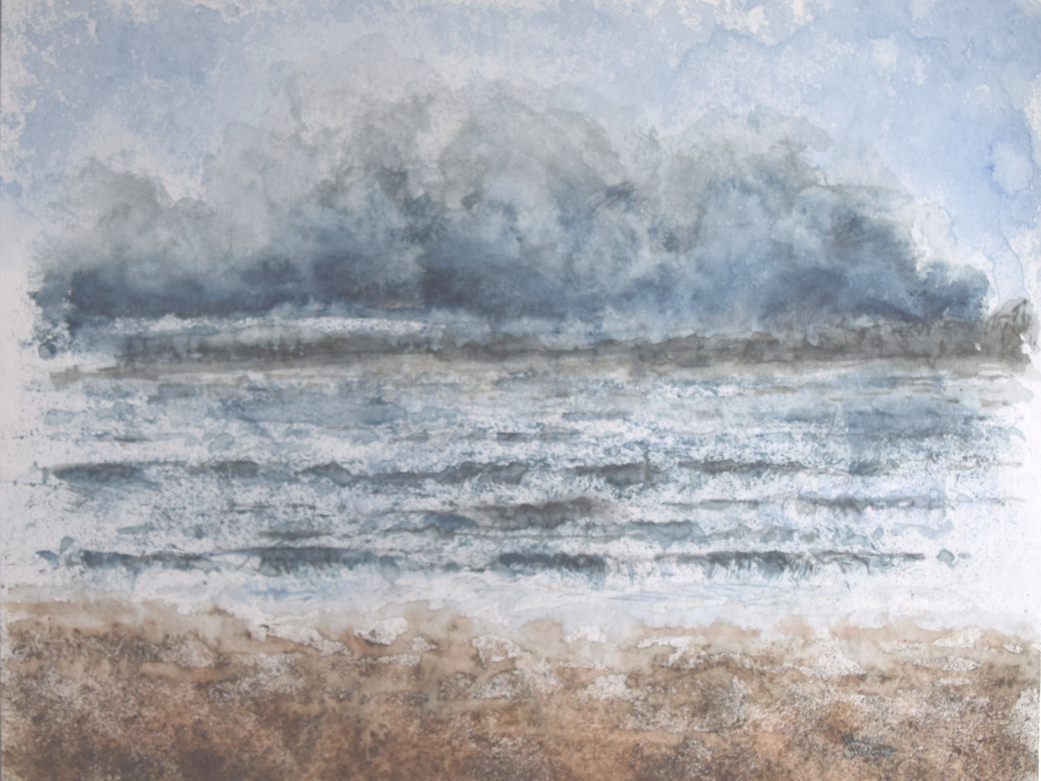
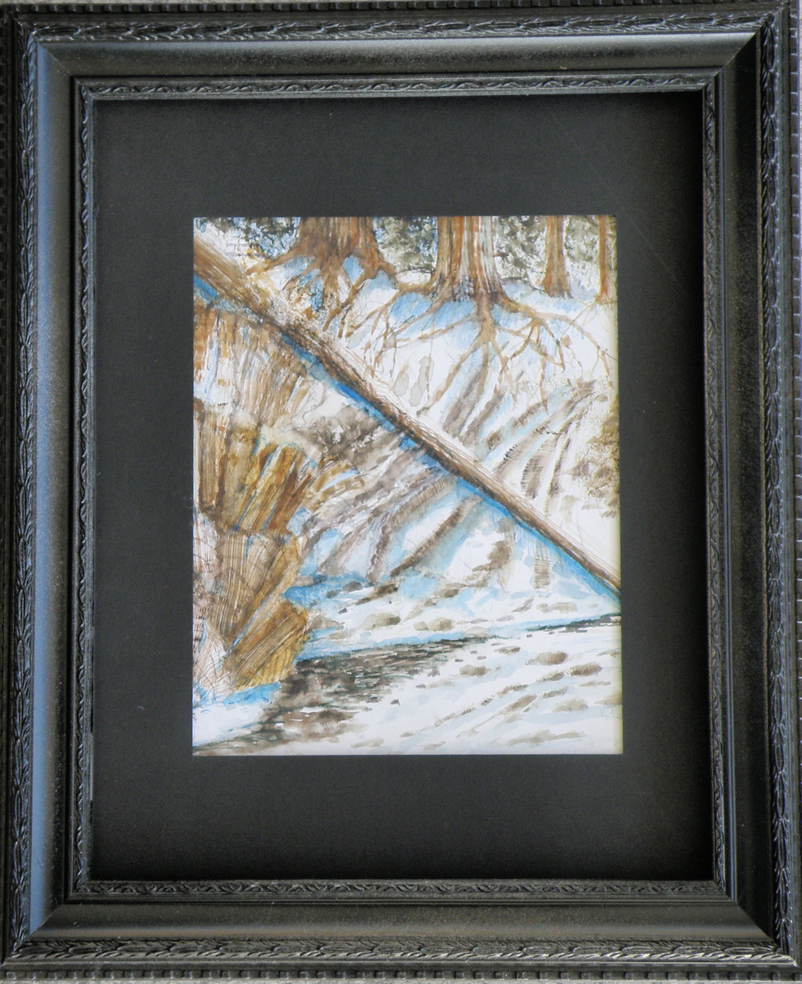
the tranquille creek gorge
May 16, 2015
THE SOUTHERN INTERIOR of British Columbia is a desert-like landscape, plunging steeply into geologically-unique valleys that include rattlesnakes, a ground-creeping variety of prickly pear cactus, sagebrush, and tumbleweed.
I ACCIDENTALLY DISCOVERED the local cacti by casually placing my hand on top of one in our backyard shortly after we’d moved to our current home.
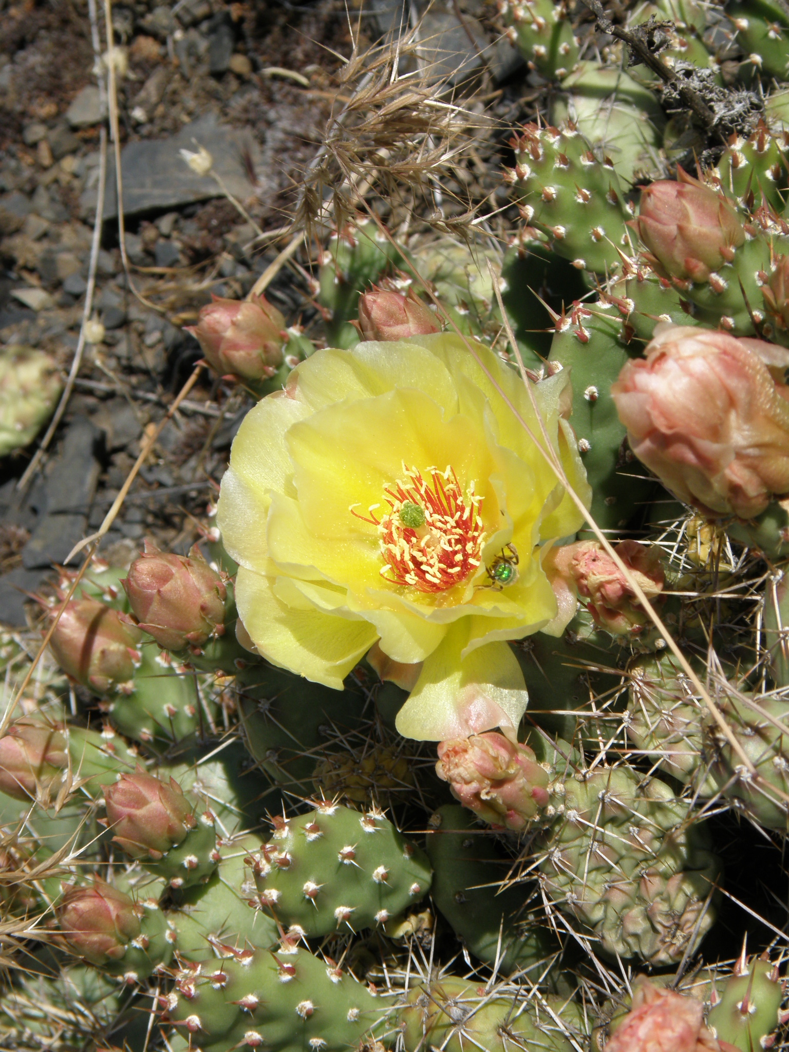
local prickly-pear cactus
OUR BACKYARD as such, is mostly mountain ridge, covered in these low-lying cacti, sagebrush, and outcropping of rock.
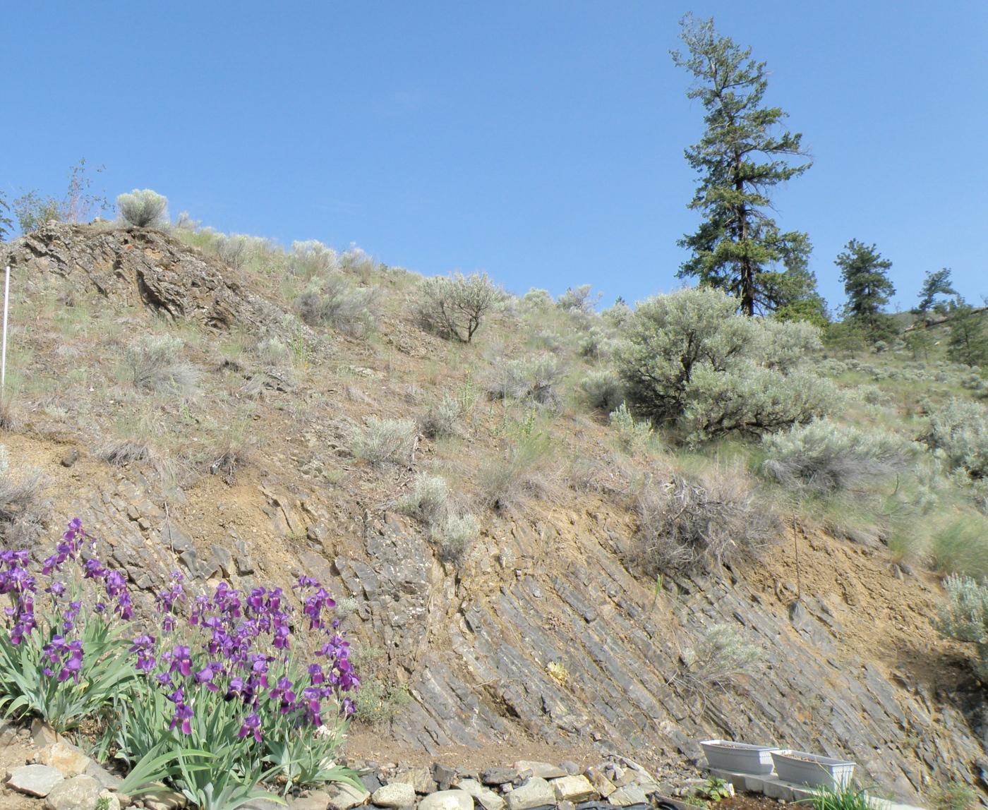
Local terrain
RUNNING UP AND DOWN OUR RIDGE are flocks of Chukar Partridges–a bird which belongs in ‘Roadrunner’ cartoons. Their name is derived from their ‘chuk-chuk-chuk-CHUK-CHUK-CHUKCHUKCHUKCHUK!!!’ call (who needs an alarm clock?). Below is a not-very-good photo of one (they are always on the run, making my camera skills not up to the task)….
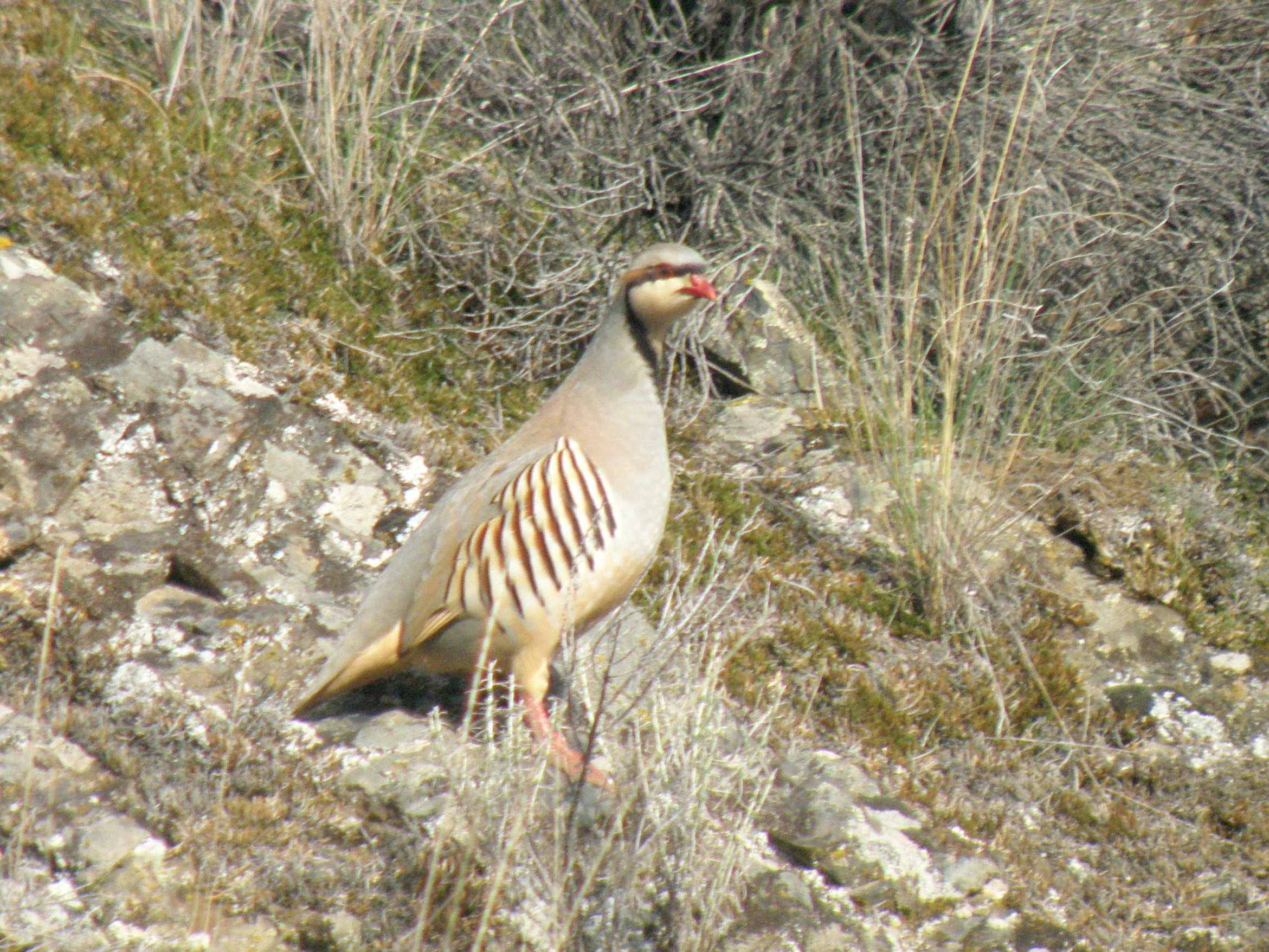
local Chukar Partridge
NEARBY US is a very geologically-dramatic area called The Tranquille Creek Gorge.
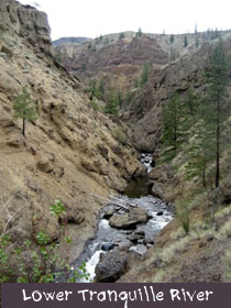
PAINTING THIS TERRAIN ON LOCATION has to be done rather quickly (depending on the time of day), as temperatures can go up to 40C and the sun is relentless due to the lack of trees, and thus, shade….
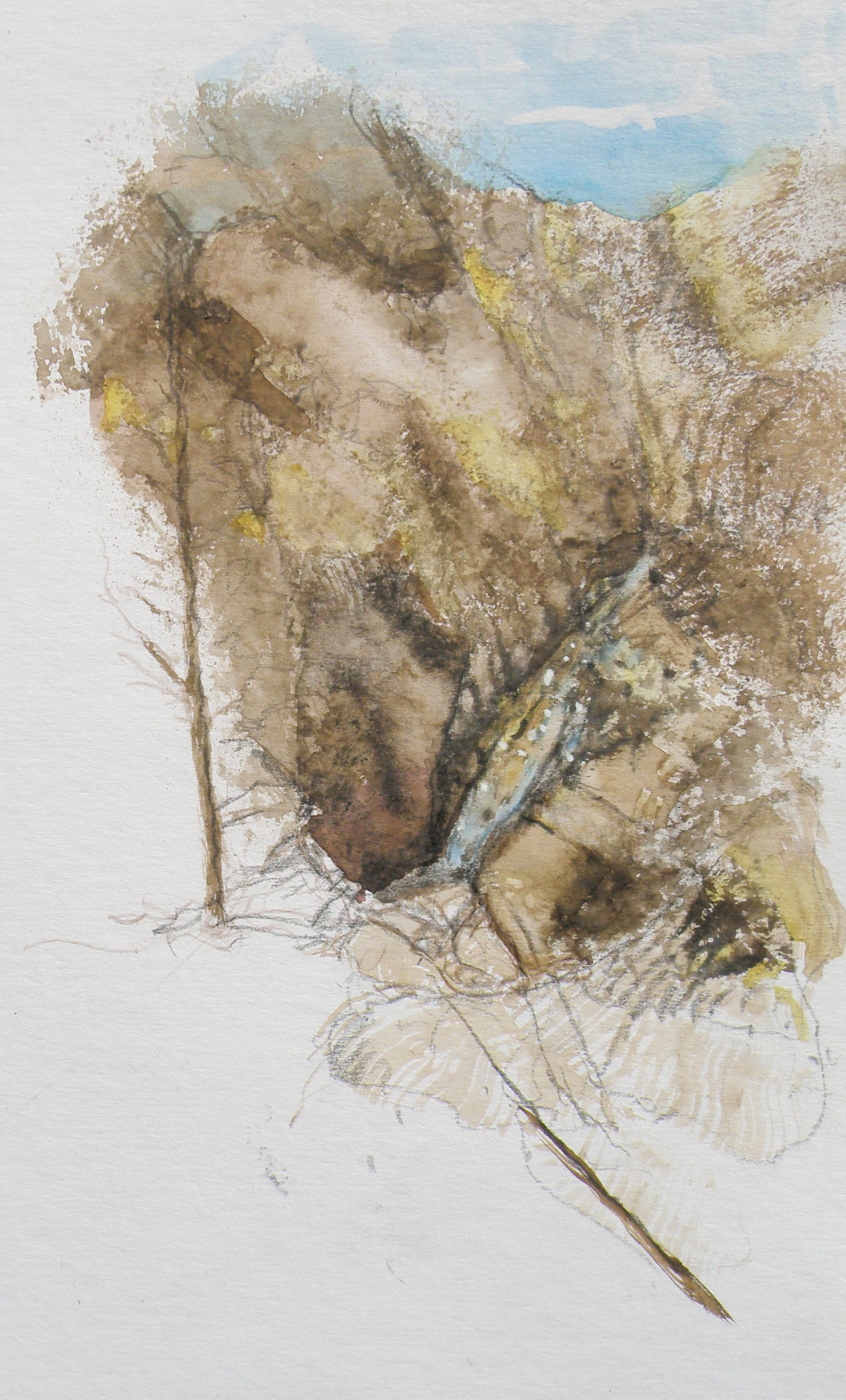
watercolour sketch, tranquille creek
COMING HERE FROM THE WET AND RAINY B. C. COAST, it has taken me years to come to fully appreciate the beauty of an arid area such as ours. But now that my eyes are open to the subtlety, I wouldn’t return to all that green for anything in the world. I’m happy in the depth of our browns (smile).
tortured brushes
May 12, 2015
THE BEST BRUSHES–in my wacked estimation–is a dollar store packet in the crafts section, next to those garish tubes of glitter and such. The second those poor things get home, they undergo an Edward Scissorhands attack that is not pretty.
SECOND-HAND STORES also usually have some wonderful, pathetic-looking excuses for brushes, pretty much being handed out for free.
VERY FEW BRUSHES I own get to keep their original shape except ones sized 0, 00, 000, and 0000. For some additional fine work, a nib pen loaded with watercolour does well also. But for large areas, chopped-up, hippie-freak brushes are like, tubular, man.

FORGET SABLE–even squirrel is too refined–woodchuck, maybe–and those synthetic sponges on handles used to paint walls with are good, too.
‘Mountain Mists’, 20cm x 28cm, Arches hot press 140 lb paper
THE TRUE ENJOYMENT OF PAINTING comes when viewing how another painter’s personal and unique need for self-expression realises itself in ways personal and unique. Interaction with the subject demands an approach which only the painter her/himself knows is right.
painting pickles
May 7, 2015
CAMPING ALONE along the Oregon Coast–that fantastically alive strip of ocean wonders–provided many outdoor painting pickles. . . .
PICKLE #1–mosquitoes and bugs. Surely some art restoration expert somewhere has discovered kamikaze mosquitoes embedded in the impasto of Impressionist art. French curses likely filled the air, Claude spending as much time squashing bugs as trying to capture the light. Imagine the fog of mosquitoes waiting for him up beside those water lilies;
PICKLE #2–the wind. Big, dramatic, vividly-alive ocean waves are that size because of the wind. The wind along the Oregon Coast is permanent and robust. It carries away notebooks, sketch pads, laptop easels, flimsy plastic pallets, kolinsky brushes, art pencils, and tissues. And, as one panics, dashing after them, fresh water rinse containers are spilled (of course, the nearest fresh water source is at the damn parking lot bathroom), and then (naturally) there goes the lawn chair, too–end over end, heading towards the box kite-flying couple smirking at the Mr. Bean imitation. Everything rescued, finally sitting, easel anchored with one determined hand, brush swishing about in the water jar, a sudden gust throws sand over everything, and the stupid tilley hat Christmas present (guaranteed to age a person 20 yrs, whether 25 or 55) is seen sailing out towards the surf, the wind carrying away the muttered sounds of ‘good riddance’ along with it.

PICKLE #3…..time and tides. Outdoor painting (forget this en plein air crap–it’s called painting outdoors) isn’t done in studio time. It’s done in real live time. The tides never stay put. So the grand, thundering waves are either constantly retreating as the scene is being depicted, or–this is nabob of stubbornness–they are approaching at an erratic, yet ever-constant rate, until the-I’m-staying-put painter sees his supplies (pallet, paint box, little stool, brushes, tubes, you name it) suddenly sucked out into the collapsing surf of an unannounced, really big wave–a REALLY BIG WAVE–which is about to be followed by another.
PICKLE #4…..no supplies left…..
cliffs near Newport Beach, Oregon
….. and sketching is suddenly the preferred medium….*sigh*… and geriatric Charlie Brown decides to go find some fish and chips–and a local art supply store.
…..and maybe a therapist. or a bar.
composition woes….
May 3, 2015
MY GREATEST CHALLENGE when painting anything is composition. For years I felt I was being a ‘purist’, insisting that I always paint on location, never in a studio setting. And once at the location, I convinced myself that if a tree was in that spot, then that was how it needed to be depicted.
IT WAS ALL DUE TO my tendency to early-on stop referring to the subject in front of me and become more and more involved in what was happening on paper, to the point where I may as well have not been on location at all. So in an effort at self-discipline, I decided that not only should I paint what things actually look like, I shouldn’t muck around with how and where ‘mother nature’ placed them.
THE SILLY THING WAS, I ended up choosing a composition by default because of course, I couldn’t paint everything my eyes saw in front of me. And more often than not, it was not a good composition. So now, not only do I go to some lengths to study the skill of creating an interesting arrangement, I realise it is the painter’s task to take what ‘mother nature’ provides and make art out of that. Fences do need to be repositioned, as do trees and hills and clouds.
SO NOW I MAKE thumbnail studies first on matt board before beginning anything . . .
THE OBJECTIVE is to provide a focal point, a visual way in towards it, then additional visual interest so the eye has more to discover by wandering beyond the subject itself. These thumbnails are exploring the use of a compositional figure ‘Z’ shape to lead the eye of the viewer.
The Gleaners
April 30, 2015
THE GLEANERS is a renowned painting by Jean-Francois Millet, finished in 1857.
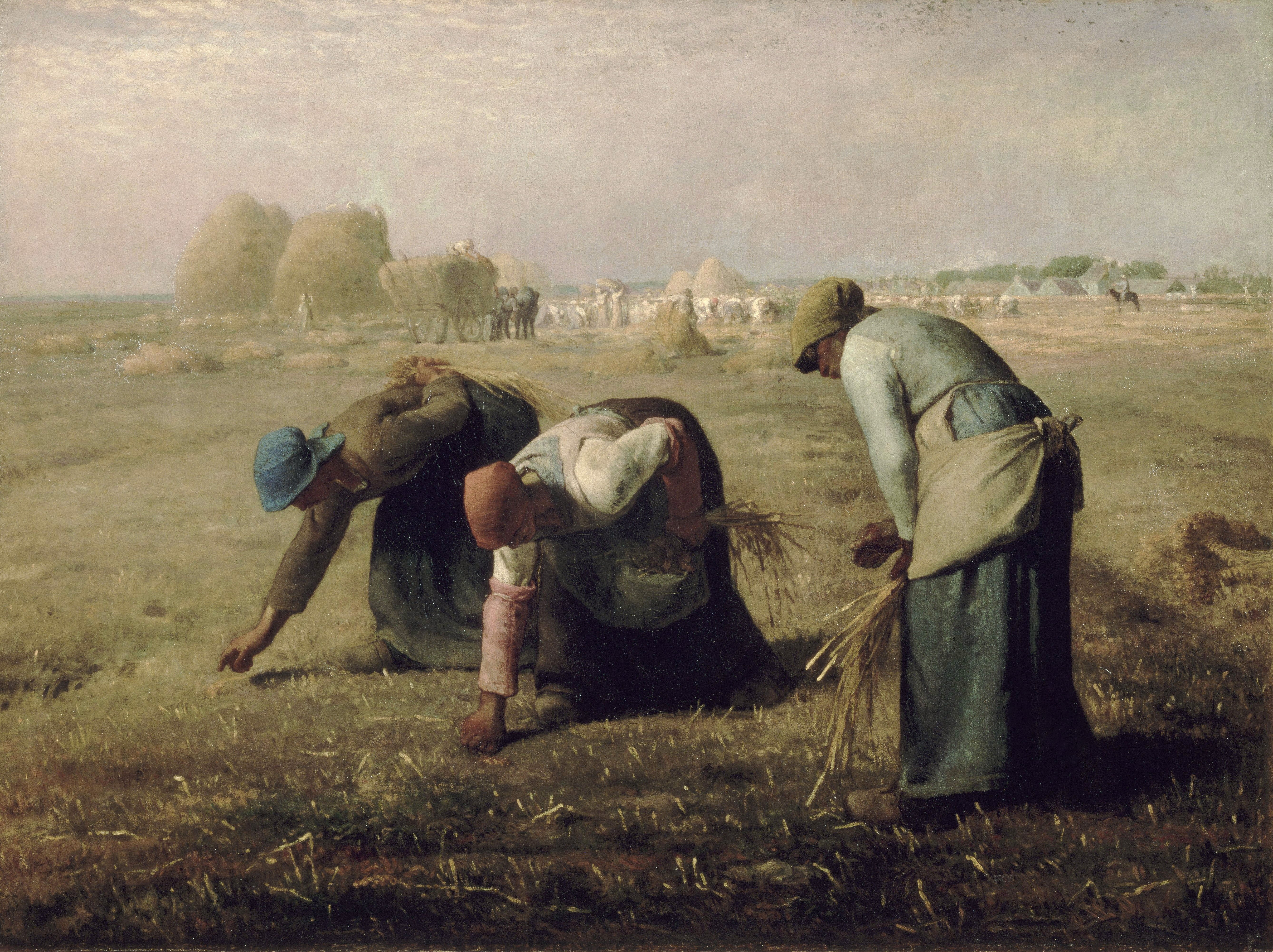
It was controversial in France for its depiction of the lowest classes of society, picking from the fields what little was left after harvest. Prior to this, paintings of people were usually paintings of people who were rich enough to have their portraits done.
THERE WILL ALWAYS BE GLEANERS, as we know. And each of us, in our own way, were often taught by our parents to make good use of every last bit of something, including the meal(s) in front of us.
IN THE ANIMAL WORLD, Ravens are gleaners supreme, going after what little remains of just about anything left behind, tossed aside, or just there for the taking. Yesterday I encountered one in the parking lot of our local Mall, hopping about a garbage can with a broken wing, waiting for someone to provide some slim pickings. Its noble bearing and size–the gloss of its plumage, the inherent dignity–only added to the poignancy of its situation. And yet, it wasn’t exhibiting signs of pain or discomfort, just a keen willingness to take what it could get and survive. And glean.
commissioned work . . .
April 28, 2015
I HAVE NEVER TRAVELED to Europe, except through the amazing blogs of those I follow. The countries I have had the privilege of visiting have been confined to Canada (10 of the 11 Provinces); The United States (45 of the 50 states); Israel (1989); Taiwan (2002); and The Philippines (2003,04,05).
OUR FINANCIAL ADVISOR’S FAMILY comes from Italy and she went to visit the cities and places which mean the most to her, and asked me to paint a watercolour based on the photos she provided me with upon her return . . .
Campanile de San Marco
33cm x 50cm (13″ x 20″) watercolour on 140 lb. Arches Hot Press Paper
‘Award of Excellence’, Federation of Canadian Artists, 2013
IT WAS A PRIVILEGE being able to work on this scene for it allowed me to be there, even though I wasn’t (smile).
Silt Bluffs
April 26, 2015
THE KAMLOOPS REGION is a geological wonder. 50 million years ago, volcanoes erupted and volcanic ash and lava covered the land, and their record is preserved in fossil beds throughout the area. Ancient rivers carved the landscape, forming the modern valleys of the Thompson Rivers and, during the Ice Ages, ice sheets carved the valleys and rounded the plateaus and mountains in the Kamloops area. (sourced from ‘Tourism Kamloops’ website)
THIS PAINTING is of a local geological formation called The Silt Bluffs. In the height of summer they are baked by a 40C sun, and are the home of rattlesnakes and cacti . . . and Ravens.

“The Silt Bluffs”
23cm x 30.5cm (9″ x 12″), watercolour, 140 lb. Arches Hot Press Paper, sold
the stuff of watercolour
April 22, 2015
WATERCOLOUR is simply a mixture of pigment (ground-up minerals: organic and synthetic) held in a semi-solid form by a binder (usually gum arabic). In days of yore (not that long ago)–this was sold in little square cubes, called pans or cakes. The pans are ‘activated’ by adding a drop of water to them, causing the gum arabic to dissolve enough for the pigment to loosen and adhere to the brush tip.
TODAY IT IS DIFFICULT (for me) to find the pans, which have only pigment and a touch of gum arabic in them. Today everything is sold in tubes. This isn’t because tubes are so superior. No. It is because the painter gets stuff like water, glycerin, corn syrup, and who-knows-what-else, and only then, some pigment. . .

I HAVE PANS (winsor newton) which are 40 years old and just as good and useable as ever.

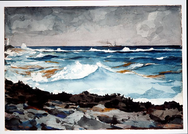
DO YOU THINK my pallets are messy? Have a gander at the pallet of one of the most renowned watercolourists, ever–Winslow Homer . . .

FROM THIS MESS he painted this . . .
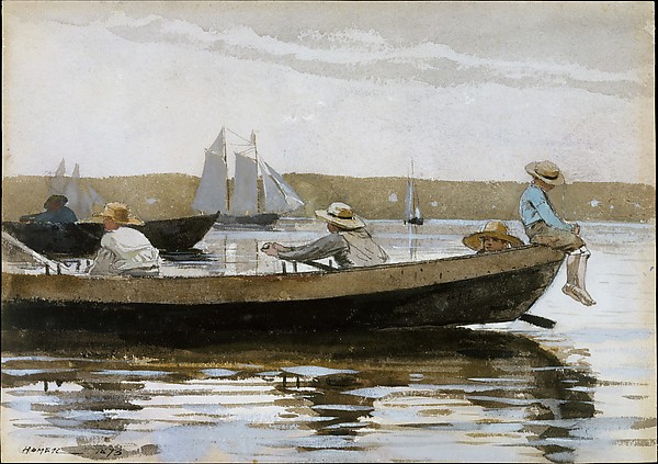
“Boys In A Dory”, Prouts Neck, Maine, Metropolitan Museum of Art, Winslow Homer, 1873, 25cm x 35cm, watercolour on paper
The only comparison which has any remote bearing is the messiness of our pallets. Other than that, watercolour painters of my calibre only stand in awe of his eternal greatness.
BEFORE YOU GO, do have a look at another of Winslow Homer’s delicious watercolours . . .
“Shore and Surf, Nassau”, Winslow Homer, 38cm x 54cm, 1899, Metropolitan Museum of Art
WOW. This man did not paint over top of washes (except to strengthen the intent of the line) allowing the whiteness of the paper to pass through, dazzling the eye. And adding even more punch, Winslow Homer did not shrink from placing great and deep darks right beside the lightest lights, thus heightening the power of the contrast. What a master. Wow.
The Common Raven (corvus corax)
April 21, 2015
THE COMMON RAVEN is amply represented in British Columbia and enjoys the distinction of co-existing with people for thousands of years, to the point where–in Haida Nation tradition–the Raven has god-like qualities. It was the Raven which released the Sun from its little box–made the stars and moon–and even brought people out of the earth in order to populate a party being thrown. But in traditional stories Raven doesn’t actually create (make things out of nothing), so much as steal, exchange, rearrange and redistribute and generally push things around into new combinations. If that isn’t humanlike, I don’t know what is, lol.

“Spring Thaw”
watercolour on art board, 20 cm x 28 cm (8″ x 11″), sold
In Kamloops it is against the law to feed them, as well as crows. A buyer of my work named Joan pours bags of cat kibble into her elaborate and large cement bird baths in the Winter and revels in their continuous, noisy presence. The neighbours? not so much. When they report her, she just pays the fine and keeps at it.
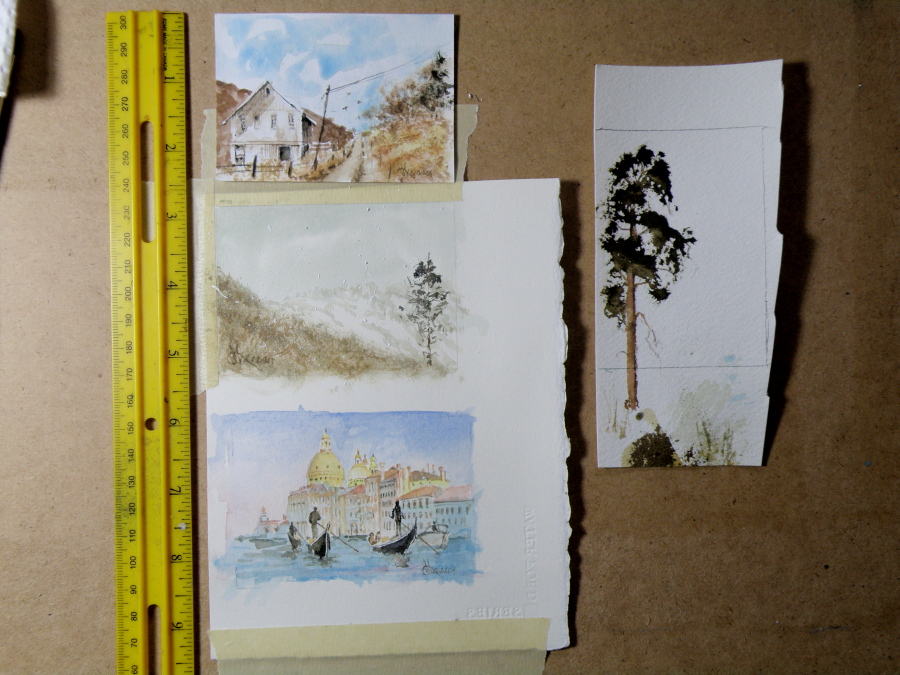
ACEOs (Art Card Editions and Originals)
April 20, 2015
ARTIST TRADING CARDS aka ART CARD EDITIONS AND ORIGINALS are popularly known as ACEOs. ACEOs are the size of baseball cards–65mm x 89mm (2.5″ x 3.5″) and are purchased and then traded and sold the way sports cards are. The ACEO movement originated in Switzerland in the 90s but grew in popularity through eBay, where art cards are now sold and bought on a 24hr basis.
They require precision and are very enjoyable to do. But then, who wouldn’t be fascinated by the challenge of painting tiny things (smile). The subject matter can be chosen by the purchaser, and the painting done accordingly.
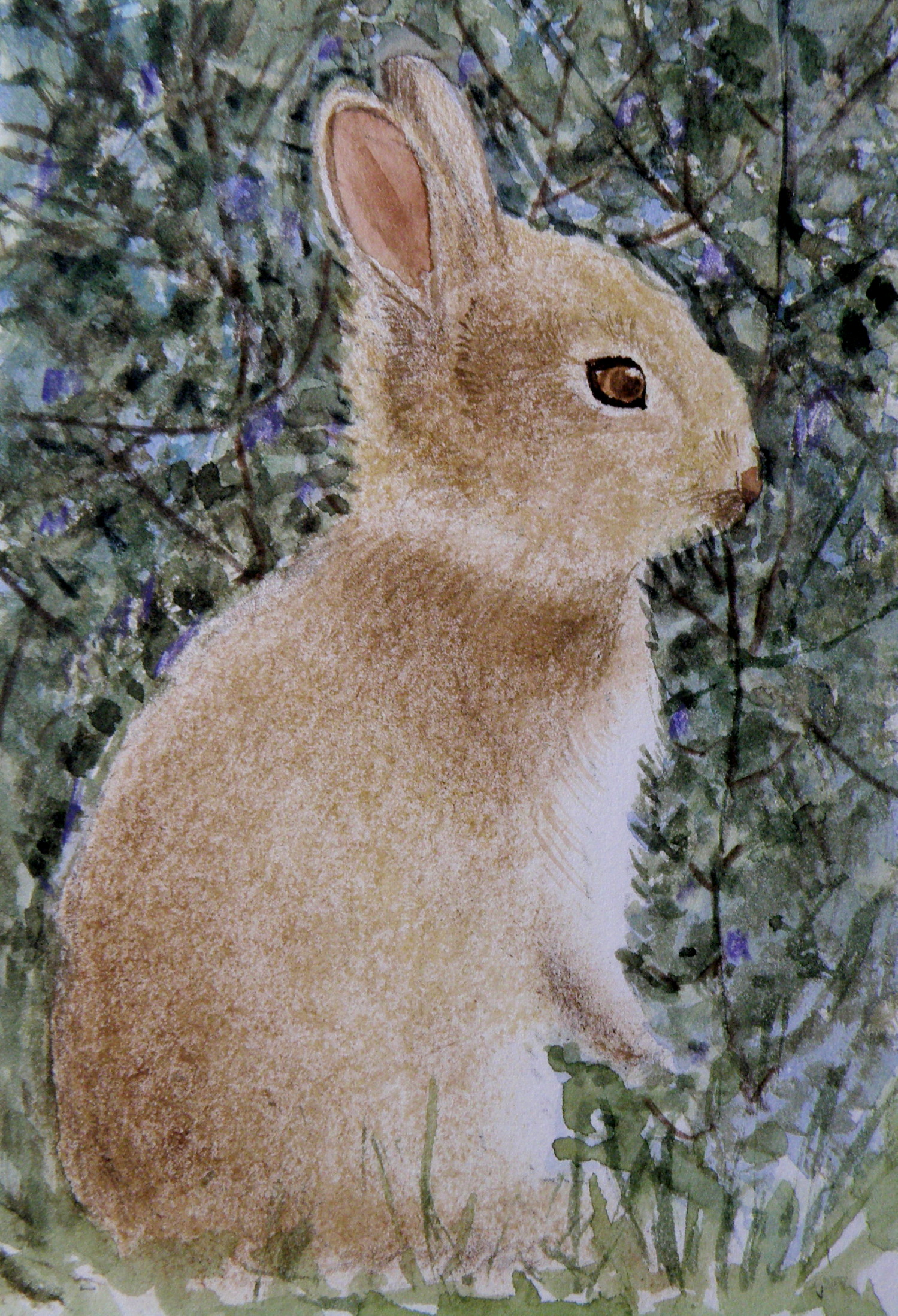
Spring means….bunnies
April 17, 2015
Finished work….”Logged-In”
April 16, 2015
“Logged-In”, 25.5 cm x 35.5 cm (10″ x 14″), Watercolour on Arches 140 lb Hot Press paper, (donated to Kamloops Art Gallery Annual Art Auction)
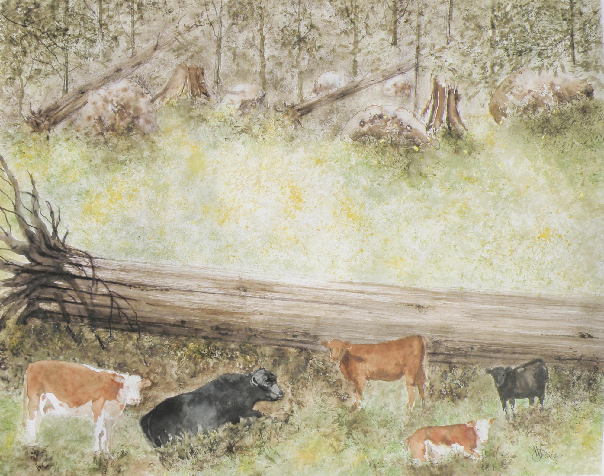
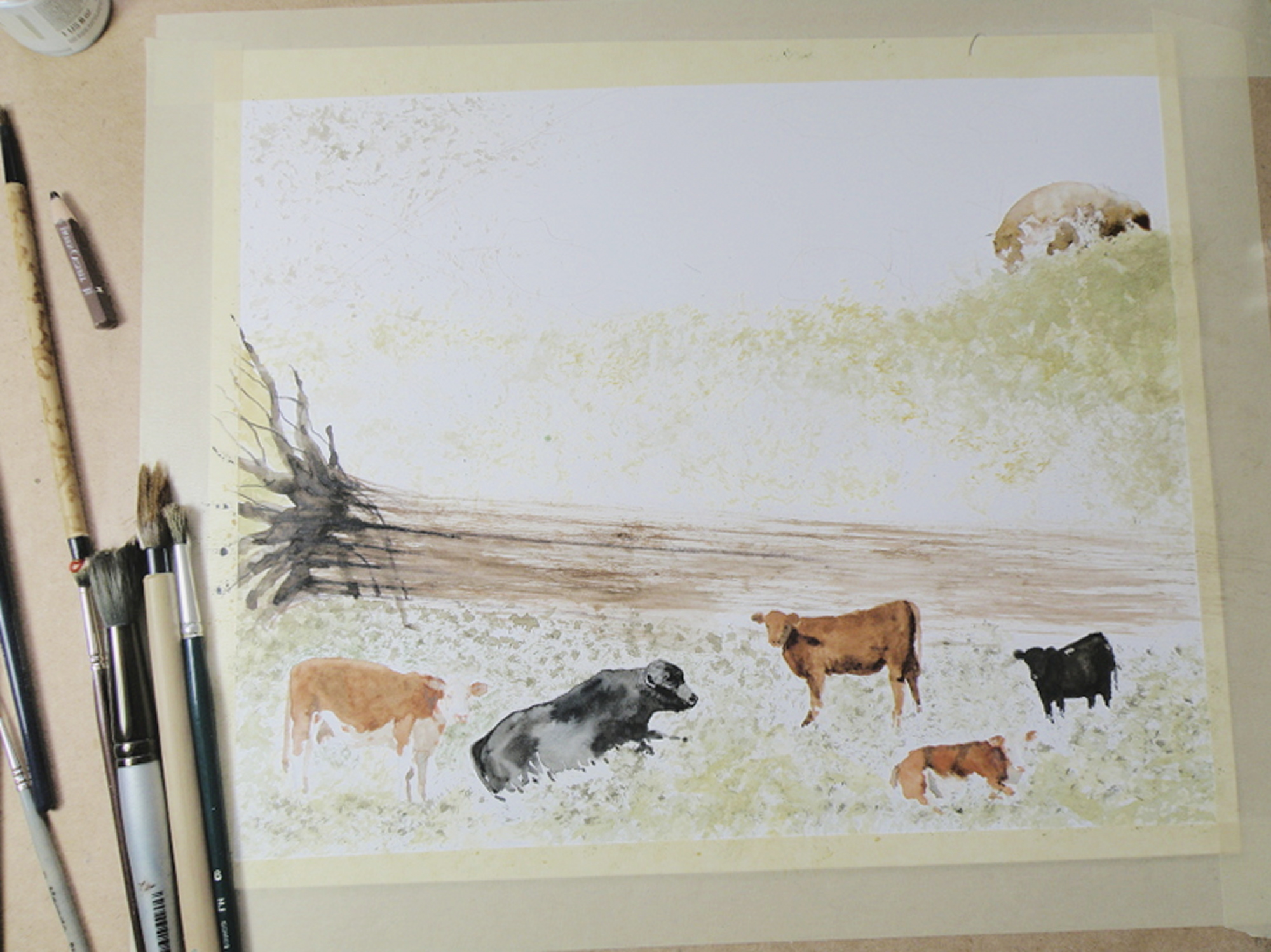
painting progression 4 . . . “Cows”
April 15, 2015
THESE ARE BEEF COWS, Herefords, the breed most favoured by ranchers in our region. Their origins descend from small red cattle introduced by The Romans in ancient Britain, along with breeds from old Wales, their subsequent nurtured evolution taking place in Herefordshire where the Hereford is king. Today more than five million pedigree Hereford cattle exist in over 50 countries.

BECAUSE THE LARGE FALLEN CEDAR is indicated with only a minimum of brushwork it is necessary to help give it size, weight and substance through the simple use of shadow.
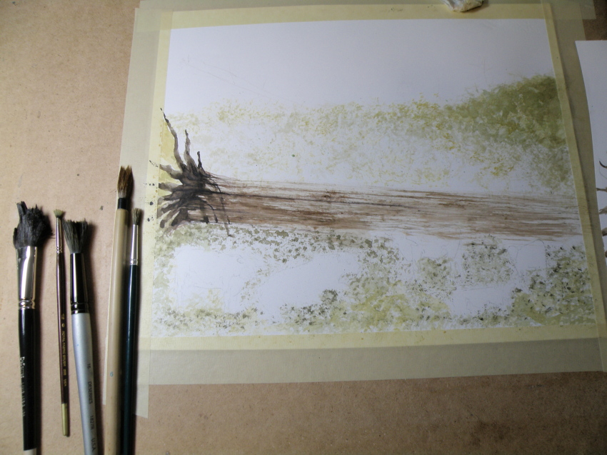
painting progression 3 . . . . “Cows”
April 14, 2015
THE SUBJECT MATTER comes from this photo, very quickly taken when we’d stopped the car on the dirt road running through The Dewdrop Valley (just outside the city limits of Kamloops) after I’d yelled, ‘Cows!’
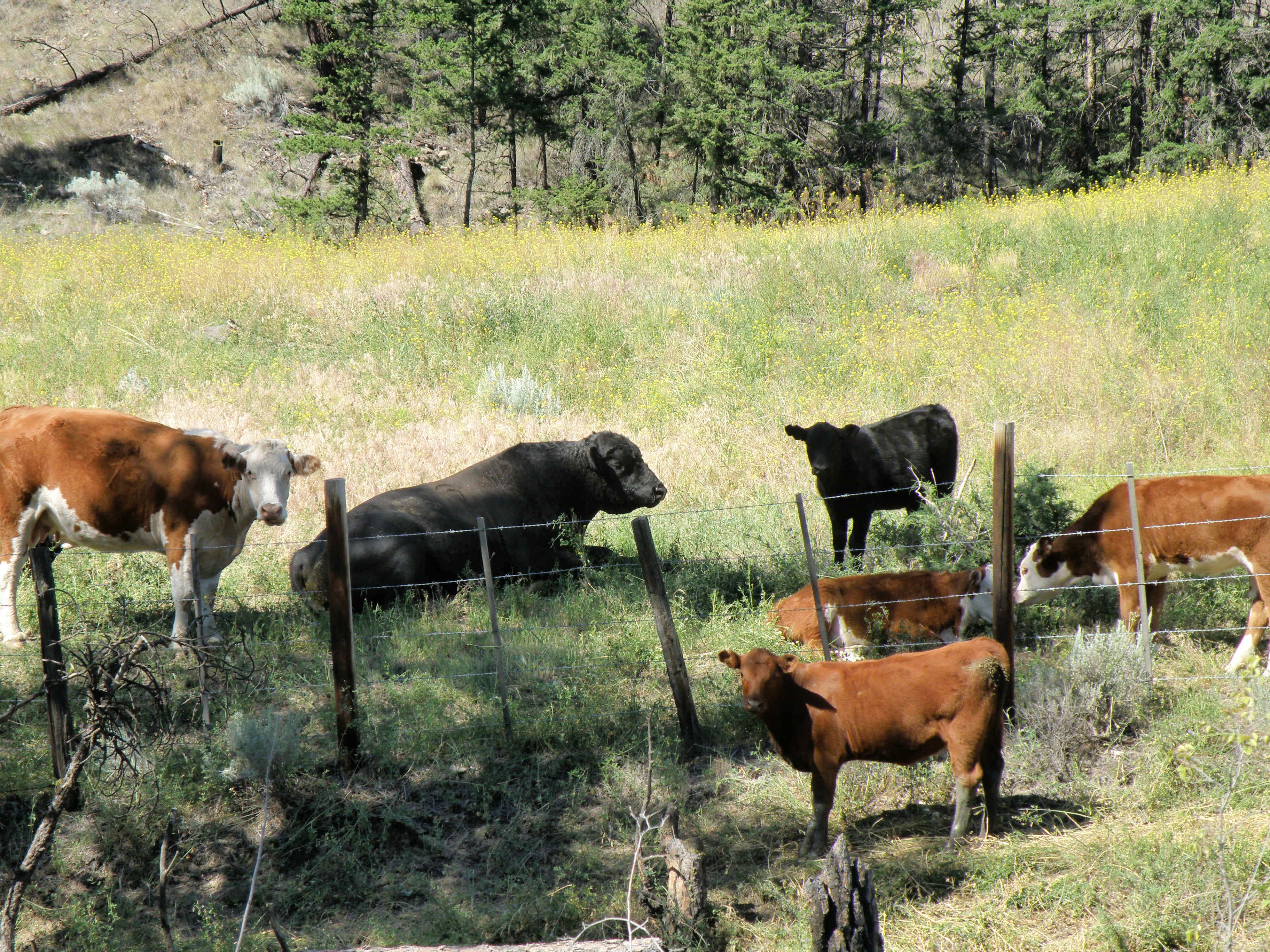
This grouping was described to me by my friend Max as a perfect example of a bull and his harem–and the ‘harem’ got nervous and didn’t remain in place very long once I began snapping pictures. The bull couldn’t have cared less what I was up to, and just lay there chewing.
The very prominent tree in the painting is placed to provide focus. Rather than leave in the barbed wire fence (in front of them), a natural enclosure is placed behind to sneak a storyline into the scene (the best grass lies out of reach)—that, and taking out the wire fence gives a more natural feel to the setting.
IN THIS GRASS RICH region, cattle roam all over boulder-strewn and mountainous terrain throughout the Spring and Summer. They are finally rounded up on horseback in classic cowboy style in the Autumn. Because of this, the beef from Kamloops is renowned for its organic, grass fed superior flavour and quality.
painting progression . . . 2 “Cows”
April 13, 2015
THE PAPER IN USE HERE is a very smooth-surfaced one called Hot Press (140 lb.) by the French Company, Arches (a very old watercolour paper maker). Hot Press paper has virtually no surface texture at all and is slightly cream-toned. When papers are this smooth, the paint initially floats on top before being absorbed. This floating quality creates effects a rough surfaced paper can’t deliver.

So Hot Press paper looks and feels pretty much like dollar store poster paper–smooth, shiny, and about the same thickness. And because it is not a heavy paper, and because it is so smooth, Hot Press watercolour paper cannot take a lot of scrubbing out if mistakes are made. The painter needs to be rather confident about the strength and amount of pigment to use before putting brush to paper. So because I am always a bit tentative when beginning to paint something as challenging as an animal, I gain confidence by always having a scrap piece of watercolour paper handy to try things out on first. Once I see how to do it on a scrap piece of paper, then I have confidence to do the same thing on the painting itself.
It needs to be stressed that Arches paper is superb and bears absolutely no comparison to poster paper when paint is applied to it. The weight (140 lb) is how thick the paper is. 300 lb. paper is very thick and therefore can take a lot more scrubbing and multiple washes, without losing luminosity. The downside is that 300 lb. watercolour paper is quite a bit more expensive. And when I work on very expensive paper, I am too aware of its cost. That makes me somewhat nervous about possibly ruining the painting. So I usually choose 140 lb. paper because if it gets ruined, I am not that concerned, and so therefore approach the painting with more boldness which gives a better result.
Painting progression 1. . . ‘Cows’
April 11, 2015
THE DEWDROP VALLEY is a local site and part of a much larger area near Tranquille River and the Tranquille River Gorge. In essence, the Dewdrop is really rocky, hilly, grass-and-tree- covered pasture for cows and cattle during the Spring and Summer months. The Kamloops Thompson Nicola Shuswap Region is no-nonsense cowboy rancher country, complete with serious Rodeos and horse and rider cattle round-ups in the Autumn.
This is the first of recording daily progress towards completing a watercolour depicting a typical scene in The Dewdrop Valley . . . .
ON DISPLAY are a fine collection of tortured brushes. Some are from dollar stores or second hand bargain stores, and as soon as they get into the spare bedroom cum studio they’re cut up with scissors. None of them cost more than $2, and who knows what they’re made of–Moose? Sasquatch hair, perhaps. Each, however, is priceless.
Miniatures: Chipmunk
April 10, 2015
AS CHILDREN we always gravitated towards Chipmunks, squatting in total stillness with extended hands, hoping one would overcome its natural wariness and take the peanut being offered. The sprightly flicks of tail and peppy darts forward to snatch the gift–so quickly and deftly we didn’t see or feel it leave our palm–only added more charm to their compact, large-eyed, tiny bodied allure. On the other hand, the Grey Squirrel was just a nuisance. I guess size and colour made all the difference in our juvenile minds between one rodent’s mystique and another’s ho-hum plainness. We didn’t entice Squirrels. We threw sticks at them. Their raiding our bird feeders didn’t win them any points, either, I must say….

watercolour, 10cm x 10cm (4″ x 4″), art board
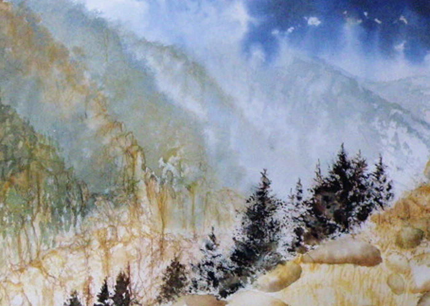
Local Mountains 2
April 9, 2015
THIS COMPLETED PAINTING of the mountains in our Kamloops area was in need of cropping in order to strengthen the composition . . .
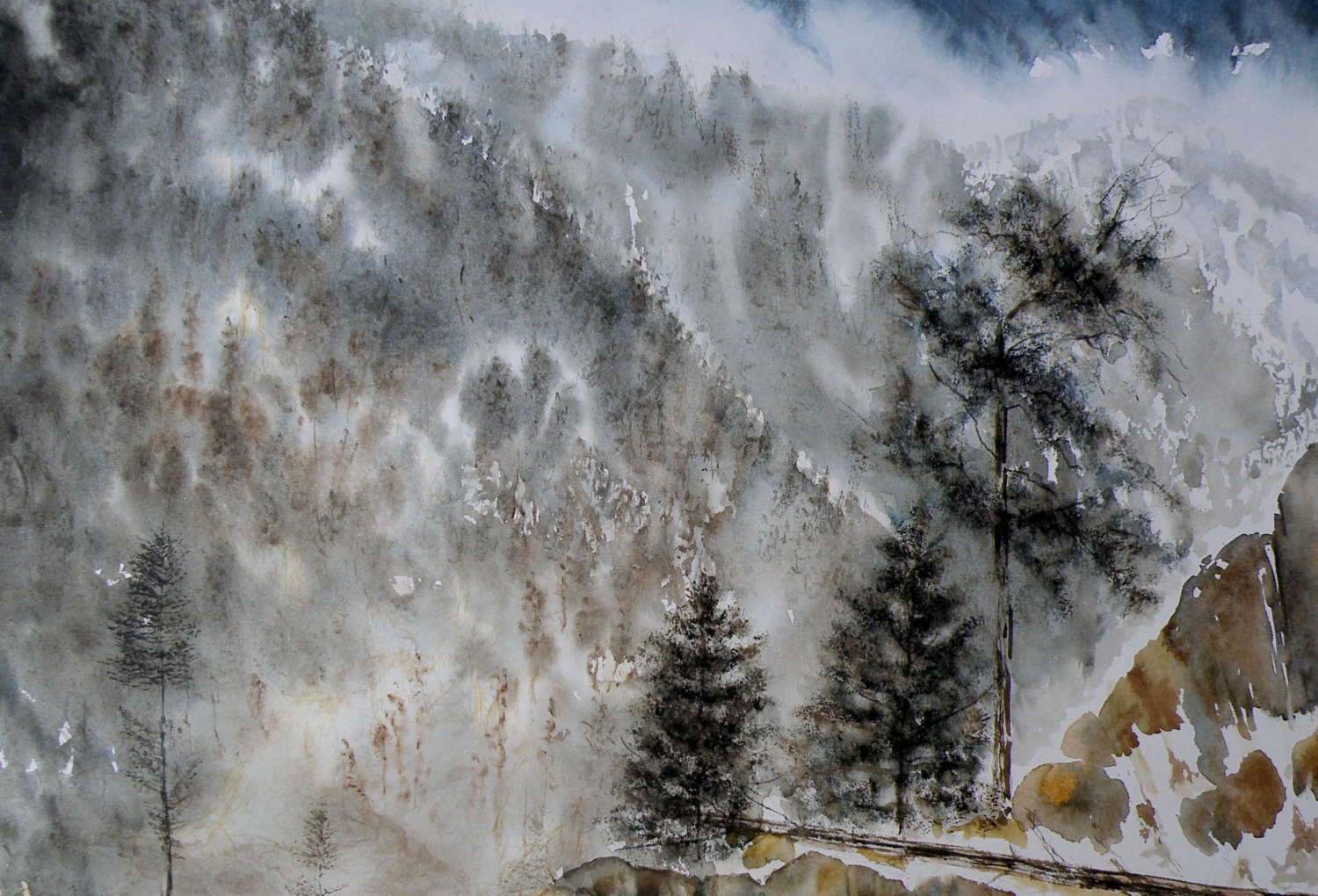
THE PAINTING WAS REDUCED IN SIZE down to this as the completed painting .. .
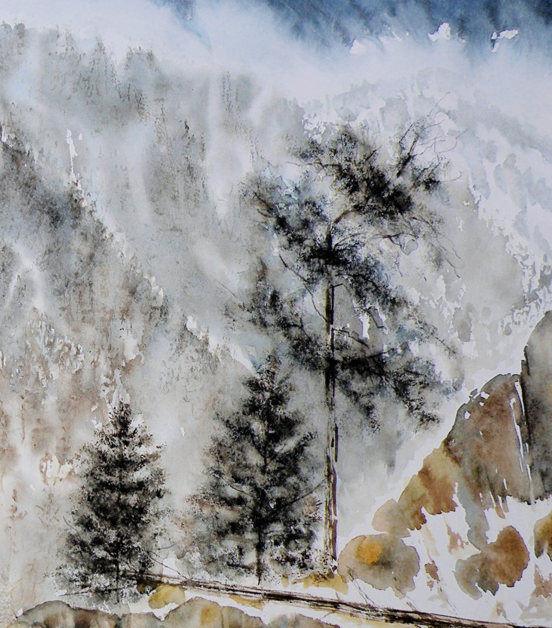
THE CHOPPED OFF parts of cropped work can successfully be made into bookmarks, I’ve found, and then be sold for around $2 ea in our little co-op Gallery (www.kamloopscourthousegallery.ca). Waste not, want not, lol!
Local Mountains
April 8, 2015
A decision has to be made as to whether this painting ‘holds up’, composition-wise. It succeeds in conveying the misty atmospheric conditions of winter in the mountains. But the composition is troubling me.
The Federation of Canadian Artists’ National Show
April 7, 2015
THE FEDERATION OF CANADIAN ARTISTS had its beginnings in 1941, and had as its goal the unified representation of all Provinces through one organization. Canada’s premier artists, The Group of Seven, were instrumental in organizing The FCA, with A. Y. Jackson as the Ontario head, and Lawren Harris in charge of the West Coast region.
TODAY THE FCA has become largely a Western Canadian organization with most of its activity within the Province of British Columbia. The hub is Vancouver [www.artists.ca] with regional Chapters throughout B. C. and Southern Alberta. The Thompson Nicola Shuswap Chapter (which I am a member of) has been hosting two Annual Art Shows for many years, with the 2015 National Show being mounted this coming Wednesday, April 8th.

THE NATIONAL SHOW is open to any qualifying FCA member, but submissions for jurying are limited to 3. Digital images of a member’s work are submitted to Vancouver and juried by three Signature Artists who use a point system to arrive at which pieces will be accepted and which will be declined. Of the 130+ digital entries, only 85 pieces are selected for inclusion into this National Show.
MY OWN SUBMISSIONS (two) have been juried, one being accepted–
‘Approaching Storm, Sechelt’, 25cm x 35.5cm (10.5″ x 14″), Watercolour on board
It is considered an achievement simply to get into this Art Show, while Opening Night, Friday the 10th, will be the occasion when $2800.00 in Prizes are awarded by another set of Jurors for those paintings which stand out as the best of The Best. Only once has a piece of mine ever been awarded a prize.
SENIOR MEMBERS OF THE FEDERATION have these paintings being considered for The SFCA Prize, with only one receiving top honours.
NEARLY ALL THE WORK submitted by artists for these Shows is rendered in acrylics or oils, with some pastel, and a few watercolours, and fewer still graphite drawings. Watercolour, generally, is not the preferred medium of most painters. It is considered difficult and problematic because of its demands and limtations.
New bird miniatures
April 6, 2015
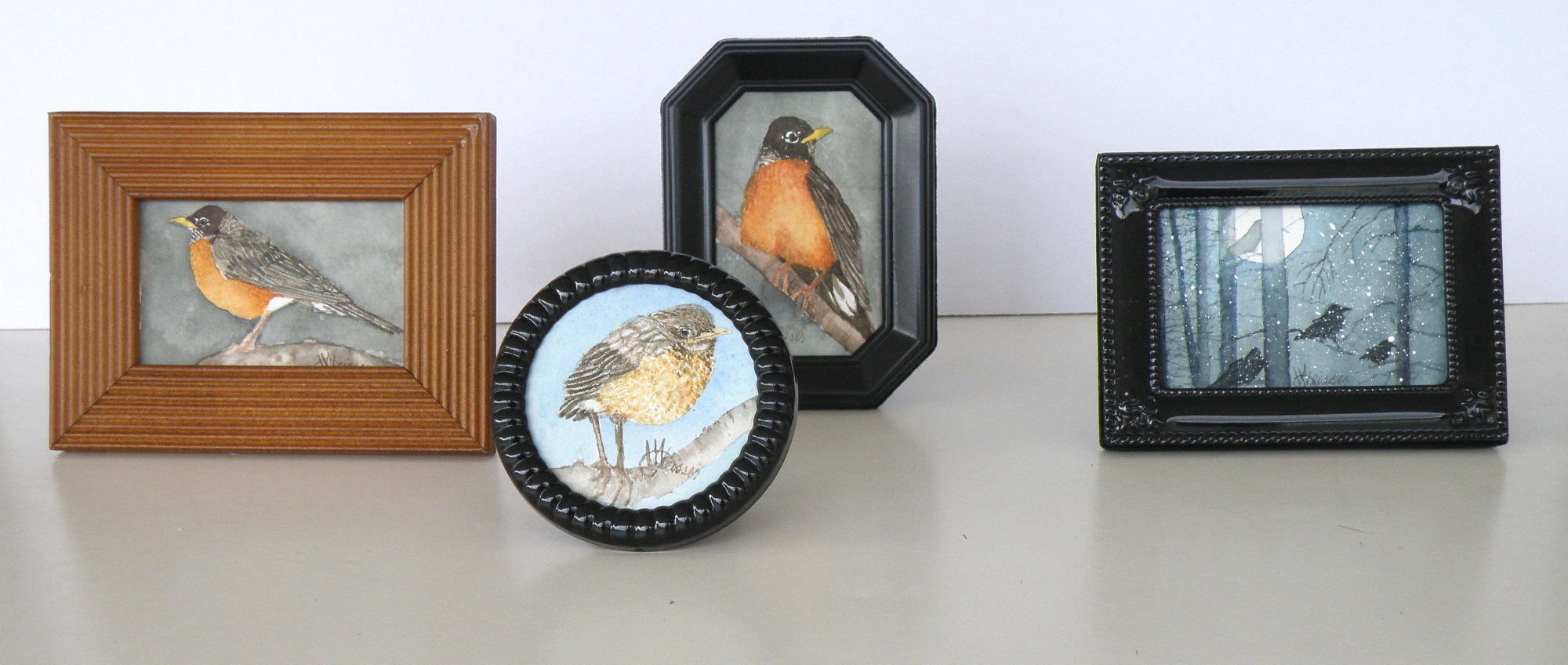
The image sizes here are approximately 5cm x 8cm (2″ x 3″). I use a pair of rather strong magnifying glasses when working this small–the kind you find on display at pharmacies (around here they’re referred to as ‘cheaters’). So when working on a tiny miniature they are an enormous help, until I turn to go check on something in the kitchen and walk into the wall, lol.
A FEW LAST COMMENTS about this painting…..there is a decided difference between nature and the art of depicting nature. Mother Nature is not only a hoarder, but not interested in housekeeping nor pruning, encapsulating, or boiling-down. She wants it all, all the time, and enjoys lavishing on us the plentitude of what happens when everything we look at, at any given moment, reproduces at will and overwhelms us with dozens–and even thousands–of itself.
FOR THE LANDSCAPE PAINTER the challenge, always, is to take Nature and make it into Art. It is the very human discipline of paring down, re-arranging, configuring and composing. What separates raw Nature from the art of painting is having a limited space, with only two dimensions, which is ultimately going to end up on a wall inside a human-made space. That restrictiveness requires moving trees and clouds and birds about in order to have a sense of balance or sense of wonder or sense of drama. It means the painter must dare to alter time itself, put limits on colour, and restrict amounts of what is naturally before the painter’s eyes.
MAKING ART is similar to the difference between looking at a field of wheat and sitting down to a loaf of freshly-baked bread. What happens between those two events is the act of altering something to create something else.
THIS PAINTING is not what the photograph of this scene looks like. For many years I struggled with whether I was ‘allowed’ as a painter to do anything other than depict Nature as it presented itself to me. Sitting out on some stoney ground, I would suddenly find myself slavishly working at painting the weeds between cracks of rock, then painting the seed heads on the weeds to look exactly like what my eyes saw, when really I knew the larger purpose of sitting there in the hot sun was not to pay attention to weeds, but to paint the distant mountains above and beyond them. By the time I’d gotten away from doing weeds justice, I was so hot I had to fold up my equipment and go back to the car. And I went home with a painting of weeds between rocks and a big expanse of white paper above them.
THAT DOESN’T HAPPEN ANYMORE. I have learned that I must take what is presented to me and do with it as I wish to do. That is the work of a painter.
A PHOTOGRAPHER has a whole different set of challenges because a lens is very different from a human eye (it can’t do half of what a living, ‘breathing’ eye can do) and from human imagination (once it has seen what is before the eye) . But I have noticed some irony happening between the worlds of photography and painting. In the past, painters often worked very diligently to make a painting ‘look like’ a photograph. These days, with technological photo-shopping manipulation, a photographer seems more or less obsessed with trying to make a photograph look like a painting. I am not convinced either enterprise is worth spending all that amount of time on.
IF A PAINTER WISHES TO BE A PHOTOGRAPHER, then don’t go trying to make a painting into a photograph. Do go and take courses and buy equipment and learn how to take photographs and do the work a photographer must work at in order to eventually become a photographer. And IF A PHOTOGRAPHER WISHES TO BE A PAINTER, then leave the photo-shopping manipulation apps alone and do take courses and buy equipment and learn how to paint paintings and do the work a painter must work at in order to eventually become a painter. They are two distinctly separate and inherently different artforms and–in my flawed way of viewing things–should stay that way.
AND YOU…what’s your view? Tell me how I’m missing things you’ve discovered!
Painting progression 3…. ‘Jamieson Creek Thaw’
April 4, 2015
BECAUSE WATERCOLOUR is such a watery, transparent, delicate medium–one which must always allow the paper it’s laid on top of to breathe through it–one which traditionally doesn’t use white pigment, but relies on the paper to be the white of the painting–BECAUSE of this (and more) the challenge of the watercolour student is to convey an illusion of texture, without the ability to actually build up a surface texture.
WERE WATERCOLOUR PIGMENT applied so thickly as to create an impasto-like texture on the paper beneath, it would lose its luminosity and look pasty, muddy, dull–worse, it would crack. Watercolour pigment only works when the paper beneath dazzles through it and brings life to the pigmentation. In other words, watercolour as a medium is more the business of staining paper than it is a business of building up layers and coats of daubs, stipples, slatherings.
THAT’S WHY CARE is required to not apply so many washes that the luminosity of the paper receeds and eventually provides no life at all. And that’s why the whites of the paper must be thoughtfully reserved and left untouched in key areas–the crests of waves; the moon; snow; clouds; a picket fence–and skill taken to paint AROUND these places to let the paper be the white.
SO….a student of watercolour (me) learns early-on that (s)he will be a student of the medium for life–that mastery is illusive–and failures, many. A good piece is approached very thoughtfully, noting where the paper will be left to serve the function of white (pigment) and painted around. Then the student will also have to gather enough courage to apply exceedingly dark washes in one ‘go’, while maintaining a sense of secure, carefree animation in order to present an immediacy and liveliness in the final piece.
THE DEATHKNELL of a failing, dying work of watercolour is finicky overworking of areas, and a refusal to accept what happened when water joined pigment joined brush joined paper. It is NOT a medium for those who love to micro-manage or be in control.
THE STUDENT OF WATERCOLOUR has to be more a Peter Pan than a child wanting to grow up–loving the thrill of what happens when ‘danger’ is courted, yet having the assurance that daring will win the day. However, that daring and search for adventure–on the surface of a good piece of paper–will only be pulled off if it is backed by enough experience to have a good hunch about what will happen when such-and-such is tried.
ATTEMPTING what remains beyond one’s ability isn’t courting danger–it is ignoring it. Trying to fly without thinking happy thoughts will give a person a broken bone. Within the bounds of representational art–(i.e. wishing to have a tree ‘look like’ a tree)–a painter cannot ‘pull off’ a landscape with lots of shadows if (s)he has yet to study them in some depth. Trying to do a scene which includes far far more than what one yet learned how to interpret is an invitation to frustration and wanting to give up watercolour for say, acrylics (oh, my).
AND SO FOR MYSELF, I know by this time that I must confine my attentions to learning about how corn grows, what it feels like, looks like, behaves like, before I can throw my abandonment into rendering a watercolour of winter corn in January. Not only that, but I must also have studied the qualities of snow–the qualities of what a winter sun does to shadows of corn stalk–the blues, the purples. And only then can a learned abandonment bring about a possible reward.
IT TAKES A LONG TIME to find the right paper, the right brushes, the right working pallet of colours, the right approach and the right subject matter. Knowing what can be done when paper is sopping wet–and what can’t–depends on who made the paper, how thick it is, how textured it is, how stretched it is, how quickly it will dry. Knowing when to wait until the paper is exactly wet or damp or dry enough to throw one’s energies at it, comes (usually) through ruining (many pieces of) good paper.
HERE IS THE LATEST DEVELOPMENT of the subject of Jamieson Creek in a February thaw…..
TOMORROW will (hopefully) provide a photo of the finished piece!
