…. Tranquille Creek Gorge

January 21, 2016

The watercolour video demonstrations of David Dunlop are challenging and yet simple.  https://www.youtube.com/watch?v=Lgtg-Adql1Y&index=6&list=PLtEJwQmsB7SvVg8C4J2c4LDijerH7SSKF (I tried to embed the video itself in this post, but WordPress thought otherwise).  But here is the blurb describing it….”Emmy Award winning David Dunlop takes you to his Connecticut studio to demonstrate a two minute watercolor, used as preparation for an oil sketch or to explore ideas“.

Mr. Dunlop is an artist/teacher from Connecticut, whose manner when teaching is inspiring and animated.  He is a great follower of descriptive, energetic Masters like J.M.W. Turner and Winslow Homer, and seeks to employ their methods, while demonstrating their techniques.

The video cited above challenges painters to do two to three minute painting sketches, which convey the movement and mood and spirit of the subject, without stopping to think and rework.  In an effort to ‘do’ and not think, the subject chosen here is a favourite–a place about 20 minutes from our house–called Tranquille Creek Gorge.


OLYMPUS DIGITAL CAMERA

Mr. Dunlop’s videos are quite dynamic and aimed more at oil painters a bit more than watercolourists, but full of very encouraging lessons because of the force of his optimistic personality and sense of fun.  They are well worth watching, for those who enjoy painting as a means of expression.


….composition exercise 2

January 17, 2016

Continuing on with an attempt to test out the compositional dictum known as ‘the rule of thirds’, which was conceived and named by John Thomas Smith in 1797 :

“. . .  Analogous to this “Rule of thirds”, (if I may be allowed so to call it) I have presumed to think that, in connecting or in breaking the various lines of a picture, it would likewise be a good rule to do it, in general, by a similar scheme of proportion; for example, in a design of landscape, to determine the sky at about two-thirds ; or else at about one-third, so that the material objects might occupy the other two : Again, two thirds of one element, (as of water) to one third of another element (as of land); and then both together to make but one third of the picture, of which the two other thirds should go for the sky and aerial perspectives. . . “

To illustrate its basics…..

ruke of thirds

Once again, this is the drawing I did initially, to put this into practice….

OLYMPUS DIGITAL CAMERA

And this is the first go at painting the scene….

OLYMPUS DIGITAL CAMERA

And now today, here is the progress so far, attempting to locate some visual interest at each of the four intersections within the piece, the barn being the first and the pine being the second and the creekbed being the third…..

OLYMPUS DIGITAL CAMERA

The darkest darks and greatest contrast will remain with the barn, for that is the intended focus for the picture, when completed.

The ‘rule of thirds’, as stated above, holds that generally two-thirds of a landscape be devoted to the sky, with one-third given to the land below (the sky being such a vast and dominant feature).  In this case two-thirds is dedicated to the land and a very high horizon means that the one third is devoted to the sky area.


….snow

November 25, 2015

We received about 12cm overnight and now everything’s white, with temperatures starting to drop to around -10C (16F) under strong winds.

The birds are in the branches of the large Red Maple just beyond our big front window–at the four hanging feeders and suet cakes.  We get mostly goldfinches and house finches, chickadees, juncos, nuthatches, flickers, clark’s nutcrackers, pine siskins, ring-necked doves, occasional pileated and downy woodpeckers, grosbeaks, stellar’s jays, magpies, ravens, white-crowned sparrows, and when it gets really cold the sweetly-blushing redpolls come down from the Arctic (but not likely until January or so).

Occasionally we see a Northern Pygmy Owl which swoops in on the dining lot, lighting on a branch like a handful of fluff with alarming eyes and causes the rest to take off like an explosion. They are one of a few daylight-hunting owls, and for two or three days following, the feeders remain untouched, the memory of that fist-sized, feathered-danger keeping everyone away.

In honour of the occasion — the advent of real Winter — a wintry watercolour, not unlike what the countryside looks like presently.  The subject no doubt wishes the wind were less than it is….

OLYMPUS DIGITAL CAMERA

….but imagine the pleasures of fireplace and toddies once he gets back.

It’s an old painting–6 years–and approximately 8″ x 10″ on my favoured Arches Aquarelle Hot Press 140# paper.  It took approximately 30 years to finally discover the right paper, having gone through all the choices of surface, weight, paper-maker (brand), and so on.  Were it to be done again, the figure would be altered some, as there’s something anatomically odd about it.

….the silt bluffs

November 22, 2015

An area east of Kamloops, B. C., follows the South Thompson River which flows between dramatic limestone cliffs originally formed (it is estimated) 270 million years ago.

Among those cliffs is a gully–a waterworn ravine known as ‘the silt bluffs’, featuring very distinctive rock formations which have the look and feel of something out of a Western movie.

OLYMPUS DIGITAL CAMERA

Massive geological formations such as these require some form of treatment by a painter in order to adequately convey their uniqueness and grandeur.  This watercolour attempts to do that by purposely choosing to paint directly into the sun.

This part of our landscape gets quite literally baked by heat at midday, so when painting outdoors it is important to get it done quickly.


….a little nuts

November 20, 2015

Quite some months ago I asked Jackie of ‘Lost In Thought Photos’ (https://lostinthotphotos.wordpress.com/) for permission to do a miniature based on her wonderful photograph of a little tree squirrel.

Jackie very kindly agreed and emailed me back a very fine image of what –based on its colouration– appears to be a Fox Squirrel, which, even the most hardened rodent defamer would have to be a little nuts not to admit is cute.

treesquirrel-2 (1000x864)

Here’s how they are described in Wikipedia:  “. . . Fox squirrels are strictly diurnal, non-territorial, and spend more of their time on the ground than most other tree squirrels. They are still, however, agile climbers. They construct two types of homes called ‘dreys’, depending on the season. Summer dreys are often little more than platforms of sticks high in the branches of trees, while winter dens are usually hollowed out of tree trunks by a succession of occupants over as many as 30 years. Cohabitation of these dens is not uncommon, particularly among breeding pairs. . . ”

Besides their cuteness, it is charming that they are non-territorial, and have been known to share their homes.  That is certainly not true for a great many squirrels, who seem to busy themselves hurling insults and chasing rivals all day long.

Hunting for frames is fun, losing myself in one or some of our ten or so 2nd hand stores, and recently resulted in this very nice (likely faux) leather 5″ x 7″ one for $.75.  It allows this little painting to sell for $35.

OLYMPUS DIGITAL CAMERA

Our little Gallery keeps 20% commission. So many thanks to Jackie at https://lostinthotphotos.wordpress.com/ !


….November

November 14, 2015

It is the most blessed of months heralding the muted pallet–the toned-down greens, beefed-up greys, complex browns, accents of burnt orange, titian–trees simply/complexly themselves, displaying their line, frost-kissed leaves flashing their last colour, refusing dismissal.

Wonderous November--leaf-whipping, mini-cyclones, clouds suddenly letting forth face-lashing first flakes on towards frost-spongy earth–days framed by late mornings and early evenings, one’s home truly one’s castle, warming against the elements.

wells gray November a

Showboats gone, one paddles purposefully, keeping warm, the lapping sounds musical, deep-throated rooks ricocheting their call round rocky bends echoing, bouncing off glassy surfaces, wood-smoky mists rising.

Banished is the garish, overly-festooned–any and all too-muchness falling away to let be what simply is…..

November

Winter’s cusp

Summer’s compliment

Spring’s concealer

…..downtown, phase 2

November 9, 2015

The Plaza Hotel (completed in 1928) is a five story Spanish Colonial Revival building in downtown Kamloops BC, Canada. It is listed as a cultural heritage site in the Canadian Register of Historic Places.

ThePlaza

As is so often the case when seeking out subjects for painting, the postcard view isn’t usually very interesting.

The photo used for reference for this watercolour was taken from the rear alley of The Plaza.

OLYMPUS DIGITAL CAMERA

In view is the old Fire Hall tower, with belfry, 73 ft, built in 1935 at a cost of $24,500, when Kamloops had a population of approximately 6,000 (population today is about 100,000).  It remains a distinctive landmark.

OLYMPUS DIGITAL CAMERA

The decision to cast the subject in Winter has to do with wanting to bring some drama to the scene due to there being an overly abundant amount of sky.  Pigeons have also been added to give more visual interest.

OLYMPUS DIGITAL CAMERA

Because the hotel is a very light orange, (which gives off a bit of a pink cast in late afternoon), the sky is a wash of quin red, quin yellow and ultramarine blue in order to help incorporate the tones of the building into the rest of the painting.  So quin red and quin yellow will be used as the shade of the hotel as the painting progresses.

…..photographic thank you

November 3, 2015

A number of months ago, coming across stunning photographs of Puffins, permission was sought from the photographer and world traveler, Rolf Stange, to use one of them for the painting of a miniature.

OLYMPUS DIGITAL CAMERA

Getting such spectacular images of these illusive birds takes persistence and resolve.  They spend nearly all of their lives in open sea, coming to shore only to breed.  Here is more about them…..

“. . . Iceland is the breeding home of perhaps 60 percent of the world’s Atlantic puffins. The birds often select precipitous, rocky cliff tops to build their nests, which they line with feathers or grass. Females lay a single egg, and both parents take turns incubating it. When a chick hatches, its parents take turns feeding it by carrying small fish back to the nest in their relatively spacious bills. Puffin couples often reunite at the same burrow site each year. It is unclear how these birds navigate back to their home grounds. They may use visual reference points, smells, sounds, the Earth’s magnetic fields—or perhaps even the stars. . . ”

source:  http://animals.nationalgeographic.com/animals/birds/atlantic-puffin/

s_Rolf_Stange-Rolf-2010

Rolf Stange ‘at home’ (which looks about as inviting as spending most of the year bobbing about the N. Atlantic nose-diving for herring)

Here is Rolf’s wonderful photo which was the inspiration for a watercolour miniature …..

puffin

http://www.spitsbergen-svalbard.com/spitsbergen-information/fauna/atlantic-puffin.html

…..downtown

October 31, 2015

Growing up in the 50s, we lived in a treed suburb of Rochester, New York (home of Eastman Kodak, Bausch and Lomb), but my father was a Pastor of a poor, post-WWII German refugee, inner city Church next to the Greyhound bus depot.  My fascination with the grittier side of Rochester’s downtown must have come from how much more interesting it was compared with the staid predictability of houses and lawns and more houses and more lawns where we lived.

Sneaking away during the sermon, I’d scout out the alleyways of crumbling late 19th century brick tenements with their fascinating tangle of iron fire escapes doubling as fasteners for clotheslines, festooned with gingham tablecloths and sheets and jeans.  Labyrinths of back-doored kitchens, cooks smoking, observing me in my too-small Sunday navy suit, an out-of-place kid trying to look nonchalant and part of the scene.

Luckily for me, Kamloops has that kind of feel.  It is a railroad hub, cow ranchers beyond that–a labourer’s city–begun in 1812 as an outpost of the Hudson’s Bay Company, and has enough Western wear and roughness that some citizens feel our downtown still lacks class.  By ‘class’ they mean there aren’t enough designer boutiques and specialty shops.

This is the start of a painting of downtown from behind one of the old hotels. . . .

OLYMPUS DIGITAL CAMERA

Downtown Kamloops, B. C. Canada

The intention here is to make this a Christmasy, snowy subject, and its progress will be followed as the days go by.

“. . . The Harry Potter series borrowed ancient Celtic views towards the European Mountain Ash also called the Rowan Tree. The Celts and other people of early British Isles thought the tree had magical properties. Its powers were to protect you from witchcraft, one of two reasons why it is also called Witchwood. The other reason is a pucker at the end of the fruit reminds some of a pentagram which is associated with witchery.”

“As one might think, animals also know the mountain ashes as food. It is a favored browse of moose and white-tailed deer. Bears, fishers and martens like it as well as snowshoe hares, squirrels, small woodland rodents, the ruffed grouse, ptarmigans, sharp-tailed grouse, blue grouse, American robins, thrushes, waxwings, and jays. . . ”  http://www.eattheweeds.com/mountain-ash-rowan/

OLYMPUS DIGITAL CAMERA

“American Blue Jays and Mountain Ash”, watercolour on Arches Hot Press 140# Paper, original available for purchase $85US (unframed, excluding postal charges), 5.5″ x 11.5″

From Canadian Author Sarah B. Hood [http://www.sarahbhood.com/]

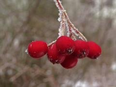
“. . . A couple of years ago I made the wonderful discovery that the common ornamental tree I know as Mountain Ash is the fabled rowan tree, revered in the mythology of northern lands for its protective and divinatory properties. I was told about it by the mother of a friend who also informed me that rowan jelly is the traditional accompaniment to twelfth-cake in the Christmas season.

I have since looked at many different recipes for rowan berry jelly, and note that most of them advise one not to make jelly until the berries have been frozen (either on the tree or in the freezer), since this makes them sweeter. Apparently raw mountain ash berries can be toxic (I remember my father complaining that they were so acidic that they could eat holes in cars), but heat and freezing both change the chemical structure of the acids they contain.

Here’s a recipe that I’ve used. It came to a lovely set and a great colour, like rosé wine. The taste is something like a cross between grapefruit peels and cranberries: bitter, but tasty.”

Rowan Berry Jelly Recipe
Makes about 3 cups

  • About 4 cups of berries which have been frozen (unfrozen berries are very bitter)
  • About 1 cup of water
  • ¼ cup of lemon juice
  • About 1½ cups of natural pectin from apples (You can substitute commercial pectin, but you’ll have to change the quantity of sugar according to their instruction for a similar recipe such as grape jelly.)
  • About 3 cups of sugar
Day One
  1. Rinse berries and remove stray leaves, stems and shriveled berries
  2. Barely cover them with water and heat them to the boiling point, then cover and simmer until they have completely dissolved. You can use a potato masher to reduce them to a pea soup-like mush, as pictured below.
  3. Strain through a jelly bag. Hang the bag overnight to catch all the liquid, but do not squeeze the bag.

Day Two
  1. Use a turkey baster or pour carefully to extract the rowan berry juice without any sediment that may have collected. It should come to about 1½ cups (top up with extra apple juice if necessary).
  2. In a wide, deep non-reactive pot, combine rowan berry juice, apple pectin, sugar and lemon juice and bring to a rolling boil. It may be rather scummy, so skim if you like.
  3. When it reaches the setting point, ladle into jars and process for ten minutes.
  4. Label and date the jars, and refrigerate any jars that don’t seal.

One Jay we do not have in the West is the Blue Jay.  The ‘why’ of this is puzzling simply because the weather and climate here rather mirror that of Eastern Provinces and States (minus the humidity, thank heaven).

As annoying as this bird can be, the sheer pleasure it appears to take in creating continuous drama — the screeching cry it passes off as ‘song’ turns the lovely silence of a Sunday morning into a birdie alarm clock — makes the Blue Jay an attention receiver (like that kid you always remember from Grade 4).

And….the Blue Jay–like most Jays–is beautiful.

OLYMPUS DIGITAL CAMERA

Their blue, black and white colouration is as dramatic as the Blue Jay personality.  They have the ability to turn any bird feeder situation into a Three Stooges food fight.  And for all these reasons, make a great subject for painting.

A favourite natural food in Winter is the Mountain Ash berry.

16449456800_9db81e018f_m

These trees are in abundance here in Southern British Columbia, and grow very large, and are responsible for allowing the N. American Robin to return very early–often at the end of February–sustaining them until the ground becomes warm enough for pursuing worms.

Choosing both Blue Jays and Mountain Ash in Winter makes for great contrast in colour, and a lively composition for painting.

Now we’ll just have to see how it all turns out….

….depicting snowy pines

October 22, 2015

Snow-laden firs and pines aren’t the easiest of subjects for depicting in watercolour–(at least not for this painter).  The challenge comes in first understanding the effect snow has on branches, for, obviously, there is snow and then there is snow–each snowfall having its own unique effect.  That crystalline, hardened seizing of tender branches by icy snow pulls them heavily towards the ground, while sub-zero powdered flurries creates a mere dusting of needles–each presenting technical challenges.

Of course, the problem is one of always having to paint around the white of the paper allowing it to ‘be’ the snow in watercolour.  Given that opaque white can’t be used, a light dusting on pine needles becomes really quite a bit more difficult than painting the after-effects of a full-blown blizzard.  Leaving minute dots of paper surrounding green needles is a recipe for madness in my book.  Give me a snow-stormed pine any day of the week in its place.

OLYMPUS DIGITAL CAMERA

Figuring out just where branches are on a given variety of pine, fir, balsam, cedar or spruce is key to understanding where snow will sit when on them.  So it seems crucial that any study be limited to particular species, (in the above case, cedar) — otherwise, a painter of representational art will be in danger of ending up with a kind of ‘marshmellowed’, generic evergreen most often seen on Hallmark Christmas cards.

Truly, each variety of coniferous tree accepts snow in its own unique way.  A blue spruce, for example, with its stiff, jutting branches, is much more able to bear the weight of snow than the red cedar in the above study, whose branches are prone to drooping and bending.

This study was done on leftover piece of plain white matt board, using a chopped-up small fan brush to go after the greens, then a more pointed, conventional brush to soften the hard edges and provide shadowed depth to the snow.  The branches aren’t quite correct.  Once snow is included, it changes perception to such a degree, I have trouble understanding where it goes and branches fall.

The beauty of our being blessed with so many evergreens to choose from comes in knowing that each one offers the student of watercolour great and intriguing challenges, especially when brimming with that wonderful adornment–snow.

venice challenge

September 6, 2015

We’ve reached the finish line, limping all the way.  This was somewhat beyond my abilities as a painter. Whether a success or not, every endeavour provides a great learning experience.  All the watercolourists looked up to for advice offer the same counsel:  when it comes to watercolour as a medium, suggesting detail far surpasses actually getting bogged-down in it.  The pitfalls begin when the painter keeps trying to improve on what’s there.

Despite the overworked areas, enough aspects work to allow this to maybe escape the scrap heap — but probably not.  It would, however, be useful to begin it again and learn from the errors.

OLYMPUS DIGITAL CAMERA

OLYMPUS DIGITAL CAMERA

OLYMPUS DIGITAL CAMERA

OLYMPUS DIGITAL CAMERA

Draw A Bird Rewind . . .

September 1, 2015

Laura of Creatarteveryday has thrown down the gauntlet, and we’re rising to the challenge (even if it is a repost!)

So here goes, Laura. . . .

OLYMPUS DIGITAL CAMERA

Juvenile N. American Robin, done on commission for J. Leckie, Christmas, 2011

Your turn!  Follow Laura at https://wordpress.com/read/post/feed/32739058/794878009

In January of 1990 I had the privilege of going on a tour of Israel conducted by an outstanding Orthodox guide named Joe, who was so completely well-versed in history and biblical understanding that archaeological sites acquired lively, humanized detail under his well-studied knowledge of what we believe took place there.

Though he was conducting about a dozen clergy, he was able to draw comparison between traditions which were tied to ha aretz (הארץ), to the land, helping us see the visceral, physical connections we’d only tried to understand through having read the ancient texts and stories.

OLYMPUS DIGITAL CAMERA

 ‘Western Wall Shacharit’

watercolour on Arches Hot Press 140# Paper, 10″ x 15″, sold

The Western Wall is almost certainly the most revered of all sites in Israel, as it physically connects worshipers to those before them who also had to struggle to build a homeland–who also had to appeal to that higher power to protect and defend them.

I felt privileged to have been able to see Israel at a time when the intifada was at a standstill and veritably every location in the country was accessible and security was more relaxed.  We could travel the Golan Heights as well as the West Bank, stand at the Lebanese border and visit the historic cities and towns throughout the land.

…this is a repost from an entry several years ago

ocean study

August 22, 2015

For many years I lived in Vancouver, B. C., which is considered one of the top 3 ‘most livable’ cities in the world.  One of its best features is being surrounded by water on three sides.  On one occasion I was painting a view from Locarno, one of the many beaches, and was suddenly overcome by a summer storm.  It seemed to descend out of nowhere.

As I was not going to escape getting soaked, I soldiered-on and managed to get as much as I could onto paper without the deluge completely washing away everything while working.

OLYMPUS DIGITAL CAMERA

‘ocean study Locarno Beach‘, Vancouver, 13cm x 18cm (5″ x 7″)

Fortunately I had some sort of makeshift shelter–even so, rain splattered onto the painting as I worked.

Painting on location has its rewards as well as its hazards.  In those years, I wouldn’t paint at all unless it was outdoors. I was something of a purist, and felt watercolour was meant to be done on location–its immediacy and qualities almost demand it being put to use that way. But bad knees are what they are, and now I almost can’t imagine having to go do that again–which is really a shame.  Working from photographs is not my idea of what watercolour should be about.

it’s not easy being….

August 18, 2015

The beauty of people is that though 99.9% the same, we all know it only takes going to, say, The Iowa State Fair, to discover we’re probably not.  All you have to do is stand aside (wondering what on earth you bought that hot dog and sauerkraut for) and watch everyone passing by.

This is just a convoluted way of confessing that not everyone is a great fan of Summer.  Painters (some painters who write certain blogs about watercolour) in particular who like landscapes can (on occasion) find Summer just too, um, well, green.

There are ways of uncomplicating all the greens.  When I lived in The Adirondacks of New York, not far from our town, in another small town, the famous Grandma Moses, who began painting at the age of 78 had only recently died at the age of 101 .

AAEAAQAAAAAAAALIAAAAJGFkN2M5ZmNiLWEwZGItNDU0ZC04MDNhLTE3OTNkYzAwN2JlMQ   not_detected_251609

She was once found in her studio with masonite panels at her feet and a roller with blue paint.  Looking up from coating a panel and filling the roller with more blue from the tray, she informed her visitor, “On Thursdays I do skies.”

In 2006 one of her pieces sold for $1.6 million.

Greens can be as simply applied to a landscape as opening up a tube of something and rolling it on. In representational forms of art, trying to authenticate the many greens of a summer scene can be a complex challenge, if for no other reason than that there are just so many variations.  Leaves on the very same tree play on different greens, without even mentioning the grasses, shrubs, bushes, ferns below it.

Because it is a colour derived from mixing blues and yellows, greens straight from the tube nearly always have a garishness when, for example, painted against a very blue sky.  That’s because the blue of the sky likely isn’t the same blue used to create that particular green. If the sky is cerulean, mixing a green from cerulean and a yellow used in another part of the painting will harmonize. So finding ways to harmonize greens through using their primary parents elsewhere in the painting is a way forward–a way of conquering ‘the greens’.

A worthwhile exercise from a contributor named ‘CharM’ on the site http://www.wetcanvas.com, posted in 2011, is provided by this chart:

20514-GreenChart

‘CharM’ takes a similar exercise to completion here:

20514-JDGreenChart

http://www.wetcanvas.com/forums/showthread.php?t=925152

While one is actually in the process of painting a landscape with a variety of greens, it is entirely possible to include in the painting all of the above blues, through washes, cloud shadows, sky and/or water, and generally just finding ways to get them all in there.  Likewise, the full range of yellows can also find their way into the painting.  Doing this then puts all the blues in the scene, as well as all the yellows, and sets the stage for being able to harmoniously use every single green (and more) shown on ‘CharM’s very helpful chart(s).

I still prefer doing fog, mist, moonlight, winter and early dawns (before green has a glimmer of a chance of making an appearance).  And that’s fine, because we all know I am .001% different — or lived a past life on a Scotland isle, where being able to see beyond the front step meant it was a lovely day.

Touted often as being the most difficult of mediums, and sometimes even as ‘the medium of mediums’, not everyone holds watercolour in such honour.  Indeed, oils are deemed the zenith of painting mediums.

‘Blowing the horn’ about watercolour as the ‘medium of mediums’ is a bit rich, perhaps.  That is, until one tries to master its elusive qualities and discovers how the more it is controlled, the less it is allowed to be what it is: a medium set free by water.

Perhaps no greater example of the power of watercolour allowed to find its own way through minimum control is by the hand of its greatest advocate, J. M. W. Turner.

jmwTurner_-_Incident_at_the_London_Parliament_1834-1024x757

‘Incident At The London Parliament’ 1834

“If I could find anything blacker than black, I’d use it” is a quote which highlights Turner’s love for the power of contrast, which is what watercolour achieves spectacularly when the snow white of the paper is allowed to breathe while then bordered by the darkest dark.

'Duddon Sands' circa 1825-32 Joseph Mallord William Turner 1775-1851 Accepted by the nation as part of the Turner Bequest 1856 http://www.tate.org.uk/art/work/D25226

‘Duddon Sands’ circa 1825-32 Joseph Mallord William Turner 1775-1851 Accepted by the nation as part of the Turner Bequest 1856

Joseph Mallord William Turner is sometimes referred to as ‘the father of the abstract’.   It is possibly due to the apparent pleasure he took in allowing the medium to run wild, catching it back at just the right moment to indicate location.

turneryellow

a Venetian watercolour, ‘Untitled’, JMW Turner

Somewhere there is a story about how Turner was very guarded over letting anyone watch him work.  But at some sort of gathering Turner asked a young boy if he wanted a picture of something he liked.  The boy asked for a Spanish Galleon, and the artist took him into his studio, and not too long afterwards the boy immerged with a small and perfect depiction of a great ship in tossing waves.

Grilled by others about how the master had gone about producing it, the boy dazzled them in claiming Turner was very fast–almost phrenetic–using one unusually long fingernail to rather frantically scrape and tear at the paper for crests and foam of storm-thrown waves.

venice challenge 3

August 14, 2015

It is so affirming when blogging friends don’t find details about paint pigments and their sedimentation arcane.  One can easily picture guests around a table nodding-off face-first into their creme-brulee.

In the Renaissance, clay earth from Siena, Tuscany,  (Terra di Siena, “Siena ground”) rich in iron oxide and manganese oxide was used for pigments.  In its natural state, is a yellowish clay, and becomes raw sienna as a pigment.  When heated up, it turns reddish brown and becomes burnt sienna.

However, due to its being heated up, there is a variety of watercolour burnt sienna shades and hues among the various manufacturers because some heat it a little more, some a little less, making it somewhat more or less ‘burnt’.

burnt seinna options

http://janeblundellart.blogspot.com.au/2013/11/watercolour-comparisons-4-burnt-sienna.html

Ultramarine and burnt sienna will be the two colours for the whole piece with the exception of a bit of Rose Madder and Quin Gold for the more distant buildings.  Doing so (almost) guarantees integration.  That is because a viewer’s eye will find a colour harmony whenever the pallet is limited, as no one colour or tone will be glaringly different from the rest.

OLYMPUS DIGITAL CAMERA

stage two

Focal points are achieved in limited-pallet paintings through value contrast (the dark windows against the lighter walls), rather than by there being a glaringly-different colour thrown in.  That said, some of the early masters used a glaringly-different colour to great visual effect, as in Corot, whose ‘signature’ accent was the use of a dash of scarlet in an otherwise integrated landscape….

jean_baptiste_camille_corot_b1147_paturage_dans_les_marais_small    woman-picking-flowers-in-a-pasture  Souvenir-du-Pont-de-Mantes

JEAN-BAPTISTE-CAMILLE COROT (1796 – 1875)

(sources for ‘burnt sienna’ from Jane Blundell and Wikipedia)


venice challenge 2

August 12, 2015

The ongoing quest to interpret in watercolour a photo of Venice by Frank Dwyer of our local Kamloops Photo Arts Club has begun to take shape with a decision to take this 11.5cm x 16.5cm image and paint it as bigger–28cm x 25.5cm (11″ x 14″) –simply because a miniature of such a complex scene might prove less successful.

venice001

So here goes….

OLYMPUS DIGITAL CAMERA

Arches Hot Press #140 lb. Paper, stretched and stapled onto gatorboard, then taped.

As much as the photo (entitled ‘The Blue Umbrella’) reveals damp pavement and the umbrella-holding couple, the sky isn’t quite as rainy-looking as perhaps it can be made to be for artistic interpretation purposes.  So ultramarine blue and burnt sienna were applied to the whole of the sky as a wash.

Ultramarine Blue has a nice quality of being one of the ‘granulating’ pigments of watercolour.  Its origins stem from the grinding of lapis lazuli, and received its name from the Latin ‘ultramarinus’ (meaning ‘beyond the sea’) .

So treasured and prized by the early painters, ground lapis (from Afghanistan, principally) was used by the painters of early icons as the garments for The Blessed Virgin.  (When The Holy Mother is depicted, her robes are red.)

In 1826 a synthetic version was created which itself derives from a mineral compound, lazurite, and is today the most complex of all pigments.  Being a ground mineral, ultramarine produces sediment that dries in a granular way when mixed with water.

To get this effect, however, the painter must apply ultramarine as a wash so the sediment can, in fact, separate and settle to create granulization.  That is why, then, the sky dropped into the first stage of the painting appears granulated and gives a kind of antique look.  If ultramarine is applied with only a bit of water, or straight from the tube (yikes), it will not granulate as such.

Some watercolourists are so avid about granulization, they buy a granulating medium from Daniel Smith, which, when mixed with most any watercolour paint, granulates.  However, the natural granulating pigments are raw umber, burnt umber, raw sienna, and some brands of burnt sienna.  That is because they come from the earth, and earth leaves sediment.

All of this material comes from a variety of sources, including http://janeblundellart.blogspot.com.au/ — (a very thorough and devoted watercolourist from Australia).

book cover

August 11, 2015

Leon Idriz Azevedo is a Brazilian author who requested the use of the painting “Raven Moon” for the cover of his recent Novel “The Desert of My Eyes” (“O Deserto Dos Meus Olhos”).

510ZtrZ8e3L._AA324_PIkin4,BottomRight,-54,22_AA346_SH20_OU15_

The Novel (currently available in Portuguese) finds the main character, Rupert Lang, thrown into a historic quest to seek the remains of what he stumbles upon as a ‘lost identity’ — taking him through ‘the Spanish court of the reign of Isabel II, the streets of Prague Johannes Kepler and the halls of a Buddhist temple built on a cliff in China’.

“. . . What could have been lived and what is suspected from the imagination receive equal value, challenging the reader to trust the chaos and find answers and truths in the improbable . . . “

A miniature of the new book’s cover has just been painted and is wending its (slow, ship-bound way) to Brazil, with best wishes and hopes Mr. Azevedo receives great reviews and even greater public readership of this new adventurous Novel.

My hope is that I’ll soon be able to read it in English.

http://www.amazon.ca/Deserto-dos-Meus-Olhos-Portuguese-ebook/dp/B01366YVZE/ref=sr_1_1_twi_kin_1_ku?s=digital-text&ie=UTF8&qid=1439291465&sr=1-1

venice challenge 1

August 9, 2015

Our local Kamloops Photo Arts Club is doing a joint arts project with our Kamloops Courthouse Gallery, involving the pairing of chosen art photographs with various art media interpretations based on the photo.

At one of our meetings we sat around large tables with a great many photographs strewn about, and at a given moment were invited to select ones which struck us as exciting to base our own work on.  Jan, who is a weaver, selected photos which spoke to her about textures and colours.  Others went with shapes, values, composition.

As a student of representational painting technique, almost all of the photographs were appealing due to their rich tones and lively views.  One in particular was very striking because it involved architecture and rain and water, and an exemplary scene from that painter’s perennial eye-trap, Venice–a place so overly painted, yet so eternally attractive.

venice001

“Blue Umbrella”, 11.5cm x 16.5cm (4.5″ x 6.5″), Frank Dwyer KPAC, 2014

Choices had to be made immediately about size, complexity (whether to simplify while not messing with the integrity of the scene), wetness/dryness (very rainy? or as is), attention to detail (loose interpretation, or ala the photo itself), type of paper, and selection of pallet (minimal number of colours, or full compliment), overall tonal value (to keep it dark or go for something less so).

There is a website where its blogger goes to great and tremendously helpful lengths to demonstrate the qualities of particular watercolour colours when mixed together.  Her name is Jane Blundell http://janeblundellart.blogspot.com.au/.  When wanting to know what might work well as a pallet, she never fails but to provide great choices.  So it was through her that the combination of Ultramarine Blue and Burnt Sienna was selected as the backbone for this challenging photo/watercolour project.

49 Burnt sienna +ultramarine

combination of visual effects possible when combining burnt sienna and ultramarine blue, Jane Blundell: Watercolour Comparisons 4 – burnt sienna

This visual and written saga will continue as progress is (slowly) made on this.  If all is well, the painting and the photograph will be displayed side-by-side in The Main Gallery of The Old Courthouse, Kamloops, B. C. for the month of November. (www.kamloopscourthousegallery.ca)

STAN07  In his own words…

“I remember, when I must have been quite young, watching my older brother Greg draw. He was good. In the third grade our teacher taught us perspective, how to make a road go back and disappear into the mountains. I never forgot how to do that. When I was seven or eight years old, our family took a trip to Wisconsin to visit a friend of my Dads. He was a professional watercolorist. I remember the drive through the woods, walking up to his front door, through the entry, looking up at the walls as soon as I entered the house. I wanted to see his paintings. Randy Penner. I’ll never forget that name or that trip and the influence it had on me.

“In Junior High I took some art, mechanical drawing and enjoyed it. I wrote a career paper on becoming an artist but never really thought that it was possible. In college I decided to major in physical education since I considered an art major unrealistic. The second year I switched to a commercial art major since the community college had a good graphics program. It was during the three years of training to become a commercial artist that I took watercolor. My first watercolor class I got a “C”. The worst grade I had ever received in any art class. I was required to take it again the following year and it went much better. Not only did I get an “A”, but I fell in love with it. I started selling my paintings before I graduated for as little as $2. In the fall of 1973 I had made a decision to try to make a living as a full time, professional watercolorist and have managed to do that now for more than thirty years.”

Stan Miller

venicecalmlg30

“Venice Calm”, watercolour, Stan Miller, AWS (sold)

sundaymorning600

“Sunday Morning Snow” , Stan Miller
watercolour 18″ x 24″  (sold)

I have learned some important fundamentals by watching Stan Miller’s presentations on YouTube.  There are a cartload of painters offering ‘tips’ and ‘tricks’ on how to ‘do’ watercolours on YouTube, and while I do not always wish to pursue instruction beyond what the medium itself teaches me through trial and error, there are areas where I absolutely require help.

Searching for help regarding composition can be frustrating and fruitless.  That is because not every painter’s views on the subject resonate.  Gut feeling is something I have come to trust when it comes to watercolour, and many instructional videos on YouTube don’t ring true to my own personal approach.  That is not to say these videos won’t ring true to someone else’s taste and fulfil their ‘gut feeling’.

Stan Miller is plain spoken, down to earth and sensible about how he goes about painting.  There’s very little ‘artiness’ about the man.  Yet, what he accomplishes on paper is, to my eyes, lovely and true and a delight to the senses.

Here is his helpful short video on how to logically and sensibly approach the difficult area of composition–something I forever struggle with–which you might find helpful also.

breakers

July 22, 2015

The depicting of waves in watercolour is particularly challenging when one has decided on being a ‘purist’ by refraining from both opaque white and masking fluid.  Personally speaking, masking fluid has become so offensive in terms of smell (its natural thinner, in case anyone wonders, is ammonia, which is why it smells so awful–but a little ammonia will indeed thin thickened masking fluid, if stirred in slowly), and damaging brushes (even when dipping them in soapy water first), and causing the hardest of edges when removed, that it’s rarely a choice for me.  It does make for quite lovely snow squalls when flicked from a stiff toothbrush, I must say–and great fun, too.

OLYMPUS DIGITAL CAMERA

‘Third Beach, Vancouver’, watercolour, painted on location, 35.5cm x 23cm (14″ x 9″), Arches Hot Press 140lb. Paper

Breaking waves challenge any student of watercolour (and every single person working in this medium will forever be a student) because of having to leave paper white for crest foam, swash, and the receding backwash effects.  This, coupled with understanding which part of the wave receives more or less pigment, not to mention the change of pigmentation if backwash is curling up and drawing in sand at the same time, comes the added realisation that sky is being reflected off top surfaces the further from shore one looks.

There truly is nothing for it but to get right into the actual physics of spilling, surging, plunging, and collapsing breakers, each of which exhibits its own characteristic properties–ones our eyes are very accustomed to and therefore recognize in a flash when viewing surf–properties a viewer expects to be reproduced in paintings (if the painting is trying to conform to the challenges of representational art, that is).

https://en.wikipedia.org/wiki/Breaking_wave  Drawing each of these examples over and over again makes wave action less of a mystery and eventually becomes familiar and far less challenging.  However, a single line of waves is always backed by more, multiplying the visual dynamics, adding to the confusion of having to depict row upon row of breakers.  Where does foam end and the gathering wave behind it start?  For this, it is very instructive to carefully observe photographs and again draw over and over how this actually does look.(https://en.wikipedia.org/wiki/Breaking_wave)  Only then, personally speaking, do I find painting on location not as daunting, for stopped action is easier to analyze than sitting in front of actual pounding surf.

Painting water is a dedicated pursuit all of its own.  There is a painting friend of mine who includes water in every single piece he does because he is dedicated to the depiction of water, whether in the form of rain, surf, river, lake, stream, waterfall, because in each case there is a lifetime’s worth of challenge.

first tries

July 20, 2015

At age thirteen, in 1960, there was a book at the public library on ‘how to paint’ in watercolour.  In those years we lived in Rochester, New York (the home of Eastman Kodak and famous for its Lilac Festival), and ‘art class’ had been a favourite because of Miss Wright.

Miss Wright (Cecile) had a long wooden table covered in Mason jars filled with tempera paint of what seemed to be every colour known to humankind.  There were those wooden medical tongue depressors in each jar for stirring, and the rank smell of that paint probably still resides somewhere on our persons.  In the back room she had dozens of file folders filled with magazine clippings of any subject we wished to study in order to do our work–trees, flowers, mountains, old people, young people, dogs, cats, chipmunks, birds and on and on and on.

There was no real structure to that 45 min. period, insofar as we simply went to the back room and retrieved whichever folder was of interest that day and put on our smocks (my father’s old shirt), dribbled our paint selections onto an old plate and went to town.  Miss Wright was strict and had her long greying hair wound round tightly atop her nobly-held head, through which she always thrust her pencil.  She was strict about a few things, including making sure that if a street lamp or person or fence post were in front of a tree branch, we had to be sure to make the rest of the branch extend beyond the object (“otherwise it looks like the lamp post chopped it off!”, she’d say, grabbing our brush and doing it herself. “See??”).

To this day I have always followed this advice.  No lamp posts ever chop off branches.

In the ‘how to paint’ book were step-by-step instructions of how to do a finished painting, complete with step-by-step illustrations.  All I had available were those paints in round pans housed in a black metal rectangle of a box, which every child in America at some point found thrust into a Christmas stocking (not what the book recommended).

OLYMPUS DIGITAL CAMERA

watercolour study, some kind of spiral-pad watercolour paper, 18cm x 28cm (7″ x 11″)

Beginning with the drawing (not as difficult a subject as the others available), the first task was the sky.  It was an absolute fascination discovering how a wetted area would feather into sort-of ‘instant’ clouds.  That alone had me sold.  Learning from the author that more distant objects required less paint and more water was very helpful.  And so was adding more detail as the paper dried, saving the finest detail for when it had dried completely.

And the most helpful thing was learning that a single Kleenex solved a lot of problems. What it didn’t teach me was when it was a good time to stop fussing and ‘perfecting’ (another word for ‘ruining’), which I’ve still not quite managed to learn.

%d bloggers like this: