‘The Way Home’
January 24, 2018
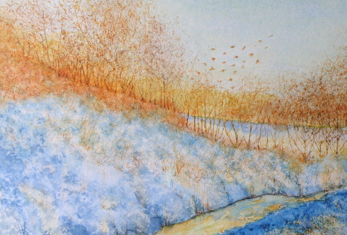
In the spirit of watercolour experimentation, it was interesting to take ordinary white mat board and coat it with a thin layer of clear acrylic medium. The board then had to dry for a good 24 hours. The experience when painting is one of finding it acts as a kind of resist while providing a rather intriguing texturing quality.

It is a bit tricky because there’s no wet-in-wet opportunity, or much reworking/touching up or the acrylic medium will moisten and lift from the surface and become gummy. So getting one crack at it is pretty much all one gets, making every brushstroke really count.
‘A Play of Jays’
January 13, 2018
We know the fun which comes from discovering how groups of birds are labelled and identified:
- a convocation of eagles
- a wake of buzzards
- a parliament of owls
- an exaltation of larks
- an ostentation of peacocks
Jays have two possibles–a ‘scold’, or a ‘play’–and given their feisty nature, both can be true at once. Here in Western Canada we have the Steller Jay, as well as the Whisky Jack or Grey Jay. Eastern Canada is home to the more familiar Blue Jay.

“A Play of Jays”, watercolour by Lance Weisser, 8″ x 30″, 140 lb. Saunders Waterford Hot Press Paper. Sold.
….Chickadee Miniature
April 21, 2016
This Winter along with the usual Mountain Chickadees at our feeders, we were pleased to have Black-Capped Chickadees as well. Coming from Eastern parts, they are the ones associated with childhood and so have a special place for me.
Right now we are experiencing amazingly warm temperatures–85F (30C)–and gardening is ramped up as a result. Dividing time between perennials and painting is a pleasure. As an Autumn and Winter person, I continue painting with that pallet of tones and colourations, and so ask you to cut some slack if/when I post snow scenes in April.

‘Pause That Refreshes’
5"x 7", Watercolour, Saunders Hot Press #140 paper
Cool Facts
- The Black-Capped Chickadee hides seeds and other food items to eat later. Each item is placed in a different spot and the chickadee can remember thousands of hiding places.
- Every autumn Black-capped Chickadees allow brain neurons containing old information to die, replacing them with new neurons so they can adapt to changes in their social flocks and environment even with their tiny brains.
- Chickadee calls are complex and language-like, communicating information on identity and recognition of other flocks as well as predator alarms and contact calls. The more dee notes in a chickadee-dee-deecall, the higher the threat level.
- Winter flocks with chickadees serving as the nucleus contain mated chickadee pairs and nonbreeders, but generally not the offspring of the adult pairs within that flock. Other species that associate with chickadee flocks include nuthatches, woodpeckers, kinglets, creepers, warblers and vireos.
- Most birds that associate with chickadee flocks respond to chickadee alarm calls, even when their own species doesn’t have a similar alarm call.
- There is a dominance hierarchy within flocks. Some birds are “winter floaters” that don’t belong to a single flock—these individuals may have a different rank within each flock they spend time in.
- Even when temperatures are far below zero, chickadees virtually always sleep in their own individual cavities. In rotten wood, they can excavate nesting and roosting holes entirely on their own.
- Because small songbirds migrating through an unfamiliar area often associate with chickadee flocks, watching and listening for chickadee flocks during spring and fall can often alert birders to the presence of interesting migrants.
- The oldest known wild Black-capped Chickadee was at least 11 years, 6 months old when it was recaptured and re-released during banding operations in Minnesota.
source: https://www.allaboutbirds.org/guide/Black-capped_Chickadee/lifehistory
…..Keeping Watch
April 7, 2016
Our little Gallery in the small city of Kamloops, B. C.’s historic Courthouse (1911) has a Featured Artist offering every month and May will be my month to put on a display of recent miniatures. So now it is a matter of working towards having a good showing.

“Keeping Watch”
watercolour on Saunders Hot Press #140 lb paper, 4″ x 6″
I can’t quite explain why it is that depictions of Ravens sell so well, but they do. So it is a pleasure to be able to comply and feed the need, so to speak. They are indeed a very symbolic and ancient bird whose fame is heralded in many countries and cultural legends concerning them abound.
Out taking photographs of them this week, I came across a pair whose size was truly astonishing and whose throaty calls echoed off the nearby boulders and across the wide Thompson River. Once that is accomplished, it is a matter of trying to place them in a scene which has definite mood and emotional impact.
…. composition exercise conclusion
February 27, 2016
Results of ‘composition exercise 1’: dividing a landscape into thirds, placing visual interest at each intersectional point….

Results of ‘composition exercise 2’:

and 3:

bringing us to 4:
It has taken a long spell of waffling over what to do about being less than pleased with the finished piece. The snowy fields seemed to extend themselves too far down, without enough visual interest to hold a viewer’s attention. And then I gave into the temptation/artistic trap I almost always seem to fall into, which is going one step too far by defining open field with regimented rows of corn which wind up being so monotonous, the fence posts going the opposite direction only add yet more visual predictability and kill whatever freshness the piece had going for it.
….so the only satisfactory outcome was to crop the painting and salvage what could be salvaged.

It is a very small painting, about 6″ x 12″, and has at least enough mood still going on to make it only just worth framing.
As an exercise, however, it was more than useful, and confirmed satisfactorily that placing interest at intersectional points within a composition divided into thirds works (sans rows of corn, that is), does hold one’s attention, and lends a feeling of balance.
…. belated draw a bird day
February 9, 2016
It has become ‘belated everything’ for me lately…so why not this as well.

2.5″ x 3.75″ watercolour on Arches Hot Press 140#
We’ve come to know this as the English Robin (at least here in Canada), though I see it referred to elsewhere as the European Robin (which of course no Brit would ever go for).
Here are some (possibly) little-known tidbits about it: “. . . The distinctive orange breast of both sexes contributed to the European robin’s original name of redbreast (orange as the name of a colour was unknown in English until the sixteenth century, by which time the fruit of that name had been introduced). In the fifteenth century, when it became popular to give human names to familiar species, the bird came to be known as robin redbreast, which was eventually shortened to robin. As a given name, Robin was originally a diminutive of Robert . . . ” [ Lack, D. (1950). Robin Redbreast. Oxford: Oxford, Clarendon Press. p. 44]
Personally, I have never seen this bird except depicted and written about in stories like “The Secret Garden”. But whenever I paint a miniature of them, it is purchased very quickly, and usually by a homesick, transplanted member of a country ‘across the pond’. It would be a treat to see them in their natural setting.
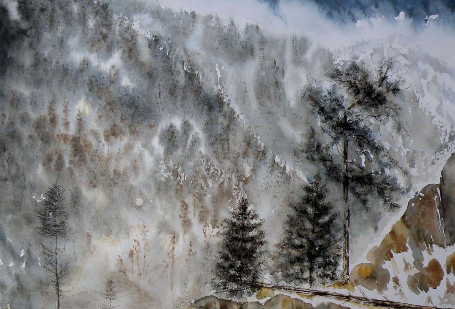
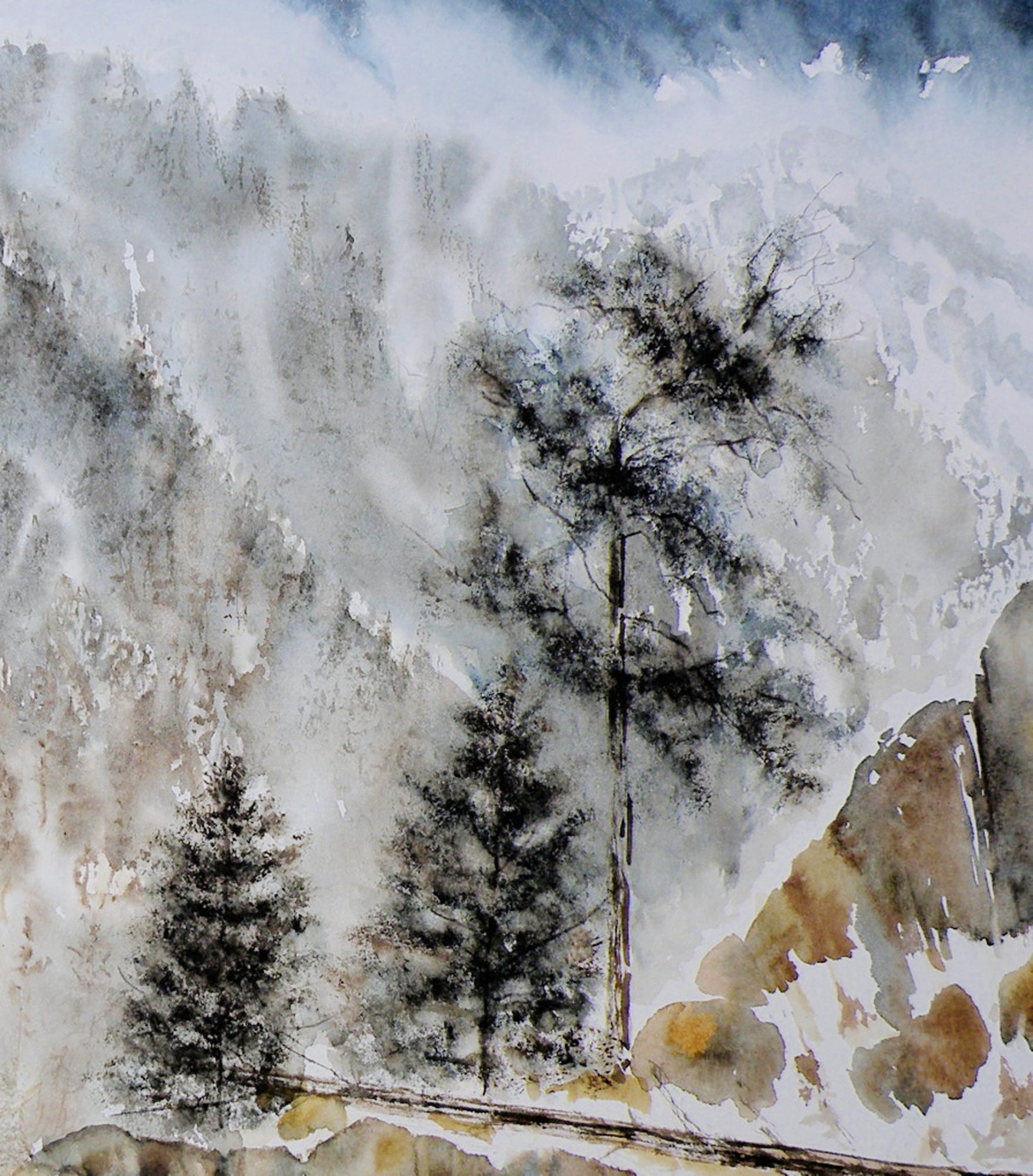
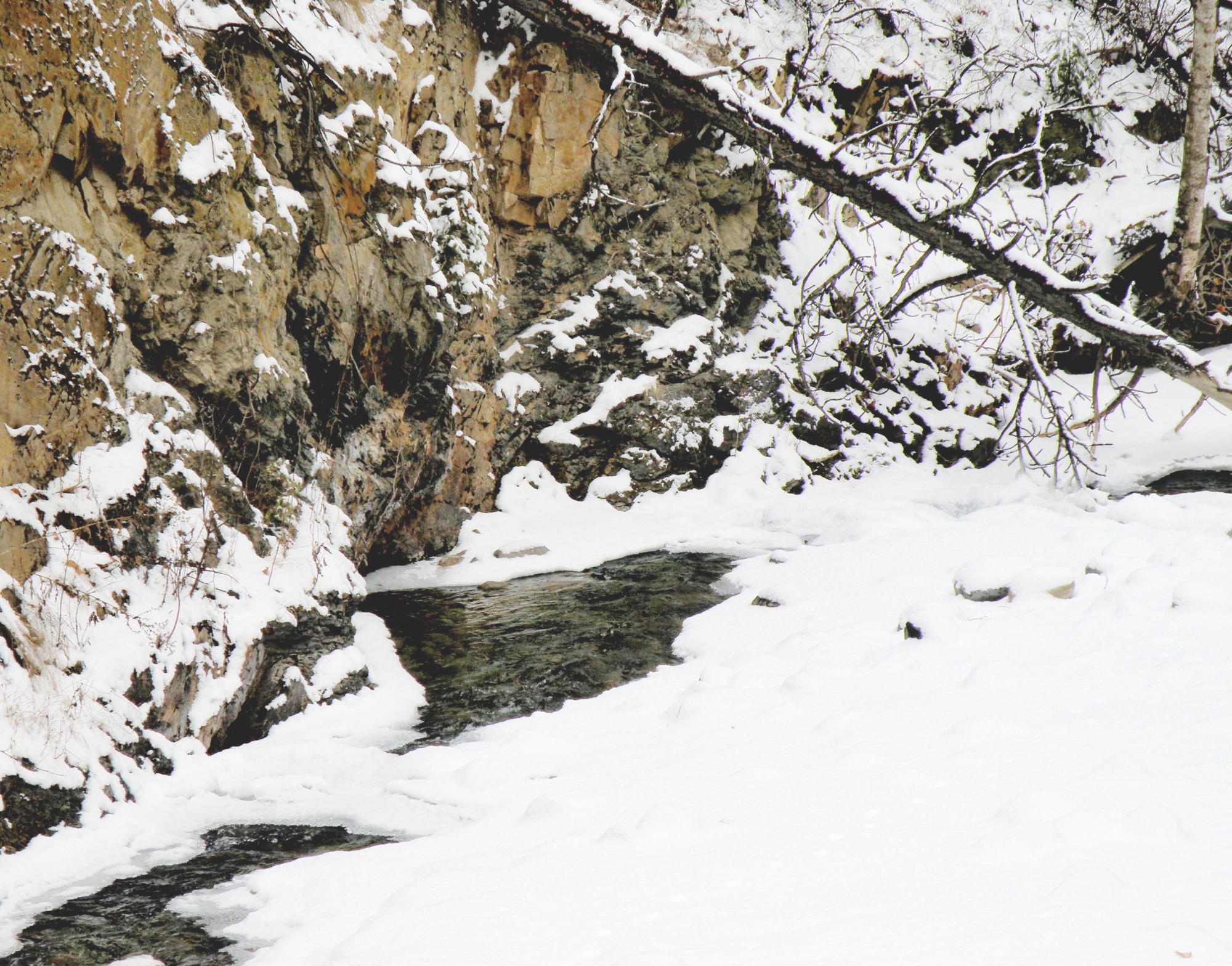
…. Tranquille Creek Gorge
January 21, 2016
The watercolour video demonstrations of David Dunlop are challenging and yet simple. https://www.youtube.com/watch?v=Lgtg-Adql1Y&index=6&list=PLtEJwQmsB7SvVg8C4J2c4LDijerH7SSKF (I tried to embed the video itself in this post, but WordPress thought otherwise). But here is the blurb describing it….”Emmy Award winning David Dunlop takes you to his Connecticut studio to demonstrate a two minute watercolor, used as preparation for an oil sketch or to explore ideas“.
Mr. Dunlop is an artist/teacher from Connecticut, whose manner when teaching is inspiring and animated. He is a great follower of descriptive, energetic Masters like J.M.W. Turner and Winslow Homer, and seeks to employ their methods, while demonstrating their techniques.
The video cited above challenges painters to do two to three minute painting sketches, which convey the movement and mood and spirit of the subject, without stopping to think and rework. In an effort to ‘do’ and not think, the subject chosen here is a favourite–a place about 20 minutes from our house–called Tranquille Creek Gorge.

Mr. Dunlop’s videos are quite dynamic and aimed more at oil painters a bit more than watercolourists, but full of very encouraging lessons because of the force of his optimistic personality and sense of fun. They are well worth watching, for those who enjoy painting as a means of expression.
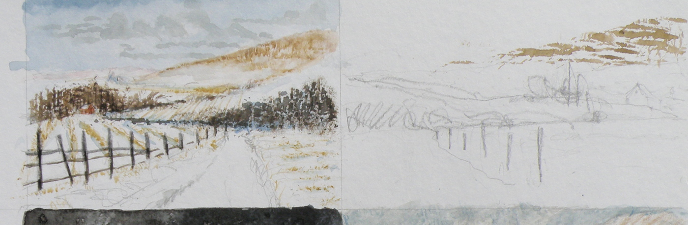
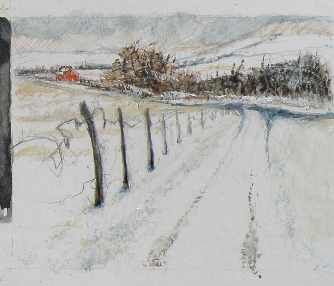
….composition exercise 2
January 17, 2016
Continuing on with an attempt to test out the compositional dictum known as ‘the rule of thirds’, which was conceived and named by John Thomas Smith in 1797 :
“. . . Analogous to this “Rule of thirds”, (if I may be allowed so to call it) I have presumed to think that, in connecting or in breaking the various lines of a picture, it would likewise be a good rule to do it, in general, by a similar scheme of proportion; for example, in a design of landscape, to determine the sky at about two-thirds ; or else at about one-third, so that the material objects might occupy the other two : Again, two thirds of one element, (as of water) to one third of another element (as of land); and then both together to make but one third of the picture, of which the two other thirds should go for the sky and aerial perspectives. . . “
To illustrate its basics…..

Once again, this is the drawing I did initially, to put this into practice….

And this is the first go at painting the scene….

And now today, here is the progress so far, attempting to locate some visual interest at each of the four intersections within the piece, the barn being the first and the pine being the second and the creekbed being the third…..

The darkest darks and greatest contrast will remain with the barn, for that is the intended focus for the picture, when completed.
The ‘rule of thirds’, as stated above, holds that generally two-thirds of a landscape be devoted to the sky, with one-third given to the land below (the sky being such a vast and dominant feature). In this case two-thirds is dedicated to the land and a very high horizon means that the one third is devoted to the sky area.
….snow
November 25, 2015
We received about 12cm overnight and now everything’s white, with temperatures starting to drop to around -10C (16F) under strong winds.
The birds are in the branches of the large Red Maple just beyond our big front window–at the four hanging feeders and suet cakes. We get mostly goldfinches and house finches, chickadees, juncos, nuthatches, flickers, clark’s nutcrackers, pine siskins, ring-necked doves, occasional pileated and downy woodpeckers, grosbeaks, stellar’s jays, magpies, ravens, white-crowned sparrows, and when it gets really cold the sweetly-blushing redpolls come down from the Arctic (but not likely until January or so).
Occasionally we see a Northern Pygmy Owl which swoops in on the dining lot, lighting on a branch like a handful of fluff with alarming eyes and causes the rest to take off like an explosion. They are one of a few daylight-hunting owls, and for two or three days following, the feeders remain untouched, the memory of that fist-sized, feathered-danger keeping everyone away.
In honour of the occasion — the advent of real Winter — a wintry watercolour, not unlike what the countryside looks like presently. The subject no doubt wishes the wind were less than it is….

….but imagine the pleasures of fireplace and toddies once he gets back.
It’s an old painting–6 years–and approximately 8″ x 10″ on my favoured Arches Aquarelle Hot Press 140# paper. It took approximately 30 years to finally discover the right paper, having gone through all the choices of surface, weight, paper-maker (brand), and so on. Were it to be done again, the figure would be altered some, as there’s something anatomically odd about it.
twilight time
June 26, 2015
DUSK HAS ALWAYS BEEN a magical time for photographers and painters alike. Exemplifying this is John Singer Sargents’ famous work, ‘Carnation, Lily, Lily Rose’ . . .

He would work on the piece by running outside every evening at that magical time to take in the effects the setting sun created in his garden, and add more detail to this wonderful painting–and did this over an entire year, between 1885 and 1886.
It borders on fatuous to have a Singer Sargent and something of mine on the same page, so please refrain from making a comparison. Rather, note along with me that regardless of who is photographing, painting in oils, watercolour, or pastel, trying to gain an understanding of the effects of the setting sun continues to be a worthy and challenging pursuit, no matter which century we happen to find ourselves living in.
“Winter Sun”, watercolour, 20cm x 30.5cm (8″ x 10″), art board, unsold
painting night
May 18, 2015
THERE IS A FASCINATION surrounding night, when all is cloaked in darkness and the earth dons a mysterious manteau.
WE SEE, and yet we don’t. Depicting night is a painting fascination because I personally do not have a firm visual anamnesis of what exactly night ‘looks like’.
FOR EXAMPLE, is the moon really white–or silvery? Or is it, rather, lemony–or perhaps, blue?
A NUMBER OF RENOWNED NORTH AMERICAN PAINTERS made the depiction of night their signature subject. Some, like the famous Western painter, Remington, chose to depict moonlight as a bit of each, including even at times, degrees of green….


IT IS SOMEWHAT OF A MYSTERY as to what our eyes truly see, in terms of chromaticity, when looking at night, and particularly, moonlight. Painting night offers an enjoyable challenge: convincing viewers that what has been painted corresponds to their personal, nightly experience.
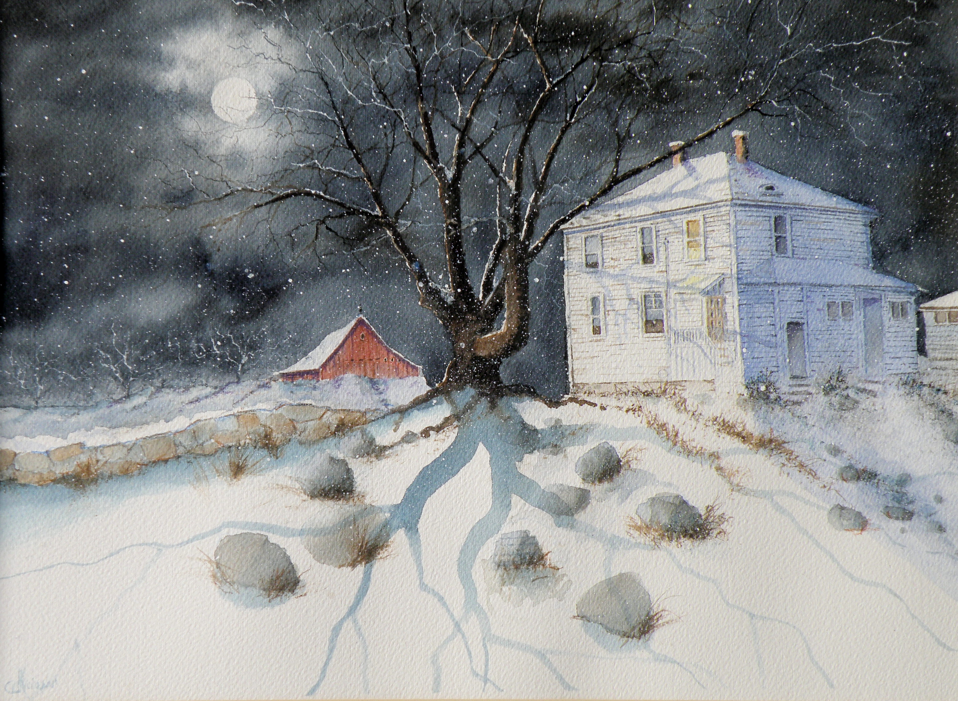
‘Up Late’, watercolour, Arches Hot Press Paper, “14×18”, (sold)
THIS IS ANOTHER heritage home in Kamloops, known locally as Fort House, because it was built on land originally used as a Fort by The Hudson Bay Company when Kamloops was established in 1812. At present, this early 20th century farmhouse is a rather rundown rooming house.
composition woes….
May 3, 2015
MY GREATEST CHALLENGE when painting anything is composition. For years I felt I was being a ‘purist’, insisting that I always paint on location, never in a studio setting. And once at the location, I convinced myself that if a tree was in that spot, then that was how it needed to be depicted.
IT WAS ALL DUE TO my tendency to early-on stop referring to the subject in front of me and become more and more involved in what was happening on paper, to the point where I may as well have not been on location at all. So in an effort at self-discipline, I decided that not only should I paint what things actually look like, I shouldn’t muck around with how and where ‘mother nature’ placed them.
THE SILLY THING WAS, I ended up choosing a composition by default because of course, I couldn’t paint everything my eyes saw in front of me. And more often than not, it was not a good composition. So now, not only do I go to some lengths to study the skill of creating an interesting arrangement, I realise it is the painter’s task to take what ‘mother nature’ provides and make art out of that. Fences do need to be repositioned, as do trees and hills and clouds.
SO NOW I MAKE thumbnail studies first on matt board before beginning anything . . .
THE OBJECTIVE is to provide a focal point, a visual way in towards it, then additional visual interest so the eye has more to discover by wandering beyond the subject itself. These thumbnails are exploring the use of a compositional figure ‘Z’ shape to lead the eye of the viewer.
Local Mountains 2
April 9, 2015
THIS COMPLETED PAINTING of the mountains in our Kamloops area was in need of cropping in order to strengthen the composition . . .
THE PAINTING WAS REDUCED IN SIZE down to this as the completed painting .. .
THE CHOPPED OFF parts of cropped work can successfully be made into bookmarks, I’ve found, and then be sold for around $2 ea in our little co-op Gallery (www.kamloopscourthousegallery.ca). Waste not, want not, lol!
A FEW LAST COMMENTS about this painting…..there is a decided difference between nature and the art of depicting nature. Mother Nature is not only a hoarder, but not interested in housekeeping nor pruning, encapsulating, or boiling-down. She wants it all, all the time, and enjoys lavishing on us the plentitude of what happens when everything we look at, at any given moment, reproduces at will and overwhelms us with dozens–and even thousands–of itself.
FOR THE LANDSCAPE PAINTER the challenge, always, is to take Nature and make it into Art. It is the very human discipline of paring down, re-arranging, configuring and composing. What separates raw Nature from the art of painting is having a limited space, with only two dimensions, which is ultimately going to end up on a wall inside a human-made space. That restrictiveness requires moving trees and clouds and birds about in order to have a sense of balance or sense of wonder or sense of drama. It means the painter must dare to alter time itself, put limits on colour, and restrict amounts of what is naturally before the painter’s eyes.
MAKING ART is similar to the difference between looking at a field of wheat and sitting down to a loaf of freshly-baked bread. What happens between those two events is the act of altering something to create something else.
THIS PAINTING is not what the photograph of this scene looks like. For many years I struggled with whether I was ‘allowed’ as a painter to do anything other than depict Nature as it presented itself to me. Sitting out on some stoney ground, I would suddenly find myself slavishly working at painting the weeds between cracks of rock, then painting the seed heads on the weeds to look exactly like what my eyes saw, when really I knew the larger purpose of sitting there in the hot sun was not to pay attention to weeds, but to paint the distant mountains above and beyond them. By the time I’d gotten away from doing weeds justice, I was so hot I had to fold up my equipment and go back to the car. And I went home with a painting of weeds between rocks and a big expanse of white paper above them.
THAT DOESN’T HAPPEN ANYMORE. I have learned that I must take what is presented to me and do with it as I wish to do. That is the work of a painter.
A PHOTOGRAPHER has a whole different set of challenges because a lens is very different from a human eye (it can’t do half of what a living, ‘breathing’ eye can do) and from human imagination (once it has seen what is before the eye) . But I have noticed some irony happening between the worlds of photography and painting. In the past, painters often worked very diligently to make a painting ‘look like’ a photograph. These days, with technological photo-shopping manipulation, a photographer seems more or less obsessed with trying to make a photograph look like a painting. I am not convinced either enterprise is worth spending all that amount of time on.
IF A PAINTER WISHES TO BE A PHOTOGRAPHER, then don’t go trying to make a painting into a photograph. Do go and take courses and buy equipment and learn how to take photographs and do the work a photographer must work at in order to eventually become a photographer. And IF A PHOTOGRAPHER WISHES TO BE A PAINTER, then leave the photo-shopping manipulation apps alone and do take courses and buy equipment and learn how to paint paintings and do the work a painter must work at in order to eventually become a painter. They are two distinctly separate and inherently different artforms and–in my flawed way of viewing things–should stay that way.
AND YOU…what’s your view? Tell me how I’m missing things you’ve discovered!
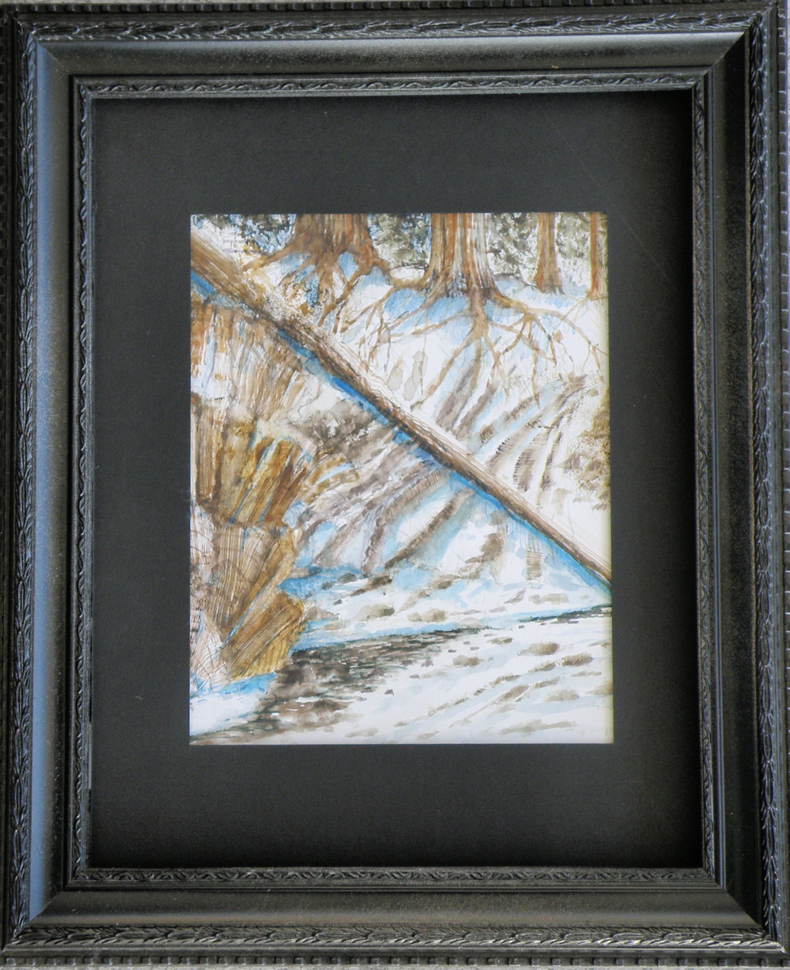
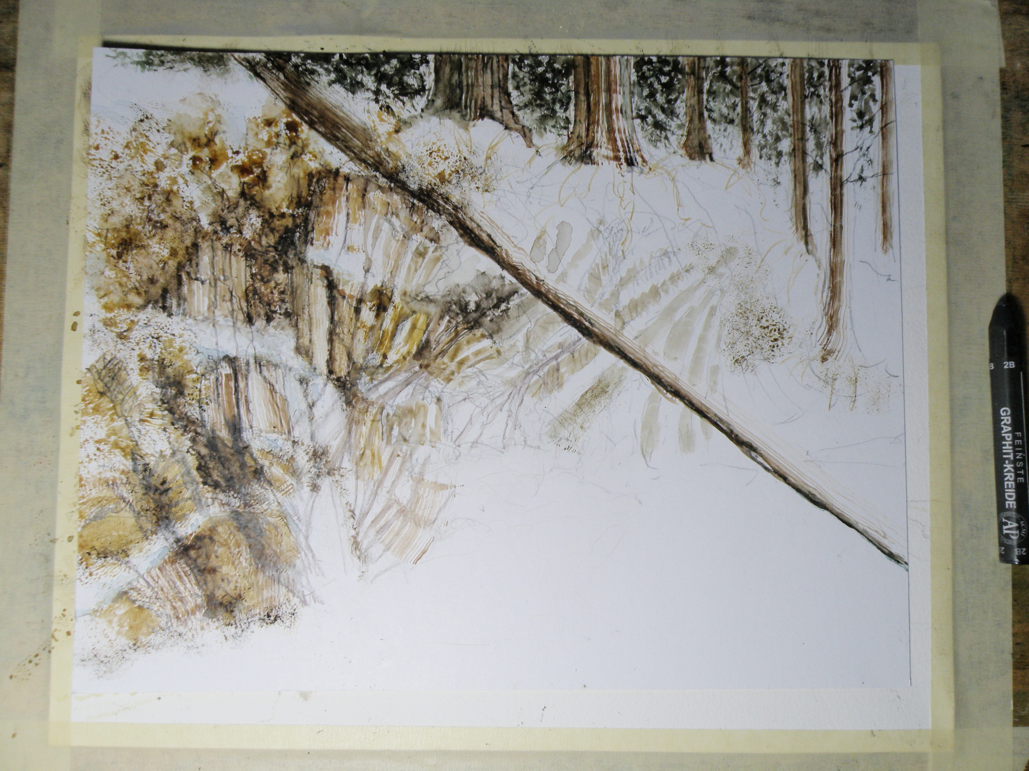
Painting progression 3…. ‘Jamieson Creek Thaw’
April 4, 2015
BECAUSE WATERCOLOUR is such a watery, transparent, delicate medium–one which must always allow the paper it’s laid on top of to breathe through it–one which traditionally doesn’t use white pigment, but relies on the paper to be the white of the painting–BECAUSE of this (and more) the challenge of the watercolour student is to convey an illusion of texture, without the ability to actually build up a surface texture.
WERE WATERCOLOUR PIGMENT applied so thickly as to create an impasto-like texture on the paper beneath, it would lose its luminosity and look pasty, muddy, dull–worse, it would crack. Watercolour pigment only works when the paper beneath dazzles through it and brings life to the pigmentation. In other words, watercolour as a medium is more the business of staining paper than it is a business of building up layers and coats of daubs, stipples, slatherings.
THAT’S WHY CARE is required to not apply so many washes that the luminosity of the paper receeds and eventually provides no life at all. And that’s why the whites of the paper must be thoughtfully reserved and left untouched in key areas–the crests of waves; the moon; snow; clouds; a picket fence–and skill taken to paint AROUND these places to let the paper be the white.
SO….a student of watercolour (me) learns early-on that (s)he will be a student of the medium for life–that mastery is illusive–and failures, many. A good piece is approached very thoughtfully, noting where the paper will be left to serve the function of white (pigment) and painted around. Then the student will also have to gather enough courage to apply exceedingly dark washes in one ‘go’, while maintaining a sense of secure, carefree animation in order to present an immediacy and liveliness in the final piece.
THE DEATHKNELL of a failing, dying work of watercolour is finicky overworking of areas, and a refusal to accept what happened when water joined pigment joined brush joined paper. It is NOT a medium for those who love to micro-manage or be in control.
THE STUDENT OF WATERCOLOUR has to be more a Peter Pan than a child wanting to grow up–loving the thrill of what happens when ‘danger’ is courted, yet having the assurance that daring will win the day. However, that daring and search for adventure–on the surface of a good piece of paper–will only be pulled off if it is backed by enough experience to have a good hunch about what will happen when such-and-such is tried.
ATTEMPTING what remains beyond one’s ability isn’t courting danger–it is ignoring it. Trying to fly without thinking happy thoughts will give a person a broken bone. Within the bounds of representational art–(i.e. wishing to have a tree ‘look like’ a tree)–a painter cannot ‘pull off’ a landscape with lots of shadows if (s)he has yet to study them in some depth. Trying to do a scene which includes far far more than what one yet learned how to interpret is an invitation to frustration and wanting to give up watercolour for say, acrylics (oh, my).
AND SO FOR MYSELF, I know by this time that I must confine my attentions to learning about how corn grows, what it feels like, looks like, behaves like, before I can throw my abandonment into rendering a watercolour of winter corn in January. Not only that, but I must also have studied the qualities of snow–the qualities of what a winter sun does to shadows of corn stalk–the blues, the purples. And only then can a learned abandonment bring about a possible reward.
IT TAKES A LONG TIME to find the right paper, the right brushes, the right working pallet of colours, the right approach and the right subject matter. Knowing what can be done when paper is sopping wet–and what can’t–depends on who made the paper, how thick it is, how textured it is, how stretched it is, how quickly it will dry. Knowing when to wait until the paper is exactly wet or damp or dry enough to throw one’s energies at it, comes (usually) through ruining (many pieces of) good paper.
HERE IS THE LATEST DEVELOPMENT of the subject of Jamieson Creek in a February thaw…..
TOMORROW will (hopefully) provide a photo of the finished piece!
Painting progression 2…. ‘Jamieson Creek Thaw’
April 3, 2015

Painting progression 1…. ‘Jamieson Creek Thaw’
April 2, 2015
JAMIESON CREEK is about a 15 minute drive from our home, along a dirt logging road. The Kamloops, British Columbia, region is a geologist’s dream come true, featuring some of the oldest mountains in Canada. As a student of watercolour, I am fascinated by stone and rock, particularly because it is so challenging as a subject.
This is Jamieson Creek, taken four years ago around February, early March….
And here is my initial drawing of the subject…..

As you can already see, photography is not my gift (which is why I paint, lol)–so forgive the darkness. It was taken, pre-dawn in the spare room which serves as a studio.
Same subject, different take…
March 17, 2015
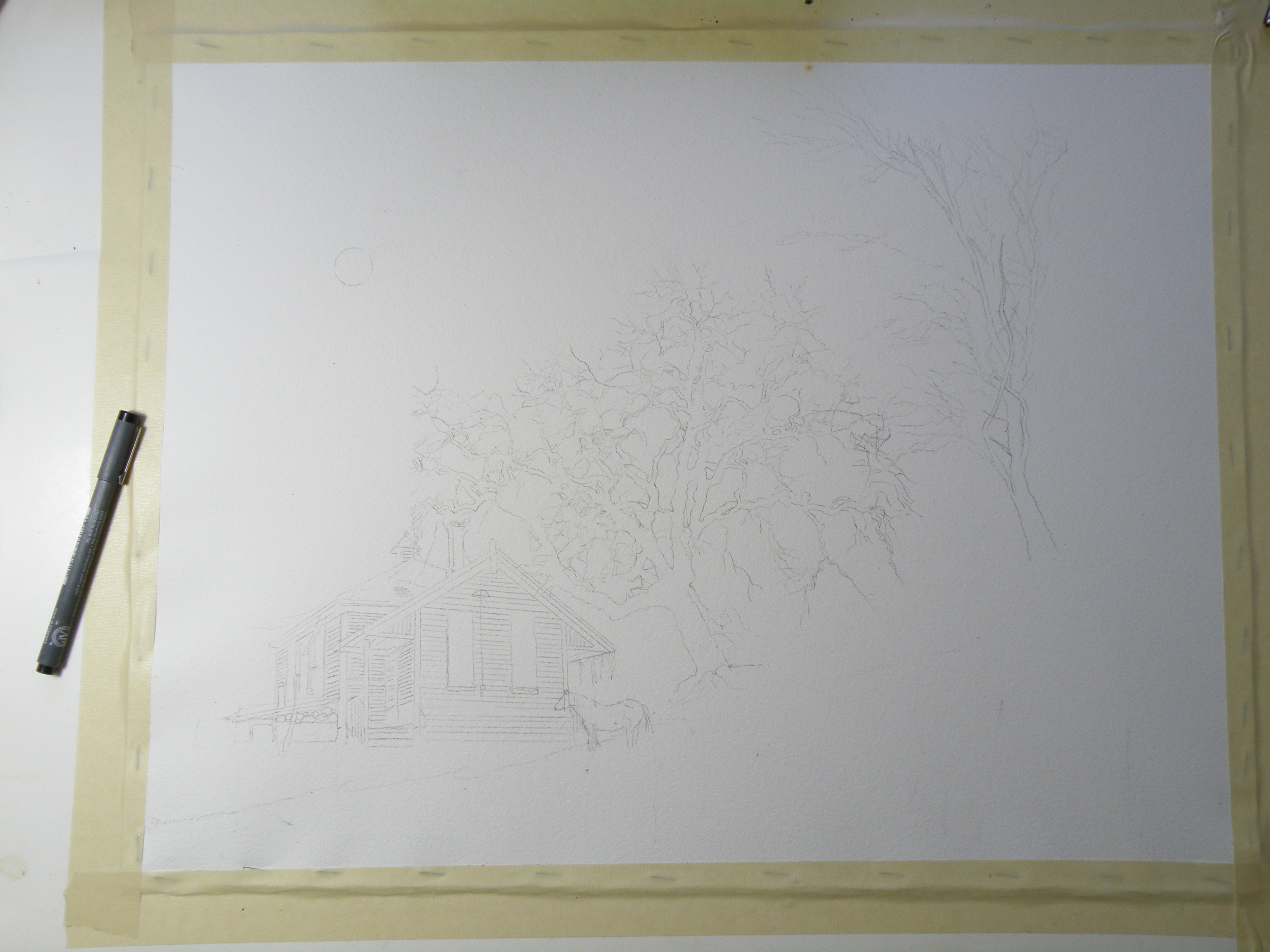
THE OLD SCHOOLHOUSE is once again the subject……

THIS TIME around, a horse was to be included, which meant it could not be a nocturnal scene, as that would be an odd addition to a night painting. The choice was made to have only a single horse, even though horses are most often seen in pairs or groups, being a social animal…..
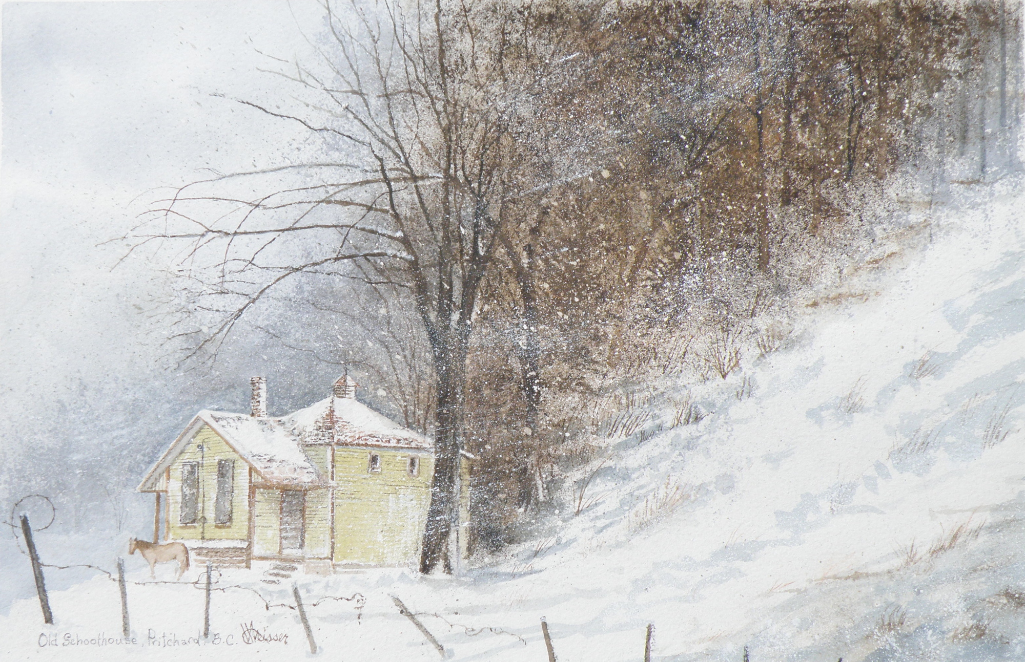
THE DECISION over depicting a single horse was selected as adding to the feeling of isolation: a lone horse beside an abandoned school in a lonely, forgotten field in the dead of winter……
“FROZEN IN TIME”
watercolour, 12″ x 15″, 140 lb. Arches Cold Press Paper, Kamloops Courthouse Gallery, Kamloops, British Columbia http://www.kamloopscourthousegallery.ca
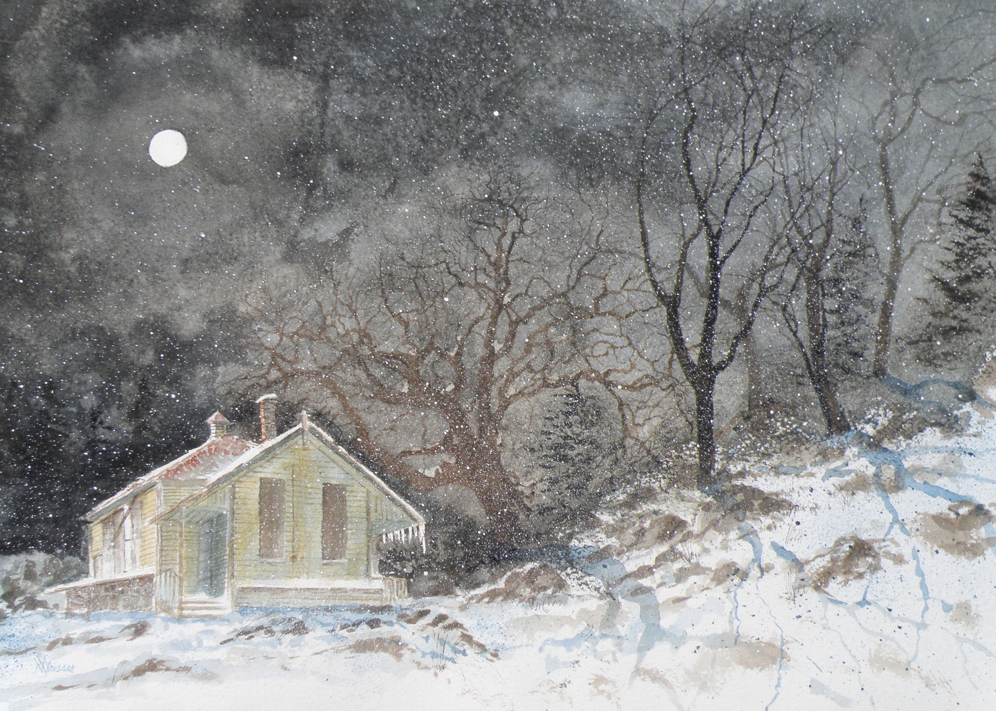
Painting progression 5
March 16, 2015
THE FINISHED piece–“Abandoned Schoolhouse, Pritchard”. The rocks needed darkening and definition. Pines were added. Spattering of snow was used to unify the whole and add a feeling of movement.
Painting Progression 1….
March 12, 2015
THERE WAS an old schoolhouse in the Township of Pritchard, British Columbia, just down the road from my friend Shiela. 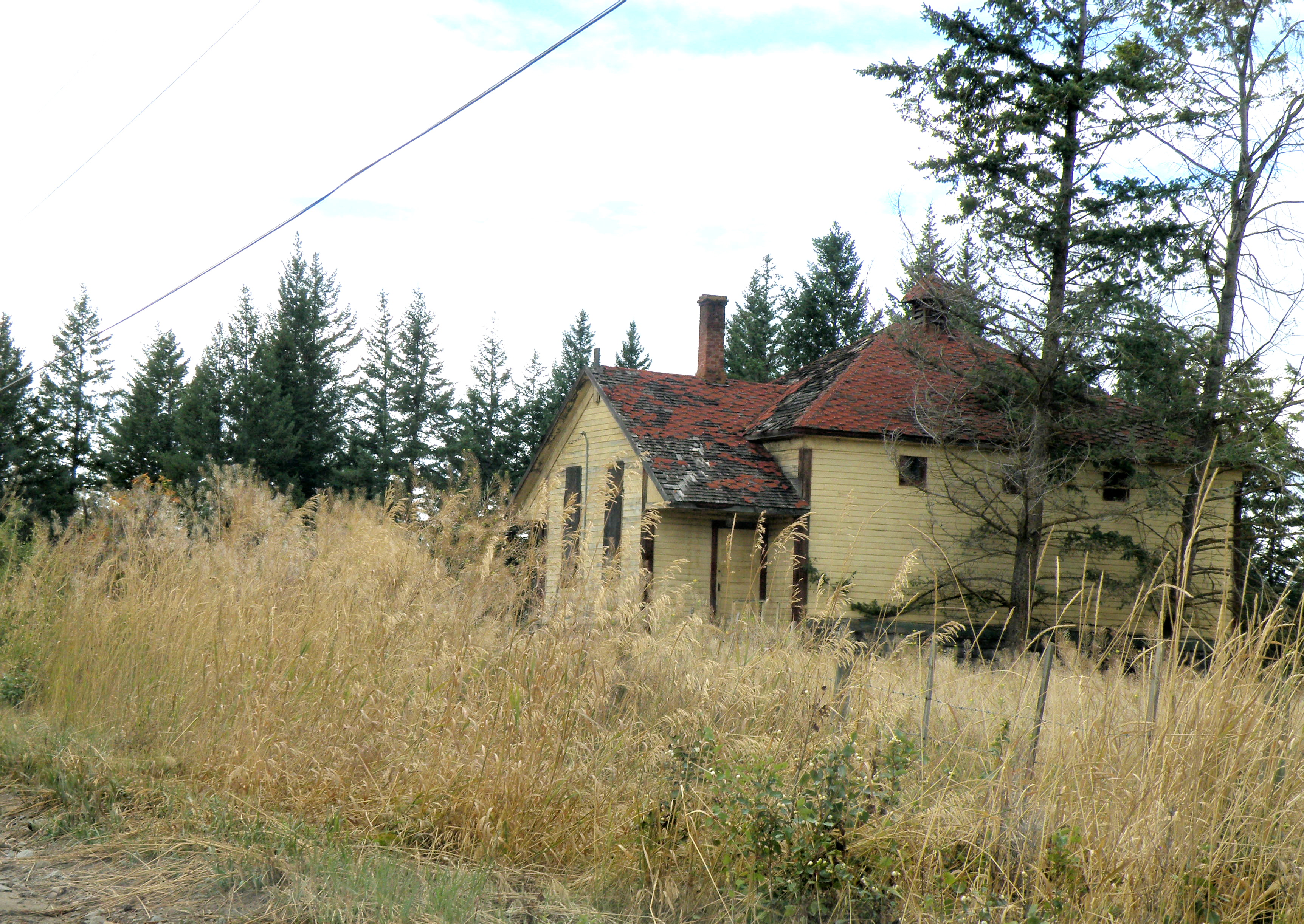 It was kept on a corner of field by a rancher who had attended it, hoping someday someone would see to its restoration. Eventually it was torn down, but not before I was able to photograph it. And I have painted it several times, choosing to situate it where I please….
This is the initial drawing. Because the rancher kept horses, I decided to position one for sake of interest. The paper is Arches Cold Press 140 lb., stretched stapled and taped onto gater board, approx. 15 x 20 in.
Jamieson Creek
May 6, 2012
This little painting (6″ x 7.5″) is of Jamieson Creek, which is not even ten minutes drive from our front door. This is a desert-like region, featuring its own local cacti (which I discovered by way of my hand), and is called The Sunshine Capital of Canada. Water, while not scarce, has usage restrictions and homes are now being installed with water meters.
So to have the Jamieson splashing over and around rocks and fallen timbers is a great joy. It is the epitome of the ‘laughing brook’ of literature, and compliments the broad, slow-moving Thompson Rivers which run through town. Were it not for our rivers, Kamloops would be uninhabitable. Right now the creek and rivers are swelling from the melt-off of mountain snows. Kamloops itself is some 4,000 ft in elevation, the mountain snows are up that much higher, and June is when the river level is at its peak.

“Up The Jamieson”, L & M Jones Collection
This painting was on the wall no longer than ten minutes before it was sold. My colleague in art, Lynda Jones, thought it complimented her pottery so well she went with her impulses. And that made my day.
The Columbias
February 10, 2012
For seven summers I was the cook for The British Columbia Natural History Society. In 1994 I graduated from The Dubruelle French Culinary School in Vancouver, and ran a kitchen at a small residence on the UBC Campus. This left my summers free, and I took on the task of prepping to feed upwards of sixty hikers at elevations upwards to some 3000 m., or approximately 10,000 ft.
It involved cooking and then packing vacuum-sealed , frozen meals in large chests with dry ice before joining the caravan of cars towards the mountain destination of choice. Once at the base, everything–including me–was hauled to the summit in a net-outfitted helicopter, and the business of setting up the huge kitchen and dining tents was begun. Frequently it was snowing up top–though only twenty minutes before I’d been roasting in the July heat–leaving me scrambling to find my parka.
The challenge was to get everything unboxed and laid out in some semblance of order–while ensuring the burners were properly hooked up to giant propane tanks–so that all-important first meal could be served some three hours later. After that, I could do the washing-up and at least semi-relax by first getting my little tent set up and then getting myself organized enough to be able to do breakfast when I awoke at 4 a.m.
By Day Three (of the ten day experience), it felt like I’d lived there my whole life, and could spend my days doing watercolours while the hikers tramped all over the rugged terrain carrying the bagged lunches they packed for themselves after dinner the night before. Once I’d served their breakfast, they’d stroll about with final cups of coffee making sure I overheard their latest Grizzly Bear spotting stories. Then they’d be off, leaving me sitting there all day minding that food all by myself.
Here is a painting from one of those seven summers. And though I can’t be entirely positive, I believe this particular view is from the Eastern British Columbia Mountain Range known simply as The Columbias.

Glaciers in The Columbias
And yes, I did see Grizzlies, but only from a distance.
thank god.
Winter Horses
February 1, 2012
The Old Schoolhouse in Pritchard on Duck Range Road was torn down last summer. It was in a farmer’s field–a farmer who’d gone to it as a child–and though he wanted to see it restored and taken over by the community, no one stepped forward to do so.
For years his horses used the school yard as their private pasture. Rain or shine–snow or sleet–anyone driving by would see them, the pair of steeds only momentarily looking up before resuming their grazing.

"School Yard Pasture"
Finally, after numerous appeals to various groups to assume responsibility for the Old School, the farmer reluctantly went about making sure it didn’t collapse and possibly cause an accident. Someone told me it only took a couple of hours for it to be reduced to a pile of boards and beams. If one drives by now, the only thing left standing are the horses.
A little ‘cheating’ . . .
January 25, 2012
Watercolour has its limitations and its unique requirements. About the biggest challenge is the understanding that anything white in a watercolour is the paper left blank. So white clouds are achieved by painting blue around them. Whitecapped waves are accomplished by painting the dark part of the wave and leaving the paper white for the crest. The same goes for snow, of course, and really anything at all that’s white.
The famous British painter, J. M. W. Turner (23 April 1775 – 19 December 1851) is widely regarded as the artist who took watercolour to its pinnacle–who forced it to be considered a serious medium, alongside oil (though even today watercolour is not treated with the same gravitas as oil). His work is nothing short of astonishing. And apparently he often achieved some of his whites by ripping at the paper with a long fingernail.
My training was such that the use of opaque white was absolutely forbidden. It was considered a breaking of the most important ‘rule’ of watercolour: that only the white of the paper (called ‘reserved white’) was acceptable in a pure, transparent watercolour.
I have, though, been talked into letting myself experiment with a limited usage of opaque white. A great many watercolourists use it, though sparingly.
The following picture was my first attempt at using a bit of opaque white in the branches of the trees. The clouds, grasses, snow, and other whites were achieved by reserved whites (leaving the paper blank) and/or scratching out with a knife (my fingernails aren’t nearly long enough).

"Snug"
A bit of New York
January 4, 2012
I was raised in Rochester, New York, and then later on the New York / Vermont border. At some point we had occasion to visit the town of Saranac Lake, New York, which hosted the 1980 Winter Olympics and much earlier in its history was one of North America’s best known tuberculosis sanatorium locales. Patients went there to receive plenty of sunshine and fresh air.
Kamloops, British Columbia, my present home, was also chosen as a prime location for a TB sanatorium and it was located just outside the city limits at Tranquille, B. C., beside Kamloops Lake. The air here is dry, without even a hint of humidity in the Summer and bracingly-cold in the Winter.
I loved staying in Saranac Lake that one week in January. The lake itself was completely frozen over, with a fresh layer of snow and a blindingly-bright sun.

'A Frosty Saranac Lake, Saranac Lake, New York, c1989'
