blue moon
July 4, 2015
Because watercolour basically amounts to taking white paper and staining it with various colours by way of a brush and water-activated pigments, the possibility of texture using a buildup of paint, gesso, gel medium and other ‘helps’ available to painters in acrylic and oil just isn’t there. IOW, in classic watercolour technique the word ‘impasto’ doesn’t exist.
Some painters get around this disadvantage by way of collage, and apply watercolour to glued on tissue and similar textural material…..
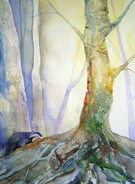 “Forest Forager”, watercolour and collage by Shari Hills, source: httpwww.drawntothevalley.co.ukartistsdetailshari-hills
Here, the painter, Sheri (Colours by Sheri), used ‘delicate papers’ as a glued foundation to provide textures which then received watercolour paint to complete the effect. On her site she describes how she also has used organic leaf material at times.
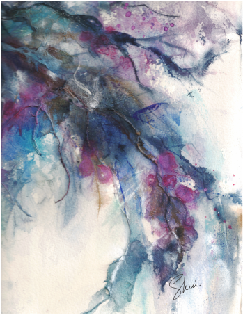
“Winter’s Chill”, watercolour collage, Colours by Sheri, source: httpwww.coloursbysheri.comcurrent-series.html#sthash.aUBXtd8f.dpuf
If this method is used, painters are required to identify their medium as ‘collage’, or ‘watercolour collage’ if entering the piece in an exhibition or juried show. Such work falls outside the accepted boundaries of what constitutes a ‘watercolour’.
In order to remain within the rather strict boundaries painters cannot have more than one third be of another medium or it then becomes a ‘mixed media’ work or ‘collage’ or ‘gauche’. Gauche is watercolour which uses white tempera paint, and thus is opaque, not transparent. Of course, that is perfectly well and good. Every painter does as (s)he is led to do.

‘Moonrise’, watercolour on art board, 19cm x 24cm, (7.5″ x 9.5″)
Personally, like writers who enjoy the challenge of staying within the bounds of iambic pentameter and composing 14 line sonnets, being ‘confined’ to the rather strict parameters of traditional watercolour is rewarding. These protocols include reserving paper to serve as white in a painting (such as the moon in the above example) — and the white of the paper is what brings life to the pigments laid over it. And it means having to discover ways of creating texture which, in the end, remains just an illusion.
twilight time
June 26, 2015
DUSK HAS ALWAYS BEEN a magical time for photographers and painters alike. Exemplifying this is John Singer Sargents’ famous work, ‘Carnation, Lily, Lily Rose’ . . .

He would work on the piece by running outside every evening at that magical time to take in the effects the setting sun created in his garden, and add more detail to this wonderful painting–and did this over an entire year, between 1885 and 1886.
It borders on fatuous to have a Singer Sargent and something of mine on the same page, so please refrain from making a comparison. Rather, note along with me that regardless of who is photographing, painting in oils, watercolour, or pastel, trying to gain an understanding of the effects of the setting sun continues to be a worthy and challenging pursuit, no matter which century we happen to find ourselves living in.
“Winter Sun”, watercolour, 20cm x 30.5cm (8″ x 10″), art board, unsold
heatwave relief
June 24, 2015
IT IS BARELY PAST the first day of Summer and temperatures here in Southern British Columbia, Canada, are scheduled to climb to 40C (104F) and stay there. It is feared the heat and drought affecting California is heading North, Along with such heat, thunderstorm probabilities rise, and they become fire starters. By August there’ll be what weather reports term ‘local smoke’–a haze hanging over everything–accompanied by the sound of helicopters and planes working to douse flames in affected regions close by.
My favourite month is November. It is both an exciting and contemplative month–exciting because any day, any moment I might step out to feel those fortifying winds suddenly becoming the first snow squall. Contemplative, because the fog rising from the closeby Thompson River mixes with wood stove breathings and the last of the leathery oak leaves falling to join the others, invites thoughts on things ethereal and eternal.

“Logging along Jamieson Creek Road”, watercolour, 20cm x 25cm, (8″ x 10″) Arches Hot Press 140 lb Paper, unsold
As a child, there was nothing more beautiful than what I called ‘purple snow’–that snow which signalled to us that we’d best take only one more turn sledding down Dead Man’s Hill (many years prior, legend had it, a man went down its twists and turns standing on his sled and smacked into a maple–back in the old days, when men apparently went sledding). Purple snow meant dinner. Purple snow meant finally discovering just how cold our digits actually were– thawing under a running cold faucet–pins and needles hot pink cold.
And even now, there is nothing to me more beautiful than purple snow. On this 40C second day of Summer, all I can say is, Lord get us through to November.
more night
June 5, 2015
I KNOW, I KNOW, it’s June. I’m incurably attracted to Autumn and Winter, most likely because they are for me what I’d describe as cozy seasons, where a sweater serves perfectly.
ADMITTING to age preferences is slightly embarrassing, but only slightly. Heat is no longer an attraction to me, weather-wise, and here it is June 5 and in two days it will be going to 92F (33C). Now please, do NOT misinterpret this as whining. I’m not (right now), but rather simply stating a preference in order to justify posting this painting….
‘Pale Moon’, Watercolour on Arches Hot Press 140 lb Paper, 13cm x 18cm (5″ x 7″)
WHEN PAINTING, I admit to finding it more satisfying to express feeling through stark scenes with diminished-light. For one thing, the above place is not one many people would find themselves visiting at that hour in that weather. It therefore brings us in as though inviting a search for Snowy Owls on the prowl, or a pack of Grey Wolves threading a path back to the lair.
conveying mood
May 14, 2015
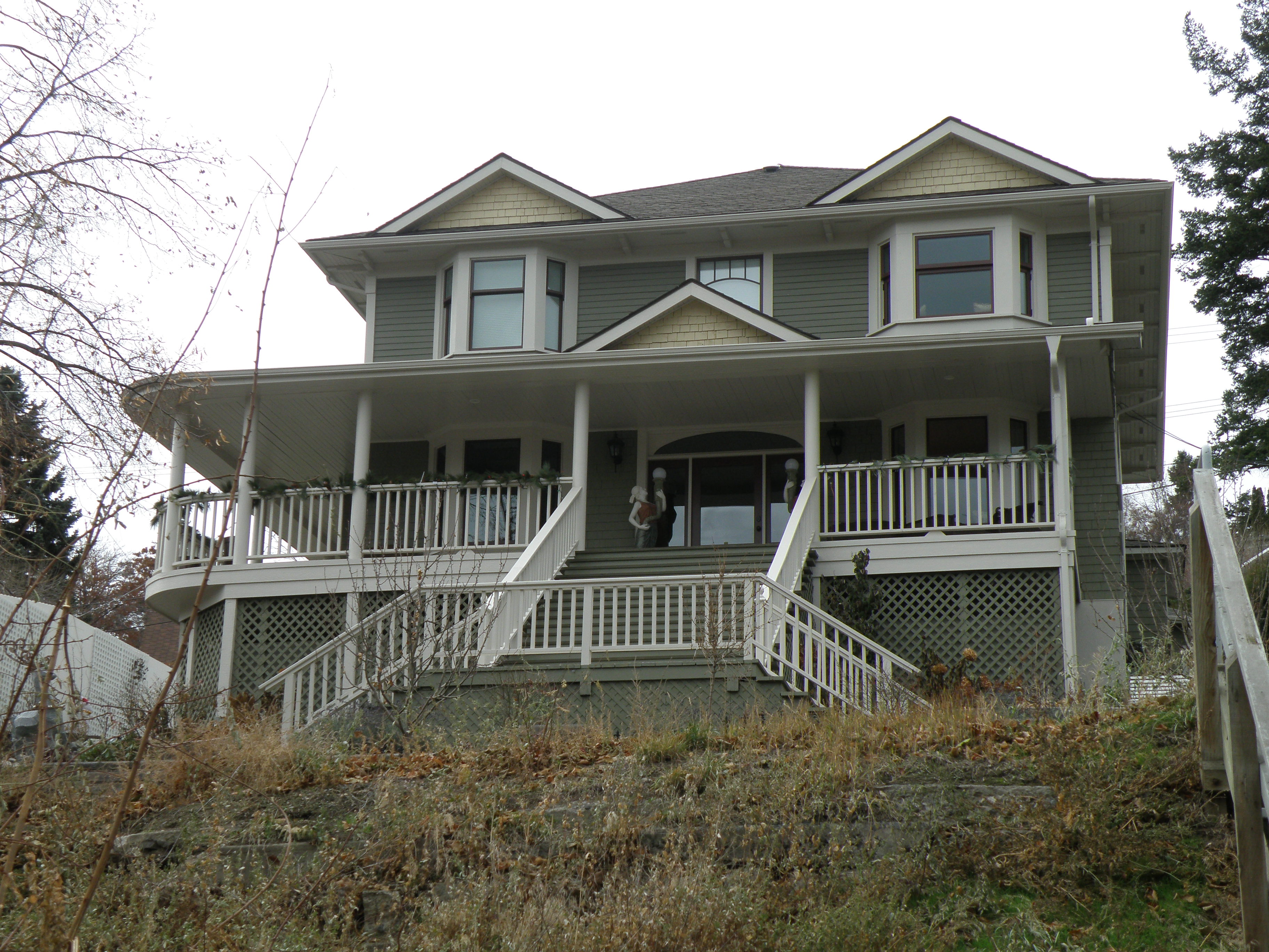
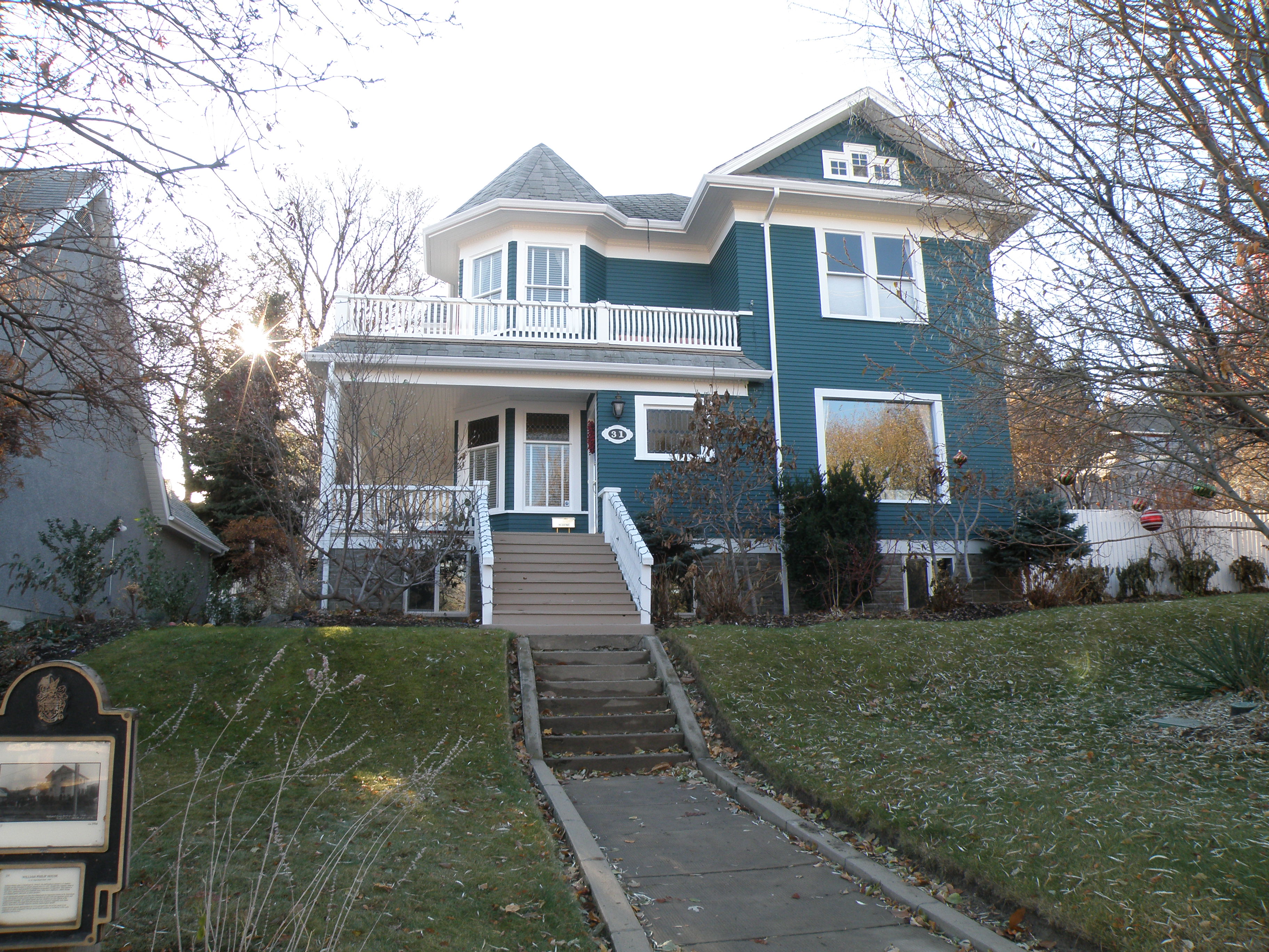
THE HERITAGE HOMES in our city of Kamloops were built at the turn of the 20th Century and are really rather distinctive, reflecting a very decided Victorian panache. Here are a couple which have been perfectly maintained….
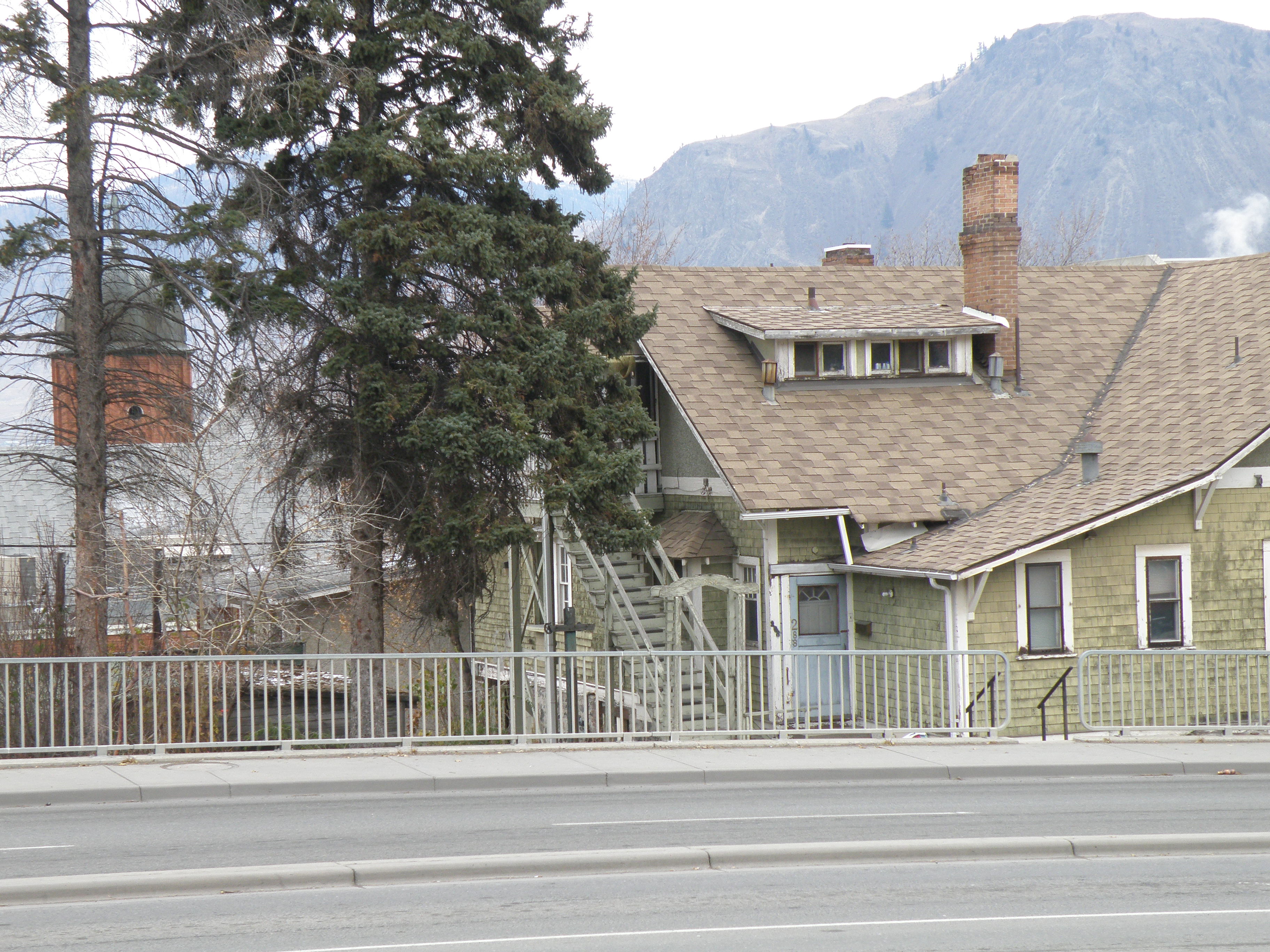
PAINTING-WISE, the more interesting homes are, for me, the ones which have been given up for rooming houses, and therefore rather neglected….
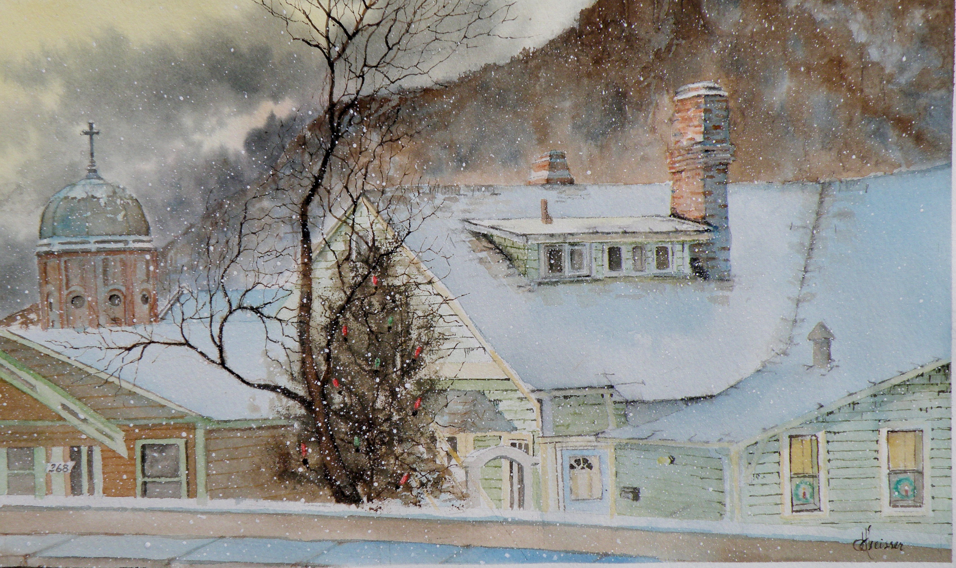
‘Columbia Street Noel’, 7″x12″, watercolour, (sold)
THE OBJECTIVE is to successfully convey a particular mood to the viewer–in this case, a certain melancholy–a fragile attempt at dressing-up a once-proud home in the midst of frigid temperatures and icy snow.
The buyer of this painting saw it in the Gallery and exclaimed that her parents had had this house built, and immediately claimed it for her own. It suddenly made me wish I hadn’t been quite so accurate about painting in the worn and shabby details.
composition woes….
May 3, 2015
MY GREATEST CHALLENGE when painting anything is composition. For years I felt I was being a ‘purist’, insisting that I always paint on location, never in a studio setting. And once at the location, I convinced myself that if a tree was in that spot, then that was how it needed to be depicted.
IT WAS ALL DUE TO my tendency to early-on stop referring to the subject in front of me and become more and more involved in what was happening on paper, to the point where I may as well have not been on location at all. So in an effort at self-discipline, I decided that not only should I paint what things actually look like, I shouldn’t muck around with how and where ‘mother nature’ placed them.
THE SILLY THING WAS, I ended up choosing a composition by default because of course, I couldn’t paint everything my eyes saw in front of me. And more often than not, it was not a good composition. So now, not only do I go to some lengths to study the skill of creating an interesting arrangement, I realise it is the painter’s task to take what ‘mother nature’ provides and make art out of that. Fences do need to be repositioned, as do trees and hills and clouds.
SO NOW I MAKE thumbnail studies first on matt board before beginning anything . . .
THE OBJECTIVE is to provide a focal point, a visual way in towards it, then additional visual interest so the eye has more to discover by wandering beyond the subject itself. These thumbnails are exploring the use of a compositional figure ‘Z’ shape to lead the eye of the viewer.
The Gleaners
April 30, 2015
THE GLEANERS is a renowned painting by Jean-Francois Millet, finished in 1857.
It was controversial in France for its depiction of the lowest classes of society, picking from the fields what little was left after harvest. Prior to this, paintings of people were usually paintings of people who were rich enough to have their portraits done.
THERE WILL ALWAYS BE GLEANERS, as we know. And each of us, in our own way, were often taught by our parents to make good use of every last bit of something, including the meal(s) in front of us.
IN THE ANIMAL WORLD, Ravens are gleaners supreme, going after what little remains of just about anything left behind, tossed aside, or just there for the taking. Yesterday I encountered one in the parking lot of our local Mall, hopping about a garbage can with a broken wing, waiting for someone to provide some slim pickings. Its noble bearing and size–the gloss of its plumage, the inherent dignity–only added to the poignancy of its situation. And yet, it wasn’t exhibiting signs of pain or discomfort, just a keen willingness to take what it could get and survive. And glean.
The Common Raven (corvus corax)
April 21, 2015
THE COMMON RAVEN is amply represented in British Columbia and enjoys the distinction of co-existing with people for thousands of years, to the point where–in Haida Nation tradition–the Raven has god-like qualities. It was the Raven which released the Sun from its little box–made the stars and moon–and even brought people out of the earth in order to populate a party being thrown. But in traditional stories Raven doesn’t actually create (make things out of nothing), so much as steal, exchange, rearrange and redistribute and generally push things around into new combinations. If that isn’t humanlike, I don’t know what is, lol.

“Spring Thaw”
watercolour on art board, 20 cm x 28 cm (8″ x 11″), sold
In Kamloops it is against the law to feed them, as well as crows. A buyer of my work named Joan pours bags of cat kibble into her elaborate and large cement bird baths in the Winter and revels in their continuous, noisy presence. The neighbours? not so much. When they report her, she just pays the fine and keeps at it.
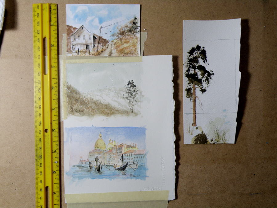
ACEOs (Art Card Editions and Originals)
April 20, 2015
ARTIST TRADING CARDS aka ART CARD EDITIONS AND ORIGINALS are popularly known as ACEOs. ACEOs are the size of baseball cards–65mm x 89mm (2.5″ x 3.5″) and are purchased and then traded and sold the way sports cards are. The ACEO movement originated in Switzerland in the 90s but grew in popularity through eBay, where art cards are now sold and bought on a 24hr basis.
They require precision and are very enjoyable to do. But then, who wouldn’t be fascinated by the challenge of painting tiny things (smile). The subject matter can be chosen by the purchaser, and the painting done accordingly.
Local Mountains 2
April 9, 2015
THIS COMPLETED PAINTING of the mountains in our Kamloops area was in need of cropping in order to strengthen the composition . . .
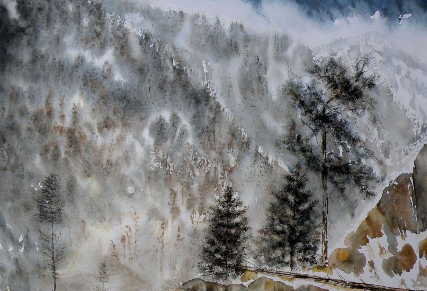
THE PAINTING WAS REDUCED IN SIZE down to this as the completed painting .. .
THE CHOPPED OFF parts of cropped work can successfully be made into bookmarks, I’ve found, and then be sold for around $2 ea in our little co-op Gallery (www.kamloopscourthousegallery.ca). Waste not, want not, lol!
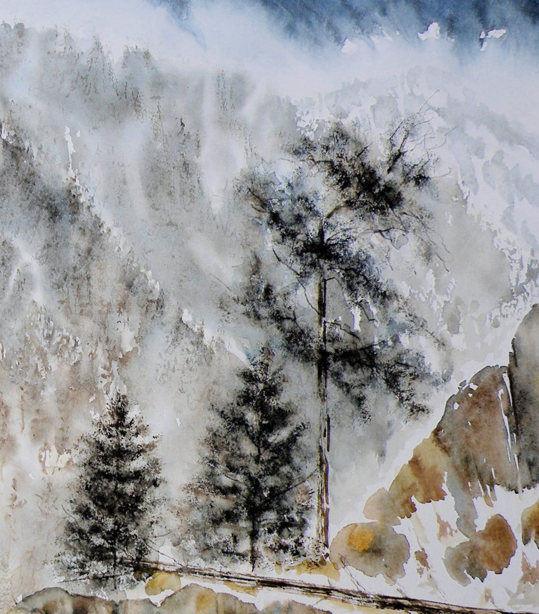
Local Mountains
April 8, 2015
A decision has to be made as to whether this painting ‘holds up’, composition-wise. It succeeds in conveying the misty atmospheric conditions of winter in the mountains. But the composition is troubling me.
New bird miniatures
April 6, 2015
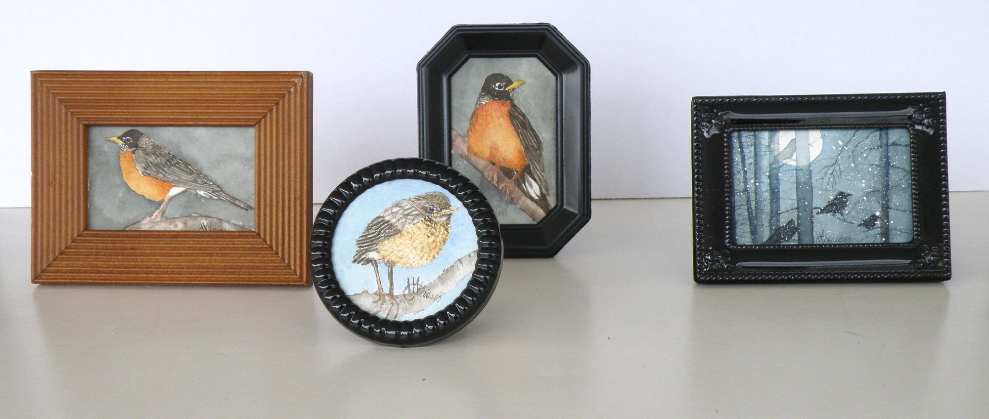
The image sizes here are approximately 5cm x 8cm (2″ x 3″). I use a pair of rather strong magnifying glasses when working this small–the kind you find on display at pharmacies (around here they’re referred to as ‘cheaters’). So when working on a tiny miniature they are an enormous help, until I turn to go check on something in the kitchen and walk into the wall, lol.
A FEW LAST COMMENTS about this painting…..there is a decided difference between nature and the art of depicting nature. Mother Nature is not only a hoarder, but not interested in housekeeping nor pruning, encapsulating, or boiling-down. She wants it all, all the time, and enjoys lavishing on us the plentitude of what happens when everything we look at, at any given moment, reproduces at will and overwhelms us with dozens–and even thousands–of itself.
FOR THE LANDSCAPE PAINTER the challenge, always, is to take Nature and make it into Art. It is the very human discipline of paring down, re-arranging, configuring and composing. What separates raw Nature from the art of painting is having a limited space, with only two dimensions, which is ultimately going to end up on a wall inside a human-made space. That restrictiveness requires moving trees and clouds and birds about in order to have a sense of balance or sense of wonder or sense of drama. It means the painter must dare to alter time itself, put limits on colour, and restrict amounts of what is naturally before the painter’s eyes.
MAKING ART is similar to the difference between looking at a field of wheat and sitting down to a loaf of freshly-baked bread. What happens between those two events is the act of altering something to create something else.
THIS PAINTING is not what the photograph of this scene looks like. For many years I struggled with whether I was ‘allowed’ as a painter to do anything other than depict Nature as it presented itself to me. Sitting out on some stoney ground, I would suddenly find myself slavishly working at painting the weeds between cracks of rock, then painting the seed heads on the weeds to look exactly like what my eyes saw, when really I knew the larger purpose of sitting there in the hot sun was not to pay attention to weeds, but to paint the distant mountains above and beyond them. By the time I’d gotten away from doing weeds justice, I was so hot I had to fold up my equipment and go back to the car. And I went home with a painting of weeds between rocks and a big expanse of white paper above them.
THAT DOESN’T HAPPEN ANYMORE. I have learned that I must take what is presented to me and do with it as I wish to do. That is the work of a painter.
A PHOTOGRAPHER has a whole different set of challenges because a lens is very different from a human eye (it can’t do half of what a living, ‘breathing’ eye can do) and from human imagination (once it has seen what is before the eye) . But I have noticed some irony happening between the worlds of photography and painting. In the past, painters often worked very diligently to make a painting ‘look like’ a photograph. These days, with technological photo-shopping manipulation, a photographer seems more or less obsessed with trying to make a photograph look like a painting. I am not convinced either enterprise is worth spending all that amount of time on.
IF A PAINTER WISHES TO BE A PHOTOGRAPHER, then don’t go trying to make a painting into a photograph. Do go and take courses and buy equipment and learn how to take photographs and do the work a photographer must work at in order to eventually become a photographer. And IF A PHOTOGRAPHER WISHES TO BE A PAINTER, then leave the photo-shopping manipulation apps alone and do take courses and buy equipment and learn how to paint paintings and do the work a painter must work at in order to eventually become a painter. They are two distinctly separate and inherently different artforms and–in my flawed way of viewing things–should stay that way.
AND YOU…what’s your view? Tell me how I’m missing things you’ve discovered!
Painting progression 3…. ‘Jamieson Creek Thaw’
April 4, 2015
BECAUSE WATERCOLOUR is such a watery, transparent, delicate medium–one which must always allow the paper it’s laid on top of to breathe through it–one which traditionally doesn’t use white pigment, but relies on the paper to be the white of the painting–BECAUSE of this (and more) the challenge of the watercolour student is to convey an illusion of texture, without the ability to actually build up a surface texture.
WERE WATERCOLOUR PIGMENT applied so thickly as to create an impasto-like texture on the paper beneath, it would lose its luminosity and look pasty, muddy, dull–worse, it would crack. Watercolour pigment only works when the paper beneath dazzles through it and brings life to the pigmentation. In other words, watercolour as a medium is more the business of staining paper than it is a business of building up layers and coats of daubs, stipples, slatherings.
THAT’S WHY CARE is required to not apply so many washes that the luminosity of the paper receeds and eventually provides no life at all. And that’s why the whites of the paper must be thoughtfully reserved and left untouched in key areas–the crests of waves; the moon; snow; clouds; a picket fence–and skill taken to paint AROUND these places to let the paper be the white.
SO….a student of watercolour (me) learns early-on that (s)he will be a student of the medium for life–that mastery is illusive–and failures, many. A good piece is approached very thoughtfully, noting where the paper will be left to serve the function of white (pigment) and painted around. Then the student will also have to gather enough courage to apply exceedingly dark washes in one ‘go’, while maintaining a sense of secure, carefree animation in order to present an immediacy and liveliness in the final piece.
THE DEATHKNELL of a failing, dying work of watercolour is finicky overworking of areas, and a refusal to accept what happened when water joined pigment joined brush joined paper. It is NOT a medium for those who love to micro-manage or be in control.
THE STUDENT OF WATERCOLOUR has to be more a Peter Pan than a child wanting to grow up–loving the thrill of what happens when ‘danger’ is courted, yet having the assurance that daring will win the day. However, that daring and search for adventure–on the surface of a good piece of paper–will only be pulled off if it is backed by enough experience to have a good hunch about what will happen when such-and-such is tried.
ATTEMPTING what remains beyond one’s ability isn’t courting danger–it is ignoring it. Trying to fly without thinking happy thoughts will give a person a broken bone. Within the bounds of representational art–(i.e. wishing to have a tree ‘look like’ a tree)–a painter cannot ‘pull off’ a landscape with lots of shadows if (s)he has yet to study them in some depth. Trying to do a scene which includes far far more than what one yet learned how to interpret is an invitation to frustration and wanting to give up watercolour for say, acrylics (oh, my).
AND SO FOR MYSELF, I know by this time that I must confine my attentions to learning about how corn grows, what it feels like, looks like, behaves like, before I can throw my abandonment into rendering a watercolour of winter corn in January. Not only that, but I must also have studied the qualities of snow–the qualities of what a winter sun does to shadows of corn stalk–the blues, the purples. And only then can a learned abandonment bring about a possible reward.
IT TAKES A LONG TIME to find the right paper, the right brushes, the right working pallet of colours, the right approach and the right subject matter. Knowing what can be done when paper is sopping wet–and what can’t–depends on who made the paper, how thick it is, how textured it is, how stretched it is, how quickly it will dry. Knowing when to wait until the paper is exactly wet or damp or dry enough to throw one’s energies at it, comes (usually) through ruining (many pieces of) good paper.
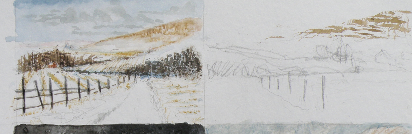
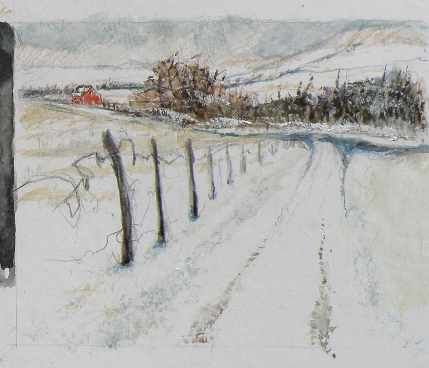
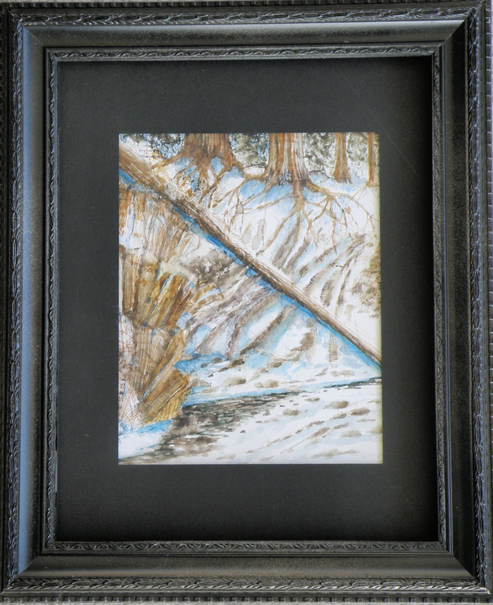
HERE IS THE LATEST DEVELOPMENT of the subject of Jamieson Creek in a February thaw…..
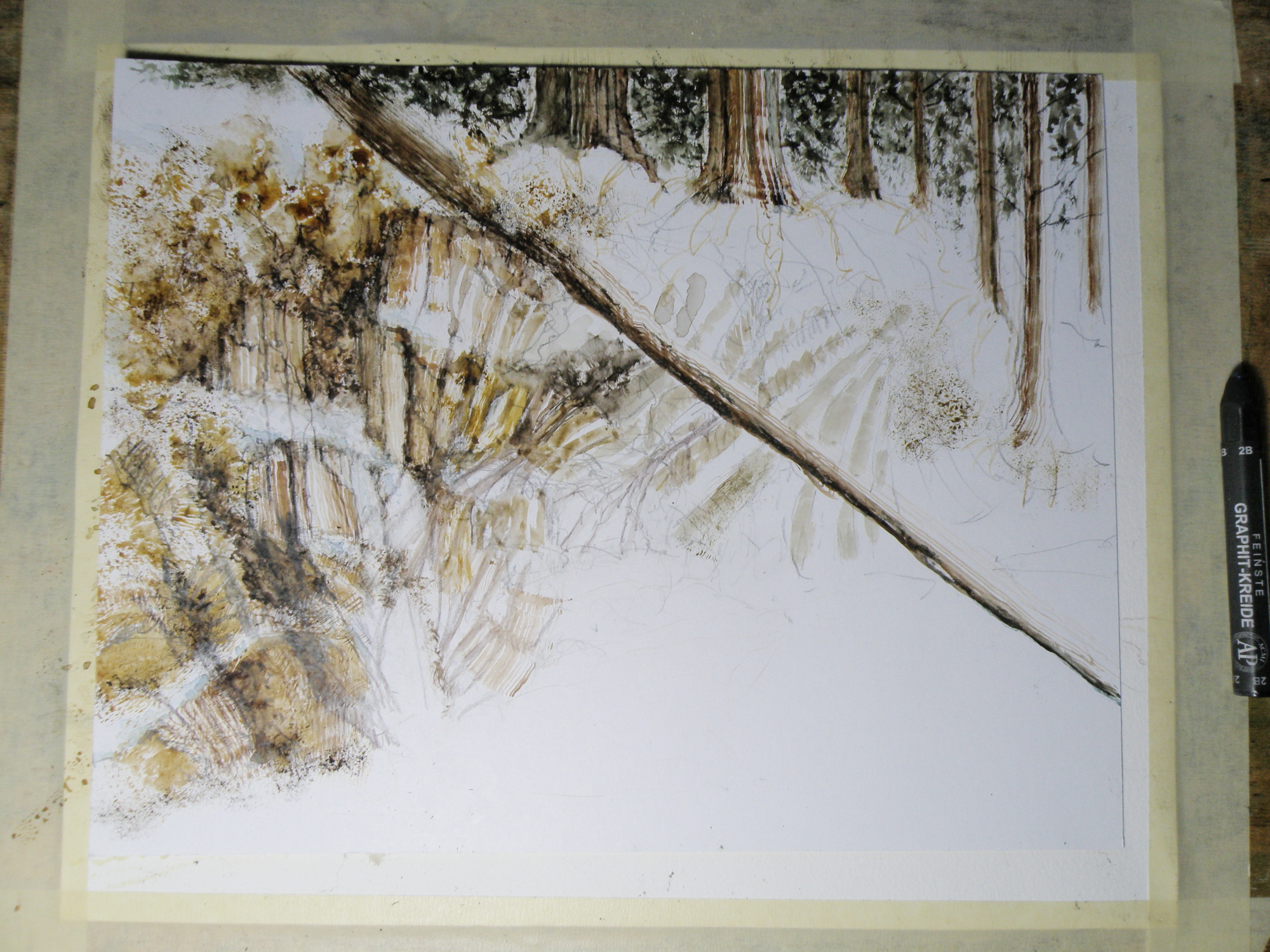
TOMORROW will (hopefully) provide a photo of the finished piece!
Painting progression 2…. ‘Jamieson Creek Thaw’
April 3, 2015

Painting progression 1…. ‘Jamieson Creek Thaw’
April 2, 2015
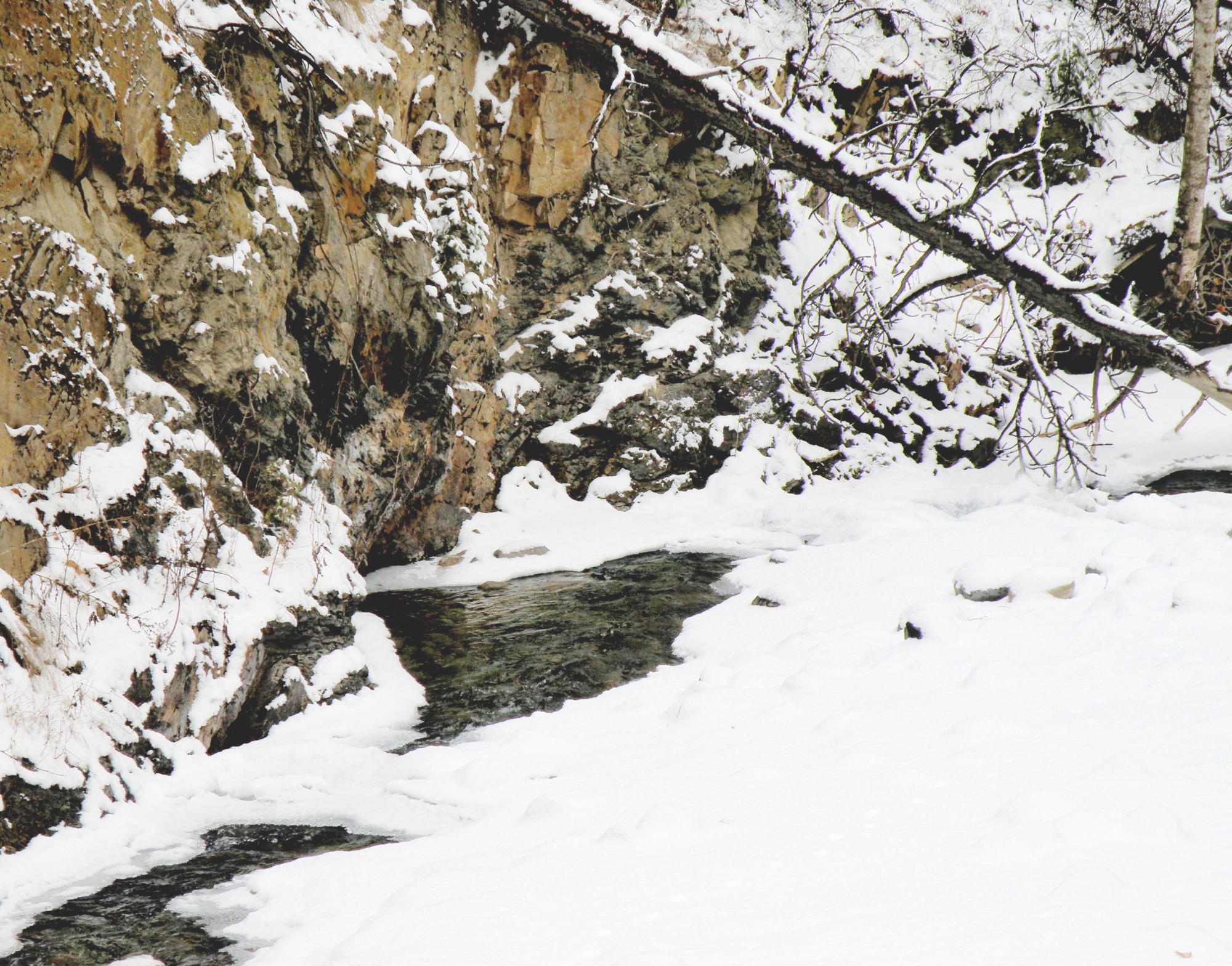
JAMIESON CREEK is about a 15 minute drive from our home, along a dirt logging road. The Kamloops, British Columbia, region is a geologist’s dream come true, featuring some of the oldest mountains in Canada. As a student of watercolour, I am fascinated by stone and rock, particularly because it is so challenging as a subject.
This is Jamieson Creek, taken four years ago around February, early March….
And here is my initial drawing of the subject…..

As you can already see, photography is not my gift (which is why I paint, lol)–so forgive the darkness. It was taken, pre-dawn in the spare room which serves as a studio.
Miniatures
March 20, 2015
THE DARK-EYED JUNCO ignores the feeders hanging in the red maple just beyond the front window, shunning the bossy finch rabble bumping one another off the perches. A Junco will head below, delighting in the shower of sunflower crumbs spit from Goldfinch beaks, already shelled, served on a bed of fresh snow.
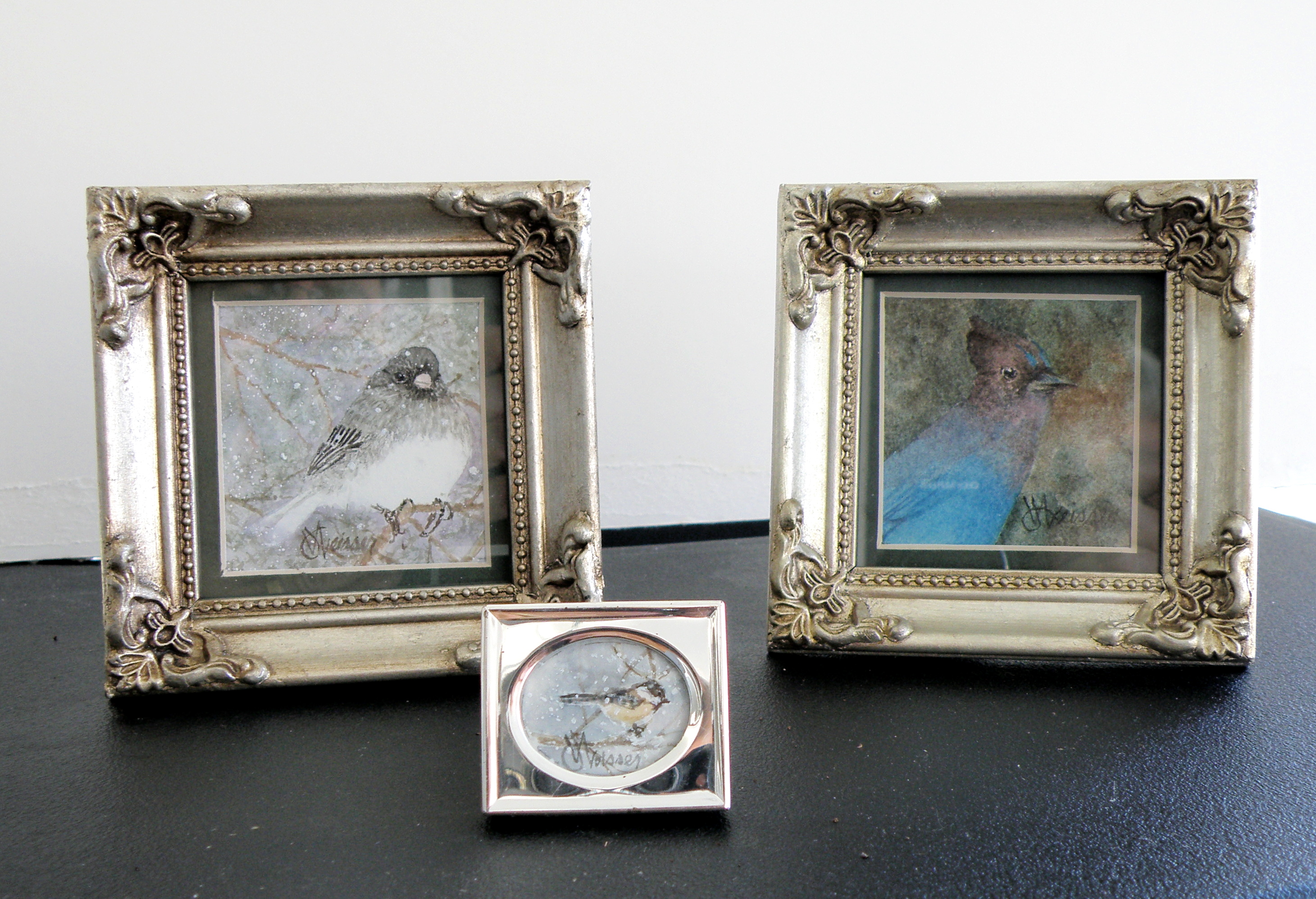
STELLAR JAYS have the tact and grace of a sociopath. Self-absorbed to the point of being incognizant there even are other lifeforms, they bray and scatter seed as though perpetually going through puberty. Once chaos has been accomplished, they go over to our neighbour, Brenda, and do the same with her feeder.
BLACK-CAPPED CHICKADEES dart in to claim a single seed, flit to a branch, hammer the shell apart, then dart in again–chee-cheeing a mantra as though making merry to themselves alone.
2″ x 2″, and 1/2″x 3/4″ , watercolour on Arches 140 lb. Hot Press Paper
Same subject, different take…
March 17, 2015
THE OLD SCHOOLHOUSE is once again the subject……

THIS TIME around, a horse was to be included, which meant it could not be a nocturnal scene, as that would be an odd addition to a night painting. The choice was made to have only a single horse, even though horses are most often seen in pairs or groups, being a social animal…..
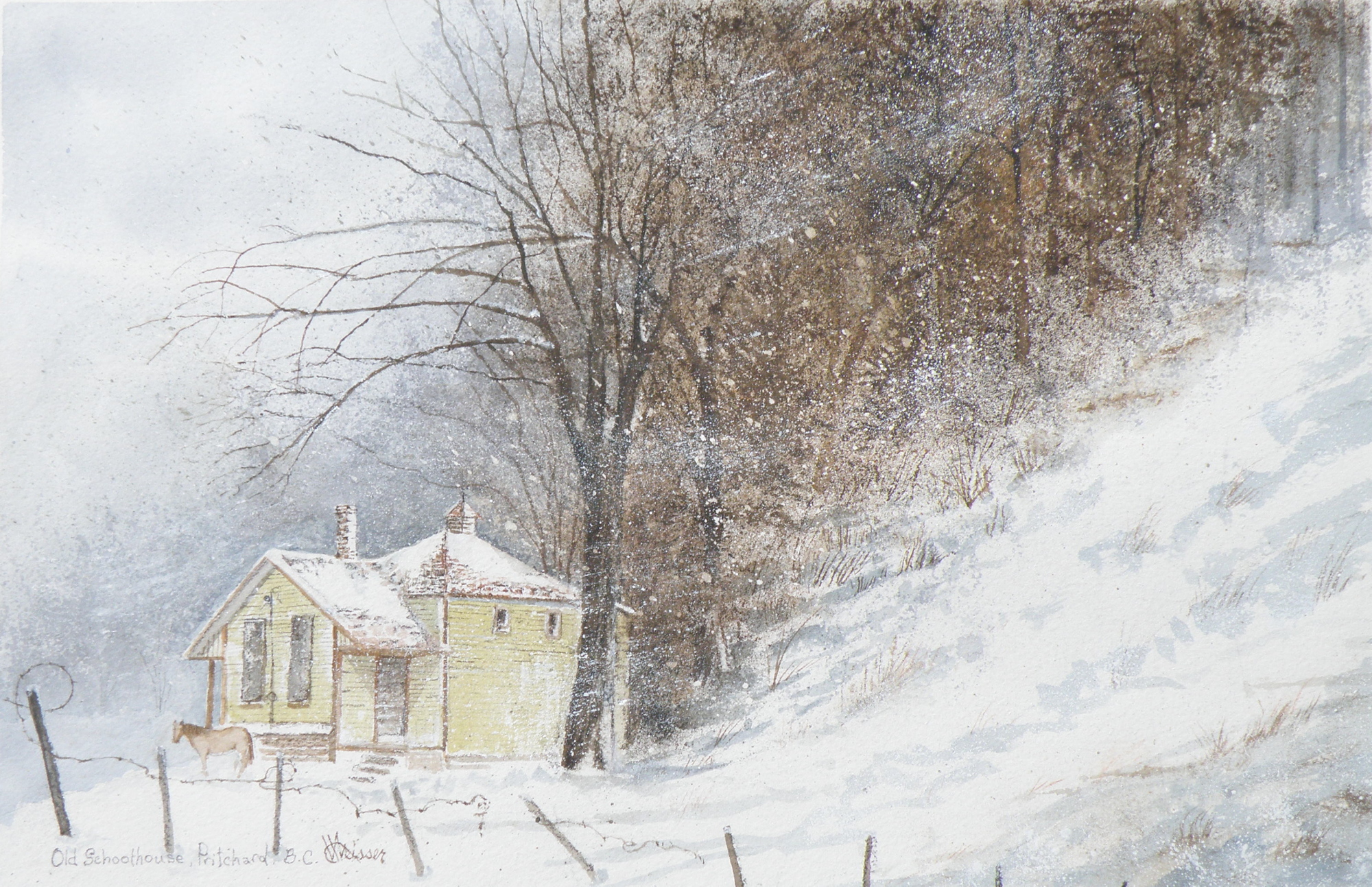
THE DECISION over depicting a single horse was selected as adding to the feeling of isolation: a lone horse beside an abandoned school in a lonely, forgotten field in the dead of winter……
“FROZEN IN TIME”
watercolour, 12″ x 15″, 140 lb. Arches Cold Press Paper, Kamloops Courthouse Gallery, Kamloops, British Columbia http://www.kamloopscourthousegallery.ca
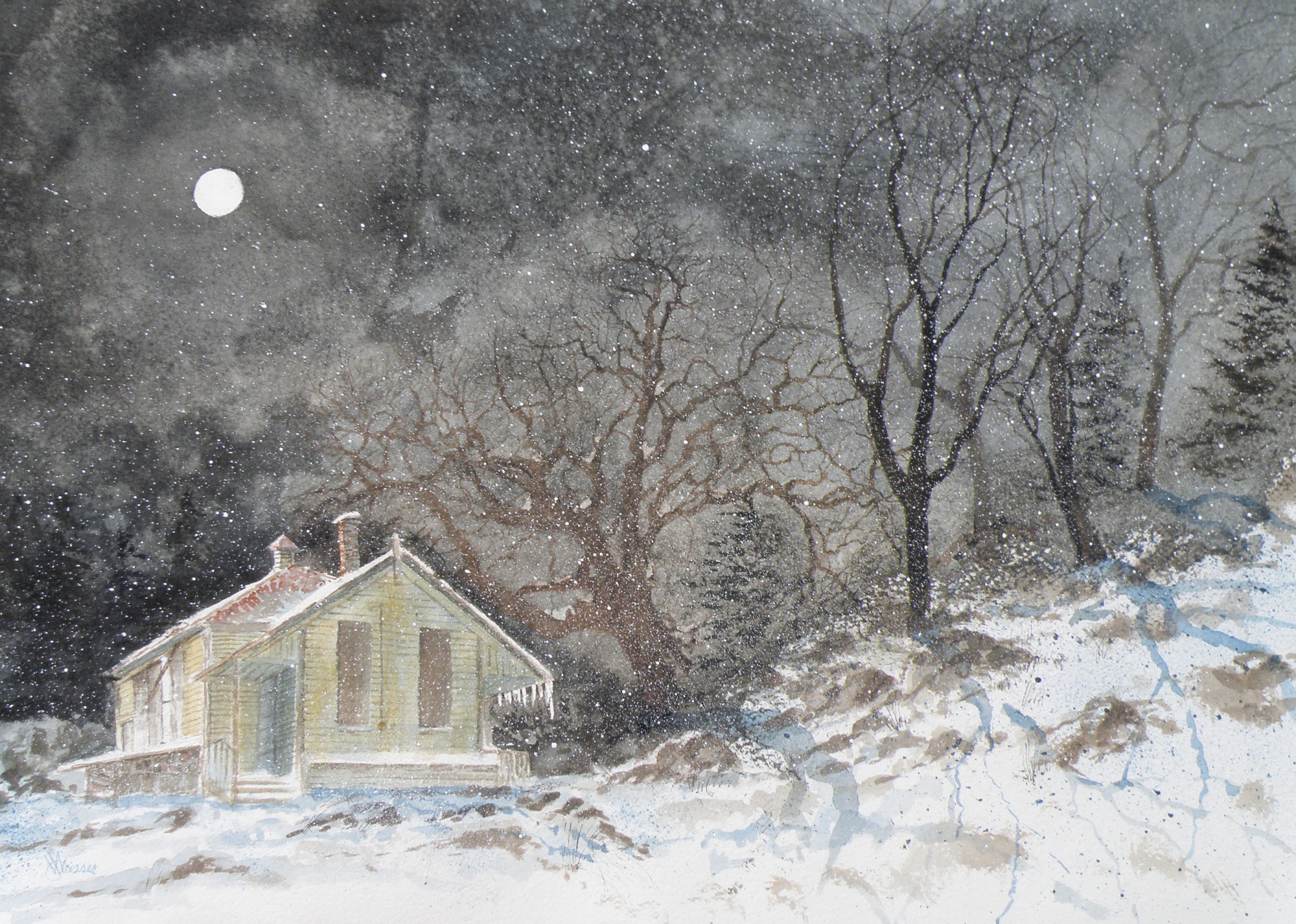
Painting progression 5
March 16, 2015
THE FINISHED piece–“Abandoned Schoolhouse, Pritchard”. The rocks needed darkening and definition. Pines were added. Spattering of snow was used to unify the whole and add a feeling of movement.
Painting Progression 1….
March 12, 2015
THERE WAS an old schoolhouse in the Township of Pritchard, British Columbia, just down the road from my friend Shiela. 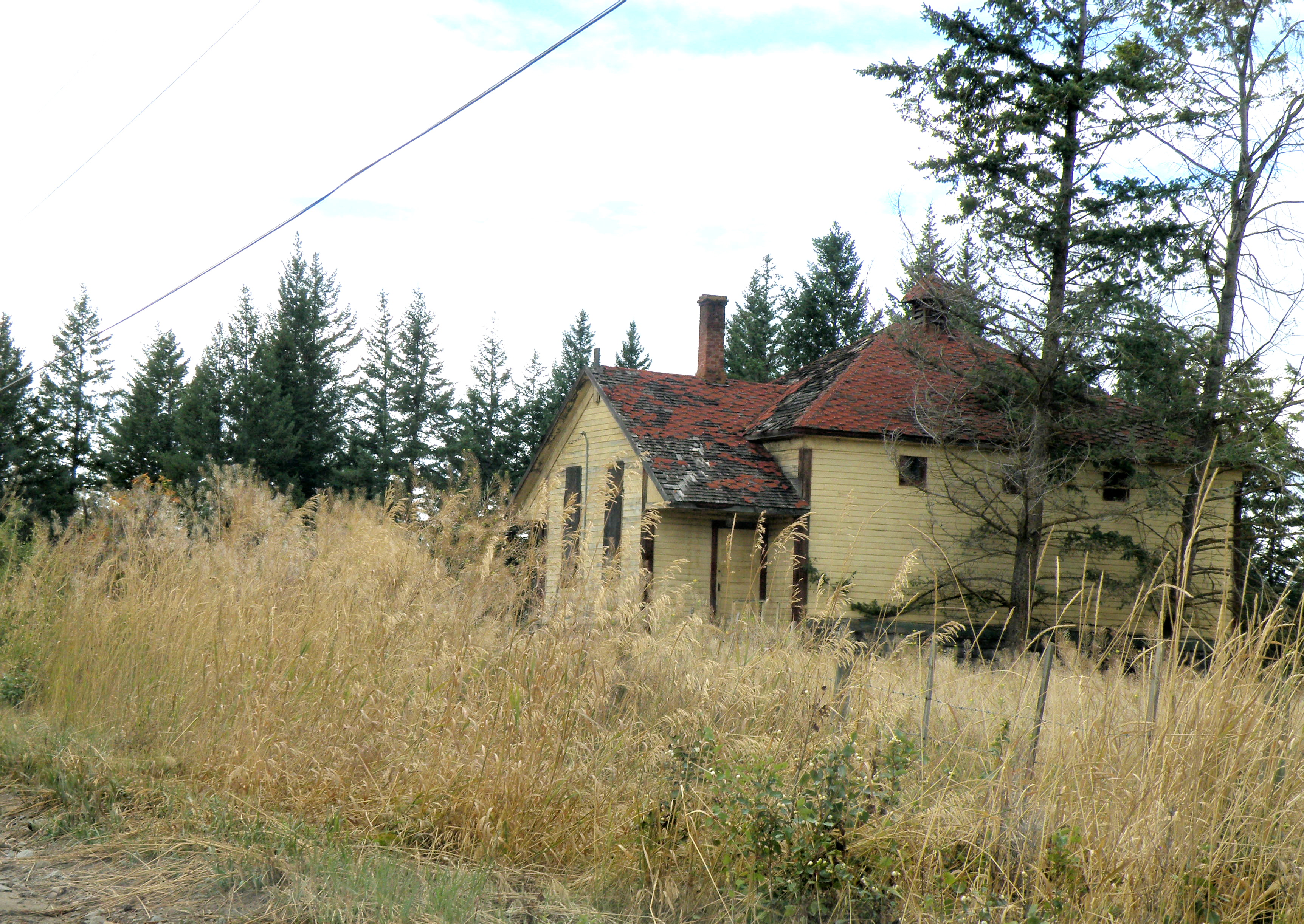 It was kept on a corner of field by a rancher who had attended it, hoping someday someone would see to its restoration. Eventually it was torn down, but not before I was able to photograph it. And I have painted it several times, choosing to situate it where I please….
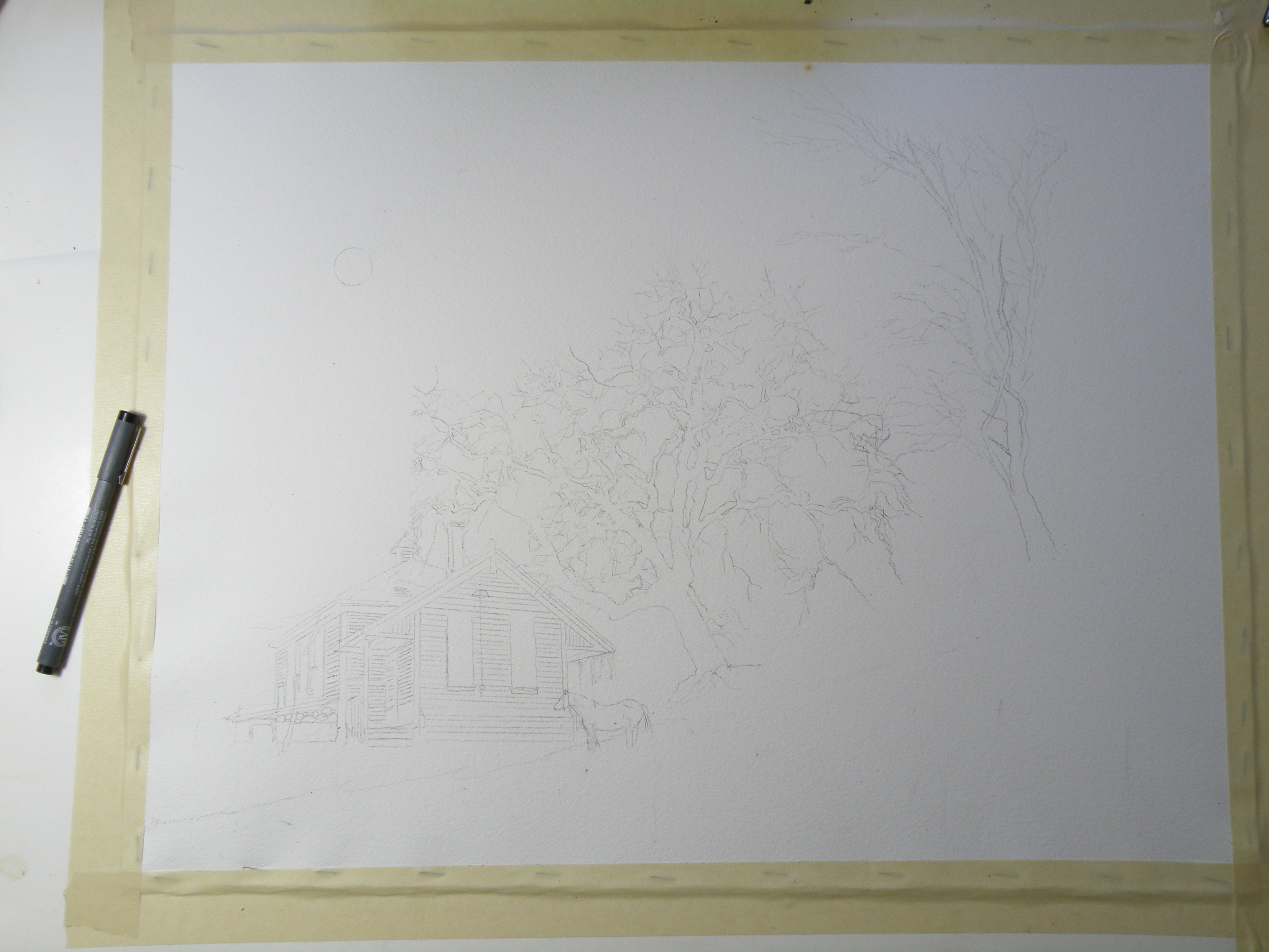
This is the initial drawing. Because the rancher kept horses, I decided to position one for sake of interest. The paper is Arches Cold Press 140 lb., stretched stapled and taped onto gater board, approx. 15 x 20 in.
Jamieson Creek
May 6, 2012
This little painting (6″ x 7.5″) is of Jamieson Creek, which is not even ten minutes drive from our front door. This is a desert-like region, featuring its own local cacti (which I discovered by way of my hand), and is called The Sunshine Capital of Canada. Water, while not scarce, has usage restrictions and homes are now being installed with water meters.
So to have the Jamieson splashing over and around rocks and fallen timbers is a great joy. It is the epitome of the ‘laughing brook’ of literature, and compliments the broad, slow-moving Thompson Rivers which run through town. Were it not for our rivers, Kamloops would be uninhabitable. Right now the creek and rivers are swelling from the melt-off of mountain snows. Kamloops itself is some 4,000 ft in elevation, the mountain snows are up that much higher, and June is when the river level is at its peak.

“Up The Jamieson”, L & M Jones Collection
This painting was on the wall no longer than ten minutes before it was sold. My colleague in art, Lynda Jones, thought it complimented her pottery so well she went with her impulses. And that made my day.
The Columbias
February 10, 2012
For seven summers I was the cook for The British Columbia Natural History Society. In 1994 I graduated from The Dubruelle French Culinary School in Vancouver, and ran a kitchen at a small residence on the UBC Campus. This left my summers free, and I took on the task of prepping to feed upwards of sixty hikers at elevations upwards to some 3000 m., or approximately 10,000 ft.
It involved cooking and then packing vacuum-sealed , frozen meals in large chests with dry ice before joining the caravan of cars towards the mountain destination of choice. Once at the base, everything–including me–was hauled to the summit in a net-outfitted helicopter, and the business of setting up the huge kitchen and dining tents was begun. Frequently it was snowing up top–though only twenty minutes before I’d been roasting in the July heat–leaving me scrambling to find my parka.
The challenge was to get everything unboxed and laid out in some semblance of order–while ensuring the burners were properly hooked up to giant propane tanks–so that all-important first meal could be served some three hours later. After that, I could do the washing-up and at least semi-relax by first getting my little tent set up and then getting myself organized enough to be able to do breakfast when I awoke at 4 a.m.
By Day Three (of the ten day experience), it felt like I’d lived there my whole life, and could spend my days doing watercolours while the hikers tramped all over the rugged terrain carrying the bagged lunches they packed for themselves after dinner the night before. Once I’d served their breakfast, they’d stroll about with final cups of coffee making sure I overheard their latest Grizzly Bear spotting stories. Then they’d be off, leaving me sitting there all day minding that food all by myself.
Here is a painting from one of those seven summers. And though I can’t be entirely positive, I believe this particular view is from the Eastern British Columbia Mountain Range known simply as The Columbias.

Glaciers in The Columbias
And yes, I did see Grizzlies, but only from a distance.
thank god.
Winter Horses
February 1, 2012
The Old Schoolhouse in Pritchard on Duck Range Road was torn down last summer. It was in a farmer’s field–a farmer who’d gone to it as a child–and though he wanted to see it restored and taken over by the community, no one stepped forward to do so.
For years his horses used the school yard as their private pasture. Rain or shine–snow or sleet–anyone driving by would see them, the pair of steeds only momentarily looking up before resuming their grazing.

"School Yard Pasture"
Finally, after numerous appeals to various groups to assume responsibility for the Old School, the farmer reluctantly went about making sure it didn’t collapse and possibly cause an accident. Someone told me it only took a couple of hours for it to be reduced to a pile of boards and beams. If one drives by now, the only thing left standing are the horses.
A little ‘cheating’ . . .
January 25, 2012
Watercolour has its limitations and its unique requirements. About the biggest challenge is the understanding that anything white in a watercolour is the paper left blank. So white clouds are achieved by painting blue around them. Whitecapped waves are accomplished by painting the dark part of the wave and leaving the paper white for the crest. The same goes for snow, of course, and really anything at all that’s white.
The famous British painter, J. M. W. Turner (23 April 1775 – 19 December 1851) is widely regarded as the artist who took watercolour to its pinnacle–who forced it to be considered a serious medium, alongside oil (though even today watercolour is not treated with the same gravitas as oil). His work is nothing short of astonishing. And apparently he often achieved some of his whites by ripping at the paper with a long fingernail.
My training was such that the use of opaque white was absolutely forbidden. It was considered a breaking of the most important ‘rule’ of watercolour: that only the white of the paper (called ‘reserved white’) was acceptable in a pure, transparent watercolour.
I have, though, been talked into letting myself experiment with a limited usage of opaque white. A great many watercolourists use it, though sparingly.
The following picture was my first attempt at using a bit of opaque white in the branches of the trees. The clouds, grasses, snow, and other whites were achieved by reserved whites (leaving the paper blank) and/or scratching out with a knife (my fingernails aren’t nearly long enough).

"Snug"
Great Nephew II
January 17, 2012
About the scariest thing in my younger days was our basement, which featured a gigantic coal-fed furnace complete with horrifying facial qualities. The grill was its mouth, and I went down there only to fling my soggy snowsuit over one of its tentacle arms in order to then put on a freshly-dried suit. Once done, I’d try not to peek at the flames licking at the hideous mouth as I raced back out into the snowball fight du jour.
Tied for second in the scary department was the black-and-white-filmed 1951 classic “A Christmas Carol” starring Alistair Sim, (whose facial qualities were probably borrowed by the designer of the furnace grill). It was back then a relatively new movie and always gave me recurring nightmares.
I happened to be taking a few snapshots when the older of my two Great Nephews was watching that very same 1951 “A Christmas Carol’ in 2006. Up till then he wasn’t allowed to see it (which restriction I wish my own parents had imposed on me), so this was his very first glimpse at Jacob Marley screaming his way through Scrooge’s bed chamber walls.

'Marley's Ghost Makes an Appearance'
His Aunt and Uncle are obviously ‘Christmas Carol’ vets, regarding the shrieking spirit as ‘just an undigested bit of beef’.
This painting was juried into one of The Federation of Canadian Artists’ Open Shows a couple of years ago. The words ‘Open Show’ indicates that the show is open to all qualifying artists across Canada.
