…. Tranquille Creek Gorge
January 21, 2016
The watercolour video demonstrations of David Dunlop are challenging and yet simple. https://www.youtube.com/watch?v=Lgtg-Adql1Y&index=6&list=PLtEJwQmsB7SvVg8C4J2c4LDijerH7SSKF (I tried to embed the video itself in this post, but WordPress thought otherwise). But here is the blurb describing it….”Emmy Award winning David Dunlop takes you to his Connecticut studio to demonstrate a two minute watercolor, used as preparation for an oil sketch or to explore ideas“.
Mr. Dunlop is an artist/teacher from Connecticut, whose manner when teaching is inspiring and animated. He is a great follower of descriptive, energetic Masters like J.M.W. Turner and Winslow Homer, and seeks to employ their methods, while demonstrating their techniques.
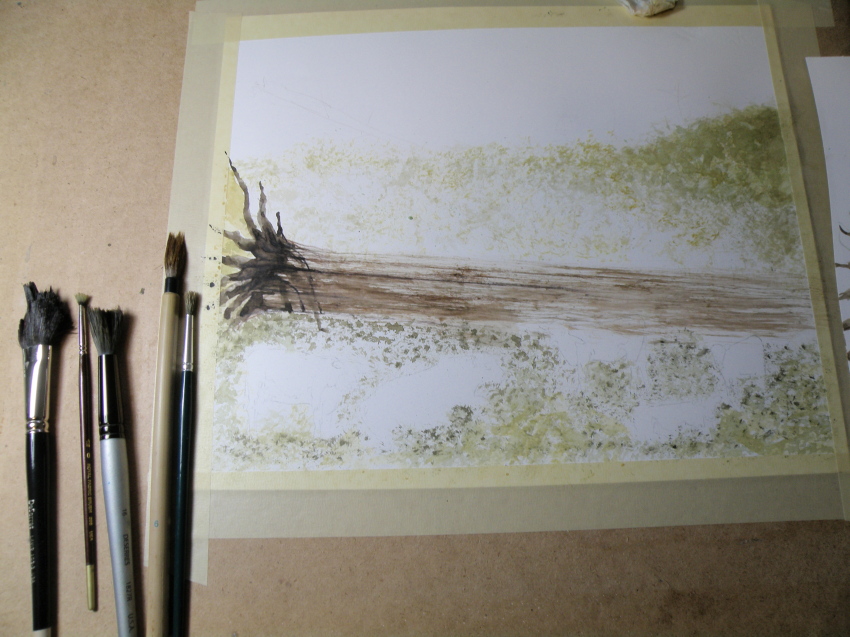
The video cited above challenges painters to do two to three minute painting sketches, which convey the movement and mood and spirit of the subject, without stopping to think and rework. In an effort to ‘do’ and not think, the subject chosen here is a favourite–a place about 20 minutes from our house–called Tranquille Creek Gorge.

Mr. Dunlop’s videos are quite dynamic and aimed more at oil painters a bit more than watercolourists, but full of very encouraging lessons because of the force of his optimistic personality and sense of fun. They are well worth watching, for those who enjoy painting as a means of expression.
….composition exercise 2
January 17, 2016
Continuing on with an attempt to test out the compositional dictum known as ‘the rule of thirds’, which was conceived and named by John Thomas Smith in 1797 :
“. . . Analogous to this “Rule of thirds”, (if I may be allowed so to call it) I have presumed to think that, in connecting or in breaking the various lines of a picture, it would likewise be a good rule to do it, in general, by a similar scheme of proportion; for example, in a design of landscape, to determine the sky at about two-thirds ; or else at about one-third, so that the material objects might occupy the other two : Again, two thirds of one element, (as of water) to one third of another element (as of land); and then both together to make but one third of the picture, of which the two other thirds should go for the sky and aerial perspectives. . . “
To illustrate its basics…..

Once again, this is the drawing I did initially, to put this into practice….

And this is the first go at painting the scene….

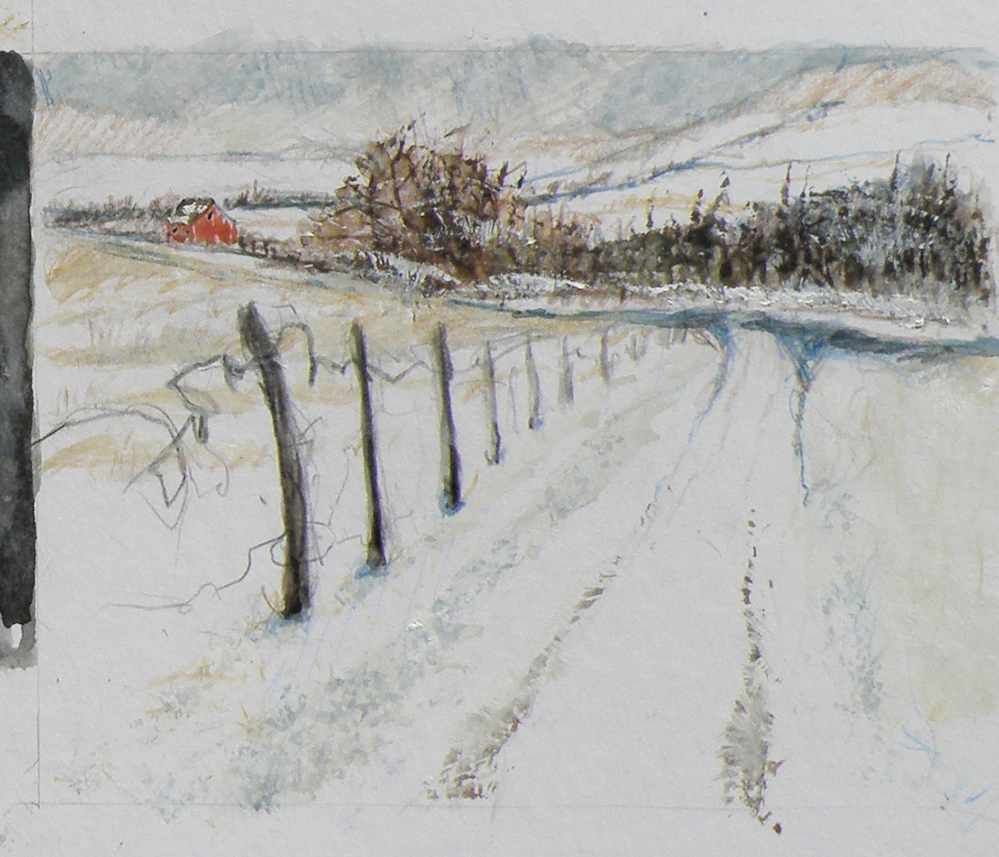
And now today, here is the progress so far, attempting to locate some visual interest at each of the four intersections within the piece, the barn being the first and the pine being the second and the creekbed being the third…..

The darkest darks and greatest contrast will remain with the barn, for that is the intended focus for the picture, when completed.
The ‘rule of thirds’, as stated above, holds that generally two-thirds of a landscape be devoted to the sky, with one-third given to the land below (the sky being such a vast and dominant feature). In this case two-thirds is dedicated to the land and a very high horizon means that the one third is devoted to the sky area.
heatwave relief
June 24, 2015
IT IS BARELY PAST the first day of Summer and temperatures here in Southern British Columbia, Canada, are scheduled to climb to 40C (104F) and stay there. It is feared the heat and drought affecting California is heading North, Along with such heat, thunderstorm probabilities rise, and they become fire starters. By August there’ll be what weather reports term ‘local smoke’–a haze hanging over everything–accompanied by the sound of helicopters and planes working to douse flames in affected regions close by.
My favourite month is November. It is both an exciting and contemplative month–exciting because any day, any moment I might step out to feel those fortifying winds suddenly becoming the first snow squall. Contemplative, because the fog rising from the closeby Thompson River mixes with wood stove breathings and the last of the leathery oak leaves falling to join the others, invites thoughts on things ethereal and eternal.

“Logging along Jamieson Creek Road”, watercolour, 20cm x 25cm, (8″ x 10″) Arches Hot Press 140 lb Paper, unsold
As a child, there was nothing more beautiful than what I called ‘purple snow’–that snow which signalled to us that we’d best take only one more turn sledding down Dead Man’s Hill (many years prior, legend had it, a man went down its twists and turns standing on his sled and smacked into a maple–back in the old days, when men apparently went sledding). Purple snow meant dinner. Purple snow meant finally discovering just how cold our digits actually were– thawing under a running cold faucet–pins and needles hot pink cold.
And even now, there is nothing to me more beautiful than purple snow. On this 40C second day of Summer, all I can say is, Lord get us through to November.
mountain pine
June 20, 2015
In January 2011, a Pacific ponderosa pine in the Rogue River–Siskiyou National Forest in Oregon was measured with a laser to be 268.35 ft (81.79 m) high. This is now the tallest known pine. The previous tallest known pine was a sugar pine.
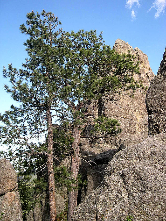
Ponderosa Pine photo by Jason Sturner
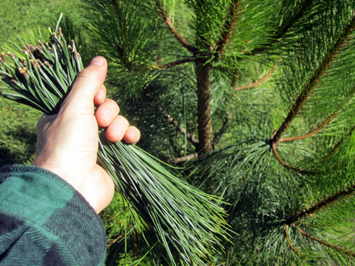
The needles are harvested by First Nations and other local artisans, then washed and woven into Ponderosa Pine needle baskets . . .

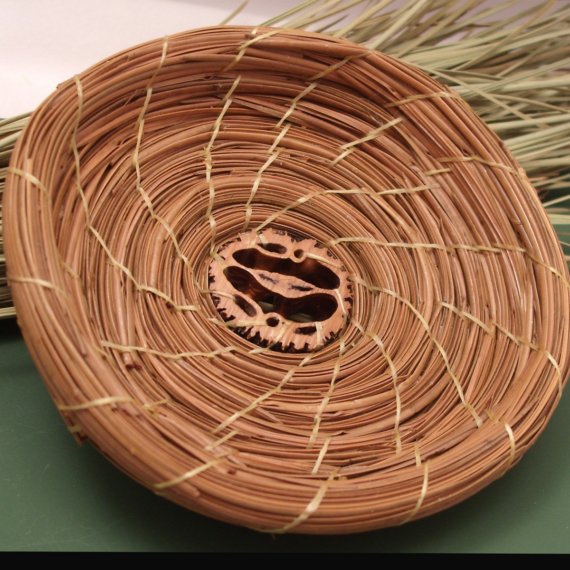
(photos: PineGardenBaskets, Etsy)
The mountain pine beetle is just over six millimetres long (about the size of a grain of rice). But the tiny forest insect has infested huge areas of mature pine around the interior of British Columbia, causing colossal amounts of damage on B.C. forests.
The beetle likes mature pine and mild weather. Because B.C. has more old pine than ever before, and has had several consecutive mild winters, mountain pine beetle populations have exploded to epidemic levels. (source + photo: Government of British Columbia)
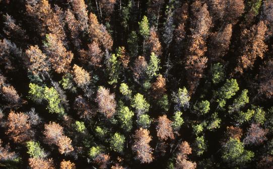
Here in Kamloops, B. C., even pines growing in people’s yards get ravaged–as much as in our great forests. It is a helpless feeling, yet more and more innovative products are being developed from pine beetle timber.
Below is the Richmond, B. C., Olympic Skating Oval, totally made from pine beetle-killed timber. The wood has retained all the pine beetle bores and markings, and has been acclaimed as a ‘truly majestic work of art and design’.
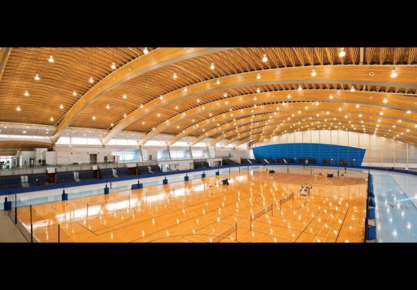
photo: Architectural Review
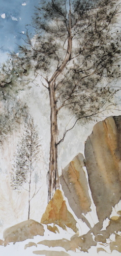
‘Mountain Pine’, (study), watercolour, 15cm x 36cm, 6″ x 14″, Arches Hot Press 140 lb. Paper, unsold
tranquille creek gorge
June 3, 2015
ANCIENT FLOWS OF LAVA have left our regional landscape (Kamloops, B. C.) with dramatic canyons, a single lane dirt road skirting the edges.

‘Tranquille Creek Gorge’, watercolour 23cm x 41cm (9″x16″) Arches Hot Press 140 lb. Paper, sold
MY PAINTING FRIEND MAX drove me through this arid landscape, only 10 minutes outside a city of nearly 100,000. Every so often she’d tell me of cars which had not been successful at executing a snowy, icy, tricky piece of road only to careen down the sides. At one place, the car was still there, making me both dizzy and almost nauseous, leaning over to see its rusting bulk caught between broken pines and rock.
‘MY GOD, WHERE WERE THEY HEADED?’ I’d asked. ‘Home, of course’, Max pointed ahead. And there was a small grouping of houses not far from the road, some fencing in horses or livestock–one had alpacas–and looking semi-deserted, though that was far from the case. Dogs barked at Max’s pickup as we threaded through and headed into yet more wilderness. ‘They take this road to Kamloops and back?’ — it seemed to my chicken, urban-minded guardedness a scary place to build one’s home. ‘Only for shopping, or a night on the town’, Max said. ‘Which is why someone sometimes doesn’t make it home–especially in the Winter.’
mountain storm
May 24, 2015
MOUNTAIN STORMS ALWAYS COME WITH high winds and occasionally with hail, and here in Kamloops, British Columbia, are often felt in one part of the city and not in others. Being a city of roughly 90,000, built around, about, and on top of mountainous terrain, the overall elevation is about 350 meters (1,125 ft). There can be terrible flashes and crashes and gusts–much huffing and puffing–with the promised deluge itself being delivered everywhere else but on our crispy, thirsty yard and gardens.
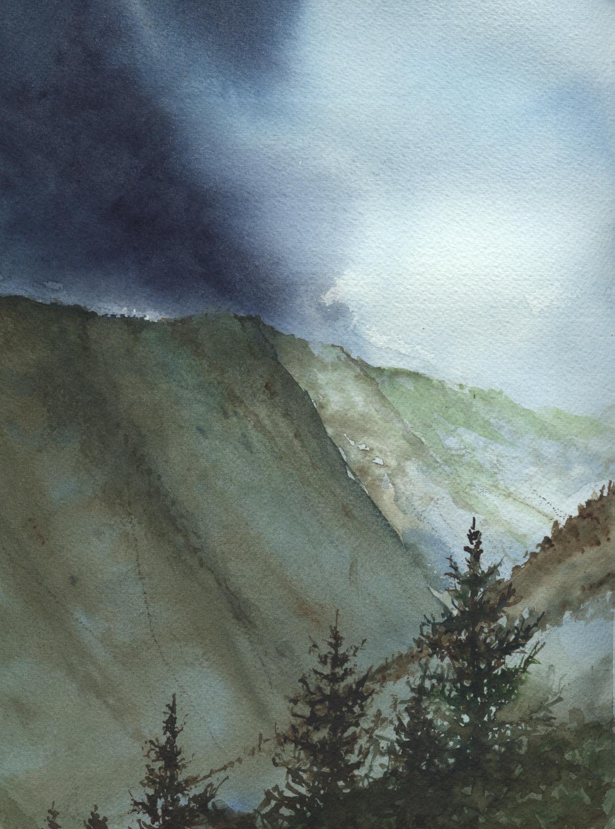
‘Summer Storm’
watercolour, 30cm x 23cm, (12″ x 9″), Arches Cold Press 140 lb. paper,
G.W. Weisser Collection
composition woes….
May 3, 2015
MY GREATEST CHALLENGE when painting anything is composition. For years I felt I was being a ‘purist’, insisting that I always paint on location, never in a studio setting. And once at the location, I convinced myself that if a tree was in that spot, then that was how it needed to be depicted.
IT WAS ALL DUE TO my tendency to early-on stop referring to the subject in front of me and become more and more involved in what was happening on paper, to the point where I may as well have not been on location at all. So in an effort at self-discipline, I decided that not only should I paint what things actually look like, I shouldn’t muck around with how and where ‘mother nature’ placed them.
THE SILLY THING WAS, I ended up choosing a composition by default because of course, I couldn’t paint everything my eyes saw in front of me. And more often than not, it was not a good composition. So now, not only do I go to some lengths to study the skill of creating an interesting arrangement, I realise it is the painter’s task to take what ‘mother nature’ provides and make art out of that. Fences do need to be repositioned, as do trees and hills and clouds.
SO NOW I MAKE thumbnail studies first on matt board before beginning anything . . .
THE OBJECTIVE is to provide a focal point, a visual way in towards it, then additional visual interest so the eye has more to discover by wandering beyond the subject itself. These thumbnails are exploring the use of a compositional figure ‘Z’ shape to lead the eye of the viewer.
Finished work….”Logged-In”
April 16, 2015
“Logged-In”, 25.5 cm x 35.5 cm (10″ x 14″), Watercolour on Arches 140 lb Hot Press paper, (donated to Kamloops Art Gallery Annual Art Auction)
painting progression 4 . . . “Cows”
April 15, 2015
THESE ARE BEEF COWS, Herefords, the breed most favoured by ranchers in our region. Their origins descend from small red cattle introduced by The Romans in ancient Britain, along with breeds from old Wales, their subsequent nurtured evolution taking place in Herefordshire where the Hereford is king. Today more than five million pedigree Hereford cattle exist in over 50 countries.

BECAUSE THE LARGE FALLEN CEDAR is indicated with only a minimum of brushwork it is necessary to help give it size, weight and substance through the simple use of shadow.
painting progression 3 . . . . “Cows”
April 14, 2015
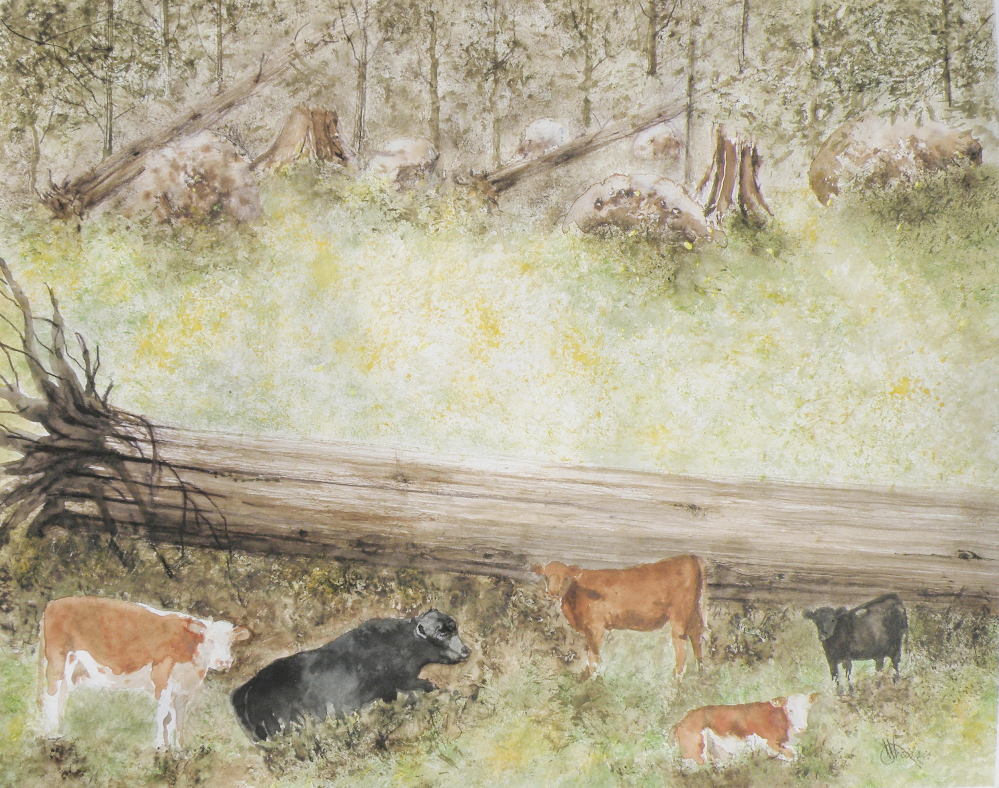
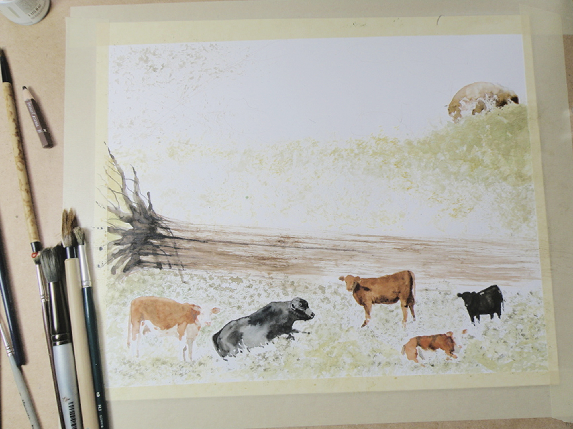
THE SUBJECT MATTER comes from this photo, very quickly taken when we’d stopped the car on the dirt road running through The Dewdrop Valley (just outside the city limits of Kamloops) after I’d yelled, ‘Cows!’
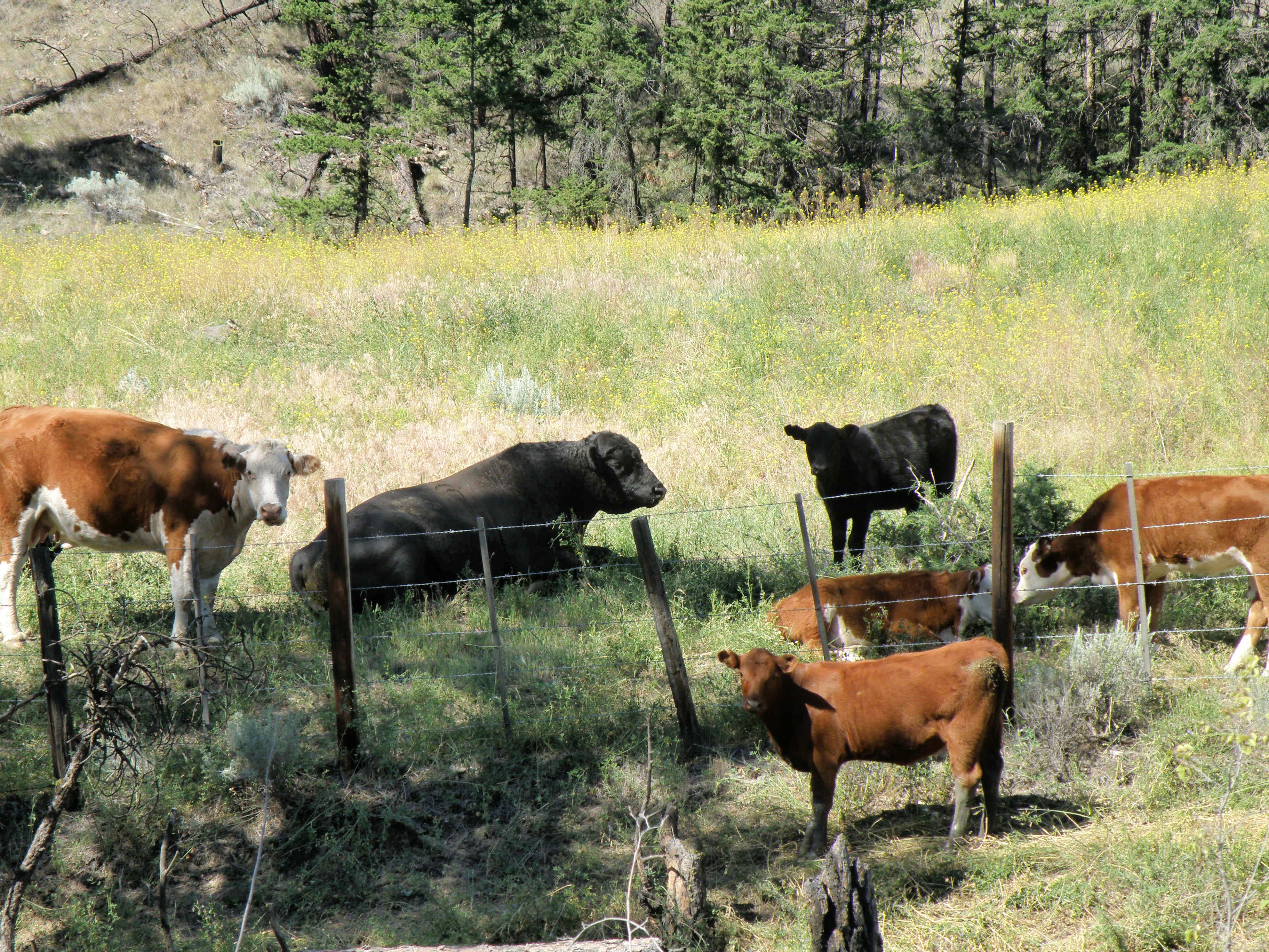
This grouping was described to me by my friend Max as a perfect example of a bull and his harem–and the ‘harem’ got nervous and didn’t remain in place very long once I began snapping pictures. The bull couldn’t have cared less what I was up to, and just lay there chewing.
The very prominent tree in the painting is placed to provide focus. Rather than leave in the barbed wire fence (in front of them), a natural enclosure is placed behind to sneak a storyline into the scene (the best grass lies out of reach)—that, and taking out the wire fence gives a more natural feel to the setting.
IN THIS GRASS RICH region, cattle roam all over boulder-strewn and mountainous terrain throughout the Spring and Summer. They are finally rounded up on horseback in classic cowboy style in the Autumn. Because of this, the beef from Kamloops is renowned for its organic, grass fed superior flavour and quality.
painting progression . . . 2 “Cows”
April 13, 2015
THE PAPER IN USE HERE is a very smooth-surfaced one called Hot Press (140 lb.) by the French Company, Arches (a very old watercolour paper maker). Hot Press paper has virtually no surface texture at all and is slightly cream-toned. When papers are this smooth, the paint initially floats on top before being absorbed. This floating quality creates effects a rough surfaced paper can’t deliver.

So Hot Press paper looks and feels pretty much like dollar store poster paper–smooth, shiny, and about the same thickness. And because it is not a heavy paper, and because it is so smooth, Hot Press watercolour paper cannot take a lot of scrubbing out if mistakes are made. The painter needs to be rather confident about the strength and amount of pigment to use before putting brush to paper. So because I am always a bit tentative when beginning to paint something as challenging as an animal, I gain confidence by always having a scrap piece of watercolour paper handy to try things out on first. Once I see how to do it on a scrap piece of paper, then I have confidence to do the same thing on the painting itself.
It needs to be stressed that Arches paper is superb and bears absolutely no comparison to poster paper when paint is applied to it. The weight (140 lb) is how thick the paper is. 300 lb. paper is very thick and therefore can take a lot more scrubbing and multiple washes, without losing luminosity. The downside is that 300 lb. watercolour paper is quite a bit more expensive. And when I work on very expensive paper, I am too aware of its cost. That makes me somewhat nervous about possibly ruining the painting. So I usually choose 140 lb. paper because if it gets ruined, I am not that concerned, and so therefore approach the painting with more boldness which gives a better result.
Painting progression 1. . . ‘Cows’
April 11, 2015
THE DEWDROP VALLEY is a local site and part of a much larger area near Tranquille River and the Tranquille River Gorge. In essence, the Dewdrop is really rocky, hilly, grass-and-tree- covered pasture for cows and cattle during the Spring and Summer months. The Kamloops Thompson Nicola Shuswap Region is no-nonsense cowboy rancher country, complete with serious Rodeos and horse and rider cattle round-ups in the Autumn.
This is the first of recording daily progress towards completing a watercolour depicting a typical scene in The Dewdrop Valley . . . .
ON DISPLAY are a fine collection of tortured brushes. Some are from dollar stores or second hand bargain stores, and as soon as they get into the spare bedroom cum studio they’re cut up with scissors. None of them cost more than $2, and who knows what they’re made of–Moose? Sasquatch hair, perhaps. Each, however, is priceless.
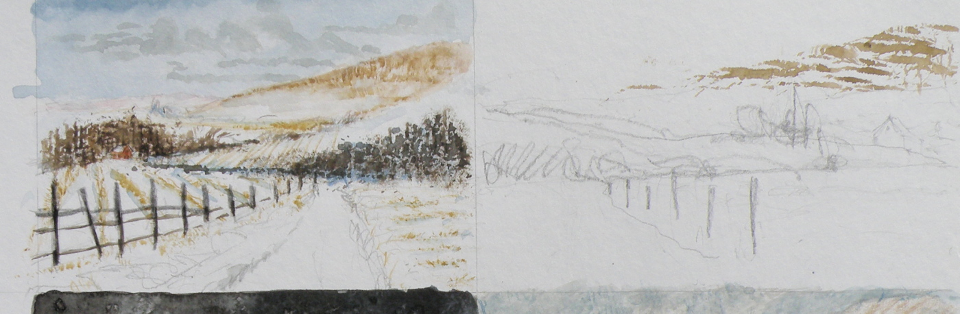
Local Mountains
April 8, 2015
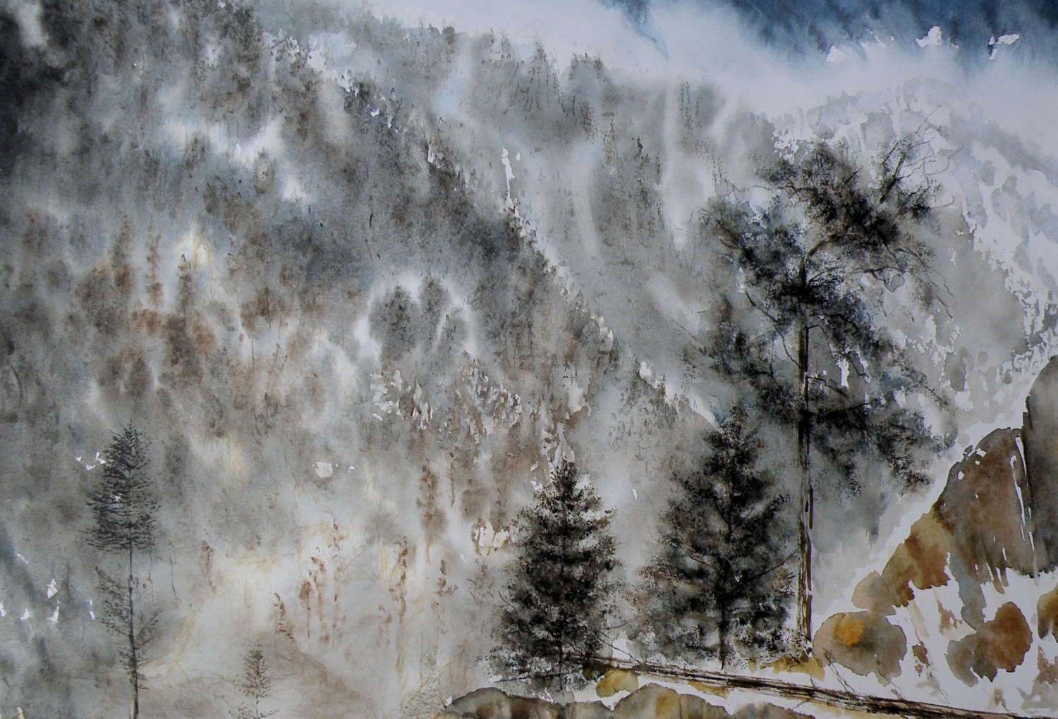
A decision has to be made as to whether this painting ‘holds up’, composition-wise. It succeeds in conveying the misty atmospheric conditions of winter in the mountains. But the composition is troubling me.
Painting progression 3…. ‘Jamieson Creek Thaw’
April 4, 2015
BECAUSE WATERCOLOUR is such a watery, transparent, delicate medium–one which must always allow the paper it’s laid on top of to breathe through it–one which traditionally doesn’t use white pigment, but relies on the paper to be the white of the painting–BECAUSE of this (and more) the challenge of the watercolour student is to convey an illusion of texture, without the ability to actually build up a surface texture.
WERE WATERCOLOUR PIGMENT applied so thickly as to create an impasto-like texture on the paper beneath, it would lose its luminosity and look pasty, muddy, dull–worse, it would crack. Watercolour pigment only works when the paper beneath dazzles through it and brings life to the pigmentation. In other words, watercolour as a medium is more the business of staining paper than it is a business of building up layers and coats of daubs, stipples, slatherings.
THAT’S WHY CARE is required to not apply so many washes that the luminosity of the paper receeds and eventually provides no life at all. And that’s why the whites of the paper must be thoughtfully reserved and left untouched in key areas–the crests of waves; the moon; snow; clouds; a picket fence–and skill taken to paint AROUND these places to let the paper be the white.
SO….a student of watercolour (me) learns early-on that (s)he will be a student of the medium for life–that mastery is illusive–and failures, many. A good piece is approached very thoughtfully, noting where the paper will be left to serve the function of white (pigment) and painted around. Then the student will also have to gather enough courage to apply exceedingly dark washes in one ‘go’, while maintaining a sense of secure, carefree animation in order to present an immediacy and liveliness in the final piece.
THE DEATHKNELL of a failing, dying work of watercolour is finicky overworking of areas, and a refusal to accept what happened when water joined pigment joined brush joined paper. It is NOT a medium for those who love to micro-manage or be in control.
THE STUDENT OF WATERCOLOUR has to be more a Peter Pan than a child wanting to grow up–loving the thrill of what happens when ‘danger’ is courted, yet having the assurance that daring will win the day. However, that daring and search for adventure–on the surface of a good piece of paper–will only be pulled off if it is backed by enough experience to have a good hunch about what will happen when such-and-such is tried.
ATTEMPTING what remains beyond one’s ability isn’t courting danger–it is ignoring it. Trying to fly without thinking happy thoughts will give a person a broken bone. Within the bounds of representational art–(i.e. wishing to have a tree ‘look like’ a tree)–a painter cannot ‘pull off’ a landscape with lots of shadows if (s)he has yet to study them in some depth. Trying to do a scene which includes far far more than what one yet learned how to interpret is an invitation to frustration and wanting to give up watercolour for say, acrylics (oh, my).
AND SO FOR MYSELF, I know by this time that I must confine my attentions to learning about how corn grows, what it feels like, looks like, behaves like, before I can throw my abandonment into rendering a watercolour of winter corn in January. Not only that, but I must also have studied the qualities of snow–the qualities of what a winter sun does to shadows of corn stalk–the blues, the purples. And only then can a learned abandonment bring about a possible reward.
IT TAKES A LONG TIME to find the right paper, the right brushes, the right working pallet of colours, the right approach and the right subject matter. Knowing what can be done when paper is sopping wet–and what can’t–depends on who made the paper, how thick it is, how textured it is, how stretched it is, how quickly it will dry. Knowing when to wait until the paper is exactly wet or damp or dry enough to throw one’s energies at it, comes (usually) through ruining (many pieces of) good paper.
HERE IS THE LATEST DEVELOPMENT of the subject of Jamieson Creek in a February thaw…..
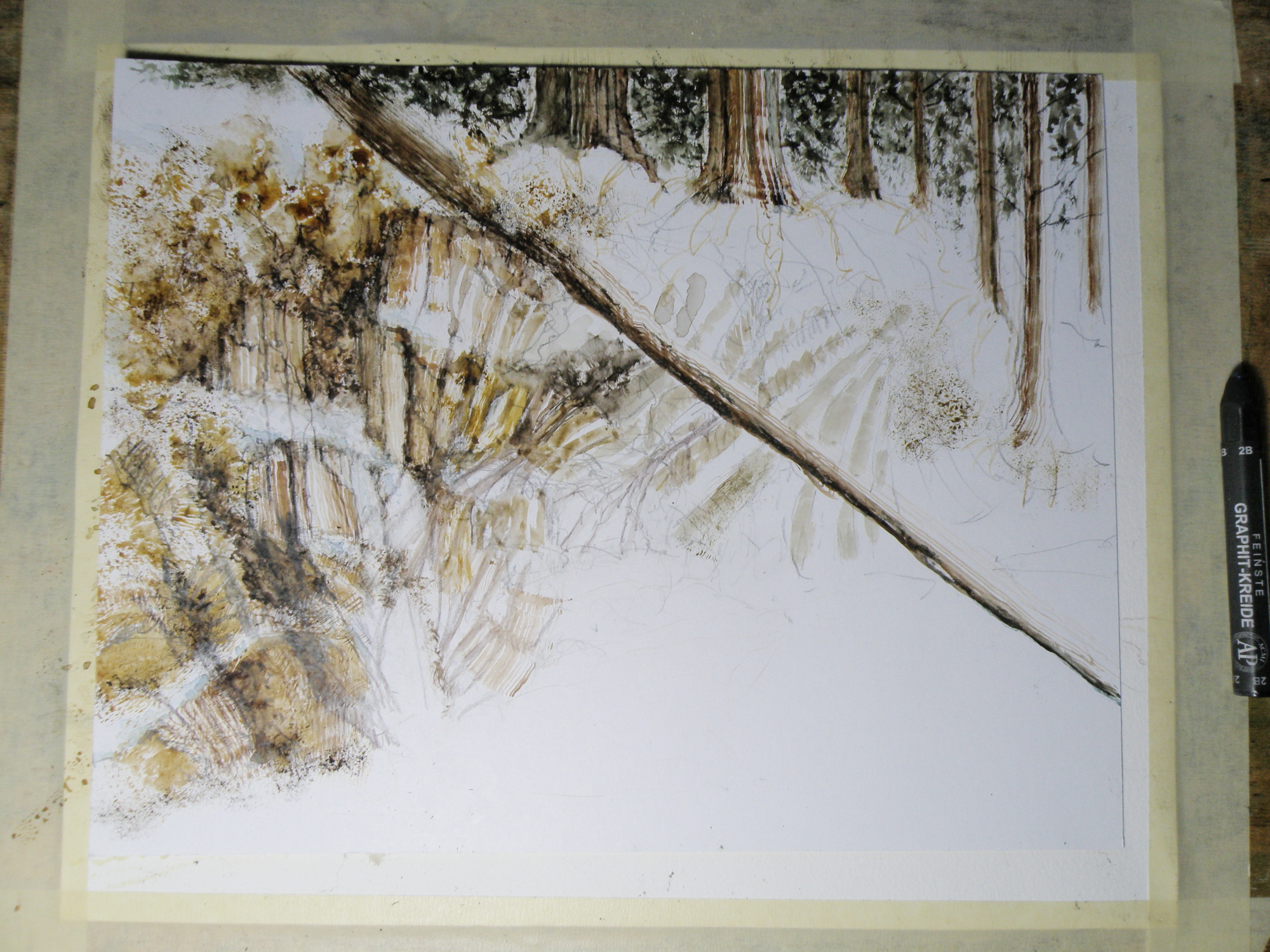
TOMORROW will (hopefully) provide a photo of the finished piece!
Painting progression 2…. ‘Jamieson Creek Thaw’
April 3, 2015

Painting progression 1…. ‘Jamieson Creek Thaw’
April 2, 2015
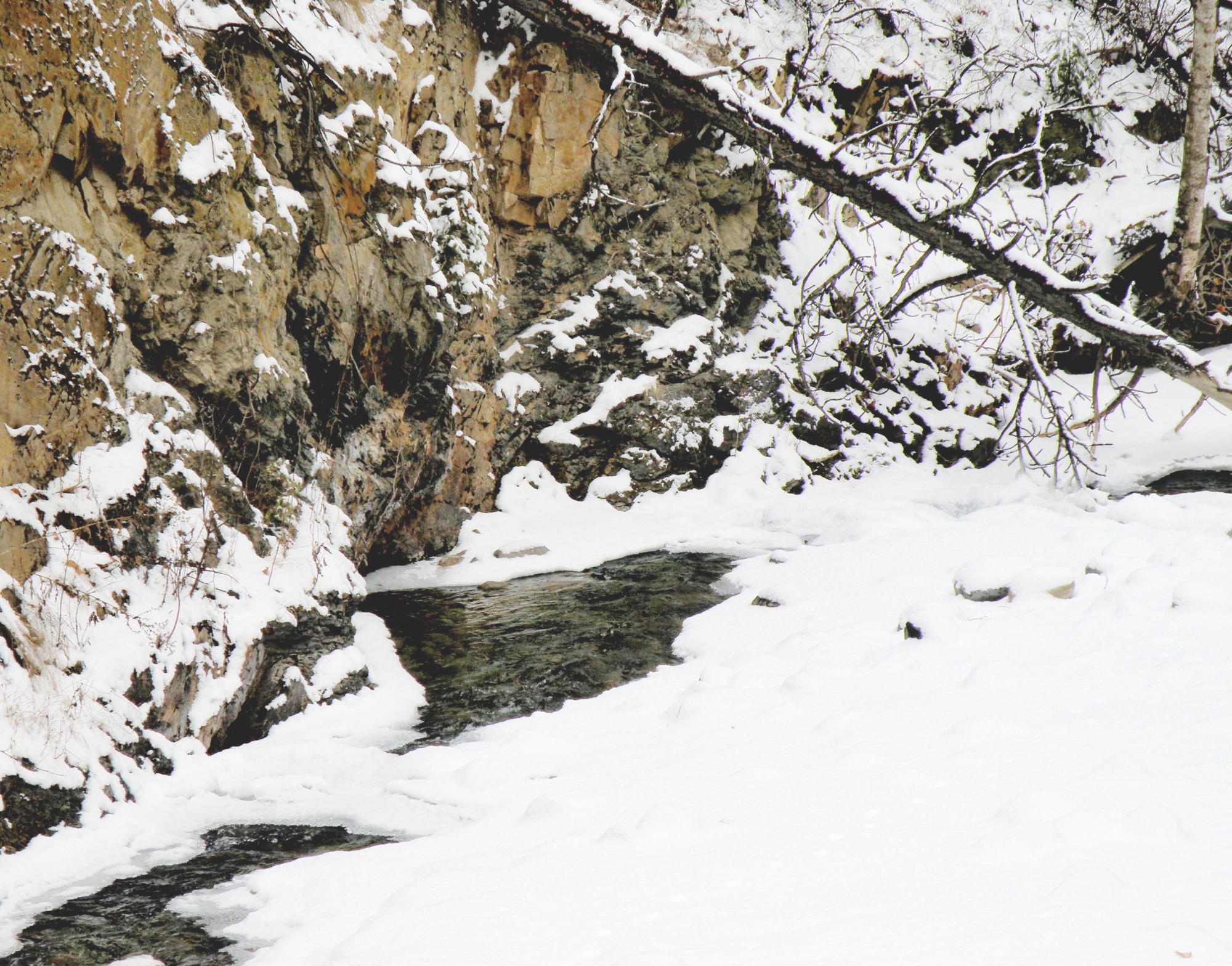
JAMIESON CREEK is about a 15 minute drive from our home, along a dirt logging road. The Kamloops, British Columbia, region is a geologist’s dream come true, featuring some of the oldest mountains in Canada. As a student of watercolour, I am fascinated by stone and rock, particularly because it is so challenging as a subject.
This is Jamieson Creek, taken four years ago around February, early March….
And here is my initial drawing of the subject…..

As you can already see, photography is not my gift (which is why I paint, lol)–so forgive the darkness. It was taken, pre-dawn in the spare room which serves as a studio.
Same subject, different take…
March 17, 2015
THE OLD SCHOOLHOUSE is once again the subject……

THIS TIME around, a horse was to be included, which meant it could not be a nocturnal scene, as that would be an odd addition to a night painting. The choice was made to have only a single horse, even though horses are most often seen in pairs or groups, being a social animal…..
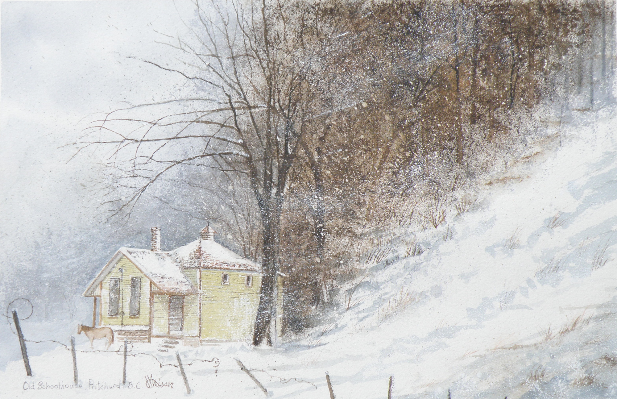
THE DECISION over depicting a single horse was selected as adding to the feeling of isolation: a lone horse beside an abandoned school in a lonely, forgotten field in the dead of winter……
“FROZEN IN TIME”
watercolour, 12″ x 15″, 140 lb. Arches Cold Press Paper, Kamloops Courthouse Gallery, Kamloops, British Columbia http://www.kamloopscourthousegallery.ca
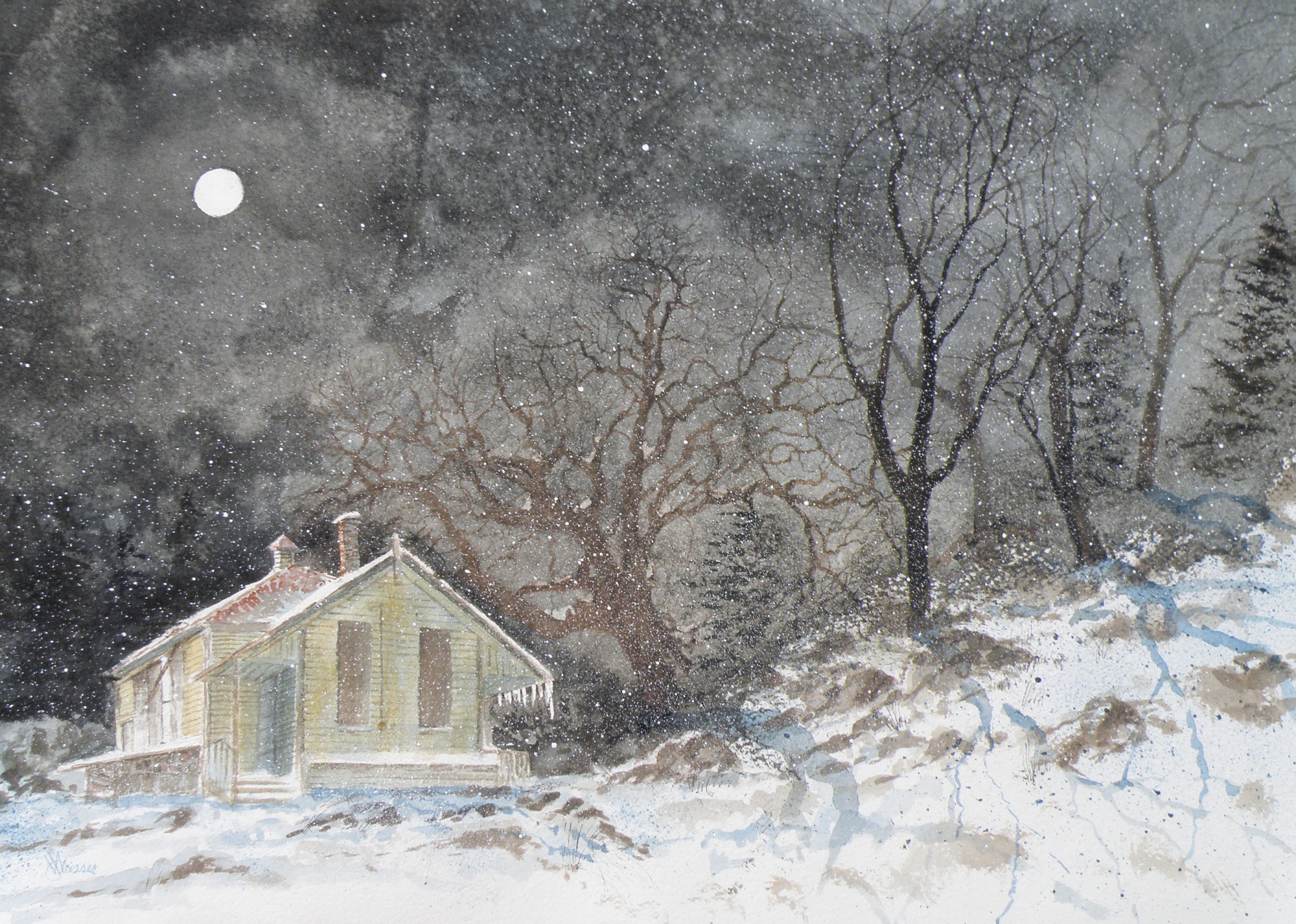
Painting progression 5
March 16, 2015
THE FINISHED piece–“Abandoned Schoolhouse, Pritchard”. The rocks needed darkening and definition. Pines were added. Spattering of snow was used to unify the whole and add a feeling of movement.
Painting Progression 1….
March 12, 2015
THERE WAS an old schoolhouse in the Township of Pritchard, British Columbia, just down the road from my friend Shiela. 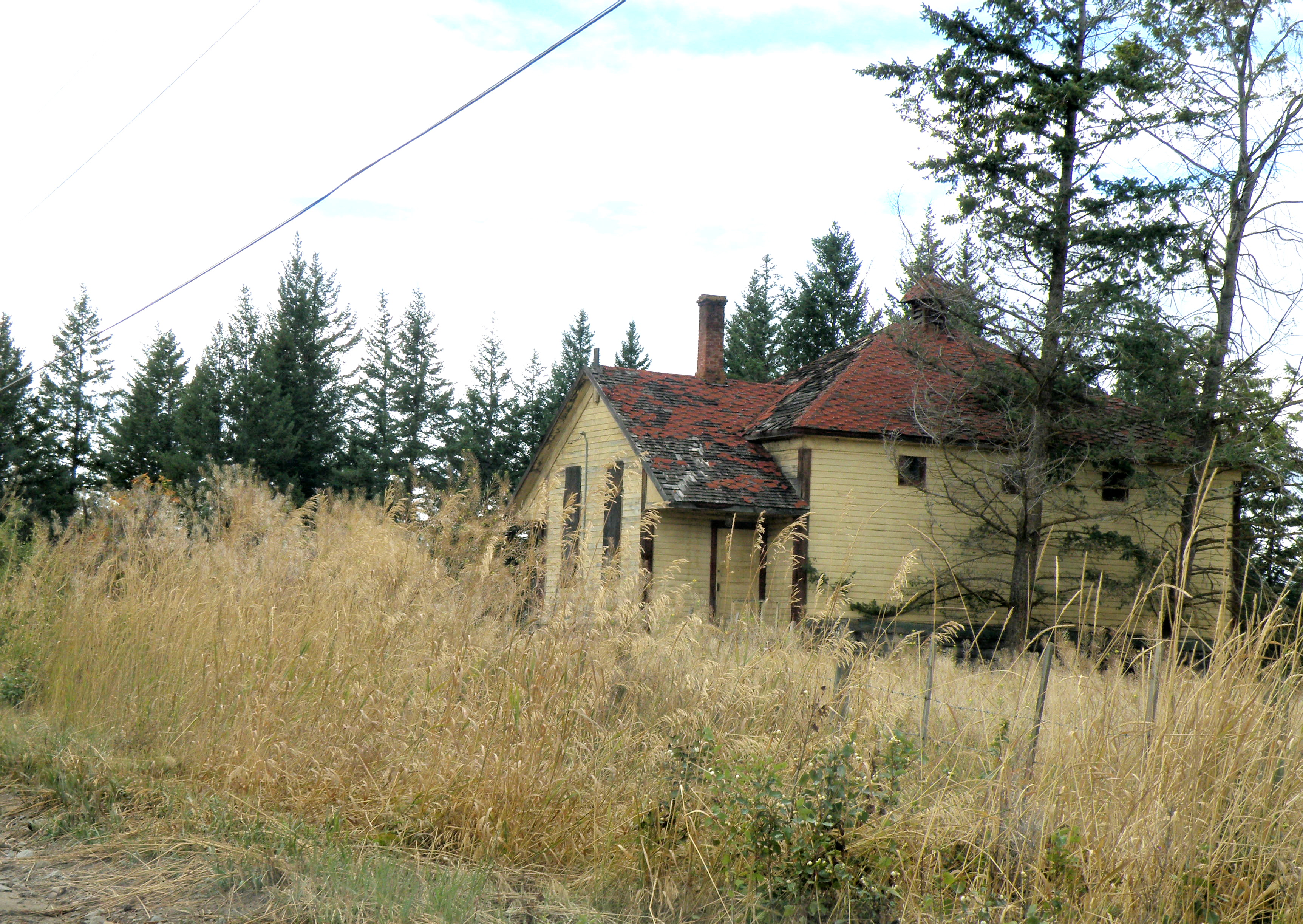 It was kept on a corner of field by a rancher who had attended it, hoping someday someone would see to its restoration. Eventually it was torn down, but not before I was able to photograph it. And I have painted it several times, choosing to situate it where I please….
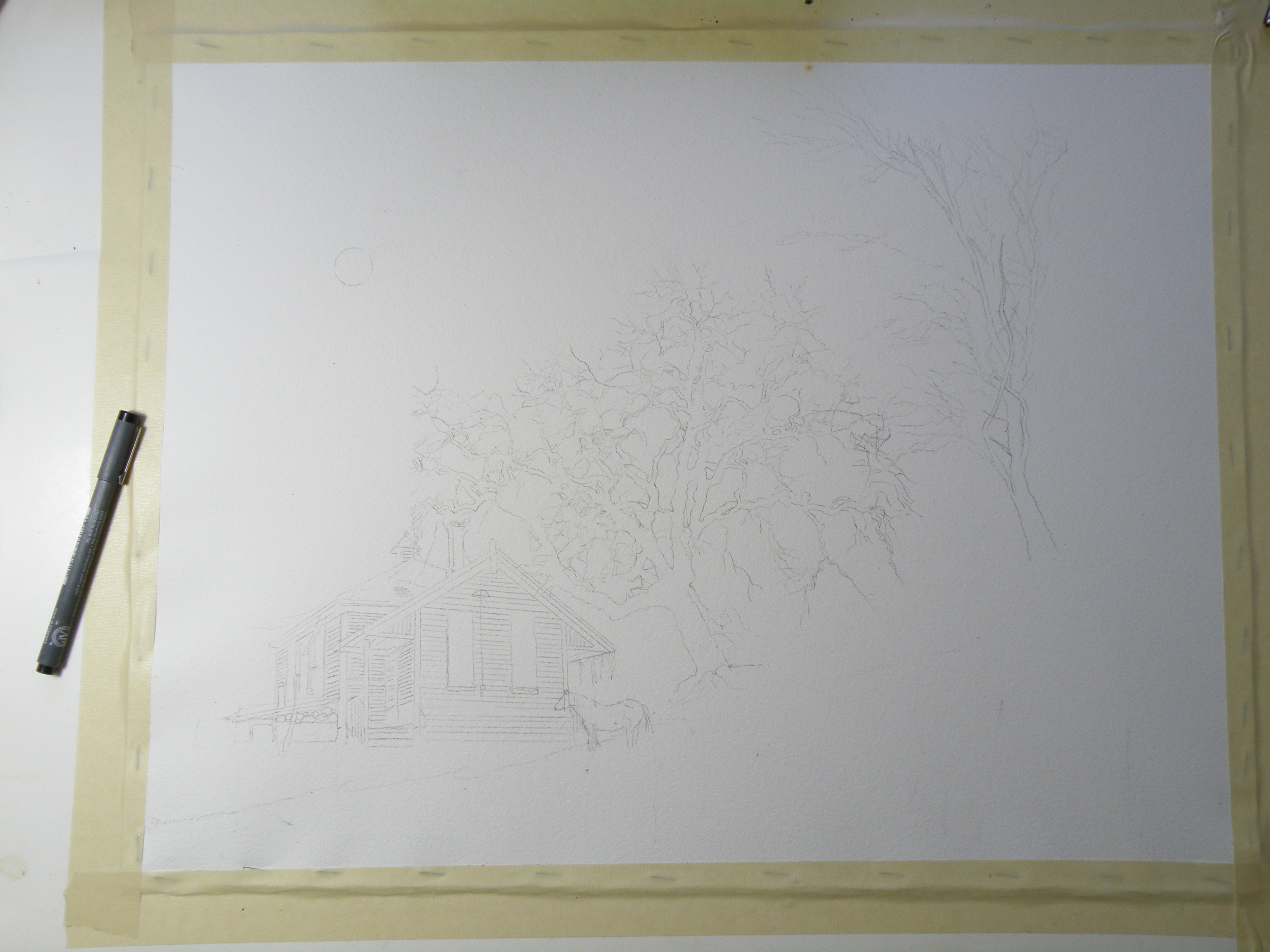
This is the initial drawing. Because the rancher kept horses, I decided to position one for sake of interest. The paper is Arches Cold Press 140 lb., stretched stapled and taped onto gater board, approx. 15 x 20 in.
Jamieson Creek
May 6, 2012
This little painting (6″ x 7.5″) is of Jamieson Creek, which is not even ten minutes drive from our front door. This is a desert-like region, featuring its own local cacti (which I discovered by way of my hand), and is called The Sunshine Capital of Canada. Water, while not scarce, has usage restrictions and homes are now being installed with water meters.
So to have the Jamieson splashing over and around rocks and fallen timbers is a great joy. It is the epitome of the ‘laughing brook’ of literature, and compliments the broad, slow-moving Thompson Rivers which run through town. Were it not for our rivers, Kamloops would be uninhabitable. Right now the creek and rivers are swelling from the melt-off of mountain snows. Kamloops itself is some 4,000 ft in elevation, the mountain snows are up that much higher, and June is when the river level is at its peak.

“Up The Jamieson”, L & M Jones Collection
This painting was on the wall no longer than ten minutes before it was sold. My colleague in art, Lynda Jones, thought it complimented her pottery so well she went with her impulses. And that made my day.
The Columbias
February 10, 2012
For seven summers I was the cook for The British Columbia Natural History Society. In 1994 I graduated from The Dubruelle French Culinary School in Vancouver, and ran a kitchen at a small residence on the UBC Campus. This left my summers free, and I took on the task of prepping to feed upwards of sixty hikers at elevations upwards to some 3000 m., or approximately 10,000 ft.
It involved cooking and then packing vacuum-sealed , frozen meals in large chests with dry ice before joining the caravan of cars towards the mountain destination of choice. Once at the base, everything–including me–was hauled to the summit in a net-outfitted helicopter, and the business of setting up the huge kitchen and dining tents was begun. Frequently it was snowing up top–though only twenty minutes before I’d been roasting in the July heat–leaving me scrambling to find my parka.
The challenge was to get everything unboxed and laid out in some semblance of order–while ensuring the burners were properly hooked up to giant propane tanks–so that all-important first meal could be served some three hours later. After that, I could do the washing-up and at least semi-relax by first getting my little tent set up and then getting myself organized enough to be able to do breakfast when I awoke at 4 a.m.
By Day Three (of the ten day experience), it felt like I’d lived there my whole life, and could spend my days doing watercolours while the hikers tramped all over the rugged terrain carrying the bagged lunches they packed for themselves after dinner the night before. Once I’d served their breakfast, they’d stroll about with final cups of coffee making sure I overheard their latest Grizzly Bear spotting stories. Then they’d be off, leaving me sitting there all day minding that food all by myself.
Here is a painting from one of those seven summers. And though I can’t be entirely positive, I believe this particular view is from the Eastern British Columbia Mountain Range known simply as The Columbias.

Glaciers in The Columbias
And yes, I did see Grizzlies, but only from a distance.
thank god.
Start to Finish . . .
February 7, 2012
Though I’ve certainly seen this done many times on websites and in books, I’ve never taken photos of a painting of mine as it progresses from a drawing to a finished piece. Whether it proves interesting or useful is anyone’s guess, but here goes . . .
I sought out written permission from the Irish Photographer Joseph Hogan to use his images to create watercolours. This is necessary whenever an artist chooses to make use of another artist’s image(s). I have paintings which I’ve done from photos I’ve found on the internet but won’t post them here (nor sell them) because I’ve yet to go about getting explicit permission to use the original image.
In any case, here is the image I am using for a painting entitled “Winter Barn“. . . .

Original Photograph by Joseph Hogan (used with Joe's exclusive permission)
The first step is for me to choose the right kind of paper. It took me about ten years to discover ‘my’ paper–the one that receives my style of painting the best. (And there are honking bunches of types of paper out there beckoning watercolourists.) For this particular subject I chose Arches 140 lb. Cold Press Paper, because it has a creamy hue and just a bit of tooth to it. My other preferred paper is Arches 140 lb. Hot Press Paper which is smooth as glass (which is what I used for ‘Winter Horses’, for example). Both papers receive the paint in a different way.
I first decided to change this photo into a night scene. For me it is important to establish a definite and personal mood, to embody the photograph–use it to draw out from me what I feel when I see it–let my mind take me back to similar scenes in time’s past.
When we lived in Granville, New York, we lived in the Baptist Parsonage (my father was a Pastor) and it was a 19th Century house with the original horse barn for our garage. Sitting at its open back door, I remember looking at the host of stars while sneaking a Marlboro, and wondering what my life was going to involve. (And, lo and behold, it involved a prolonged effort to finally give up those deliciously-sinful Marlboros). But I sat there rain or shine or snow–usually at night–and thought my thoughts and enjoyed just being me instead of a Pastor’s son.
Back to the task at hand—I made a detailed drawing of the barn, used a prescription medicine container to draw a moon, then used masking fluid to mask out the moon, the window, and several fruit trees I decided belonged on a hill not in the photo.

Once that was done, I gave a preliminary wash to the night sky using Payne’s grey.

First wash over sky using Payne's Grey and a touch of Sepia
The next stage was to define the sky with a second, and darker wash. This is occasionally referred to as ‘glazing’ by my partners in crime but I just call it a second wash. I also decided to remove the masked moon and trees by rubbing off the rubbery masking, and then began defining the fruit trees by using Sepia mixed with Payne’s Grey and some Burnt Umber using a fan brush to give the feeling of many branches against a moonlit night.

blocking-in of fruit trees
I also used a small rigger brush to create more defined trees within the grove . . .

more tree detail . . .
As you can see, I also added shadows using Payne’s Grey and Thalo Blue. I want to convey the impression that they are growing on a hillside. And now it is time to begin the initial washes over the wood of the barn. The red in the photograph is not the red of my memory. I want the red of the barn in Granville, and not the red of Joseph Hogan’s barn photo.

initial barn washes and grasses on the hill
The next several illustrations show the development of the barn–the attention paid to the stonework, the window, the planks, the grasses and shadows. This takes me hours, and is somewhat distressing (in a I-just-want-a-Marlboro kind of way) because again, this is taking a photo of an anonymous barn in the daylight and changing it into a personal painting of a memory-laden place where my teenage self got lost in imagining futures (a different one every time I went out there–but all of them grand). In other words, there’s no blueprint to follow and it needs to look authentic, yet I have no scene before me to guide my brush–I must let the painting tell me where to go next . . .


more definition added to barn's stonework and planks . . .

yet more detail . . .
Finally, it took several days to stew over how to find the guts to put in the barn’s frosty shadows. I say ‘guts’ because with watercolour, there’s no turning back–once darks are laid in, they’re there to stay. (At any point along the way, an ill-advised decision has many a time consigned my work to the ‘not good enough’ heap.) And I chose to use a sponge and Payne’s Grey mixed with Thalo Blue to provide a texture-like effect to the snow covered grasses in front of the barn.
I then spattered Payne’s Grey over the wooden parts of the barn and over the fruit trees. I also spattered Yellow Ochre onto the stonework, and used it to sponge-in more grasses. Selective spattering adds the feeling of age to the barn, and more depth to the trees.
To finally convey the effect of a moonlit Wintery night, I spattered Opaque White over the whole to give the feel of a fine powder of snow falling gently onto the scene.
This may yet prove to be the final rendering of this subject–but then again, I may still stand back and feel it’s missing the mark (which I do feel it is, but can’t quite figure out how) and get in there and muck around some more. I actually do think I may spatter a bit more snow into the air . . . .

Final (maybe) version of "Winter Barn" by Lance Weisser relying on an image by Joseph Hogan (with permission)
I’ve enjoyed sharing this process with you. More than that, I have come to appreciate with increasing affection and encouragement your own artistic endeavours. You all spur me on, and make me happy that I’ve chosen watercolour as my medium to share as I take heart in your photos, pottery, paintings, drawings, computer art, and poetry.
Thank you for being my friends.
