Cornelia
May 9, 2015
AT OUR RECENT FEDERATION OF CANADIAN ARTISTS ART SHOW, I kept coming back to look at a piece by the Vancouver painter Ali Sepahi. (www.sepahigallery.com)
BECAUSE OF RECENT KINDNESSES SENT MY WAY by people requesting commissions, I had enough moola burning a hole in my pocket to be able look at his painting with acquisitional eyes.
BUYING ARTWORK is a wonderful delight that I don’t give in to unless someone is buying one/some of mine. And I am not beyond bargaining. If I only have X-number of dollars from a recent sale, that is all I have to spend (a necessary and self-imposed rule).
IF I DON’T HAVE ENOUGH MONEY from having sold something of mine–and the painter I’m negotiating with can’t meet my bottom line–I have to walk away. And that is sometimes very very difficult to do. Usually, however, an arrangement is able to be made–but has to be done once an art show or exhibit has closed, and–of course–the painting outlasted the event and went unsold.
THIS PAINTING WAS ENTITLED ‘Grandma’. Not being greatly enamoured with that choice (after all, I don’t exactly enjoy being looked at by onlookers as ‘Grandpa’), I researched female names and after dithering a long time decided the work was to be re-christened ‘Cornelia’. That’s because I don’t know any Cornelias. [I was going to name her ‘Beatrice’, but I already know a Beatrice, and it wouldn’t do — insights into my slightly OCD brain.]
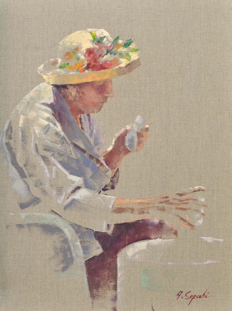
Ali Sepahi, oil on canvas, 61cm x 46cm (24″ x 18″), painted using a colour shaper
THIS WORK IS ABSOLUTELY STUNNING in my book. The brevity of line, sparse delineation, those slight indicators of head tilt, clutch of serviette, careful reach towards drinking glass–oh my, oh my, but this is GOOD. And crowning it all is the floral panache of a hat chosen to show that underneath it is no ordinary person willing to be defined by age or the brittleness of what our ripening years dish out.
FOR TEN YEARS my profession was that of Clergy–Presbyterian–and prior to that, my experience of memorable people in the manner of this painting, was due to my having been born ‘a child of the Manse’. The ‘Cornelias’ I have been privileged to know, and yes, love, from my childhood onward, have been many. Observing each one, discreetly attending to her carefully chosen paper plate of chicken salad–sitting apart from the younger ones at wedding receptions–finding that place under a large oak at the Sunday School picnic–not wanting to be obvious, while wearing a hat which was anything but humdrum, I knew before long I would be making my way towards her. And she was always gracious in welcoming me–whether I was 8, or whether, wearing full collar, I was approaching as her Cleric–ready to amuse me with wry observations, regale me with stories of memorable wedding disasters, charm me in a smilingly-hushed voice, all the while allowing her milky-blue eyes to convey her longing that I not yet go visit someone else, and leave her–once again–all alone.
IT MAKES MY OWN EYES WELL UP EVEN YET, how the Cornelias of this world have unexpectedly nurtured my needy heart time and time again. And it will be an honour and a privilege to find her–this Cornelia–a treasured place on the dining room wall, even as we observe yet another floral-hatted Mother’s Day Sunday.
composition woes….
May 3, 2015
MY GREATEST CHALLENGE when painting anything is composition. For years I felt I was being a ‘purist’, insisting that I always paint on location, never in a studio setting. And once at the location, I convinced myself that if a tree was in that spot, then that was how it needed to be depicted.
IT WAS ALL DUE TO my tendency to early-on stop referring to the subject in front of me and become more and more involved in what was happening on paper, to the point where I may as well have not been on location at all. So in an effort at self-discipline, I decided that not only should I paint what things actually look like, I shouldn’t muck around with how and where ‘mother nature’ placed them.
THE SILLY THING WAS, I ended up choosing a composition by default because of course, I couldn’t paint everything my eyes saw in front of me. And more often than not, it was not a good composition. So now, not only do I go to some lengths to study the skill of creating an interesting arrangement, I realise it is the painter’s task to take what ‘mother nature’ provides and make art out of that. Fences do need to be repositioned, as do trees and hills and clouds.
SO NOW I MAKE thumbnail studies first on matt board before beginning anything . . .
THE OBJECTIVE is to provide a focal point, a visual way in towards it, then additional visual interest so the eye has more to discover by wandering beyond the subject itself. These thumbnails are exploring the use of a compositional figure ‘Z’ shape to lead the eye of the viewer.
The Gleaners
April 30, 2015
THE GLEANERS is a renowned painting by Jean-Francois Millet, finished in 1857.
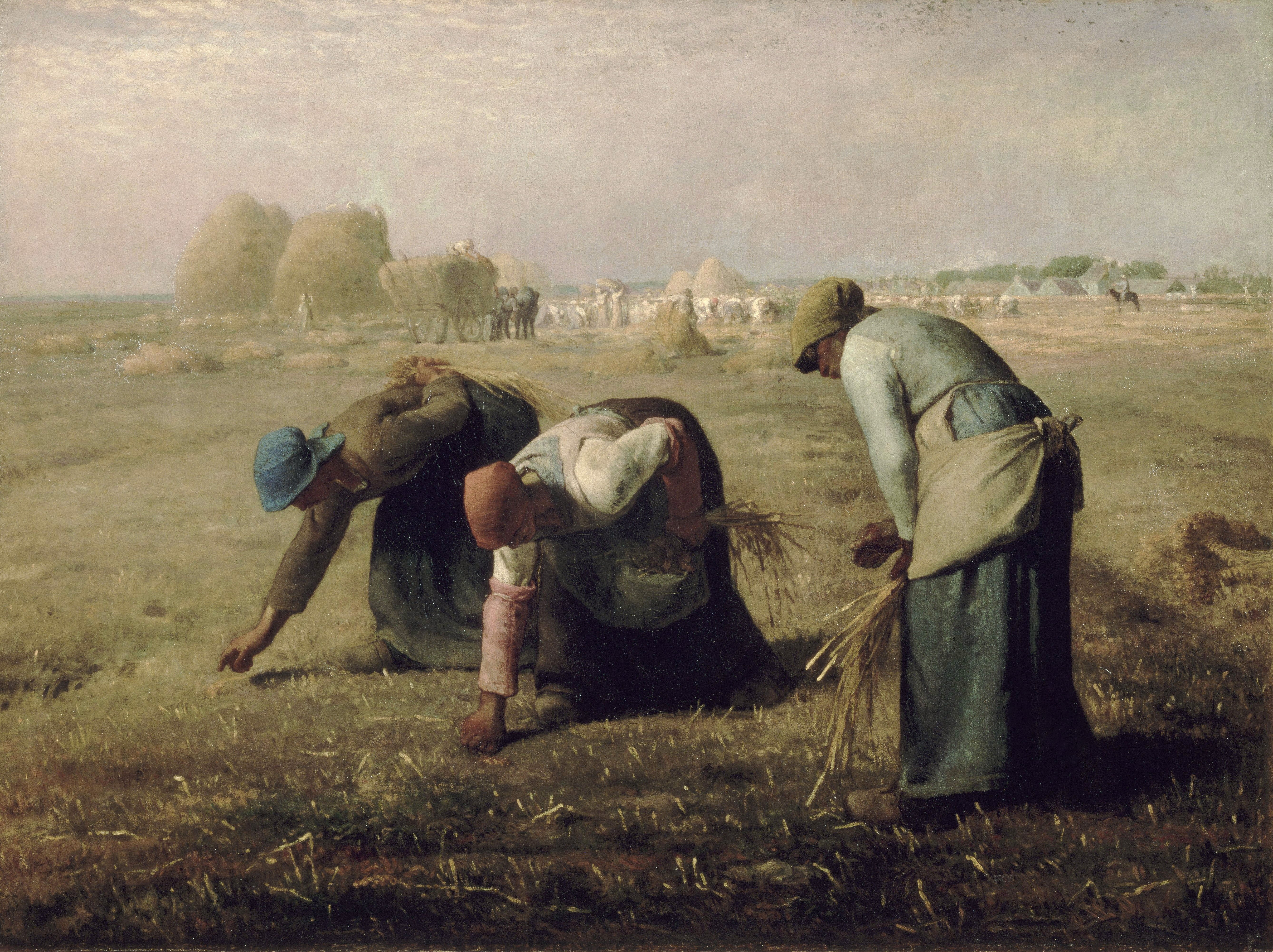
It was controversial in France for its depiction of the lowest classes of society, picking from the fields what little was left after harvest. Prior to this, paintings of people were usually paintings of people who were rich enough to have their portraits done.
THERE WILL ALWAYS BE GLEANERS, as we know. And each of us, in our own way, were often taught by our parents to make good use of every last bit of something, including the meal(s) in front of us.
IN THE ANIMAL WORLD, Ravens are gleaners supreme, going after what little remains of just about anything left behind, tossed aside, or just there for the taking. Yesterday I encountered one in the parking lot of our local Mall, hopping about a garbage can with a broken wing, waiting for someone to provide some slim pickings. Its noble bearing and size–the gloss of its plumage, the inherent dignity–only added to the poignancy of its situation. And yet, it wasn’t exhibiting signs of pain or discomfort, just a keen willingness to take what it could get and survive. And glean.
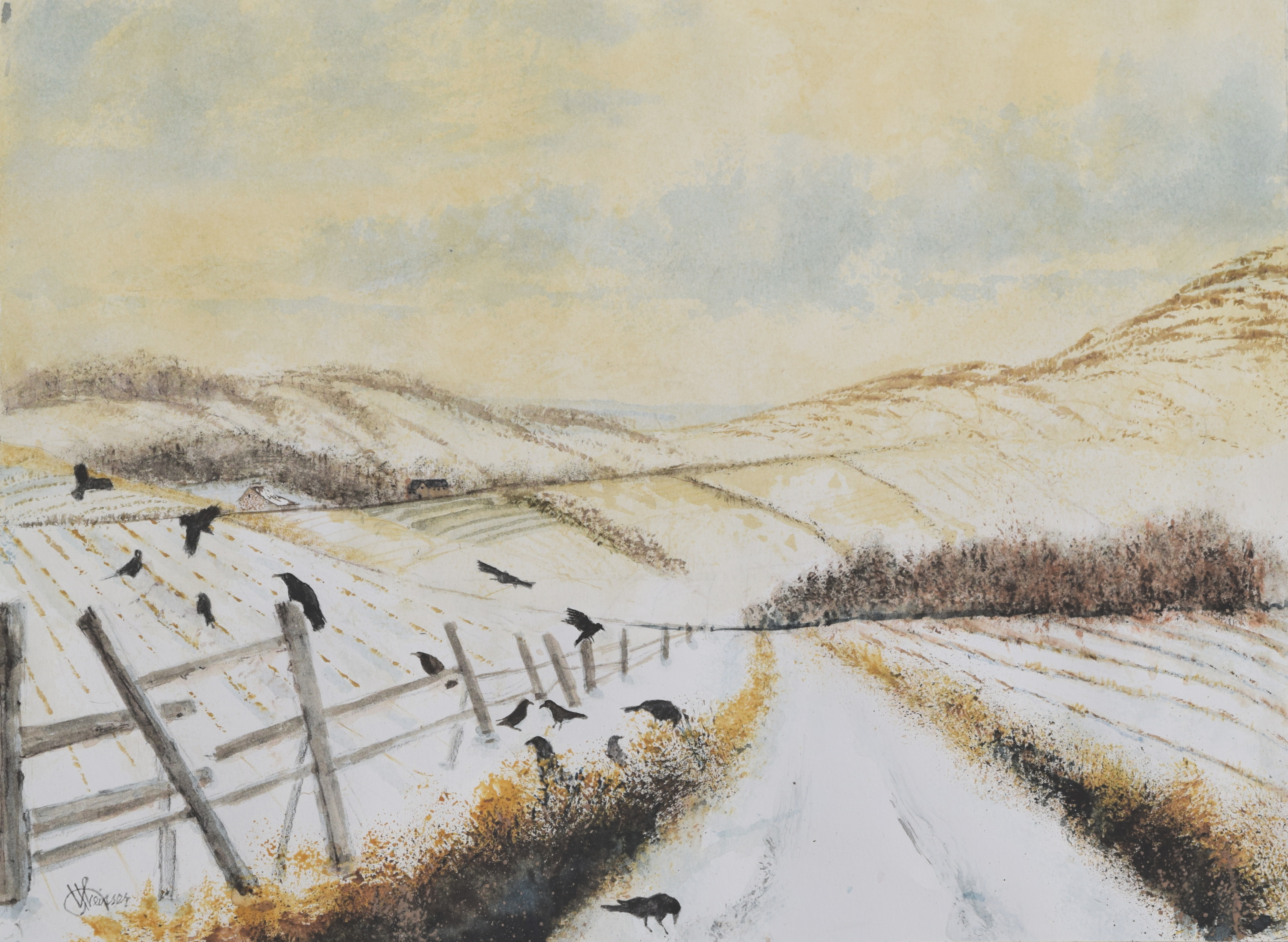
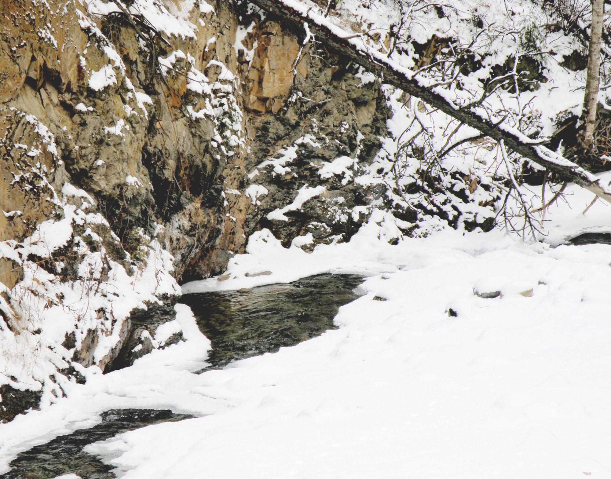
Silt Bluffs
April 26, 2015
THE KAMLOOPS REGION is a geological wonder. 50 million years ago, volcanoes erupted and volcanic ash and lava covered the land, and their record is preserved in fossil beds throughout the area. Ancient rivers carved the landscape, forming the modern valleys of the Thompson Rivers and, during the Ice Ages, ice sheets carved the valleys and rounded the plateaus and mountains in the Kamloops area. (sourced from ‘Tourism Kamloops’ website)
THIS PAINTING is of a local geological formation called The Silt Bluffs. In the height of summer they are baked by a 40C sun, and are the home of rattlesnakes and cacti . . . and Ravens.

“The Silt Bluffs”
23cm x 30.5cm (9″ x 12″), watercolour, 140 lb. Arches Hot Press Paper, sold
a constable of ravens
April 24, 2015
YOU’VE HEARD OF ‘a murder of crows’, a ‘volery of birds’, a ‘brood of chickens’. The term for the groupings of Ravens is less fixed. Ravens were/are often seen gathering about The Tower of London, and in meaner times, The Tower was a Royal place of execution (Anne Boleyn, et al) .
AN UNKINDNESS OF RAVENS is what a grouping of them was called when a Royal was awaiting death–as though their presence was a foreboding, a cruel anticipating, a sign of ill will.
A CONSTABLE OF RAVENS is what their grouping was called when The Tower was no longer sinister, but rather a symbol of The Monarchy itself. Their presence in such times meant they were keeping guard over the Royal Family. Ravens were a constance, a watchful presence–a constable.
A CONSPIRACY OF RAVENS is another label for their gatherings, stemming from their ganging together whenever there’s carrion or bodily remains to be picked apart and eaten. Ravens don’t allow other than their own to share in the find.
A WOMAN IN OUR TOWN THUMBS HER NOSE AT by-laws and ritualistically feeds Ravens all through the Winter months by pouring out cat kibble in several of her collection of decorative cement-cast bird baths around the yard of her time-worn and historic home.
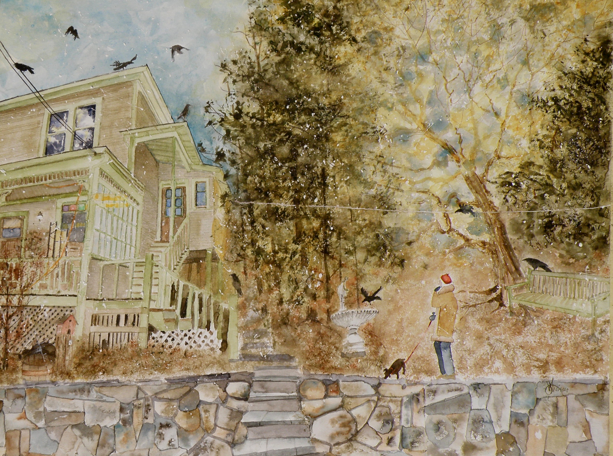
‘Where The Heart Is’
watercolour, 41cm x 50cm (16″ x 20″), 140 lb. Arches Hot Press Paper, J. R. Weisser Collection
THE INTENTION of this rather busy piece of work is simply to allow the viewer entry into Joan’s world. Sometimes our hearts want to be filled–if not by another’s affections, then by the things we’ve grown fond of–and sometimes, not just filled, but rather overflowing with so much that we’ve come to take heart in, that its accumulated presence brings with it a comfort.
A CONSTABLE OF RAVENS watches over and protects and guards the fading beauty of Seasons gone by, loves had and interred, and a lasting, loving sanctuary of the heart–as yet another Autumn invites one inside to sit by the fire and grow warm, and remember.
local recognition
April 23, 2015
IT IS ALWAYS VERY NICE when what is for me a self-educational hobby, receives outside recognition, as in this edition of our locally-published ‘Currents’ Magazine . . .
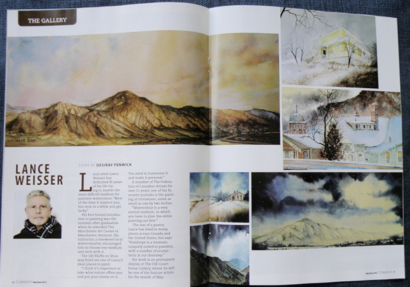
KAMLOOPS (derived from a First Nations word meaning, ‘crux of two rivers’) is a wonderful city for promoting The Arts. We have a great live theatre venue, with a full annual repertoire of plays, as well as a number of smaller companies and our own symphony.
The Common Raven (corvus corax)
April 21, 2015
THE COMMON RAVEN is amply represented in British Columbia and enjoys the distinction of co-existing with people for thousands of years, to the point where–in Haida Nation tradition–the Raven has god-like qualities. It was the Raven which released the Sun from its little box–made the stars and moon–and even brought people out of the earth in order to populate a party being thrown. But in traditional stories Raven doesn’t actually create (make things out of nothing), so much as steal, exchange, rearrange and redistribute and generally push things around into new combinations. If that isn’t humanlike, I don’t know what is, lol.

“Spring Thaw”
watercolour on art board, 20 cm x 28 cm (8″ x 11″), sold
In Kamloops it is against the law to feed them, as well as crows. A buyer of my work named Joan pours bags of cat kibble into her elaborate and large cement bird baths in the Winter and revels in their continuous, noisy presence. The neighbours? not so much. When they report her, she just pays the fine and keeps at it.
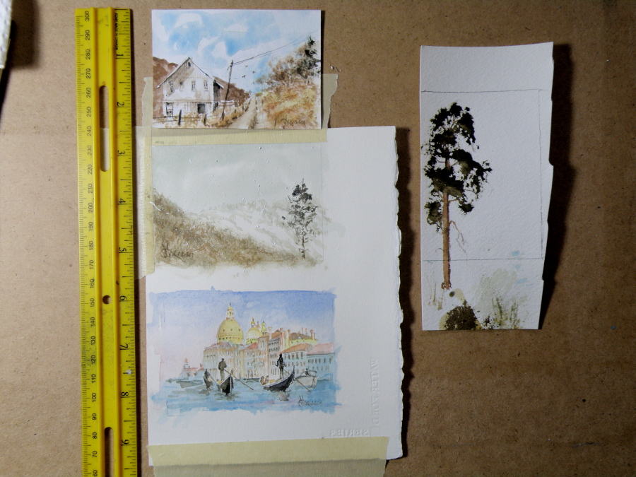
ACEOs (Art Card Editions and Originals)
April 20, 2015
ARTIST TRADING CARDS aka ART CARD EDITIONS AND ORIGINALS are popularly known as ACEOs. ACEOs are the size of baseball cards–65mm x 89mm (2.5″ x 3.5″) and are purchased and then traded and sold the way sports cards are. The ACEO movement originated in Switzerland in the 90s but grew in popularity through eBay, where art cards are now sold and bought on a 24hr basis.
They require precision and are very enjoyable to do. But then, who wouldn’t be fascinated by the challenge of painting tiny things (smile). The subject matter can be chosen by the purchaser, and the painting done accordingly.
Finished work….”Logged-In”
April 16, 2015
“Logged-In”, 25.5 cm x 35.5 cm (10″ x 14″), Watercolour on Arches 140 lb Hot Press paper, (donated to Kamloops Art Gallery Annual Art Auction)
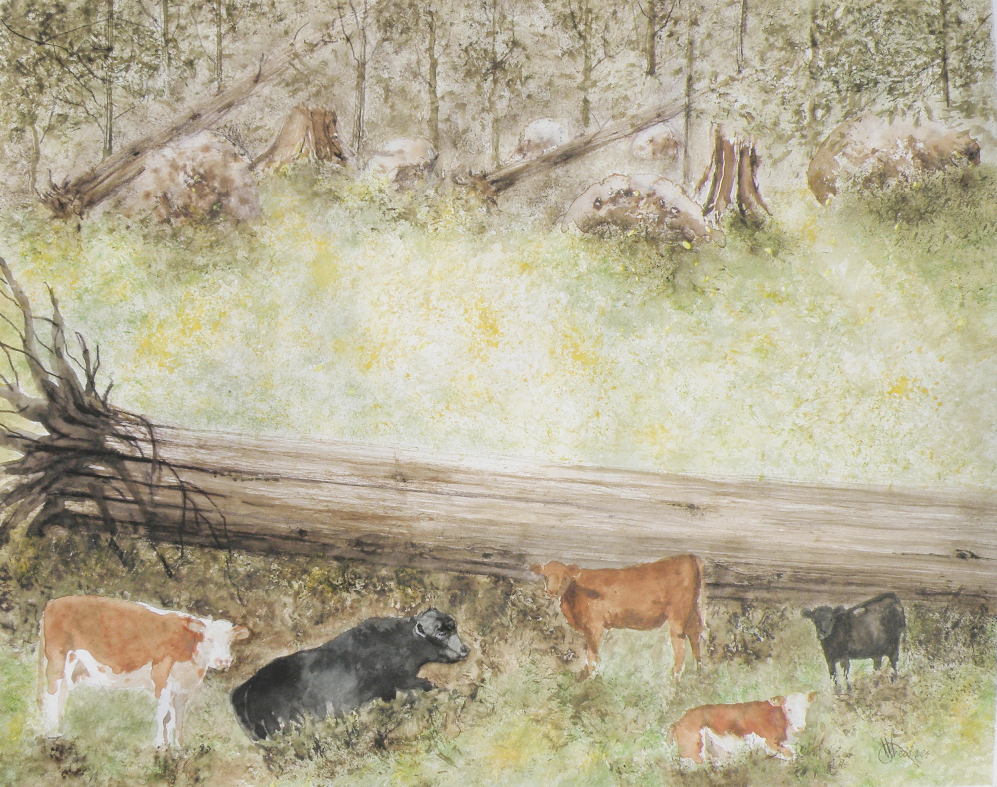
painting progression 4 . . . “Cows”
April 15, 2015
THESE ARE BEEF COWS, Herefords, the breed most favoured by ranchers in our region. Their origins descend from small red cattle introduced by The Romans in ancient Britain, along with breeds from old Wales, their subsequent nurtured evolution taking place in Herefordshire where the Hereford is king. Today more than five million pedigree Hereford cattle exist in over 50 countries.

BECAUSE THE LARGE FALLEN CEDAR is indicated with only a minimum of brushwork it is necessary to help give it size, weight and substance through the simple use of shadow.
painting progression 3 . . . . “Cows”
April 14, 2015
THE SUBJECT MATTER comes from this photo, very quickly taken when we’d stopped the car on the dirt road running through The Dewdrop Valley (just outside the city limits of Kamloops) after I’d yelled, ‘Cows!’
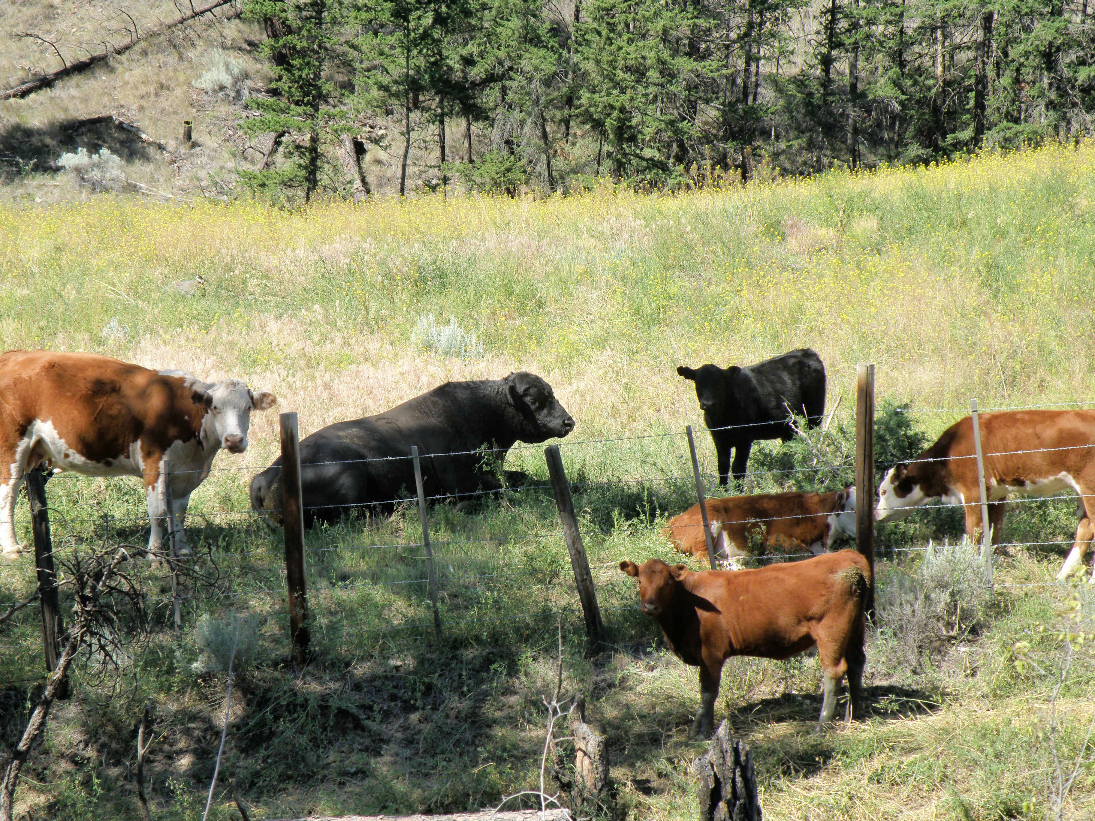
This grouping was described to me by my friend Max as a perfect example of a bull and his harem–and the ‘harem’ got nervous and didn’t remain in place very long once I began snapping pictures. The bull couldn’t have cared less what I was up to, and just lay there chewing.
The very prominent tree in the painting is placed to provide focus. Rather than leave in the barbed wire fence (in front of them), a natural enclosure is placed behind to sneak a storyline into the scene (the best grass lies out of reach)—that, and taking out the wire fence gives a more natural feel to the setting.
IN THIS GRASS RICH region, cattle roam all over boulder-strewn and mountainous terrain throughout the Spring and Summer. They are finally rounded up on horseback in classic cowboy style in the Autumn. Because of this, the beef from Kamloops is renowned for its organic, grass fed superior flavour and quality.
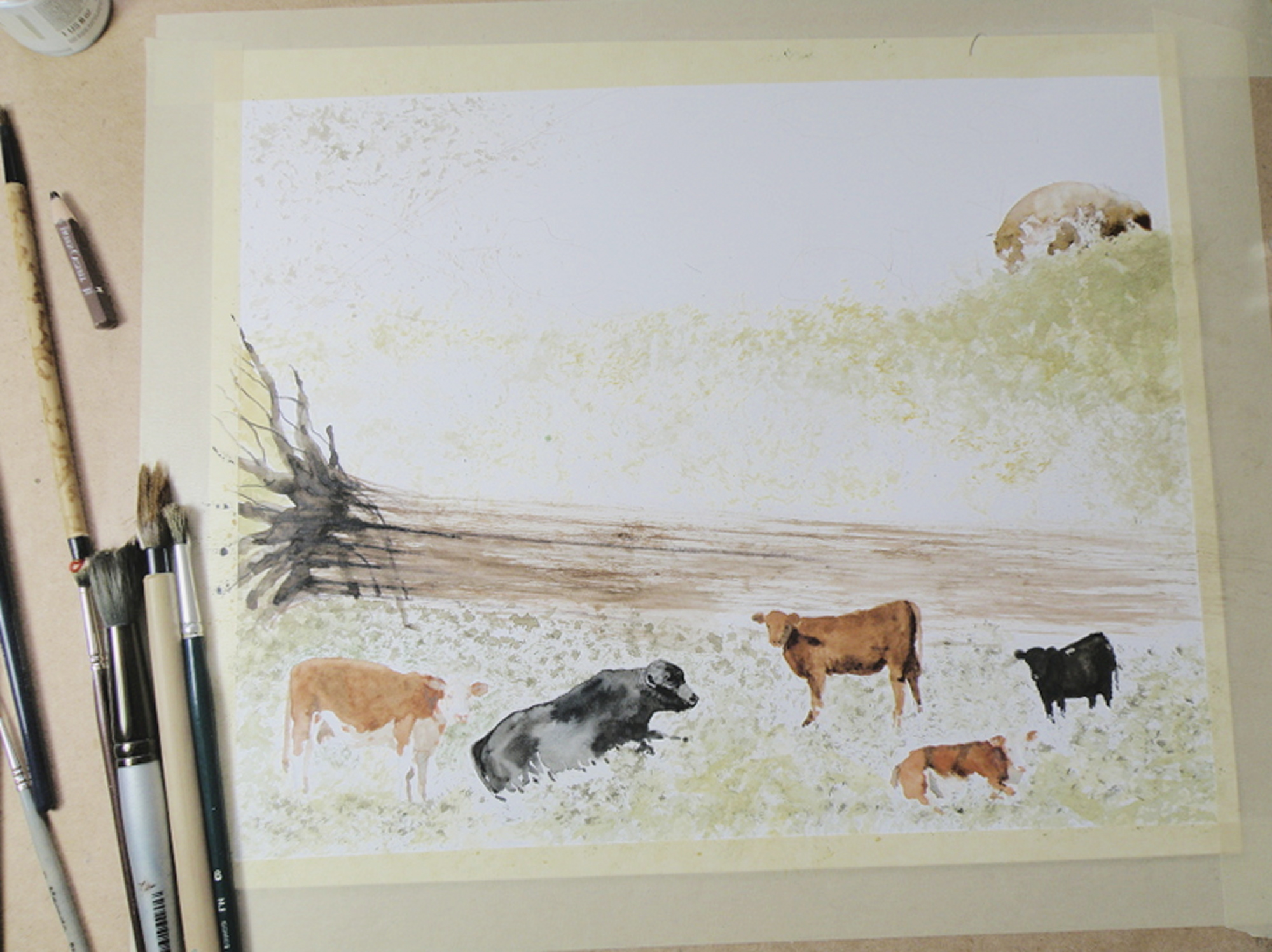
painting progression . . . 2 “Cows”
April 13, 2015
THE PAPER IN USE HERE is a very smooth-surfaced one called Hot Press (140 lb.) by the French Company, Arches (a very old watercolour paper maker). Hot Press paper has virtually no surface texture at all and is slightly cream-toned. When papers are this smooth, the paint initially floats on top before being absorbed. This floating quality creates effects a rough surfaced paper can’t deliver.

So Hot Press paper looks and feels pretty much like dollar store poster paper–smooth, shiny, and about the same thickness. And because it is not a heavy paper, and because it is so smooth, Hot Press watercolour paper cannot take a lot of scrubbing out if mistakes are made. The painter needs to be rather confident about the strength and amount of pigment to use before putting brush to paper. So because I am always a bit tentative when beginning to paint something as challenging as an animal, I gain confidence by always having a scrap piece of watercolour paper handy to try things out on first. Once I see how to do it on a scrap piece of paper, then I have confidence to do the same thing on the painting itself.
It needs to be stressed that Arches paper is superb and bears absolutely no comparison to poster paper when paint is applied to it. The weight (140 lb) is how thick the paper is. 300 lb. paper is very thick and therefore can take a lot more scrubbing and multiple washes, without losing luminosity. The downside is that 300 lb. watercolour paper is quite a bit more expensive. And when I work on very expensive paper, I am too aware of its cost. That makes me somewhat nervous about possibly ruining the painting. So I usually choose 140 lb. paper because if it gets ruined, I am not that concerned, and so therefore approach the painting with more boldness which gives a better result.
Painting progression 1. . . ‘Cows’
April 11, 2015
THE DEWDROP VALLEY is a local site and part of a much larger area near Tranquille River and the Tranquille River Gorge. In essence, the Dewdrop is really rocky, hilly, grass-and-tree- covered pasture for cows and cattle during the Spring and Summer months. The Kamloops Thompson Nicola Shuswap Region is no-nonsense cowboy rancher country, complete with serious Rodeos and horse and rider cattle round-ups in the Autumn.
This is the first of recording daily progress towards completing a watercolour depicting a typical scene in The Dewdrop Valley . . . .
ON DISPLAY are a fine collection of tortured brushes. Some are from dollar stores or second hand bargain stores, and as soon as they get into the spare bedroom cum studio they’re cut up with scissors. None of them cost more than $2, and who knows what they’re made of–Moose? Sasquatch hair, perhaps. Each, however, is priceless.
Miniatures: Chipmunk
April 10, 2015
AS CHILDREN we always gravitated towards Chipmunks, squatting in total stillness with extended hands, hoping one would overcome its natural wariness and take the peanut being offered. The sprightly flicks of tail and peppy darts forward to snatch the gift–so quickly and deftly we didn’t see or feel it leave our palm–only added more charm to their compact, large-eyed, tiny bodied allure. On the other hand, the Grey Squirrel was just a nuisance. I guess size and colour made all the difference in our juvenile minds between one rodent’s mystique and another’s ho-hum plainness. We didn’t entice Squirrels. We threw sticks at them. Their raiding our bird feeders didn’t win them any points, either, I must say….

watercolour, 10cm x 10cm (4″ x 4″), art board
Local Mountains 2
April 9, 2015
THIS COMPLETED PAINTING of the mountains in our Kamloops area was in need of cropping in order to strengthen the composition . . .
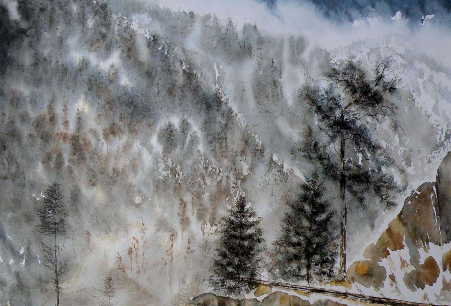
THE PAINTING WAS REDUCED IN SIZE down to this as the completed painting .. .
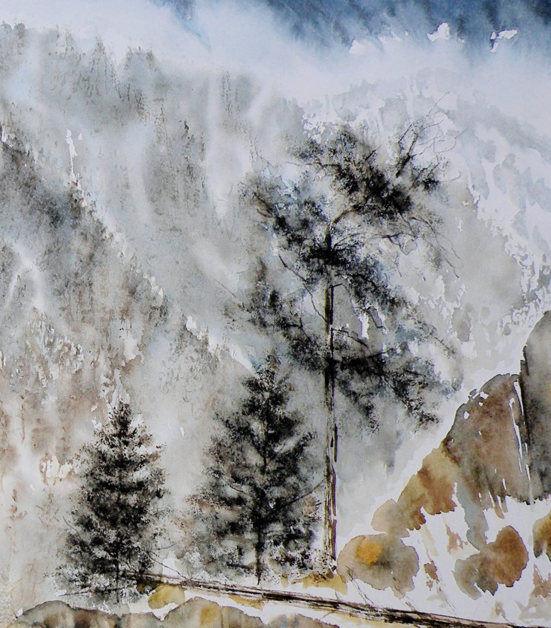
THE CHOPPED OFF parts of cropped work can successfully be made into bookmarks, I’ve found, and then be sold for around $2 ea in our little co-op Gallery (www.kamloopscourthousegallery.ca). Waste not, want not, lol!
Local Mountains
April 8, 2015
A decision has to be made as to whether this painting ‘holds up’, composition-wise. It succeeds in conveying the misty atmospheric conditions of winter in the mountains. But the composition is troubling me.
The Federation of Canadian Artists’ National Show
April 7, 2015
THE FEDERATION OF CANADIAN ARTISTS had its beginnings in 1941, and had as its goal the unified representation of all Provinces through one organization. Canada’s premier artists, The Group of Seven, were instrumental in organizing The FCA, with A. Y. Jackson as the Ontario head, and Lawren Harris in charge of the West Coast region.
TODAY THE FCA has become largely a Western Canadian organization with most of its activity within the Province of British Columbia. The hub is Vancouver [www.artists.ca] with regional Chapters throughout B. C. and Southern Alberta. The Thompson Nicola Shuswap Chapter (which I am a member of) has been hosting two Annual Art Shows for many years, with the 2015 National Show being mounted this coming Wednesday, April 8th.

THE NATIONAL SHOW is open to any qualifying FCA member, but submissions for jurying are limited to 3. Digital images of a member’s work are submitted to Vancouver and juried by three Signature Artists who use a point system to arrive at which pieces will be accepted and which will be declined. Of the 130+ digital entries, only 85 pieces are selected for inclusion into this National Show.
MY OWN SUBMISSIONS (two) have been juried, one being accepted–
‘Approaching Storm, Sechelt’, 25cm x 35.5cm (10.5″ x 14″), Watercolour on board
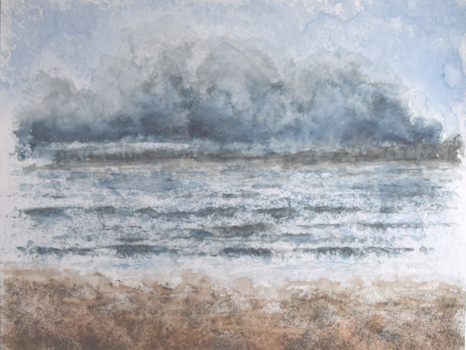
It is considered an achievement simply to get into this Art Show, while Opening Night, Friday the 10th, will be the occasion when $2800.00 in Prizes are awarded by another set of Jurors for those paintings which stand out as the best of The Best. Only once has a piece of mine ever been awarded a prize.
SENIOR MEMBERS OF THE FEDERATION have these paintings being considered for The SFCA Prize, with only one receiving top honours.
NEARLY ALL THE WORK submitted by artists for these Shows is rendered in acrylics or oils, with some pastel, and a few watercolours, and fewer still graphite drawings. Watercolour, generally, is not the preferred medium of most painters. It is considered difficult and problematic because of its demands and limtations.
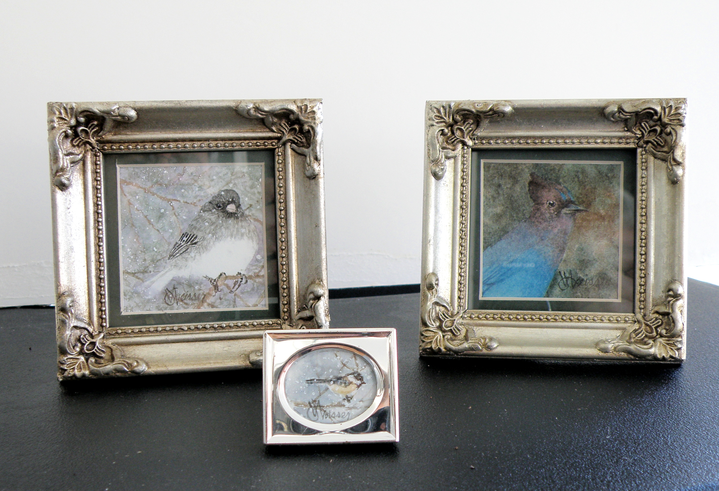
New bird miniatures
April 6, 2015
The image sizes here are approximately 5cm x 8cm (2″ x 3″). I use a pair of rather strong magnifying glasses when working this small–the kind you find on display at pharmacies (around here they’re referred to as ‘cheaters’). So when working on a tiny miniature they are an enormous help, until I turn to go check on something in the kitchen and walk into the wall, lol.
A FEW LAST COMMENTS about this painting…..there is a decided difference between nature and the art of depicting nature. Mother Nature is not only a hoarder, but not interested in housekeeping nor pruning, encapsulating, or boiling-down. She wants it all, all the time, and enjoys lavishing on us the plentitude of what happens when everything we look at, at any given moment, reproduces at will and overwhelms us with dozens–and even thousands–of itself.
FOR THE LANDSCAPE PAINTER the challenge, always, is to take Nature and make it into Art. It is the very human discipline of paring down, re-arranging, configuring and composing. What separates raw Nature from the art of painting is having a limited space, with only two dimensions, which is ultimately going to end up on a wall inside a human-made space. That restrictiveness requires moving trees and clouds and birds about in order to have a sense of balance or sense of wonder or sense of drama. It means the painter must dare to alter time itself, put limits on colour, and restrict amounts of what is naturally before the painter’s eyes.
MAKING ART is similar to the difference between looking at a field of wheat and sitting down to a loaf of freshly-baked bread. What happens between those two events is the act of altering something to create something else.
THIS PAINTING is not what the photograph of this scene looks like. For many years I struggled with whether I was ‘allowed’ as a painter to do anything other than depict Nature as it presented itself to me. Sitting out on some stoney ground, I would suddenly find myself slavishly working at painting the weeds between cracks of rock, then painting the seed heads on the weeds to look exactly like what my eyes saw, when really I knew the larger purpose of sitting there in the hot sun was not to pay attention to weeds, but to paint the distant mountains above and beyond them. By the time I’d gotten away from doing weeds justice, I was so hot I had to fold up my equipment and go back to the car. And I went home with a painting of weeds between rocks and a big expanse of white paper above them.
THAT DOESN’T HAPPEN ANYMORE. I have learned that I must take what is presented to me and do with it as I wish to do. That is the work of a painter.
A PHOTOGRAPHER has a whole different set of challenges because a lens is very different from a human eye (it can’t do half of what a living, ‘breathing’ eye can do) and from human imagination (once it has seen what is before the eye) . But I have noticed some irony happening between the worlds of photography and painting. In the past, painters often worked very diligently to make a painting ‘look like’ a photograph. These days, with technological photo-shopping manipulation, a photographer seems more or less obsessed with trying to make a photograph look like a painting. I am not convinced either enterprise is worth spending all that amount of time on.
IF A PAINTER WISHES TO BE A PHOTOGRAPHER, then don’t go trying to make a painting into a photograph. Do go and take courses and buy equipment and learn how to take photographs and do the work a photographer must work at in order to eventually become a photographer. And IF A PHOTOGRAPHER WISHES TO BE A PAINTER, then leave the photo-shopping manipulation apps alone and do take courses and buy equipment and learn how to paint paintings and do the work a painter must work at in order to eventually become a painter. They are two distinctly separate and inherently different artforms and–in my flawed way of viewing things–should stay that way.
AND YOU…what’s your view? Tell me how I’m missing things you’ve discovered!
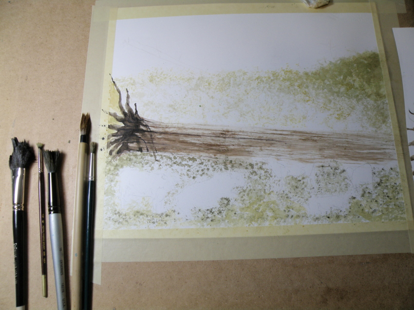
Painting progression 3…. ‘Jamieson Creek Thaw’
April 4, 2015
BECAUSE WATERCOLOUR is such a watery, transparent, delicate medium–one which must always allow the paper it’s laid on top of to breathe through it–one which traditionally doesn’t use white pigment, but relies on the paper to be the white of the painting–BECAUSE of this (and more) the challenge of the watercolour student is to convey an illusion of texture, without the ability to actually build up a surface texture.
WERE WATERCOLOUR PIGMENT applied so thickly as to create an impasto-like texture on the paper beneath, it would lose its luminosity and look pasty, muddy, dull–worse, it would crack. Watercolour pigment only works when the paper beneath dazzles through it and brings life to the pigmentation. In other words, watercolour as a medium is more the business of staining paper than it is a business of building up layers and coats of daubs, stipples, slatherings.
THAT’S WHY CARE is required to not apply so many washes that the luminosity of the paper receeds and eventually provides no life at all. And that’s why the whites of the paper must be thoughtfully reserved and left untouched in key areas–the crests of waves; the moon; snow; clouds; a picket fence–and skill taken to paint AROUND these places to let the paper be the white.
SO….a student of watercolour (me) learns early-on that (s)he will be a student of the medium for life–that mastery is illusive–and failures, many. A good piece is approached very thoughtfully, noting where the paper will be left to serve the function of white (pigment) and painted around. Then the student will also have to gather enough courage to apply exceedingly dark washes in one ‘go’, while maintaining a sense of secure, carefree animation in order to present an immediacy and liveliness in the final piece.
THE DEATHKNELL of a failing, dying work of watercolour is finicky overworking of areas, and a refusal to accept what happened when water joined pigment joined brush joined paper. It is NOT a medium for those who love to micro-manage or be in control.
THE STUDENT OF WATERCOLOUR has to be more a Peter Pan than a child wanting to grow up–loving the thrill of what happens when ‘danger’ is courted, yet having the assurance that daring will win the day. However, that daring and search for adventure–on the surface of a good piece of paper–will only be pulled off if it is backed by enough experience to have a good hunch about what will happen when such-and-such is tried.
ATTEMPTING what remains beyond one’s ability isn’t courting danger–it is ignoring it. Trying to fly without thinking happy thoughts will give a person a broken bone. Within the bounds of representational art–(i.e. wishing to have a tree ‘look like’ a tree)–a painter cannot ‘pull off’ a landscape with lots of shadows if (s)he has yet to study them in some depth. Trying to do a scene which includes far far more than what one yet learned how to interpret is an invitation to frustration and wanting to give up watercolour for say, acrylics (oh, my).
AND SO FOR MYSELF, I know by this time that I must confine my attentions to learning about how corn grows, what it feels like, looks like, behaves like, before I can throw my abandonment into rendering a watercolour of winter corn in January. Not only that, but I must also have studied the qualities of snow–the qualities of what a winter sun does to shadows of corn stalk–the blues, the purples. And only then can a learned abandonment bring about a possible reward.
IT TAKES A LONG TIME to find the right paper, the right brushes, the right working pallet of colours, the right approach and the right subject matter. Knowing what can be done when paper is sopping wet–and what can’t–depends on who made the paper, how thick it is, how textured it is, how stretched it is, how quickly it will dry. Knowing when to wait until the paper is exactly wet or damp or dry enough to throw one’s energies at it, comes (usually) through ruining (many pieces of) good paper.
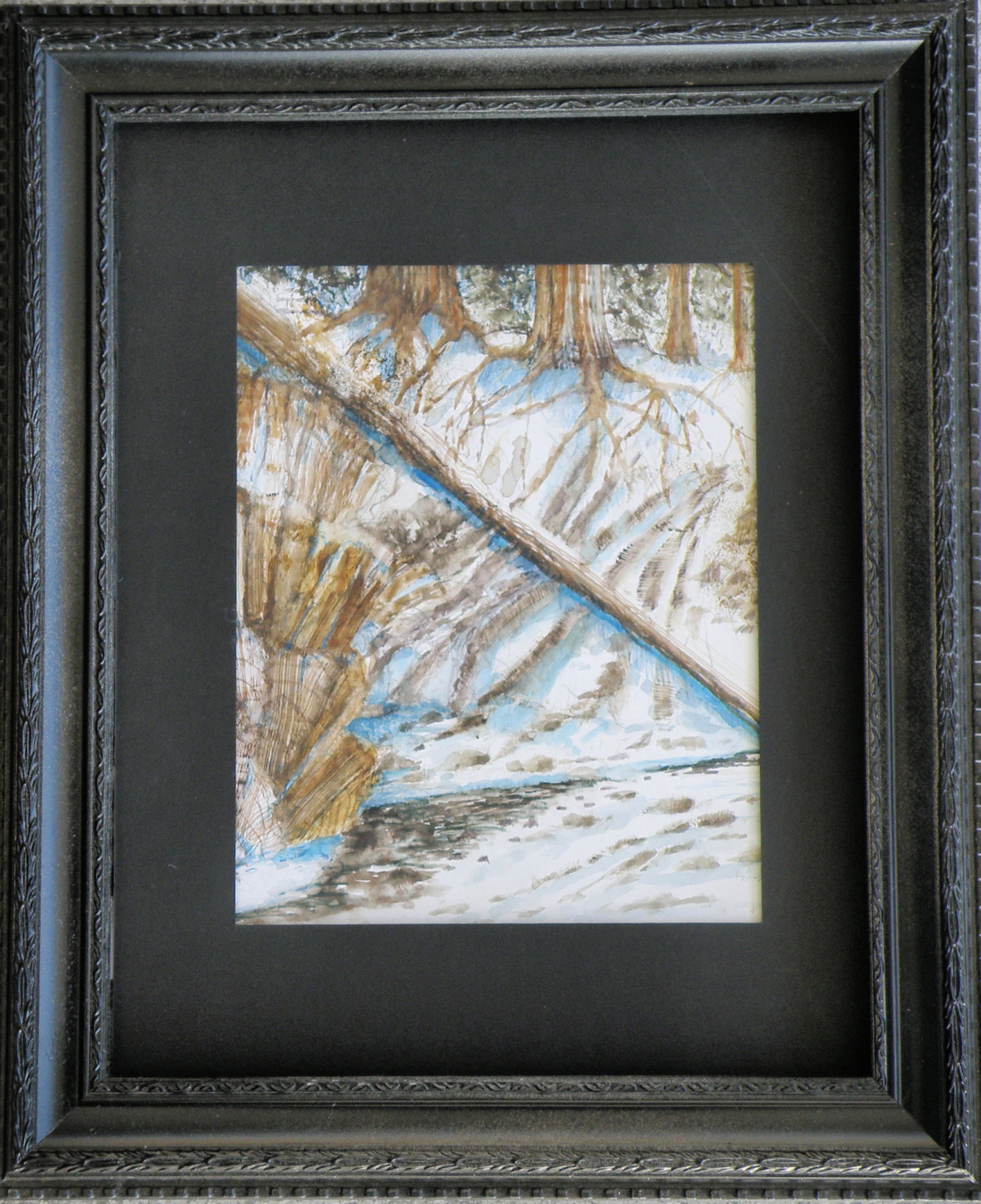
HERE IS THE LATEST DEVELOPMENT of the subject of Jamieson Creek in a February thaw…..
TOMORROW will (hopefully) provide a photo of the finished piece!
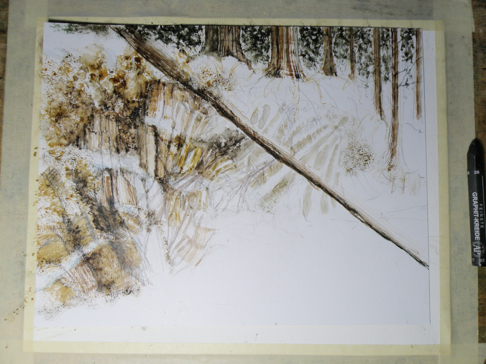
Painting progression 2…. ‘Jamieson Creek Thaw’
April 3, 2015

Painting progression 1…. ‘Jamieson Creek Thaw’
April 2, 2015
JAMIESON CREEK is about a 15 minute drive from our home, along a dirt logging road. The Kamloops, British Columbia, region is a geologist’s dream come true, featuring some of the oldest mountains in Canada. As a student of watercolour, I am fascinated by stone and rock, particularly because it is so challenging as a subject.
This is Jamieson Creek, taken four years ago around February, early March….
And here is my initial drawing of the subject…..

As you can already see, photography is not my gift (which is why I paint, lol)–so forgive the darkness. It was taken, pre-dawn in the spare room which serves as a studio.
Miniatures
March 20, 2015
THE DARK-EYED JUNCO ignores the feeders hanging in the red maple just beyond the front window, shunning the bossy finch rabble bumping one another off the perches. A Junco will head below, delighting in the shower of sunflower crumbs spit from Goldfinch beaks, already shelled, served on a bed of fresh snow.
STELLAR JAYS have the tact and grace of a sociopath. Self-absorbed to the point of being incognizant there even are other lifeforms, they bray and scatter seed as though perpetually going through puberty. Once chaos has been accomplished, they go over to our neighbour, Brenda, and do the same with her feeder.
BLACK-CAPPED CHICKADEES dart in to claim a single seed, flit to a branch, hammer the shell apart, then dart in again–chee-cheeing a mantra as though making merry to themselves alone.
2″ x 2″, and 1/2″x 3/4″ , watercolour on Arches 140 lb. Hot Press Paper
Same subject, different take…
March 17, 2015
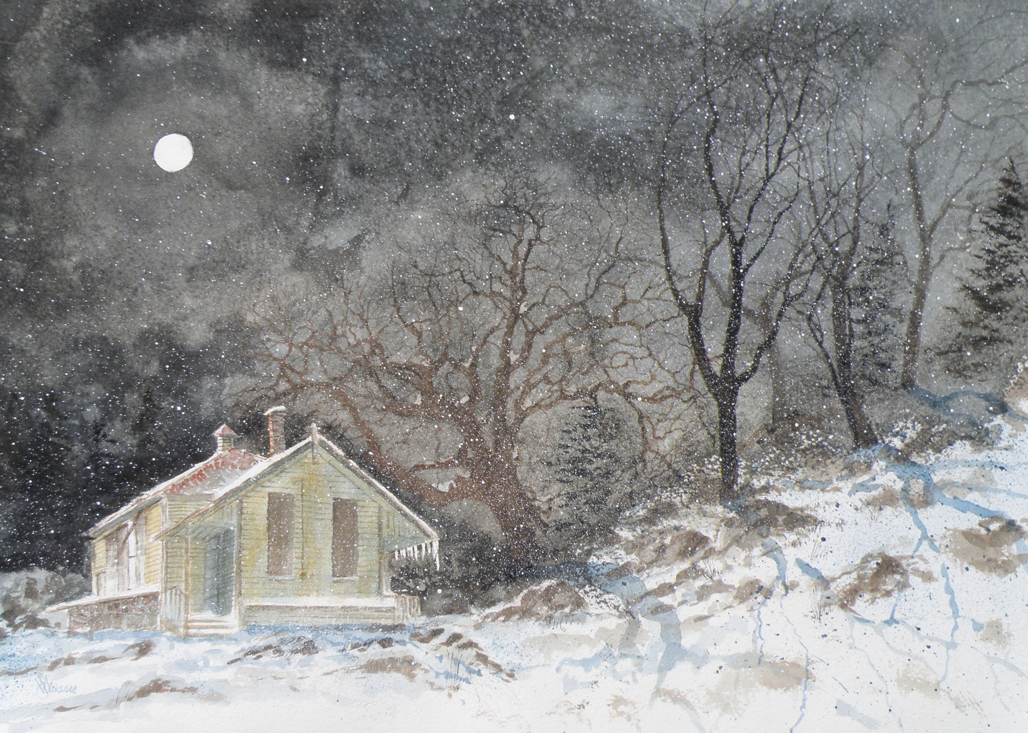
THE OLD SCHOOLHOUSE is once again the subject……

THIS TIME around, a horse was to be included, which meant it could not be a nocturnal scene, as that would be an odd addition to a night painting. The choice was made to have only a single horse, even though horses are most often seen in pairs or groups, being a social animal…..
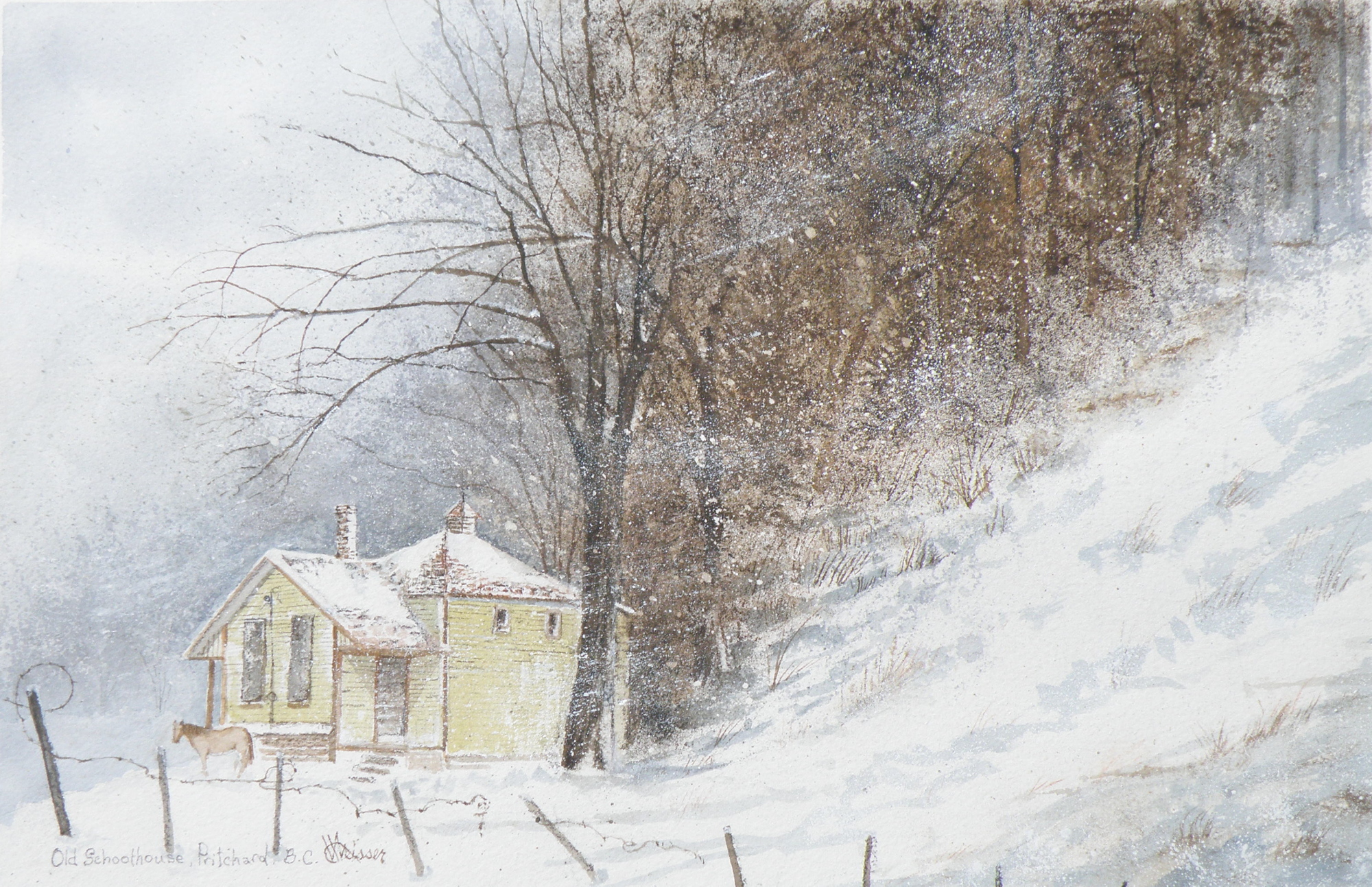
THE DECISION over depicting a single horse was selected as adding to the feeling of isolation: a lone horse beside an abandoned school in a lonely, forgotten field in the dead of winter……
“FROZEN IN TIME”
watercolour, 12″ x 15″, 140 lb. Arches Cold Press Paper, Kamloops Courthouse Gallery, Kamloops, British Columbia http://www.kamloopscourthousegallery.ca
Painting progression 5
March 16, 2015
THE FINISHED piece–“Abandoned Schoolhouse, Pritchard”. The rocks needed darkening and definition. Pines were added. Spattering of snow was used to unify the whole and add a feeling of movement.