Finished work….”Logged-In”
April 16, 2015
“Logged-In”, 25.5 cm x 35.5 cm (10″ x 14″), Watercolour on Arches 140 lb Hot Press paper, (donated to Kamloops Art Gallery Annual Art Auction)
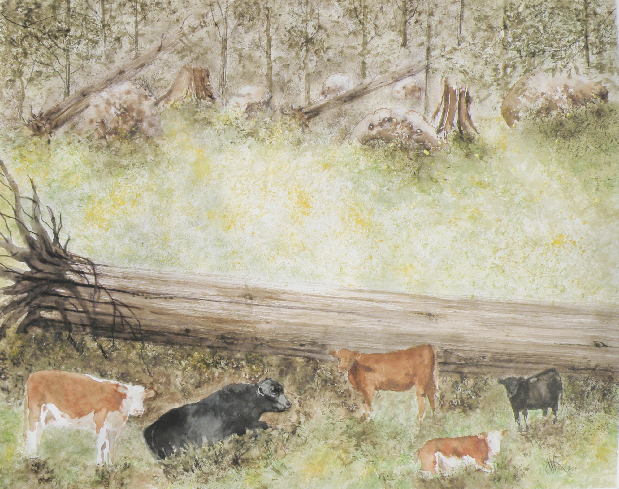
painting progression 4 . . . “Cows”
April 15, 2015
THESE ARE BEEF COWS, Herefords, the breed most favoured by ranchers in our region. Their origins descend from small red cattle introduced by The Romans in ancient Britain, along with breeds from old Wales, their subsequent nurtured evolution taking place in Herefordshire where the Hereford is king. Today more than five million pedigree Hereford cattle exist in over 50 countries.

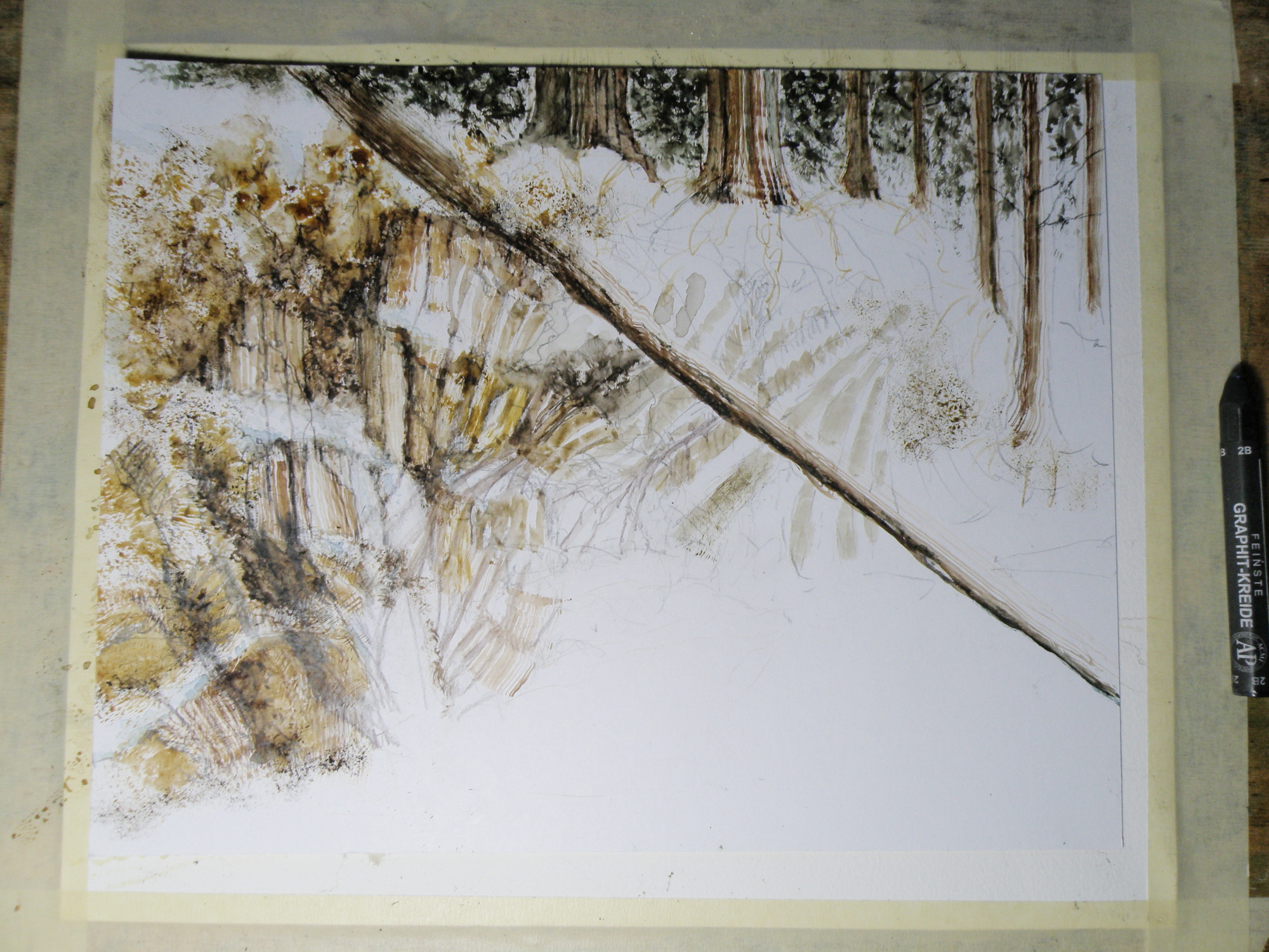
BECAUSE THE LARGE FALLEN CEDAR is indicated with only a minimum of brushwork it is necessary to help give it size, weight and substance through the simple use of shadow.
painting progression 3 . . . . “Cows”
April 14, 2015
THE SUBJECT MATTER comes from this photo, very quickly taken when we’d stopped the car on the dirt road running through The Dewdrop Valley (just outside the city limits of Kamloops) after I’d yelled, ‘Cows!’
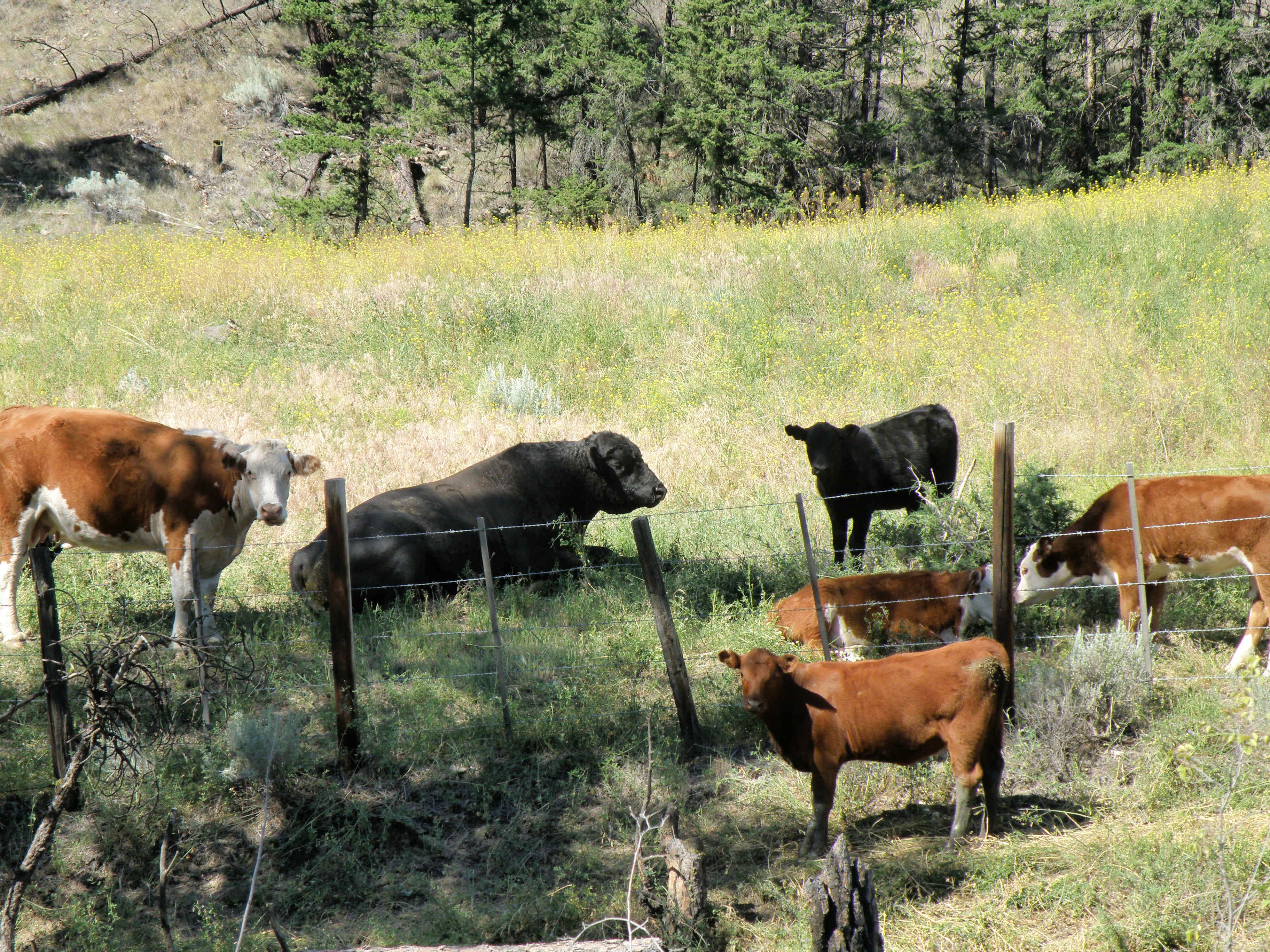
This grouping was described to me by my friend Max as a perfect example of a bull and his harem–and the ‘harem’ got nervous and didn’t remain in place very long once I began snapping pictures. The bull couldn’t have cared less what I was up to, and just lay there chewing.
The very prominent tree in the painting is placed to provide focus. Rather than leave in the barbed wire fence (in front of them), a natural enclosure is placed behind to sneak a storyline into the scene (the best grass lies out of reach)—that, and taking out the wire fence gives a more natural feel to the setting.
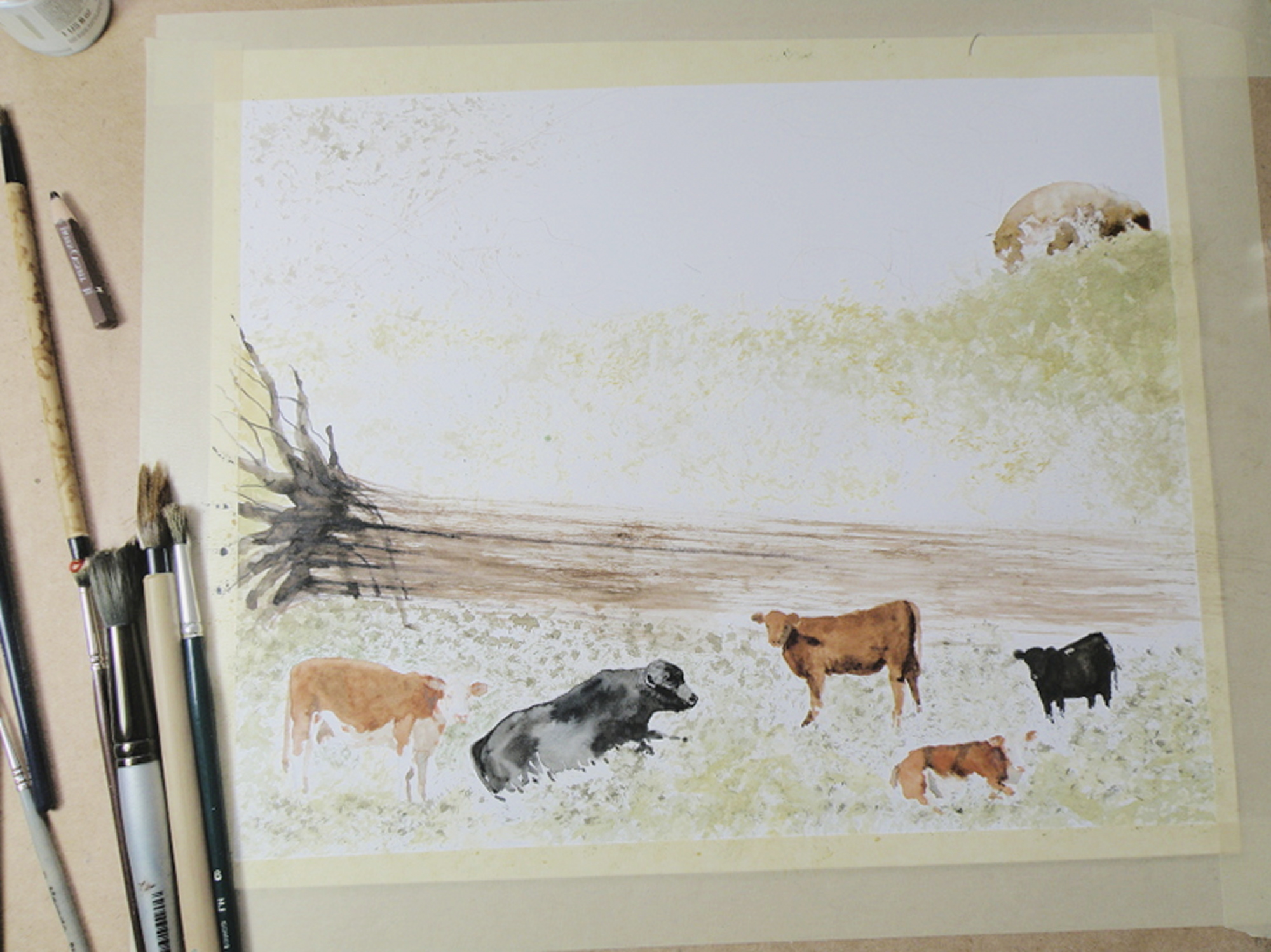
IN THIS GRASS RICH region, cattle roam all over boulder-strewn and mountainous terrain throughout the Spring and Summer. They are finally rounded up on horseback in classic cowboy style in the Autumn. Because of this, the beef from Kamloops is renowned for its organic, grass fed superior flavour and quality.
painting progression . . . 2 “Cows”
April 13, 2015
THE PAPER IN USE HERE is a very smooth-surfaced one called Hot Press (140 lb.) by the French Company, Arches (a very old watercolour paper maker). Hot Press paper has virtually no surface texture at all and is slightly cream-toned. When papers are this smooth, the paint initially floats on top before being absorbed. This floating quality creates effects a rough surfaced paper can’t deliver.

So Hot Press paper looks and feels pretty much like dollar store poster paper–smooth, shiny, and about the same thickness. And because it is not a heavy paper, and because it is so smooth, Hot Press watercolour paper cannot take a lot of scrubbing out if mistakes are made. The painter needs to be rather confident about the strength and amount of pigment to use before putting brush to paper. So because I am always a bit tentative when beginning to paint something as challenging as an animal, I gain confidence by always having a scrap piece of watercolour paper handy to try things out on first. Once I see how to do it on a scrap piece of paper, then I have confidence to do the same thing on the painting itself.
It needs to be stressed that Arches paper is superb and bears absolutely no comparison to poster paper when paint is applied to it. The weight (140 lb) is how thick the paper is. 300 lb. paper is very thick and therefore can take a lot more scrubbing and multiple washes, without losing luminosity. The downside is that 300 lb. watercolour paper is quite a bit more expensive. And when I work on very expensive paper, I am too aware of its cost. That makes me somewhat nervous about possibly ruining the painting. So I usually choose 140 lb. paper because if it gets ruined, I am not that concerned, and so therefore approach the painting with more boldness which gives a better result.
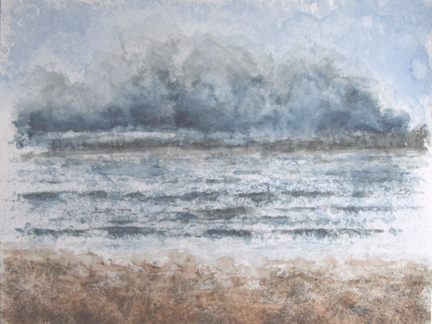
Local Mountains 2
April 9, 2015
THIS COMPLETED PAINTING of the mountains in our Kamloops area was in need of cropping in order to strengthen the composition . . .
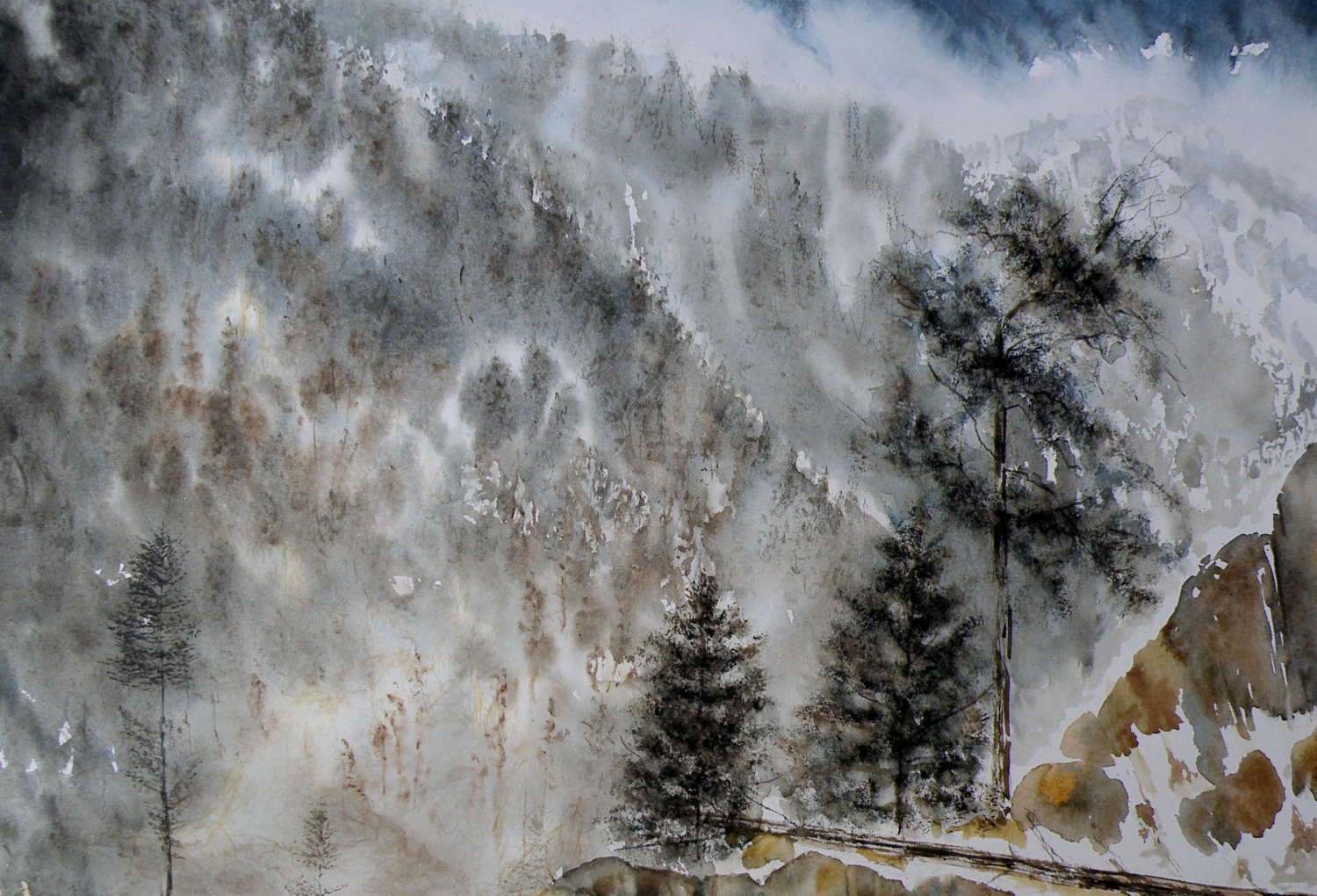
THE PAINTING WAS REDUCED IN SIZE down to this as the completed painting .. .
THE CHOPPED OFF parts of cropped work can successfully be made into bookmarks, I’ve found, and then be sold for around $2 ea in our little co-op Gallery (www.kamloopscourthousegallery.ca). Waste not, want not, lol!
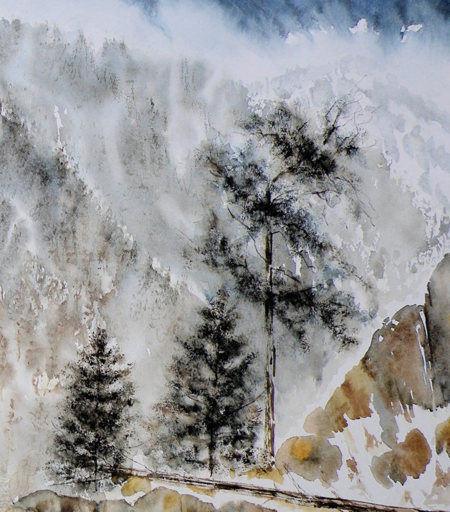
Local Mountains
April 8, 2015
A decision has to be made as to whether this painting ‘holds up’, composition-wise. It succeeds in conveying the misty atmospheric conditions of winter in the mountains. But the composition is troubling me.
The Federation of Canadian Artists’ National Show
April 7, 2015
THE FEDERATION OF CANADIAN ARTISTS had its beginnings in 1941, and had as its goal the unified representation of all Provinces through one organization. Canada’s premier artists, The Group of Seven, were instrumental in organizing The FCA, with A. Y. Jackson as the Ontario head, and Lawren Harris in charge of the West Coast region.
TODAY THE FCA has become largely a Western Canadian organization with most of its activity within the Province of British Columbia. The hub is Vancouver [www.artists.ca] with regional Chapters throughout B. C. and Southern Alberta. The Thompson Nicola Shuswap Chapter (which I am a member of) has been hosting two Annual Art Shows for many years, with the 2015 National Show being mounted this coming Wednesday, April 8th.

THE NATIONAL SHOW is open to any qualifying FCA member, but submissions for jurying are limited to 3. Digital images of a member’s work are submitted to Vancouver and juried by three Signature Artists who use a point system to arrive at which pieces will be accepted and which will be declined. Of the 130+ digital entries, only 85 pieces are selected for inclusion into this National Show.
MY OWN SUBMISSIONS (two) have been juried, one being accepted–
‘Approaching Storm, Sechelt’, 25cm x 35.5cm (10.5″ x 14″), Watercolour on board
It is considered an achievement simply to get into this Art Show, while Opening Night, Friday the 10th, will be the occasion when $2800.00 in Prizes are awarded by another set of Jurors for those paintings which stand out as the best of The Best. Only once has a piece of mine ever been awarded a prize.
SENIOR MEMBERS OF THE FEDERATION have these paintings being considered for The SFCA Prize, with only one receiving top honours.
NEARLY ALL THE WORK submitted by artists for these Shows is rendered in acrylics or oils, with some pastel, and a few watercolours, and fewer still graphite drawings. Watercolour, generally, is not the preferred medium of most painters. It is considered difficult and problematic because of its demands and limtations.
New bird miniatures
April 6, 2015
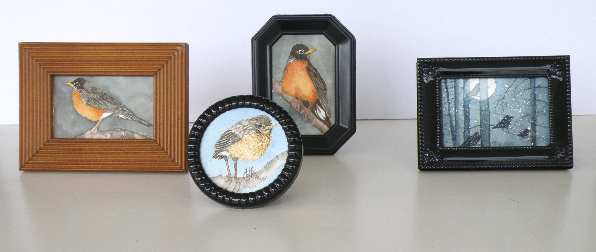
The image sizes here are approximately 5cm x 8cm (2″ x 3″). I use a pair of rather strong magnifying glasses when working this small–the kind you find on display at pharmacies (around here they’re referred to as ‘cheaters’). So when working on a tiny miniature they are an enormous help, until I turn to go check on something in the kitchen and walk into the wall, lol.
Painting progression 3…. ‘Jamieson Creek Thaw’
April 4, 2015
BECAUSE WATERCOLOUR is such a watery, transparent, delicate medium–one which must always allow the paper it’s laid on top of to breathe through it–one which traditionally doesn’t use white pigment, but relies on the paper to be the white of the painting–BECAUSE of this (and more) the challenge of the watercolour student is to convey an illusion of texture, without the ability to actually build up a surface texture.
WERE WATERCOLOUR PIGMENT applied so thickly as to create an impasto-like texture on the paper beneath, it would lose its luminosity and look pasty, muddy, dull–worse, it would crack. Watercolour pigment only works when the paper beneath dazzles through it and brings life to the pigmentation. In other words, watercolour as a medium is more the business of staining paper than it is a business of building up layers and coats of daubs, stipples, slatherings.
THAT’S WHY CARE is required to not apply so many washes that the luminosity of the paper receeds and eventually provides no life at all. And that’s why the whites of the paper must be thoughtfully reserved and left untouched in key areas–the crests of waves; the moon; snow; clouds; a picket fence–and skill taken to paint AROUND these places to let the paper be the white.
SO….a student of watercolour (me) learns early-on that (s)he will be a student of the medium for life–that mastery is illusive–and failures, many. A good piece is approached very thoughtfully, noting where the paper will be left to serve the function of white (pigment) and painted around. Then the student will also have to gather enough courage to apply exceedingly dark washes in one ‘go’, while maintaining a sense of secure, carefree animation in order to present an immediacy and liveliness in the final piece.
THE DEATHKNELL of a failing, dying work of watercolour is finicky overworking of areas, and a refusal to accept what happened when water joined pigment joined brush joined paper. It is NOT a medium for those who love to micro-manage or be in control.
THE STUDENT OF WATERCOLOUR has to be more a Peter Pan than a child wanting to grow up–loving the thrill of what happens when ‘danger’ is courted, yet having the assurance that daring will win the day. However, that daring and search for adventure–on the surface of a good piece of paper–will only be pulled off if it is backed by enough experience to have a good hunch about what will happen when such-and-such is tried.
ATTEMPTING what remains beyond one’s ability isn’t courting danger–it is ignoring it. Trying to fly without thinking happy thoughts will give a person a broken bone. Within the bounds of representational art–(i.e. wishing to have a tree ‘look like’ a tree)–a painter cannot ‘pull off’ a landscape with lots of shadows if (s)he has yet to study them in some depth. Trying to do a scene which includes far far more than what one yet learned how to interpret is an invitation to frustration and wanting to give up watercolour for say, acrylics (oh, my).
AND SO FOR MYSELF, I know by this time that I must confine my attentions to learning about how corn grows, what it feels like, looks like, behaves like, before I can throw my abandonment into rendering a watercolour of winter corn in January. Not only that, but I must also have studied the qualities of snow–the qualities of what a winter sun does to shadows of corn stalk–the blues, the purples. And only then can a learned abandonment bring about a possible reward.
IT TAKES A LONG TIME to find the right paper, the right brushes, the right working pallet of colours, the right approach and the right subject matter. Knowing what can be done when paper is sopping wet–and what can’t–depends on who made the paper, how thick it is, how textured it is, how stretched it is, how quickly it will dry. Knowing when to wait until the paper is exactly wet or damp or dry enough to throw one’s energies at it, comes (usually) through ruining (many pieces of) good paper.
HERE IS THE LATEST DEVELOPMENT of the subject of Jamieson Creek in a February thaw…..
TOMORROW will (hopefully) provide a photo of the finished piece!
Painting progression 2…. ‘Jamieson Creek Thaw’
April 3, 2015

Painting progression 1…. ‘Jamieson Creek Thaw’
April 2, 2015
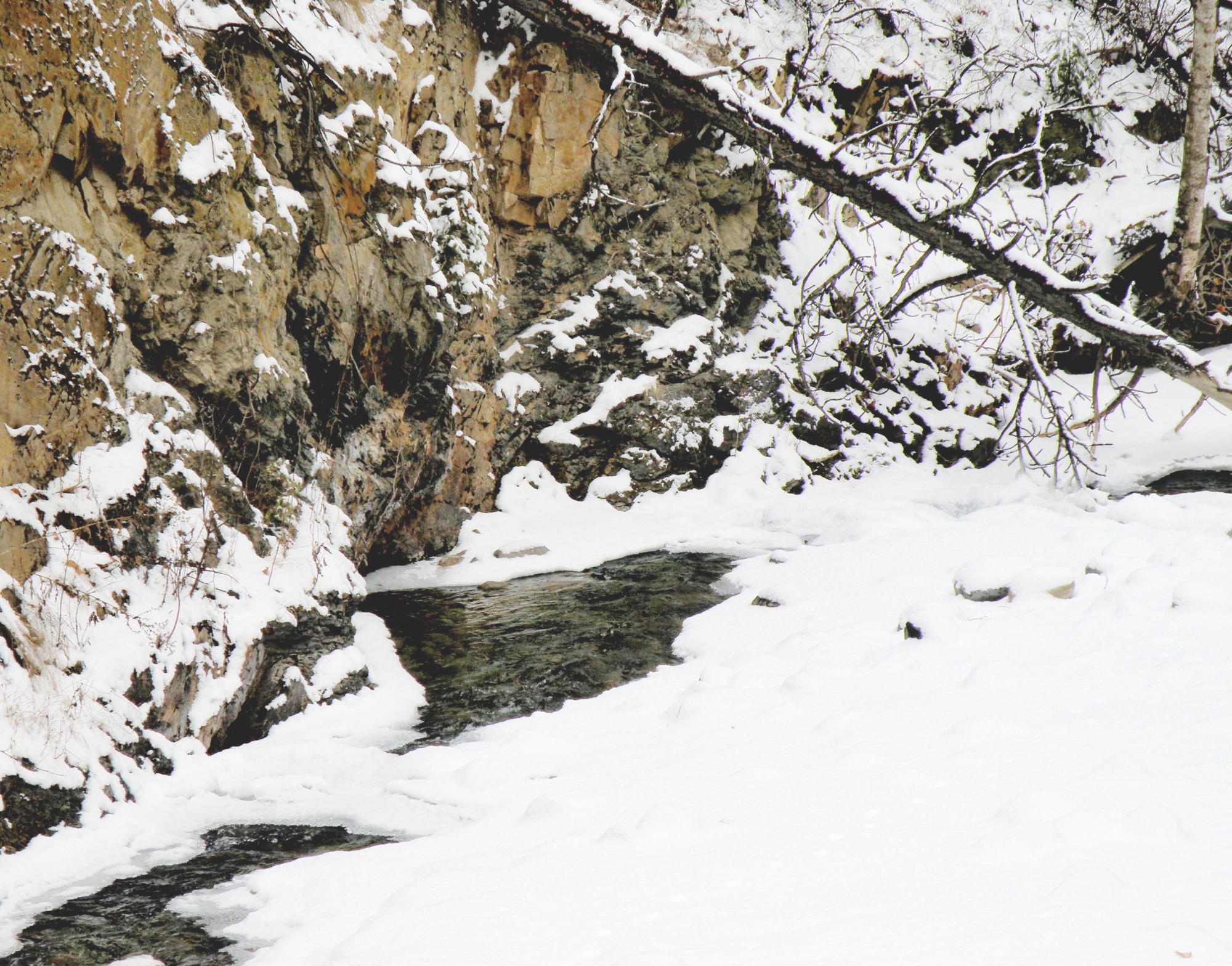
JAMIESON CREEK is about a 15 minute drive from our home, along a dirt logging road. The Kamloops, British Columbia, region is a geologist’s dream come true, featuring some of the oldest mountains in Canada. As a student of watercolour, I am fascinated by stone and rock, particularly because it is so challenging as a subject.
This is Jamieson Creek, taken four years ago around February, early March….
And here is my initial drawing of the subject…..

As you can already see, photography is not my gift (which is why I paint, lol)–so forgive the darkness. It was taken, pre-dawn in the spare room which serves as a studio.
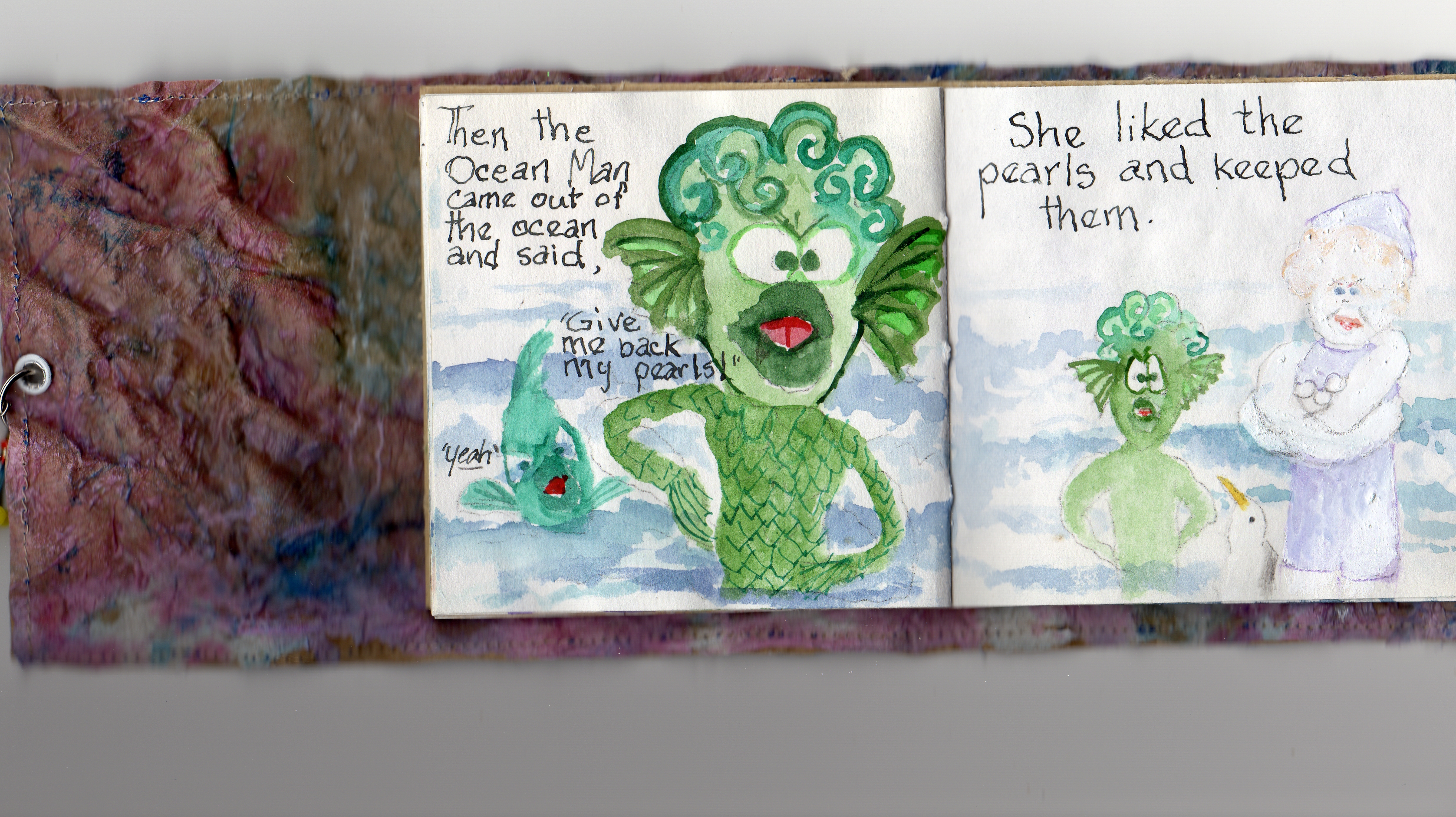
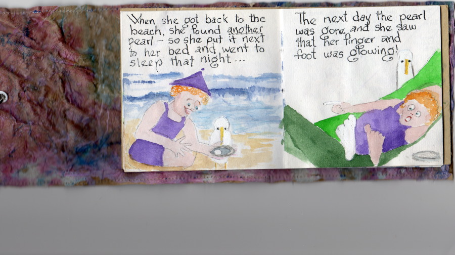
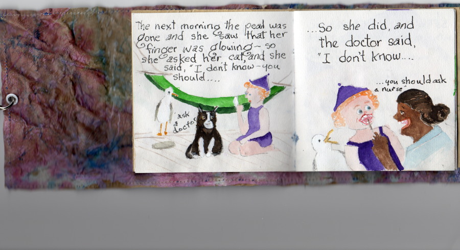
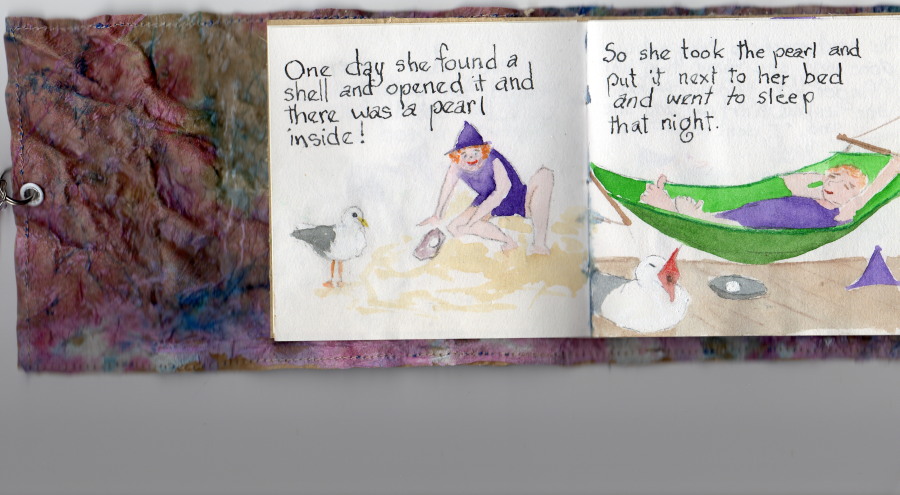
Moral: don’t mess with Mother Nature (or the Ocean Man).
~~~~~
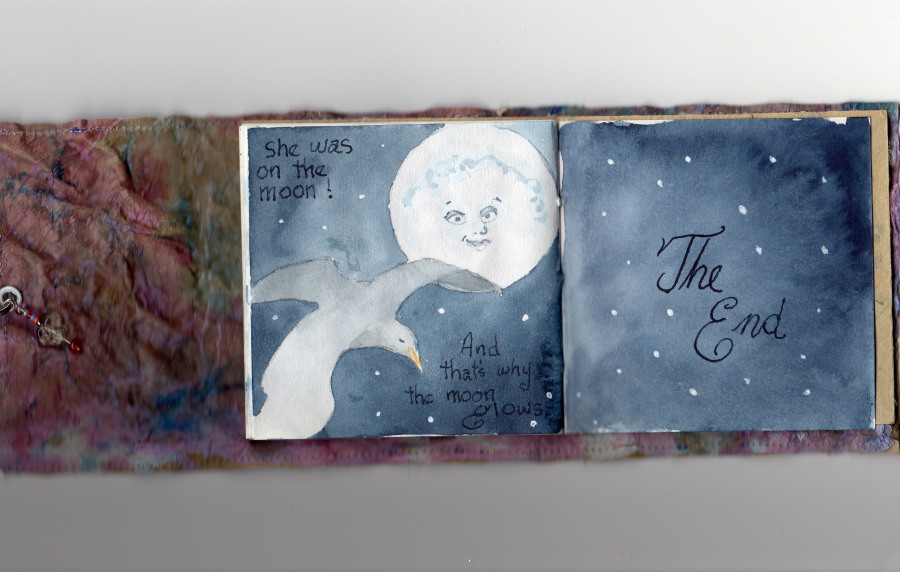
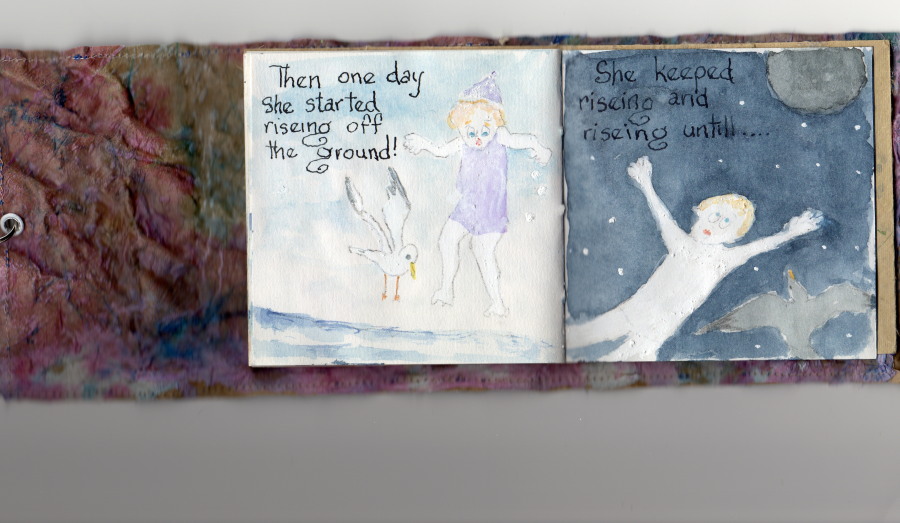
Aneleise (Ane) at her Grandparents’, age 8. . .

. . .’why the moon glows’ by Ane Jones (age 8)
March 31, 2015
……’why the moon glows’, by Ane Jones (age 8)
March 30, 2015
……’why the moon glows’, by Ane Jones (age 8)
March 29, 2015

……’why the moon glows’, by Ane Jones (age 8)
March 28, 2015

……’why the moon glows’, by Ane Jones (age 8)
March 27, 2015
……’why the moon glows’, by Ane Jones (age 8)
March 26, 2015

……’why the moon glows’, by Ane Jones (age 8)
March 25, 2015
……’why the moon glows’, by Ane Jones (age 8)
March 24, 2015
……’why the moon glows’, by Ane Jones (age 8)
March 23, 2015

Same subject, different take…
March 17, 2015
THE OLD SCHOOLHOUSE is once again the subject……

THIS TIME around, a horse was to be included, which meant it could not be a nocturnal scene, as that would be an odd addition to a night painting. The choice was made to have only a single horse, even though horses are most often seen in pairs or groups, being a social animal…..
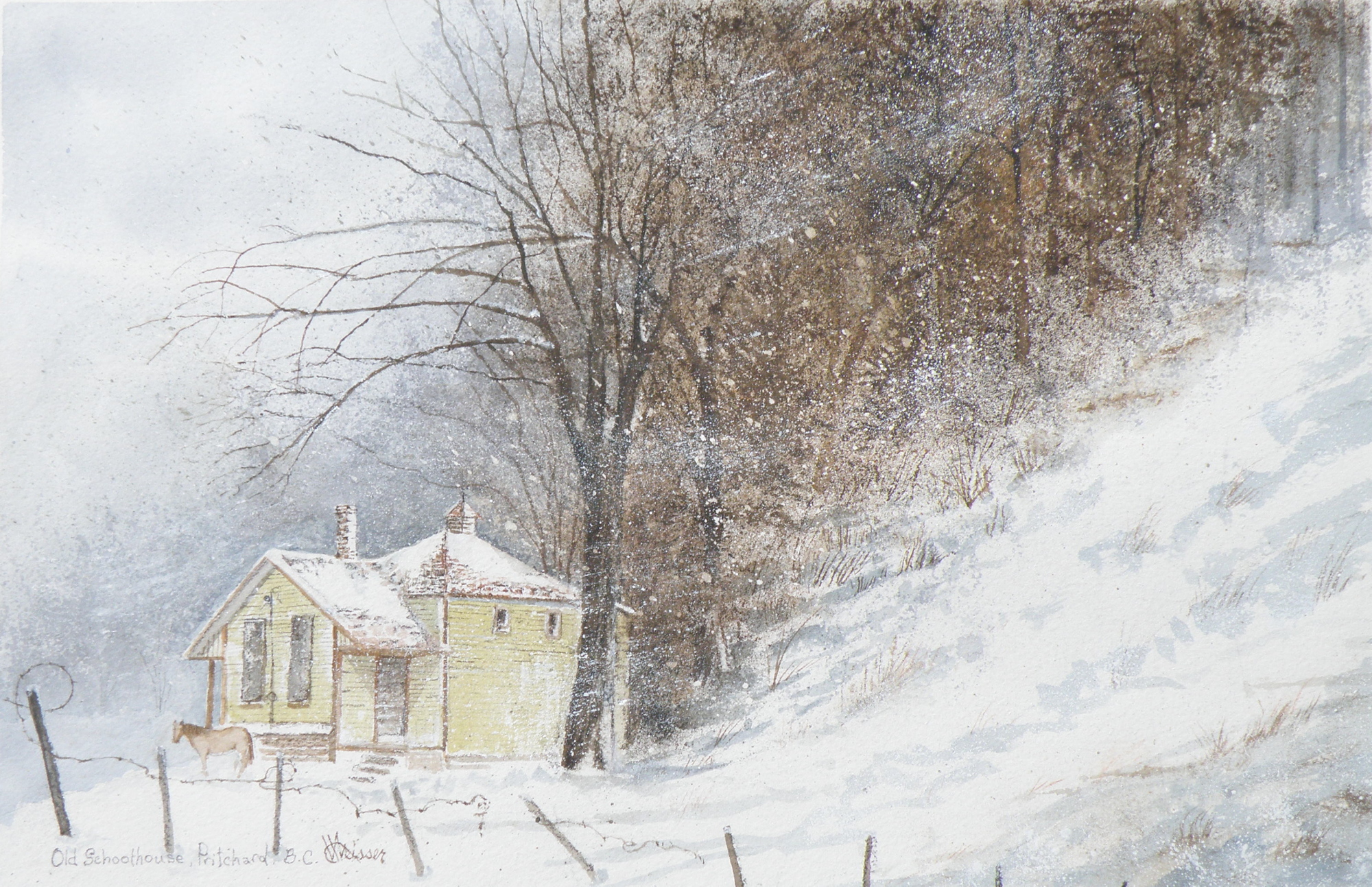
THE DECISION over depicting a single horse was selected as adding to the feeling of isolation: a lone horse beside an abandoned school in a lonely, forgotten field in the dead of winter……
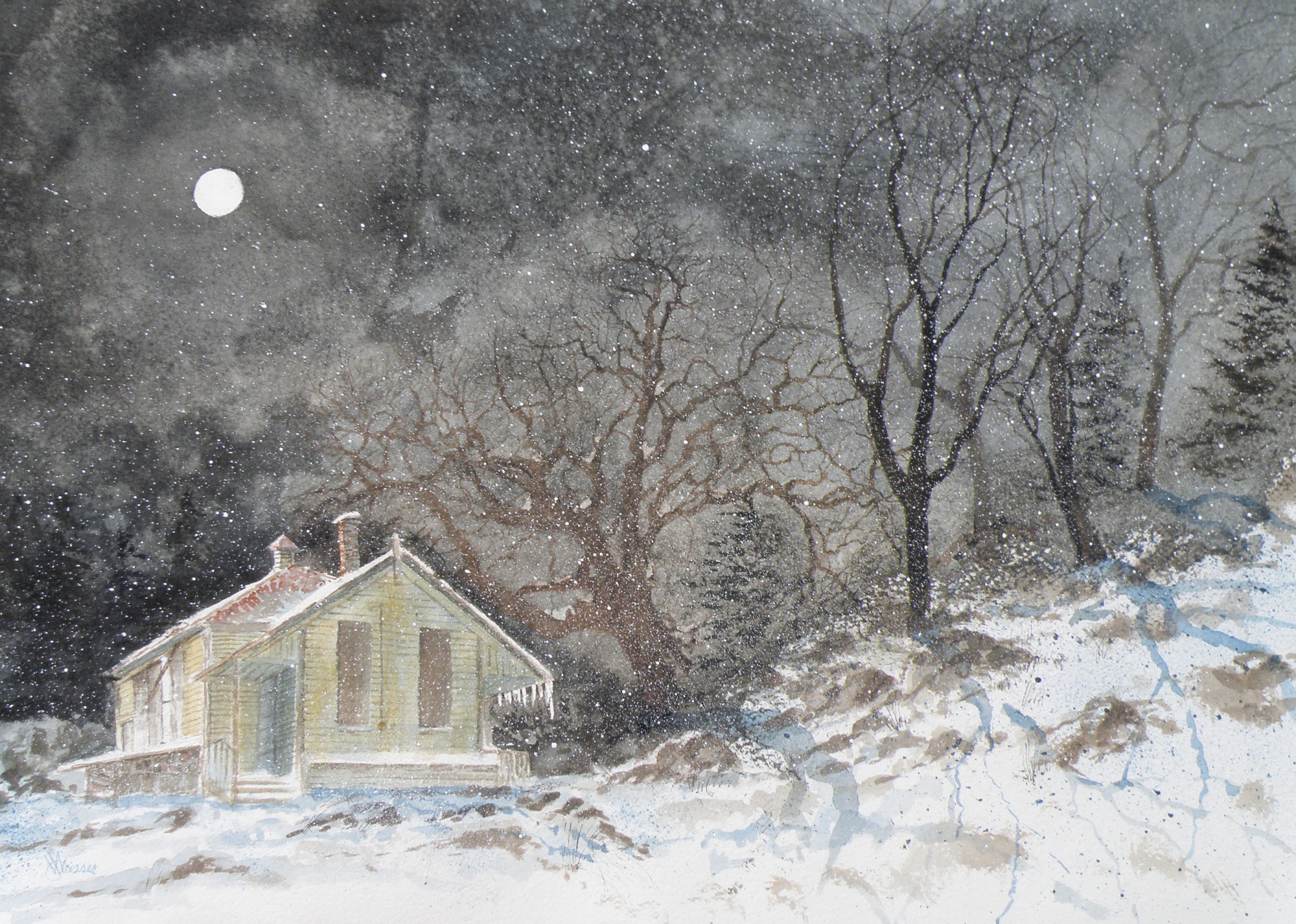
“FROZEN IN TIME”
watercolour, 12″ x 15″, 140 lb. Arches Cold Press Paper, Kamloops Courthouse Gallery, Kamloops, British Columbia http://www.kamloopscourthousegallery.ca
Painting progression 5
March 16, 2015
THE FINISHED piece–“Abandoned Schoolhouse, Pritchard”. The rocks needed darkening and definition. Pines were added. Spattering of snow was used to unify the whole and add a feeling of movement.
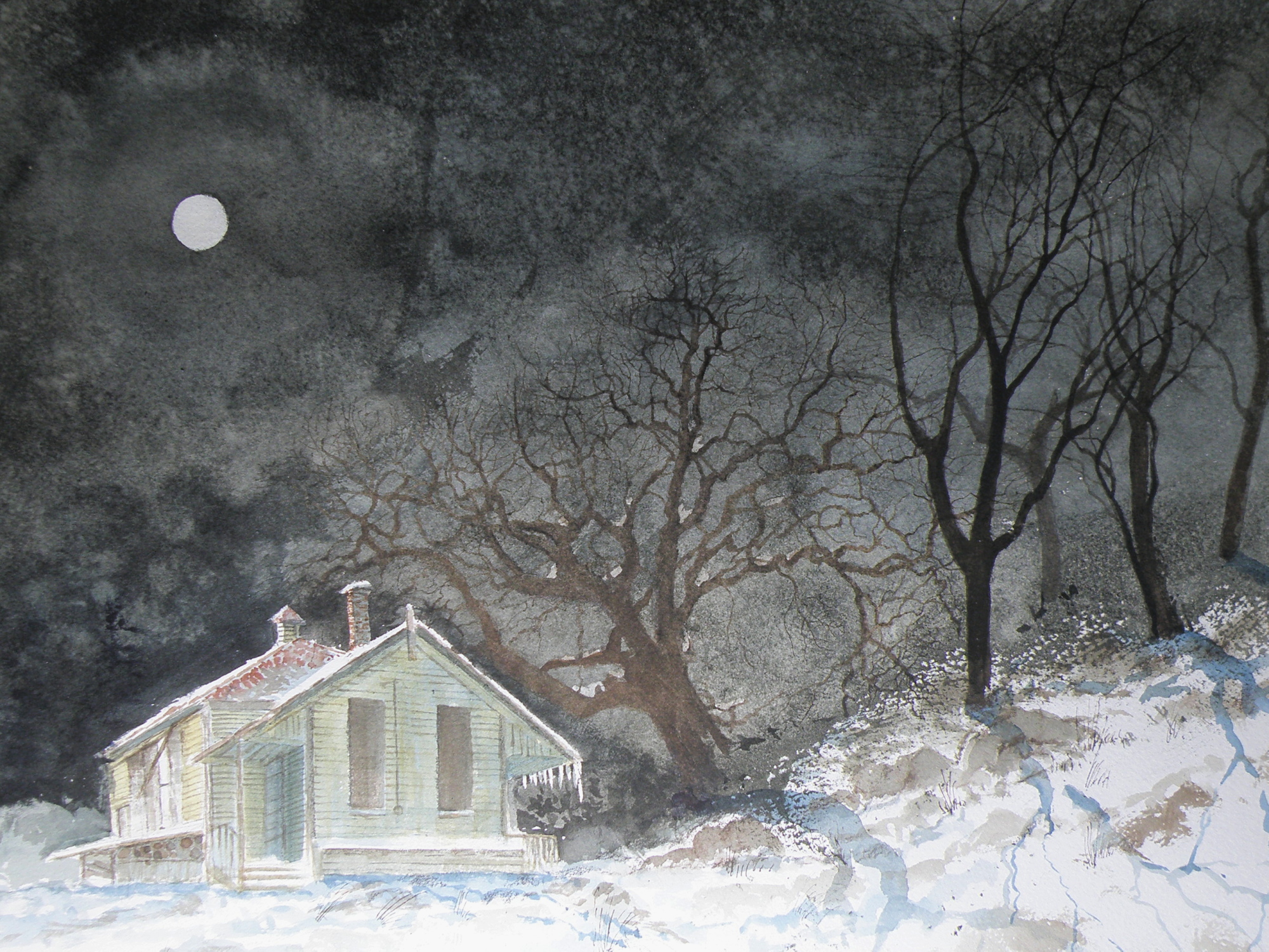
Painting progression 4
March 15, 2015
MORE TREES needed adding. The suggestion of rocky outcrop is introduced. The aging building is blocked in. Shadowing completes this phase…..
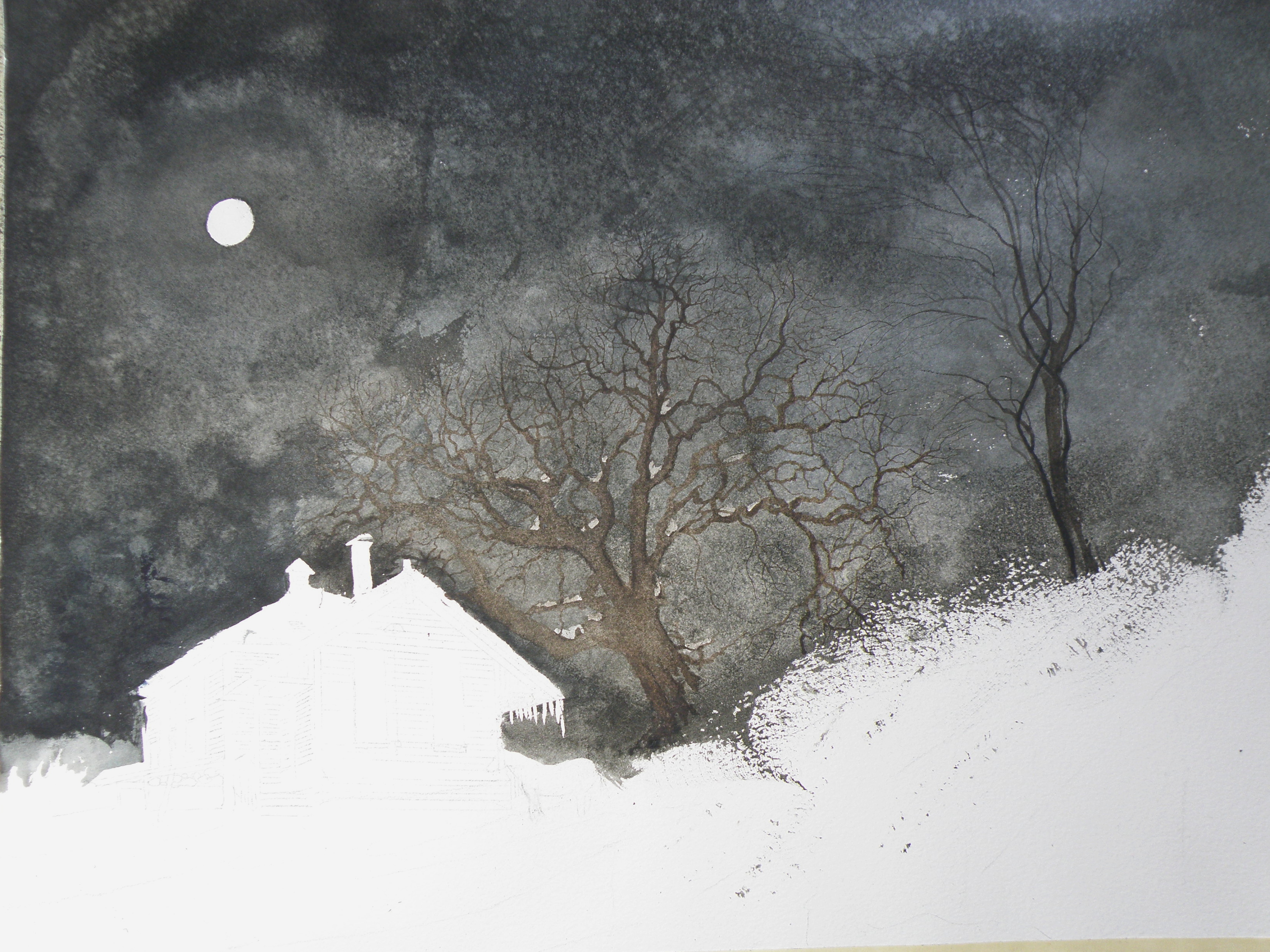
Painting progression 3
March 14, 2015
THE MOON and schoolhouse roof were masked, then a wash applied in the sky areas.
Once done, a decision was made to next eliminate the horse, it becoming an unintended focal point if left in. (A lone horse standing at night in front of an abandoned school in bitter cold would be incongruous).
