Local Mountains 2
April 9, 2015
THIS COMPLETED PAINTING of the mountains in our Kamloops area was in need of cropping in order to strengthen the composition . . .
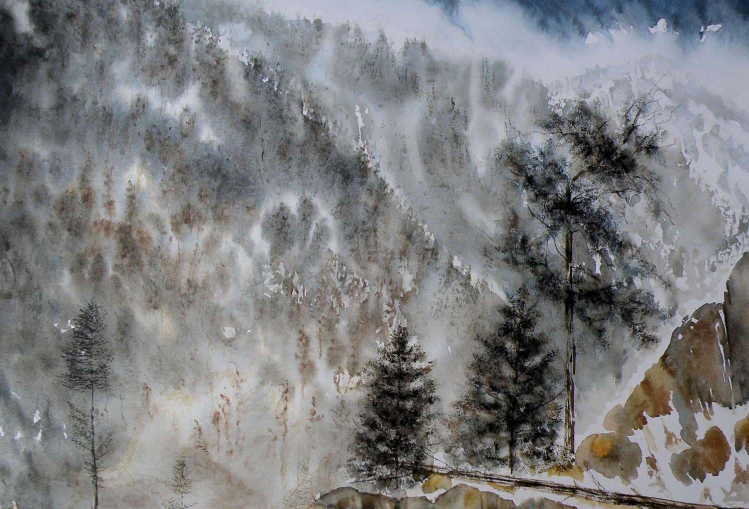
THE PAINTING WAS REDUCED IN SIZE down to this as the completed painting .. .
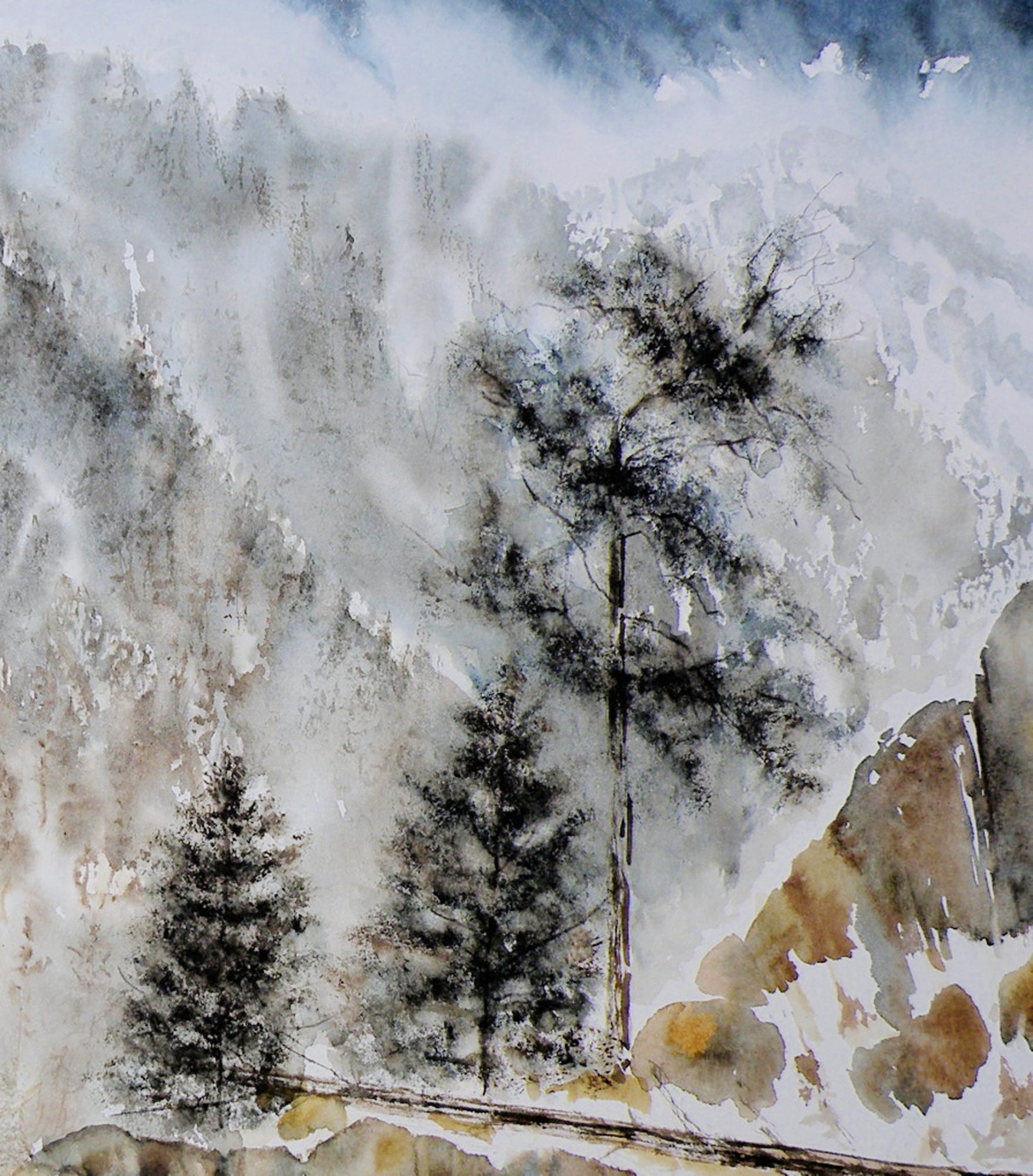
THE CHOPPED OFF parts of cropped work can successfully be made into bookmarks, I’ve found, and then be sold for around $2 ea in our little co-op Gallery (www.kamloopscourthousegallery.ca). Waste not, want not, lol!
Local Mountains
April 8, 2015
A decision has to be made as to whether this painting ‘holds up’, composition-wise. It succeeds in conveying the misty atmospheric conditions of winter in the mountains. But the composition is troubling me.
A FEW LAST COMMENTS about this painting…..there is a decided difference between nature and the art of depicting nature. Mother Nature is not only a hoarder, but not interested in housekeeping nor pruning, encapsulating, or boiling-down. She wants it all, all the time, and enjoys lavishing on us the plentitude of what happens when everything we look at, at any given moment, reproduces at will and overwhelms us with dozens–and even thousands–of itself.
FOR THE LANDSCAPE PAINTER the challenge, always, is to take Nature and make it into Art. It is the very human discipline of paring down, re-arranging, configuring and composing. What separates raw Nature from the art of painting is having a limited space, with only two dimensions, which is ultimately going to end up on a wall inside a human-made space. That restrictiveness requires moving trees and clouds and birds about in order to have a sense of balance or sense of wonder or sense of drama. It means the painter must dare to alter time itself, put limits on colour, and restrict amounts of what is naturally before the painter’s eyes.
MAKING ART is similar to the difference between looking at a field of wheat and sitting down to a loaf of freshly-baked bread. What happens between those two events is the act of altering something to create something else.
THIS PAINTING is not what the photograph of this scene looks like. For many years I struggled with whether I was ‘allowed’ as a painter to do anything other than depict Nature as it presented itself to me. Sitting out on some stoney ground, I would suddenly find myself slavishly working at painting the weeds between cracks of rock, then painting the seed heads on the weeds to look exactly like what my eyes saw, when really I knew the larger purpose of sitting there in the hot sun was not to pay attention to weeds, but to paint the distant mountains above and beyond them. By the time I’d gotten away from doing weeds justice, I was so hot I had to fold up my equipment and go back to the car. And I went home with a painting of weeds between rocks and a big expanse of white paper above them.
THAT DOESN’T HAPPEN ANYMORE. I have learned that I must take what is presented to me and do with it as I wish to do. That is the work of a painter.
A PHOTOGRAPHER has a whole different set of challenges because a lens is very different from a human eye (it can’t do half of what a living, ‘breathing’ eye can do) and from human imagination (once it has seen what is before the eye) . But I have noticed some irony happening between the worlds of photography and painting. In the past, painters often worked very diligently to make a painting ‘look like’ a photograph. These days, with technological photo-shopping manipulation, a photographer seems more or less obsessed with trying to make a photograph look like a painting. I am not convinced either enterprise is worth spending all that amount of time on.
IF A PAINTER WISHES TO BE A PHOTOGRAPHER, then don’t go trying to make a painting into a photograph. Do go and take courses and buy equipment and learn how to take photographs and do the work a photographer must work at in order to eventually become a photographer. And IF A PHOTOGRAPHER WISHES TO BE A PAINTER, then leave the photo-shopping manipulation apps alone and do take courses and buy equipment and learn how to paint paintings and do the work a painter must work at in order to eventually become a painter. They are two distinctly separate and inherently different artforms and–in my flawed way of viewing things–should stay that way.
AND YOU…what’s your view? Tell me how I’m missing things you’ve discovered!
Painting progression 3…. ‘Jamieson Creek Thaw’
April 4, 2015
BECAUSE WATERCOLOUR is such a watery, transparent, delicate medium–one which must always allow the paper it’s laid on top of to breathe through it–one which traditionally doesn’t use white pigment, but relies on the paper to be the white of the painting–BECAUSE of this (and more) the challenge of the watercolour student is to convey an illusion of texture, without the ability to actually build up a surface texture.
WERE WATERCOLOUR PIGMENT applied so thickly as to create an impasto-like texture on the paper beneath, it would lose its luminosity and look pasty, muddy, dull–worse, it would crack. Watercolour pigment only works when the paper beneath dazzles through it and brings life to the pigmentation. In other words, watercolour as a medium is more the business of staining paper than it is a business of building up layers and coats of daubs, stipples, slatherings.
THAT’S WHY CARE is required to not apply so many washes that the luminosity of the paper receeds and eventually provides no life at all. And that’s why the whites of the paper must be thoughtfully reserved and left untouched in key areas–the crests of waves; the moon; snow; clouds; a picket fence–and skill taken to paint AROUND these places to let the paper be the white.
SO….a student of watercolour (me) learns early-on that (s)he will be a student of the medium for life–that mastery is illusive–and failures, many. A good piece is approached very thoughtfully, noting where the paper will be left to serve the function of white (pigment) and painted around. Then the student will also have to gather enough courage to apply exceedingly dark washes in one ‘go’, while maintaining a sense of secure, carefree animation in order to present an immediacy and liveliness in the final piece.
THE DEATHKNELL of a failing, dying work of watercolour is finicky overworking of areas, and a refusal to accept what happened when water joined pigment joined brush joined paper. It is NOT a medium for those who love to micro-manage or be in control.
THE STUDENT OF WATERCOLOUR has to be more a Peter Pan than a child wanting to grow up–loving the thrill of what happens when ‘danger’ is courted, yet having the assurance that daring will win the day. However, that daring and search for adventure–on the surface of a good piece of paper–will only be pulled off if it is backed by enough experience to have a good hunch about what will happen when such-and-such is tried.
ATTEMPTING what remains beyond one’s ability isn’t courting danger–it is ignoring it. Trying to fly without thinking happy thoughts will give a person a broken bone. Within the bounds of representational art–(i.e. wishing to have a tree ‘look like’ a tree)–a painter cannot ‘pull off’ a landscape with lots of shadows if (s)he has yet to study them in some depth. Trying to do a scene which includes far far more than what one yet learned how to interpret is an invitation to frustration and wanting to give up watercolour for say, acrylics (oh, my).
AND SO FOR MYSELF, I know by this time that I must confine my attentions to learning about how corn grows, what it feels like, looks like, behaves like, before I can throw my abandonment into rendering a watercolour of winter corn in January. Not only that, but I must also have studied the qualities of snow–the qualities of what a winter sun does to shadows of corn stalk–the blues, the purples. And only then can a learned abandonment bring about a possible reward.
IT TAKES A LONG TIME to find the right paper, the right brushes, the right working pallet of colours, the right approach and the right subject matter. Knowing what can be done when paper is sopping wet–and what can’t–depends on who made the paper, how thick it is, how textured it is, how stretched it is, how quickly it will dry. Knowing when to wait until the paper is exactly wet or damp or dry enough to throw one’s energies at it, comes (usually) through ruining (many pieces of) good paper.
HERE IS THE LATEST DEVELOPMENT of the subject of Jamieson Creek in a February thaw…..
TOMORROW will (hopefully) provide a photo of the finished piece!
Painting progression 2…. ‘Jamieson Creek Thaw’
April 3, 2015

Painting progression 1…. ‘Jamieson Creek Thaw’
April 2, 2015
JAMIESON CREEK is about a 15 minute drive from our home, along a dirt logging road. The Kamloops, British Columbia, region is a geologist’s dream come true, featuring some of the oldest mountains in Canada. As a student of watercolour, I am fascinated by stone and rock, particularly because it is so challenging as a subject.
This is Jamieson Creek, taken four years ago around February, early March….
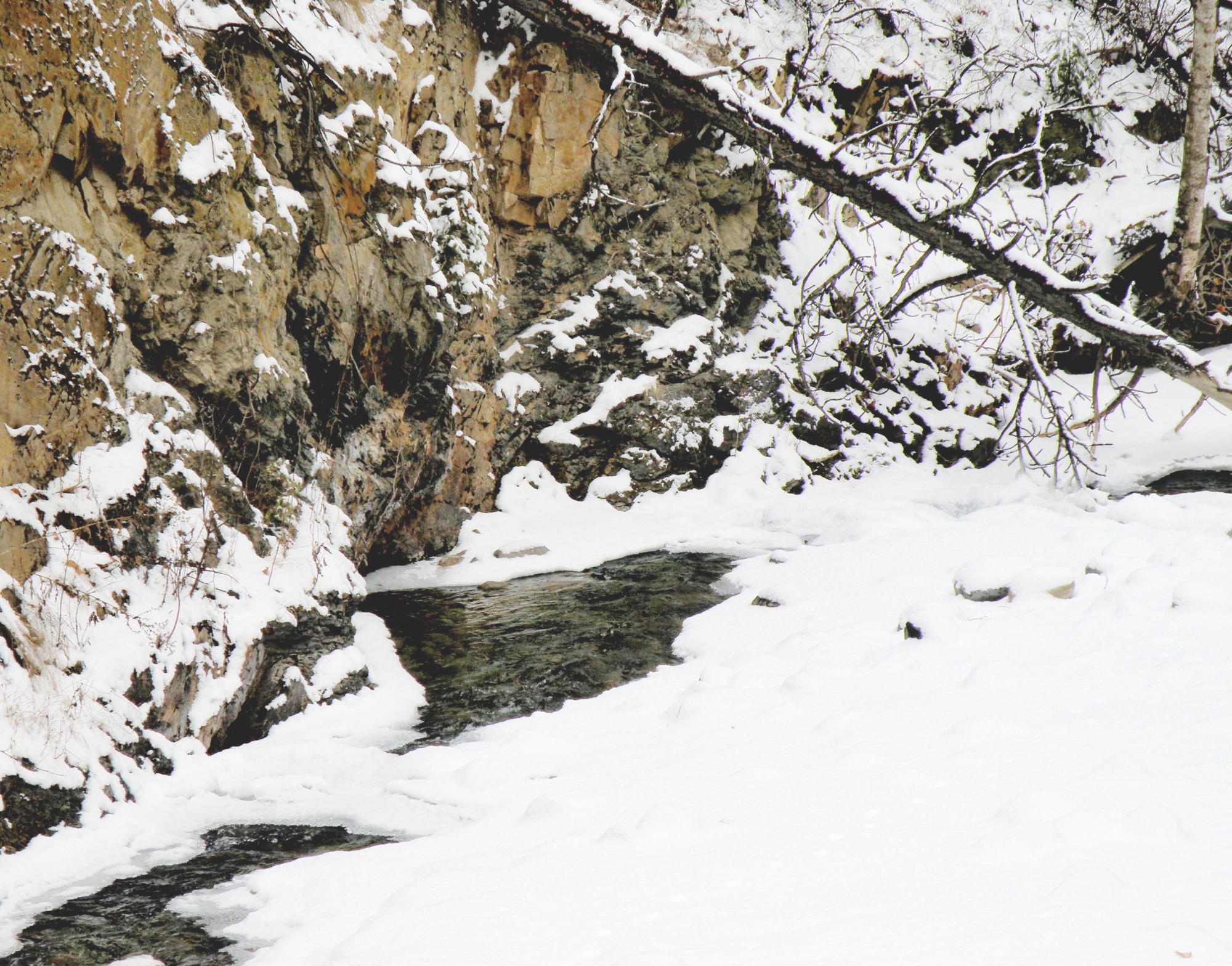
And here is my initial drawing of the subject…..

As you can already see, photography is not my gift (which is why I paint, lol)–so forgive the darkness. It was taken, pre-dawn in the spare room which serves as a studio.
Miniatures
March 20, 2015
THE DARK-EYED JUNCO ignores the feeders hanging in the red maple just beyond the front window, shunning the bossy finch rabble bumping one another off the perches. A Junco will head below, delighting in the shower of sunflower crumbs spit from Goldfinch beaks, already shelled, served on a bed of fresh snow.
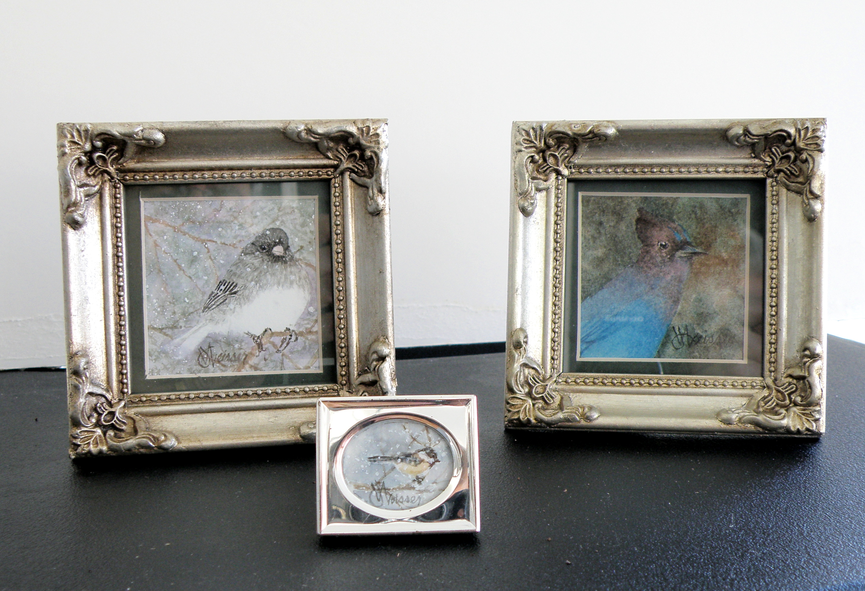
STELLAR JAYS have the tact and grace of a sociopath. Self-absorbed to the point of being incognizant there even are other lifeforms, they bray and scatter seed as though perpetually going through puberty. Once chaos has been accomplished, they go over to our neighbour, Brenda, and do the same with her feeder.
BLACK-CAPPED CHICKADEES dart in to claim a single seed, flit to a branch, hammer the shell apart, then dart in again–chee-cheeing a mantra as though making merry to themselves alone.
2″ x 2″, and 1/2″x 3/4″ , watercolour on Arches 140 lb. Hot Press Paper
Same subject, different take…
March 17, 2015
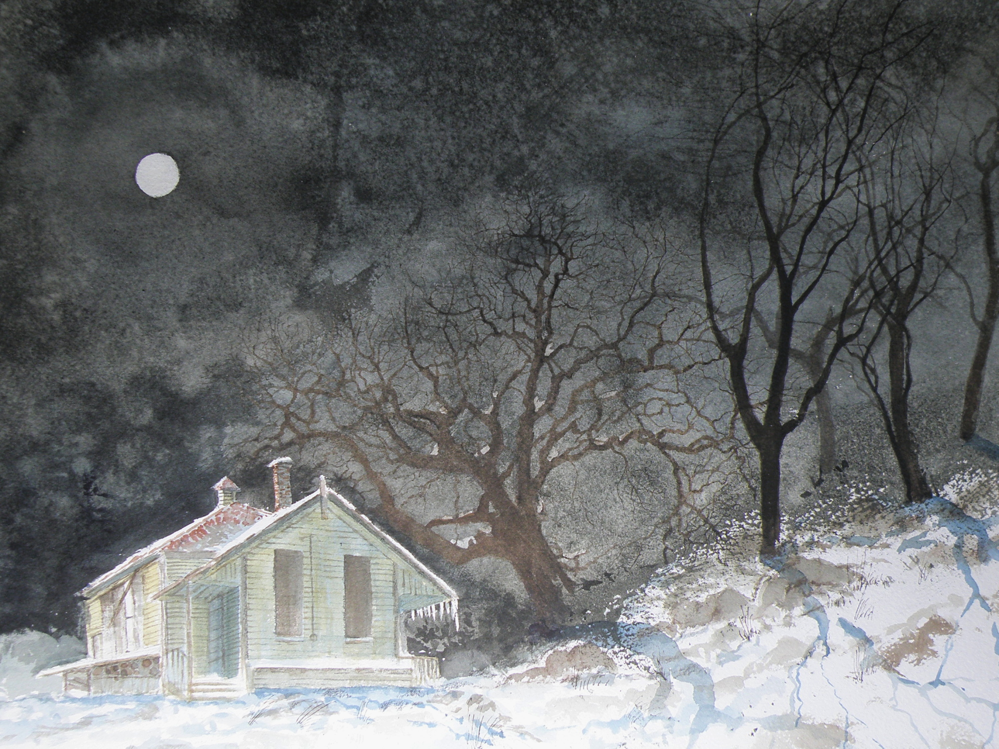
THE OLD SCHOOLHOUSE is once again the subject……

THIS TIME around, a horse was to be included, which meant it could not be a nocturnal scene, as that would be an odd addition to a night painting. The choice was made to have only a single horse, even though horses are most often seen in pairs or groups, being a social animal…..
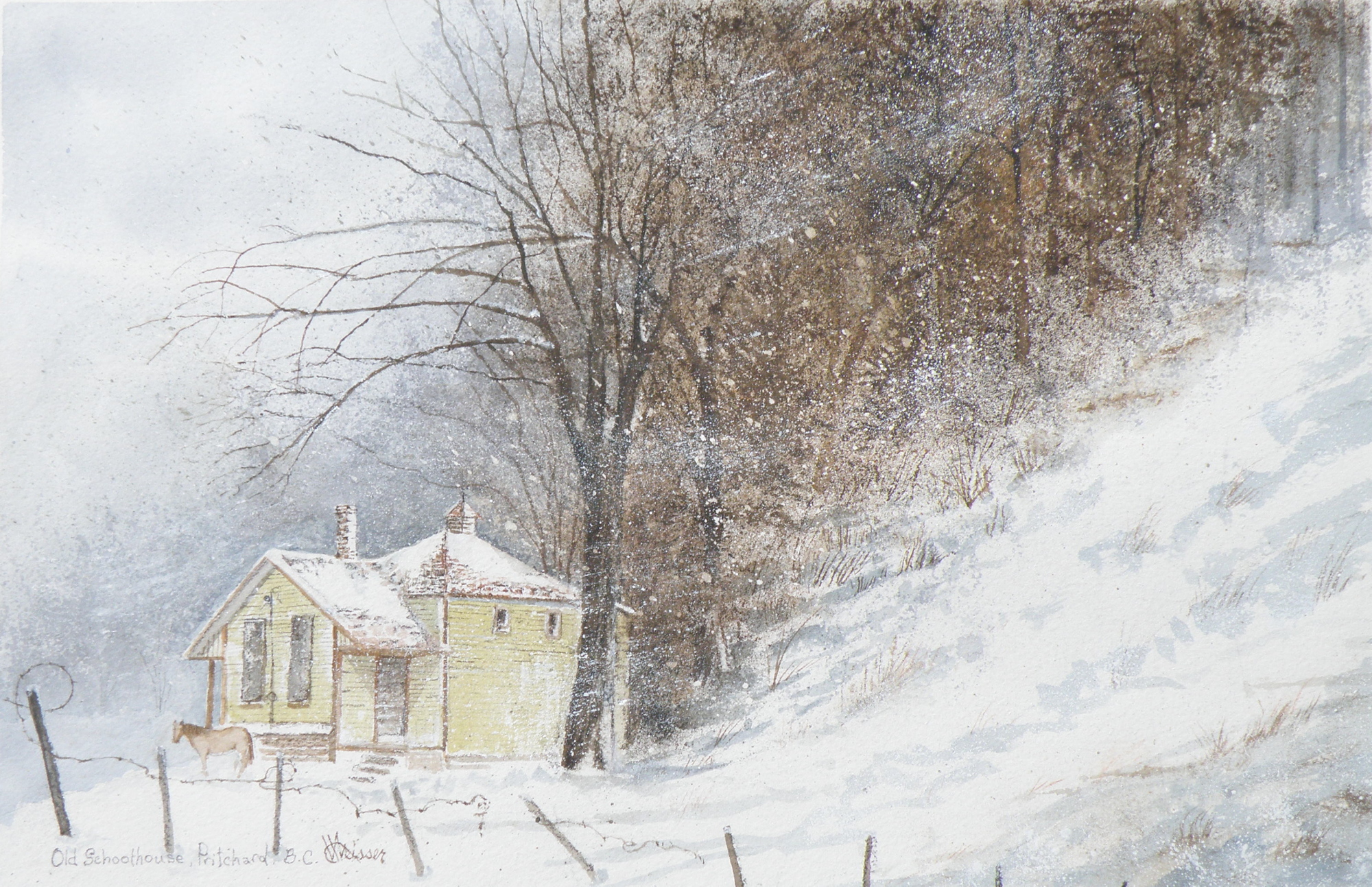
THE DECISION over depicting a single horse was selected as adding to the feeling of isolation: a lone horse beside an abandoned school in a lonely, forgotten field in the dead of winter……
“FROZEN IN TIME”
watercolour, 12″ x 15″, 140 lb. Arches Cold Press Paper, Kamloops Courthouse Gallery, Kamloops, British Columbia http://www.kamloopscourthousegallery.ca
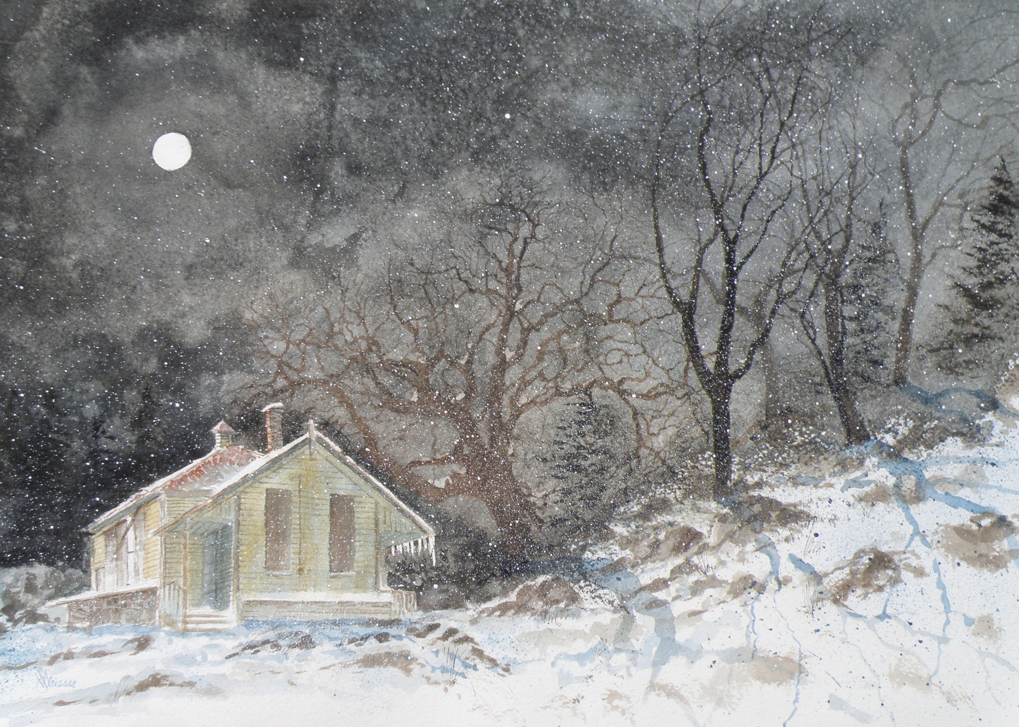
Painting progression 5
March 16, 2015
THE FINISHED piece–“Abandoned Schoolhouse, Pritchard”. The rocks needed darkening and definition. Pines were added. Spattering of snow was used to unify the whole and add a feeling of movement.
Painting progression 4
March 15, 2015
MORE TREES needed adding. The suggestion of rocky outcrop is introduced. The aging building is blocked in. Shadowing completes this phase…..
Painting progression 3
March 14, 2015
THE MOON and schoolhouse roof were masked, then a wash applied in the sky areas.
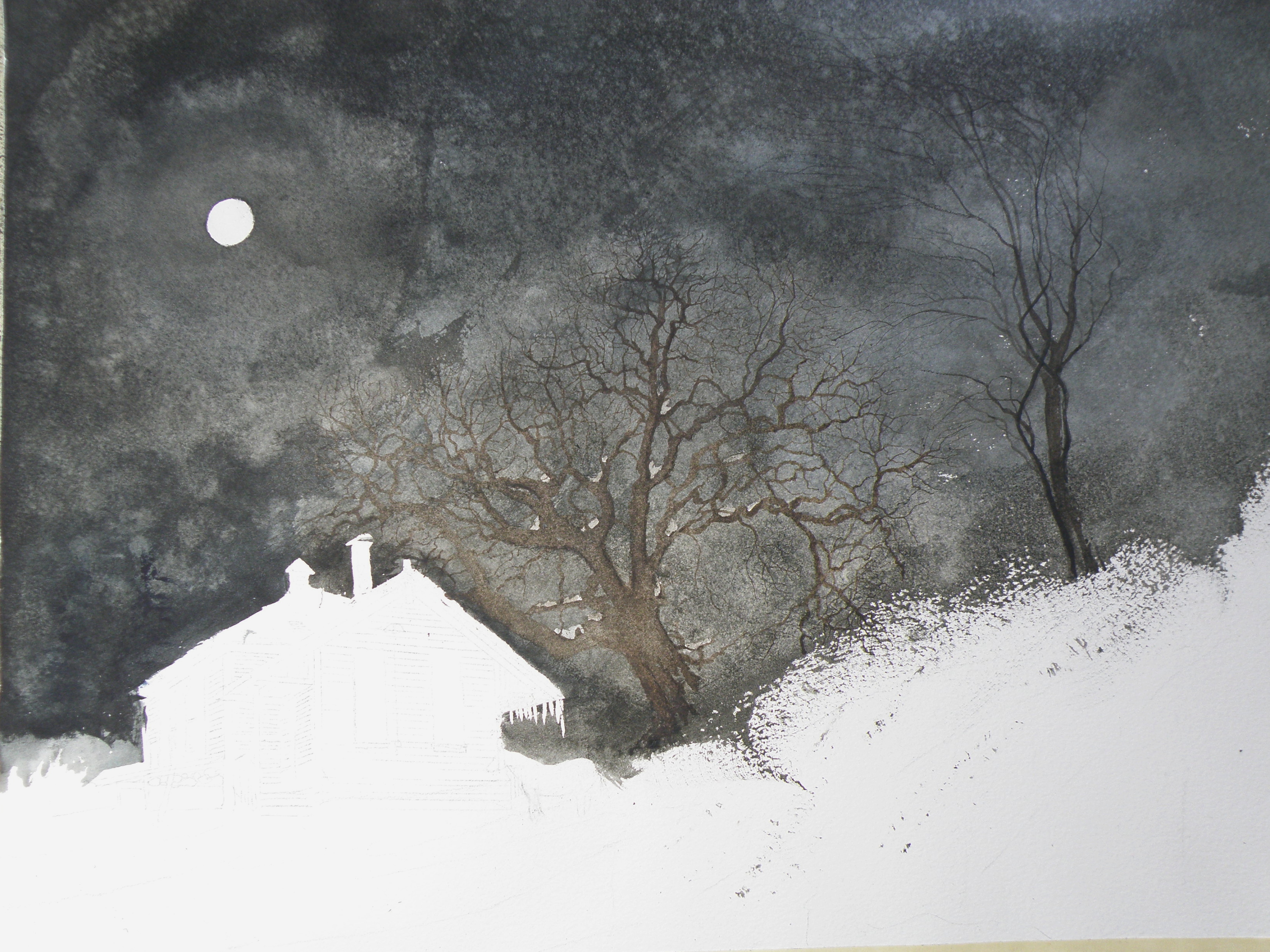
Once done, a decision was made to next eliminate the horse, it becoming an unintended focal point if left in. (A lone horse standing at night in front of an abandoned school in bitter cold would be incongruous).
Painting Progression 2
March 13, 2015
TREES are painted in very dark and the watercolour pigment tempered a bit in order to have it resist being completely taken away by an overlay of secondary wash.
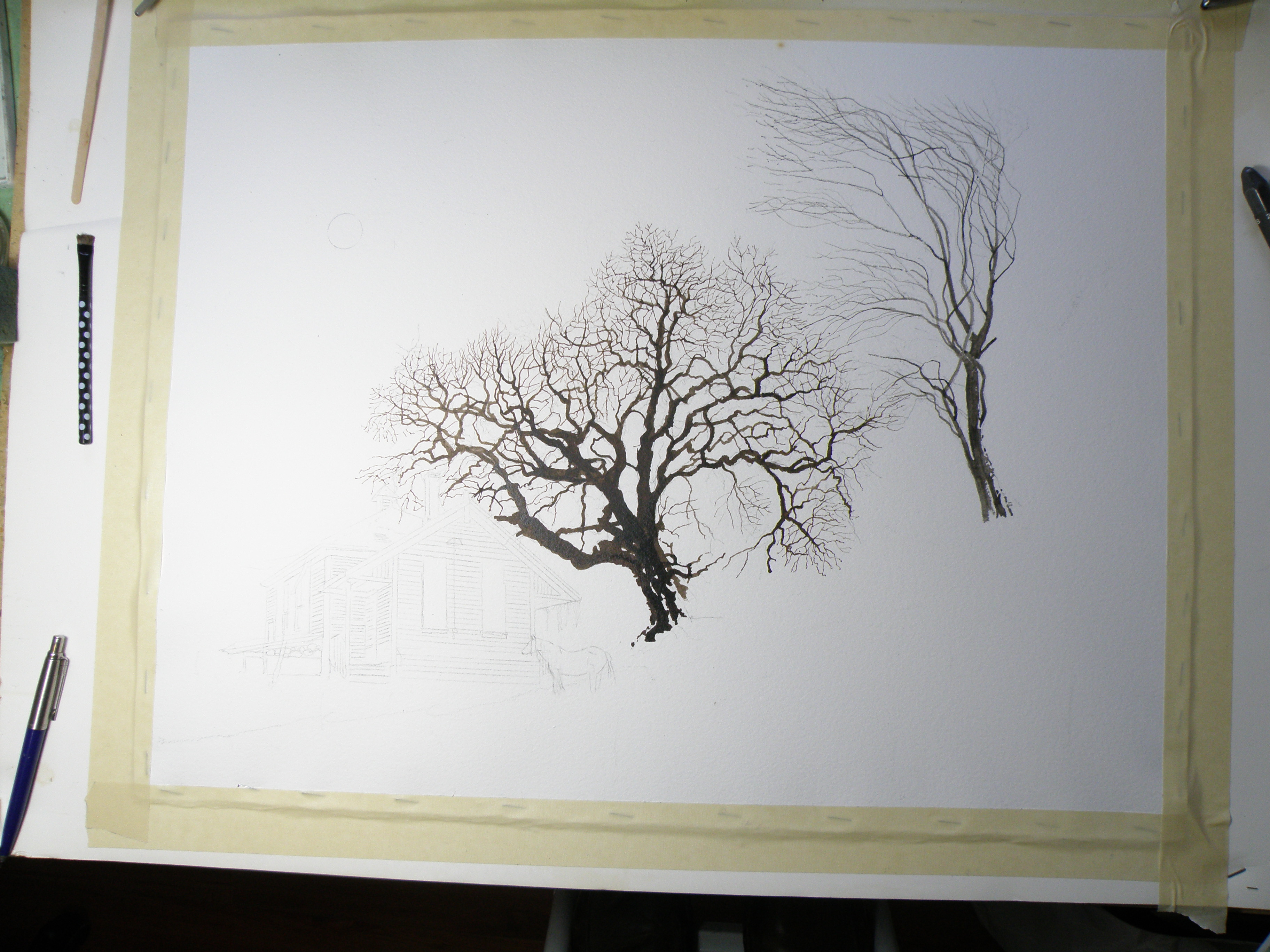
Painting Progression 1….
March 12, 2015
THERE WAS an old schoolhouse in the Township of Pritchard, British Columbia, just down the road from my friend Shiela. 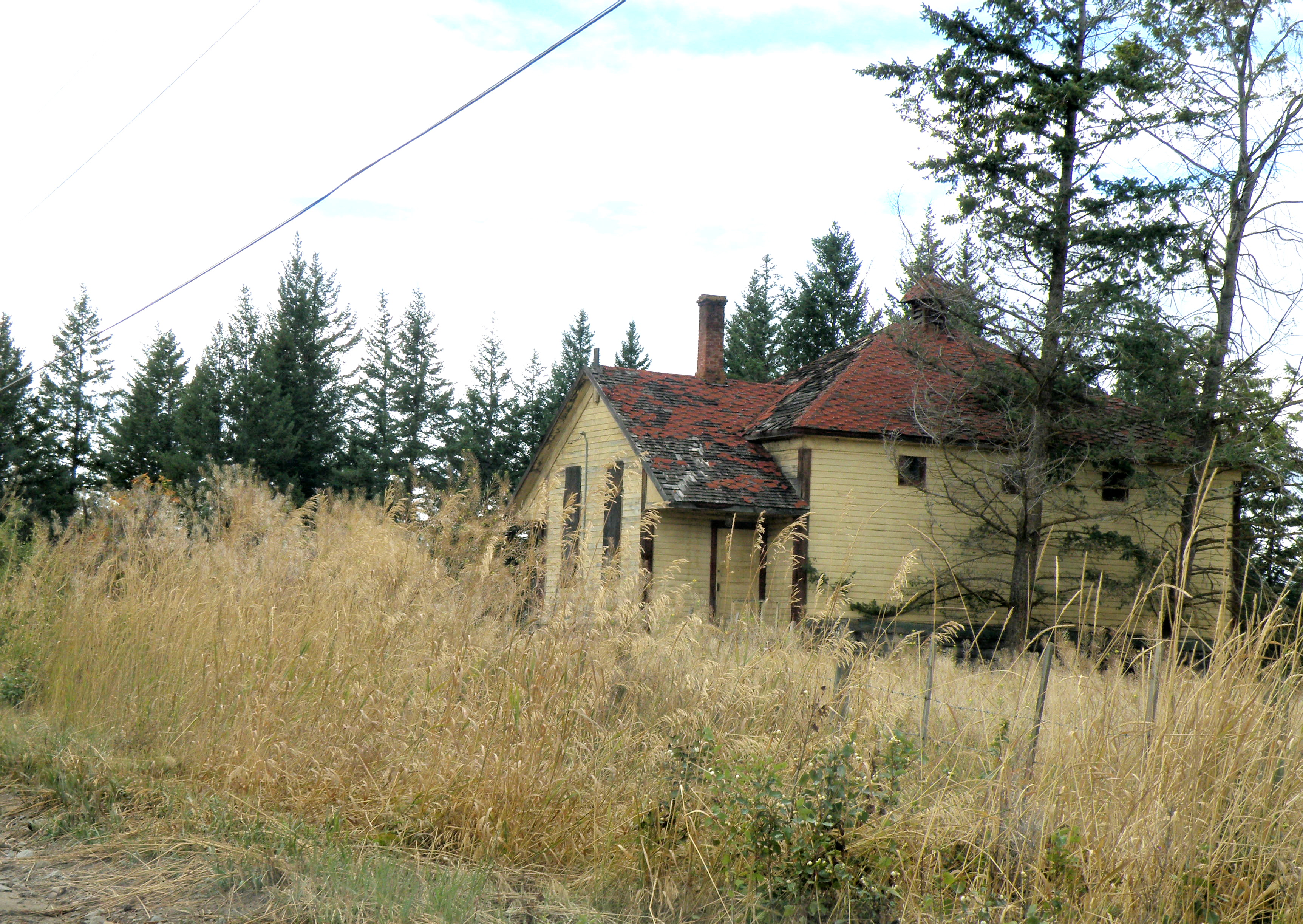 It was kept on a corner of field by a rancher who had attended it, hoping someday someone would see to its restoration. Eventually it was torn down, but not before I was able to photograph it. And I have painted it several times, choosing to situate it where I please….
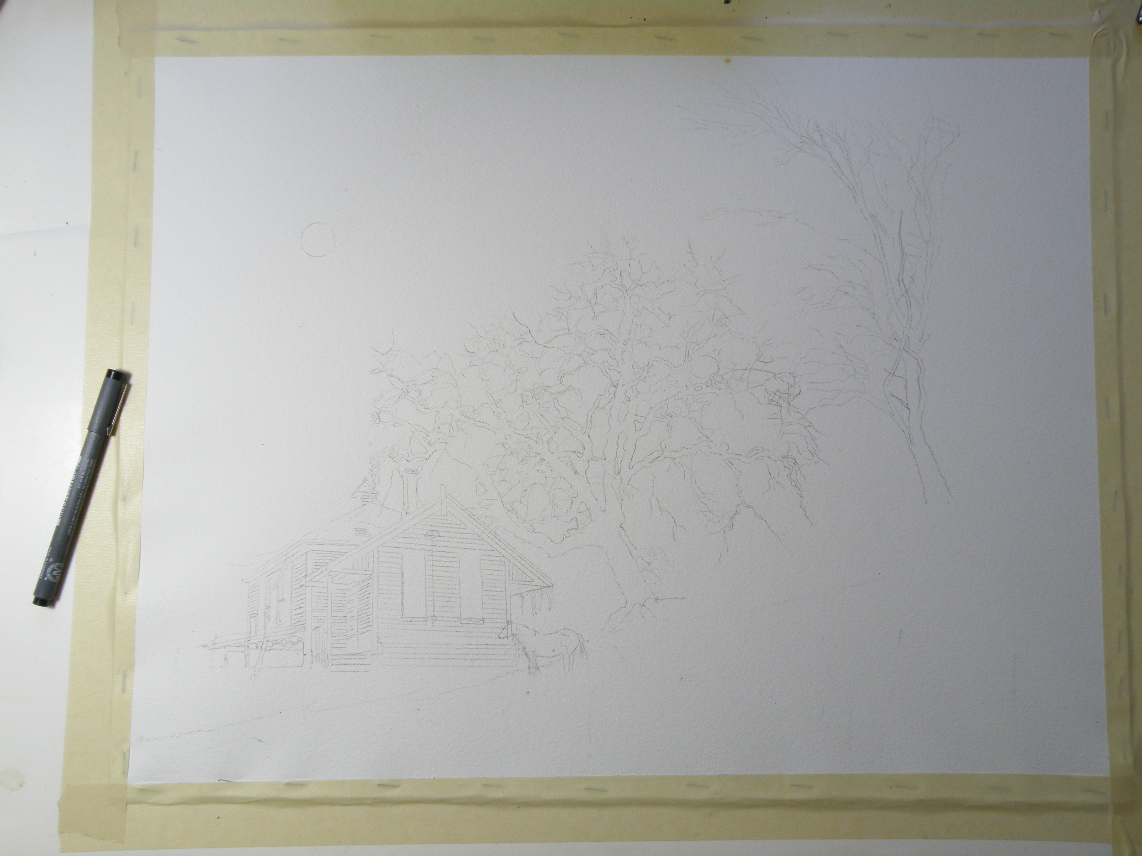
This is the initial drawing. Because the rancher kept horses, I decided to position one for sake of interest. The paper is Arches Cold Press 140 lb., stretched stapled and taped onto gater board, approx. 15 x 20 in.
The Columbias
February 10, 2012
For seven summers I was the cook for The British Columbia Natural History Society. In 1994 I graduated from The Dubruelle French Culinary School in Vancouver, and ran a kitchen at a small residence on the UBC Campus. This left my summers free, and I took on the task of prepping to feed upwards of sixty hikers at elevations upwards to some 3000 m., or approximately 10,000 ft.
It involved cooking and then packing vacuum-sealed , frozen meals in large chests with dry ice before joining the caravan of cars towards the mountain destination of choice. Once at the base, everything–including me–was hauled to the summit in a net-outfitted helicopter, and the business of setting up the huge kitchen and dining tents was begun. Frequently it was snowing up top–though only twenty minutes before I’d been roasting in the July heat–leaving me scrambling to find my parka.
The challenge was to get everything unboxed and laid out in some semblance of order–while ensuring the burners were properly hooked up to giant propane tanks–so that all-important first meal could be served some three hours later. After that, I could do the washing-up and at least semi-relax by first getting my little tent set up and then getting myself organized enough to be able to do breakfast when I awoke at 4 a.m.
By Day Three (of the ten day experience), it felt like I’d lived there my whole life, and could spend my days doing watercolours while the hikers tramped all over the rugged terrain carrying the bagged lunches they packed for themselves after dinner the night before. Once I’d served their breakfast, they’d stroll about with final cups of coffee making sure I overheard their latest Grizzly Bear spotting stories. Then they’d be off, leaving me sitting there all day minding that food all by myself.
Here is a painting from one of those seven summers. And though I can’t be entirely positive, I believe this particular view is from the Eastern British Columbia Mountain Range known simply as The Columbias.

Glaciers in The Columbias
And yes, I did see Grizzlies, but only from a distance.
thank god.
Start to Finish . . .
February 7, 2012
Though I’ve certainly seen this done many times on websites and in books, I’ve never taken photos of a painting of mine as it progresses from a drawing to a finished piece. Whether it proves interesting or useful is anyone’s guess, but here goes . . .
I sought out written permission from the Irish Photographer Joseph Hogan to use his images to create watercolours. This is necessary whenever an artist chooses to make use of another artist’s image(s). I have paintings which I’ve done from photos I’ve found on the internet but won’t post them here (nor sell them) because I’ve yet to go about getting explicit permission to use the original image.
In any case, here is the image I am using for a painting entitled “Winter Barn“. . . .

Original Photograph by Joseph Hogan (used with Joe's exclusive permission)
The first step is for me to choose the right kind of paper. It took me about ten years to discover ‘my’ paper–the one that receives my style of painting the best. (And there are honking bunches of types of paper out there beckoning watercolourists.) For this particular subject I chose Arches 140 lb. Cold Press Paper, because it has a creamy hue and just a bit of tooth to it. My other preferred paper is Arches 140 lb. Hot Press Paper which is smooth as glass (which is what I used for ‘Winter Horses’, for example). Both papers receive the paint in a different way.
I first decided to change this photo into a night scene. For me it is important to establish a definite and personal mood, to embody the photograph–use it to draw out from me what I feel when I see it–let my mind take me back to similar scenes in time’s past.
When we lived in Granville, New York, we lived in the Baptist Parsonage (my father was a Pastor) and it was a 19th Century house with the original horse barn for our garage. Sitting at its open back door, I remember looking at the host of stars while sneaking a Marlboro, and wondering what my life was going to involve. (And, lo and behold, it involved a prolonged effort to finally give up those deliciously-sinful Marlboros). But I sat there rain or shine or snow–usually at night–and thought my thoughts and enjoyed just being me instead of a Pastor’s son.
Back to the task at hand—I made a detailed drawing of the barn, used a prescription medicine container to draw a moon, then used masking fluid to mask out the moon, the window, and several fruit trees I decided belonged on a hill not in the photo.

Once that was done, I gave a preliminary wash to the night sky using Payne’s grey.

First wash over sky using Payne's Grey and a touch of Sepia
The next stage was to define the sky with a second, and darker wash. This is occasionally referred to as ‘glazing’ by my partners in crime but I just call it a second wash. I also decided to remove the masked moon and trees by rubbing off the rubbery masking, and then began defining the fruit trees by using Sepia mixed with Payne’s Grey and some Burnt Umber using a fan brush to give the feeling of many branches against a moonlit night.

blocking-in of fruit trees
I also used a small rigger brush to create more defined trees within the grove . . .

more tree detail . . .
As you can see, I also added shadows using Payne’s Grey and Thalo Blue. I want to convey the impression that they are growing on a hillside. And now it is time to begin the initial washes over the wood of the barn. The red in the photograph is not the red of my memory. I want the red of the barn in Granville, and not the red of Joseph Hogan’s barn photo.

initial barn washes and grasses on the hill
The next several illustrations show the development of the barn–the attention paid to the stonework, the window, the planks, the grasses and shadows. This takes me hours, and is somewhat distressing (in a I-just-want-a-Marlboro kind of way) because again, this is taking a photo of an anonymous barn in the daylight and changing it into a personal painting of a memory-laden place where my teenage self got lost in imagining futures (a different one every time I went out there–but all of them grand). In other words, there’s no blueprint to follow and it needs to look authentic, yet I have no scene before me to guide my brush–I must let the painting tell me where to go next . . .


more definition added to barn's stonework and planks . . .

yet more detail . . .
Finally, it took several days to stew over how to find the guts to put in the barn’s frosty shadows. I say ‘guts’ because with watercolour, there’s no turning back–once darks are laid in, they’re there to stay. (At any point along the way, an ill-advised decision has many a time consigned my work to the ‘not good enough’ heap.) And I chose to use a sponge and Payne’s Grey mixed with Thalo Blue to provide a texture-like effect to the snow covered grasses in front of the barn.
I then spattered Payne’s Grey over the wooden parts of the barn and over the fruit trees. I also spattered Yellow Ochre onto the stonework, and used it to sponge-in more grasses. Selective spattering adds the feeling of age to the barn, and more depth to the trees.
To finally convey the effect of a moonlit Wintery night, I spattered Opaque White over the whole to give the feel of a fine powder of snow falling gently onto the scene.
This may yet prove to be the final rendering of this subject–but then again, I may still stand back and feel it’s missing the mark (which I do feel it is, but can’t quite figure out how) and get in there and muck around some more. I actually do think I may spatter a bit more snow into the air . . . .

Final (maybe) version of "Winter Barn" by Lance Weisser relying on an image by Joseph Hogan (with permission)
I’ve enjoyed sharing this process with you. More than that, I have come to appreciate with increasing affection and encouragement your own artistic endeavours. You all spur me on, and make me happy that I’ve chosen watercolour as my medium to share as I take heart in your photos, pottery, paintings, drawings, computer art, and poetry.
Thank you for being my friends.
A little ‘cheating’ . . .
January 25, 2012
Watercolour has its limitations and its unique requirements. About the biggest challenge is the understanding that anything white in a watercolour is the paper left blank. So white clouds are achieved by painting blue around them. Whitecapped waves are accomplished by painting the dark part of the wave and leaving the paper white for the crest. The same goes for snow, of course, and really anything at all that’s white.
The famous British painter, J. M. W. Turner (23 April 1775 – 19 December 1851) is widely regarded as the artist who took watercolour to its pinnacle–who forced it to be considered a serious medium, alongside oil (though even today watercolour is not treated with the same gravitas as oil). His work is nothing short of astonishing. And apparently he often achieved some of his whites by ripping at the paper with a long fingernail.
My training was such that the use of opaque white was absolutely forbidden. It was considered a breaking of the most important ‘rule’ of watercolour: that only the white of the paper (called ‘reserved white’) was acceptable in a pure, transparent watercolour.
I have, though, been talked into letting myself experiment with a limited usage of opaque white. A great many watercolourists use it, though sparingly.
The following picture was my first attempt at using a bit of opaque white in the branches of the trees. The clouds, grasses, snow, and other whites were achieved by reserved whites (leaving the paper blank) and/or scratching out with a knife (my fingernails aren’t nearly long enough).

"Snug"
Winter
January 8, 2012
It has been quietly thrilling to once again become reaquainted with the four seasons. Vancouver–my city for over twelve years–effectively enjoys a very prolonged Spring and a very prolonged Autumn. Indeed, on rare occasions there are days of snow, and days of oppressive heat, but they remain rare.
Moving to the Interior–specifically to Kamloops–in December of 2007, was a sudden re-introduction into what Winter truly is all about. The day of our move turned into the biggest blizzard I’ve ever experienced, then or since. Driving up the Coquihalla Highway was treacherously risky, its two lanes effectively reduced to a cow path. And from that moment on, I have learned to love all over again the unique characteristics of each of the Four Seasons, for Kamloops is surrounded by a wonderful and distinctly different landscape which has captivated my artistic spirit!
Above all, it is Winter which I’ve come to revel in the most. . . .

"Columbia Street Noel"
A bit of New York
January 4, 2012
I was raised in Rochester, New York, and then later on the New York / Vermont border. At some point we had occasion to visit the town of Saranac Lake, New York, which hosted the 1980 Winter Olympics and much earlier in its history was one of North America’s best known tuberculosis sanatorium locales. Patients went there to receive plenty of sunshine and fresh air.
Kamloops, British Columbia, my present home, was also chosen as a prime location for a TB sanatorium and it was located just outside the city limits at Tranquille, B. C., beside Kamloops Lake. The air here is dry, without even a hint of humidity in the Summer and bracingly-cold in the Winter.
I loved staying in Saranac Lake that one week in January. The lake itself was completely frozen over, with a fresh layer of snow and a blindingly-bright sun.

'A Frosty Saranac Lake, Saranac Lake, New York, c1989'
One Room School
January 3, 2012
Not far from Kamloops is the lovely rural town of Pritchard. On Duck Range Road was an old one room schoolhouse that was ‘adopted’ by a local farmer who had attended it as a boy and hoped some community-minded group would see to its preservation and restoration.
Unfortunately, that never happened and in the summer of 2011, it was finally knocked down. Although this painting takes some liberties over the school’s original setting, the rendering of the building itself is true to the way it looked. It was hung in The Federation of Canadian Artist’s Open Show in The Old Kamloops Courthouse, and was a favourite in a fund-raising draw for The Federation.

"One Room School, Duck Range Road, Pritchard, B. C."
Fort House
January 3, 2012
Kamloops (a native word meaning ‘the joining of two rivers’) has evolved from an c1812 outpost of The Hudson’s Bay Company and an early Railroad and Gold Rush centre into the largest city in the Thompson-Nicola Region of British Columbia’s Interior.
One of our most distinctive houses situated near the North Thompson River, was built in 1907 for a farmer, Archie Davis, who had purchased land originally belonging to Fort Kamloops. It sits at the corner of Fortune Drive and Fort Avenue, and is simply referred to as ‘Fort House’. No longer in the Davis family, its acreage has been reduced to a lot-sized yard, and its classic box design has been altered so that now it is a rooming house with various entries and stairs added.
Wanting to depict it as it once was, this painting imagines a moonlit night with one lone window indicating activity, perhaps Archie Davis preparing to get up–pre-dawn–to attend to his animals and daily chores. It was purchased almost as soon as it was displayed, by a young couple who have a fondness for this familiar Kamloops landmark.

"Up Late"
