….composition exercise 2
January 17, 2016
Continuing on with an attempt to test out the compositional dictum known as ‘the rule of thirds’, which was conceived and named by John Thomas Smith in 1797 :
“. . . Analogous to this “Rule of thirds”, (if I may be allowed so to call it) I have presumed to think that, in connecting or in breaking the various lines of a picture, it would likewise be a good rule to do it, in general, by a similar scheme of proportion; for example, in a design of landscape, to determine the sky at about two-thirds ; or else at about one-third, so that the material objects might occupy the other two : Again, two thirds of one element, (as of water) to one third of another element (as of land); and then both together to make but one third of the picture, of which the two other thirds should go for the sky and aerial perspectives. . . “
To illustrate its basics…..

Once again, this is the drawing I did initially, to put this into practice….

And this is the first go at painting the scene….

And now today, here is the progress so far, attempting to locate some visual interest at each of the four intersections within the piece, the barn being the first and the pine being the second and the creekbed being the third…..

The darkest darks and greatest contrast will remain with the barn, for that is the intended focus for the picture, when completed.
The ‘rule of thirds’, as stated above, holds that generally two-thirds of a landscape be devoted to the sky, with one-third given to the land below (the sky being such a vast and dominant feature). In this case two-thirds is dedicated to the land and a very high horizon means that the one third is devoted to the sky area.
standard-bearer of watercolour
August 15, 2015
Touted often as being the most difficult of mediums, and sometimes even as ‘the medium of mediums’, not everyone holds watercolour in such honour. Indeed, oils are deemed the zenith of painting mediums.
‘Blowing the horn’ about watercolour as the ‘medium of mediums’ is a bit rich, perhaps. That is, until one tries to master its elusive qualities and discovers how the more it is controlled, the less it is allowed to be what it is: a medium set free by water.
Perhaps no greater example of the power of watercolour allowed to find its own way through minimum control is by the hand of its greatest advocate, J. M. W. Turner.
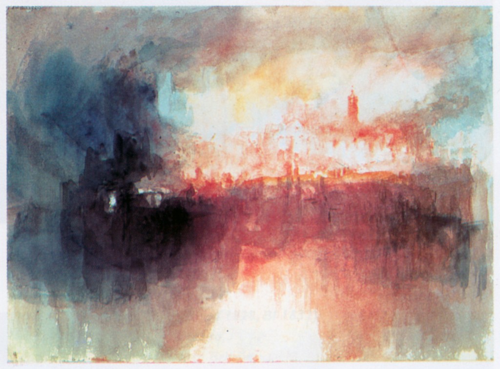
‘Incident At The London Parliament’ 1834
“If I could find anything blacker than black, I’d use it” is a quote which highlights Turner’s love for the power of contrast, which is what watercolour achieves spectacularly when the snow white of the paper is allowed to breathe while then bordered by the darkest dark.
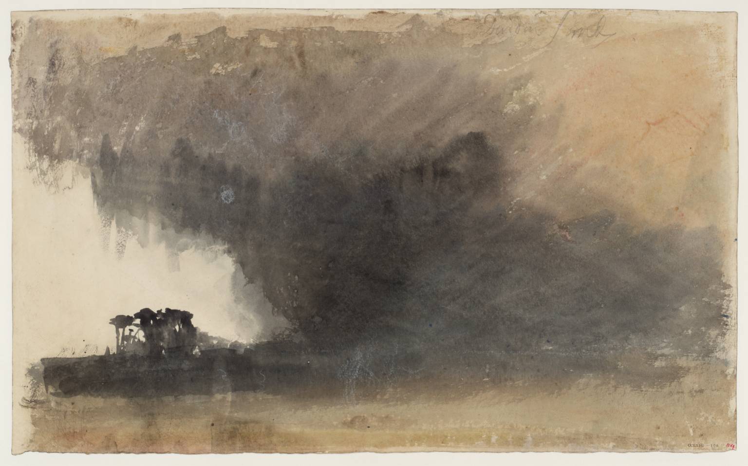
‘Duddon Sands’ circa 1825-32 Joseph Mallord William Turner 1775-1851 Accepted by the nation as part of the Turner Bequest 1856
Joseph Mallord William Turner is sometimes referred to as ‘the father of the abstract’. It is possibly due to the apparent pleasure he took in allowing the medium to run wild, catching it back at just the right moment to indicate location.
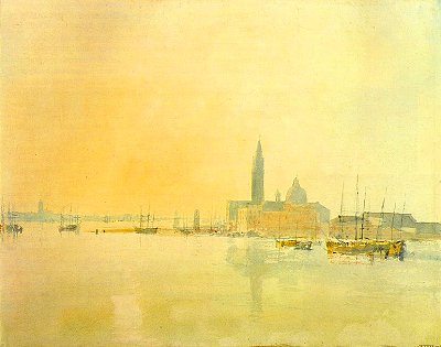
a Venetian watercolour, ‘Untitled’, JMW Turner
Somewhere there is a story about how Turner was very guarded over letting anyone watch him work. But at some sort of gathering Turner asked a young boy if he wanted a picture of something he liked. The boy asked for a Spanish Galleon, and the artist took him into his studio, and not too long afterwards the boy immerged with a small and perfect depiction of a great ship in tossing waves.
Grilled by others about how the master had gone about producing it, the boy dazzled them in claiming Turner was very fast–almost phrenetic–using one unusually long fingernail to rather frantically scrape and tear at the paper for crests and foam of storm-thrown waves.
