Painting progression 3
March 14, 2015
THE MOON and schoolhouse roof were masked, then a wash applied in the sky areas.
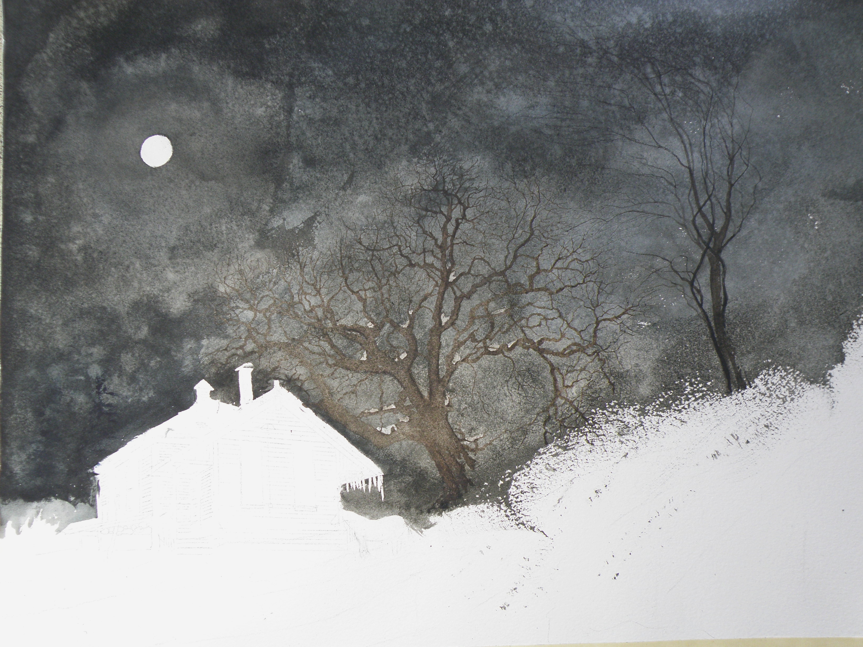
Once done, a decision was made to next eliminate the horse, it becoming an unintended focal point if left in. (A lone horse standing at night in front of an abandoned school in bitter cold would be incongruous).
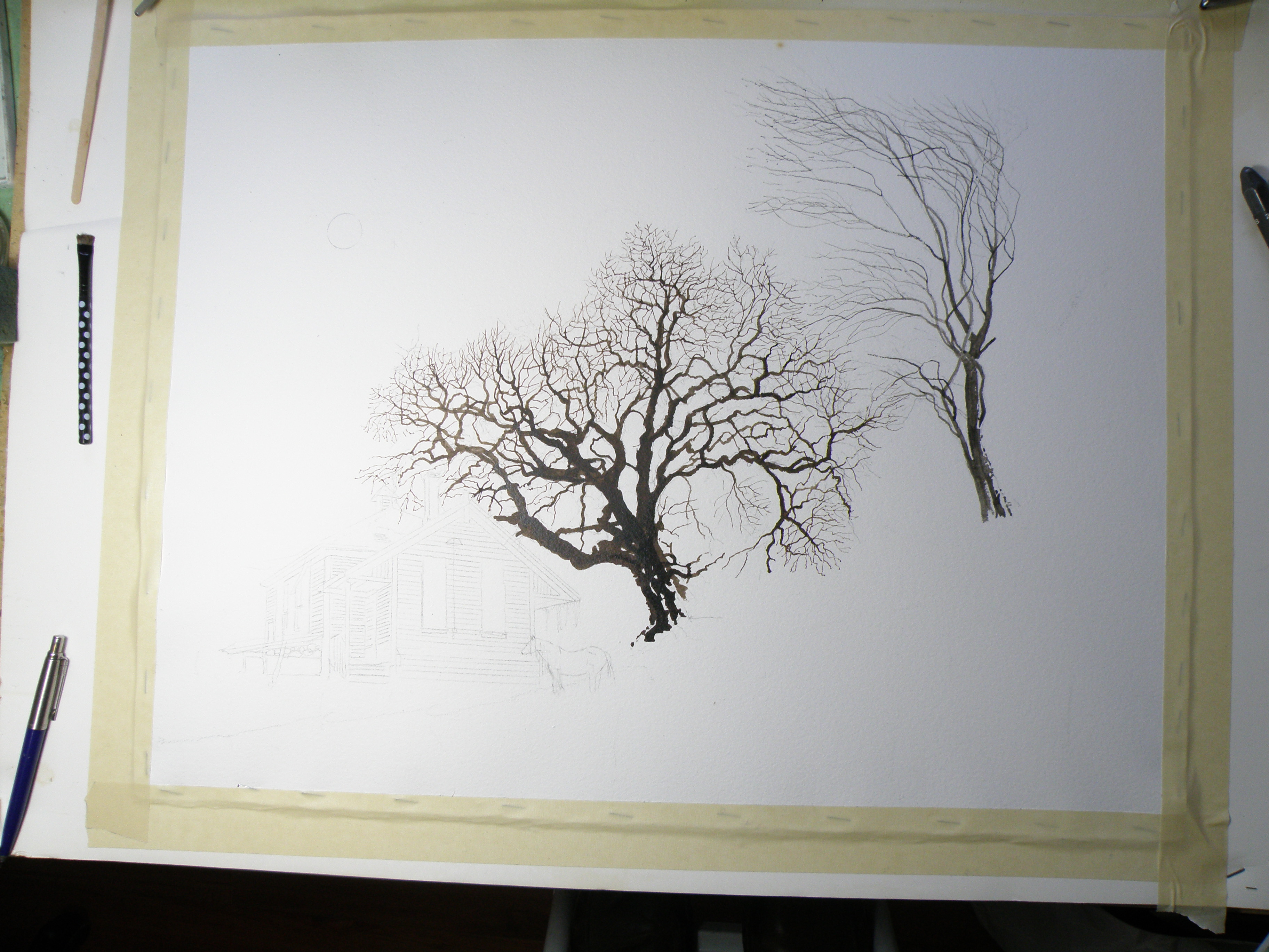
Painting Progression 2
March 13, 2015
TREES are painted in very dark and the watercolour pigment tempered a bit in order to have it resist being completely taken away by an overlay of secondary wash.
Painting Progression 1….
March 12, 2015
THERE WAS an old schoolhouse in the Township of Pritchard, British Columbia, just down the road from my friend Shiela. 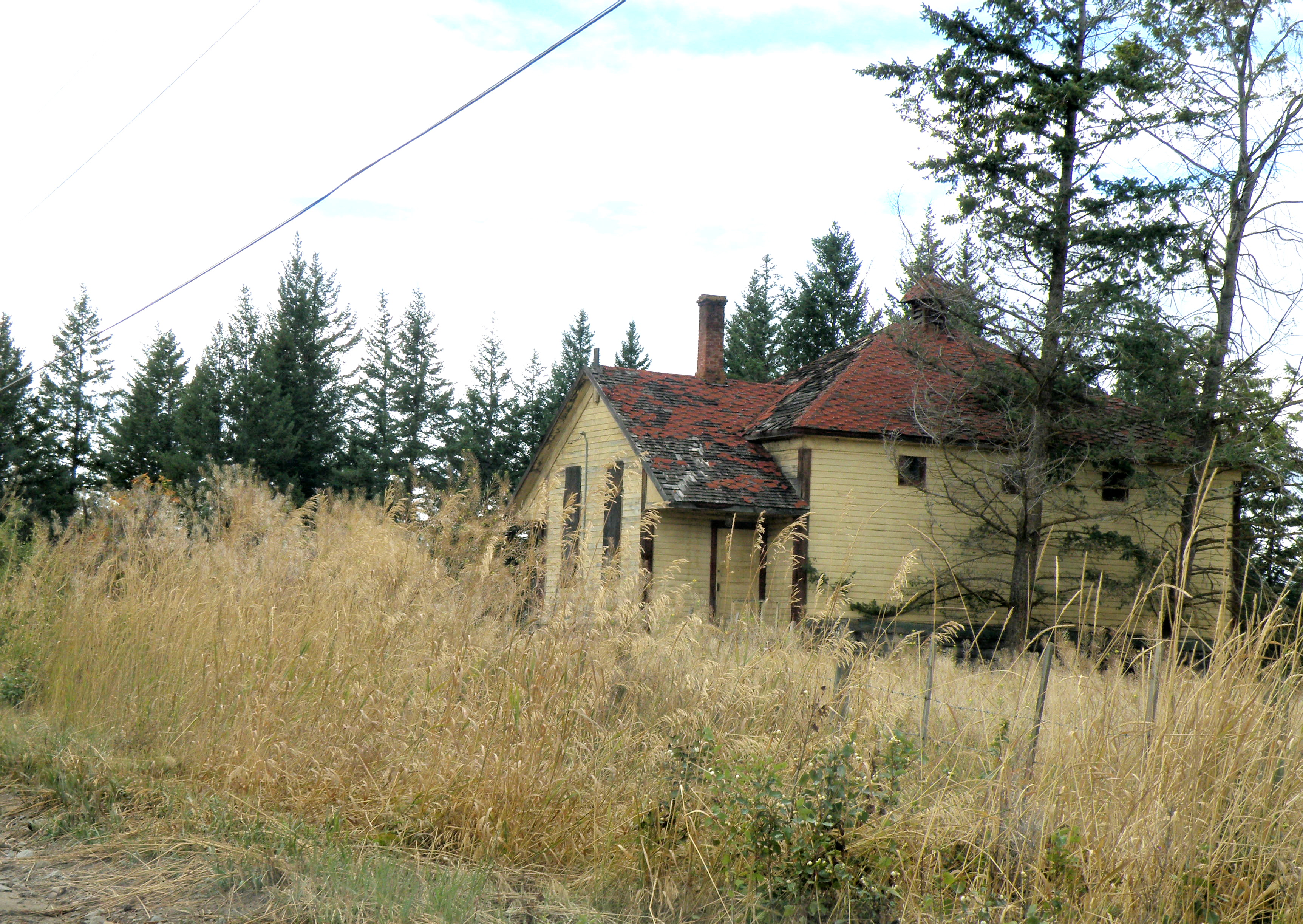 It was kept on a corner of field by a rancher who had attended it, hoping someday someone would see to its restoration. Eventually it was torn down, but not before I was able to photograph it. And I have painted it several times, choosing to situate it where I please….
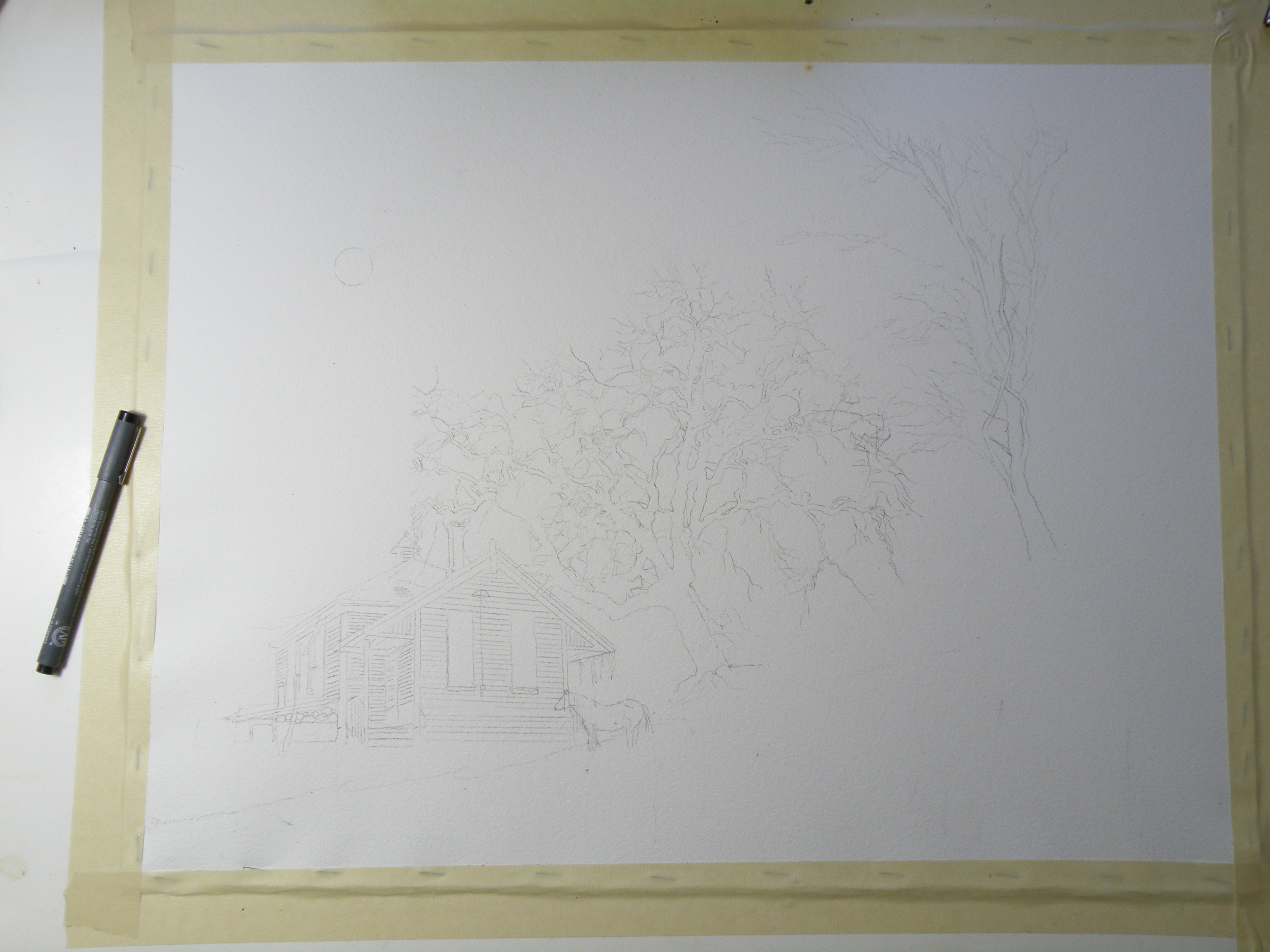
This is the initial drawing. Because the rancher kept horses, I decided to position one for sake of interest. The paper is Arches Cold Press 140 lb., stretched stapled and taped onto gater board, approx. 15 x 20 in.
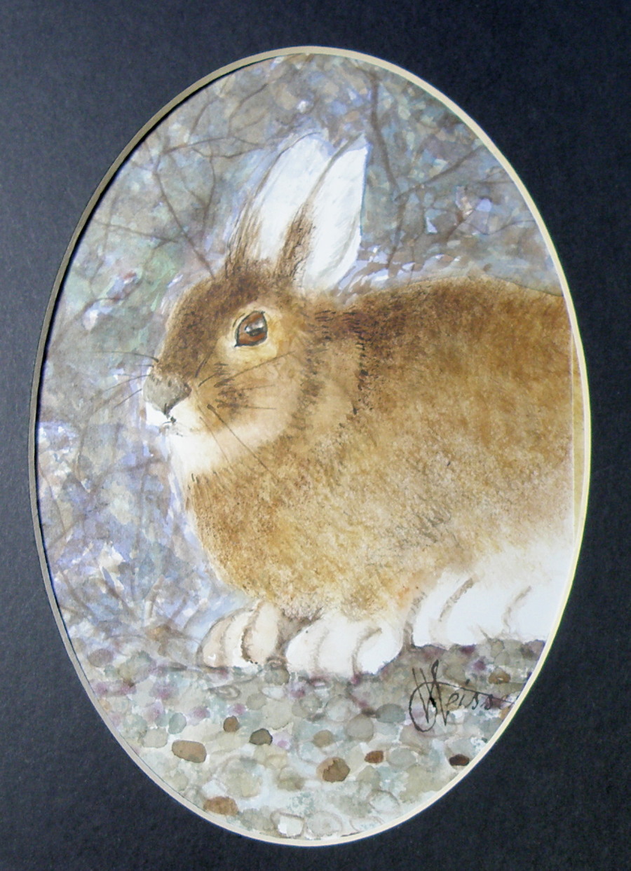
Arctic Hare
March 11, 2015
New Painting
May 23, 2012
One more post before another Tylenol 3!
This painting is based on another photograph from the Irish Photographer Joseph Hogan (used for reference with permission). I have previously used his photography for the painting ‘Winter Barn’ (posted below). It is the second painting of it, as the first crashed and burned at the last minute when applying the wash of burnt umber for the shadow.
Like most watercolours, it had to be thoroughly thought out before beginning. It was deceptively difficult even though it looks rather a simple and straightforward subject.
Here is a preliminary look at it while in progress . . .

Initial wash of diluted Burnt Umber . . .

more detail added . . .

nearing completion . . .
The finished painting . . .

“Poppa’s Chair”
7.5″ x 10.5″ watercolour on 140 lb. Arches Cold Press Paper
It is a painting with a Father’s Day theme, now hanging in The Old Courthouse Gallery here in Kamloops, British Columbia.
Tylenol 3 here I come. . . .
Barn Owl Miniature
May 23, 2012
Whine Alert! I threw my back out and even my regular swimming routine isn’t helping restore things. It has been over a week and sitting at the computer only seems to aggravate it. Oddly, standing offers the most relief, so I’ve been painting.
My apologies for not leaving comments on my favourite sites. Even this just sitting here is causing shooting pains.
This pair of Barn Owls is from a photo on the BBC Website, without credits as to whom the photographer was/is. I’m in the process of offering compensation for my using the image as reference.
The Barn Owl (Tyto alba) is, oddly enough, common in a great many countries but not here in Canada. From Wikipedia: “. . . It is known by many other names, which may refer to the appearance, call, habitat or the eerie, silent flight: White Owl, Silver Owl, Demon Owl, Ghost Owl, Death Owl, Night Owl, Rat Owl, Church Owl, Cave Owl, Stone Owl, Monkey-faced Owl, Hissing Owl, Hobgoblin or Hobby Owl, Dobby Owl, White-breasted Owl, Golden Owl, Scritch Owl, Screech Owl, Straw Owl, Barnyard Owl and Delicate Owl. “Golden Owl” might also refer to the related Golden Masked Owl (T. aurantia). “Hissing Owl” and, particularly in the USA, “screech owl”, referring to the piercing calls of these birds. . . ”

Work in progress . . .
The finished piece–a birthday gift for my friend Shiela

“Barn Owls”, watercolour on Hot Press Arches 140 lb. Paper
image: 2.5″ x 2.5″
framed size: 4″ x 4″
Thank you for your patience and support. I’ll be seeing my doctor soon, and hopefully we’ll get to the cause of the problem.
Jamieson Creek
May 6, 2012
This little painting (6″ x 7.5″) is of Jamieson Creek, which is not even ten minutes drive from our front door. This is a desert-like region, featuring its own local cacti (which I discovered by way of my hand), and is called The Sunshine Capital of Canada. Water, while not scarce, has usage restrictions and homes are now being installed with water meters.
So to have the Jamieson splashing over and around rocks and fallen timbers is a great joy. It is the epitome of the ‘laughing brook’ of literature, and compliments the broad, slow-moving Thompson Rivers which run through town. Were it not for our rivers, Kamloops would be uninhabitable. Right now the creek and rivers are swelling from the melt-off of mountain snows. Kamloops itself is some 4,000 ft in elevation, the mountain snows are up that much higher, and June is when the river level is at its peak.

“Up The Jamieson”, L & M Jones Collection
This painting was on the wall no longer than ten minutes before it was sold. My colleague in art, Lynda Jones, thought it complimented her pottery so well she went with her impulses. And that made my day.
Our Recent Show
May 5, 2012
It was an honour being asked by Lynda Jones to share her spotlight as Featured Artist at our Old Courthouse Gallery here in my city of Kamloops, British Columbia, Canada. Lynda is a potter whose studio is in Falkland, B. C.– a potter of ever-increasing recognition, most notably for her astonishingly beautiful smoke-fired pottery which can be seen in more detail here: http://www.okanaganpotters.ca/ljonesgallery.html.
Our Opening on May 1st came off well even though the wall socket we’d plugged the coffee and tea into was busted and we didn’t know until we were due to serve it. But once extension cords were found, a good time was had by all.

Lynda Jones and Lance Weisser, Featured Artists
Old Courthouse Gallery, Kamloops, B. C.
That same day, a quarterly magazine, ‘Currents’ published this very generous feature . . .

‘Currents Magazine’ May 1, 2012
Publicity like this is very helpful and makes it all the more necessary for me to remember that watercolour is my hobby, and a medium I struggle mightily with. All I can hope for is the chance to keep learning from my continual mistakes, while trying to improve in incremental steps.
Yesterday I was very happy to learn that the owner of the ‘Dr. M. S. Wade House’ (see ‘previous entries’ below) is very taken with my rendition of her home. She’s lived in it for more than 35 years and rues the day she’ll ever have to move out–but says if and when she does, she’ll now have my painting to bring back the memories. And as a painter, it just doesn’t get any better than that!
Local Cliffs, Finished Piece
April 25, 2012
D Day for me is May 1st. That is when Lynda Jones and I are teaming up to be The Featured Artists at The Old Courthouse Gallery here in Kamloops. Lynda is a rare and amazing potter who specializes in highly burnished smoke-fired pieces and counts among her collectors the former U. S. President Clinton.
Here is the fantastic poster she has designed:

PAIR' A LLs E-POSTER MAY 2012 Courthouse Gallery
The Local Cliffs subject I’ve been doing studies of has finally been completed as a work I’m satisfied enough to allow to be matted and framed.

"Cinnamon Ridge Signal" 7.5" x 9", Arches 140 lb. Cold Press Paper
One thing I’ve learned through doing it, is that this small size of 7.5″ x 9″ is very pleasing for me. It is large enough to include a good amount of detailing, and small enough to get finished in a timely way.
And now it is on to getting painting #2 for the show done before our May 1st opening. Thank you for your previous comments which helped me in producing the final result!
Local Cliffs — Study I & II
April 15, 2012
About ten minutes from our house is ‘Cinnamon Ridge’. These are cliffs with very distinctive geologic caves and ‘hoodoos’ caused by wind erosion. Though not around at the time (I was but a gleam in my parents’ eye) 50 million years ago, the Kamloops region of British Columbia (from the Native word Tk’emlups–‘where rivers meet’) was the source of great volcanic activity, and formed the seafloor of the ancestral Pacific Ocean.
Not far from Cinnamon Ridge is a loose shale shelf where my friends go to collect fossils. These fossils indeed prove this area which is so very dry, was once water-covered.
I’ve now done two studies of Cinnamon Ridge (so named because of its rich colour). The first is a small watercolour sketch about 4″ x 8″

'Cinnamon Ridge' watercolour sketch
The second is a more detailed and focused piece around 8.5″ x 12″. It has some issues as far as values go (it’s a bit too light and lacking in contrast), as well as a composition issue having to do with the train signal being much too far to the left.

'Cinnamon Ridge' Study II
And here is the photo both studies are based on:

reference photo of Cinnamon Ridge
The final painting must be ready for hanging on May 1st. So I am now about to do Study III, which will hopefully end up graduating from being a study to being worthy of mat and frame.
Painting is much like cooking. Too little salt is as much a turn-off as too much. Getting things just right wasn’t just a problem for Goldilocks.
Horse Study Continued ….
March 28, 2012
[I apologize to my blogging friends for falling behind in viewing your many entries. There have been a number of deadlines I’ve been facing, and now I feel somewhat negligent in posting and commenting.]
In continuing to try and improve on my initial study of a pair of horses, I have placed them in a more complex setting.

Icelandic Horses "Odur" and "Lettir"
I am somewhat more satisfied with this result, and have been learning a great deal in the process. This is Arches Hot Press Paper which is has a very smooth surface and is slightly creamy in tone. It has the qualities of illustration board. The demand on the painter with Hot Press is the need to lay the initial wash down with the hope of not going back into it, or back over it. Because there’s no ‘tooth’ to the paper, the paint floats on the surface before finally being absorbed.
Although the flaws of this scream out at me, the reason watercolour is considered the most demanding of painting mediums is simply because trying to correct the flaws will result in outright catastrophe.
All I can hope for is renewed confidence and another attempt. However, I remain pleased with the composition, if not some of the particulars.
My painting mentor taught me to adhere to the “20 to 1 principle”–‘for every painting you keep, throw out 19’.
Horse study . . .
March 18, 2012
I have been endeavouring to paint a fondly-loved pair of horses for a friend of mine. Were I to choose my own equine subject matter, I would likely have preferred more than two, or where they weren’t quite so front and centre. I have painted horses before, but lack confidence due to not being raised around them. I lack fundamental knowledge of what they are like, i.e. horse sense (groan).


Starting from behind . . .

"Odur" nears completion . . .

"Lettir" joins "Odur"

wash of sky is dropped in with a few strokes . . .

"Odur" and "Lettir"
The horses aren’t too bad, but the sky is too blue, and the field too green. I am also not thrilled I added the stone wall, as it cuts a swath right through the middle. So . . . back to the proverbial drawing board. I will keep you posted, and provide the next instalment.
Teeny Weeny
March 11, 2012
These two frames were recently given to me by my friend Shiela, and truly are the smallest I’ve ever come across. Measuring 1.5″ x 1.5″, or 3.5cm x 3.5cm, the paintings themselves had to be 1″ x 1″ or 2.5 cm x 2.5 cm in order to fit within the glass.

I used as subjects, birds based on the photographs of Cornel Apostol at http://apostolcornel.wordpress.com, who has introduced me to species we don’t have here, but ones he has at his feeders in Romania. I believe the first one is a Chaffinch or ‘fringilla coeleb’ and the one on the right is a Great Tit, or ‘parus major’.
Family
March 5, 2012
My Great Niece and Nephew always enjoyed their Aunt and Grandmother’s ‘tuck-ins’, and the sharing of storybooks.

This transparent watercolour was painted from a reference photograph taken some years ago now.
‘The Silt Bluffs II’
February 26, 2012
The landscape of Kamloops, British Columbia, (native word meaning ‘dividing of waters’–the Thompson River divides mid-city to create the North and South Thompson), varies remarkably.
Think of a city at 1132 ft. elevation with homes built in terraced-layers down one mountainside and up another, all finding bottom along the broad Thompson River which attracted the attention of The Hudson Bay Company in 1811. Since then Kamloops has become a train hub, a location for gold prospectors seeking their fortunes, and more recently a centre for the forest industry.
It is arid here. Summers are hot and dry, and rain is an event. Winters are cold, windy, with average amounts of snow, and a major spot for skiers and snowboarders at the highest elevations. When I walk the dog at 5 a.m., I always hear owls and sometimes coyotes, and occasionally spot a few deer searching for something in the yards below the mountain ridge we hug up against. I’ve also come across black bear in the car port, and seen the evidence of moose.
This painting is of what’s locally referred to as The Silt Bluffs. They feature hoodoos, free-standing rock formations caused by wind erosion.

'The Silt Bluffs', 5" x 7" Original and signed Watercolour on Arches Hot Press 140 lb. Paper, $100.00 black-matted & framed in gold
The most prevalent raptors in our area are the Red-Tailed Hawk, Golden and Bald Eagles, Osprey, and Turkey Vultures.
Western Wall Memories
February 17, 2012
In 1989 I had the opportunity to visit Israel. At the time I was quite involved in what was called “Jewish Christian Dialogue” in Montreal, whereby Clergy, Rabbis, and others gathered monthly to converse and hold meaningful discussions in an attempt to weave deeper strands through our historically-shared tapestry in order to examine the tears of the past while aiming to strengthen the cloth as a whole. It was an enriching experience, and provided the means for me to go to this Land of Lands.
It was a privileged time in the sense that the current unrest had not yet erupted, and we travelled freely everywhere from Palestine to Lebanon to Egypt to Jordon to the Sea without restriction or any impediment. And so this small country with it’s geographical extremes (cold and snowing up in Jerusalem, hot and dry at the Dead Sea–the lowest point on earth–a bus ride later) and historical and cultural richness kept my eyes wide and in constant amazement the entire stay.
The following painting, “Morning Prayer” is a compilation of my memory of having been at the Western Wall of the Old Temple in the Old City. This is, without question, the holiest and most memorable of places where both celebrations and anguished appeals are vaulted vertically in a spiritual, hallowed bond as past and present combine.

"Morning Prayer"
These days I particularly enjoy visiting ‘ShimonZ’ at ‘The Human Picture’, http://thehumanpicture.wordpress.com.
The Columbias
February 10, 2012
For seven summers I was the cook for The British Columbia Natural History Society. In 1994 I graduated from The Dubruelle French Culinary School in Vancouver, and ran a kitchen at a small residence on the UBC Campus. This left my summers free, and I took on the task of prepping to feed upwards of sixty hikers at elevations upwards to some 3000 m., or approximately 10,000 ft.
It involved cooking and then packing vacuum-sealed , frozen meals in large chests with dry ice before joining the caravan of cars towards the mountain destination of choice. Once at the base, everything–including me–was hauled to the summit in a net-outfitted helicopter, and the business of setting up the huge kitchen and dining tents was begun. Frequently it was snowing up top–though only twenty minutes before I’d been roasting in the July heat–leaving me scrambling to find my parka.
The challenge was to get everything unboxed and laid out in some semblance of order–while ensuring the burners were properly hooked up to giant propane tanks–so that all-important first meal could be served some three hours later. After that, I could do the washing-up and at least semi-relax by first getting my little tent set up and then getting myself organized enough to be able to do breakfast when I awoke at 4 a.m.
By Day Three (of the ten day experience), it felt like I’d lived there my whole life, and could spend my days doing watercolours while the hikers tramped all over the rugged terrain carrying the bagged lunches they packed for themselves after dinner the night before. Once I’d served their breakfast, they’d stroll about with final cups of coffee making sure I overheard their latest Grizzly Bear spotting stories. Then they’d be off, leaving me sitting there all day minding that food all by myself.
Here is a painting from one of those seven summers. And though I can’t be entirely positive, I believe this particular view is from the Eastern British Columbia Mountain Range known simply as The Columbias.

Glaciers in The Columbias
And yes, I did see Grizzlies, but only from a distance.
thank god.
Start to Finish . . .
February 7, 2012
Though I’ve certainly seen this done many times on websites and in books, I’ve never taken photos of a painting of mine as it progresses from a drawing to a finished piece. Whether it proves interesting or useful is anyone’s guess, but here goes . . .
I sought out written permission from the Irish Photographer Joseph Hogan to use his images to create watercolours. This is necessary whenever an artist chooses to make use of another artist’s image(s). I have paintings which I’ve done from photos I’ve found on the internet but won’t post them here (nor sell them) because I’ve yet to go about getting explicit permission to use the original image.
In any case, here is the image I am using for a painting entitled “Winter Barn“. . . .

Original Photograph by Joseph Hogan (used with Joe's exclusive permission)
The first step is for me to choose the right kind of paper. It took me about ten years to discover ‘my’ paper–the one that receives my style of painting the best. (And there are honking bunches of types of paper out there beckoning watercolourists.) For this particular subject I chose Arches 140 lb. Cold Press Paper, because it has a creamy hue and just a bit of tooth to it. My other preferred paper is Arches 140 lb. Hot Press Paper which is smooth as glass (which is what I used for ‘Winter Horses’, for example). Both papers receive the paint in a different way.
I first decided to change this photo into a night scene. For me it is important to establish a definite and personal mood, to embody the photograph–use it to draw out from me what I feel when I see it–let my mind take me back to similar scenes in time’s past.
When we lived in Granville, New York, we lived in the Baptist Parsonage (my father was a Pastor) and it was a 19th Century house with the original horse barn for our garage. Sitting at its open back door, I remember looking at the host of stars while sneaking a Marlboro, and wondering what my life was going to involve. (And, lo and behold, it involved a prolonged effort to finally give up those deliciously-sinful Marlboros). But I sat there rain or shine or snow–usually at night–and thought my thoughts and enjoyed just being me instead of a Pastor’s son.
Back to the task at hand—I made a detailed drawing of the barn, used a prescription medicine container to draw a moon, then used masking fluid to mask out the moon, the window, and several fruit trees I decided belonged on a hill not in the photo.

Once that was done, I gave a preliminary wash to the night sky using Payne’s grey.

First wash over sky using Payne's Grey and a touch of Sepia
The next stage was to define the sky with a second, and darker wash. This is occasionally referred to as ‘glazing’ by my partners in crime but I just call it a second wash. I also decided to remove the masked moon and trees by rubbing off the rubbery masking, and then began defining the fruit trees by using Sepia mixed with Payne’s Grey and some Burnt Umber using a fan brush to give the feeling of many branches against a moonlit night.

blocking-in of fruit trees
I also used a small rigger brush to create more defined trees within the grove . . .

more tree detail . . .
As you can see, I also added shadows using Payne’s Grey and Thalo Blue. I want to convey the impression that they are growing on a hillside. And now it is time to begin the initial washes over the wood of the barn. The red in the photograph is not the red of my memory. I want the red of the barn in Granville, and not the red of Joseph Hogan’s barn photo.

initial barn washes and grasses on the hill
The next several illustrations show the development of the barn–the attention paid to the stonework, the window, the planks, the grasses and shadows. This takes me hours, and is somewhat distressing (in a I-just-want-a-Marlboro kind of way) because again, this is taking a photo of an anonymous barn in the daylight and changing it into a personal painting of a memory-laden place where my teenage self got lost in imagining futures (a different one every time I went out there–but all of them grand). In other words, there’s no blueprint to follow and it needs to look authentic, yet I have no scene before me to guide my brush–I must let the painting tell me where to go next . . .


more definition added to barn's stonework and planks . . .

yet more detail . . .
Finally, it took several days to stew over how to find the guts to put in the barn’s frosty shadows. I say ‘guts’ because with watercolour, there’s no turning back–once darks are laid in, they’re there to stay. (At any point along the way, an ill-advised decision has many a time consigned my work to the ‘not good enough’ heap.) And I chose to use a sponge and Payne’s Grey mixed with Thalo Blue to provide a texture-like effect to the snow covered grasses in front of the barn.
I then spattered Payne’s Grey over the wooden parts of the barn and over the fruit trees. I also spattered Yellow Ochre onto the stonework, and used it to sponge-in more grasses. Selective spattering adds the feeling of age to the barn, and more depth to the trees.
To finally convey the effect of a moonlit Wintery night, I spattered Opaque White over the whole to give the feel of a fine powder of snow falling gently onto the scene.
This may yet prove to be the final rendering of this subject–but then again, I may still stand back and feel it’s missing the mark (which I do feel it is, but can’t quite figure out how) and get in there and muck around some more. I actually do think I may spatter a bit more snow into the air . . . .

Final (maybe) version of "Winter Barn" by Lance Weisser relying on an image by Joseph Hogan (with permission)
I’ve enjoyed sharing this process with you. More than that, I have come to appreciate with increasing affection and encouragement your own artistic endeavours. You all spur me on, and make me happy that I’ve chosen watercolour as my medium to share as I take heart in your photos, pottery, paintings, drawings, computer art, and poetry.
Thank you for being my friends.
Winter Horses
February 1, 2012
The Old Schoolhouse in Pritchard on Duck Range Road was torn down last summer. It was in a farmer’s field–a farmer who’d gone to it as a child–and though he wanted to see it restored and taken over by the community, no one stepped forward to do so.
For years his horses used the school yard as their private pasture. Rain or shine–snow or sleet–anyone driving by would see them, the pair of steeds only momentarily looking up before resuming their grazing.

"School Yard Pasture"
Finally, after numerous appeals to various groups to assume responsibility for the Old School, the farmer reluctantly went about making sure it didn’t collapse and possibly cause an accident. Someone told me it only took a couple of hours for it to be reduced to a pile of boards and beams. If one drives by now, the only thing left standing are the horses.
Little Bird Miniatures
January 29, 2012
My home, Kamloops, British Columbia, is one of the locations in North America where the Mountain Bluebird nests. They are stunningly blue–shockingly so, and are appreciated by birders the world over. A monogamous species, the Mountain Bluebird mates for life and prefer nesting boxes which local people here build especially for them.
Another favourite bird of mine is the American Goldfinch which is startlingly yellow and black in the Summer, but moults into a very modest olive green shade in the Winter. They are rampantly at our feeders these days, up to sixty at a time. They are acrobatic in their jostling for position and make me smile to watch them nudge one another off the perches.
There are many Ravens in our region which are larger than Crows and stir many feelings within me when I hear their calls.
Perhaps my most favourite bird in Winter is the Junco, because they appear to be timid (they don’t generally feed at the feeders, but prefer to pick at what’s on the ground) yet won’t be bossed around, especially by Goldfinches. I absolutely love their grey, white and brown feathers and their pert, quick ways.

Junco, Raven, Mountain Bluebird, Goldfinch Miniatures

Raven Miniature (closeup)
I hope some of you will give some thought to framing some miniatures of your own. The two frames on the left were gleaned from flea markets, while the two frames on the right were imported from Italy. Of course, photos are equally pleasing in these tiny frames–and are perfect for Valentine’s Day. In case you’re wondering, I usually sell these at $25,00 each, depending on the quality of the frame and the length of time it took to paint the bird. That doesn’t make for huge profits, but it means being able to provide an original watercolour for not a whole lot of money.
Gettysburg
January 28, 2012
Gettysburg. The very name sends all manner of emotion through my heart and out the other side.
I began studying this famous American Civil War Battle (July 1,2,3, 1863) some twenty years ago and then in 2001 I simply bought a plane ticket and up and went there to see the place for myself. My sister and brother-in-law met me in Syracuse, New York, and drove me down to Southern Pennsylvania to spend five days absorbing the importance of those hallowed forests and fields.
I’m no fan of war, believe me. But having been born an American yet having now lived more than half my life as a Canadian, I study the differences between the two countries. Both British Colonies, the one revolted over taxes and the other still has The British Monarch as its Head of State. One couldn’t find the means to end slavery peacefully, while the other saw it dissolved once and for all under Britain’s 1834 Slavery Abolition Act.
Having studied in detail The Battle of Gettysburg, and while there in June of 2001, I brought along my paints and did on-the-spot watercolour sketches of the most poignantly-historic locations among those now-peaceful fields.

'The Copse Of Trees -- Gettysburg'
On July 3rd, 1863, on a stiflingly-hot afternoon, after two entire hours of constant cannon bombardment of the Yankee position on Cemetery Ridge, General Robert E. Lee ordered a massive charge across a mile-wide expanse of field. This was the concluding, and most desperate action of the horrific three days as tens of thousands Southern troops marched shoulder-to-shoulder into the deadly cannonading of Northern forces.
They were instructed to aim for an inconspicuous, yet noticeable ‘copse of trees’, dead centre in the Union Line. Only one hundred or so made that destination, the more than 20,000 others suffering an indescribable onslaught of cannon and massed rifle fire.
After painting this little painting, I solemnly walked the distance to those trees. It was a sobering, awful, respectfully-difficult-yet-important mile-long journey through the wind-blown grasses of a place now very hushed and calm. I’ve never been quite the same before, or since.
What an enormous difference between two neighbouring countries, all due to differing attitudes to being deemed ‘Colonists’.
To hell with Winter . . .
January 26, 2012
Actually, I’m joking. I’m a winter person through and through! This is the Season when I thrill at the photos of my favourite bloggers on ‘WordPress’, whose will is such that they are out there when the pale sun is orangey and the naked trees throw indigo and mauve stripes on the lapis snow. The lone leaf clinging yet to the branch moves me. The icicle tear surrounding a burnt-sienna rosehip speaks of life still sparking inside that crystal casing. Winter is the freezing of time–everything locked in icy suspension while we stand dazzled on chilled mornings over what happened as we slept.
A week ago it was -37C (with the wind chill factored in). Our pipes froze and plumbers had to repair them. The bird feeders were so busy, I had to tend them twice a day. And yet. And yet. And yet I knew even as we risked frostbite to walk our little Bichon dog, Elmo, that under all that concrete ground there were bulbs not only surviving, but actually thriving. The red maple in our yard is busy plumping up its buds. Things are happening, though for humans, an hour out there with little protection is a cruel fate.
But here’s to Summer, in the midst of Winter. Here’s to what I can’t wait to tend to when my favourite Season ends and the growing Season begins.

"Peace"
A little ‘cheating’ . . .
January 25, 2012
Watercolour has its limitations and its unique requirements. About the biggest challenge is the understanding that anything white in a watercolour is the paper left blank. So white clouds are achieved by painting blue around them. Whitecapped waves are accomplished by painting the dark part of the wave and leaving the paper white for the crest. The same goes for snow, of course, and really anything at all that’s white.
The famous British painter, J. M. W. Turner (23 April 1775 – 19 December 1851) is widely regarded as the artist who took watercolour to its pinnacle–who forced it to be considered a serious medium, alongside oil (though even today watercolour is not treated with the same gravitas as oil). His work is nothing short of astonishing. And apparently he often achieved some of his whites by ripping at the paper with a long fingernail.
My training was such that the use of opaque white was absolutely forbidden. It was considered a breaking of the most important ‘rule’ of watercolour: that only the white of the paper (called ‘reserved white’) was acceptable in a pure, transparent watercolour.
I have, though, been talked into letting myself experiment with a limited usage of opaque white. A great many watercolourists use it, though sparingly.
The following picture was my first attempt at using a bit of opaque white in the branches of the trees. The clouds, grasses, snow, and other whites were achieved by reserved whites (leaving the paper blank) and/or scratching out with a knife (my fingernails aren’t nearly long enough).

"Snug"
Rainy Day Study I
January 23, 2012
Golden Ears Provincial Park is one of the largest in British Columbia (over 62,500 hectares;1 hectare=2.47 acres) and features the pristine Alouette Lake. It also has three campgrounds and hiking trails through extremely rugged terrain. Vegetation is typical of the coastal western Hemlock forest of BC and the mountainous backcountry is not only rugged but has–almost annually–proven fatal to the unprepared. Those who go off are cautioned to understand what they’re getting themselves into.
Normally, Alouette Lake looks just like this . . .

Alouette Lake, Golden Ears Provincial Park (courtesy of Parks B. C.)
But the day I attempted to paint this scene, it started out very foggy, then changed to drizzle, then showed some promise of clearing-up. I was in the camping area that was the most primitive, and of course only when I decided to begin painting did it actually start to full-out pour. By then I was so into it that I had to keep going, even though drops were falling directly onto my work-in-progress (though I did have a make-shift tarp). But to this day, this is one of my most favourite paintings because even though it has its distortions, I didn’t give in and stayed until I finished it . . .

'Alouette Lake Study'
I can still smell the coleman stove coffee and feel the warmth of the mug against my numb fingers as I celebrated by putting my brushes away–and swearing I’d never paint another #%$#!@# watercolour again in my life.
Mount Peter
January 21, 2012
To look up the face of Mount Peter– (the sibling of the larger Mount Paul), the signature mountains overlooking our city of Kamloops, B. C.–is to look upon the core of a mountain. These are mountains so ancient, all that remains are the inner cores–their souls. Time and erosion have scarred and left them displaying a beauty it takes the eye a while to appreciate.
The roads about their base feature yellow diamond warning signs cautioning drivers to watch for Big Horn Sheep.

Big Horn Sheep (courtesy Wikimedia)
As a watercolourist, it took me a good two years before I attempted the challenge. They are unusual subjects, and not easily rendered. It was wise for me to wait, simply because I was so accustomed to the forested peaks of the Coastal Mountains that I regarded these as ugly. Until they finally become beautiful to the newly-arrived, these ancient and weather worn heights are probably best not attempted at all by art enthusiasts like me.

'Peter's Face'
