Painting Progression 2
March 13, 2015
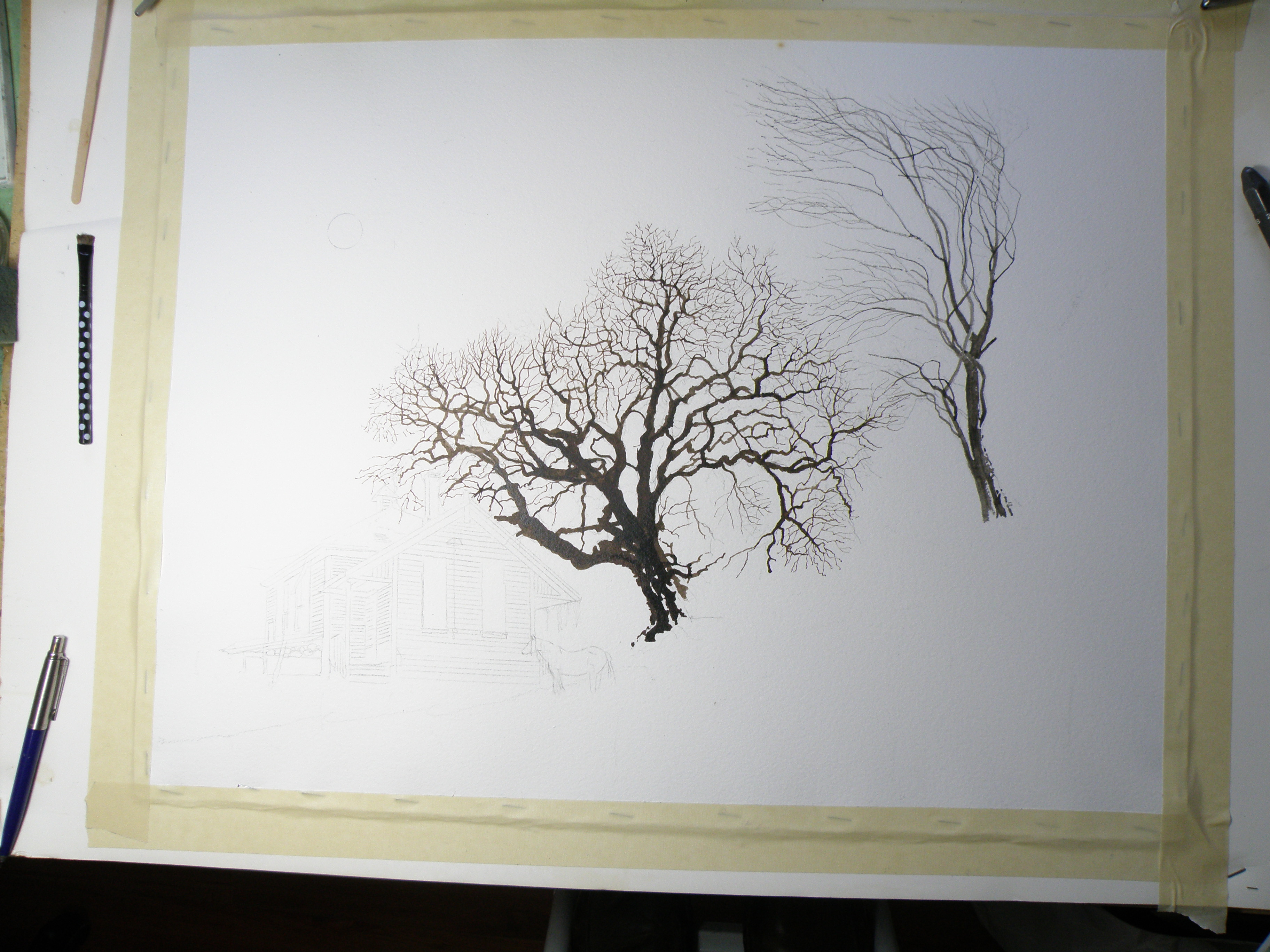
TREES are painted in very dark and the watercolour pigment tempered a bit in order to have it resist being completely taken away by an overlay of secondary wash.
Painting Progression 1….
March 12, 2015
THERE WAS an old schoolhouse in the Township of Pritchard, British Columbia, just down the road from my friend Shiela.  It was kept on a corner of field by a rancher who had attended it, hoping someday someone would see to its restoration. Eventually it was torn down, but not before I was able to photograph it. And I have painted it several times, choosing to situate it where I please….
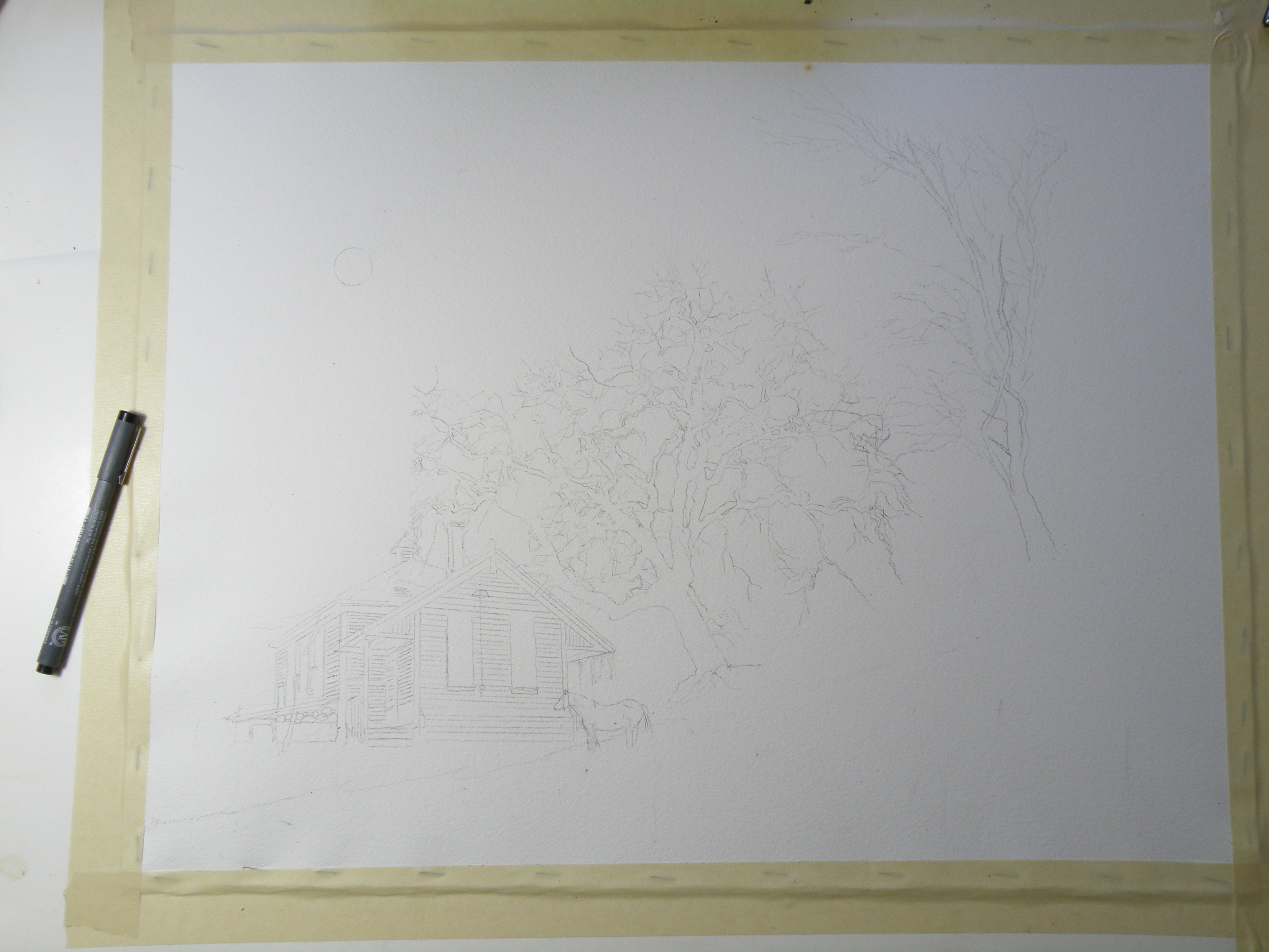
This is the initial drawing. Because the rancher kept horses, I decided to position one for sake of interest. The paper is Arches Cold Press 140 lb., stretched stapled and taped onto gater board, approx. 15 x 20 in.
Start to Finish . . .
February 7, 2012
Though I’ve certainly seen this done many times on websites and in books, I’ve never taken photos of a painting of mine as it progresses from a drawing to a finished piece. Whether it proves interesting or useful is anyone’s guess, but here goes . . .
I sought out written permission from the Irish Photographer Joseph Hogan to use his images to create watercolours. This is necessary whenever an artist chooses to make use of another artist’s image(s). I have paintings which I’ve done from photos I’ve found on the internet but won’t post them here (nor sell them) because I’ve yet to go about getting explicit permission to use the original image.
In any case, here is the image I am using for a painting entitled “Winter Barn“. . . .

Original Photograph by Joseph Hogan (used with Joe's exclusive permission)
The first step is for me to choose the right kind of paper. It took me about ten years to discover ‘my’ paper–the one that receives my style of painting the best. (And there are honking bunches of types of paper out there beckoning watercolourists.) For this particular subject I chose Arches 140 lb. Cold Press Paper, because it has a creamy hue and just a bit of tooth to it. My other preferred paper is Arches 140 lb. Hot Press Paper which is smooth as glass (which is what I used for ‘Winter Horses’, for example). Both papers receive the paint in a different way.
I first decided to change this photo into a night scene. For me it is important to establish a definite and personal mood, to embody the photograph–use it to draw out from me what I feel when I see it–let my mind take me back to similar scenes in time’s past.
When we lived in Granville, New York, we lived in the Baptist Parsonage (my father was a Pastor) and it was a 19th Century house with the original horse barn for our garage. Sitting at its open back door, I remember looking at the host of stars while sneaking a Marlboro, and wondering what my life was going to involve. (And, lo and behold, it involved a prolonged effort to finally give up those deliciously-sinful Marlboros). But I sat there rain or shine or snow–usually at night–and thought my thoughts and enjoyed just being me instead of a Pastor’s son.
Back to the task at hand—I made a detailed drawing of the barn, used a prescription medicine container to draw a moon, then used masking fluid to mask out the moon, the window, and several fruit trees I decided belonged on a hill not in the photo.

Once that was done, I gave a preliminary wash to the night sky using Payne’s grey.

First wash over sky using Payne's Grey and a touch of Sepia
The next stage was to define the sky with a second, and darker wash. This is occasionally referred to as ‘glazing’ by my partners in crime but I just call it a second wash. I also decided to remove the masked moon and trees by rubbing off the rubbery masking, and then began defining the fruit trees by using Sepia mixed with Payne’s Grey and some Burnt Umber using a fan brush to give the feeling of many branches against a moonlit night.

blocking-in of fruit trees
I also used a small rigger brush to create more defined trees within the grove . . .

more tree detail . . .
As you can see, I also added shadows using Payne’s Grey and Thalo Blue. I want to convey the impression that they are growing on a hillside. And now it is time to begin the initial washes over the wood of the barn. The red in the photograph is not the red of my memory. I want the red of the barn in Granville, and not the red of Joseph Hogan’s barn photo.

initial barn washes and grasses on the hill
The next several illustrations show the development of the barn–the attention paid to the stonework, the window, the planks, the grasses and shadows. This takes me hours, and is somewhat distressing (in a I-just-want-a-Marlboro kind of way) because again, this is taking a photo of an anonymous barn in the daylight and changing it into a personal painting of a memory-laden place where my teenage self got lost in imagining futures (a different one every time I went out there–but all of them grand). In other words, there’s no blueprint to follow and it needs to look authentic, yet I have no scene before me to guide my brush–I must let the painting tell me where to go next . . .


more definition added to barn's stonework and planks . . .

yet more detail . . .
Finally, it took several days to stew over how to find the guts to put in the barn’s frosty shadows. I say ‘guts’ because with watercolour, there’s no turning back–once darks are laid in, they’re there to stay. (At any point along the way, an ill-advised decision has many a time consigned my work to the ‘not good enough’ heap.) And I chose to use a sponge and Payne’s Grey mixed with Thalo Blue to provide a texture-like effect to the snow covered grasses in front of the barn.
I then spattered Payne’s Grey over the wooden parts of the barn and over the fruit trees. I also spattered Yellow Ochre onto the stonework, and used it to sponge-in more grasses. Selective spattering adds the feeling of age to the barn, and more depth to the trees.
To finally convey the effect of a moonlit Wintery night, I spattered Opaque White over the whole to give the feel of a fine powder of snow falling gently onto the scene.
This may yet prove to be the final rendering of this subject–but then again, I may still stand back and feel it’s missing the mark (which I do feel it is, but can’t quite figure out how) and get in there and muck around some more. I actually do think I may spatter a bit more snow into the air . . . .

Final (maybe) version of "Winter Barn" by Lance Weisser relying on an image by Joseph Hogan (with permission)
I’ve enjoyed sharing this process with you. More than that, I have come to appreciate with increasing affection and encouragement your own artistic endeavours. You all spur me on, and make me happy that I’ve chosen watercolour as my medium to share as I take heart in your photos, pottery, paintings, drawings, computer art, and poetry.
Thank you for being my friends.
Fort House
January 3, 2012
Kamloops (a native word meaning ‘the joining of two rivers’) has evolved from an c1812 outpost of The Hudson’s Bay Company and an early Railroad and Gold Rush centre into the largest city in the Thompson-Nicola Region of British Columbia’s Interior.
One of our most distinctive houses situated near the North Thompson River, was built in 1907 for a farmer, Archie Davis, who had purchased land originally belonging to Fort Kamloops. It sits at the corner of Fortune Drive and Fort Avenue, and is simply referred to as ‘Fort House’. No longer in the Davis family, its acreage has been reduced to a lot-sized yard, and its classic box design has been altered so that now it is a rooming house with various entries and stairs added.
Wanting to depict it as it once was, this painting imagines a moonlit night with one lone window indicating activity, perhaps Archie Davis preparing to get up–pre-dawn–to attend to his animals and daily chores. It was purchased almost as soon as it was displayed, by a young couple who have a fondness for this familiar Kamloops landmark.

"Up Late"
